|
| Group |
Round |
C/R |
Comment |
Date |
Image |
| 54 |
Jul 25 |
Reply |
Thank you for your kind thoughts, Alan. --Matt |
Jul 13th |
| 54 |
Jul 25 |
Reply |
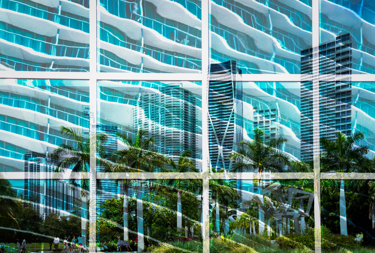
Appreciate your idea to refine the white grid, Peggy. I think that will make it more impactful. Thanks also for your comments. --Matt |
Jul 13th |
| 54 |
Jul 25 |
Reply |
I agree with you, cleaning up the white grid makes for a better image. Thank you for that, and your thoughtful comments. --Matt |
Jul 13th |
| 54 |
Jul 25 |
Reply |
That's a great suggestion Maria to refine the white lines. And, I appreciate your kind words. --Matt |
Jul 13th |
| 54 |
Jul 25 |
Comment |
What a masterpiece, Maria. The stone corridor makes a great environment for the scene and you blended the characters in very well. The story of the bull and chicken girl is both fascinating and magical. Congratulations on creating one of the most creative images I have seen in a while. |
Jul 5th |
| 54 |
Jul 25 |
Comment |
Hi Peggy, I love the way you combined your pelican experience. The movement with the flying birds over the waves gives a mystical feeling. The Spherize distortion was a good choice. I often have trouble figuring out what type of warping I want to do and will have to keep this technique in mind. As you noted, it's a good way to highlight a main subject as you did with the front pelican. I'm not a huge fan of B&W, but your editing made it work well. I did notice the waves are bleeding into the front pelican wing if that is something you might not intended to do with your opacity. Very nice! |
Jul 5th |
| 54 |
Jul 25 |
Comment |
Greetings Alan! I very much enjoy seeing what you come up with, and this month is no different. This is quite an other-worldly experience you have created. It's like she's watching a parade on Mars.
The shadowing of the objects and woman seem well-placed and bring the pieces together nicely. The texture of the 'planet' came through as well which guides the eye along with the UFOs.
I often add some dodging and burning on my dune images and that's just an idea for a bit of dimensionality.
Super work. |
Jul 5th |
| 54 |
Jul 25 |
Comment |
Talk about taking the bull by the horns! I certainly empathize with your feelings about how sad political history seems to repeat.
It took me a minute to see the duck head but when I did, I audibly laughed. So, you did add a bit of humor to the darkness. Kudos for that.
The landscape and fog/shadows make the image for me. As Alan suggested, the hand might benefit from a bit of opaqueness. I could see the head a bit lower with less sky, but that's subjective.
Thank you for creating something unique and thought-provoking, Brad! |
Jul 5th |
| 54 |
Jul 25 |
Comment |
This is terrific work, Maria. And a great example of taking an artwork and putting your own take on it. Your cutout came out well. And yes, you could make it a bit more yellow/golden, especially on the bottom, to match the beams.
I can tell you worked on the shadows. Your burning does add a dimensionality to the image that works. You could do the same with them dodging if you wanted to highlight the beams and lit areas a bit more.
The trees and shrubs add to the landscape so I would leave those in. The red version is cool too, but I agree with you that the blue is better.
What a creative image you have created! |
Jul 3rd |
5 comments - 4 replies for Group 54
|
5 comments - 4 replies Total
|


