|
| Group |
Round |
C/R |
Comment |
Date |
Image |
| 54 |
Mar 25 |
Comment |
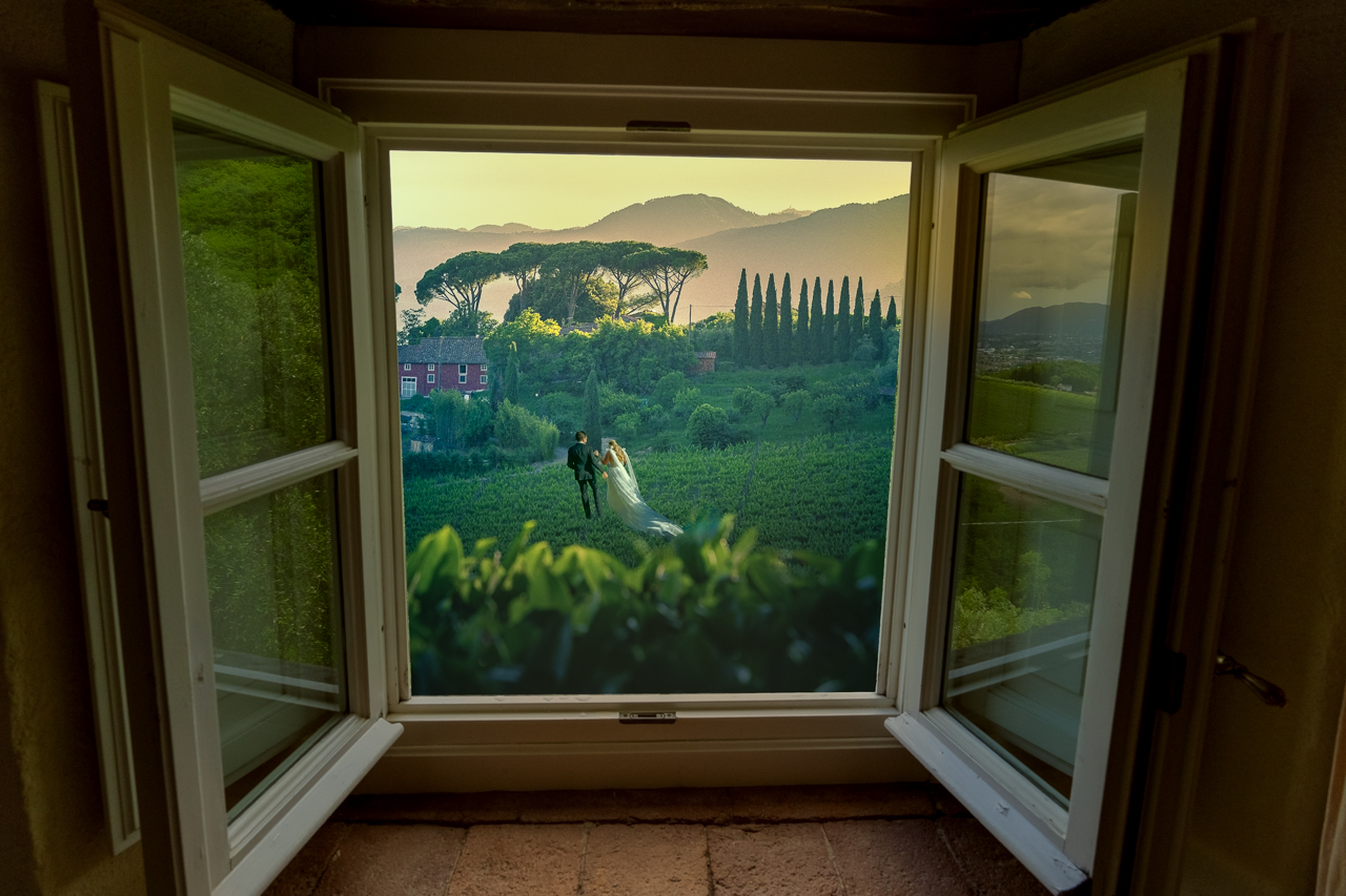
Such a wonderful transformation, especially with the lighting from the initial beach scene. You brought us back to a calmer, more civilized time. As Kirsti noted, it's right out of Downton Abbey and you blended the lady in so well to the background. The texture is just right, perhaps a bit more purple than I would have used, but so compelling and well-done. |
Mar 13th |
| 54 |
Mar 25 |
Comment |
So well done, Kirsti. As you saw last month, I really enjoy color simplification and the blue / white you have here is an excellent creative choice. It takes the viewer right into the scene with the man in the forest. You have some great suggestions above. I could add one more ... take out the bear and girl so you can expand what you have on the bottom center to make a foreground leading line border of sorts.
My only suggestion is that you have a lot of white light on the bottom third of the image so maybe add some glows and pops of light in the center around the man and the upper part of the image. Really great work! |
Mar 13th |
| 54 |
Mar 25 |
Comment |
I really enjoy these special worlds that you create from scratch, Alan. They make the viewer think and go through the image up and down. In this one, I especially like the angles that you created, mixing the figure, board, hand, etc.
I actually didn't mind the initial background you submitted (though I would have put the head more in the black section. But, I can see it both ways as the simpler background brings more attention to the chess game. I know the original figure that is bent over had those jagged edges on his pants, but I might try smoothing them out as it caught my eye as a minor distraction. I so love the hand with the chess piece coming over the board. Fantastic, all around! |
Mar 13th |
| 54 |
Mar 25 |
Comment |
So fun! I love the concept and who doesn't love a David, ha!
I think your placement works well and the new sky gives a bit of drama.
I agree with Maria that adjusting the lighting could improve the image. I actually like the lighting on the original David as it is more nuanced. Since your tree image has the sun coming from above, that is where the light should fall. |
Mar 13th |
| 54 |
Mar 25 |
Comment |
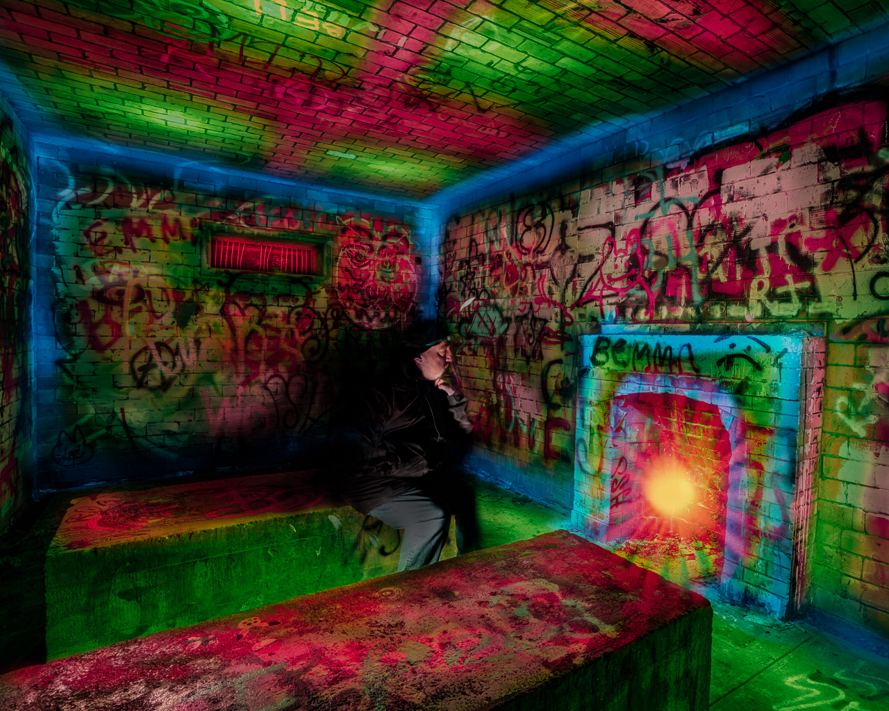
Whoa! This could be one my favorite images I've seen in DD, just spectacular. The texture layer really brings it together and your coloring of the lights makes it so inviting. I think you positioned the figures perfectly and blended them as much.
As always, our eyes are drawn to the brightest part of an image which are those white panels in the back. I don't mind it since it brought me to the back of the perspective, maybe something to think about. Overall, just terrific, congratulations Maria! |
Mar 10th |
5 comments - 0 replies for Group 54
|
5 comments - 0 replies Total
|


