|
| Group |
Round |
C/R |
Comment |
Date |
Image |
| 54 |
Dec 24 |
Comment |
It's a fun image Maria and well done. I agree with Kristi that you could play with the eyes, both the direction and placement. As others have suggested, I've seen these with 'movement' on the sides and you could try a motion or path blur for that. |
Dec 14th |
| 54 |
Dec 24 |
Comment |
Peggy, I immediately noticed the 3D effect on your image, from the size of the pedals front to back, that are quite striking the way you maneuvered the pieces relative to the background. I love the creativity of using the fall colors to compose your palette. While abstract, you can certainly make out the leaves and flower pedals and the texture just adds to that impact.
I was trying to think of how to 'ground' the image a bit, so it's not just floating. I'm not sure what the answer is with that. You could possibly add some shadows to the bottom making it look like it's in a box or room.
Overall, it's terrific. |
Dec 14th |
| 54 |
Dec 24 |
Reply |
Hi Bruce, I appreciate your noting that some composites, such as yours, are worthy embellishments rather than transformative. I addressed the 'someone else's art" point in my response to Alan so I will leave it at that. Happy Holidays. |
Dec 13th |
| 54 |
Dec 24 |
Reply |
I have been considering how to respond to your "admonishment" in response to a fun holiday composite / blend. My intent was to improve the scene, not completely replace it. I am still new to this group (though not to DD), but I did not know the primary goal was to make an image unrecognizable.
As Bruce noted in his comment, his red car on a landscape or your pasting a man in a doorway are hardly transformative, and frankly, quite perfunctory. Instead of shaming you about that, I offered suggestions that you might consider.
Regarding point of using "someone else's art," there is not another artist here as beach snowmen are generic displays in tropical locales that appear everywhere around the holidays, similar to Santa Claus or a Christmas tree. Would you attribute your attractive doorway to the architect or builder since you did not design it? Of course not.
As a sign of the value of this image's improvements with the tree and sky, the municipality saw my composite on Instagram and licensed it (for a fee) for their holiday event.
I hope we can agree to try and provide ideas and suggestions in the future. If you feel you cannot provide anything constructive, then I suggest you simply be quiet. |
Dec 13th |
| 54 |
Dec 24 |
Comment |
Hi Bruce!
Your image really hits the mark with the leading lines of the road and the diagonals that center the red classic car amid an otherwise desaturated scene. The blending really came out well to make a compelling composite image and I can see how the white layer really helped.
Focusing just on the scene rather than the technicals, the car looks a bit diminutive relative to the larger scene. In other words, if you were actually taking this image of the car, you probably would have gotten closer to it, perhaps leaving some of the left fence off. You're a transform / warp / perspective expert, so that may help do the trick by making the car larger. I do love the gnarly tree on the right so I wouldn't touch that. Overall, it all works great. |
Dec 5th |
| 54 |
Dec 24 |
Comment |
I love seascapes like this, Brad. Even though I'm still new with this group, I am already thinking about how I can take my images like this one to the next level. Good suggestions by Brad and Alan already. I personally struggle with Black and White, but it's true that more contrast is usually better. I do enjoy the shapes you combined with the cloud structure. And the rocks make sort of a semi-circle which is appealing to the eye. There's a lot to look at, nice captures! |
Dec 5th |
| 54 |
Dec 24 |
Comment |
I love Ptown and go every summer, at least once or twice. And what a door you found, I remember there were many nice options along Commercial Street. And yes, it is chaotic especially on weekends.
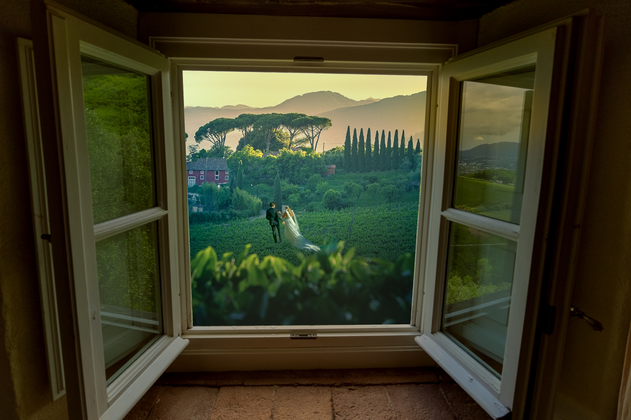
The green man is terrific, on top of the tiled walkway and you added a nice shadow. Maybe a bit darker around his feet to ground him. The flower is a nice touch. You could even angle it down or hang it lower like a glowing entry lamp.
This image had me coming back more than once, which is always a good thing. Well done! |
Dec 4th |
| 54 |
Dec 24 |
Comment |
Kristi, I'm amazed at your creativity with this one. I enjoy the symmetry of the mirrored-forest against the crumbled wallpaper. At first, I wasn't sure you even needed the squirrel, but it's always a good idea to have some type of subject rather than just a landscape.
Bruce's inside-outside trick adds a lot of depth, so terrific!
I personally like the colors of the forest, though I think you can play a bit with the wallpaper if you wanted to really go fantasy.
Nicely done! |
Dec 3rd |
6 comments - 2 replies for Group 54
|
6 comments - 2 replies Total
|


