|
| Group |
Round |
C/R |
Comment |
Date |
Image |
| 54 |
Nov 24 |
Reply |
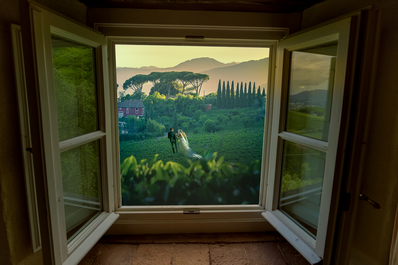
Many thanks for that, Bruce. That's a good point about the 'rightness' of the building from this perspective. It's funny as I spent hours getting it straight! But, I see your point about the realism of the top being back more. I appreciate your taking a shot at darkening the step and brightening up the windows. Those both make a nice improvements. I'm still not sure about the gravestones and might rework them or remove them completely. Thanks again. |
Nov 13th |
| 54 |
Nov 24 |
Reply |
Yes, I struggled with the gravestones. I think I have to either remove them or change their placement. Many thanks for the suggestion! |
Nov 13th |
| 54 |
Nov 24 |
Comment |
Bruce, It is terrific how you made an American 50's era image out of two international photos, especially the one from Cambodia. You blended them so well and the color palette works great.
You nailed the perspective and foot placement with the shadows. At first, I was a bit confused why the shadows are in front when the light is on the front of their dresses, but with indoor images, you can get away with that as lights could be anywhere.
I can see what Peggy mentioned about the contrast, but I wouldn't tone the dancers down too much. The pop kind of goes with the story.
I know cropping suggestions are not always helpful, but you do have a fair amount of headroom with some edge items on top.
I really love it. I bet it does very well in competition. |
Nov 13th |
| 54 |
Nov 24 |
Reply |
Thank you, Alan. I appreciate your 'less is more' suggestion and agree I got carried away with the add-ons. I hope to make this competition-ready and so most of those will have to go anyway.
I spent a lot of time shading the cathedral, first using a day-to-night lookup adjustment layer and then gradients that darkened the edges in a smooth fashion. For the darkening gradients, I selected the various sections of the cathedral, one by one, to enhance the effect. As you can see, I wanted the upper left to be darker than the bottom right. Thanks again for your comments. |
Nov 6th |
| 54 |
Nov 24 |
Comment |
The Milky Way blend for the sky worked well, although it would be impossible to have the sun shine like that and actually see the stars like that. But, I'm perfectly fine with cheating reality! The reason it also works is the lighting of the beach is dark enough to make it match up well with the night sky. The boy and the surfboard add an interesting focus subject, but seem a bit out of context as the waves are not large enough and the lighting is off. You might try repositioning and darkening him. Still, I like the fun aspect! |
Nov 6th |
| 54 |
Nov 24 |
Comment |
Wow, the wizard and use of the "card" deck makes for a magical image. I like that you changed the direction of the wizard and layered the windows in a curved shape. The disc helps ground him in the scene. The women in the frames really pop with those colors on a black background. Your angling and perception (sm to lg) make for a smooth flow of the window cards. If you wanted you could play with the angles and overlap of the windows for variations, but I like it as you have it. |
Nov 5th |
| 54 |
Nov 24 |
Comment |
Hi Kirsti, This is a creative take to bring the animals into the scene. The squirrel blends in very nicely on the rock and its position is very additive to the scene. The dinosaurs look a bit pasted in mainly because their claws don't match the ground angle. You might try darkening the area where their claws hit the ground for a shadow that might help. |
Nov 5th |
| 54 |
Nov 24 |
Comment |
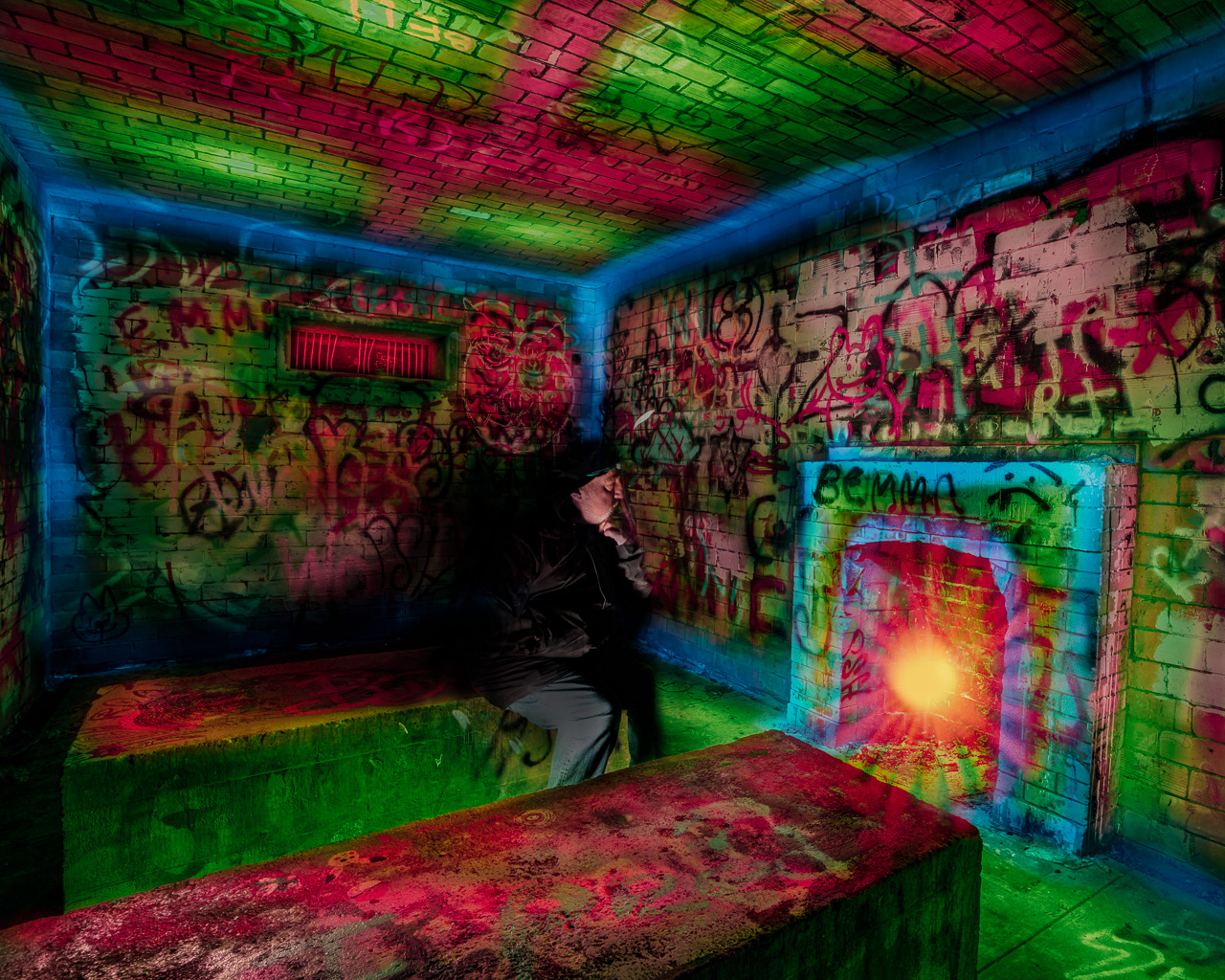
This image really works well as you brought the pieces together marvelously. The ICM and liquify combo made for a neat effect. The girl in the cloak adds an intriguing subject, like she is walking into a portal of some type. I also enjoy the color palette that you brought out with the glow filter. I don't have any significant suggestions as I think it's a complete image as is. Maybe deemphasize the dark branch that is a bit distracting in the center of the image. |
Nov 5th |
5 comments - 3 replies for Group 54
|
5 comments - 3 replies Total
|