|
| Group |
Round |
C/R |
Comment |
Date |
Image |
| 60 |
Aug 21 |
Comment |
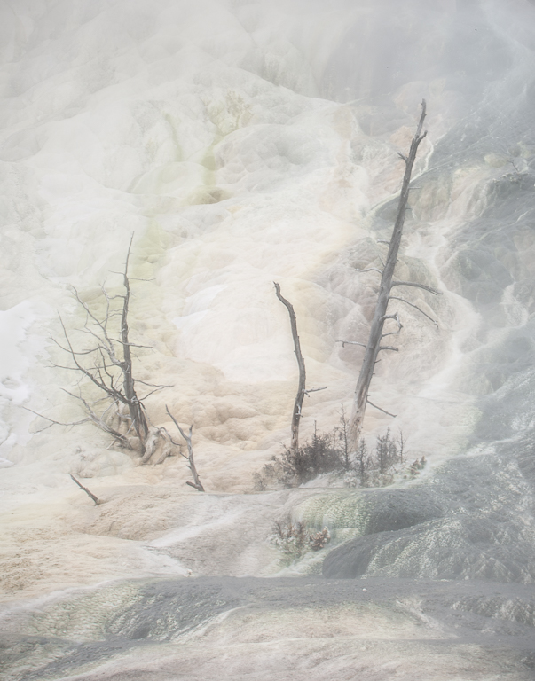
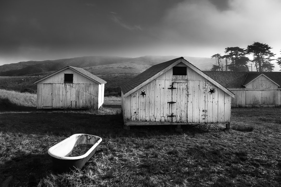
John a lovely shot and I too like Linda's edits but personally I wouldn't need to flip the image. Did you try B/W? I think foggy settings look nice in monochrone. Nicely seen. Great composition. |
Aug 27th |
| 60 |
Aug 21 |
Comment |
Damon this is beautiful. I love that all parts of the leaves are nice and sharp and the vase is a nice addition with the glaze design going nicely with the maple leaves. The background looks fine to me so you did a fine job of cleaning it up. I've never used that background but thanks I won't now. Great shot. Another nice one to print. |
Aug 25th |
| 60 |
Aug 21 |
Comment |
Richard this is beautiful! I love the pose/composition and, yes, the wonderful light. Not sure how I could improve on it. Hope you printed this one. |
Aug 25th |
3 comments - 0 replies for Group 60
|
| 83 |
Aug 21 |
Comment |
Jose I don't have anything to add to the commments above. I really like this subject and composition. A visual vacation! |
Aug 27th |
| 83 |
Aug 21 |
Comment |
Lance just a lovely composition here. Initially I too was distracted by the highlights in the background. But looking longer I feel burning the background highlights might help separate flower and butterfly from it putting them on separate planes? Anyway I really like this composition and look forward to the printed version. |
Aug 27th |
| 83 |
Aug 21 |
Reply |
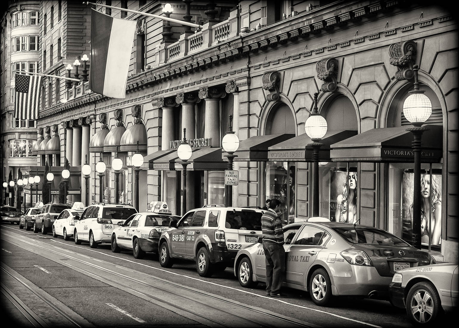
Thanks Debasish. There is a wall right there on the right and yes the exposure is no optimal as this was an early workshop on my adventure into photography. It is a tourist location in San Francisco so there isn't much time without people in the scene, I was trying to capture it between groups. Now I would just ask them to wait:-) |
Aug 22nd |
| 83 |
Aug 21 |
Comment |
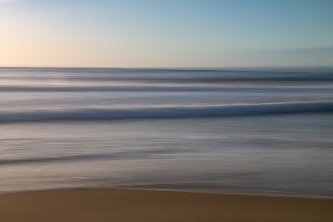
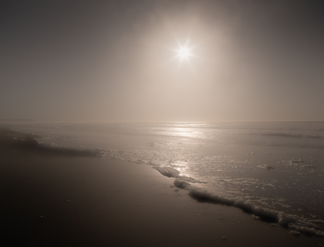
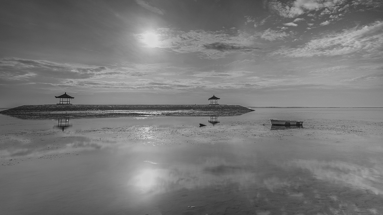
I love the subject of this image! Welcome Titi. I downloaded this to LR and played around with it as for me it is a bit dark. I increased the highlights but burned the sun and its reflection then I played around with dodging the sky highlights and whites careful not to go near the sun but did include the area under the umbrellas. With the gradient tool I lightened up the right side a little. I was trying to make the image feel like it was part of a bigger picture. Then I cropped the foam on the sand at the bottom. That was distracting for me. I had to clone out some of it so I didn't have to crop too much. Anyway I like the image and enjoyed playing with it. Let me know what you think. I hope you can go back there, what a beautiful spot. I like the composition very much. |
Aug 22nd |
 |
| 83 |
Aug 21 |
Comment |
Dirk maybe if you could dodge the pigeon's head or are you trying for a silhouette? The sky is a nice background for the silhouette look. I would like to see the birds a bit sharper and in focus. |
Aug 22nd |
| 83 |
Aug 21 |
Comment |
The boy's face hit me first as it should, adorable! My second viewing is that I wish you waited maybe a few seconds for the door to open a bit wider to get all of his left eye and the edge of the door latch out of his chin. The aspect ratio does seem a bit narrow, did you crop this? It's great you got him from head to toe and the door is nice as well. Overall it's beautiful though. |
Aug 22nd |
| 83 |
Aug 21 |
Comment |
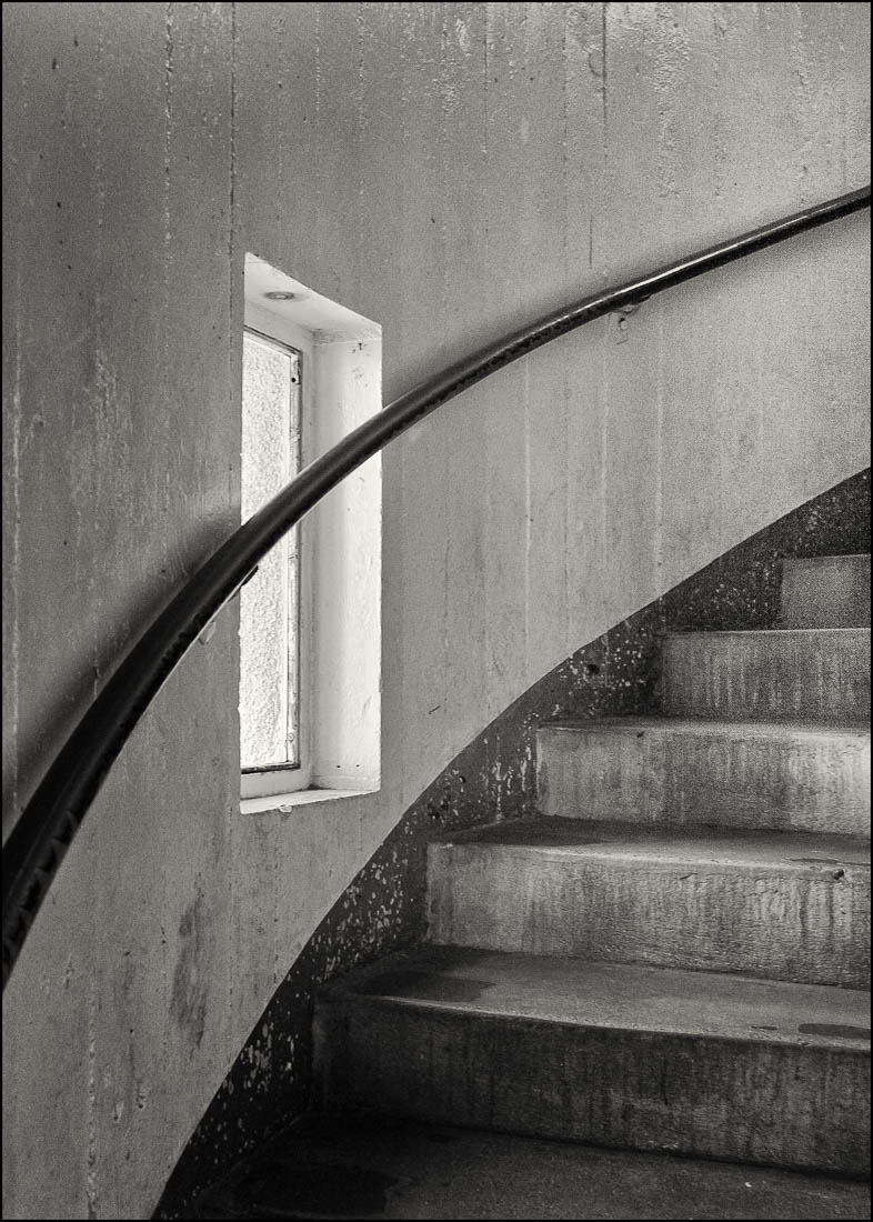
Thanks for all the comments. I've aways been on the fence about whether this needed a subject climbing the stairs to add interest. I like the idea of trying it out matted with grey. Thank you Lance. |
Aug 22nd |
6 comments - 1 reply for Group 83
|
9 comments - 1 reply Total
|
