|
| Group |
Round |
C/R |
Comment |
Date |
Image |
| 60 |
Dec 20 |
Comment |
I'm talking about the spotted ones in each of the lower corners and slightly off center on the right at the top. I don't think it would be mandatory but I noticed and I like. I was going to note the bubblegum pink color but I kind of like it. It really helps make a statement about this image and the bee, also very vivid, matches the punch. No shrinking violet this image:-) It's great. |
Dec 20th |
| 60 |
Dec 20 |
Comment |
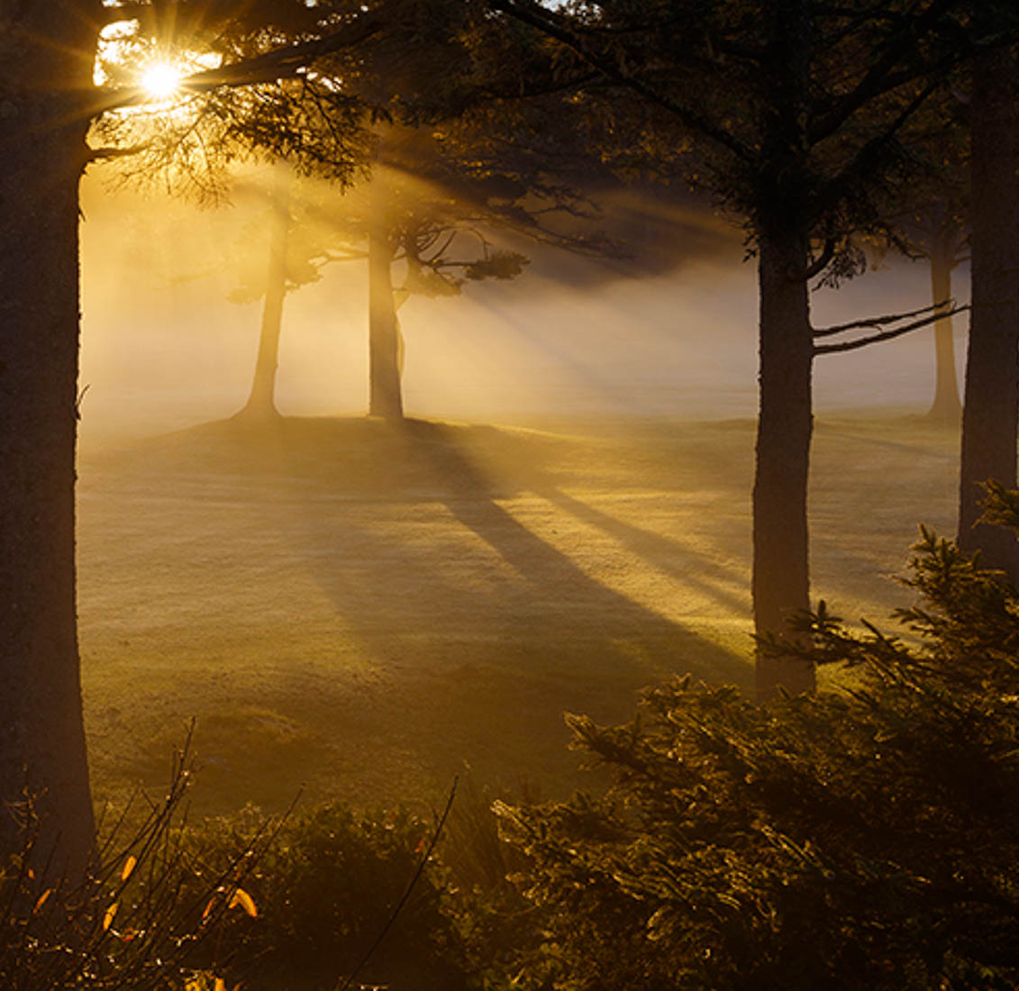
Beautiful Jane. I love those foggy mornings and evenings. I am distracted by the blue sky as well. I thought about trying to tone it down but part of my distraction is the color. Such a saturated blue with the subtle yellows of the mist over the (golf course?). Anyway in LR I cropped it different ways and finally thought I'd try cropping the sky out altogether. Totally different picture. Anyway fun to play with. Not sure I am crazy about the tree boardering on left side but that was the only way to crop out all the blue.
Way to be pro active by actually stopping to take this! |
Dec 20th |
 |
| 60 |
Dec 20 |
Comment |
Damon you have done a wonderful job here with the bee and the cropping of the image. I like the balance of the three pedals with the black spots surrounding the bee. I have tried photographing bees before and never been very successful. Great job. Good luck with PS! |
Dec 20th |
| 60 |
Dec 20 |
Comment |
What a beautiful flower! Thanks for introducing me to such an exotic thing. It's nicely captured, sharp, good detail. I think it would have been worth it to remove the spent flowers and pedals. They are a little distracting. The black board as a back drop is a great idea. I was thinking a black cloth/tarp to cover the background and then burn and blur in LR or PS maybe? It's really amazing! |
Dec 20th |
| 60 |
Dec 20 |
Comment |
What beautiful colors Emmy. The wet path provides a great leading line into the image towards the beautiful fall foliage. Could you have moved to the right a little to capture more short grass in the foreground instead of the long grass? My eye is a little distracted by the long grass, there's a lot of it. Or maybe raise the camera so the grass isn't so prominent. It seems that if the fall foliage is the main subject then there should be more of it in the image than the bold green grass. The sky doesn't bother me. I want to walk the trail to see whats around the corner:-) |
Dec 20th |
| 60 |
Dec 20 |
Comment |
Richard I think you were very successful with this image. I have never tried anything like this but it looks very intriguing. Such a nice result, great highlights, great tonal range overall. I wouldn't do anything to it. |
Dec 20th |
| 60 |
Dec 20 |
Reply |
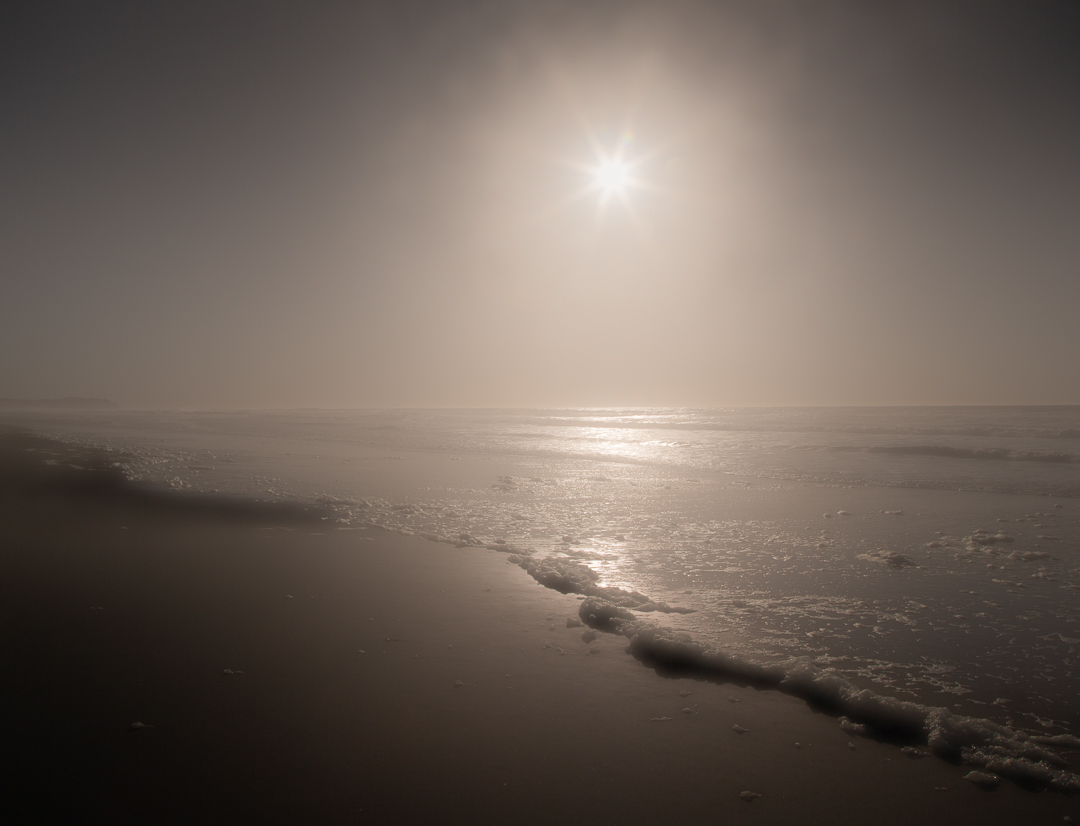
Thanks for the review Damon. This is not B&W but I agree it looks like it. I think, if we are looking at the same thing, the smudge is just the shadow created by the wave. I think dodging both shadows from the small waves might be in order as well a the lower left corner now that I see how dark they are. I went with the 1/60 and f22 because I wanted the same sharpness/softness to be the same throughout the image and I wanted to tone down the brights as much as possible. I was using a singh ray variable polarizing filter but thought it still might be too bright. This was all an experiment and when I saw it in LR I moved the anti haze slider to the left and liked the soft feel of it. So I thought I would throw it out there to get people's reactions. |
Dec 14th |
6 comments - 1 reply for Group 60
|
| 83 |
Dec 20 |
Comment |
Thank you for all you for all your comments.
Hers to Happy 2021 for all!
|
Dec 30th |
| 83 |
Dec 20 |
Comment |
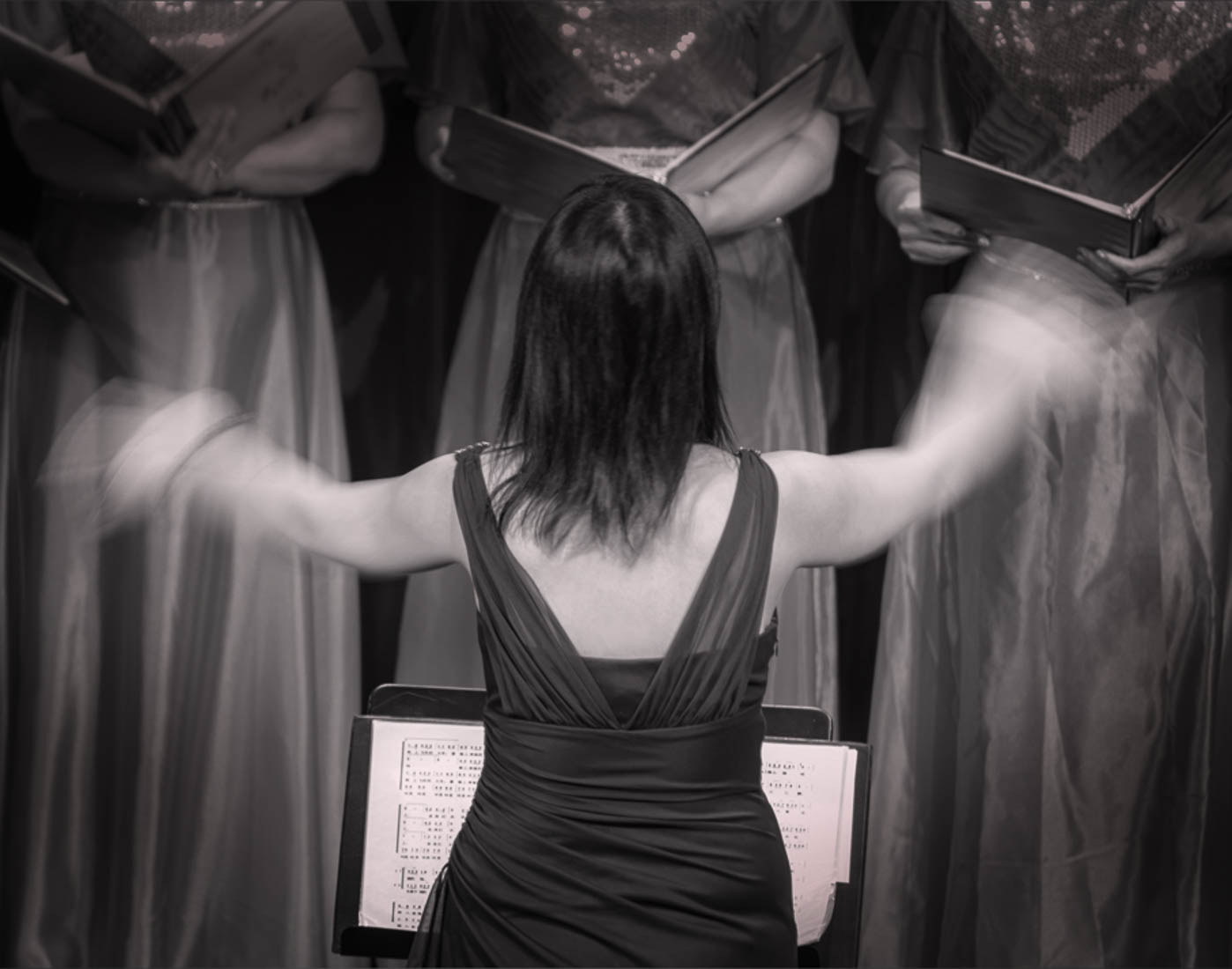
Judith you definitely captured the hand motion here. Well done. I prefer the b/w to color as well. As you want to make this a journalistic image editing is limited. I did decide to play with this in LR though,treating it as a creative work. I cropped the image on both sides then with the brush tool burned the edges. I highlighted the conductor so she stood out a bit more. Not sure I like it better but I like to experiment. Anyway, had fun with this. What a great vision Judith. Good job capturing it. |
Dec 21st |
 |
| 83 |
Dec 20 |
Comment |
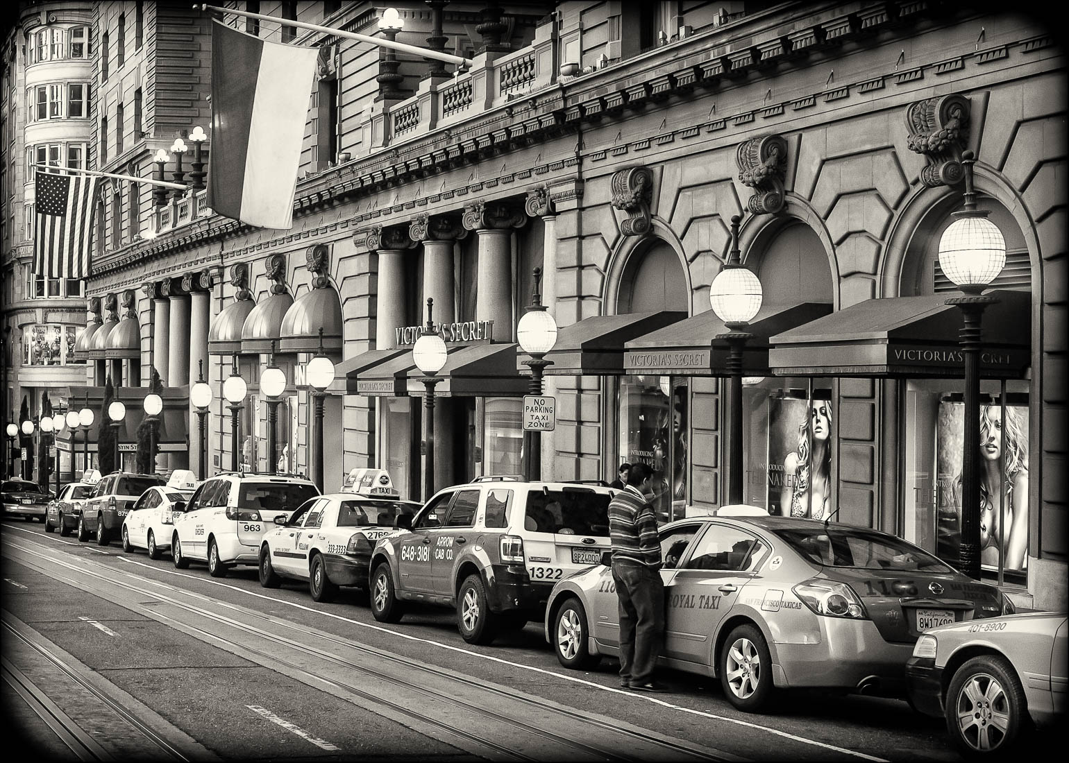
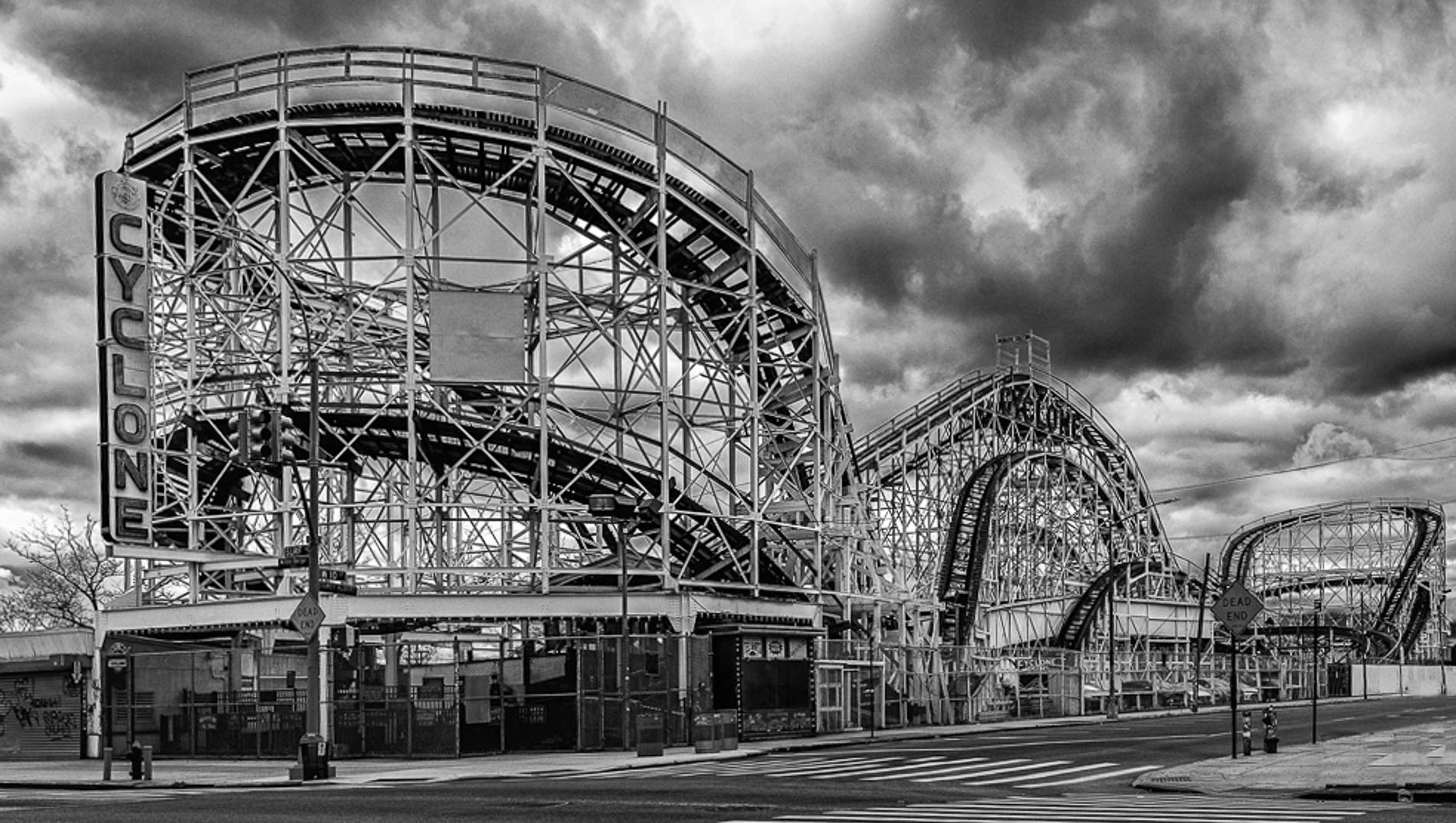
Joe these are great curves! I like the angle of the shot so we see maximun curve with the cross walk lines beautifully leading us into the picture. I played around with this in LR just to see if there was a way to enhance the roller coaster and make it stand out more then I thought I don't like the garbage cans so got rid of them (that's legal right Lance, lol) then decided the equipment above them on the right edge of the image was distracting so removed that. I increased the blacks a bit on the roller coaster with the brush too. I also cropped it to maybe give the roller coaster more impact. Anyway, had some fun with it. Obviously non of this legal in journalistic image. Nice job Joe, it's well captured. |
Dec 20th |
 |
| 83 |
Dec 20 |
Comment |
Great image! The puff of smoke makes it. I know enough cigar smokers to 'feel' how much he is enjoying it and totally oblivious to the world around. I agree I wouldn't crop this image but I would burn the bright spots in the background some so my eye wasn't always being drawn to them.
Beautiful job Jose. |
Dec 20th |
| 83 |
Dec 20 |
Comment |
Lance I like your selected image the best of the three. It's a simple, straightforward design that shows the wonderful texture of the rocks next to the softer textures of the leaves. I like that the rock is only slightly larger in surface area that the leaves but definitely it's no half and half. I am distracted by the brightness of the leaves though. I want to be able to see them with more clarity. I am struggling to make out details which detracts from the overall pleasure of the image for me. Love the composition. |
Dec 20th |
| 83 |
Dec 20 |
Comment |
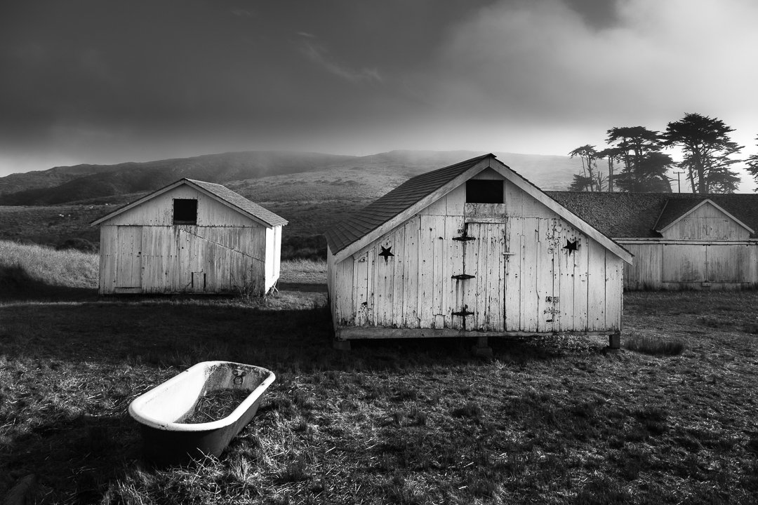
Thank you for the critique. I love the edits and comments and much appreciate them. I am looking at the original on my screen and see the shadows do have separation but I dodged it a bit and it is better. I think for some reason the images are transferring darker than the originals. The tub is too bright but not blown out in the original, only on the rim in a couple of areas and the side of the left barn. I did not notice this so thank you for pointing it out. I like the sky crop you and Lance suggested but still on the fence about the right side. I do think if I am going to crop it it should remove the entire gable. The suggestions and edits are great aids to seeing things I totally missed.-
Thank you! |
Dec 14th |
| 83 |
Dec 20 |
Reply |
Thank you Lance. I like the cropping. I like that third set of diagonals as well. I think I'll try it and live with it awhile to see which one resonates with me. |
Dec 12th |
| 83 |
Dec 20 |
Comment |
Dirk I love the subject, the ferns and their texture but yes that branch tries to steal the show. If you really wanted to practice your photoshop skills you could try removing the end of that branch up to where it joins the main part (the Y) and the piece going vertically higher up. I love your vision here. The ferns are fabulous. |
Dec 10th |
| 83 |
Dec 20 |
Comment |
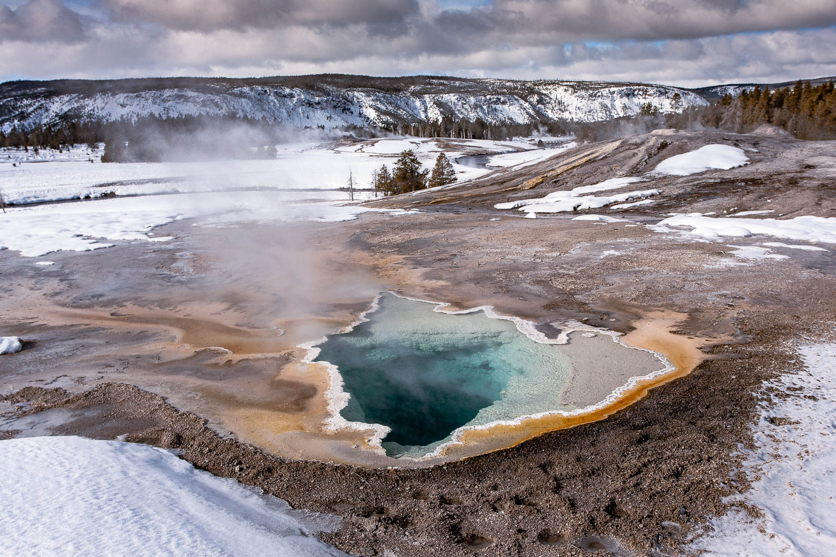
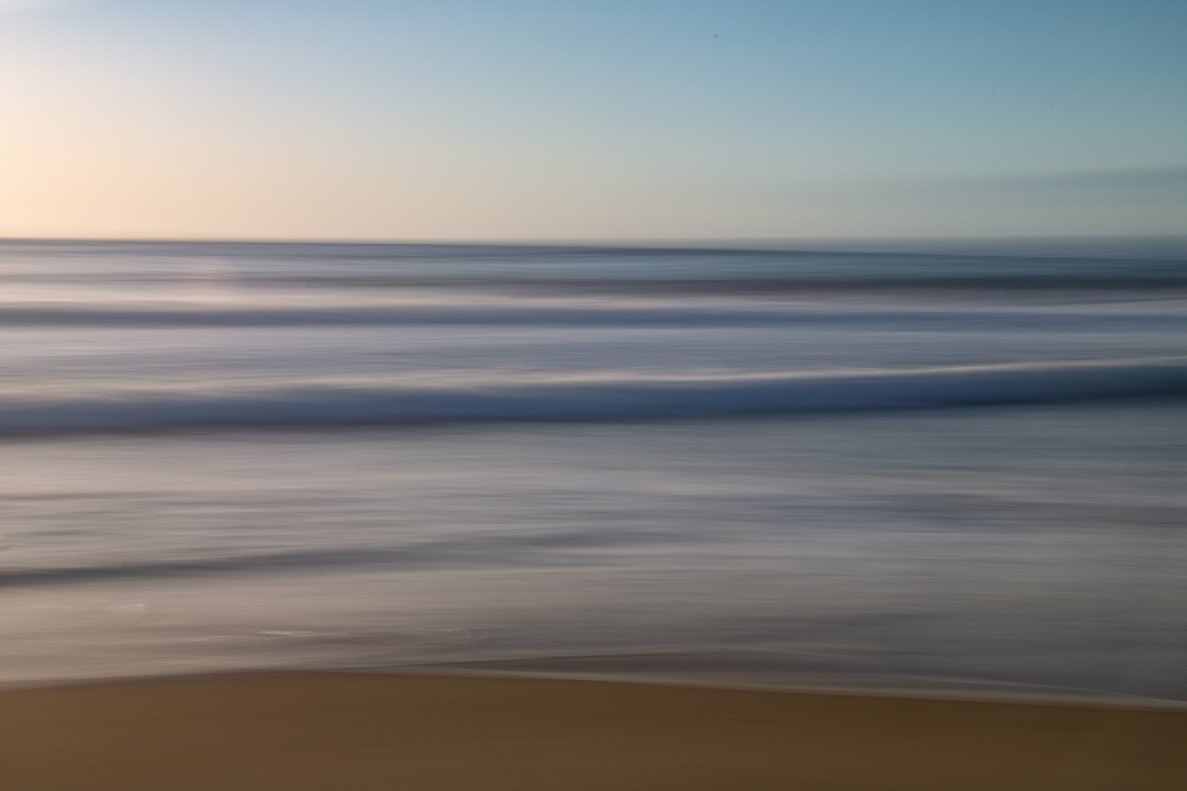
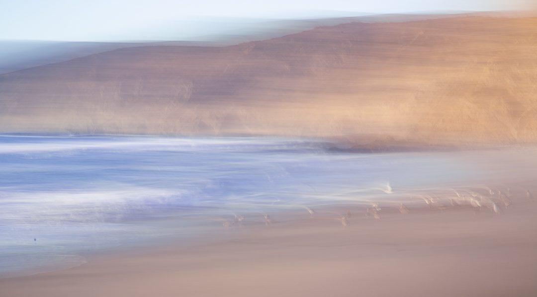
Debasish what a nice image. I'm pretty sure Drakes Beach is always windy:-) I love the grainy texture and the dark mysterious atmosphere and the uniformaty of the waves all along the beach. I do feel a bit pinched at the top on the horizon. Was that cropped or is that the top of the original image? Just something to try if it's cropped. It's beautiful. |
Dec 10th |
8 comments - 1 reply for Group 83
|
14 comments - 2 replies Total
|