|
| Group |
Round |
C/R |
Comment |
Date |
Image |
| 60 |
Sep 20 |
Comment |
Jane I am not offended at all. Thanks for the input. I think it's funny you picked the same composition. Great shot:-) |
Sep 18th |
| 60 |
Sep 20 |
Comment |
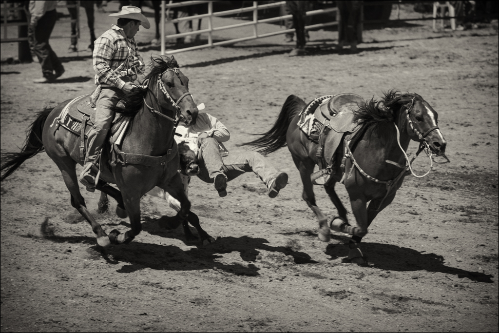
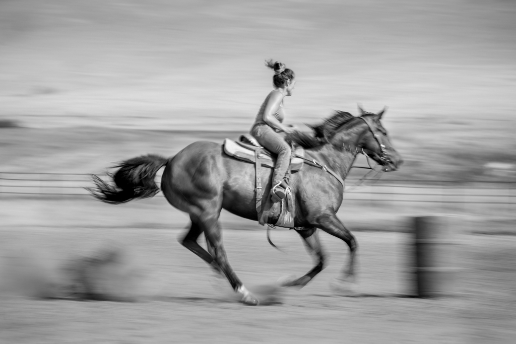
Indraneel what a great capture. I do wonder what you cropped out. I want to know more of this story rather than just a rider in a vacuum.
Nice moment in time however. |
Sep 17th |
| 60 |
Sep 20 |
Comment |
Damon this is a very interesting beautiful shot of what is clearly some sort of ceremony so yes explanation is helpful. But that doesn't make it any less interesting just maybe more so. The colors are beautiful and I am really drawn into the photo to check all the action out. Nicely captured in a difficult situation. |
Sep 15th |
| 60 |
Sep 20 |
Comment |
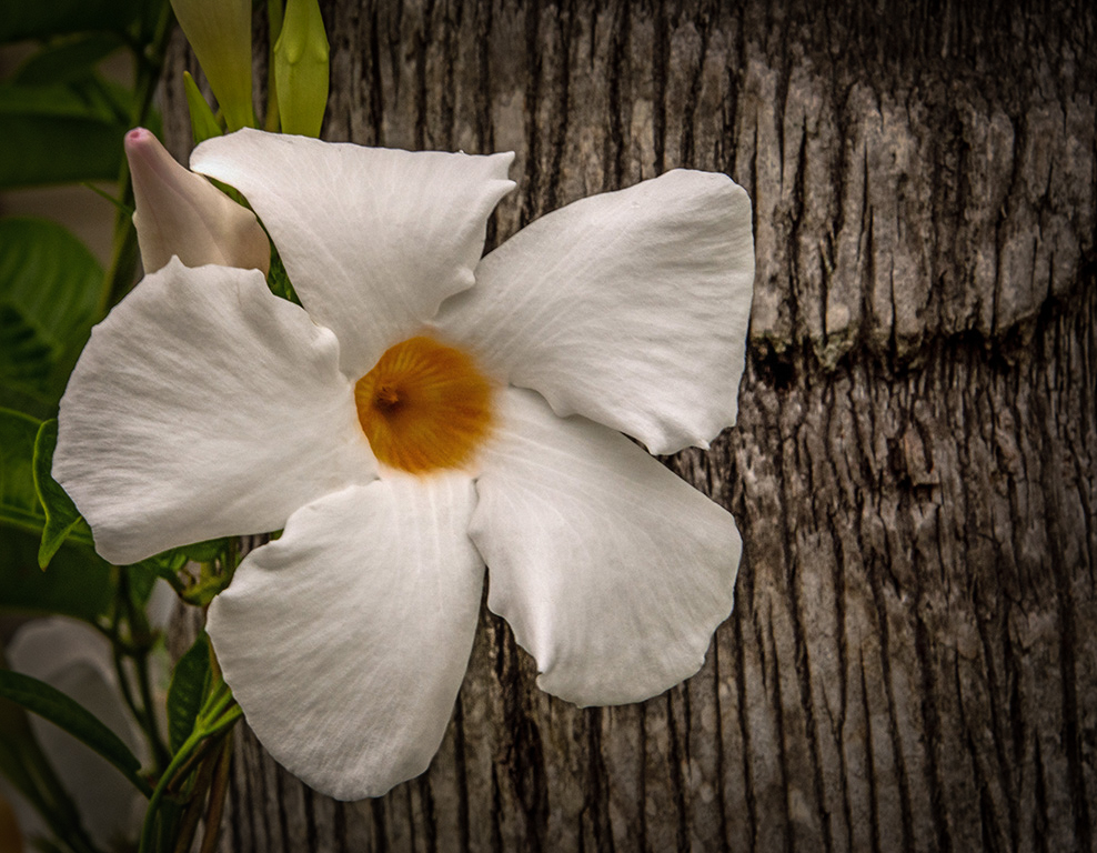
Hi Bernie. A beautiful composition with great texture and the contrast between the tree trunk and the delicate flower is interesting. All the comments so far have been great and it got me thinking about different approaches to editing it. In LR tried the approach of making the flower the main subject and everything else supporting the flower. Like Emmy suggested I think the tree should be darker but I used the vignette tool to burn everything around it. Then with the brush tool I dodged the stem,leaf and flower bud to highlight that a bit. Then again with the brush tool I upped the clarity of the stem, bud and flower to make them pop a little. It was fun to play with. You might think it too much but thought I throw it out there.
|
Sep 15th |
 |
| 60 |
Sep 20 |
Comment |
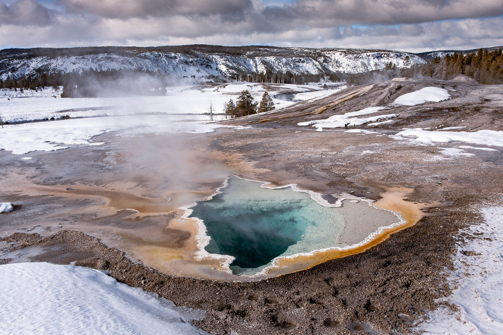
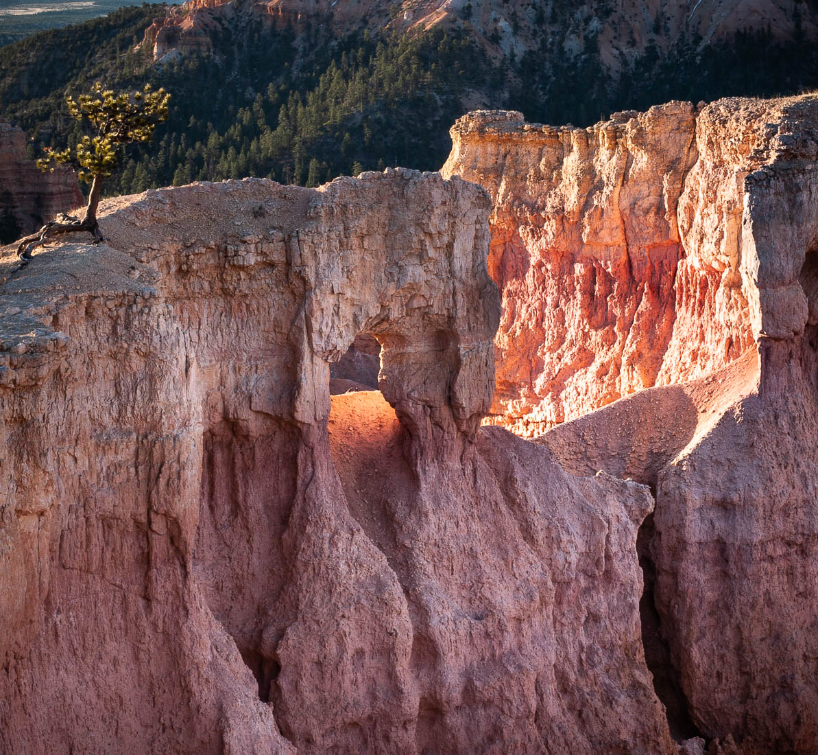
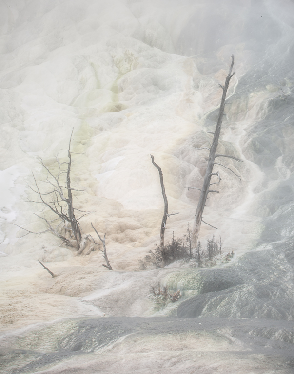
Thank you Richard. I would love to go back and try a filter out. It's on my wish list to revisit Yellowstone in winter.
|
Sep 13th |
| 60 |
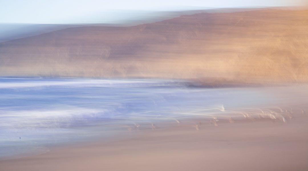
Sep 20 |
Comment |
Emmy what a nice vantage point you have here. I love taking pictures of the fog. I like how it seems to be zig zagging right and left from top to bottom. I do get the feeling it is tilted down on the right side a bit. Maybe and optical illusion. Also the dark foreground is drawing my eye to that area over and over. Can you dodge it a bit? Boy could we use the fog now! |
Sep 7th |
| 60 |
Sep 20 |
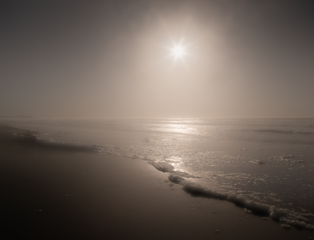
Reply |
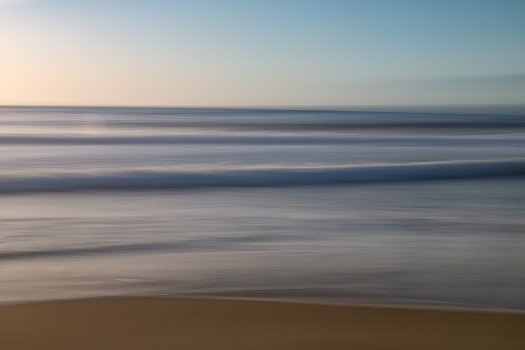
Thanks Emmy. Honestly I can't decide if I like the soft misty thing or not. Have had it hanging in my office to try to decide. Some days yes some not as much. I definitely like the colors you brought out except the greenish section toward the left side. Maybe I'll try that and print for comparison. Maybe I need more mist or less like you have done. Thanks for the input. |
Sep 7th |
| 60 |
Sep 20 |
Comment |
This is such a striking image. I love the elevated road leading into the city on the left side. The vibrant colors add interest and really draw my eye into the image to see what's happening. I like how the palm tree fits into the sky above the buildings on the right. It looks nice and sharp and so well balanced, nicely composed.
The only suggestion I can think of would be to use a tilt/shift lens to try for vertical buildings. |
Sep 6th |
8 comments - 1 reply for Group 60
|
| 83 |
Sep 20 |
Comment |
Lovely image Jose. Lighting is right for the scene I think, relaxed and comfortable feeling. I like that it evokes questions about the story that is happening. Who is the man, why the portrait being painted, if that is what is happening.
I think it might be nice if the cross on the wall on the left was not cut off on the left. Also I might, if this is not being used as journalistic image, get rid of the stacking chairs against the wall in the back. A nit pik I know but these were distracting for me. It's a great capture. |
Sep 17th |
| 83 |
Sep 20 |
Comment |
Lance these are a great set of images. I have to say I think I like #1 and #3 the best. The image you chose is lovely but my eyes are so drawn to the bright sky I have to struggle to concentrate on the leaves and the tree. I am actually squinting at the monitor. #1 I love because I can concentrate on the structure of the different plant leaves and the beauty of the tree trunk. No distractions. #3 is lovely with the sun right at the top of the tree trunk but for me that is also a distraction if you are thinking the leaves and tree trunk are the subject. I get that you are looking for light and shadow creating the interesting shapes but the light for me it is too bright in the first picture. My eyes are light sensitive so that could be part of it. That being said I have tried looking at the shapes the sky produces through the leaves and have found it easier to see shapes in #3 as the sky is less bright. Hope this makes some sense. And yes I fight my literal mind and this is a great exercise for me. Beautiful images. Let me know if this makes no sense! |
Sep 13th |
| 83 |
Sep 20 |
Comment |
Judith this is an amazing process I know nothing about really. Reading your description I am intrigued and will come back and read again to try to wrap my head around it. The resulting image you picked is beautiful. The soft light and grain is lovely with the old tools giving it a appropriately old image feeling, yet fresh. Not sure I am explaining it well but nice result. |
Sep 10th |
| 83 |
Sep 20 |
Comment |
What a beautiful image! So clean and simple yet interesting and complex at the same time. The slight difference in light intensity and the accompanying textural difference in the walls is great next to the textures on the lamp and all the details of its design. The glass textures and the bulb inside. Love it, beautifully done. There are some areas that appear black on the lamp post. Is it really black? I would prefer it if I could see some little detail there. But that's a nit pik |
Sep 10th |
| 83 |
Sep 20 |
Comment |
Thanks Lance. I have used then occasionally in the past but not the first thing I think of. I shall definitely go there more in the future. |
Sep 10th |
| 83 |
Sep 20 |
Comment |
Thank you all for the comments. I used the blue slider in LR after I converted it to black and white. I don't believe I used and color filters in Silver Efex pro. I did use it for converting the tonality to light sepia and adding the thin black frame. |
Sep 9th |
| 83 |
Sep 20 |
Comment |
Yes a nice representation of what I would not ordinarily consider a subject work taking an image of. I like this. Have you considered taking the specs in the water out? Would probably be laborious but maybe worth it. Printed on some really nice matt rag paper could be nice. |
Sep 7th |
7 comments - 0 replies for Group 83
|
15 comments - 1 reply Total
|