|
| Group |
Round |
C/R |
Comment |
Date |
Image |
| 29 |
Oct 17 |
Comment |
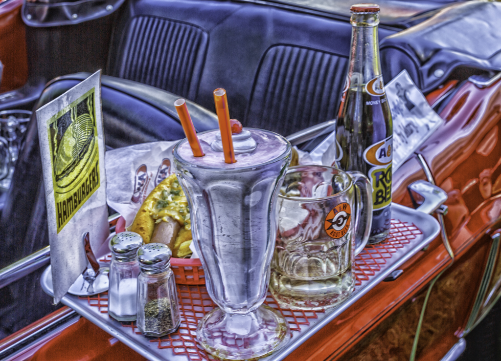
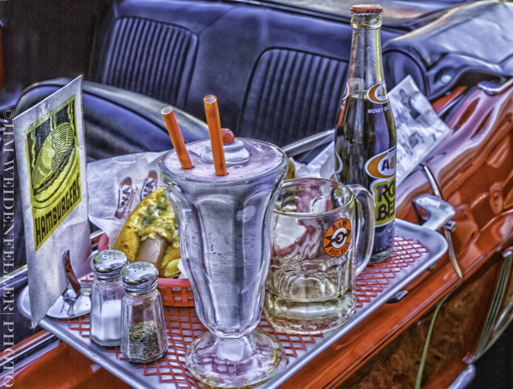
Thanks gang for the comments. Normal processing in LR from RAW. NIK Color Efex2. I played around there. I know detail extractor was used and maybe a couple of more. The parts everyone is commenting about are parts of the car. I tried to get rid od some of it. And, I just used Content Aware to try and make it less conspicuous. I don't really think it makes much of a difference. My thought was that the tray and its contents are enough to take you eye back. |
Oct 19th |
 |
| 29 |
Oct 17 |
Reply |
Judy I couldn't agree more. With PSA unless it is a photo of some place that 99% of the membership is never going to see your image will finish below the water buffalo or little man with no teeth in a hovel. Been a pet peeve of mine for years now. Which just goes with my new way of thinking, do what I like and do it the best I can and continue to make images that are the best I can do. Don't pander to judges. After all, do you know why your image got a 12 or 20. Nope, no reason. Just a judges opinion. I fail to see the educational value to that. |
Oct 6th |
| 29 |
Oct 17 |
Comment |
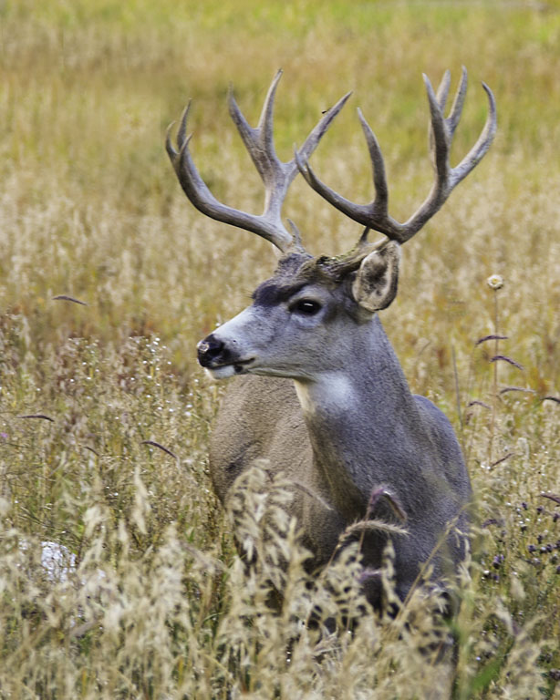
This I think is a nice clear shot. Great detail in the wing and tail feathers. it would have been nice to get some of the birds color, but you didn't so this is what you have and it is good. It tells a story, and does it effectively. |
Oct 3rd |
| 29 |
Oct 17 |
Comment |
Nice capture. Very sharp. DOF is right on. The image does seem to have a blue color cast. I took it into ACR and made a few adjustments to the white balance. |
Oct 3rd |
 |
| 29 |
Oct 17 |
Comment |
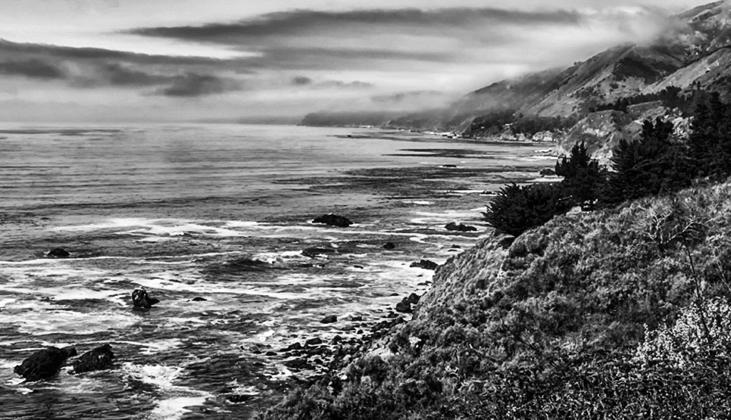
When I first looked I recognized it immediately. I think that is what is happening to a lot of images. They have been seen so many times, they no longer have the WOW factor for the judges. I have this discussion with a friend and he puts a lot of his images on Facebook. By the time they get in competition they are tired. Your image I think looks a little flat. Also the color tone seems off. I cropped it on the top and bottom. That still didn't do it for me so I took it to NIK and Silver Efects and I like it more. Just a suggestion. |
Oct 3rd |
 |
| 29 |
Oct 17 |
Comment |
I like the fire. It is Halloween like. But, as hard as I look, I cannot find "Freddie" in the fire. When I look and think I find him, it isn't. Other than that, it is a good shot. |
Oct 3rd |
5 comments - 1 reply for Group 29
|
5 comments - 1 reply Total
|