|
| Group |
Round |
C/R |
Comment |
Date |
Image |
| 54 |
Sep 20 |
Reply |
Thank you for your feedback! I am obviously still learning and that is why I am here. I will consider everything you have said. |
Sep 10th |
| 54 |
Sep 20 |
Reply |
I don't mind at all. That's why I am here. To get and share ideas. Thank You! |
Sep 10th |
| 54 |
Sep 20 |
Comment |
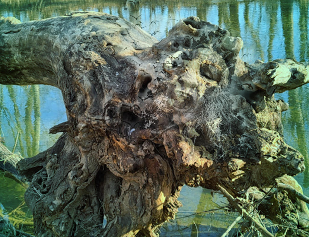
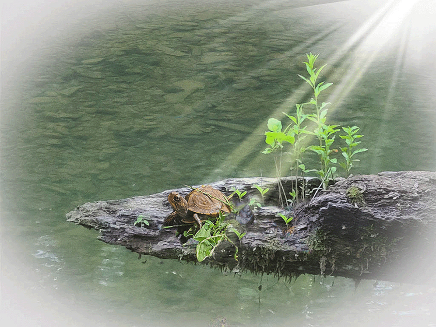
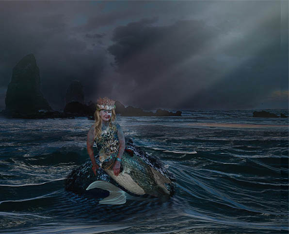
I really love concept and what you have done with it. I was tempted to play with it a bit and put a bit of the tail under a partial layer of water. |
Sep 10th |
 |
| 54 |
Sep 20 |
Comment |
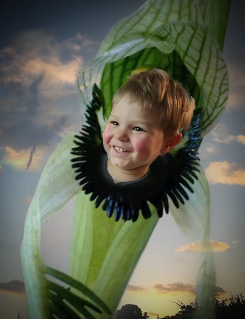
I acutually love the transition from realistic at the bottom to surrealistic at the top! It makes for a very provocative image. I find myself a bit unclear as to it's message, but perhaps that is the point? |
Sep 10th |
| 54 |
Sep 20 |
Comment |
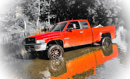
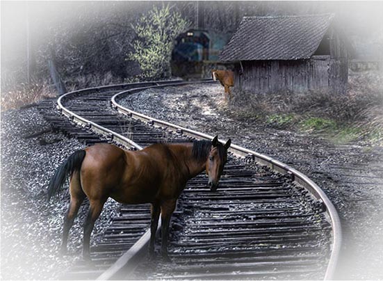
I find the way the light highlights the track really adds to this image. And I also find the white object left of the track distracting. I have taken a few liberties with this pic compositionally. I haven't detailed it, just bean to play with the idea of bringing the train forward. There are so many possabilities here. I love the horses and the setting! |
Sep 10th |
 |
| 54 |
Sep 20 |
Comment |
The image does blend together seamlessly which is great! You have totally achieved a look that is very set consistent and set back in time. The effect seams to have warped the bridge a bit much for my taste. You might want to try liquify if you want to pull it back into shape a bit. Really it is great image though, people would have a hard time telling that was a composite. |
Sep 10th |
| 54 |
Sep 20 |
Comment |
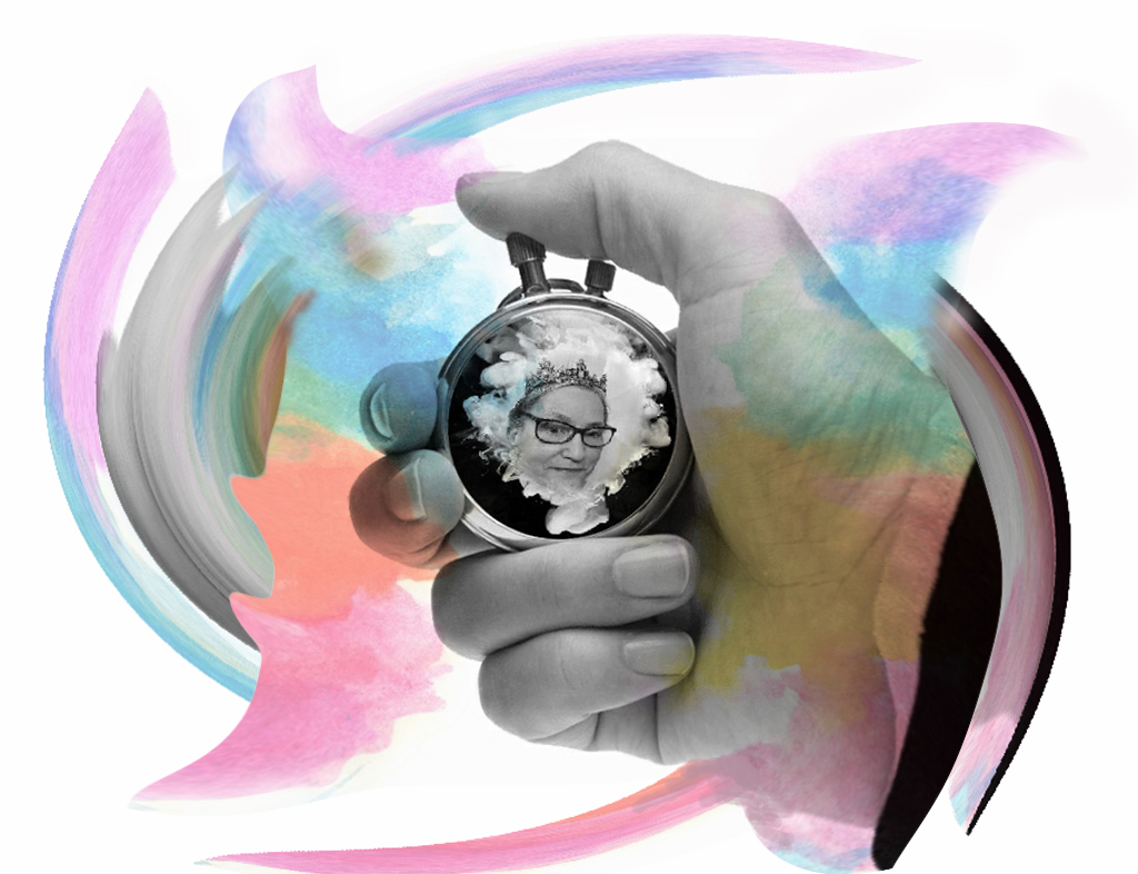
I love the creativity of this! Also, I am a pink background fan. I think you have managed to achieve a great deal of feeling from very sterile materials.I think maybe a bit of a shadow bhind it could be nice. But hey, it's great as is! |
Sep 10th |
| 54 |
Sep 20 |
Comment |
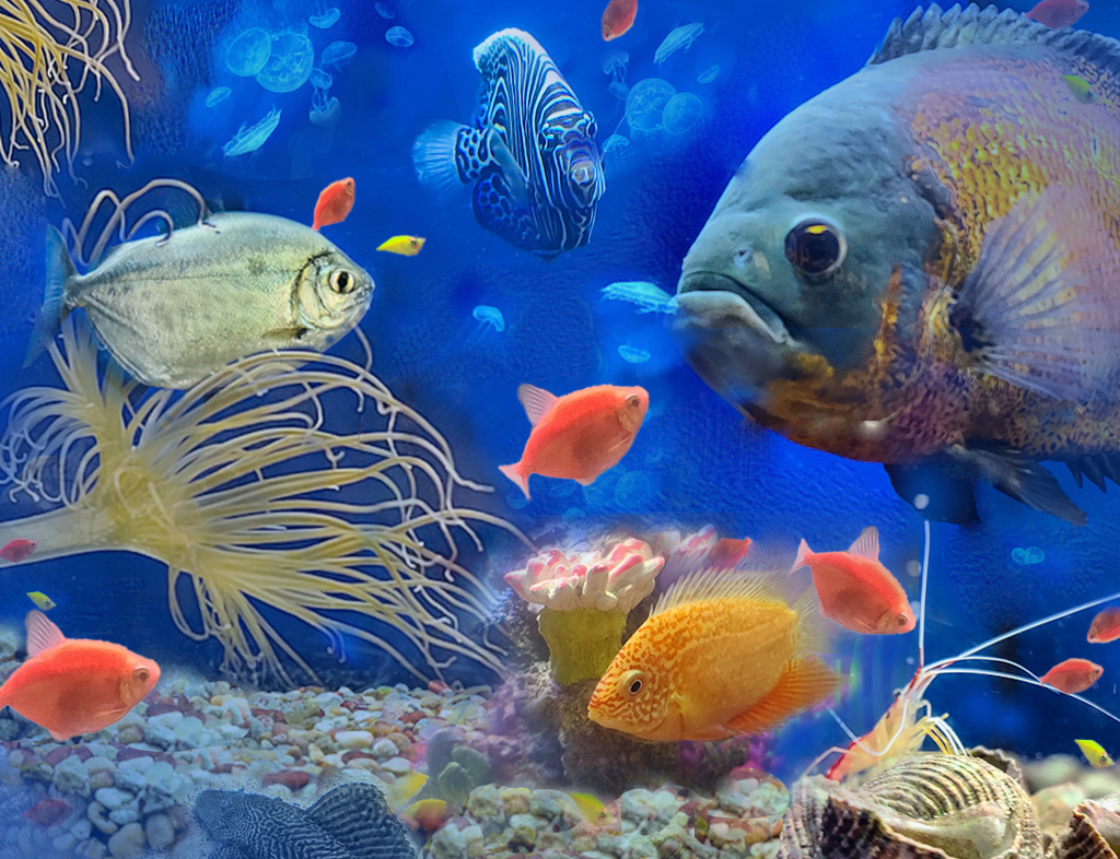
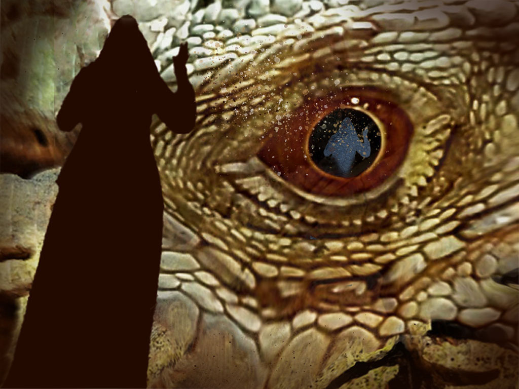
I love the fun creativity of this image. I do also notice the difference in lighting that others have mentioned. I like how you added the frog image, it really blends in. The other fish image, howeve, seems to not blend in quite as seamlessly. Maybe a bit of it showing underwater would help. |
Sep 10th |
6 comments - 2 replies for Group 54
|
| 86 |
Sep 20 |
Reply |
It was the Paper filter that gave the blocky appearance to the image. |
Sep 20th |
| 86 |
Sep 20 |
Comment |
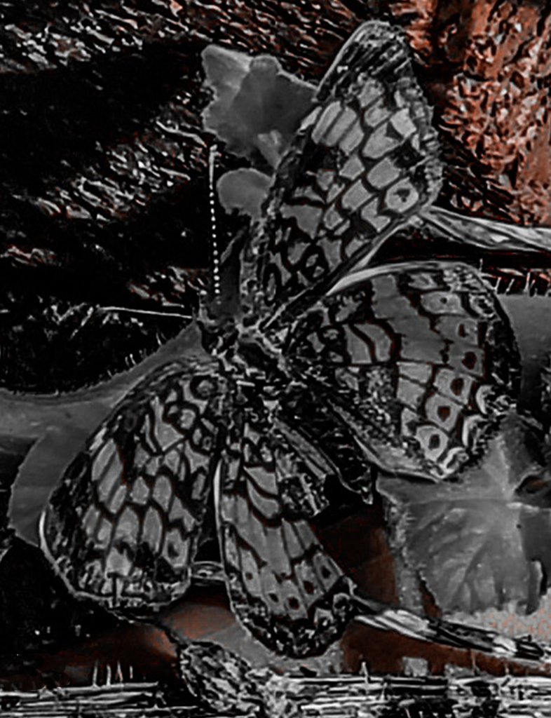
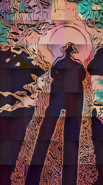
Tom, to answer your question. Yes I did have a firm idea of where I was going with this image as I know the function of the filters in question rather well and added them in a specific order on purpose. I knew that the cartoon filter would give the grainy textured appearance and then that the marker filter would add some very vibrant color. I also knew the paper filter chosen would add some color softening and add the blocky somewhat cubed appearance. I thought this would create a somewhat evocative image. Overall I was pleased with the outcome and like the FX it gave this particular combination of images. |
Sep 20th |
| 86 |
Sep 20 |
Comment |
I really like what you have done with this! You have produced a very dreamy otherworldly image. I will have to find this Mirrorlab app and play with it. Thanks for a unique image! |
Sep 10th |
| 86 |
Sep 20 |
Comment |
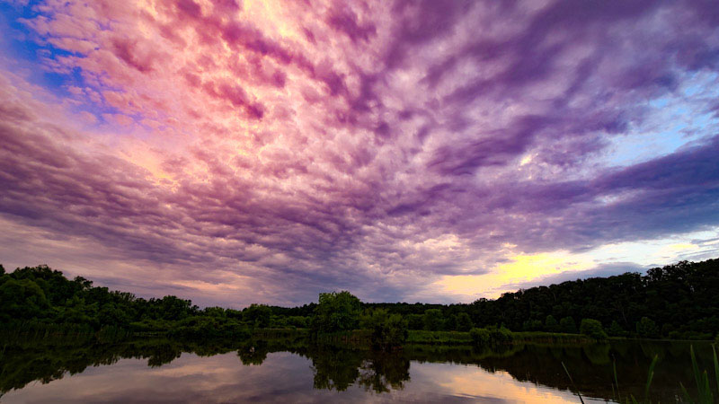
This is a nice image and evokes the feel of its environment!
You may find the free app Photo Shop Express handy to recapture the red using the dehaze option. With some pics I find it helps.
I have one suggestion compositionally. Regarding the skiff attached to the boat which is only partially in frame. I think it does not help your image. To me it causes an imbalance. I would either edit it out or move the boat more to the left in the photo so the ,boat with skiff, becomes the subject. I think either way would help the composition to be more more pleasing to the eye.
|
Sep 10th |
| 86 |
Sep 20 |
Comment |
I love the job you did of enhancing this image. Your choices hghlight without going overboard. |
Sep 10th |
| 86 |
Sep 20 |
Comment |
You have done a really lovely job on this! It shows great attention to detail which is what makes it look totally believable. |
Sep 10th |
| 86 |
Sep 20 |
Comment |
Overall I find this an interesting image. My only suggestion would be to remove the powerlines and do a little curves adjustment. |
Sep 10th |
| 86 |
Sep 20 |
Comment |
The lighting is very nice. I would have loved to see a closeup of one of the calla lilies with that same lighting. Personally, I probably would have done a little curves adjustment. The colors are looking a bit oversaturated on my monitor. |
Sep 10th |
7 comments - 1 reply for Group 86
|
13 comments - 3 replies Total
|