|
| Group |
Round |
C/R |
Comment |
Date |
Image |
| 60 |
Aug 20 |
Comment |
I usually use continuous focus but am interested in the 1/2 step back with your photo since the bird seems to be flying in on same plane as the hole as opposed to Bernie's bird |
Aug 13th |
| 60 |
Aug 20 |
Comment |
I usually use continuous focus but am interested in the 1/2 step back with your photo since the bird seems to be flying in on same plane as the hole as opposed to Bernie's bird |
Aug 13th |
| 60 |
Aug 20 |
Reply |
You are close...10 miles North of Florence |
Aug 13th |
| 60 |
Aug 20 |
Reply |
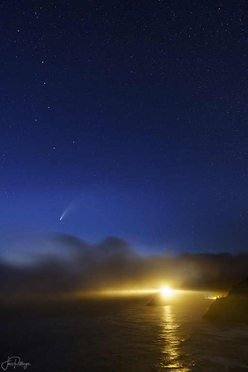
Thanks Lance. I couldn't figure out how to get good exposure on NEOWISE and the dipper while covering the lens too long |
Aug 12th |
| 60 |
Aug 20 |
Comment |
Thanks Larry |
Aug 11th |
| 60 |
Aug 20 |
Comment |
I like the title and what a magnificent car. I like your composition. To me the focus seems to be on the number 014 and the rest of the car a bit soft focused. I would have rather the focus be on the grill and lights. I would clone out the bit of car on left edge.. I suspect if they were in motion, you couldn't choose a different vantage point, but if it had been possible, I would have rather had the first motorcycle either totally out of view or separated from the car. I wonder about boosting the yellow saturation so the vintage car is more clearly the star of the show. |
Aug 10th |
| 60 |
Aug 20 |
Reply |
I'd love to hear your suggestions |
Aug 10th |
| 60 |
Aug 20 |
Comment |
My favorite number is 3 which probably biases my feelings! I also think even numbers, especially 2 and 4 have a static feel to them while 3 gives me a feeling of movement, of aliveness |
Aug 10th |
| 60 |
Aug 20 |
Reply |
Are you talking about the gradient filter in LR? Thanks for your idea and showing me what it might look like with your edit |
Aug 4th |
| 60 |
Aug 20 |
Reply |
Oh, and I like your crop idea |
Aug 4th |
| 60 |
Aug 20 |
Reply |
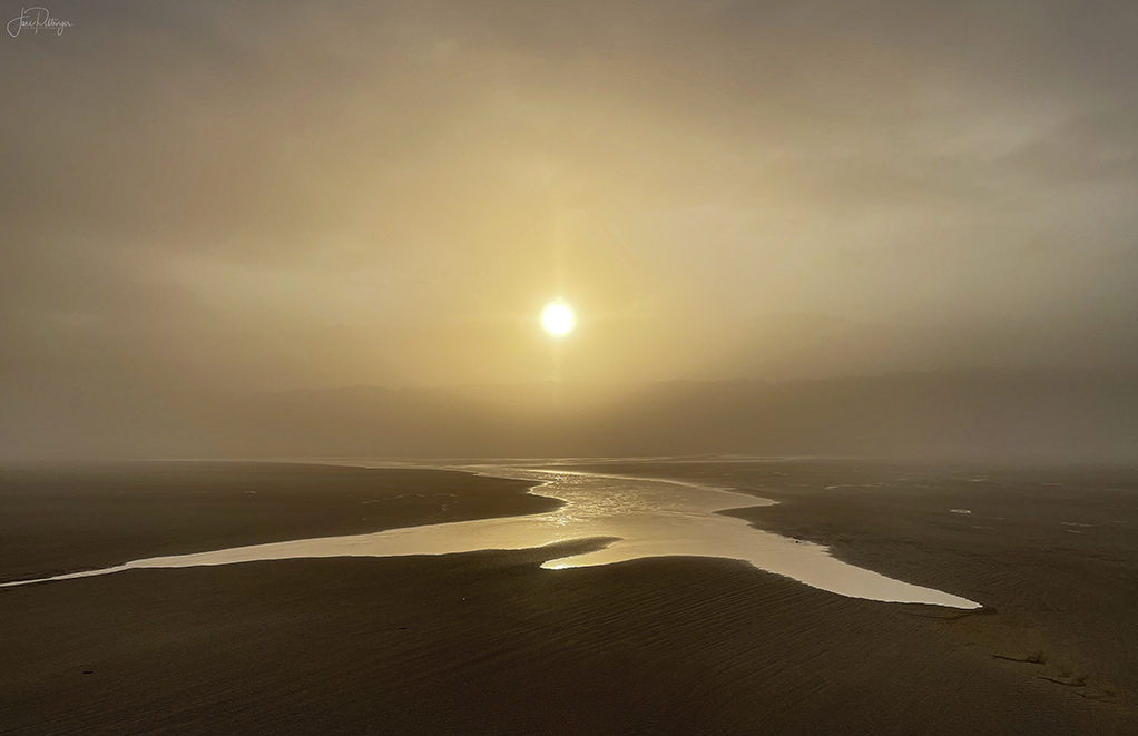
Thanks for your thoughtful critique. This was taken significantly after sunset. I covered over my lens as the light moved directly towards the lens hoping for less blow out. I have several other shots but the one I used here had the least overexposure on the lighthouse light. I expect the dynamic range was just too much with the bright lighthouse beams and the dark night sky |
Aug 4th |
| 60 |
Aug 20 |
Reply |
Thanks Bernie. This was taken on the Oregon Coast and the "sun" is actually a lighthouse light. I do have some other Neowise shots with just the comet and stars but for this one I wanted to include the lighthouse |
Aug 3rd |
| 60 |
Aug 20 |
Reply |
Thanks Damon. Yes it is Heceta Lighthouse. You are so right about how much brighter that area is. I went back to the raw file and it was that way there...maybe d/t some strange bouncing off the clouds. I went back to the edited image and lightened the right side just a bit using a curves layer and mask. I like how it ended up |
Aug 3rd |
| 60 |
Aug 20 |
Comment |
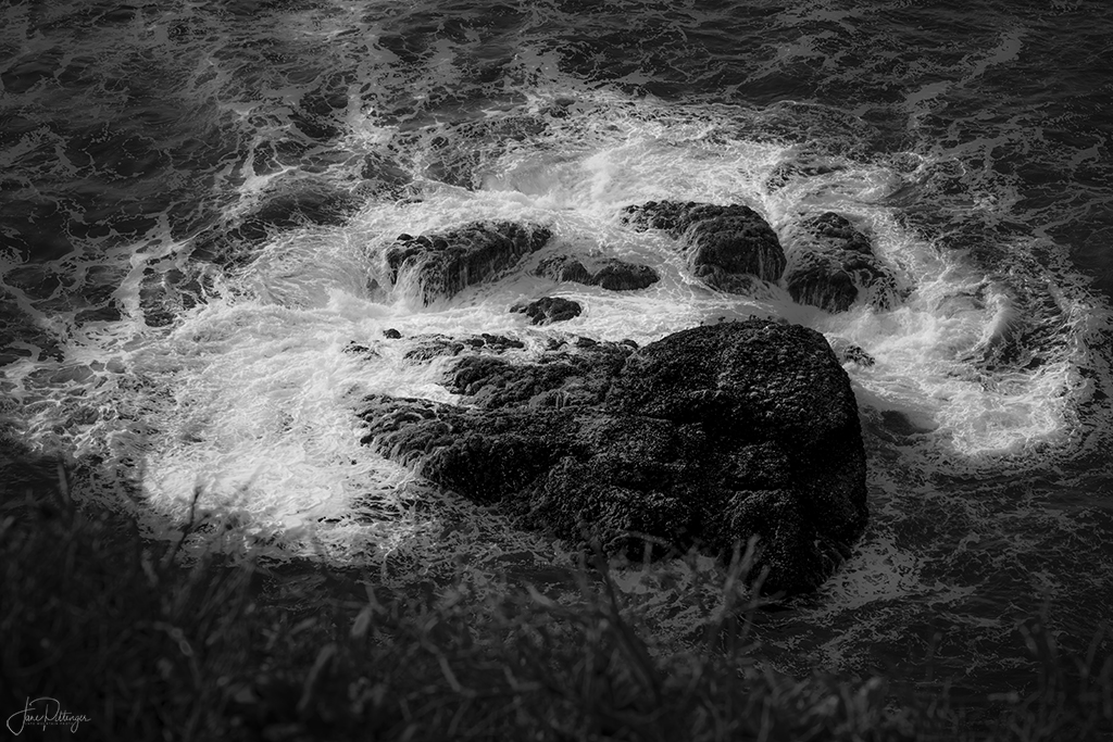
I disagree with your friend. I love the ripples, the tonal contrast, the way you have drawn out the clouds and ripples and allowed the mountain to be just a hint. It makes me take a deep breath. I only wish there had been 3 boats or at least that the one second from the right didn't have another boat behind it (or something). I find that distracting. I wonder re cloning out that one boat? |
Aug 2nd |
| 60 |
Aug 20 |
Comment |
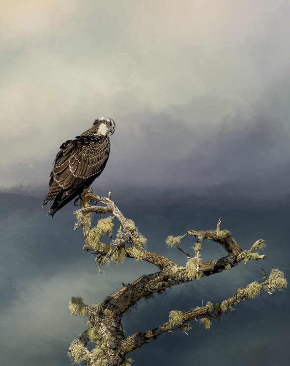
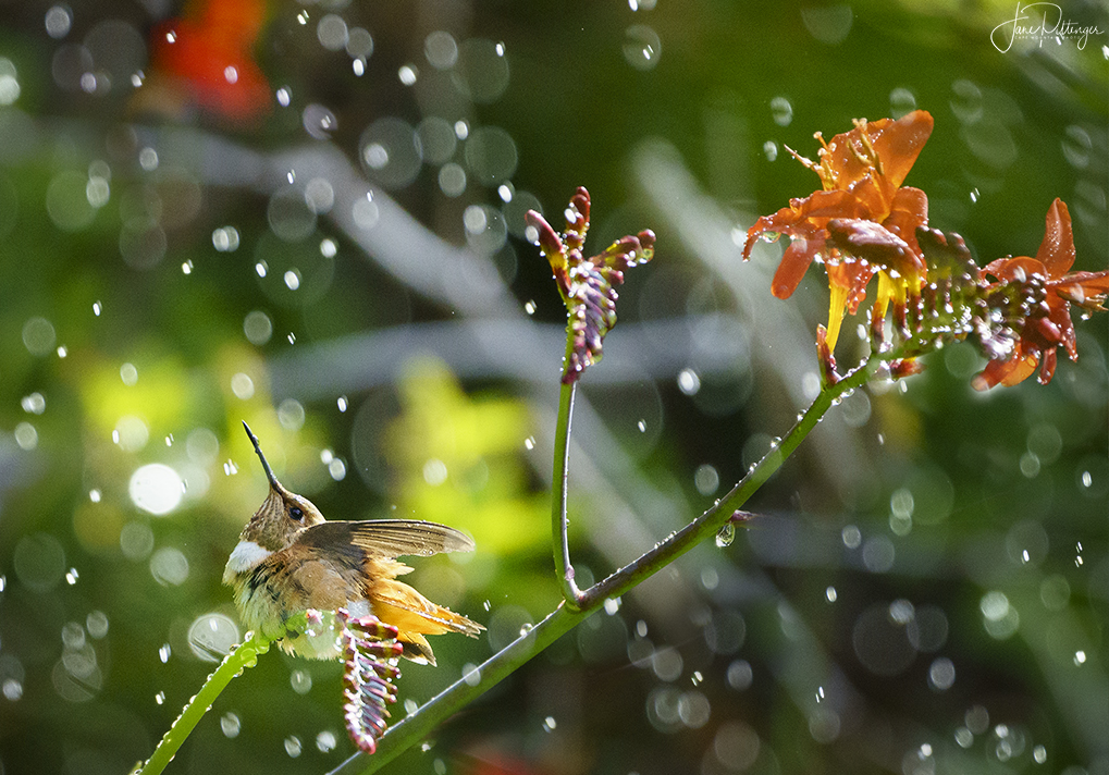
I love the feet and spread wing and the non distracting background. There is a delightful story told here. I wish the eye were sharper and had a catch light. Hard to do, I know! |
Aug 2nd |
| 60 |
Aug 20 |
Comment |
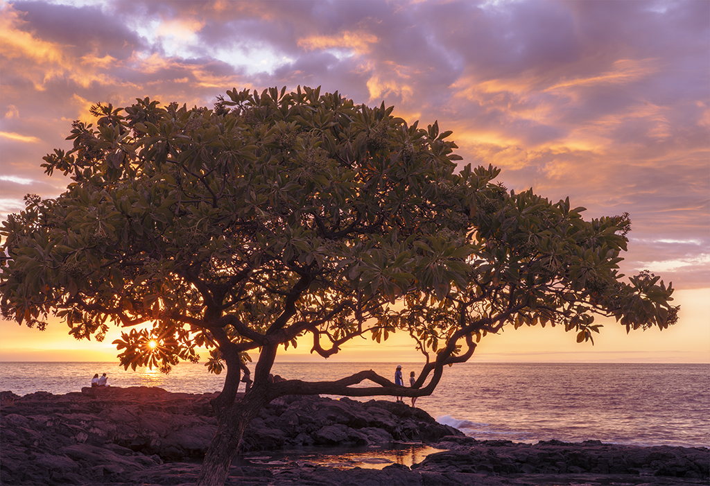
I love being taken back to Death Valley through another's eye and the light and shadows and the lines and curves are mesmerizing. The people add a wonderful sense of size. I find myself playing with the crop and considering cropping off some from the left which would 1) echo the triangle shape on the right, 2) add a sense of symmetry (but not quite) which here I find relaxing, and 3) would decrease the intensity of the Aqua by making less of it. To my eye the colors aren't over saturated so much as a tiny bit off. Artistically speaking I think it works but I think the offense of them distracts me from fully enjoying the wonderful shapes and curves and light. |
Aug 2nd |
| 60 |
Aug 20 |
Comment |
Beautiful colors, grace, Milky Way. I'm guessing this was light painted making the front of tree and roots bright. I always have a hard time getting the amount of light just right. I like the sense of mystery and magic and the roots really add to that. I find the branches in the back being so much darker than the front almost gives a bit of a blurred look which draws my eye right there. But the image as a whole is so glorious that my eyes then travels around the whole frame |
Aug 2nd |
10 comments - 8 replies for Group 60
|
10 comments - 8 replies Total
|