|
| Group |
Round |
C/R |
Comment |
Date |
Image |
| 76 |
May 21 |
Comment |
Henriette,
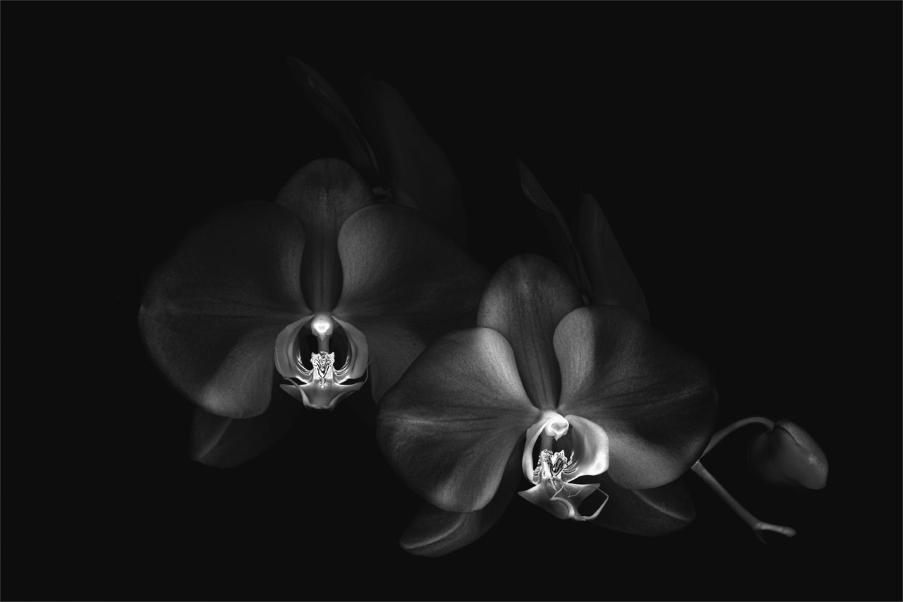
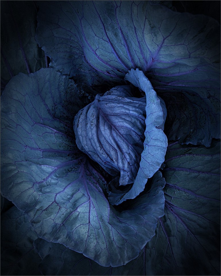
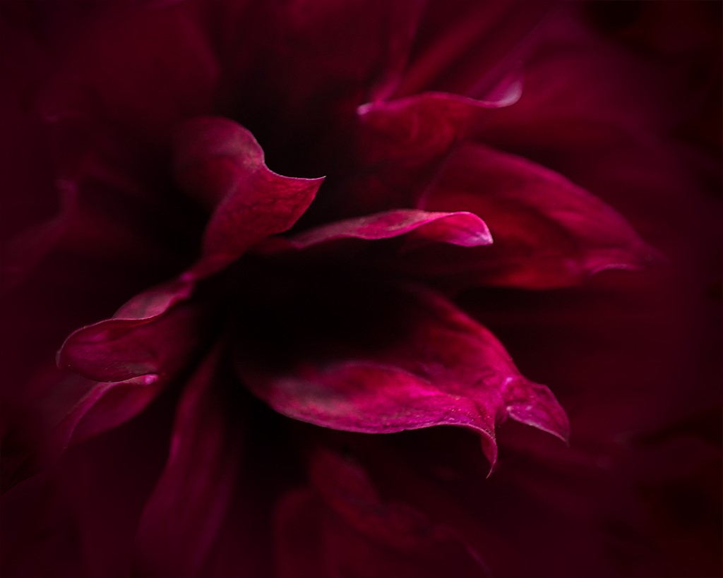
Welcome to the group. I love monochrome images and loved the abstract look of this image. I honestly didn't need to know more about it, or even what it actually was. It seems to just work.
The color image work as well with the sharper detail and contrast. Well done on both. |
May 21st |
| 76 |
May 21 |
Comment |
Nice image Ian. This makes me want to travel to your part of the world. The only think I might recommend is a tad bit more contrast in the rocks in the right foreground. Well done.
|
May 21st |
| 76 |
May 21 |
Comment |
I like the contrasting colors Jay. And the crop works very well. Nice job.
|
May 21st |
| 76 |
May 21 |
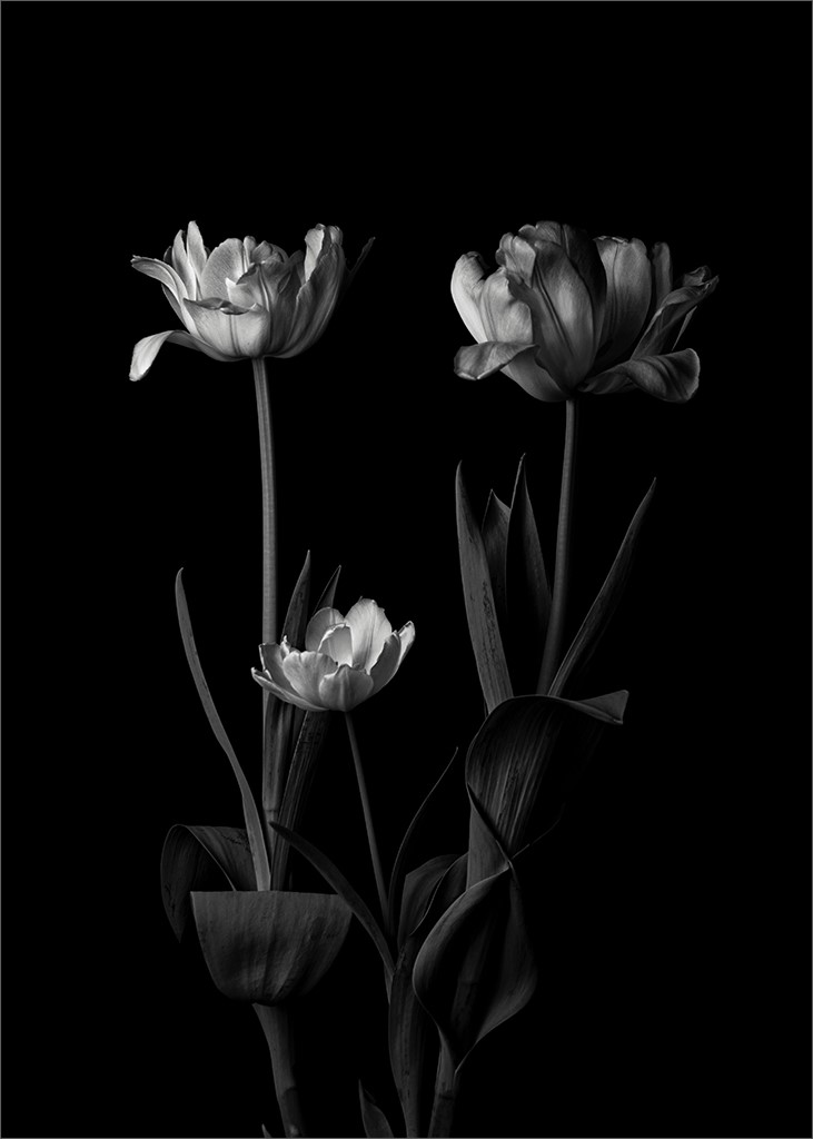
Reply |
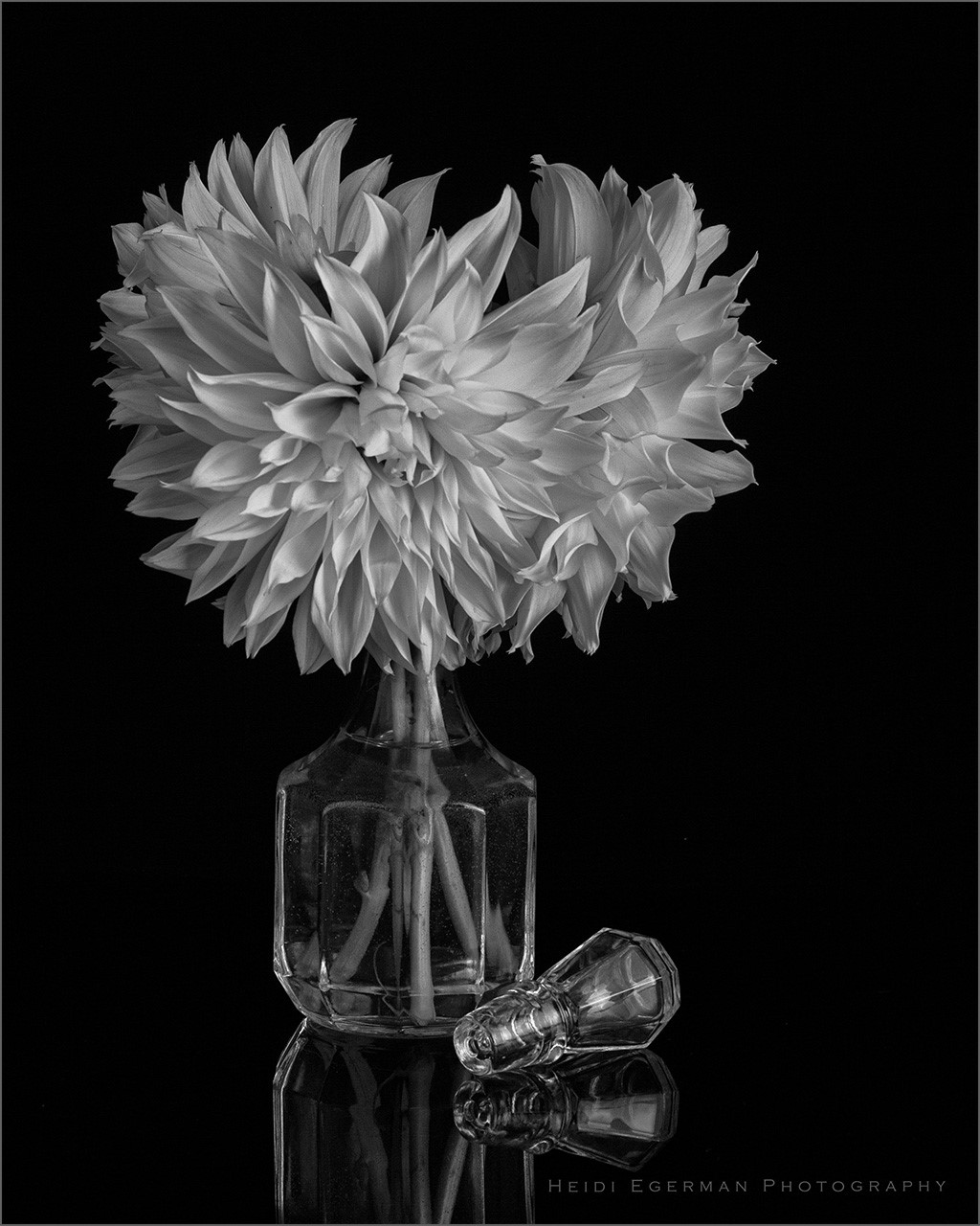
Your best choice was color Tray. The image has a lot of impact.
|
May 21st |
| 76 |
May 21 |
Reply |
Thank you Jay. This is a very nice compliment. Much appreciated. |
May 21st |
| 76 |
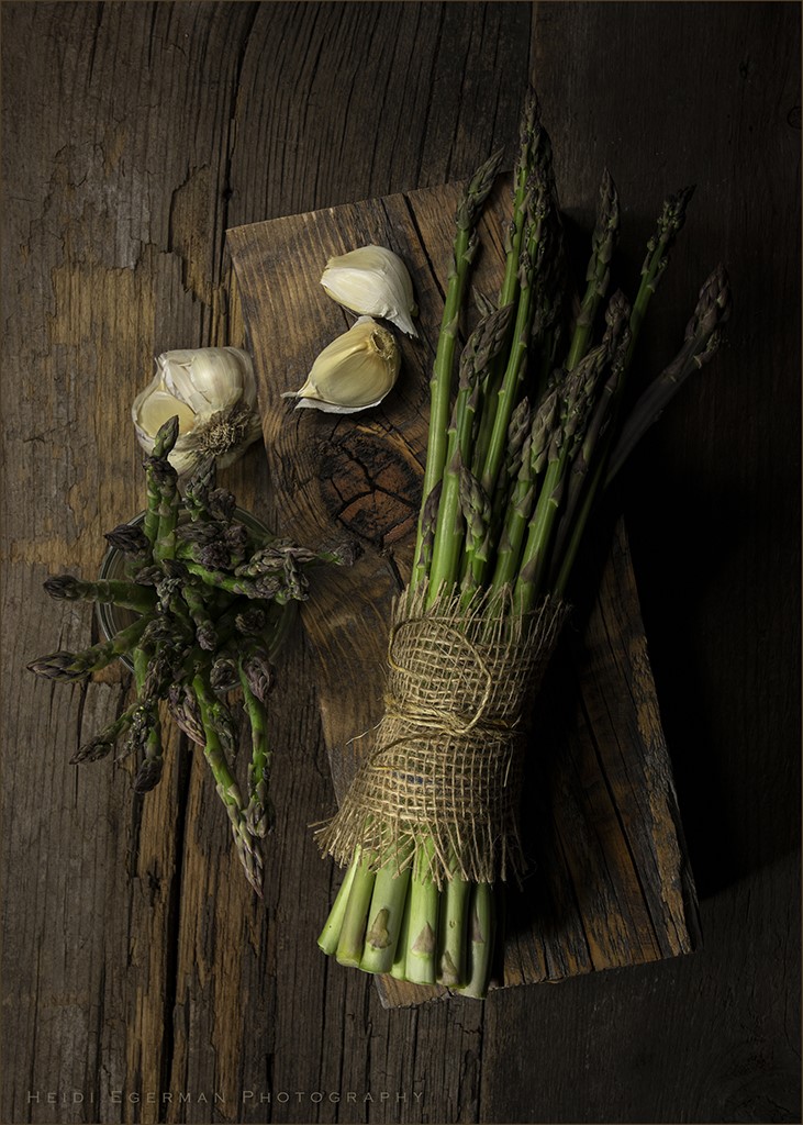
May 21 |
Reply |
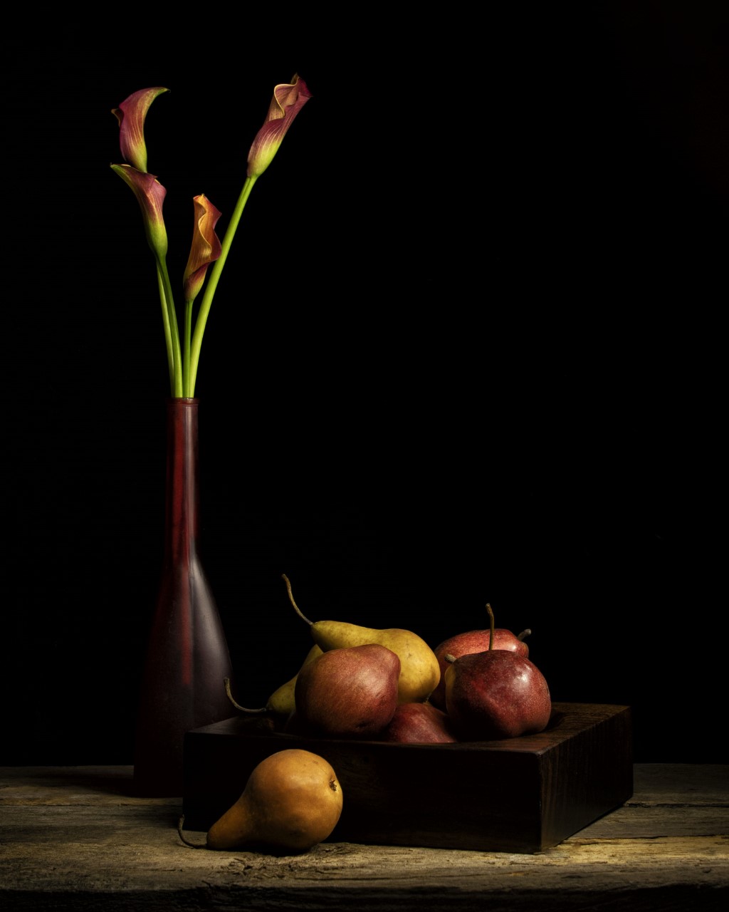
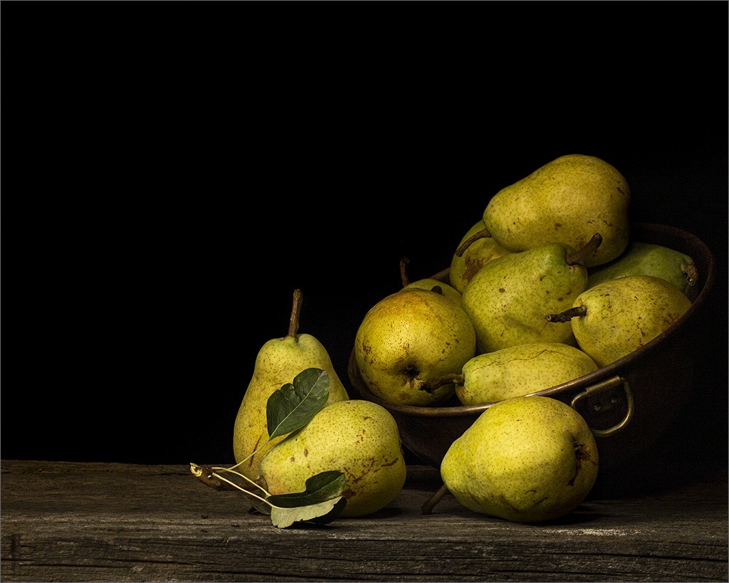
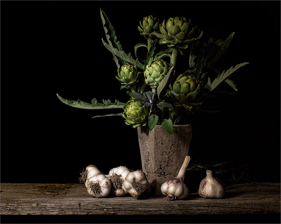
Thank you Ian. I am still not sure about the jar of asparagus on the left center, but somehow I think it makes the viewer look twice and stay a little longer. I do have a tendency to have a relatively dark area in my images and am not compelled to have everything lit. This one is lighter than most of my others. |
May 21st |
| 76 |
May 21 |
Reply |
Sophia,
Thank you very much for taking the time to view and comment on this image. Much appreciated. ~Heidi |
May 21st |
| 76 |
May 21 |
Comment |
Trey, Thank you for your comments and suggestions, and for taking the time to suggest a crop.
Garlic and asparagus are two of my favorites (look, feel, color and taste) and didn't feel the story had to be about one or the other. I was more intent on ensuring good composition and lighting. In my light painting style, I often (intentionally) leave areas quite dark for drama and style. Light should draw you into the image and the darker areas keeps your eyes within the image and not going off the page. I find that these darker images don't appeal to some and I'm OK with that too. I've even started lightening some images, or areas in an image for this reason. Thanks again for your opinion. I very much appreciate it. |
May 21st |
| 76 |
May 21 |
Reply |
Thank you Henriette. Great suggestion on the "kiss" of lighting. I will try this. |
May 13th |
| 76 |
May 21 |
Comment |
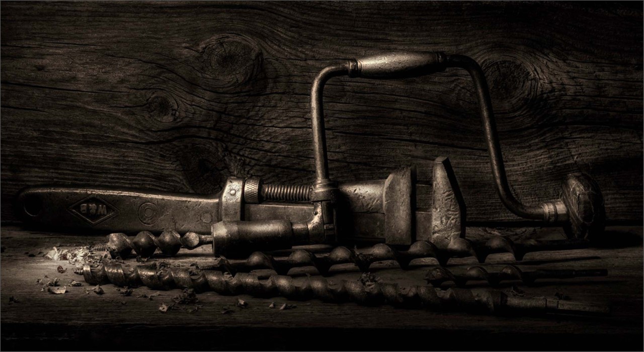
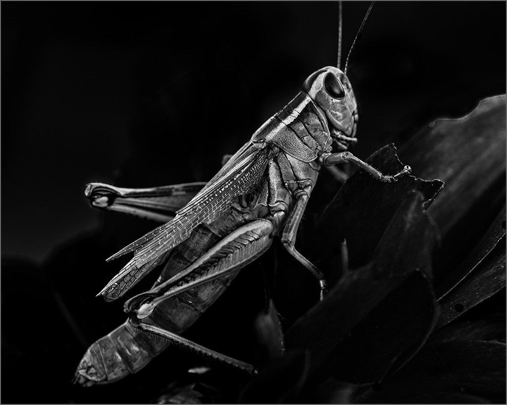
I love this image Trey. The multiple textures are intriguing to me and the lighting is so nice. I think the texture enhancements and sharpening really work here. Because of the strong contrast it might make a wonderful black and white image. Well done!
|
May 12th |
5 comments - 5 replies for Group 76
|
5 comments - 5 replies Total
|