|
| Group |
Round |
C/R |
Comment |
Date |
Image |
| 76 |
Aug 20 |
Comment |
I really like the fog in this image and the vantage point. My eye is drawn to the trees that look like they are barely holding on. I do like how you kept the detail in the fog and still have detail in the rock face. Nice! |
Aug 17th |
| 76 |
Aug 20 |
Comment |
Jorn - I like this moment you have captured in everyday life. Our lives around the world have changed so much we all wish to step back in time. I like how the grain in this image make the image look older, a bit vintage. For some reason on my screen the light areas have a pinkish cast. I'm not sure that was intentional or not. |
Aug 17th |
| 76 |
Aug 20 |
Reply |
Thank you Trey. I use a little Zanflare flashlight that has four settings - low, med. high and strobe. I generally use the low setting. I have not been bracketing or focus stacking yet, but must try that in the future. |
Aug 14th |
| 76 |
Aug 20 |
Comment |
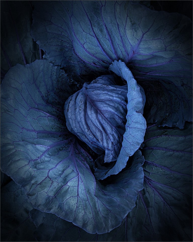
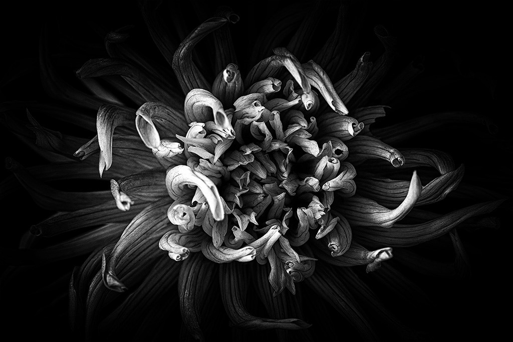
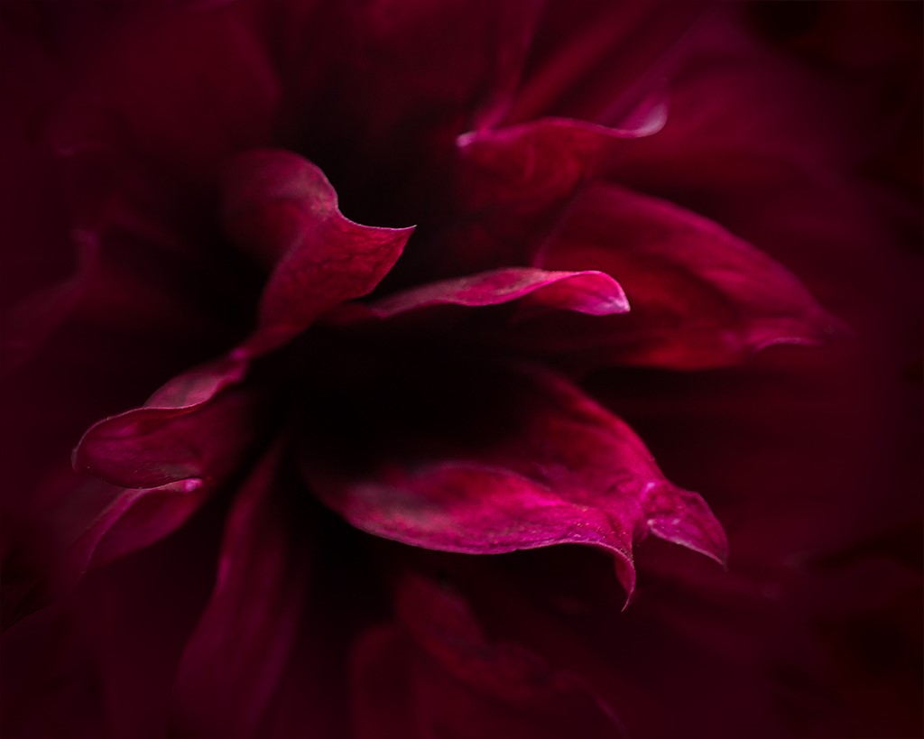
This image just pulls me into the scene. I like the composition and the many leading lines. The green captured my attention first so I wonder if it might also be quite powerful as a monochrome image because it seems to be all about the shapes and lines and less about the color. Hope you don't mind, but I pulled it into Nix and converted it to B&W. In this image, of course it has a different feel and almost becomes an abstract. I'm not sure which I prefer, but I was curious as to whether it would be more impactful. It is a nice image either way Jay. |
Aug 8th |
 |
| 76 |
Aug 20 |
Reply |
Thank you Cyndy. I was at first intimidated by this technique, but now I can't walk away. I'm always looking for something to take into my very dark room. I'm looking forward to seeing more of your work. |
Aug 8th |
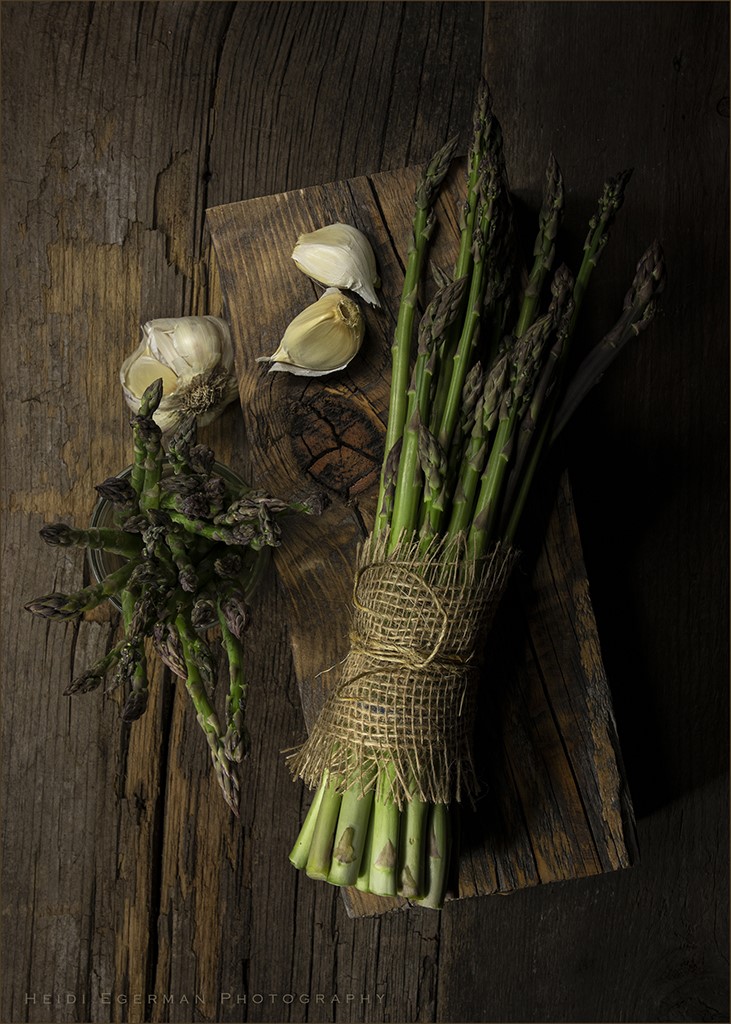
| 76 |
Aug 20 |
Reply |
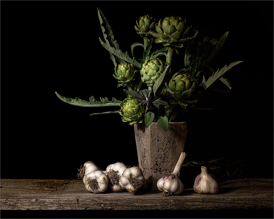
Thank you Sanford. I think garlic has the best shape and contrast. I've found it to make a great photographic subject. Looking forward to seeing some of yours. |
Aug 8th |
| 76 |
Aug 20 |
Reply |
Thank you Jay. I'm very much looking forward to being a part of this creative group.
|
Aug 8th |
| 76 |
Aug 20 |
Reply |
Thank you Ian. I very much appreciate any feedback you can offer. I sometime don't know how dark an image will show up on others monitors, although I think I have a bit of a'dark side' and have a tendency to choose to leave a little to the viewers imagination. I will definitely give that area a little more light and take a look. This will very likely be important if I decide to print this image in the future. Thank you again. |
Aug 8th |
| 76 |
Aug 20 |
Comment |
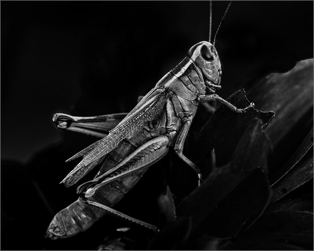
This is a very nice image Sanford. It took me a moment to see the tail and leg and then I could better understand the title. At first glance, my eyes went directly to the green background, since this is the brightest part of the image. The only thing I would suggest would be possibly tone down the bright green a bit which would call more attention to this great subject. |
Aug 6th |
| 76 |
Aug 20 |
Comment |
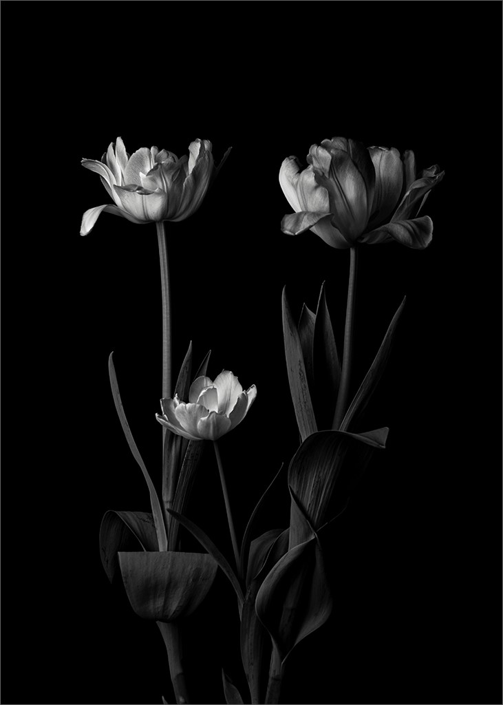
I love the word, name and meaning of 'Joy', so this image seemed to speak to me. I think the black and white was a great choice. I did want to see the chair or object on the top of the boat more clearly. I think a little bit more contrast between the boat and the background building could make that happen. All in all I think it is a great shot. |
Aug 6th |
| 76 |
Aug 20 |
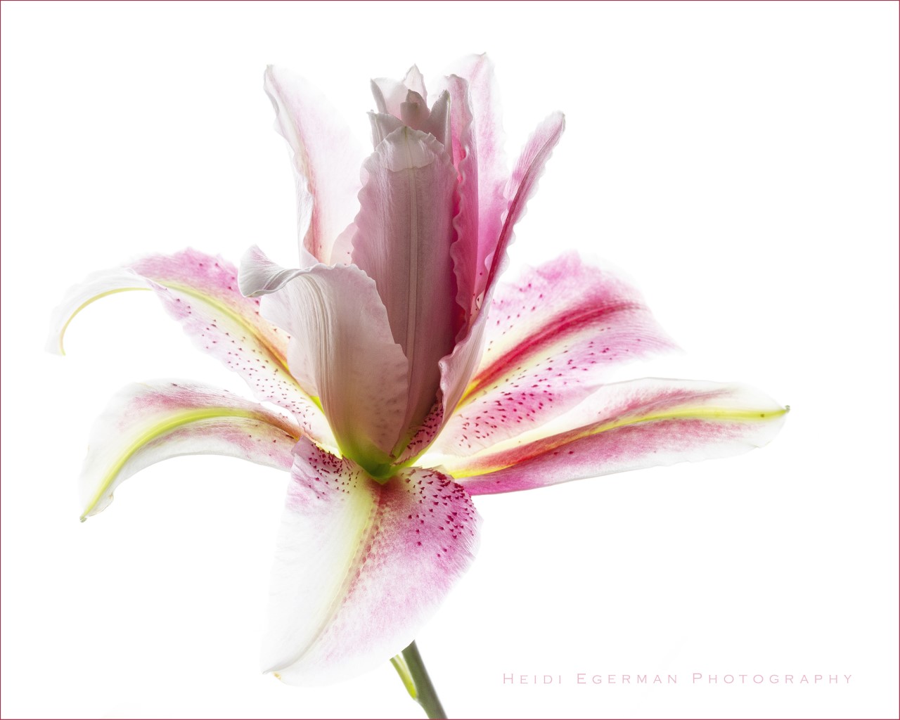
Comment |
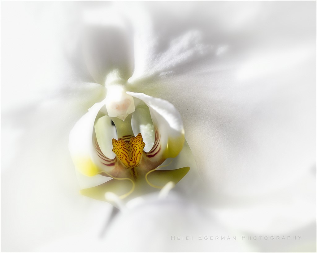
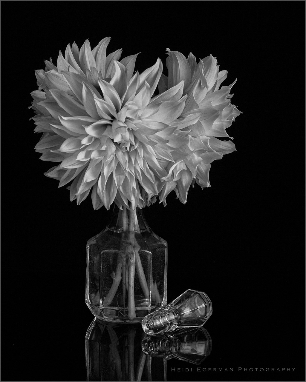
Cyndy, This is a really fun and creative image. From the edited image I could not tell what flower it was, but it didn't matter. The square, center weighted format works very nicely with this image. Well done.
|
Aug 6th |
6 comments - 5 replies for Group 76
|
6 comments - 5 replies Total
|