|
| Group |
Round |
C/R |
Comment |
Date |
Image |
| 60 |
Mar 24 |
Comment |
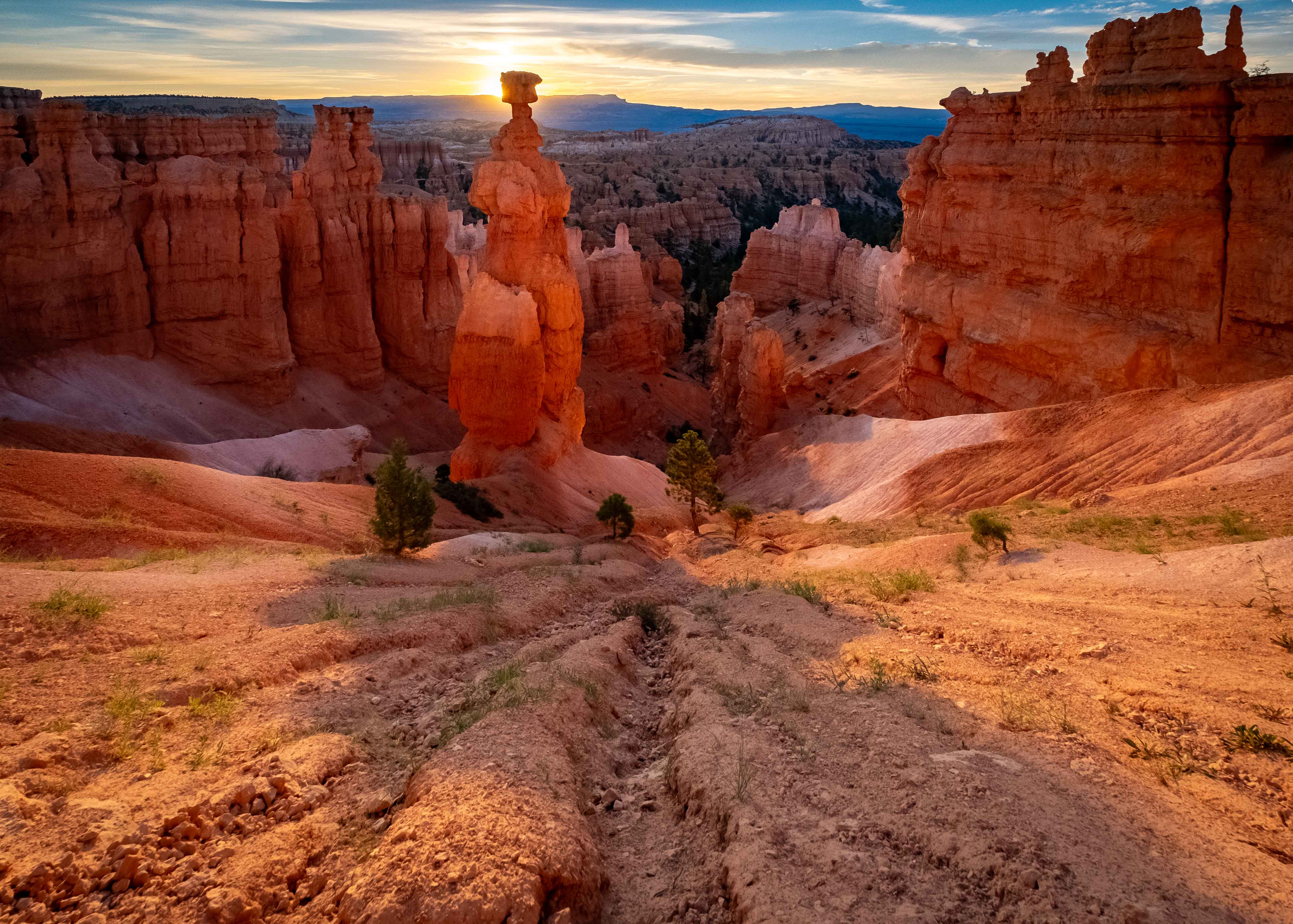
Hey Blair. You didn't just take this did you? I mean, I expect there's snow up there right now. Anyway...
Love the color gradient you have going on here (I want a T-shirt with this gradient). The bluish grey and the rusty red really speak volumes re: hazy sunsets, and they're saturated just right IMHO. I don't mind the shadowy grey of the rock, since it contrasts the and frames the horizon.
Uh, when you say you "used the auto setting to bring out the colors," what do you mean exactly? I've found iPhone images to be very good, often, but the thing is if you let the camera/phone do what IT wants, you may or may not get what you want, and often times, at least to my eye, that's over-saturated. I'm not shy about using auto features, but they're a double edged sword, and with great power comes great responsibility.
And speaking of Auto, I think that relying on auto in this case may have been less than helpful, because it used ISO 100, which forced a shutter speed of 1/45. That's typically slower than you want to use handheld (rule of thumb is a) no less than 1/60, or b) 1/ 2X the focal length). The foreground looks OK, but I do wish it were a bit crisper.
Oh yeah, is it just me or is that horizon crooked? Fortunately, that's an easy fix.
Glad you thought to whip out your picture taking machine on an occasion like this. |
Mar 10th |
| 60 |
Mar 24 |
Comment |
I get why the blue bonnet/red rock/sunset thing is hot. Just look at that color harmony! The flowers are sharp, to me, or at least the bunch in the lower left is, which is (IMHO), the ones that should be for best effect. Exposure works for me. I think you timed this about as well as you could, because that sun on the mesa leaves no doubt as to what you wanted the background interest to be. Actually, to me, the most eye grabbing feature is the sky. That gradient from stormy grey to golden haze is something I've been a million times with my eye, but never caught, and I don't know if it can be faked (please don't tell me you faked that!).
Re: your intent to blur the background, with a crisp foreground, I think you did that. No? But, I suspect that you probably did NOT do it as much as you were trying to. Why do I suspect that? Because I've been in this position exactly. Can I guess you were trying to have a really powerful, crisp foreground, with a softer, but still obvious background? Been there.
As far as setting go, the shutter is irrelevant. But, I'm guessing you had the aperture wide open and therefore were doing your best to shrink your depth of field (DoF), and therefore maximize background blur. Am I right? But, there are two other controls that could have helped you do that.
The four things that control DoF are aperture, focal length (longer = shorter DoF, all other things being equal), distance to subject (closer = shorter DoF, all other things being equal), and sensor/film size.
So, what you could have done, is to use a longer focal length, and reposition, to get the same view, with a shorter DoF. Or, you could have gotten closer to the flowers (which I think is what I probably would have done, since it would fill more of the frame with flowers too).
I think either of those two options would have gotten you closer to what I believe you were aiming for. Now, having said all that, I was in exactly the same situation at Mt. St. Helens, and chose the closer option, but never really hit on something that I was happy with. Either the background was too blurry, ruining its value as a background interest, or the background was too sharp, failing to create that separation of background from foreground. Maybe I just needed more practice.
Frankly, I like this image. I think you've done tons of things really well here. Looking at it again, I do have a suggestion that you can implement in the comfort of your own home: Try putting a linear gradient on it, and subtly playing with lightening the bottom (or maybe a radial just lighting the flowers barely), and then another linear gradient, and softening the upper half, behind the flowers. I would be interested in seeing what either/both of those could yield. |
Mar 6th |
| 60 |
Mar 24 |
Comment |
Talk about a textbook Leading-Lines image! the rails coming in from the bottom, the power lines, the train itself all act as leading lines that give depth to the image. The power poles, because of their repetition do the same thing. Focus looks crisp all the way around to me. Exposure works IMHO. Colors are great to my eye, and the yellow has extra impact due to the grey/drab appearance of everything else. I think the composition is pretty good, especially on the left 2/3 of the image (what would this look like as a 5 X 4 crop?). Good work.
I think the most significant opportunity for improvement would be that the image seems just a bit overworked in post production. I say this because it has the look I often get when I bring shadows up too much, and push highlights down too much. Also, if you look at the poles, there appear to be halos, and that usually indicates the same thing. So, backing off on some of the sliders, without losing what you like about the image would be the challenge, and goal.
I don't have any experience with NIK, so can't speak to whether or not that has any capabilities that LrC or Ps don't have, but I'm pretty sure you could get where you want to go with those applications. But, if you're comfy and proficient with NIK, then stick with what ya got. Also, whatever you do, don't lose that grey sky/yellow train thing you have going. It's killer diller.
Beyond that, as otherwise mentioned, I think I would mess with other crop ratios, and how they can be used to eliminate some of the stuff (not too much IMHO) on the right. Anyway, good work. Keep it up. |
Mar 6th |
| 60 |
Mar 24 |
Reply |
You know, that's not a bad idea. I've never done that, but I can see the use. I have done triptychs (three photos that make a single work) but never an inset. I'd have so experiment with this tool. Have you done this yourself? I challenge you to show me an example in which you have. |
Mar 6th |
| 60 |
Mar 24 |
Reply |
You are very kind Ma'am. Thanks for the encouragement. Uh, tell me though: What are you thinking when you write "an insert of the hands?" |
Mar 6th |
| 60 |
Mar 24 |
Reply |
Thanks Dean. For sure, the sense of motion of the spinning clay is a bonus. I did a bunch of squirming trying to get the right angle on both the wheel/clay and the face. I think this would be a really great subject for more effort, particularly in a controlled space, particularly with some soft, natural light. |
Mar 6th |
3 comments - 3 replies for Group 60
|
3 comments - 3 replies Total
|