|
| Group |
Round |
C/R |
Comment |
Date |
Image |
| 60 |
Feb 24 |
Reply |
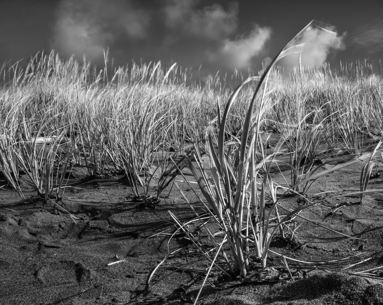
Action, especially inter- and intra-species action is better when it comes to PSA Nature Division (ND). Print? I don't know. Take a look at it and then some of your other prints. Thoughts? |
Feb 13th |
| 60 |
Feb 24 |
Comment |
Presets. Got it. I don't really use them much myself, but I think they're a great set of training wheels. And, although I believe we all need to be able to comfortably and proficiently use Manual mode, I think it's also important to know how ALL the modes work. I liken it to flying a jumbo jet: the pilots flying over the Atlantic don't have their hands on the controls for six hours because they believe in "manual mode." Instead they use the automation the engineers gave them so they can do other things, like think about the next steps. But, if things go badly, rest assured that they CAN go to Manual mode and get the job one. We need to be proficient at all modes, and use our automation, so we can think about composition, or whatever. But if we're not getting what we want, we sure as heck better be able to go to M.
I confess, I still don't know what you mean by overlay, and what your process was. But, if you're getting the look you want, and can recreate it, it doesn't matter if I know what you mean. But, if you can detail the steps you used, maybe I can figure it out.
Dust spots CAN be brought back out if you mess with contrast and the like. They're pesky. |
Feb 12th |
| 60 |
Feb 24 |
Comment |
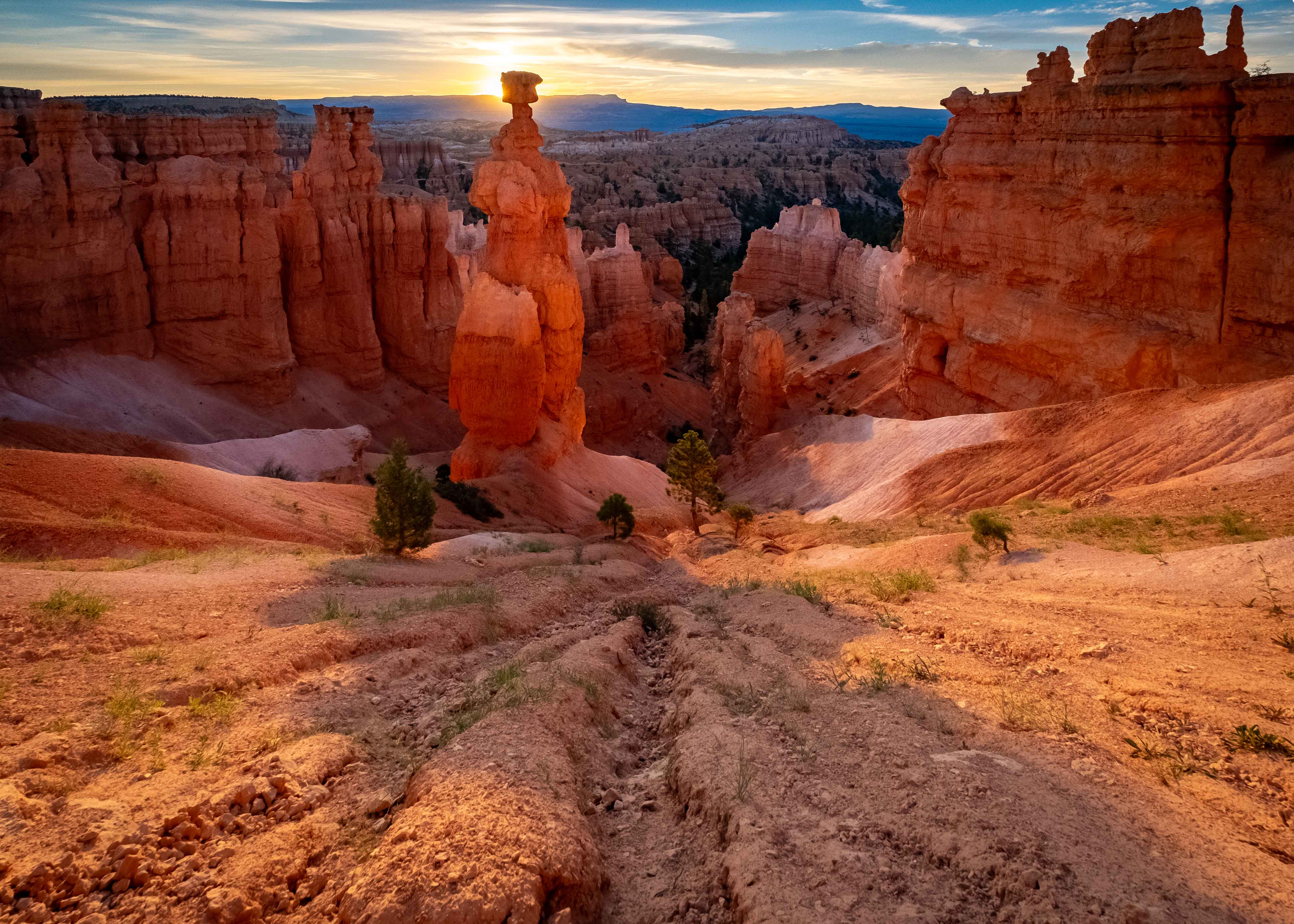
I envy you your Sedona trip. I did Zion last year, and was blown away, and I think Sedona may be even more awesome.
First, some questions:
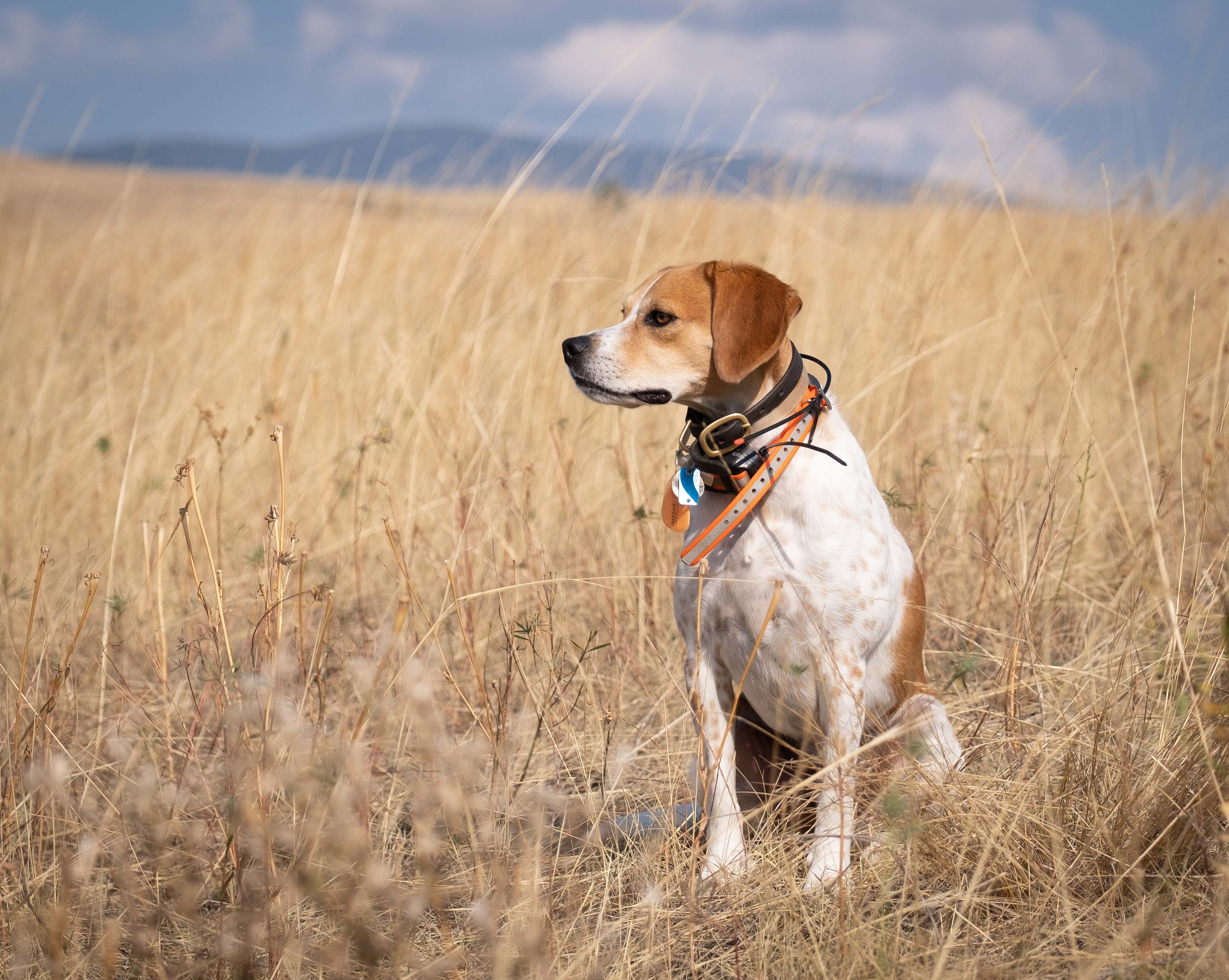
You write the image was taken "using autofocus and presets." What do you mean by "presets?" I'm only roughly familiar with Sony so need some help here.
You write you added "a dramatic blue overlay" to the image. What do you mean by "overlay?" Maybe I've forgotten, or never knew, but I'm just not sure what you man by that.
Great decision, IMHO, to bring shadows up (I assume that's what you did. No?) IMHO. It's really hard to oversaturate the rocks in that region. Even when you think you've overdone it, it's often exactly how they looked. And, the red/green color harmony is just built for photography.
I think the composition is pretty well done, given that you have pretty much equal visual weight on the left (the peak) and the right (the bush) which gives the image balance. I can easily envision that the intent was to grab the eye with the bush, and then have it travel to the peak.
I say this because your use of a relatively small aperture (F stop, f/9) puts both subjects w/in the depth of field (DoF). Which is good technique I think.
With regard to exposure, I think if it were me, I would have made money here by boosting the ISO off base (I assume 100 is your base ISO) so as to have achieved a higher shutter speed (SS, 1/100). Having said that, your image looks perfectly sharp, so it all worked out, but I look at ss as insurance, since it protects agains both camera shake AND subject motion, like blowing leaves, (lens stabilization does not protect agains subject motion, only camera motion). You're the artist though, and these are merely words to the wise.
Can I suggest cleaning up the dust spots?
I think the border you mention is that area of darker blue around the edges of the image (defining a horizontal oval, no?). True? I think it would be most accurate to call that a vignette. They can really be an awesome tool (they're built into Adobe Camera Raw (ACR), but you can also produce them with a radial mask) for bringing focus to a subject. In this case, I think it does help to bring the eye in, but it also encroaches on your subject, which makes me feel it's unintentional, and therefore a limitation of camera equipment. But, again, you're the artist so what you say goes. |
Feb 6th |
| 60 |
Feb 24 |
Comment |
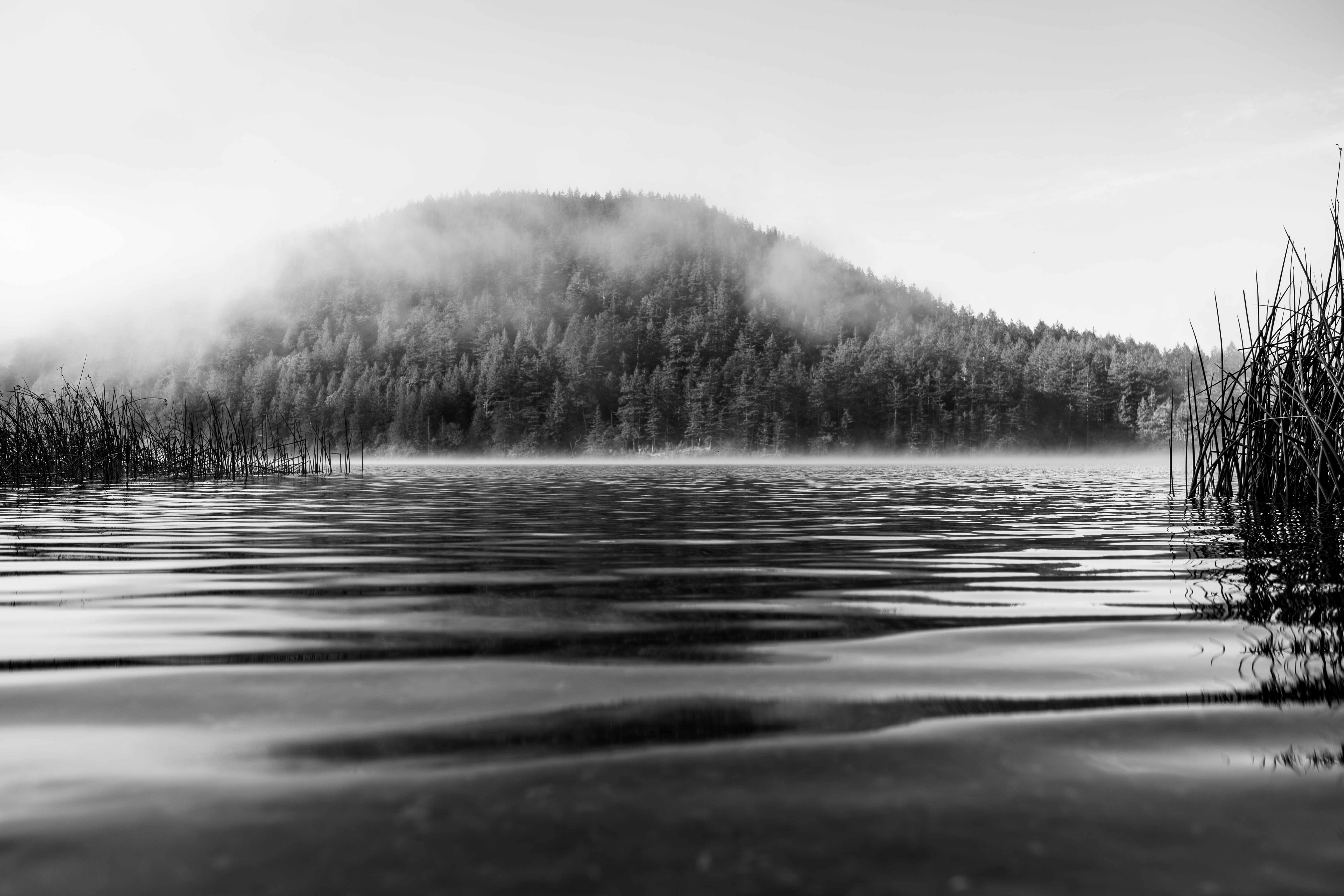
Whoa Anne! This has really got some things going for it. I think the ICM was really well executed, based on what appears very intentional shapes to the...swirls? The red/green color harmony is a classic of complementary colors. Further, colors are well saturated, IMHO, but not blown out, which makes them really look good to me (maybe you already know this, but Fuji is kind of famous for their greens, and I think this image shows why). I'm not sure how I feel about the rays emanating from the top of the frame, but the rays emanating from Midway of Fun are a killer feature, and bring you right into the sign, which really serves as a subject of the image.
I kind of wish the sign were completely unobstructed. It would be an even stronger subject. But, this is a cool image, and I'd like to see more of your ICM stuff. |
Feb 5th |
| 60 |
Feb 24 |
Comment |
This composition works for me Rita. Some folks would have a problem with the even number (versus odd number), but I don't subscribe to that particular...aversion. I think the texture of the water does a good job of simplifying the composition, and directing focus to the birds. The quality of sunlight you're getting (low and golden) looks really good. Focus looks spot on to me, and DoF works great IMHO.
I sure wish these guys were pointed 180� in the opposite direction, thus illuminating their faces (and hopefully eyes), but you got what you got (loons are terrible at taking direction). It would be nice to have a catchlight. Beyond that, I don't know what that stuff on the water is in the lower right, but I think it'd be super easy to remove, and I would be interested in seeing a version without it. It doesn't ruin anything, but I personally like the isolation of the subjects you already have and would like to see more...maybe. |
Feb 5th |
| 60 |
Feb 24 |
Reply |
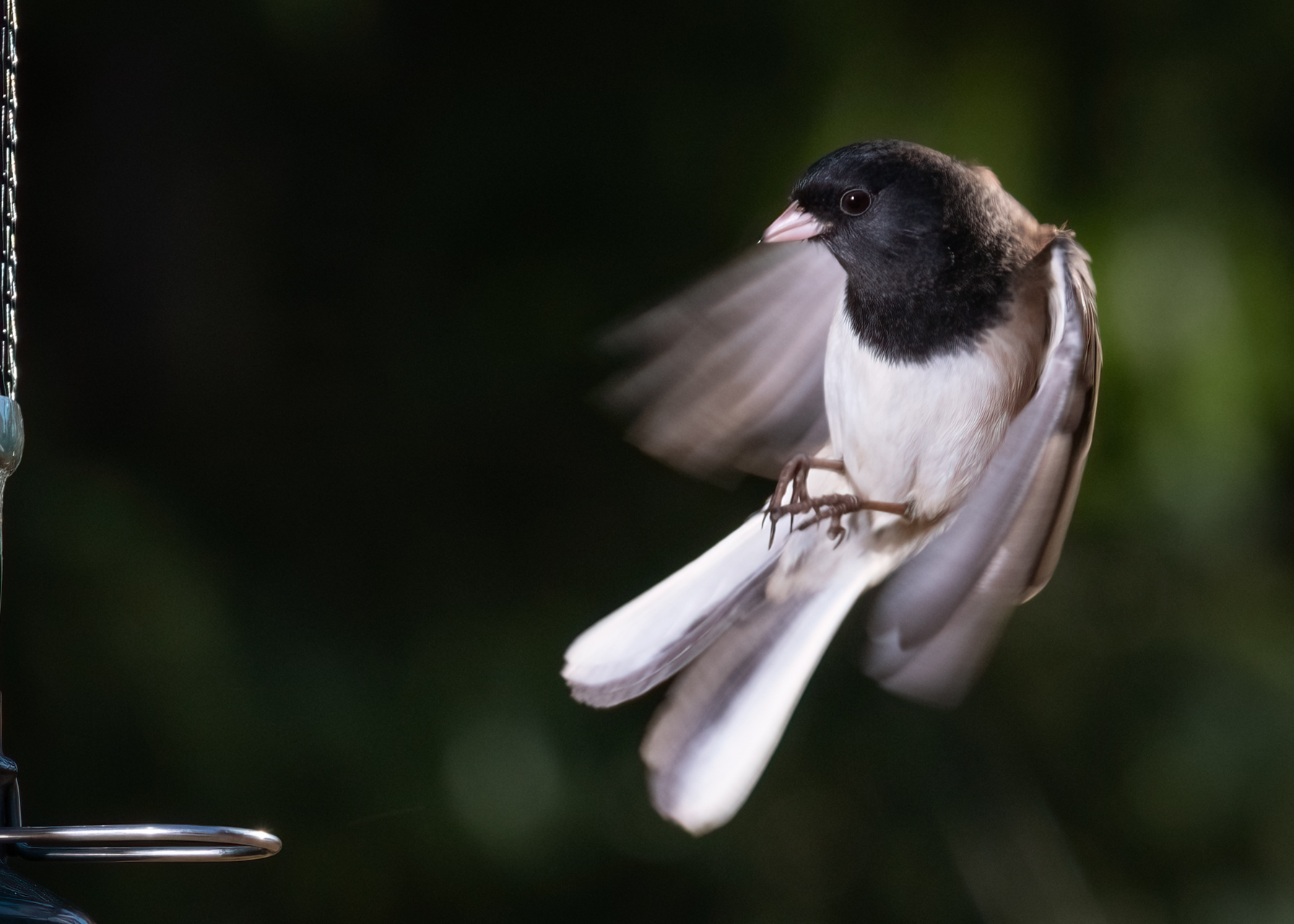
That's about the nicest thing anyone's ever said about my imagery Rita. If you find a 100lb box of Omaha Steaks in on your front porch, you'll know who they came from. ;)
So, re: denoise, I'm not sure what you mean when you say "did you sharpen or use AI?" What kind of AI do you mean? But regarding that, the only denoise I did was in-camera.
The Fuji has the ability to perform denoise (and sharpen, and many other functions) to jpg images as they are produced. Even older cameras (my Nikon D5100 from 2012 even has this under the Picture Control) have these kinds of controls. BUT, you have to remember that these types of controls (on my Nikon they are Sharpening, Contrast, Brightness, Saturation, Hue, but on my Fuji they are MUCH more extensive) are ONLY applied to JPG files. That's why I shoot in RAW + JPG nearly always. There are MANY instances in which my images take little to no editing in order to be usable, and for sports or photojournalism, that's a BIG DEAL. If the jpg comes out right, then life is good. If it doesn't, I have the RAW to back me up.
I recommend you check out your own camera's jpg controls, and experiment with them. Between in-camera denoise, and in-camera sharpening, That was 80% of the editing I needed to do here. I wrote a blog article that touched on this issue exactly, and talked about all the other issues surrounding Low-Light Sports Photography, for Rocky Mountain School of Photography. Check it out: https://blog.rmsp.com/2023/10/03/low-light-sports-photography/ |
Feb 5th |
| 60 |
Feb 24 |
Reply |
Yeah, to me it was all about the dichotomy of the community, against her solitary existence. There is a story here, and frankly I often find that nearly impossible to achieve. |
Feb 5th |
| 60 |
Feb 24 |
Comment |
Love the angles Dean. A lot of times, a wide angle can really put a hurting on anything with a lot of parallel lines, because of distortion, and there's plenty of it here, near the edges. But, it doesn't bug me here. Good eye. |
Feb 5th |
5 comments - 3 replies for Group 60
|
5 comments - 3 replies Total
|