|
| Group |
Round |
C/R |
Comment |
Date |
Image |
| 60 |
Jan 24 |
Reply |
You're right Rita. That guy outside has got to go. Maybe I should always go shooting with somebody like my buddy Knuckles, who can clean stuff up for me BEFORE I shoot. ;) |
Jan 25th |
| 60 |
Jan 24 |
Reply |
If you ever get this way, I'll take you! |
Jan 25th |
| 60 |
Jan 24 |
Comment |
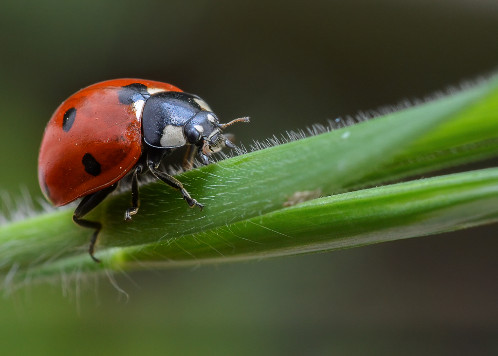
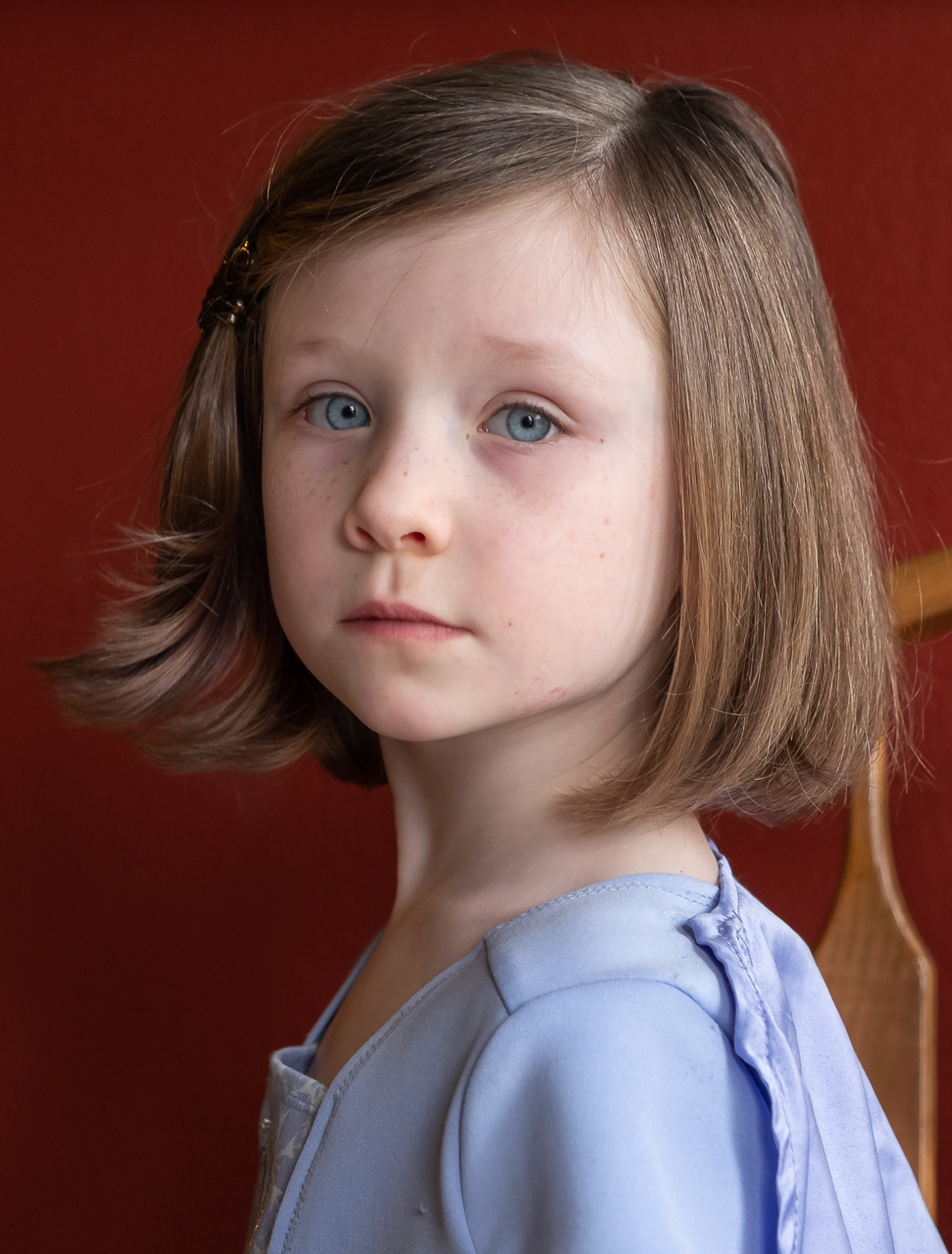
Lots of good things going on here in my eyes Blair. Nice, shallow DoF which blurs the background, and brings the subjects into sharp focus. Nice, soft light on the subjects, with just enough directionality to show shapes (look at those cheeks!), and a beautiful glow coming from the subjects' left front (Bonus!). Colors are vibrant, but despite being very saturated colors, are not weird looking, and the red/green color harmony is a classic. Exposure looks good all the way around to me. I think the composition is pretty good! Putting the girls on that stump, with a nice (soft), green background really works for me, and was a great decision. The fewer distractions you have in the background of a portrait, generally, the better, and I think this is well done. Nice work. This is a keeper.
As for as improving this image goes, I agree with everyone else that you might think about a vignette, or some other post-production technique to dim the background.
Going forward, I think the lesson to be learned is that (based on everything I've ever read and been told), the eye goes to areas of contrast, and brightness. As a result, a dark subject (relatively) with a bright background can take attention away from the subject. So, avoiding that bright background is desirable, if possible.
Another hot tip for portraits is to try to situate the subject so they'll have a catchlight (reflection from a light source) in their eyes. This is a graduate-level maneuver, but can really add a sense of life and vitality to a portrait. Just things to think about in the future.
Anyway, if this image is any indication, you already have many of the basics of portraiture down, so the above suggestions are just for polishing things up. I expect to see great things soon. ;)
|
Jan 12th |
| 60 |
Jan 24 |
Reply |
This is a super complex topic Michelle, and try as I might, language fails me. About the only truisms that I can say about photography though, are that a) the purely technical skills matter, and that b) technical execution doesn't matter. Confused?
It's like this:
I liken photo to any art, in that there are technical skills that must be mastered before an artistic vision can be produced. Paintings aren't about paint. But in the 17th century, if you couldn't produce paint, you weren't going to do much painting. It's the same today. If you don't know the basics of RAW vs. JPEG, or LrC, it's going to slow you down. Further, without a solid understanding of the how your camera works, and the fundamentals of how cameras and computers work, your creativity will be constrained.
BUT, a good, powerful image can break any and all rules, and still be a winner. Subject out of focus? Doesn't matter on the right image. Overexposed? Doesn't necessarily matter. Distractions everywhere? Could be part of the story. I think you get my drift.
I think you're right to focus on composition...and the fundamentals...and everything else. None of us will ever know it all, and as soon as we do, they'll change what ALL is. |
Jan 11th |
| 60 |
Jan 24 |
Comment |
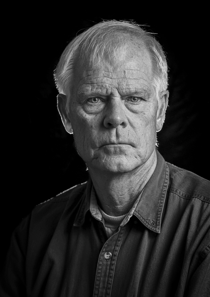
This is good feedback Anne...and I love the alternate perspective. I think maybe this comes down to personal perspective, taste, and style. After looking at things I like, and my own stuff...A LOT...I've learned that I like clean, simple stuff. So, I think my bias would be to clean him AND the chair up (which I never really saw before, good eye).
But, this brings up the entire conversation about what is distraction, and what is context. Frankly, I think we have a tendency to look for "distractions" if we can't find anything else to say about an image. I've done it, and I've seen it done. So, there's a good chance my bias toward simple and clean is a reaction to how I was brought up but other photographers. Having said that, there definitely ARE things that take the viewer away from the subject...if there is one. So it's not BS to call distractions out.
Anyway, I could talk about his for days. It's an interesting aspect of composition, IMHO. |
Jan 10th |
| 60 |
Jan 24 |
Reply |
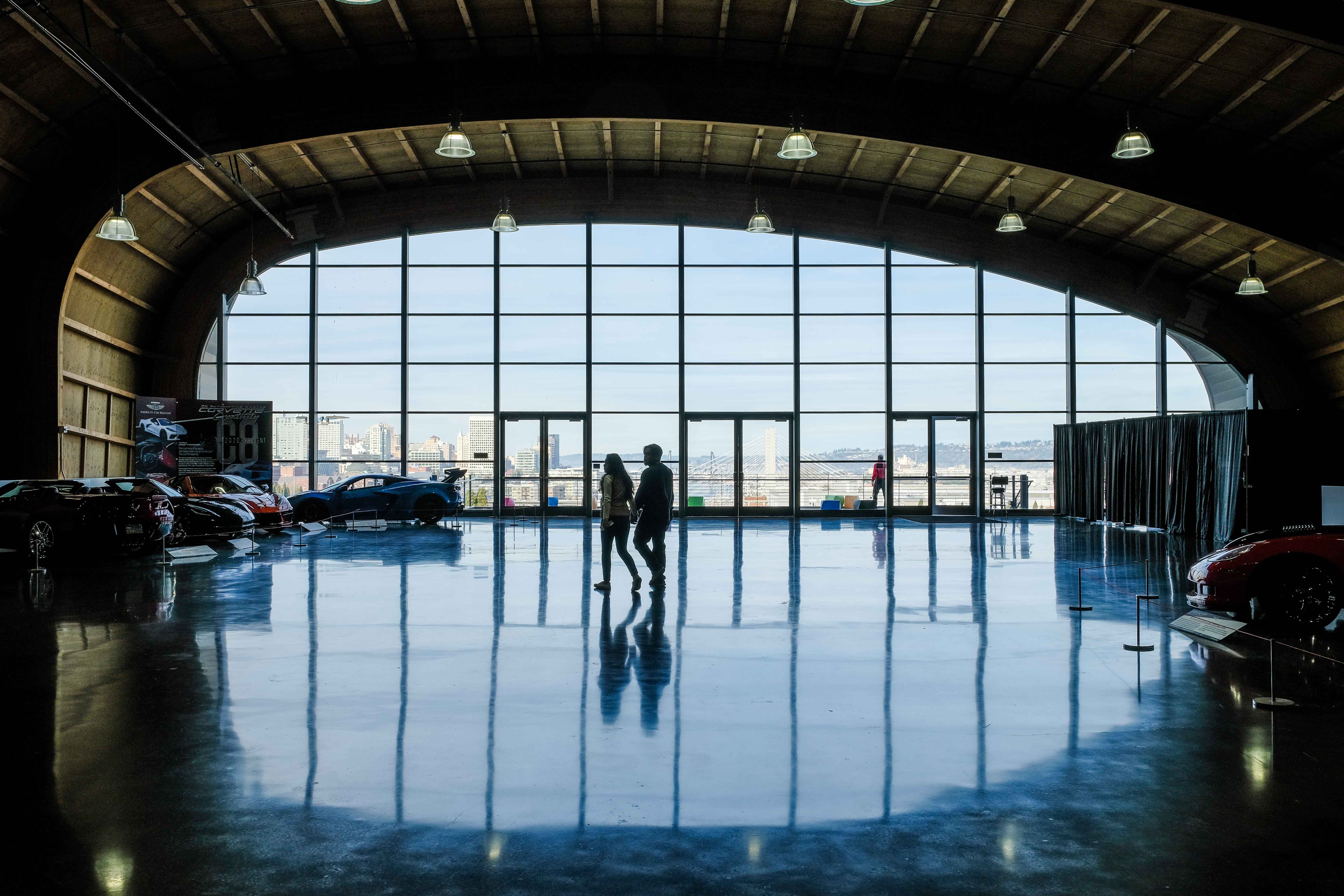
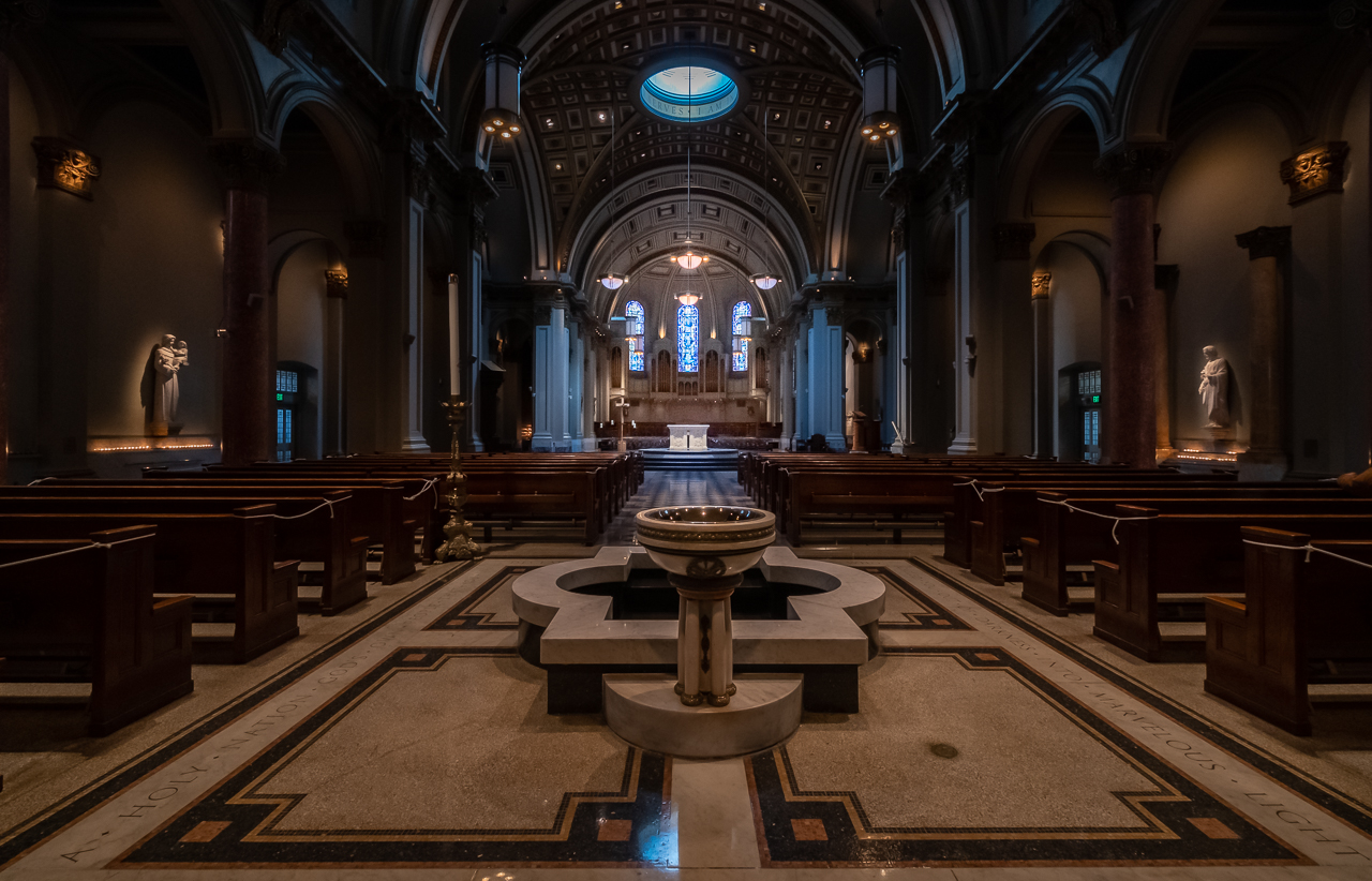
You are absolutely right about "The Guy On the Veranda!" Really, I think this is a job for Ps. I've had a lot more luck with object removal than I have with color manipulation of specific objects, and frankly, that would be cleaner, IMHO. And, the new removal tools are just SO mind-blowing.
On the other hand, this might be a good chance for me to start working with the new LrC Point Color...which I need to get up to speed on.
I don't have an intent for this image. And, besides PID I'm not sure if this really hits any PSA Interclub (IC) division squarely on the head. But, it may add to an architecture portfolio, so maybe that will drive me do to something about it. Thanks for the direct, considered, and actionable feedback. It's valuable. |
Jan 10th |
| 60 |
Jan 24 |
Reply |
Kind words Ma'am. It IS a cool museum. |
Jan 9th |
| 60 |
Jan 24 |
Reply |
Thanks for the compliments Anne. I'd really like to remove that guy out on the veranda (and I just might). Nothing's ever perfect is it? |
Jan 9th |
| 60 |
Jan 24 |
Comment |
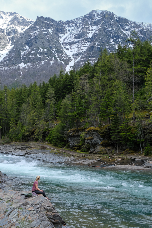
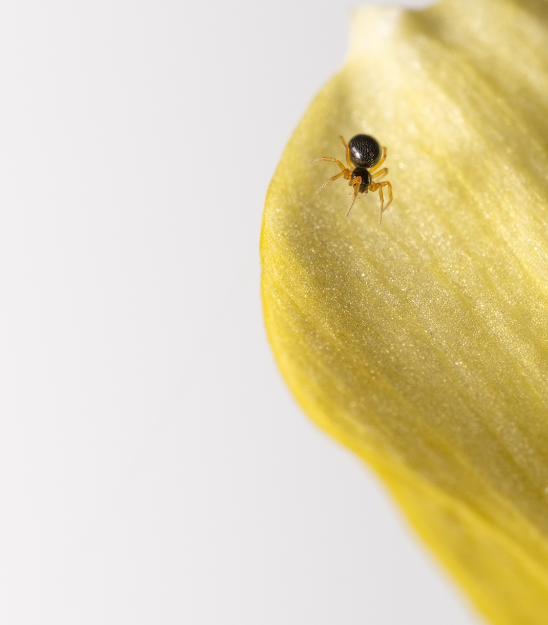
Welcome Michelle! Strong first entry. This is an interesting shot, and has lots of things going for it, IMHO. And, I know how attractive and elusive bubbles can be. I've shot them enough to have my own secret (not so secret) formula for bubble solution which gives max iridescence AND life span.
Really, this is a super tough subject, given the super bright, specular (reflective) subject, and super-wide dynamic range, but I think you handled it well. Neither the blown out sun slick, nor the clipped silhouettes ruin the image, IMHO. The shape and colors of the bubble come through (to me), which was your goal in the first place, so good on you. The bubble (subject) IS sharp, and IMHO, that is 60% of the battle. We know what you want us to look at. And, the overall feeling and composition really do say "beach," so big bonus for having some story in the composition.
But, I think you're right, that the exposing for the sky has kind of muddied the image as a whole. You may have lost something, and I'm going to suggest you take a look at the color temp one more time. Can't hurt anyway.
Like I said: strong first shot across the bow Michelle. Looking forward to having you in DD60.
OOh. One more thing. Watch out for dust spots, especially at higher f/stops. Are you familiar with the "Visualize Dust Spots" tool in LrC? It's a godsend.
|
Jan 7th |
| 60 |
Jan 24 |
Comment |
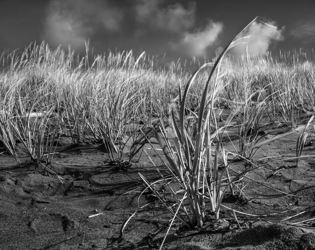
Hi Rita. I think it's awesome to see you really moving into the ICM stuff. I think it all comes up under the heading of PID (for PSA Interclub) now, but in the old days (listen to me talking like some salty dude) it would have been Creative Division. I think, as I mentioned before, I find it challenging to either judge or critique this kind of work, but that's just me.
In this case, without the title, I don't think I would have thought "ocean." Perhaps that's because of what seems to be an angularity to things especially in the lower part of the frame. Perhaps the texture kind of misdirects me too. Don't know.
However, WITH the title, I totally get it. And, the colors really really speak ocean to me. Even the hint of what looks like a kind of purple (lavender? mauve? I don't know. I'm a dude!) does it for me.
Anyway, your success with the image that we critiqued earlier is proof positive that you know what you're doing. Keep going down this road. |
Jan 7th |
| 60 |
Jan 24 |
Comment |
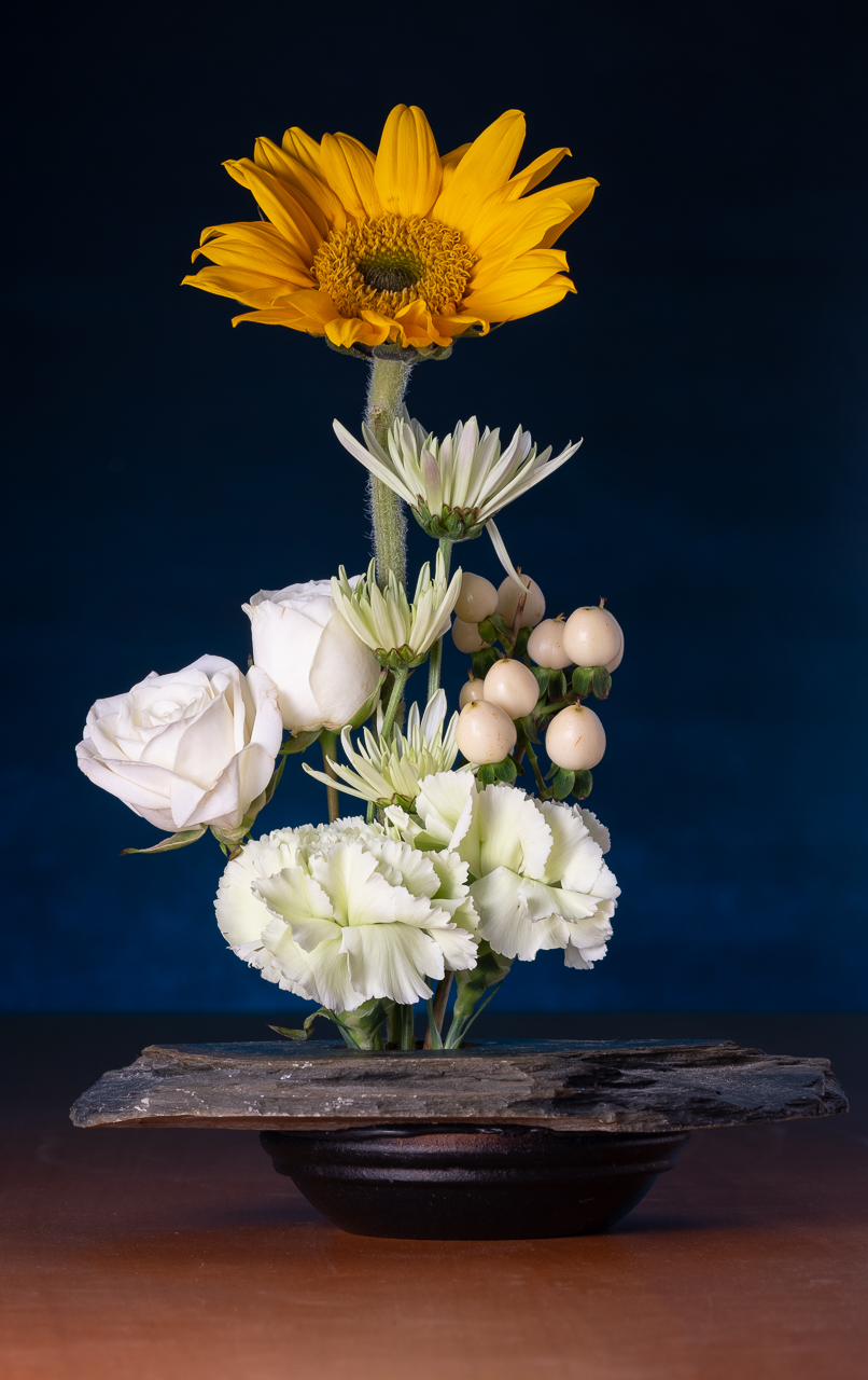
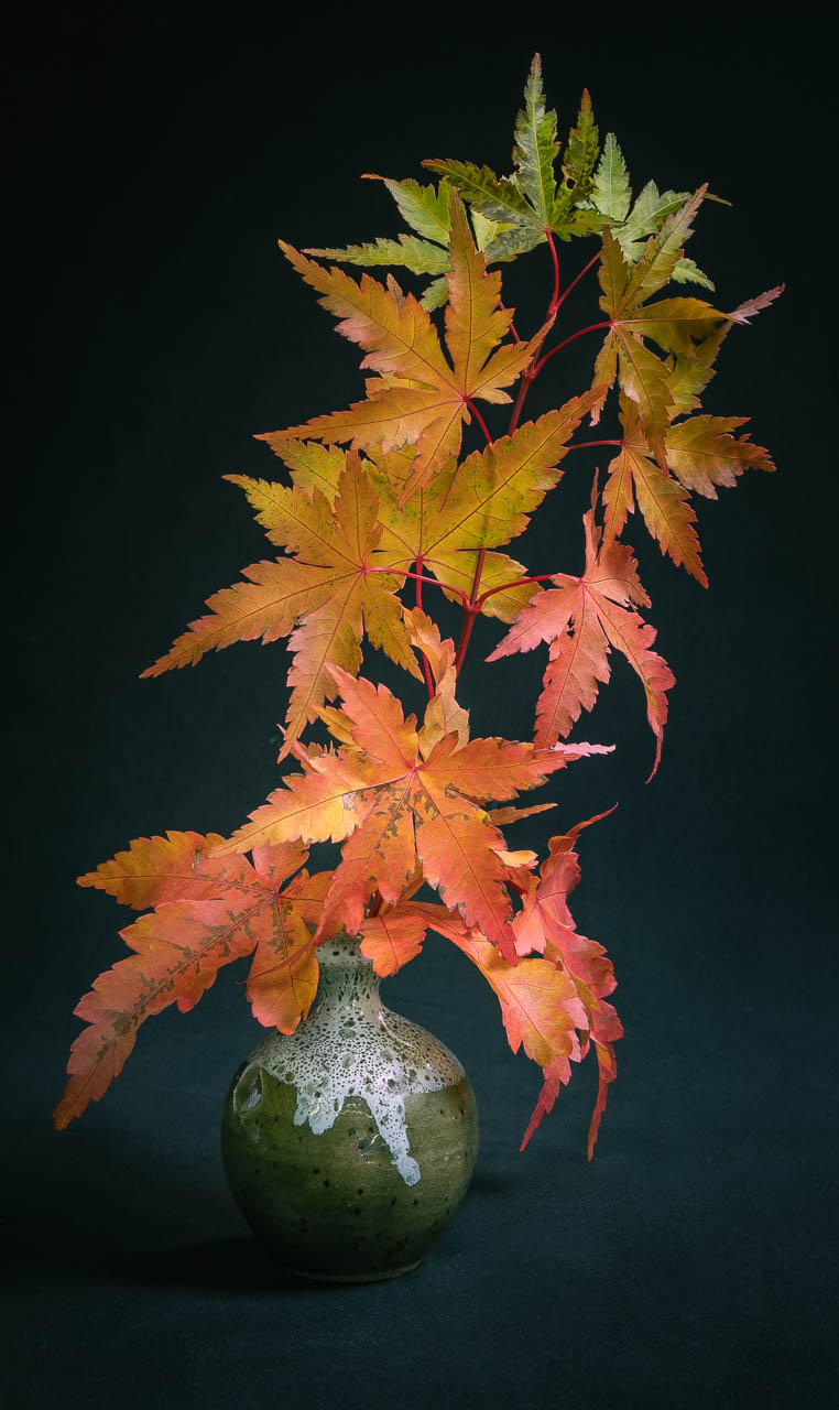
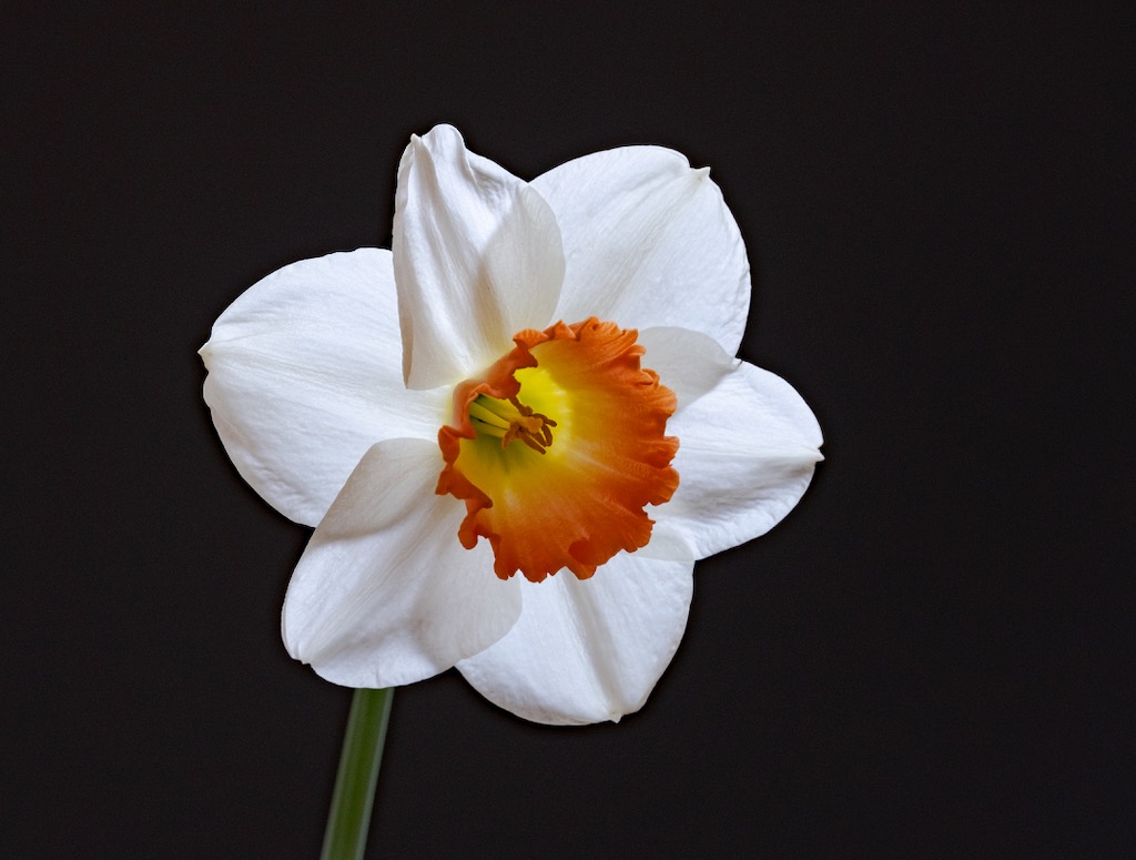
Light painting is cool. I've done it with small still-life like this, and some cars, and enjoyed it all. Good on you for expanding your horizons this way (is this new for you?).
I think the monochrome treatment works well. Exposure works with the leaves/stem being just kind of...hinted at...to me. Somebody might have something to say about the even number of flowers, but I don't have that even-numbers-phobia, so 2 is twice as great as 1 and 2/3 as nice as 3. It works for me.
Uh, I'm not sure that the front flower is all that sharp, and given that it's the most prominent thing in the frame, I feel like it ought to be. The flower behind is razor sharp though, which I really did, and wish the roles had been reversed. Beyond that, I kind of have a desire for a more conventional composition, without the leaves being cut off, and maybe more separation of the blooms, but that's just me.
I know you've really been pushing the envelope on lighting the last several months. I think it's awesome. Frankly, I'd love to see more of your light painting projects. And, I'd love to hear more about your technique, and how you went about making it happen. Keep it coming. |
Jan 7th |
| 60 |
Jan 24 |
Comment |
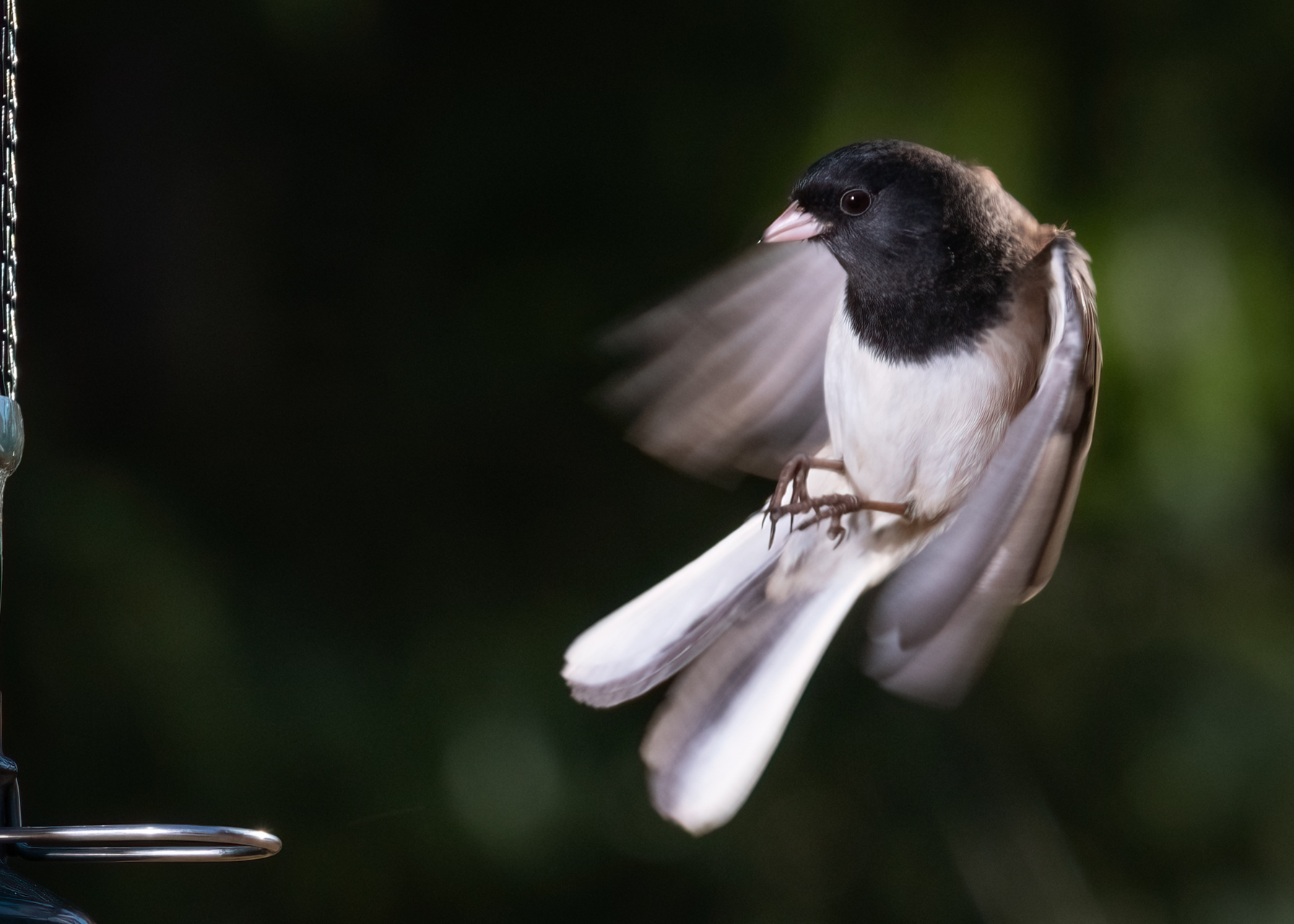
Anne, you've made a big mistake. You've had a successful bird image, which inevitably leads to addiction, and thus lifelong frustration and poverty. ;) Of course, I jest, but it seems to me that birds are one of the most difficult subjects, but when done well, one of the most rewarding. And if you can build from here, you will be very highly rewarded.
The pose on this is great. You capture motion, and EXACTLY the right aspect (front, with both eyes) of the bird, I feel. Moreover, you have a display and some action that 1000 other bird photographers would be envious of. The bird is sharp to me, the exposure is good all the way around, and the colors look natural but vibrant. And maybe as good as the pose and eyes, is the direction of the light source, which really illuminates all the important parts of the animal. GREAT work.
For all your success, there are ways to improve this, for my taste. I'm sure you too wish those branches were not obscuring the wing or tail, but alas, what're you gonna do about that? Beyond that, I'd like to see a bit of light in the bird's eyes (catch light). You might try putting a LrC brush on the eyes and bumping up the exposure, but whatever you do, don't make it look weird.
Anyway, great work in my eyes. Keep it up.
Anne, you may have read me telling someone else this, but |
Jan 7th |
| 60 |
Jan 24 |
Comment |
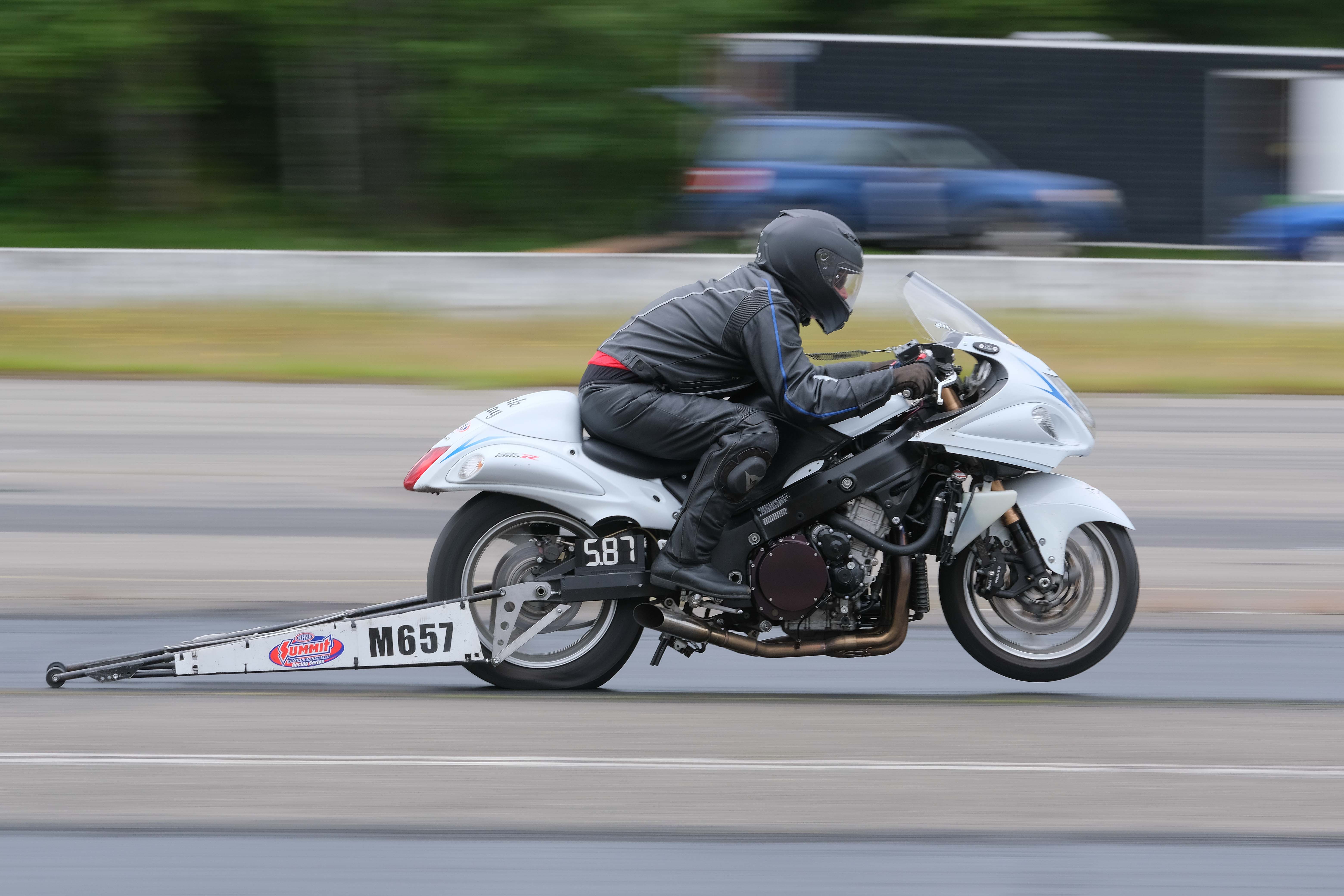
Hey Dean. Great mood. Nice composition, IMHO, with the rays of light emanating from a great location in the frame. Blacks look black, and the brightest part looks while, with a little bit of everything in between, so nice tonal range and exposure to my eye. I think your choice to blacken the foreground was the right one.
This is just me talking, but I'm not so enthused with where those great leading lines lead my eye. It's just stuff to me.
A bit more importantly, to me anyway, is that the image is that the focus, all around, is kind of soft to my eye.
Super creative and resourceful. Thanks for keeping with the current material theme. |
Jan 7th |
7 comments - 6 replies for Group 60
|
7 comments - 6 replies Total
|