|
| Group |
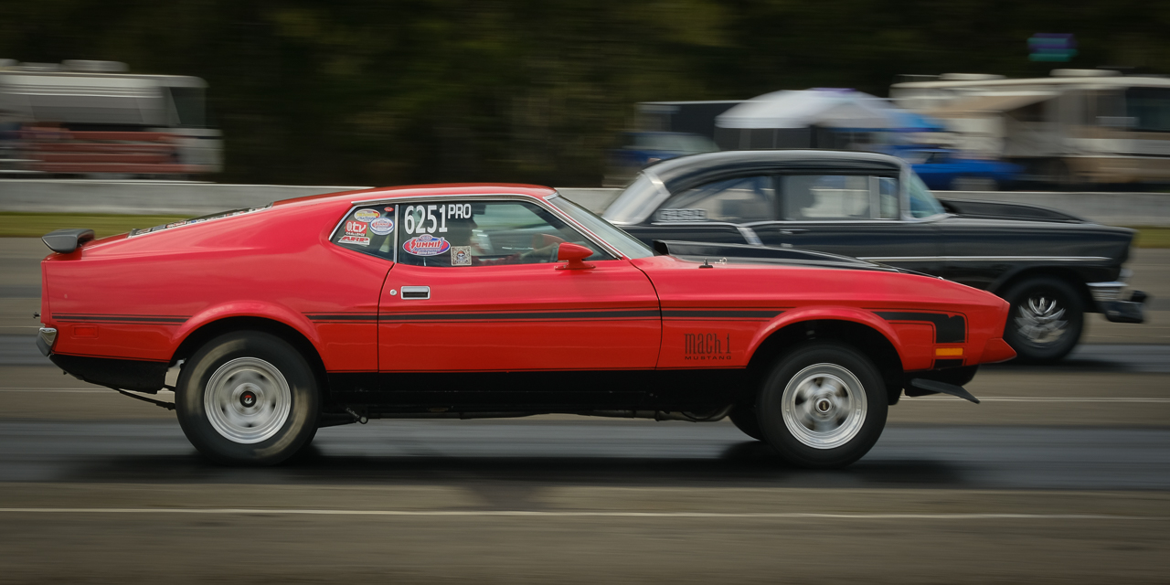
Round |
C/R |
Comment |
Date |
Image |
| 60 |
Nov 23 |
Reply |
Thank you very much Anne. I understand that if you haven't messed with artificial lighting, some of those terms might be a bit foreign to you. But, there was a time when f/ stop, ISO, and everything else was foreign to you as well. Since the artificial lighting was such an important part of this image, I thought it was important to include as much as I could, so anyone else who was interested could understand how I did it. If you're curious about anything, just ask and I'll explain it to the best of my ability. |
Nov 19th |
| 60 |
Nov 23 |
Reply |
Very kind words Blair. Thank you. Skill? Maybe. Luck? Certainly. Persistence? Definitely. As an example, I did some portraiture of her and her big sister this afternoon, and it takes about...20 images to get one that I might even consider editing.. |
Nov 19th |
| 60 |
Nov 23 |
Comment |
Hey Blair, good on you for applying your growing photography skills to your own life. I mean, I can take some pretty gnarly shots of shoes and pancakes (product and food), but a lot of my shots are still "snapshots" that only have meaning to me and my family. But, they're still much better shots than I would have taken 10 years ago, so keep it up.
I think your colors look vivid (the greens anyway) and natural. I think the exposure is well done for the most part (Whenever you include shade AND sky, you're really in danger of overexposing the sky. Oftentimes, I'll simply recompose the image to avoid sky altogether.).
Do you remember what exposure mode you used? Kudos on the your use of wide aperture/low f/stop to speed up the shutter (sharper) and reduce your depth of field in order to bring attention to the subject, which is definitely the sharpest object in the frame.
A agree, the subject should stand out more. One of the toughest things to remember is to observe your background, and to place your subject on the right background for the image you're trying to create. If I had a dollar for every time I had something I didn't like in my background, I'd be a rich man.
Anyway, glad to see you mixing it up with everyone else. Keep up the good work. |
Nov 13th |
| 60 |
Nov 23 |
Reply |
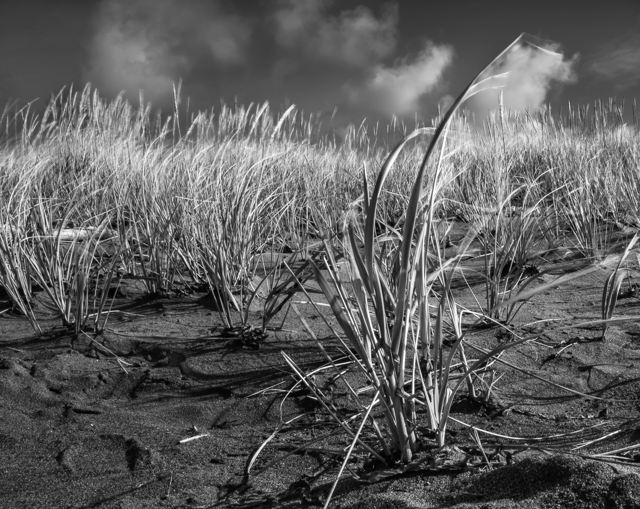
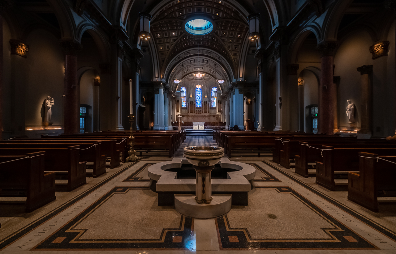
I have a feeling this might have been a diffused one. Anything you can do to make the source of the light larger softens shadow images. Sometimes that's what you want. Sometimes it ain't. Also, as you probably know, the proximity of the light source to the subject can have the same affect, since it's all about apparent angular size of the light source (not absolute or actual size) that matters. But (and sometimes for the better), this also affects the relative light on the subject vs. the background (see inverse square law). The possibilities are endless...
|
Nov 9th |
| 60 |
Nov 23 |
Comment |
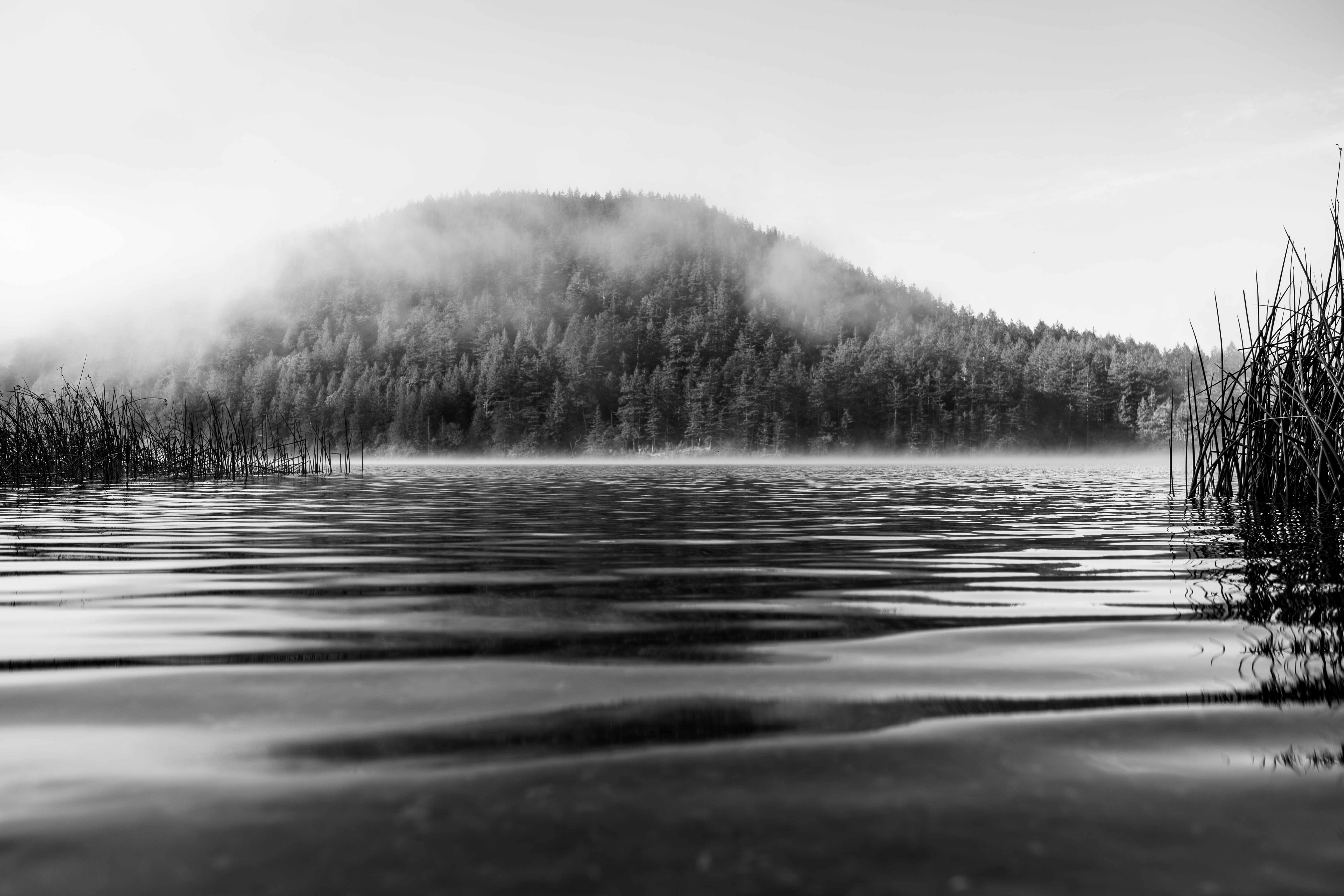
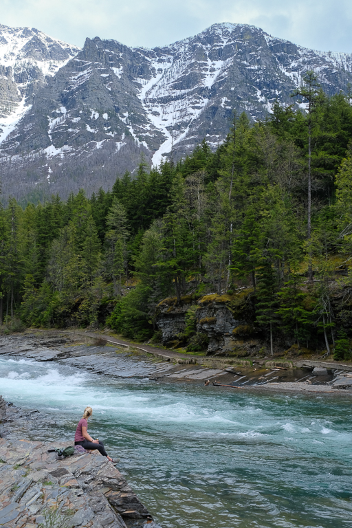
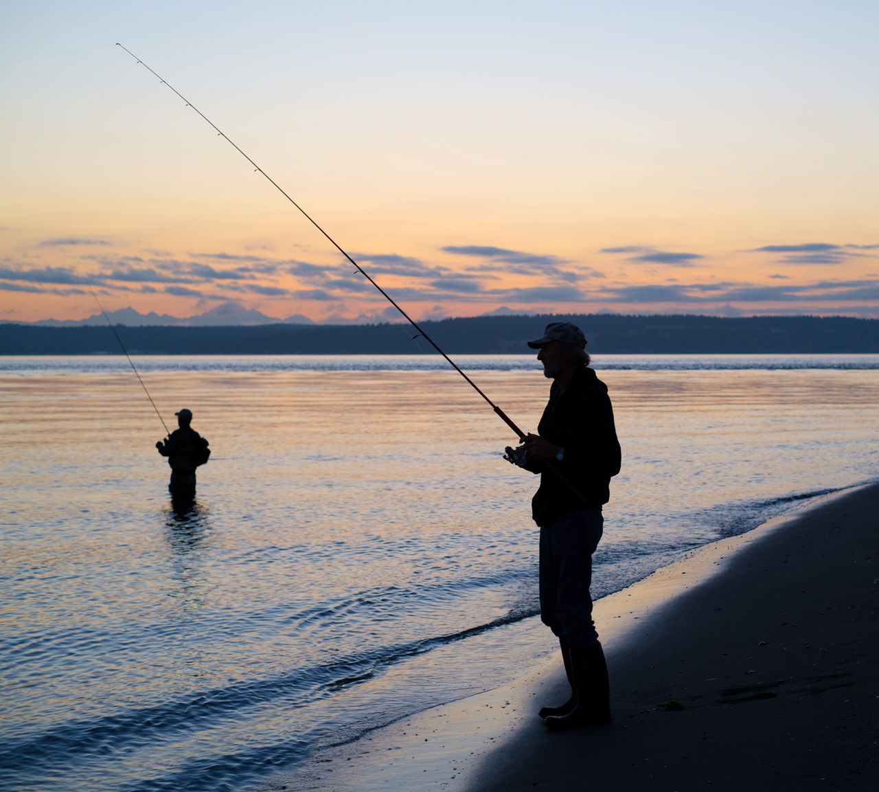
I used to fly search and rescue along the Oregon coast, and whenever I was airborne, my crew and I would always scan the shore, the cliffs, and sea for any signs of danger. One of the emergencies we frequently had to respond to was folks trapped on the many cliffs of the area, so we were especially keen to locate folks on the rocks or anywhere they shouldn't be, which happened all the time. However, if, when coming in to take a closer look, we found that the person had a fishing pole in hand, we'd say "oh, it's cool, he's just fishing." As if the act of fishing meant that for some reason the person was magically protected from disaster. But, I only remember having to rescue one fisherman, and that guy was a Russian.
As for the image, I think it's a cool subject, and I really like images that have a tiny human in a frame with a lot of raging nature. Technically, I think everything is right on. It's sharp. Colors are real. DoF is deep which communicates the magnitude of nature to me.
Like Barbara, I think it would help to bring attention to the subject. However, I think I have an other suggestion for doing that. If it were me, I think I'd crop in from the right (and maybe up from the bottom). There's a lot of homogenous rock surface to the right side of the frame, which I think is essentially dead space. By getting rid of some of that, I think you get the subject out of the center, and eliminate a bit of the dead space. Anyway, those are just my thoughts. See what you think. |
Nov 8th |
| 60 |
Nov 23 |
Comment |
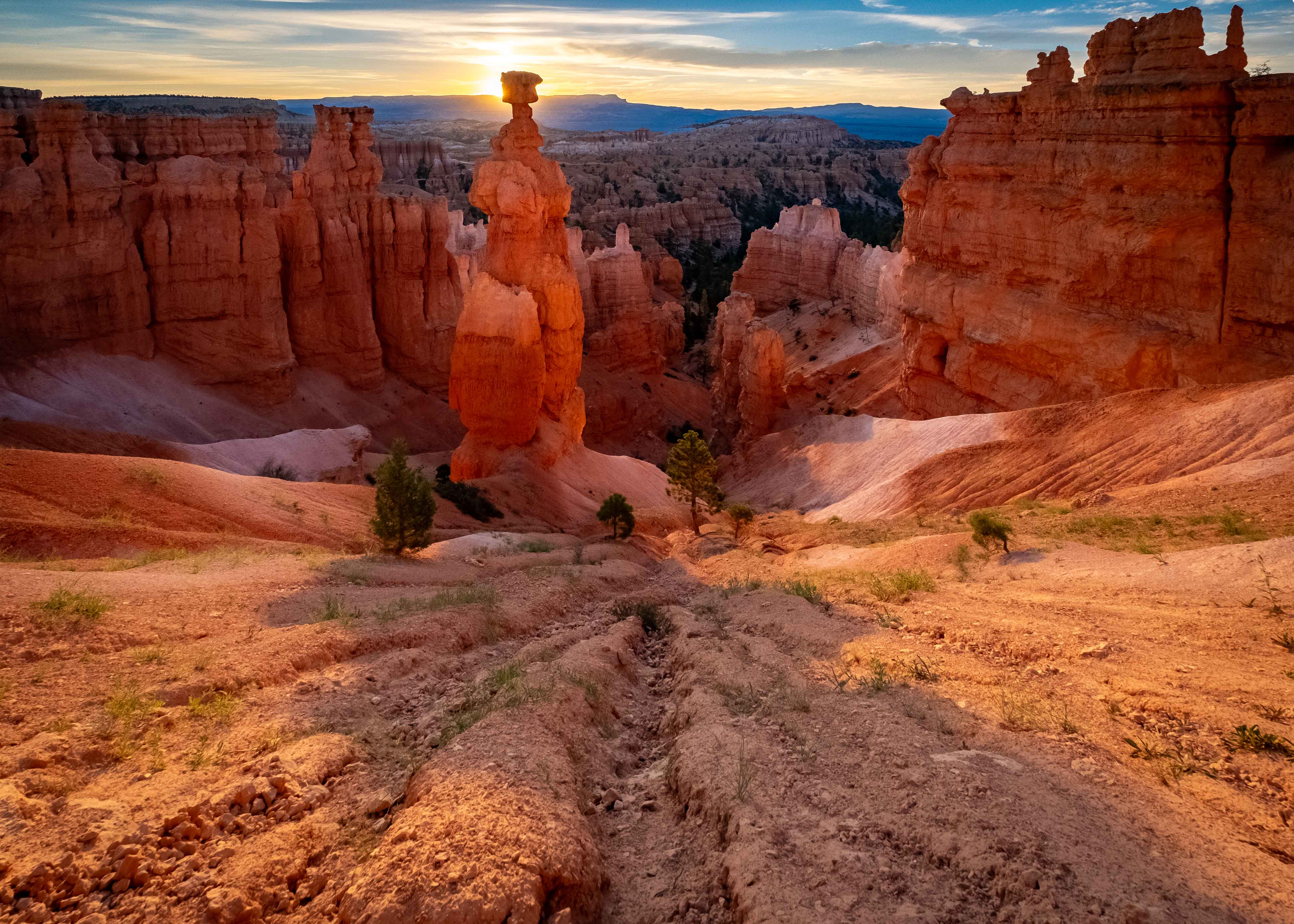
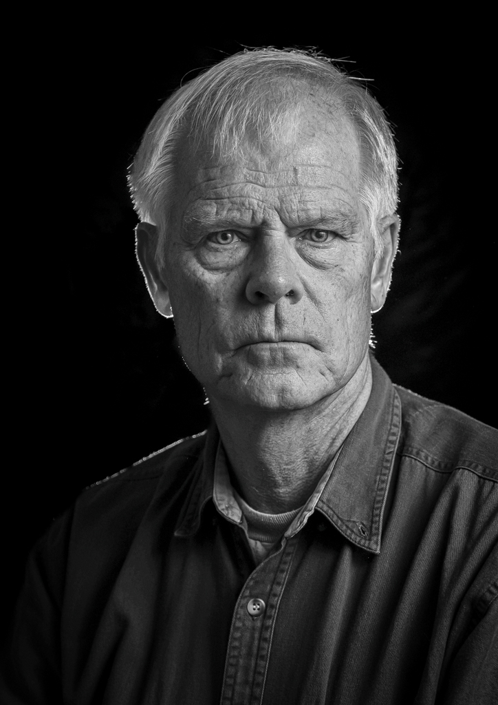
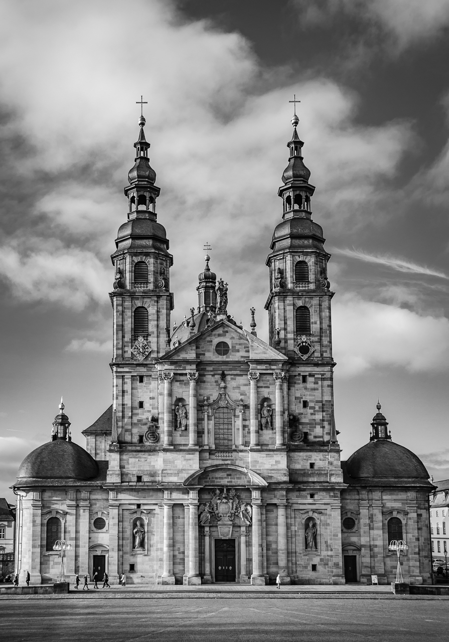
Sharp all the way around Dean. I like trying to details and abstracts of architecture too. You just never know where and what kind of shapes and shadows you're going to find. I guess that's all to say that I like the composition.
Speaking of that, I think the white column of the tower acts like a great leading line to the cupola on top. I'd like to see just a touch more detail in the lines of that black-on-black structure though. Regardless, it's a great image, and meaningful.
|
Nov 8th |
| 60 |
Nov 23 |
Comment |
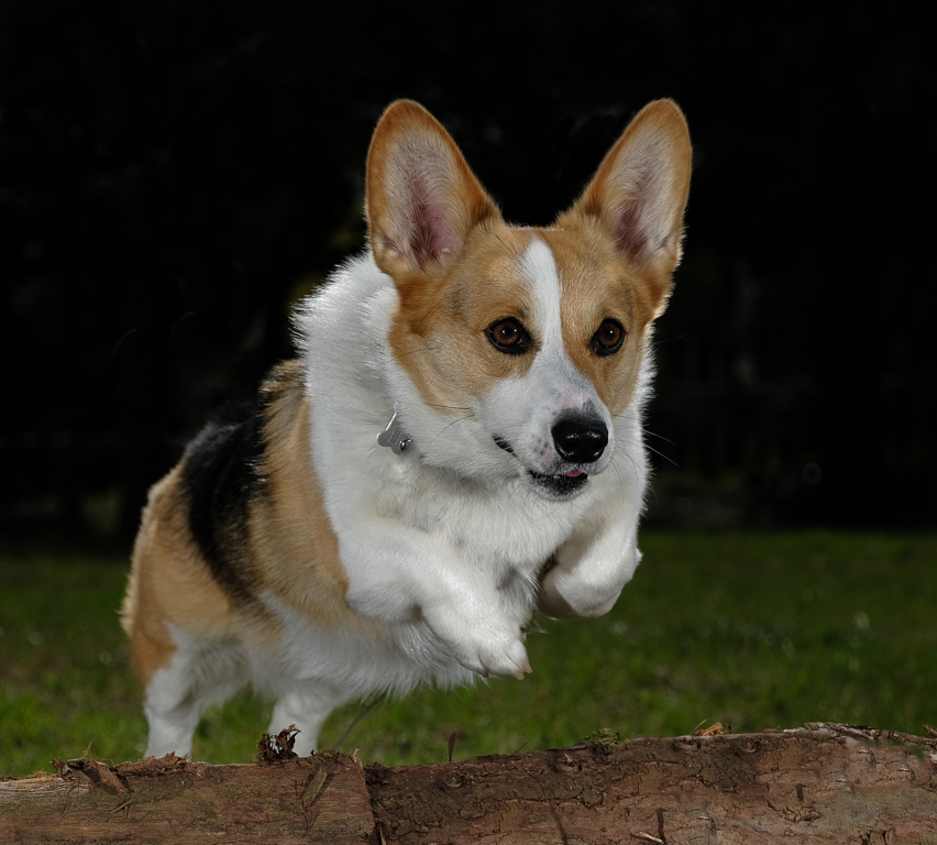
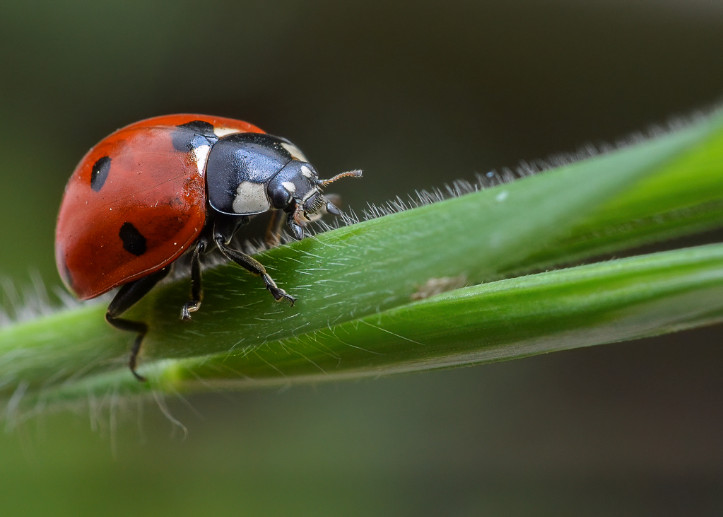
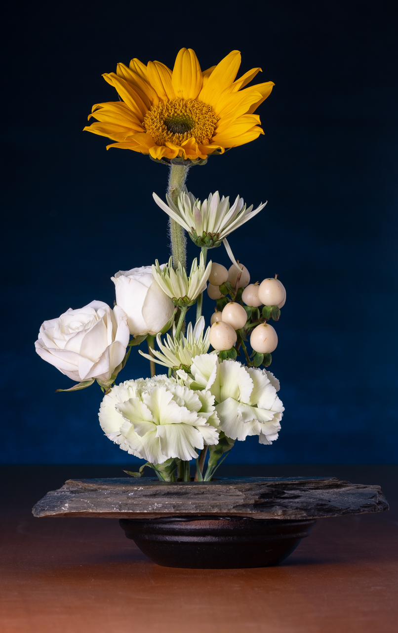
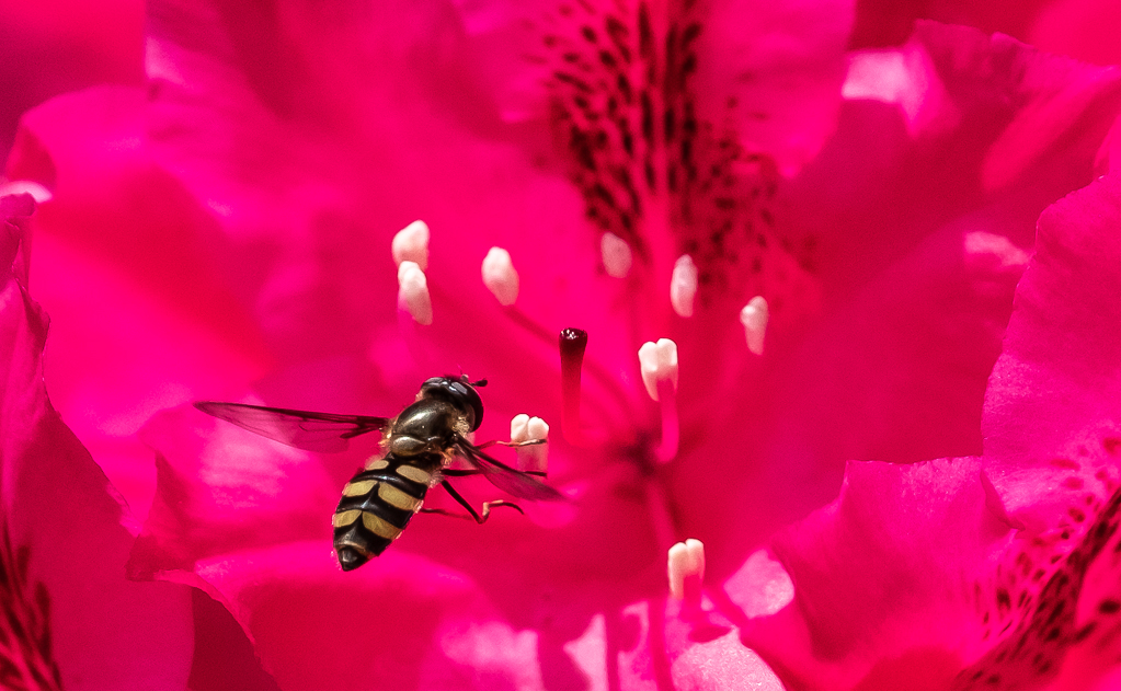
Hey Barbara, I think the black and yellow combo (contrasting) can be really striking, as this is. Razor sharp, so good choice of f/stop, focal length, AND orientation of the subject to keep it all in the DoF (I notice that focus falls off on the stem, which is a good thing IMHO).
Did you use a modifier on the speed light? I like the quality of the light (semi-soft...I'd say). Now that you're in the artificial lighting realm, you'll be playing with hard vs. soft light a lot, and how to manage the lighting of the subject vs. the background. I'm eager to see your experiments. |
Nov 8th |
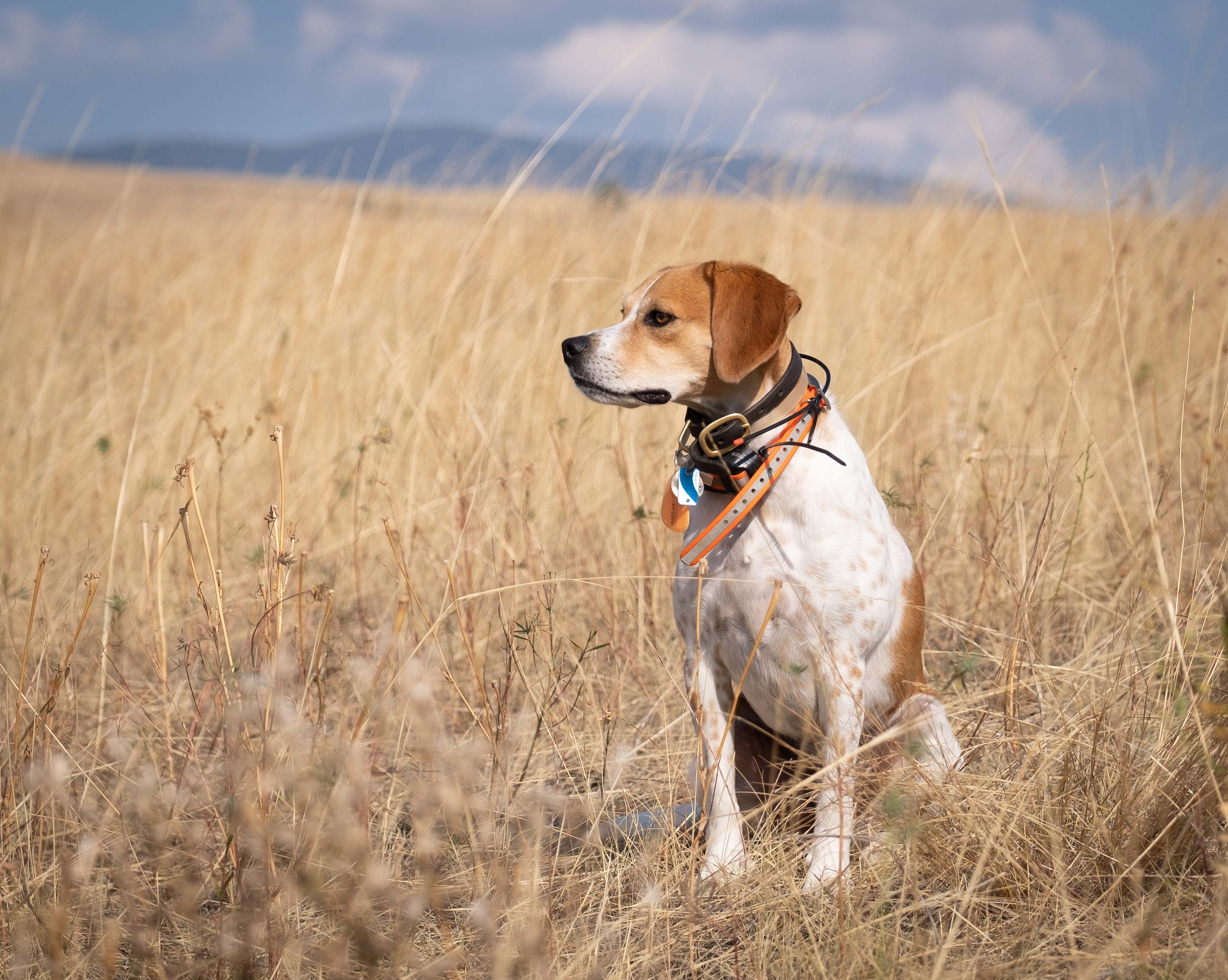
| 60 |
Nov 23 |
Reply |
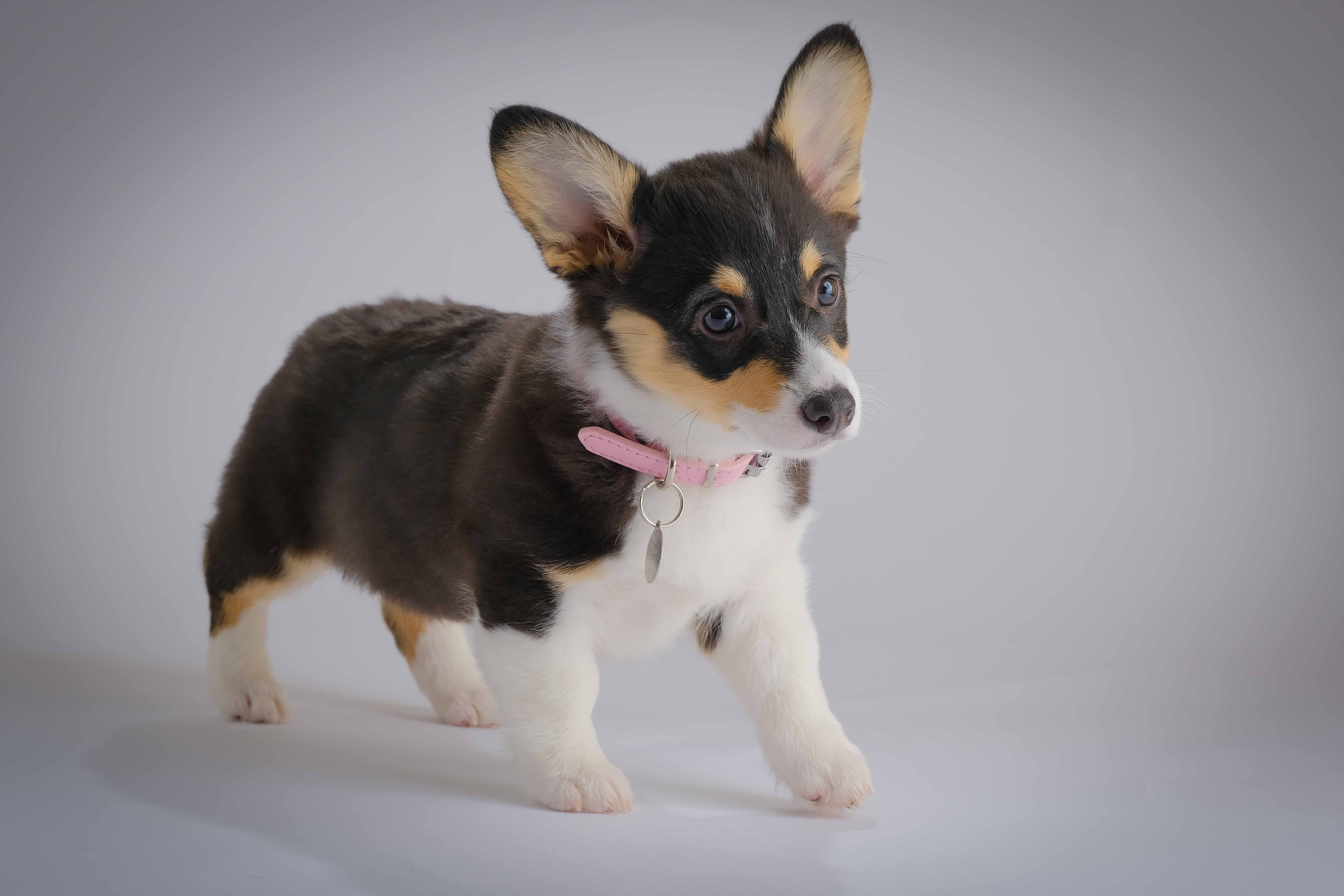
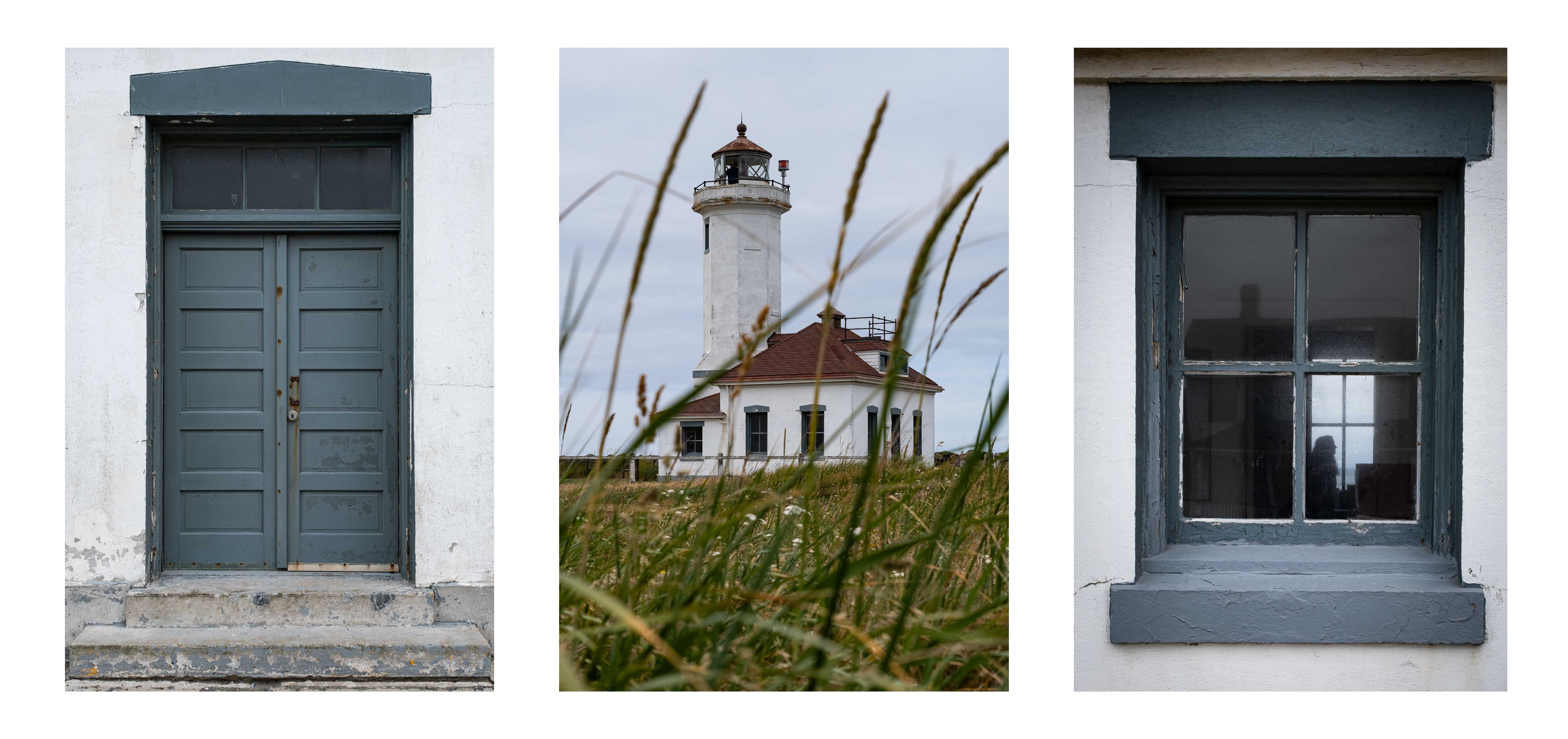
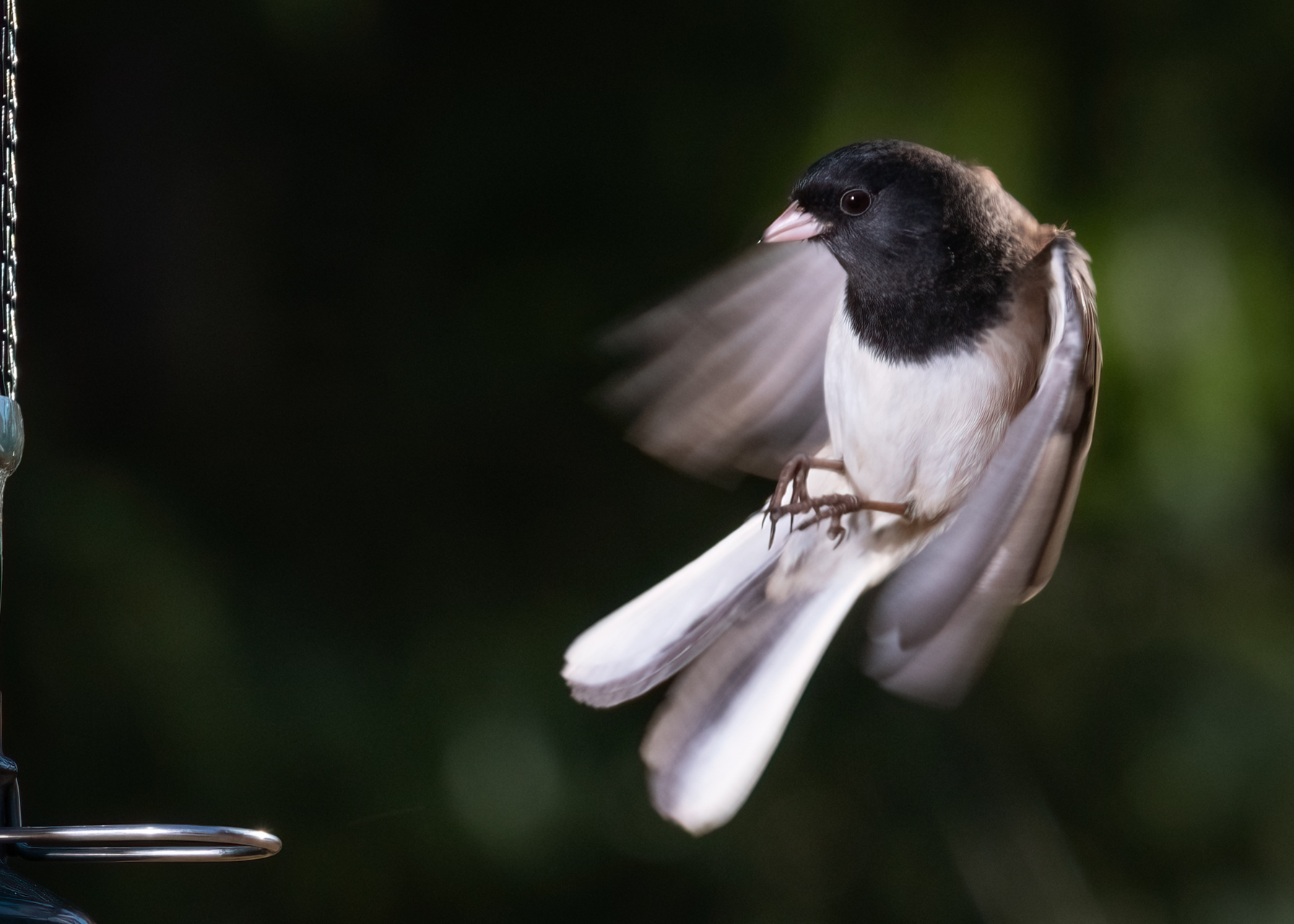
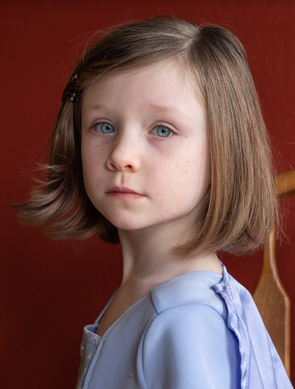
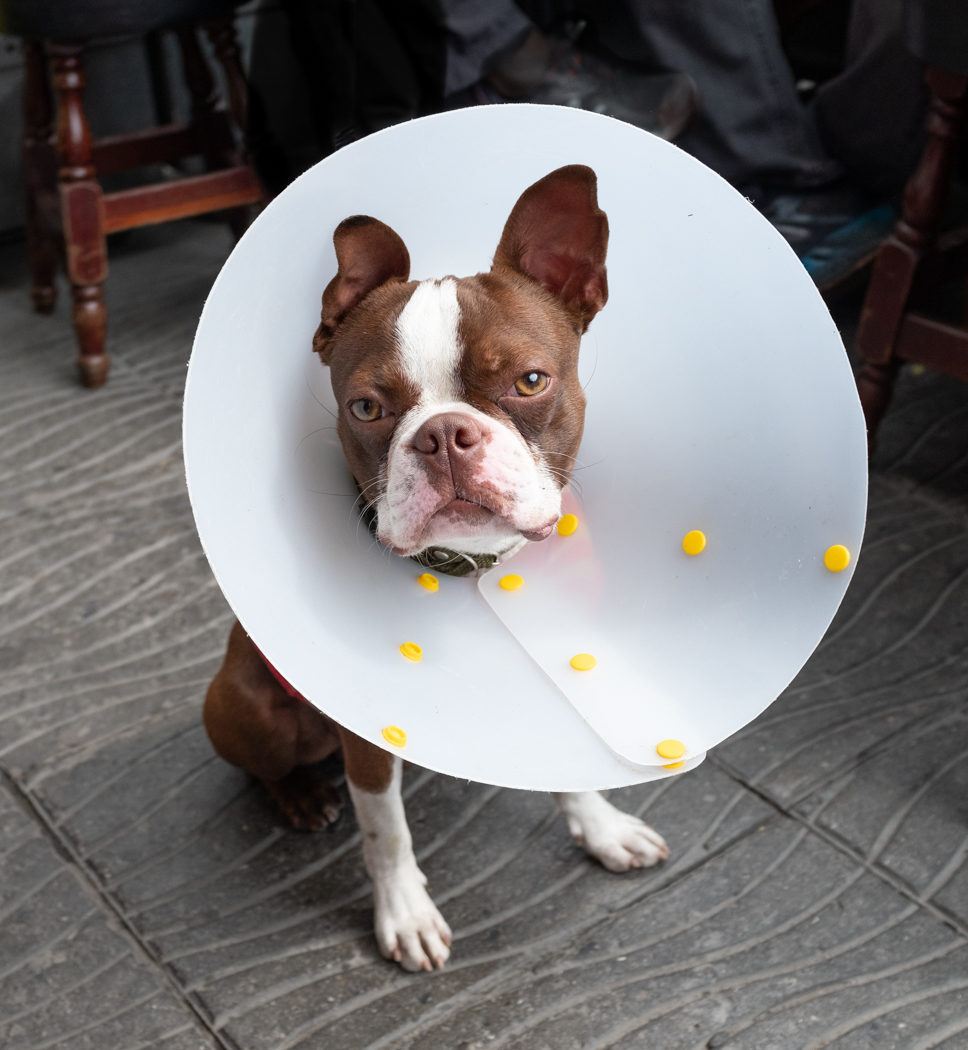
Thanks Dean. I like dogtography but my experience tells me that the most important person in that equation is the handler. The lighting stuff is easy, Getting the dog to behave is hard. My older corgi is a ham, and loves being photographed, even with flash. Pommes? Not so much. Gotta get her used to it. |
Nov 8th |
| 60 |
Nov 23 |
Reply |
Thanks Rita! Pommes (that's the German slang word for French Fries) is a corgi, just like her big sister Schnitzel.
What's she looking at? I think an escape route.
She is a sweetie isn't she? But, what a terrorist! |
Nov 8th |
| 60 |
Nov 23 |
Comment |
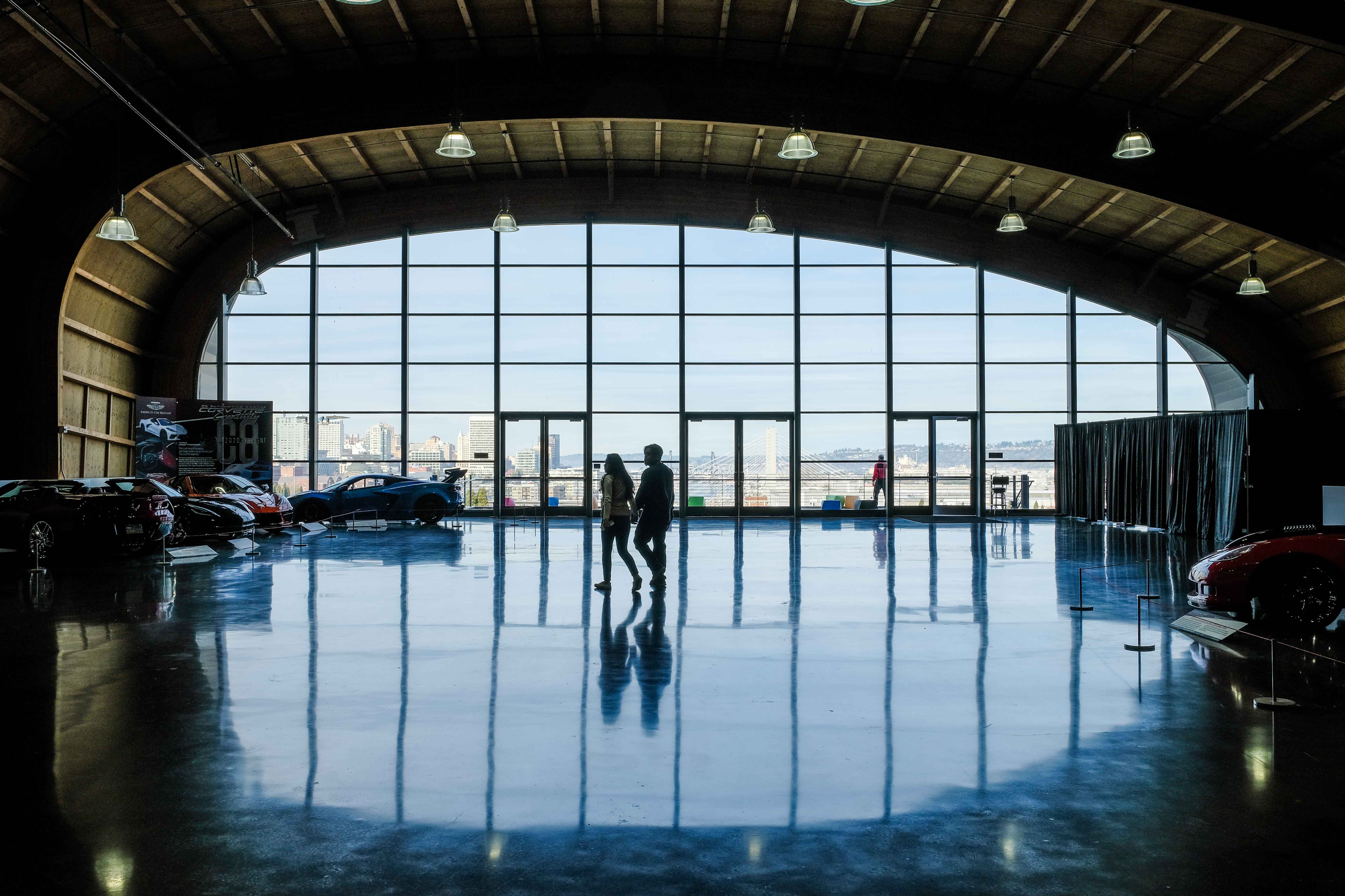
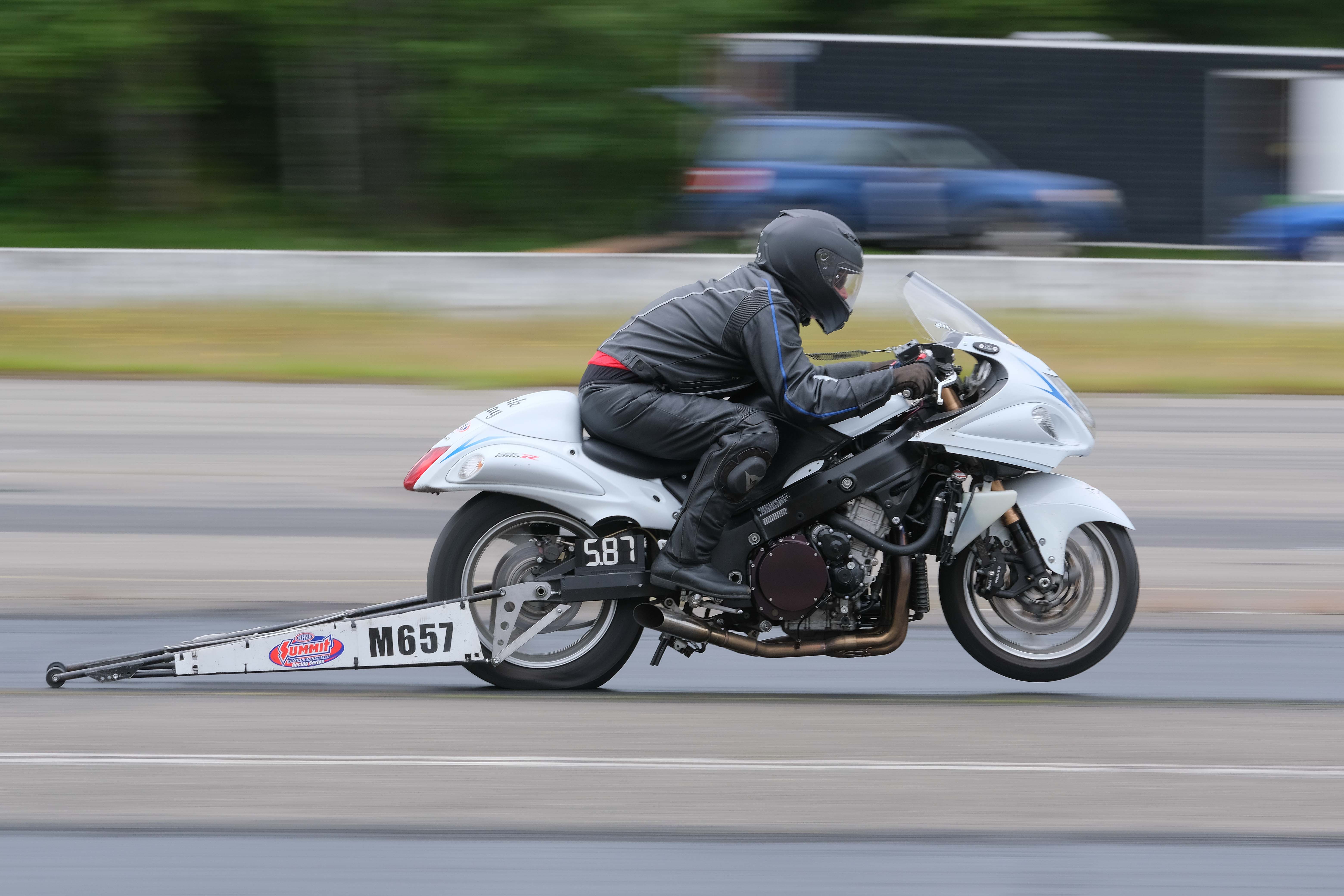
Hey Anne, cool subject. I really dig the red/gold color harmony. Super exposure with excellent tonal range from brights to darks. It looks to me like the front of the engine is the point of focus, which is as I would expect it. Your focal length of 18mm gives you a nice deep field of view, despite having an f stop of 2.8, which works really well IMHO. And, maybe best of all, I think you have kind of a nice story here, in that it's clearly a capture of a great machine in place of reverence.
Like Dean, I'd like to see those frame edges removed. I frequently can't see my composition issues until I get the images on the big screen, so I know what "let me try that again" feels like it. Try it and send it on in. |
Nov 8th |
| 60 |
Nov 23 |
Reply |
Thanks Barbara! Those are very kind words.
Interestingly, you mention the pose. Have you ever tried to pose a puppy? Don't. Anyway, I got lucky in that you can see all four legs. Not too long ago I found out that just like there's a taboo re: three wheeled cars (cars shot at an angle such that you can't see the far wheel), there's a taboo about three legged dogs. Is that a deal breaker? Does it ruin an image if you can only see of three of the dogs' legs? I don't think so, but it's a convention, and I got lucky here. |
Nov 6th |
5 comments - 6 replies for Group 60
|
5 comments - 6 replies Total
|