|
| Group |
Round |
C/R |
Comment |
Date |
Image |
| 60 |
Jul 23 |
Reply |
Thanks Debbie. I'm eager to see what you come up with. |
Jul 31st |
| 60 |
Jul 23 |
Reply |
I don't know why it's taken me so long to respond to you Barbara. My apologies, and thank you for the kind remarks. If you need some help with the diptych/triptych/whatever, just let me know, and I'll show you the technique I learned. |
Jul 31st |
| 60 |
Jul 23 |
Reply |
Rita, I think the category that this image would do best in is really dependent on the definition of that category, which in my experience, seems to very slightly from organization to organization, sometimes in meaningful ways.
In the PSA Interclub context, we call categories "divisions," and they can have pretty tightly defined limitations on what can be submitted (without risking disqualification). IMHO, this would be an excellent submission to Pictorial Image Division (PID). Photojournalism maybe (PJD)? But, if you'd like to read more about the different divisions, check this out:
https://psa-photo.org/page/division-definitions |
Jul 13th |
| 60 |
Jul 23 |
Comment |
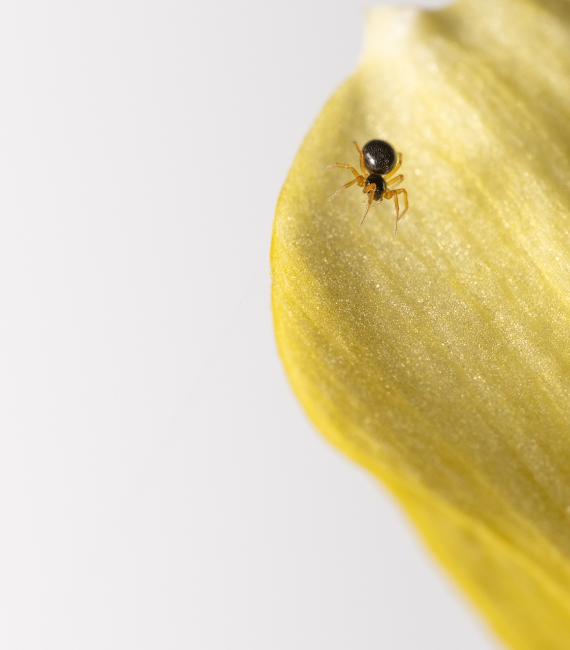
Lemons > Lemonade. That's exactly what I thought when I first saw this Dean. It's technically strong, IMHO, as your stuff always is. But, what matters about this image is the juxtaposition of the pattern of power lines, with the curves of the smoke trails.
To me, the real lesson is the need to think outside that box. I know this has become cliche', but I believe in it strongly. Matching someone else's awesome shot is great and all, but getting a different angle, a different emphasis, and creating a different portrayal of something is absolutely critical to developing our own styles. Anyway, I think you nailed it, and congratulations for giving something unconventional a chance.
|
Jul 13th |
| 60 |
Jul 23 |
Comment |
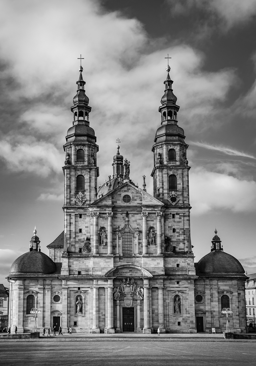
Landscape? Architecture? Travel? No need to really pigeonhole the image Debbie. Exposure/DoF look spot on to me. I think exposure is perfect, with enough detail in shadows, but nothing blown out. GREAT job on the object removal of the human (although, very often, a person can add context, scale, and interest to an image like this. Of course, they can ruin it too).
I think your composition has some real strong points too.The leading lines of the sidewalk in the foreground bring the eye to the first doorway in the mid ground, which leads the eye to the far structure, in the background. Also, I dig the way the trees frame your first doorway. Cherry.
Like Dean alluded to, your structures narrow at the top, which is called "keystone" distortion (or "keystoning") and isn't against the law, but avoiding or minimizing it is one of those conventions of architectural photography that I believe in. It occurs because the axis of the lens is not perpendicular to the vertical surfaces of the structure's walls. You can see that the center of the image is somewhere near the top of the rose window, meaning that you're pointing up, thus creating that angle. Eliminating this is one of the main uses of the tilt shift lens. The Transform tool in LrC can handle some of it, but I'm a big fan of dealing with it in-camera.
https://pixelcraft.photo.blog/2020/07/14/why-do-buildings-lean-the-keystone-effect/
What are your thoughts re: adding just a touch of saturation, especially to the sky? Just asking.
|
Jul 13th |
| 60 |
Jul 23 |
Reply |
You can certainly make a "virtual copy," and then play with the aspect ratio. Or, you can simply take the original and try different crops on it. Since Lightroom (LrC) is "non-destructive" you can always just go back to the crop you had before.
|
Jul 8th |
| 60 |
Jul 23 |
Reply |
Hey, It's your image. These are just my thoughts.
But, I think you might have missed that as for cropping to a particular aspect ratio, I said "but I can't see why you wouldn't just do that in post-processing." So, if you care to make it some other aspect ratio, make it easy on yourself and just do it in post. Again, just my thoughts... |
Jul 7th |
| 60 |
Jul 23 |
Reply |
Good questions Anne.
So, aspect ratio is the relationship of the vertical and horizontal measurements of your image, and is expressed as a ratio (with the horizontal first, then vertical). Your camera shoots in 3:2. Your monitor is 16:9. And a square, of course, is 1:1.
Common aspect ratios for photography are 3:2 (same at 6X4, or 4X6), 16:9, 4:5 (same as 8X10, or 10X8), 11 X 17, and of course, 1:1.
https://en.wikipedia.org/wiki/Aspect_ratio_(image)#:~:text=In%20still%20camera%20photography%2C%20the,medium%20format%20and%20large%20format.
I think most cameras allow you to crop to various aspect ratios before outputting, but I can't see why you wouldn't just do that in post-processing. You currently have a portrait oriented (instead of landscape oriented) aspect ratio, but by going with something more square, it can change the composition. All make sense?
As for cleaning up edges, like I said above, you have things intruding into the frame from the sides, and things leaking out of the frame. Those can be removed in post processing, if you like, and if division rules allow, so that you have a cleaner image.
Thoughts? |
Jul 7th |
| 60 |
Jul 23 |
Comment |
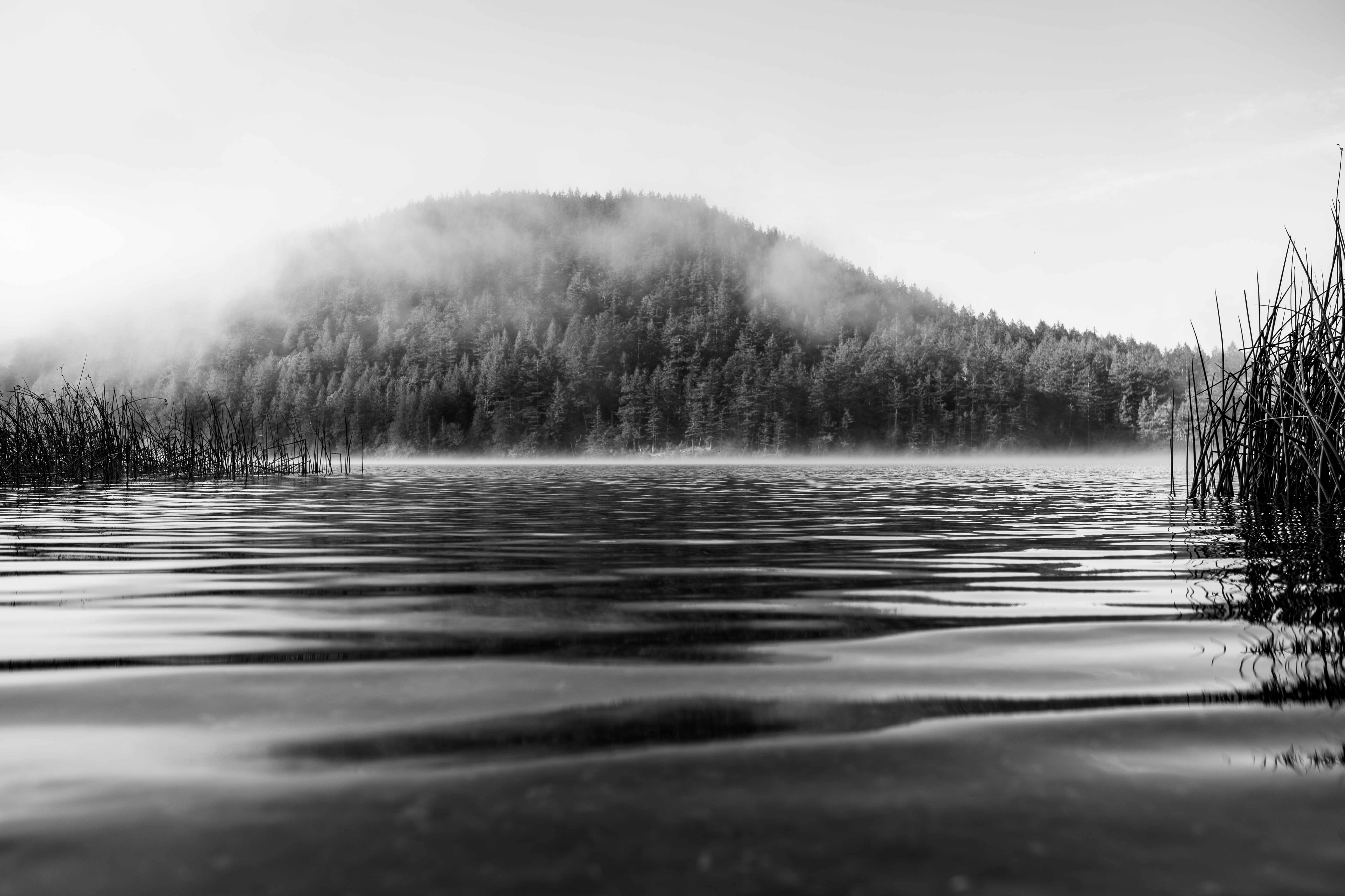
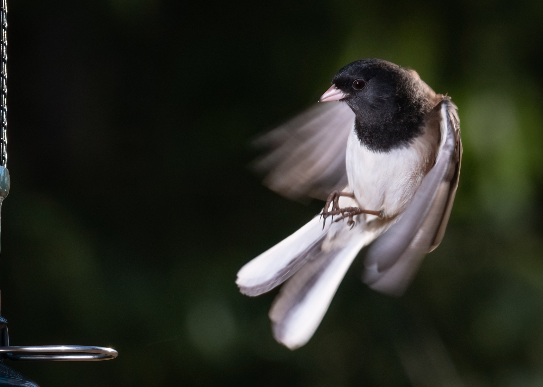
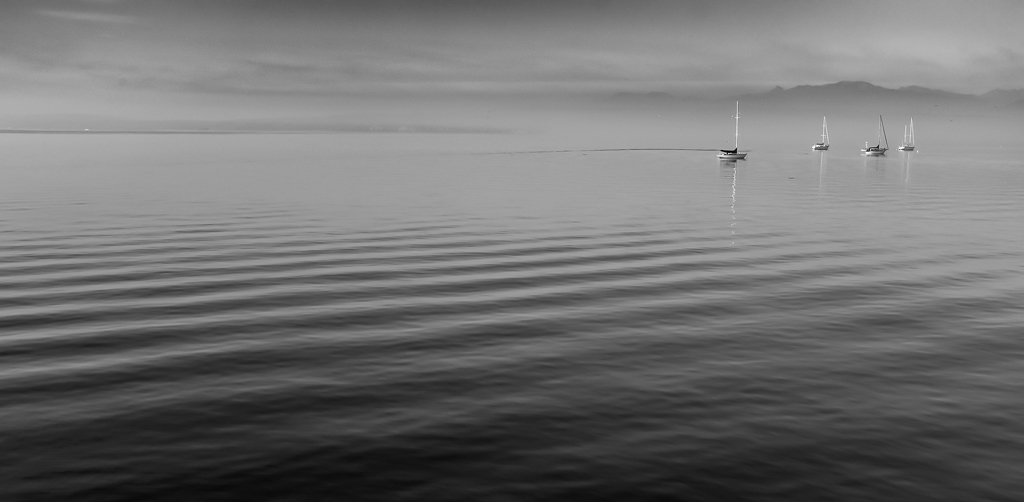
Hi Rita. The evening sky with swallows/swifts IS a wonder isn't it? I would love to get some really detailed shots of these birds, but alas, they have eluded me.
I'm glad you were able to capture the birds crisply, and even managed to get some color on the underside of one of them, which I think harmonizes with the color of the sky well. The moon and clouds look sharp, or as sharp as they should (sharp clouds?) to me as well.
I too had the impression that there was a bit more sky than absolutely optimum. Originally, I envisioned a landscape aspect crop, with about the same amount of breathing room for each bird. Then, looking at it again, I came up with something in my head like Dean's suggested crop, which to me contains the elements of the bird trio, and the what appears to me kind of like a cloud trio as well. I think if I had my druthers, I'd crop further to the right than Dean, but then I'd have to remove some cloud from the lower, right corner of the frame. Anyway, I think the strategy of more birds/moon and less clouds is a good one. Keep it up. |
Jul 7th |
| 60 |
Jul 23 |
Comment |
Hey Anne, I think you've captured some interaction here that really adds to Nature images. In fact, the Nature Division definition specifically talks about inter- and intra- species interaction as a discriminator when judging.
As far as I can tell you've nailed the technicals of good exposure, focus, and realistic color too. Kudos.
Re: composition, I would sure like to see the subjects fill more of the frame than they currently do. Like you refer to, that's not a simple matter of cropping though, based on where the subjects lie in the frame, and the fact that you probably want to give them breathing room, away from the edges.
But, I do have a couple of suggestions:
First, I think you might be able to abandon your current aspect ratio, and choose a size that's a little closer to square. That might not be possible, but I think I'd give it a shot if it were my image. That might make your cropping job easier.
Once I'd done that, and even if I hadn't, I'd try to use some post-processing magic to clean up the edges of the image (things that intrude into the image from outside the frame, and things inside the frame trying to escape) which to me would really simplify it. It would just be a whole lot easier if you subjects were closer to each other, but hey, you get what you get.
Anyway, good technicals. These are good subjects too and your patience and repeated experience with them will pay dividends. |
Jul 7th |
| 60 |
Jul 23 |
Reply |
Good feedback on the central image there Dean. I hear where you're coming from. Truth be told, I've always kind of thought that having anything between the viewer/camera and subject was just bad, and distracting execution too, but over the course of the last year or so, I've seen lots and lots of uses of the technique. I've been trying to incorporate it when I can think about it. But, I realize it's kind of a taste specific thing. Anyway, I'll keep playing with it. |
Jul 7th |
| 60 |
Jul 23 |
Reply |
Thank you Ma'am. This isn't a technique that I use very often...in fact, hardly at all, but I'm trying to use more and more. I think that it can take two-five images that are OK, but not really blockbusters on their own, and put them together so that their whole is greater than the sum of their parts. A can remember that a club mate of mine took five close ups of bark, what were kind of on a color gradient, and put then in a pentaptych (?) that I was really impressed by. I don't think I would have given the individual images a second look, but I really liked her work.
I think there are a lot of different ways to do this, but I was taught on Ps. I'm all ears for any suggestions or tips you might have re: the technique. |
Jul 7th |
| 60 |
Jul 23 |
Reply |
Thank you Anne. Would direct sun have added? Don't know, but it's a good comment.
Oh, and you might have noticed that you have a submission already. That's in error, obviously, but I can't figure out how to remedy it, without putting something in its place. So, I'll fix it when you actually submit. |
Jul 3rd |
4 comments - 9 replies for Group 60
|
4 comments - 9 replies Total
|