|
| Group |
Round |
C/R |
Comment |
Date |
Image |
| 60 |
Jun 23 |
Comment |
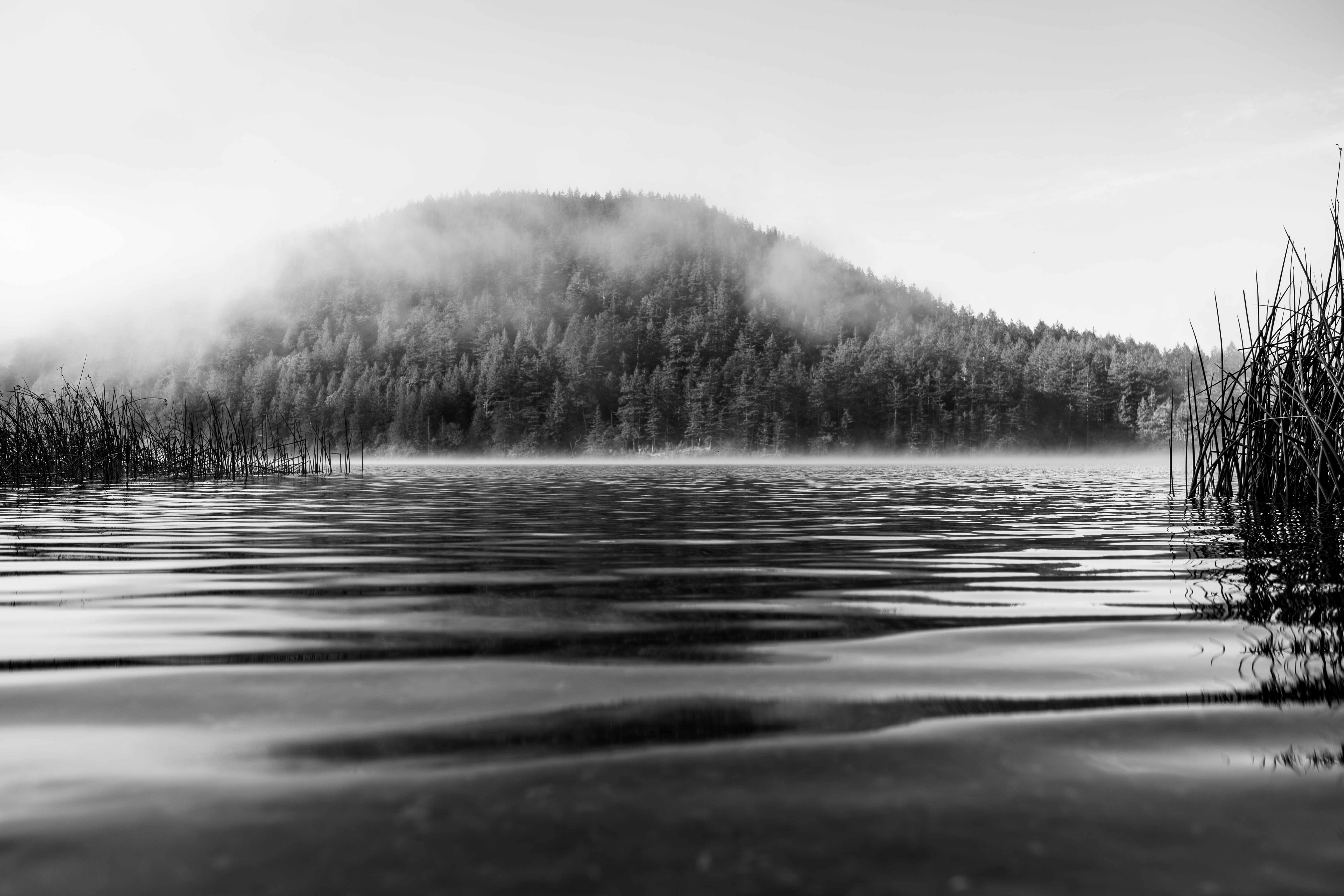
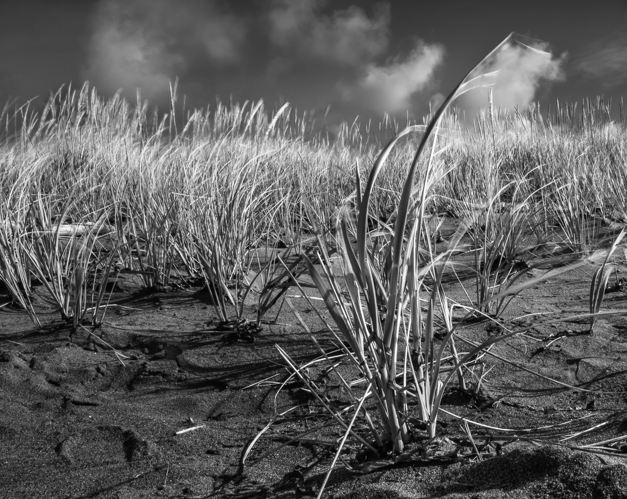
Nice repeating patterns Anne. They really help the impression of depth in this case. The decision to go B&W was the right one, IMHO, because it eliminates and potentially distracting color. Exposure works great IMHO (I think it could be more contrasty, but I don't think it has to be, and I really what you've done.). Good eye on the composition, which again, give depth.
Can I make a Fuji specific suggestion? Check out your film simulations. If you want to, then make sure to shoot in JPEG + RAW. The simulation will only apply to the jpeg, so that if you like what it's done, you win. If you don't, you still have the untouched RAW. I DIG the Acros simulation. |
Jun 14th |
| 60 |
Jun 23 |
Comment |
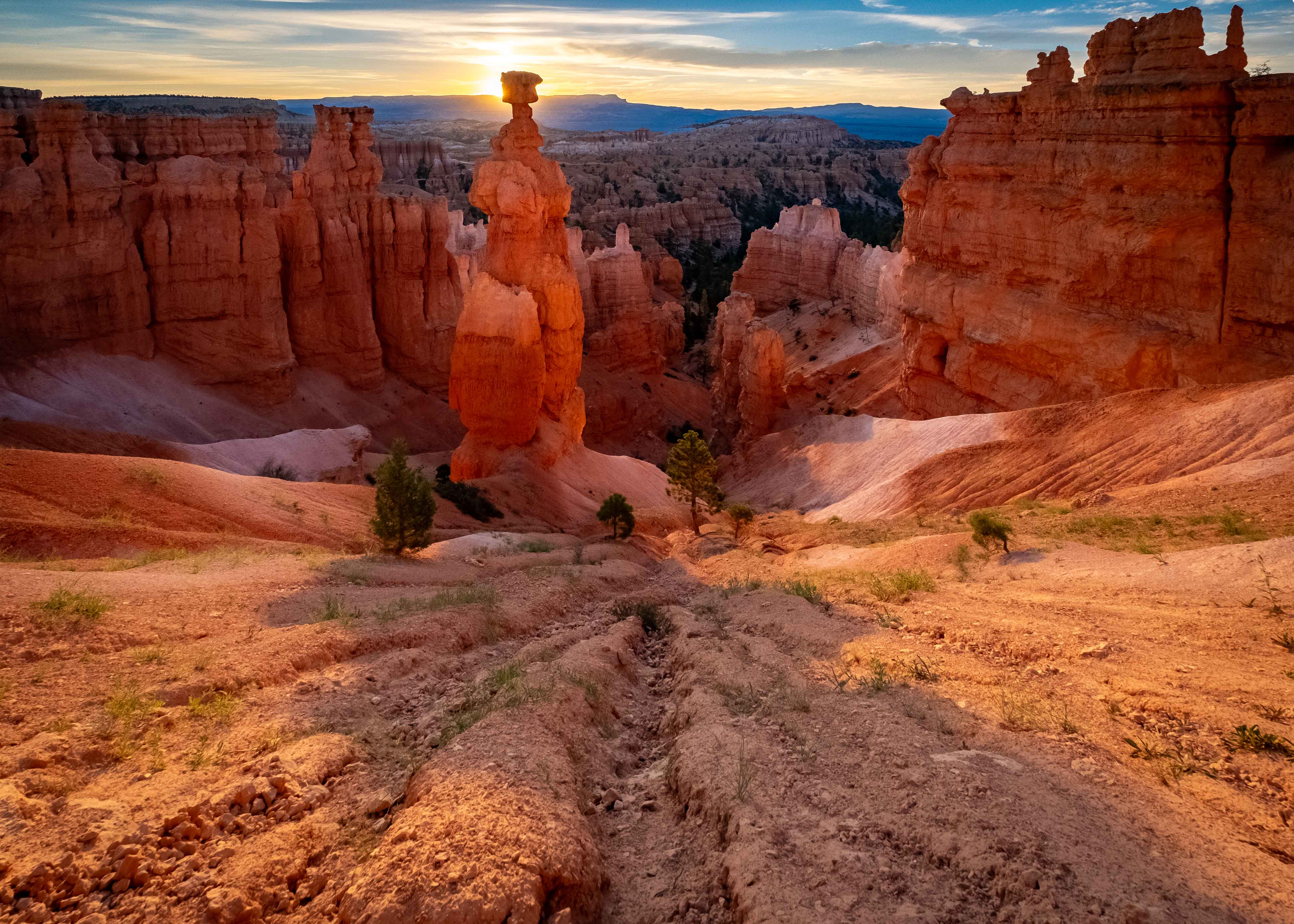
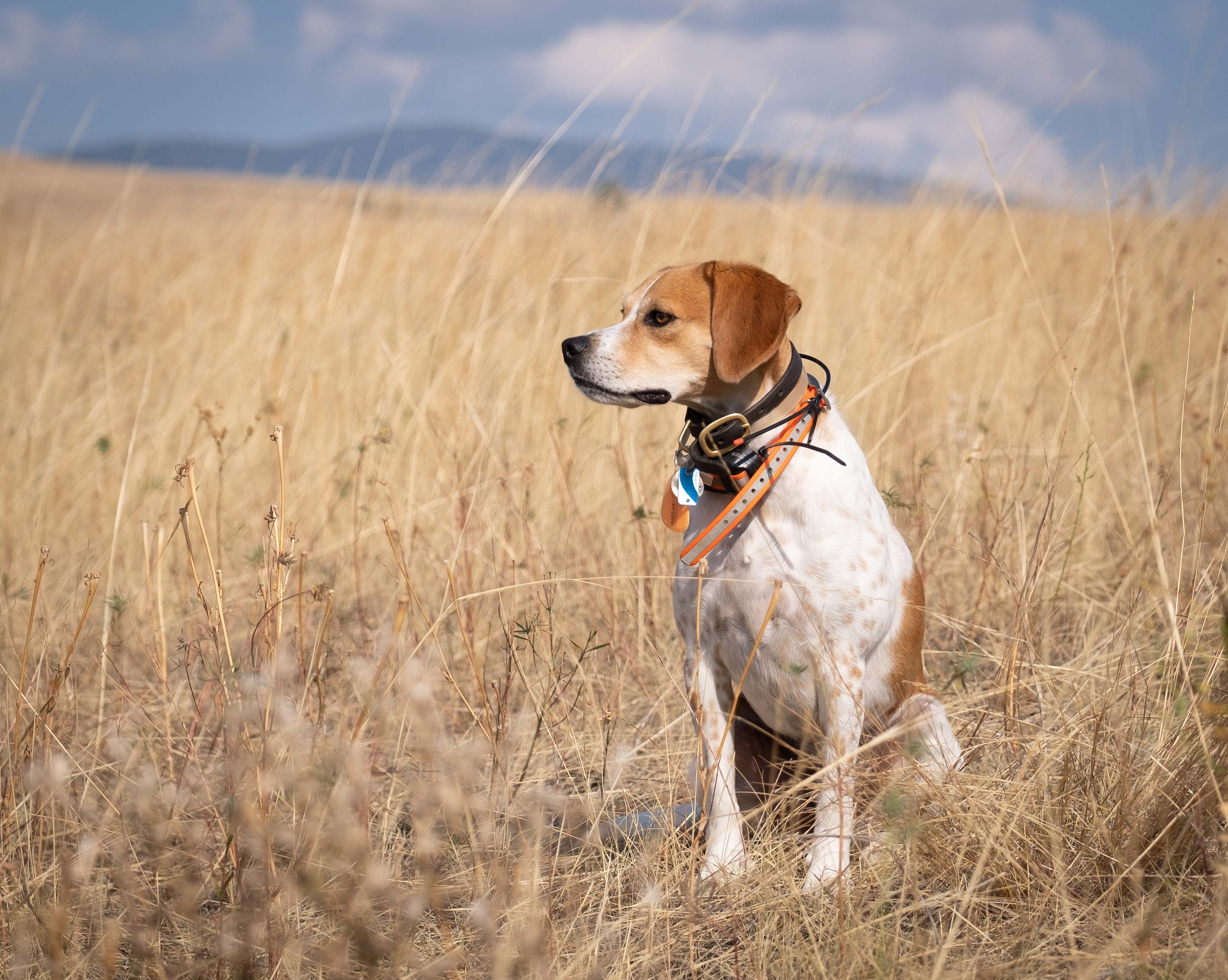
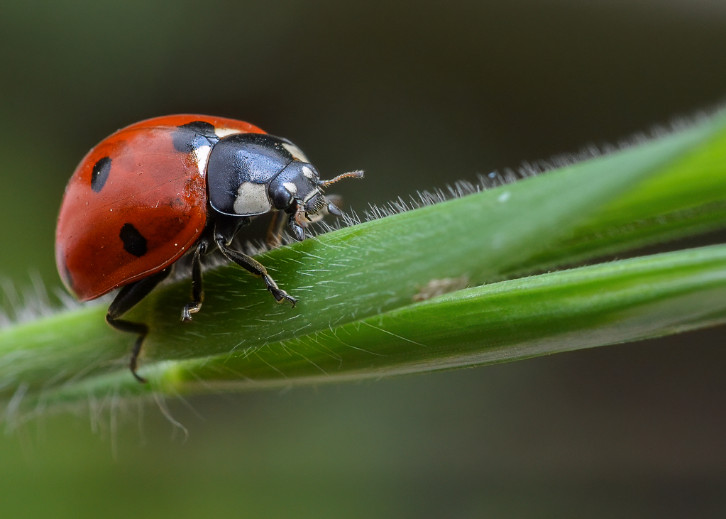
So that's a teasel huh?
I really dig the soft bokeh of the background, which implies detail to me, but doesn't have any detail sufficiently notable to draw eyes away from the subjects. The sharpness of the subjects contrasts the background beautifully. Exposure looks about as good as can be, and the semi-backlighting really helps emphasize the sharpness. Good job separating the subjects from everything else, and keeping the edges clean.
I kind of wish that (from left to right) teasel 1 and 3 were not so close in height to each other. I mean, they're not exactly the same height, but they're close enough that my very first impression was one of symmetry, and not of natural disorder. I'm not just making that up so that I can find something to critique. I think if it were me, I'd mess with rotating the frame to change their heights relative to each other, but that might mess up the angle of the stems. It's a good shot regardless and this is a super-picky, aesthetically personal thing.
What would you think about a vignette? |
Jun 14th |
| 60 |
Jun 23 |
Comment |
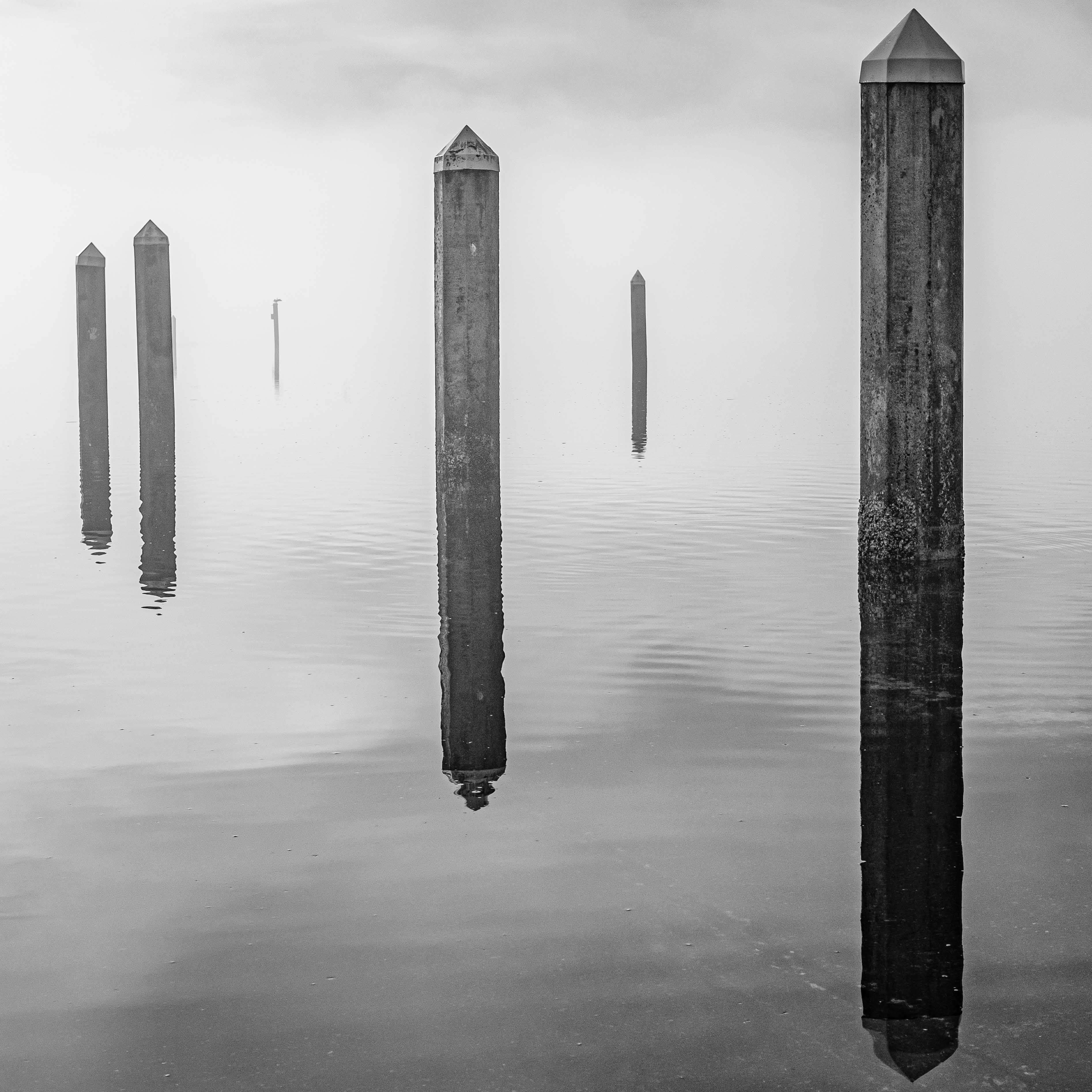
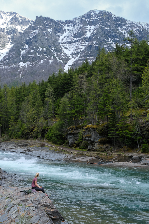
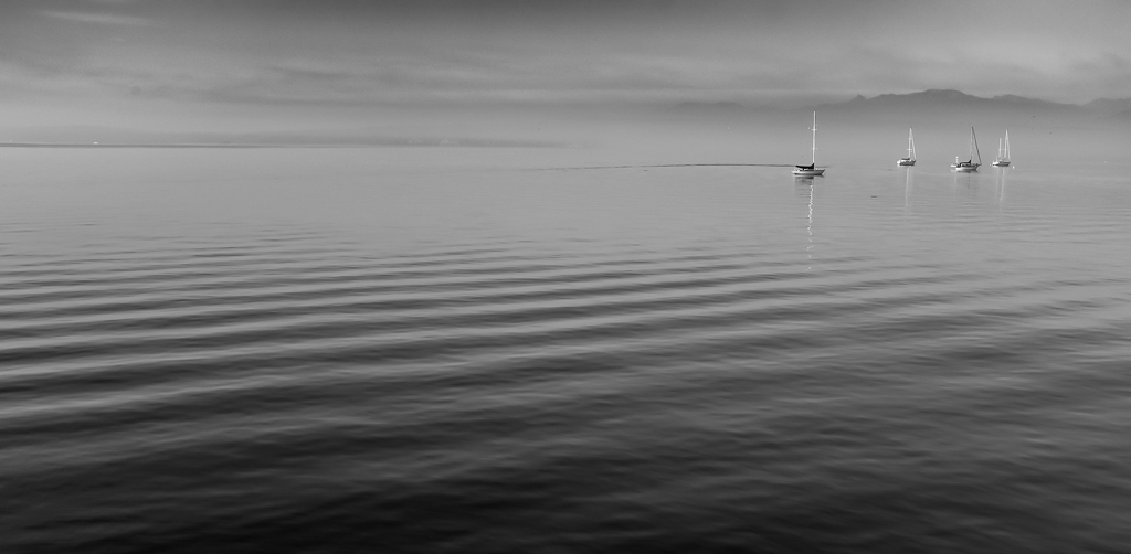
I like the minimalism too Dean. How'd you color grade it? Yes, the strong horizontal element is good and, IMHO, it's at the right height in the frame. In many cases I'd say most of the water is dead space, but in this case, given the simplicity of the composition, I'd call it empty space, since it contrasts the dark lines on the horizon.
Is it just me, or is the horizon a bit low on the right? Sometimes that's nearly impossible to tell |
Jun 14th |
| 60 |
Jun 23 |
Reply |
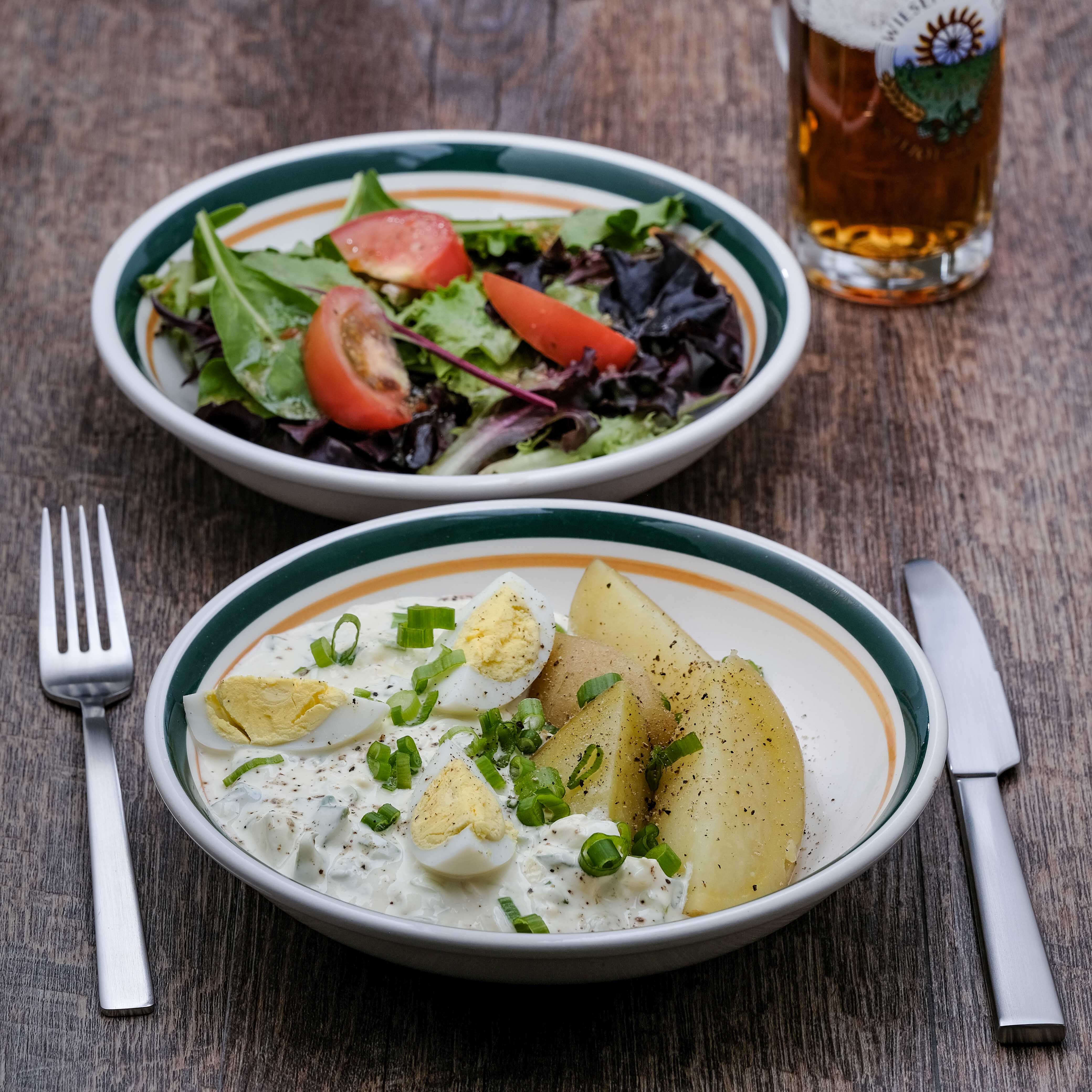
Thanks Debbie, and interesting comments by you and Anne re: the amount of beer being shown. I had the exact same feeling that by pushing the beer into the background, and cutting off the top, that it de-emphasizes it, but lets it support the subject. Not everyone feels the same way though, I can tell you. I guess just epicures like us understand. ;) |
Jun 14th |
| 60 |
Jun 23 |
Reply |
This is schnittlauch sosse, which translates to chive sauce. It's really just sour cream and LOTS of chives with chopped up eggs. It's a traditional German thing. |
Jun 14th |
| 60 |
Jun 23 |
Reply |
That might be good Rita...I mean, crab cakes with anything, right? |
Jun 14th |
| 60 |
Jun 23 |
Reply |
Thanks Dean. Good eye for detail. And, I gotta tell ya, food photography REALLY takes your attention to detail to task. |
Jun 14th |
| 60 |
Jun 23 |
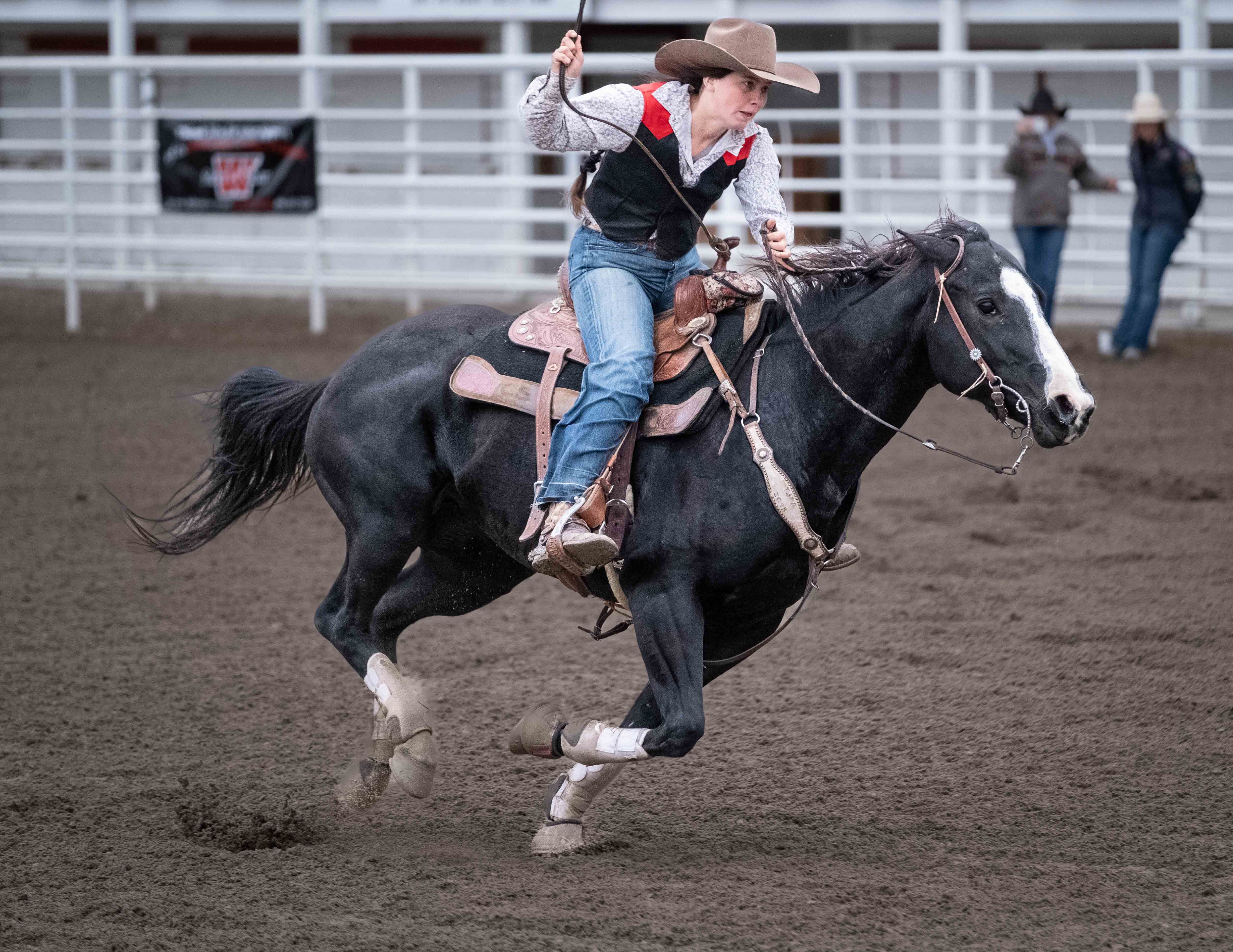
Comment |
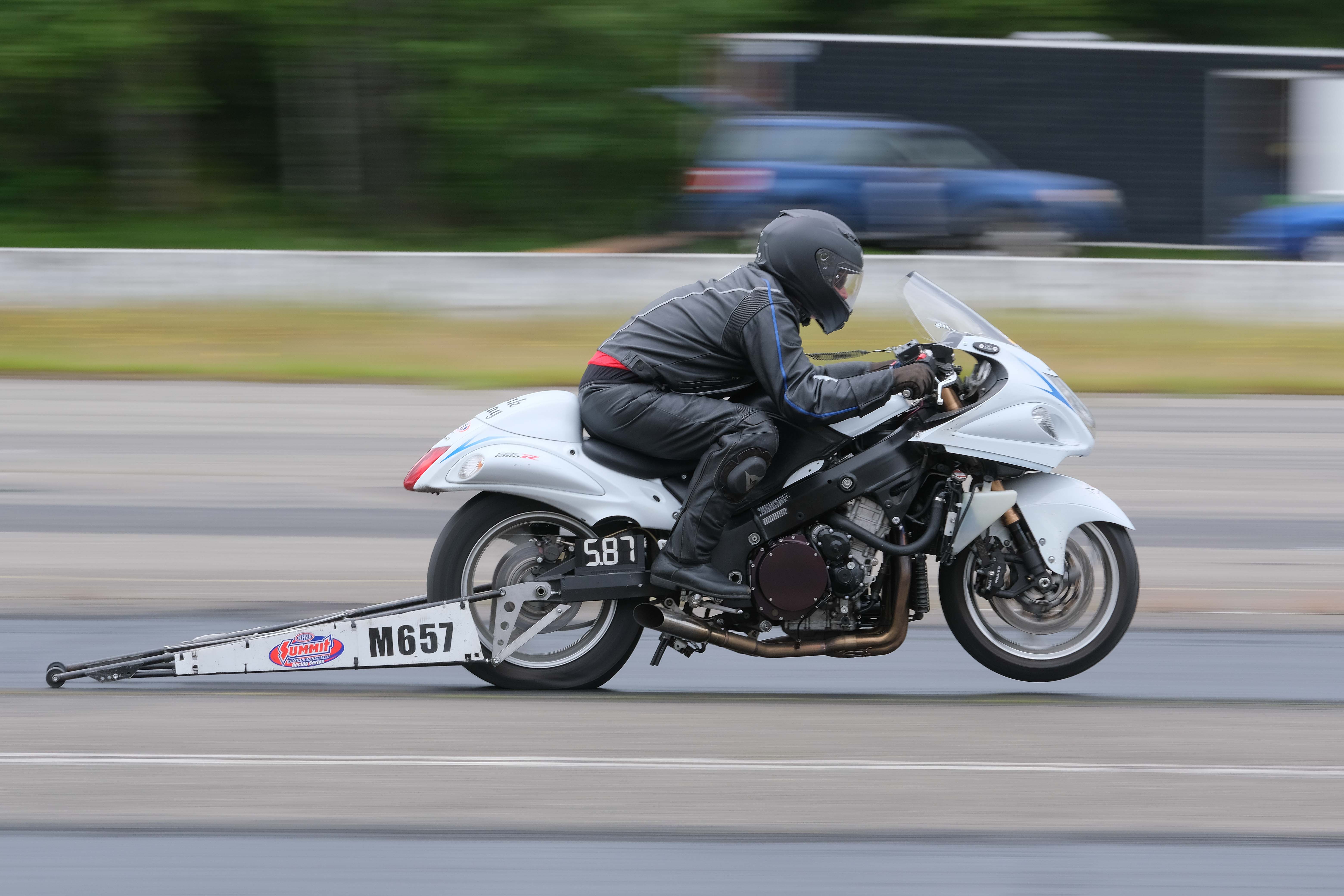
I dig it Rita. It's sharp, contrasty, well-composed (I like the people in the saddle of the hills) and full of texture. I can't critique it much really. Kudos.
How to strengthen it? Could you cut out a bit of the very bottom of the frame? Maybe but would that strengthen it? Don't know. It would move the people off the upper right crash point, which might really freak some people out. But, I like humanity stuffed into a corner in a wide landscape, so I think I'd like it.
It'd be nice if Person 1 and Person 2 didn't merge, but I don't think that's fatal at all. Generally, I think it's pretty strong as-is. |
Jun 2nd |
4 comments - 4 replies for Group 60
|
4 comments - 4 replies Total
|