|
| Group |
Round |
C/R |
Comment |
Date |
Image |
| 60 |
Mar 23 |
Reply |
Good point! |
Mar 28th |
| 60 |
Mar 23 |
Reply |
Thanks Rita. Wait! The sky can be some other color than grey? What? Oh, yeah, I seem to remember that from...months ago. ;)
I think you're right though, and had the sky been blue, I think it would have been a nice touch, especially using HSS to make it a nice dark blue. I'll keep that one in my back pocket. Thanks. |
Mar 28th |
| 60 |
Mar 23 |
Reply |
Thanks John. This was definitely a reach for me style-wise. But, I appreciate that you at least found it interesting. Thanks again. |
Mar 28th |
| 60 |
Mar 23 |
Reply |
Sorry for not replying sooner. I've been getting eaten alive by video editing. Mea Culpa.
Interesting ideas on how to add story to the image though. Good stuff. Thanks. |
Mar 28th |
| 60 |
Mar 23 |
Reply |
Too much on the colors, IMHO. But, for PSA competition? Man, that's hard to say. So much depends on the judging club and what THEY like. So, I would just go with your gut. Express yourself. Don't be limited by my sensibilities; go with YOUR sensibilities...consistently. |
Mar 13th |
| 60 |
Mar 23 |
Reply |
I happen to like the crop better. |
Mar 13th |
| 60 |
Mar 23 |
Comment |
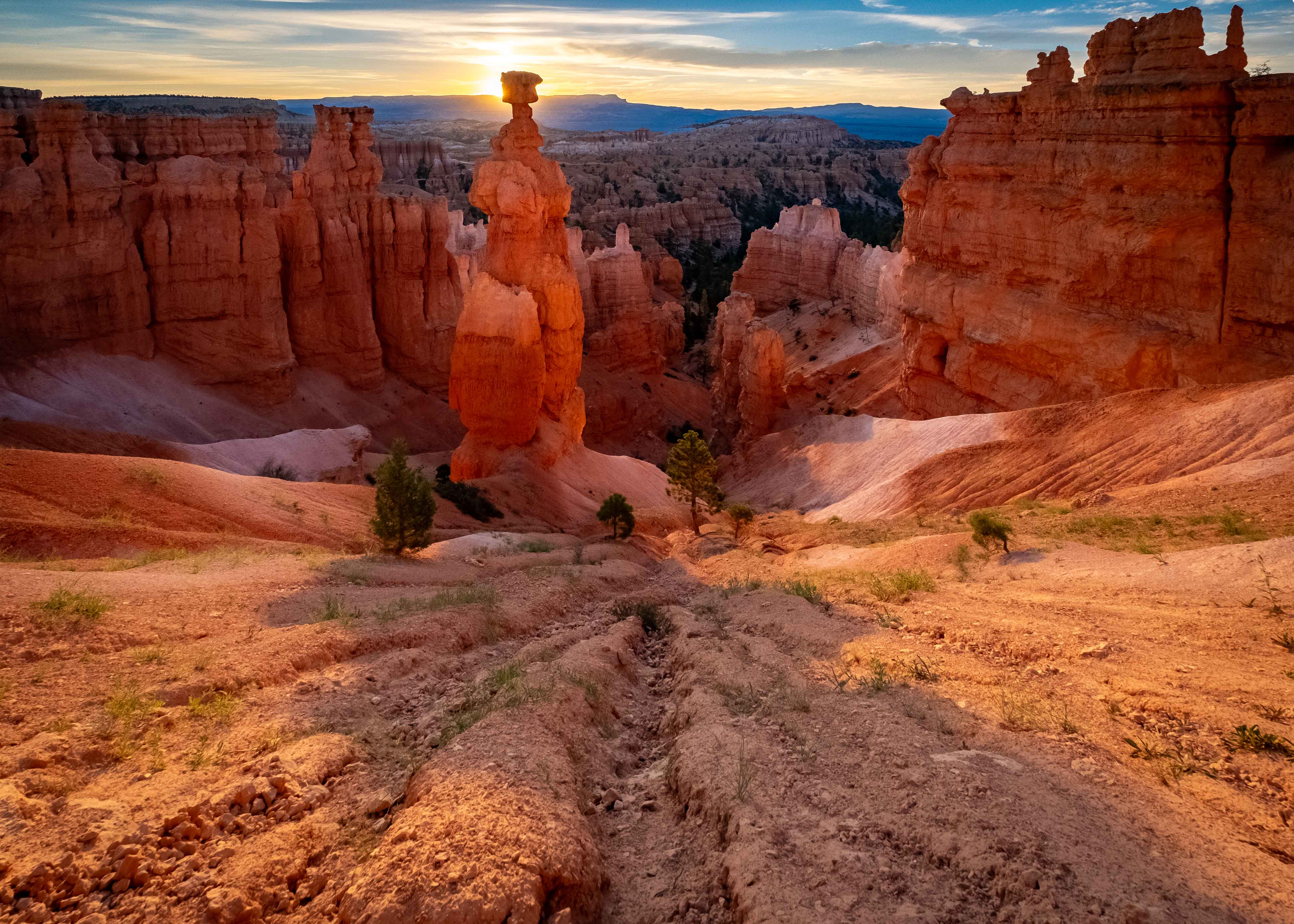
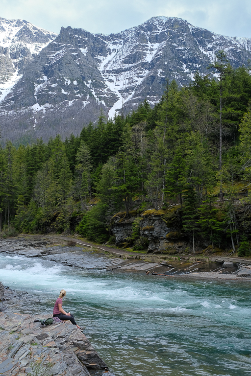
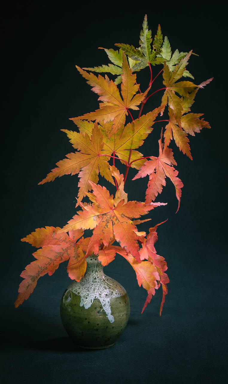
Powerful image Rita. I love the simplicity of the composition, with the butte on an unconventional point in the frame (I try to do this too). Sky colors seem aggressive to me (in a good way), but not unnatural, having lived in the high desert of CA and seen some sunsets that just didn't seem real or possible.
I think I'd echo Dean's comments re: cropping up. In my opinion, there isn't really a strong foreground interest (I don't do a whole lot of landscapes, but I do try to think about this when I do) that precludes you from doing so. If it were me, I'd do so until what was in the foreground was truly sharp, which the closest stuff did not seem to be to me (I think that might have to do with your aperture, and focusing on the peak). If you need to lose some sky in order to keep the horizon where you want it, I think you can do that without losing anything too important in the sky (you'll have to experiment).
Anyway, strong image in my opinion.
|
Mar 11th |
| 60 |
Mar 23 |
Reply |
This is just me Debbie, but I love the rest of the falls. I think if it had been my photo, I'd have cropped to 1/4 down from the top, and 1/4 in from the right, putting your crop in about the crunch point of the lower right. Just me. Still, very cool.
As for HDR technique, I think it really depends. When you say that you had "three different exposure compensations," what do you mean exactly? Did they have three different exposures? The way I do HDR, is to use the exposure bracketing feature on the camera, which allows the camera the choice on which control (f stop, shutter, or ISO) to vary in order to give me an a) under exposed (according to the camera's perception of an proper, 18% grey exposure), an properly exposed, and an over exposed image (again, according to the camera, and by the number of stops that I've requested).
Then, I use Lightroom (I think it's under the Edit menu, Combine Images...don't quote me) to have the system automatically combine the three exposures. Then, I mess around with the final product.
There are however, other ways to do this, notably in photoshop, with layers.
As for your WB experiments, are you familiar with the LrC Color Grading Panel, and the idea of split toning? It's super powerful, and if you're at the point in your experimentation where you're looking to move into color effects, this might be the panel for you. It's not my thing, but maybe it's for you. |
Mar 11th |
| 60 |
Mar 23 |
Comment |
Good on you for experimenting Debbie. I think you did a good job of capturing the creamy nature of flowing water. It seems sharp where you want it and soft where you want it. Exposure looks good to me, as I don't see anything that looks blown out, which is a major accomplishment in its own right with this subject. Kudos. I appreciate the composition of the three different tiers moving throughout the frame.
I assume you played with series of shutter speeds, gauging what the different settings had on your sense of motion and detail in the image. This looks really dreamy.
Re: your tight crop, this is just me, but if possible (distracting objects permitting), I'd kind of like something wider, with a little more context. Having said that, I didn't see your original, so your decision to crop tightly was probably perfectly warranted.
Uh, you mention that you managed white balance and other settings. What adjustments did you make? I ask that because this looks very monochrome blue to me. So, if that's what you were going for, you succeeded at your artistic intent.
|
Mar 9th |
| 60 |
Mar 23 |
Comment |
Hey John, I dig the theme here. Everything's super sharp here to me. I like the exposure overall. And as far as subjects go, I don't think you could get much better than those books. And, BTW, I commend you on playing with still life images. As you may have read, I think the genre gives the photographer enough control to really play with and master the elements of putting a good photograph together. Kudos to you.
As far as things that I might change, I have two basics, and one extra credit. In my opinion, the crop is kind of tight, especially on top. I have a tendency to crop too tightly, so I know whereof I speak. Is it possible to loosen it?
In my opinion, this lighting setup doesn't really contribute to the image. I get the impression that the white balance is pretty yellow, and it's definitely very soft (except where it isn't, like under the crossbeams on the wall). The color can be changed in editing (although it's preferable to get it right in camera), but to me, the lighting character (how soft it is), doesn't really suit the subject. Just my thoughts. Are you tuned into this idea of hard v.s. soft light? Check this out: https://en.wikipedia.org/wiki/Hard_and_soft_light
And that leads me to the extra credit. I would LOVE to see another version of this, shot so that it appears to be books on a table, with maybe a pistol resting on top, but with lighting that appears to come from an open window. Of course you'd have to meticulously stage it, but it would appear NOT STAGED, and natural. You could fill the frame with the subjects, or crop more loosely to include more of the room. And wouldn't window light, in an otherwise unlit room, on a wooden table, just scream old west? Anyway, just my thoughts. I'd love to see you pull it off, and if you want collaboration on the lighting, I'm your huckleberry. ;) |
Mar 9th |
| 60 |
Mar 23 |
Reply |
I used off camera flash (GODOX V1) and a trigger for the flash setup Debbie. I get your point of trying to tell the story of shoes kicked off on the way to the water...but that wasn't what I was going for. As mentioned, I started the with the idea of tattered shoes by the roadside, but it developed into this idea of shoes simply someplace they were completely out of context, and alone, possibly forgotten. Given that, telling a skinny dipping story wasn't my goal. But, your comments are valid, and if it doesn't speak to you then that's all there is. I appreciate your input. |
Mar 9th |
| 60 |
Mar 23 |
Reply |
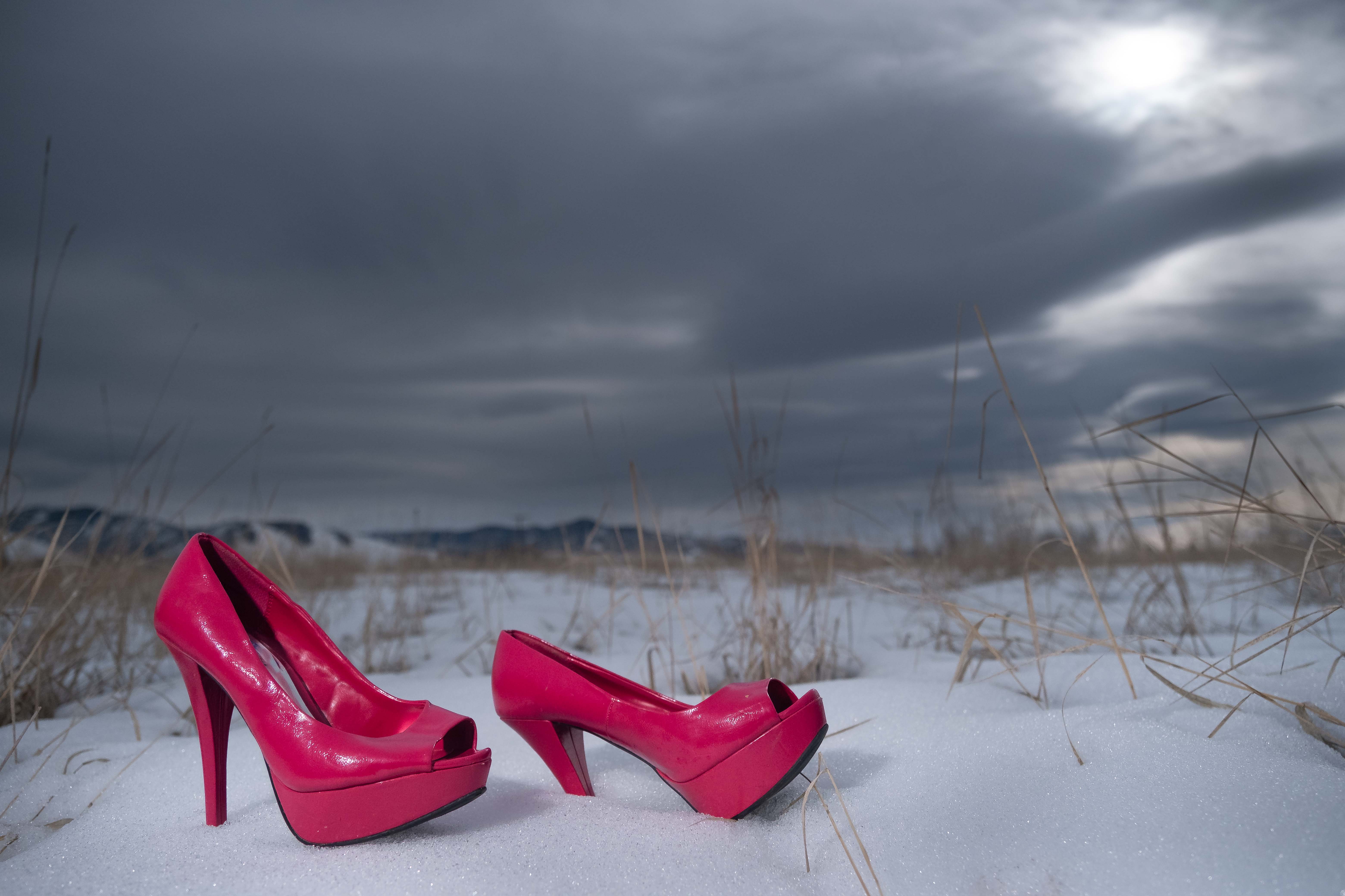
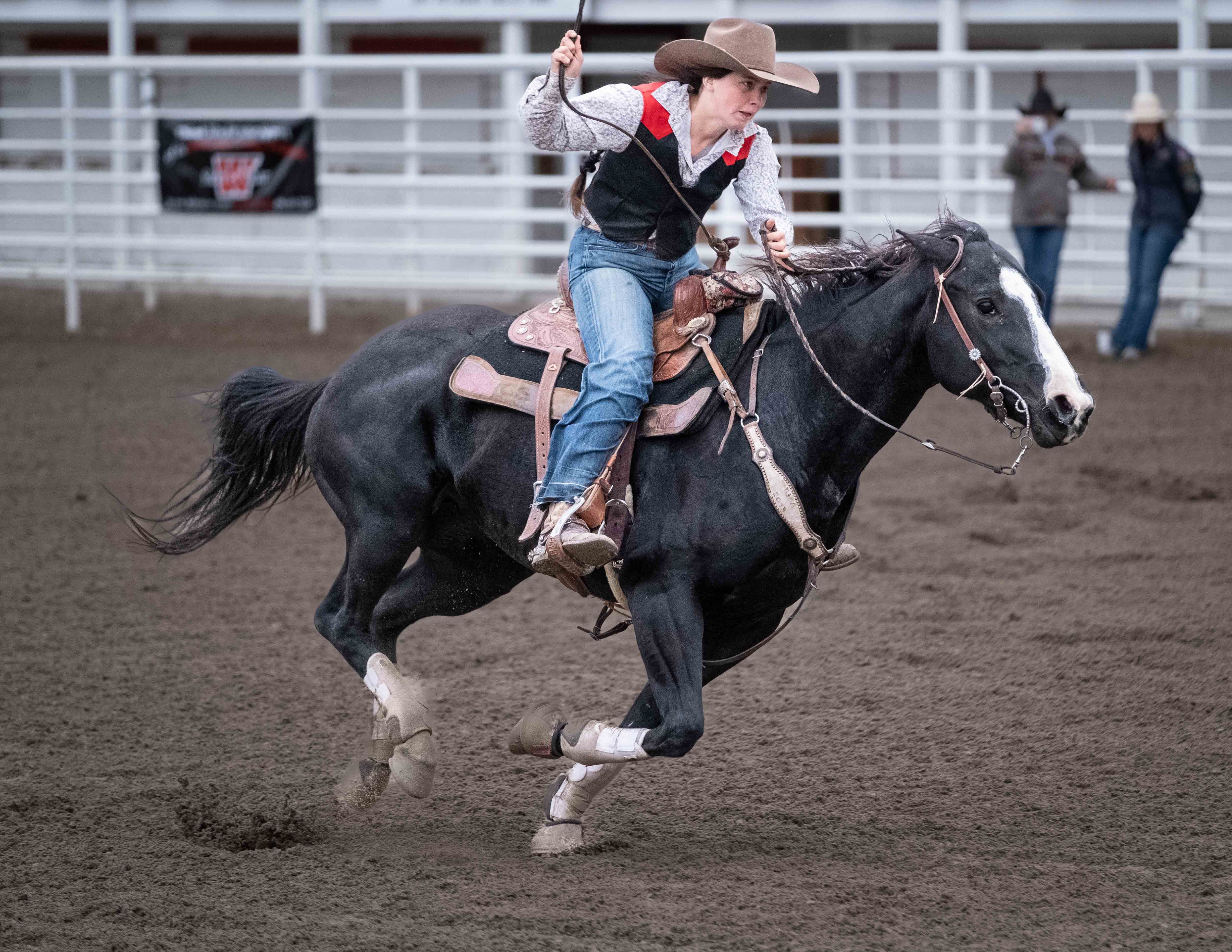
Fair comments Dean. I confess, this is not my usual style, but when given the assignment, this is what came to mind. I had some other shots in which there's even more sky, and some with less, but this seemed to be the just the right amount (at least that's what it felt like at the time) to give that sense of juxtaposition between the ominous sky, bleak environment (lemme tell ya, this is what Western Montana feels like 1/3 of the year) and these relics of the disco era. But, I understand your point. Thanks for candor. It's something to think about. |
Mar 9th |
| 60 |
Mar 23 |
Comment |
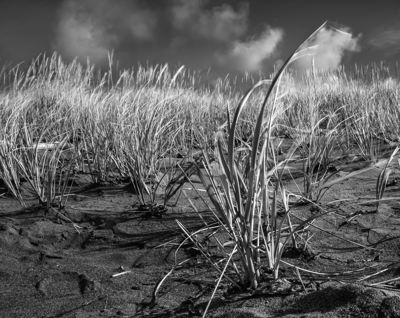
You definitely have color and texture going on here Anne. I think you could photograph this from any distance and detail, and make something abstract out of it. It's sharp, and well saturated to my eye.
This is just my opinion, but this really isn't the most moving subject. Having said that, I salute you for seeing the possibilities in everyday objects. I'm not knocking your decision to give this a shot. I think if I were going to make a suggestion, it would be to get into the details of something like this. There was obviously something interesting about this for you, and I too find beauty in the details of common objects. Explore this. Do more of it. Double down. |
Mar 7th |
| 60 |
Mar 23 |
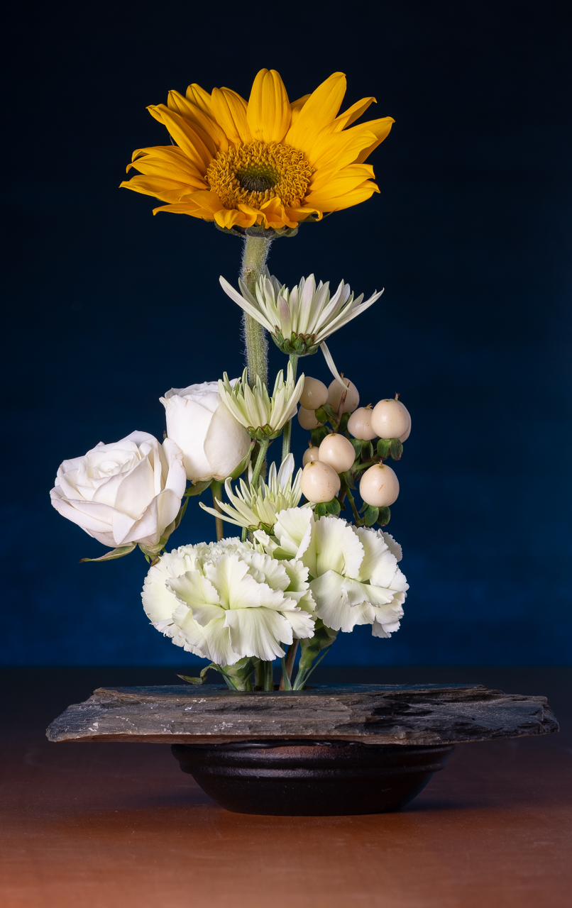
Comment |
Nice color harmony to me. Composition seems balanced to my eye. Good job on keeping specular hi lights down on the metallic stuff. Did you put a vignette in, or was that just the lighting pattern? Nice, soft lighting compliments the subjects I think.
I think the crop is a little tight on the right, but given your nice, seamless background, that could easily be fixed in Photoshop by cropping out, and then doing a content aware fill. Easy Peasy...but you probably knew that.
This is just me talking' but I like still life. Your ability to control everything (or at least a lot) gives you the ability to manicure your images. I learned a lot about artificial lighting by working on stills. Anyway, don't give up on them yet. |
Mar 7th |
| 60 |
Mar 23 |
Comment |
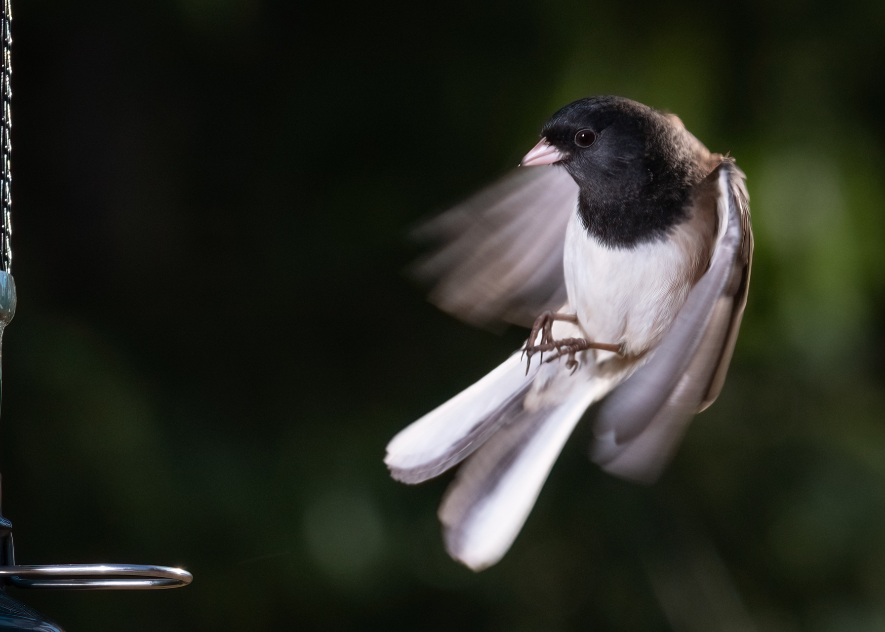
When I saw your woodpecker shot, I knew you were a glutton for punishment Patrick. ;) I've seen enough presentations on bird photography to know how incredibly challenging it can be. I mean, you have almost no control...over anything, so getting that shot is just so challenging. But, on the flip side, bird photos can be super powerful, so I admire your perseverance and drive. Keep it up.
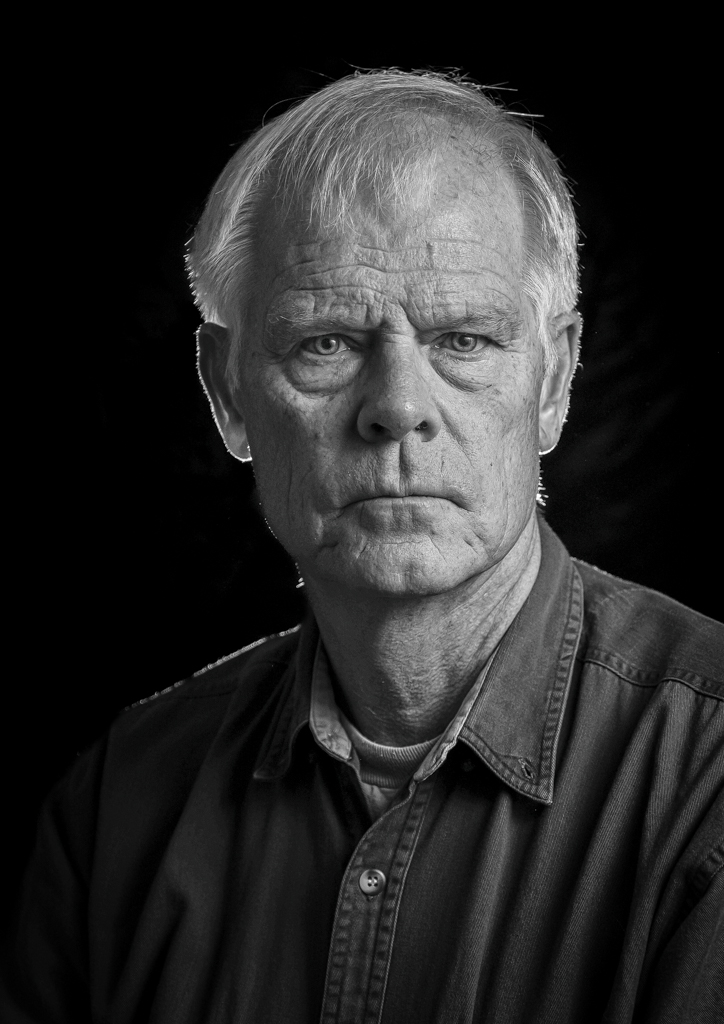
As far as choosing images for use to critique, I don't think I'd worry about it if I were you. It's a learning process no matter what. I would suggest you submit recent stuff (which is indicative of your current skills), and those images that you feel less confident about. If you have questions about an image, or feel uncertain as to how you did, that's the kind of stuff that we can help with. I don't submit the images that I feel I really nailed, and I don't submit images that I KNOW what's wrong with them. I try to submit stuff that has me scratching my head, or is stuff that's kind of timely (like that flash/ambient portrait I did a few months ago). This is a mutual admiration society (for me anyway), not a contest. I'm willing to let you guys see the warts. It's good training. |
Mar 7th |
6 comments - 9 replies for Group 60
|
6 comments - 9 replies Total
|