|
| Group |
Round |
C/R |
Comment |
Date |
Image |
| 60 |
Nov 22 |
Reply |
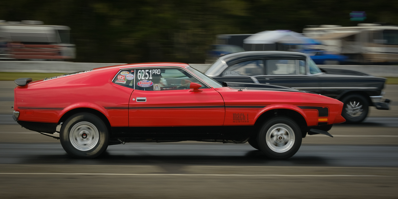
Thanks Rita. Hope your Thanksgiving was good. Well, you're right that the top is cropped tighter than ideal. I think that's really a result of my attempts to eliminate stands/people/distractions from the opposite side of the ring. I've done a pretty fair amount of sports photography, and this a very common dilemma: keep more distractions, or crowd the subject. I think when looking at sports and photojournalism it's a good idea to remember that we CAN judge them by the same criteria that we judge other, more deliberate genres (and sometimes you get images that actually stand up to that rigor), but generally, they just can't meet those standards. I'm not making excuses, and your comments are well-taken, but it's just a discussion point. |
Nov 25th |
| 60 |
Nov 22 |
Reply |
I guess I should have mentioned that I was on continuous high drive mode Patrick, at 13 fps. So, even that trick wasn't enough to make up for my lack of creativity. But hey, that's why we stick with it, right? |
Nov 24th |
| 60 |
Nov 22 |
Reply |
You know, maybe it's just me, but I think this really IS a stronger image Anne. My attention is more centralized. I think the slope of the room is a stronger compositional element. Thumbs up IMHO. What are your thoughts? |
Nov 23rd |
| 60 |
Nov 22 |
Reply |
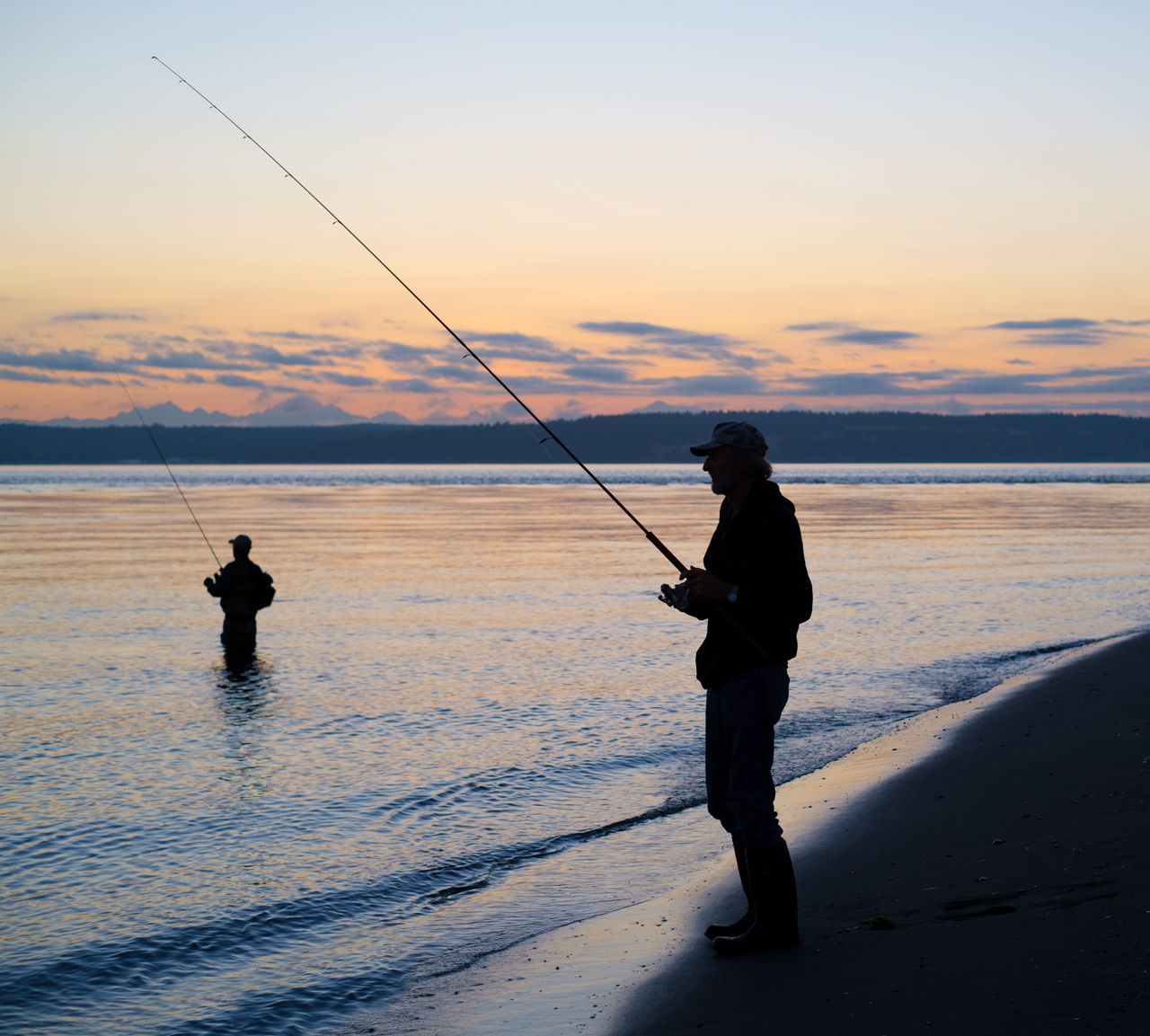
You're right John. In an actual sporting event, I think the observers in the back do distract some and you almost NEVER have a clean, controlled background free of distractions. Having said that, those background elements do detract, but are unavoidable in about 99% of the instances. You do what you can. Good eye though and thanks for the input. |
Nov 23rd |
| 60 |
Nov 22 |
Reply |
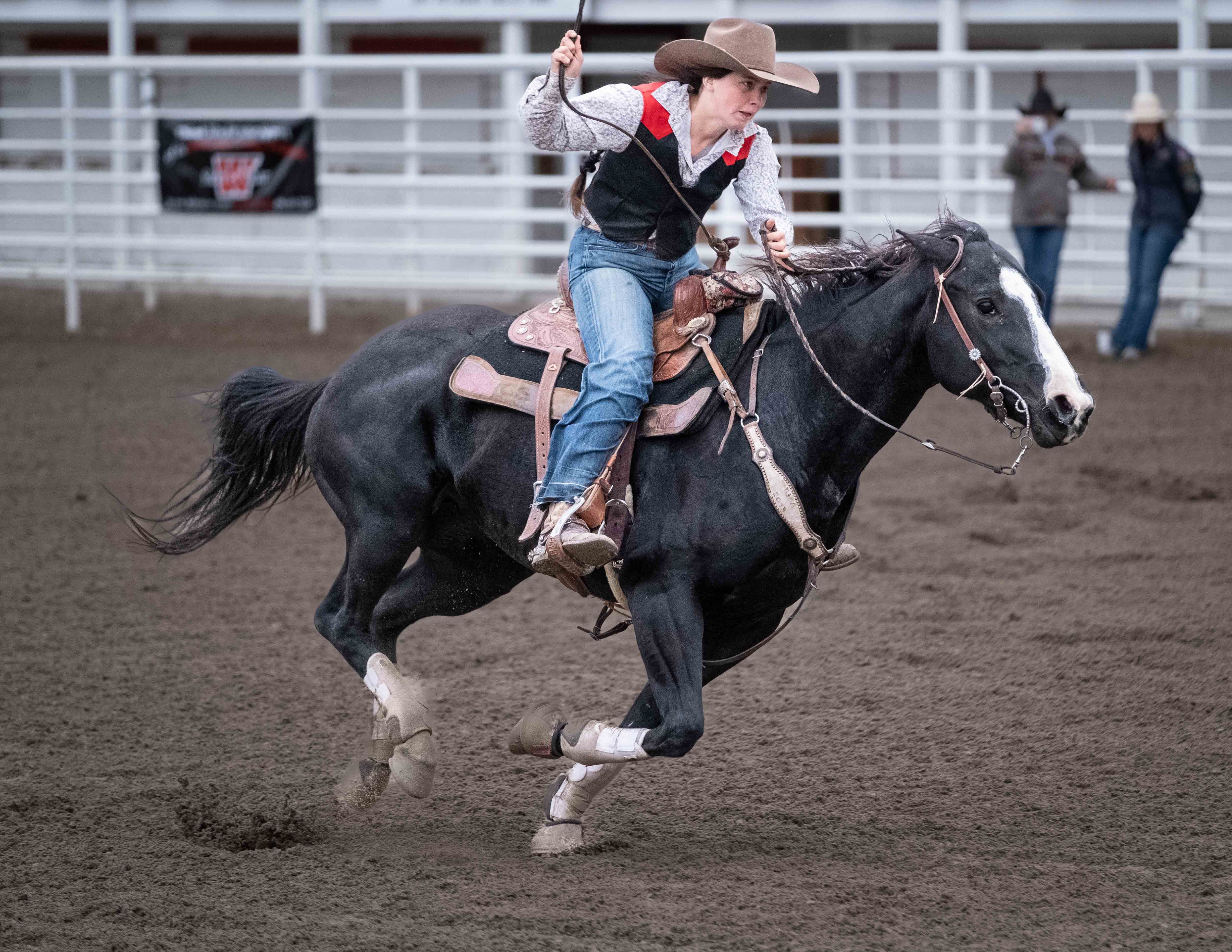
You're right Patrick. Live events like this create uncontrolled backgrounds that detract. Uh, when you mention the pant leg merger, do you mean the horse's face with the background observer? That's another one of those uncontrolled elements and yes they do detract. Every once in awhile you'll get that featureless, blurry crowd though, AND some peak action, and that's when you call Sports Illustrated! ;) |
Nov 23rd |
| 60 |
Nov 22 |
Reply |
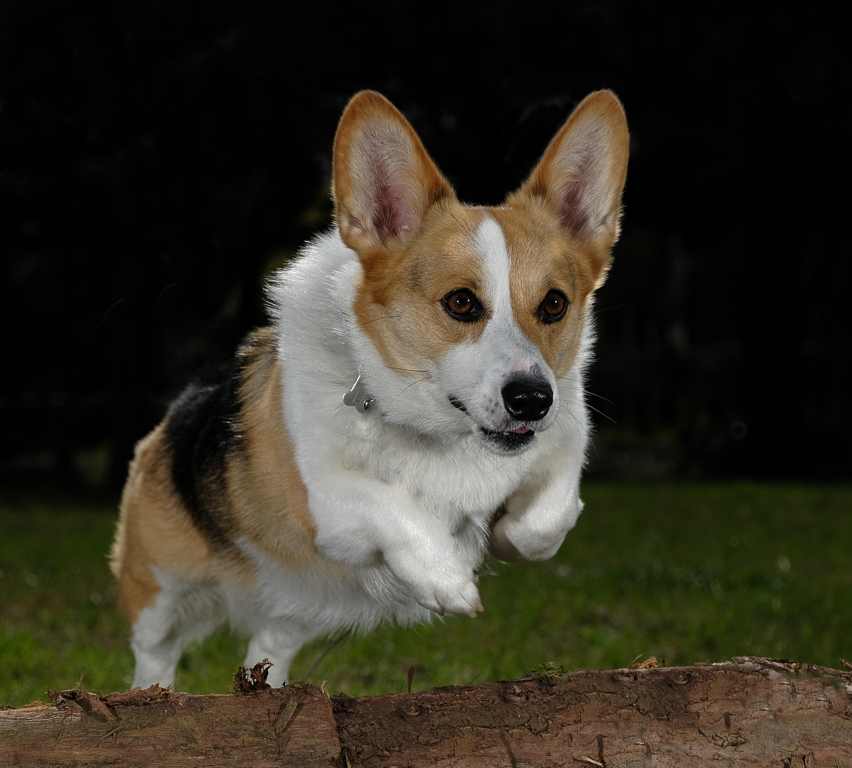
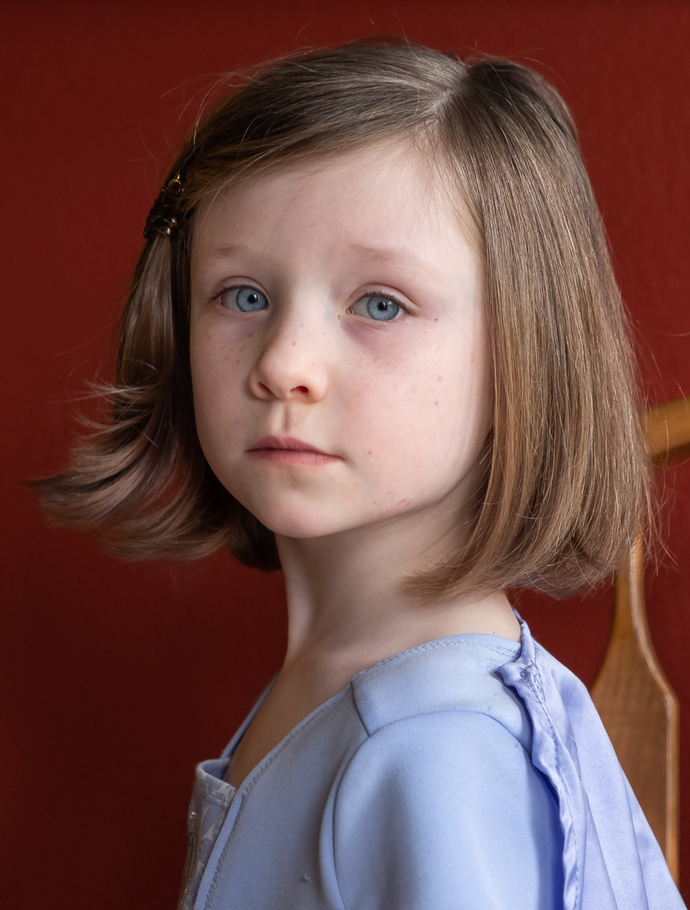
Hey Dean, the object in the rider's right hand is a riding crop, the top portion of which is not visible. I think you're 100% correct that eliminating the lariat (one of the stars of the show) would have been a bad idea, but including the entire riding crop would have also included the ever-present empty bleachers, which definitely detract from the image. Like many sports, there's really NO way to eliminate an active background. When you get that shot that has a cleaner background, it's an absolute gift. |
Nov 23rd |
| 60 |
Nov 22 |
Reply |
Hey Anne, the images visible on the page is the original. I checked it against what you sent me on Oct 13. It does not appear to have any of the edits you've made...which I'm dying to see. Please attach the new/improved version by using the Choose File button in the Reply Here dialogue box. Cool?
|
Nov 23rd |
| 60 |
Nov 22 |
Reply |
Sure. That way everyone can check it out. |
Nov 17th |
| 60 |
Nov 22 |
Comment |
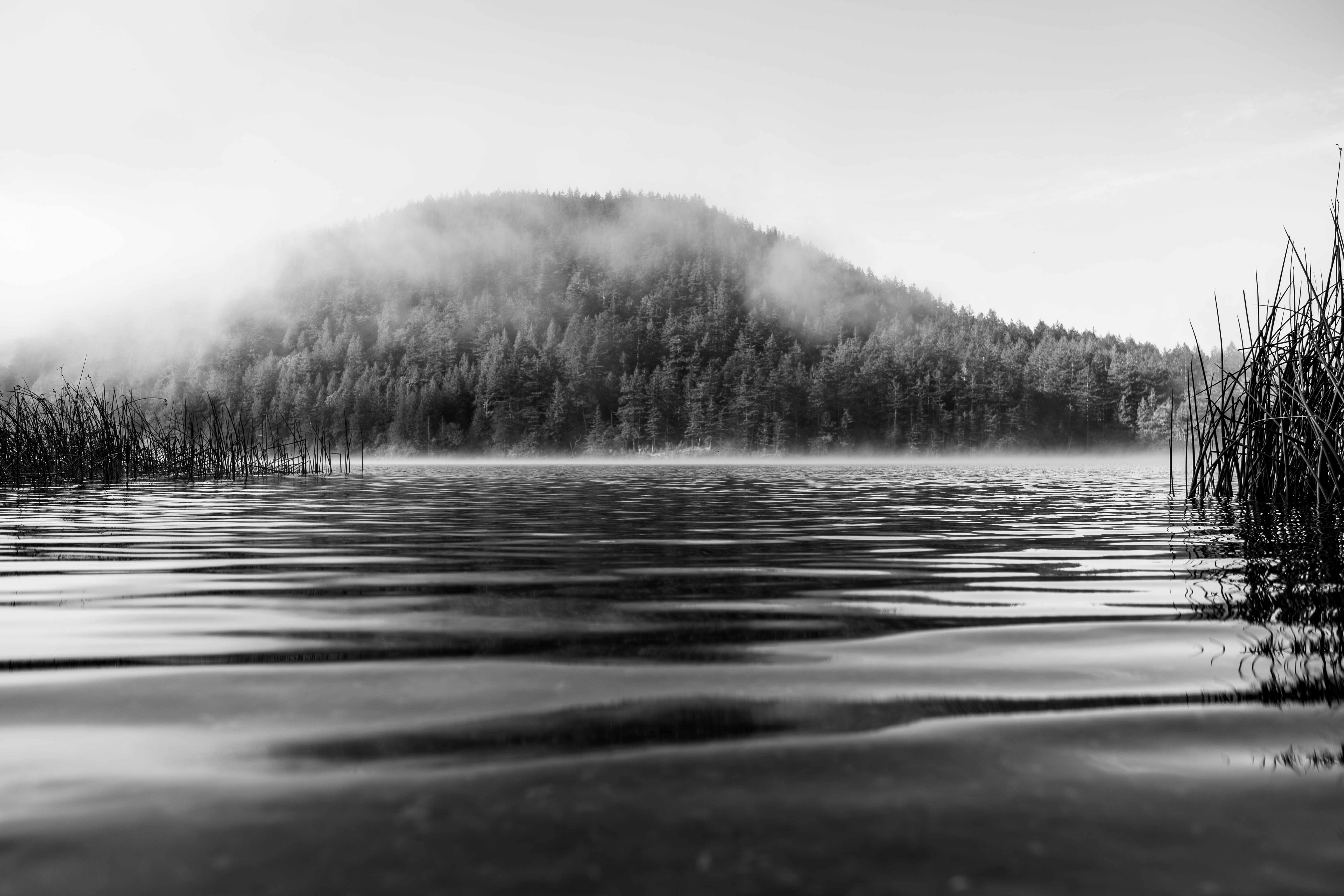
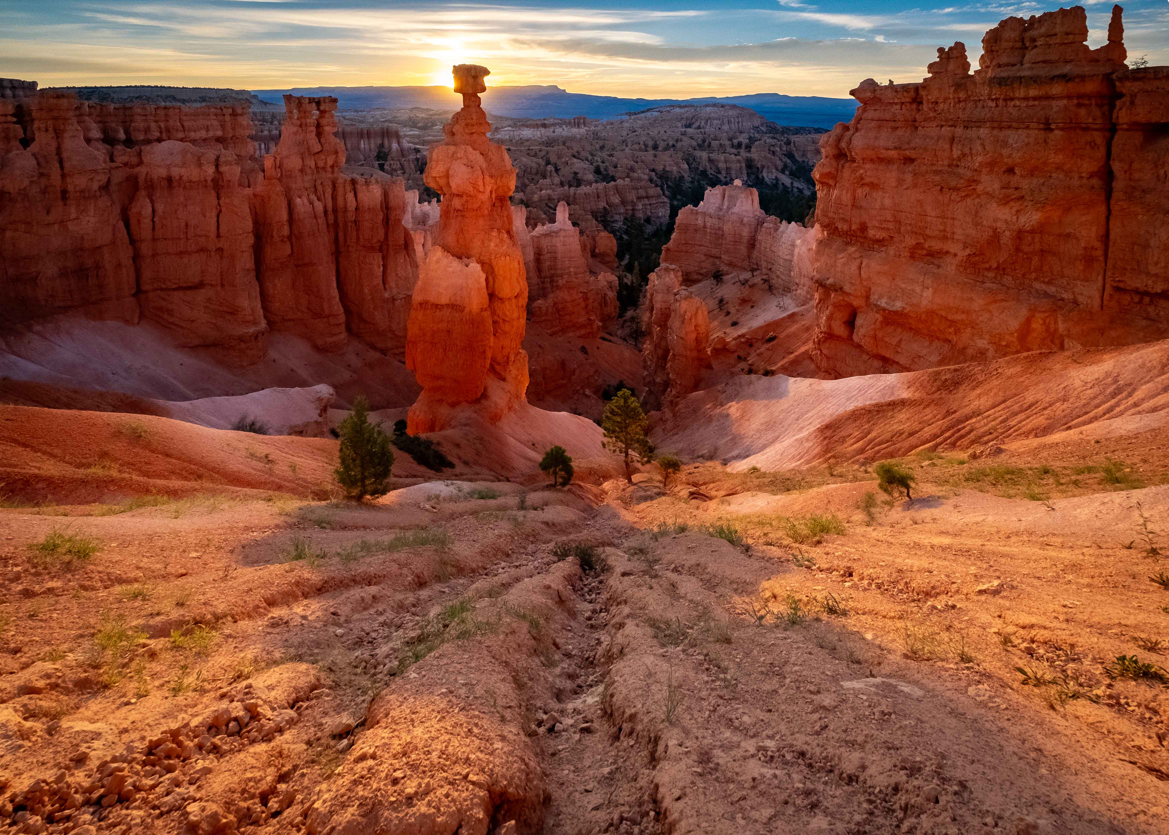
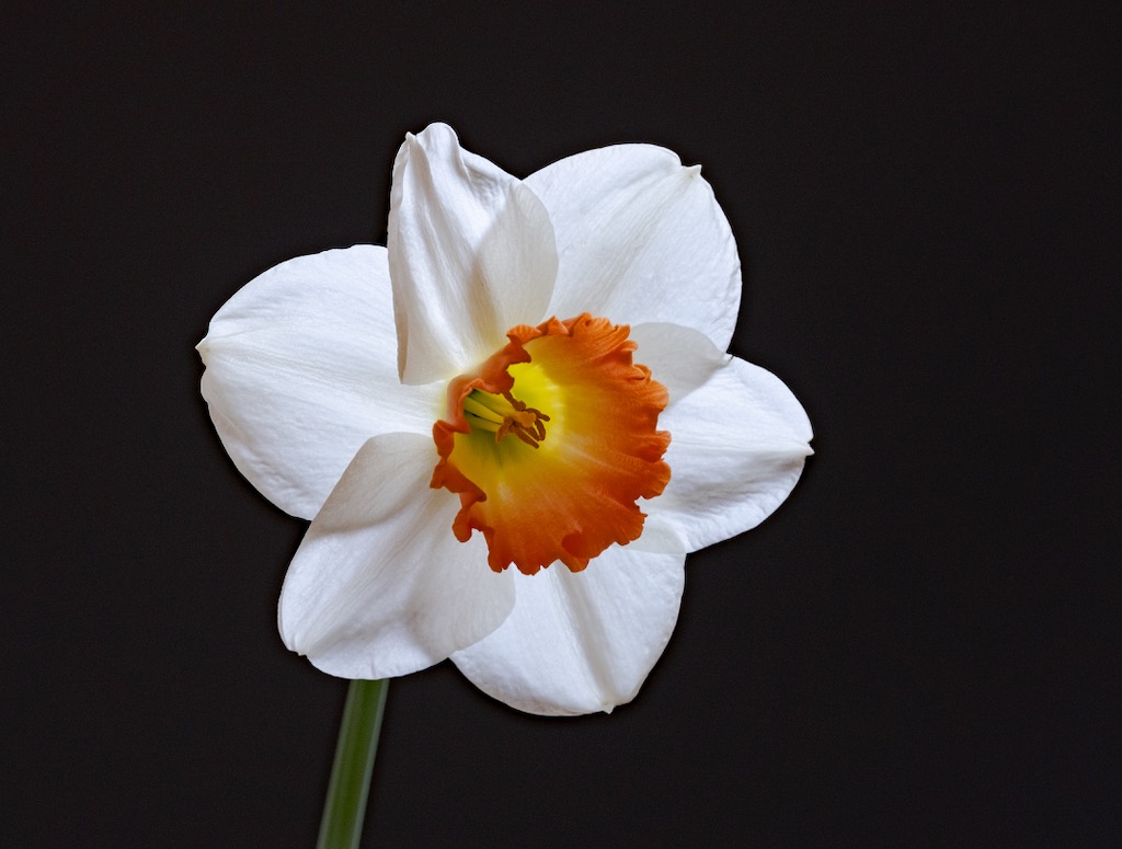
This is a solid image IMHO Dean. I think exposure is good. The image is sharp. Colors are natural, but vivid. Composition has a strong fore-mid-background aspect like your stuff usually does. There are strong compositional elements, particularly the watercourse receding into the background, and into the cleft in the treeline. It's good. Do you have a vignette on it? I have the feeling you do, but the fact that I can't attest to it proves you did it well, IMHO.
Looking at it, I think I might know why you don't feel more...strongly about it. Light...or lack thereof. Although the the soft, flat light helps add to the strong exposure, I just don't think it has light that would add drama to it. Don't you think that some golden light on one side of the water, or on the treetops, would change the scenario considerably? It's not your fault. You made a great, technical composition with the scene on hand. Great, ideal lighting would just have been the icing on this strong cake. I guess that's what drives some landscape-obsessed nuts to stand around in the cold, hours before dawn, hoping and hoping the clouds part in just the right way. |
Nov 17th |
| 60 |
Nov 22 |
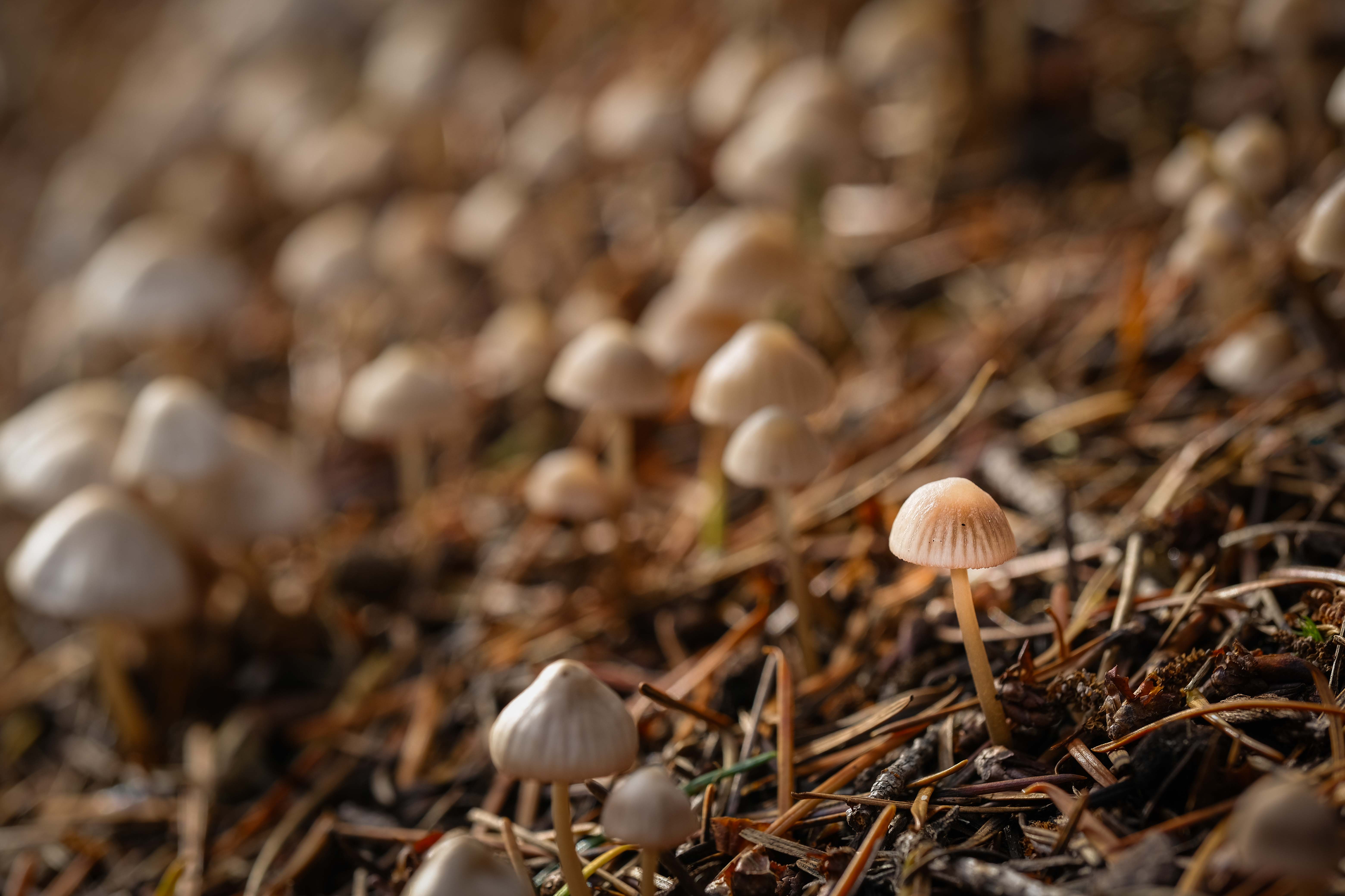
Comment |
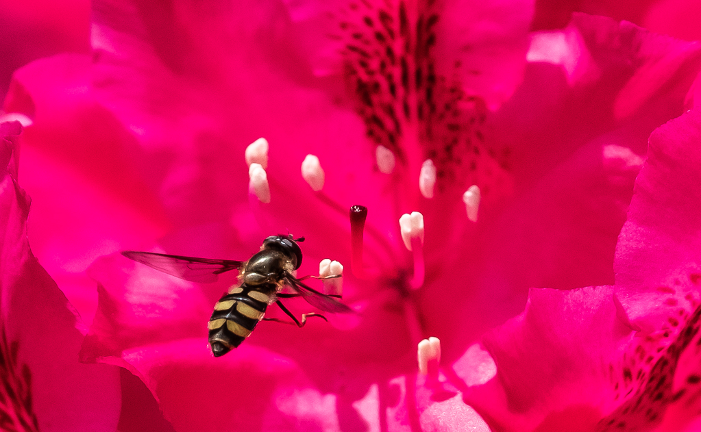
Hey Rita. What a catch!
First, I'll ask, what are you struggling with in this image?
Second, It has lots going for it. Nothing's blown or clipped, so you have lots of data to work with, in order to do whatever you want to do. I can't really tell without being able to blow it up to 100%, but from where I'm sitting, focus looks sharp, so you have that going for you too. Composition has LOTS going for it, with all these frontal aspects on the animals (do you know how envious about 100 million people are?).
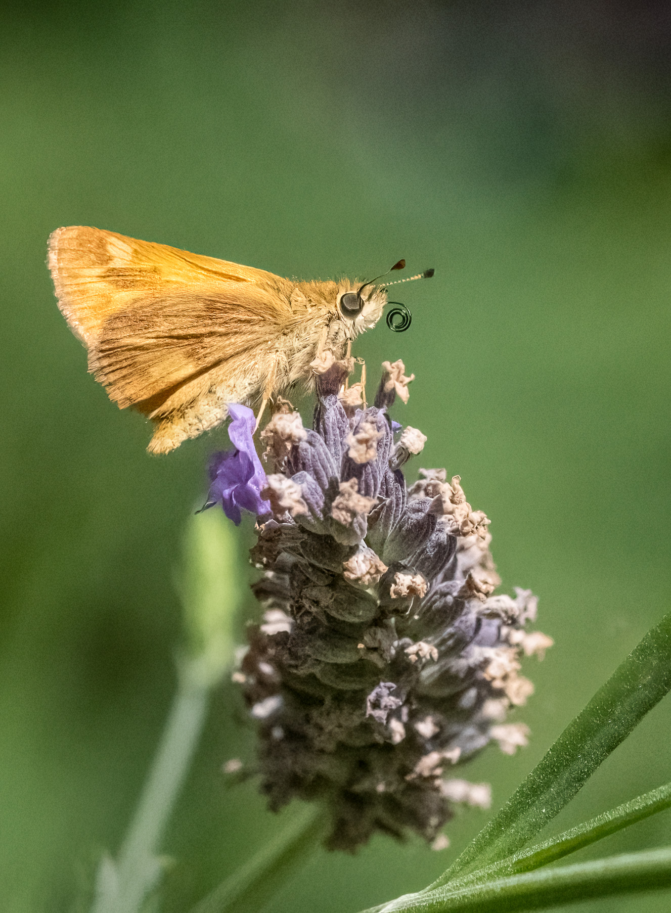
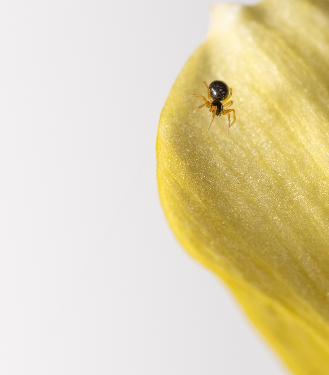
As for improvement, IMHO, the greens are a little bright to me, and even if they're true-to-life, I think they compete with the bears. So, if it were me, I'd darken the greens some, maybe put a subtle vignette on the whole thing, and perhaps most importantly, try to brighten the bears' eyes with very small radial gradients. I think you would be AMAZED at what that can do to any image of something living. Anyway, that's just me, this is an incredible capture. Enjoy it. |
Nov 17th |
| 60 |
Nov 22 |
Comment |
This is interesting John. I'm a big fan of experimenting with new and novel techniques. It expands your envelope. I've seen something kind of like this myself, except it used a screen as the background for water drops, that lens the image on screen. Also cool.
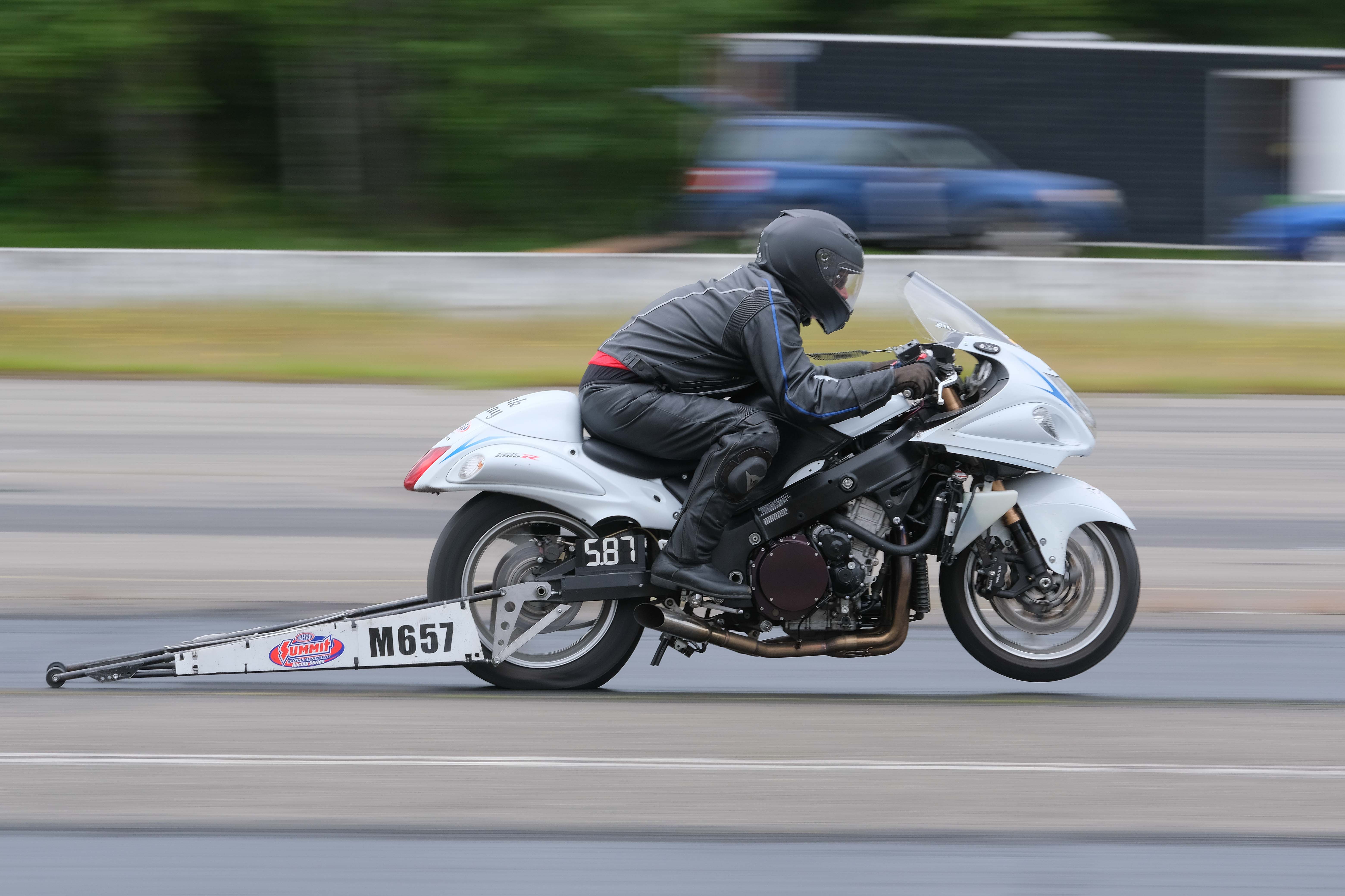
I think your exposure works. Focus appears appropriately sharp, which tells me your depth of field worked well (which we'd expect between f/8-16). I appreciate the symmetry in the composition. Are those glasses actually parallelograms in real life? 'Cause they're mind bending to me (in a good way).
I think you might have made money by having more distance between the screen and the subjects. This would have allowed you to make the glass objects sharp, while putting the screen (and its clear pixelation) in a soft haze, which would bring attention to the them. Something else kind of interesting is the clear, bending/warping/whatever pattern inside the bowl of the middle glass. If I've ever seen a perfect example of moire', this is it. In this case, I think it was just the interaction between your camera's sensor architecture, and the pattern of pixels on the screen. I don't think it really improves the image, and you might have been able to get rid of it. LrC has a moire' tool, although I've never used it. Maybe you can give it a shot and report back. Hope your computer is back to 100% already. |
Nov 17th |
| 60 |
Nov 22 |
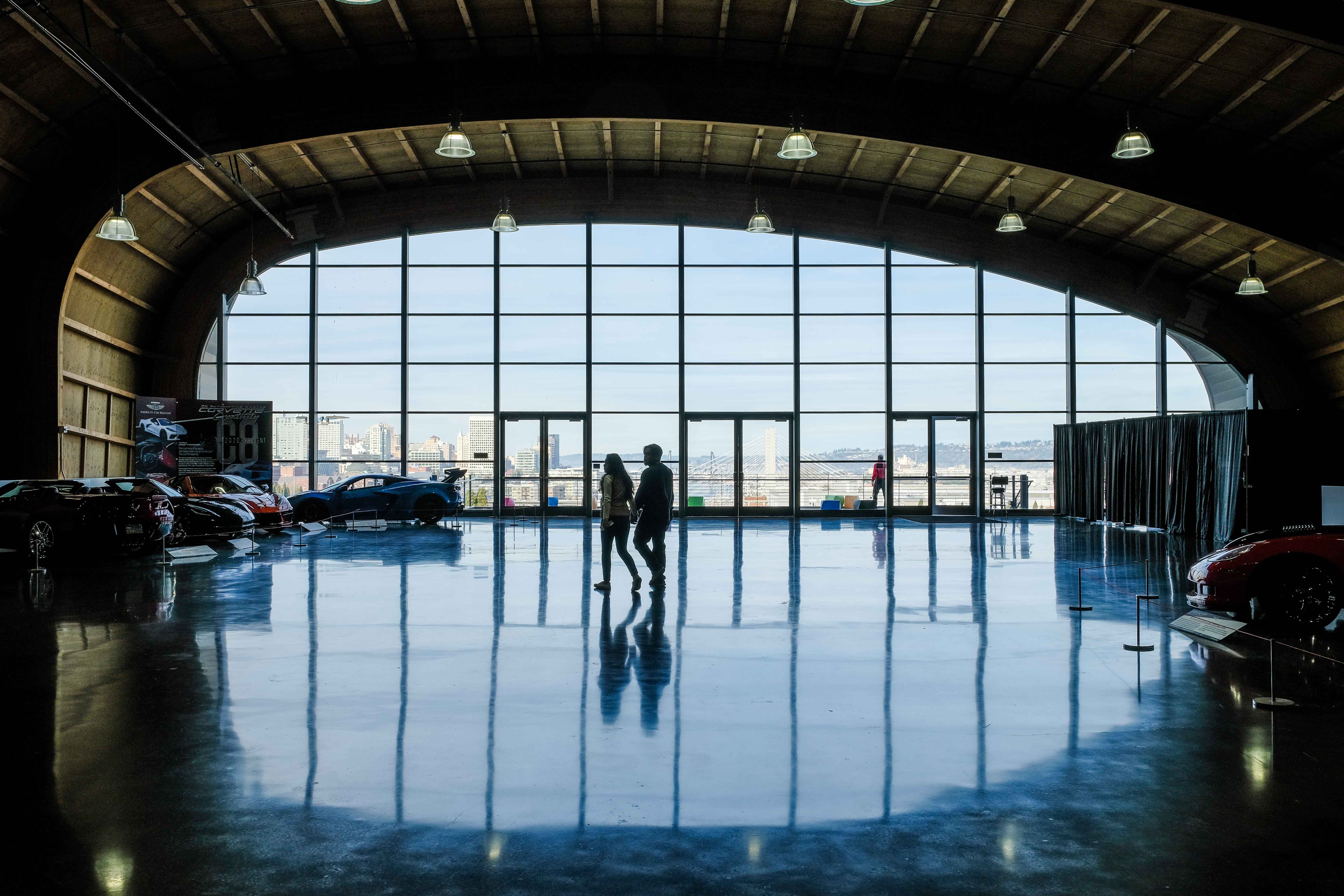
Comment |
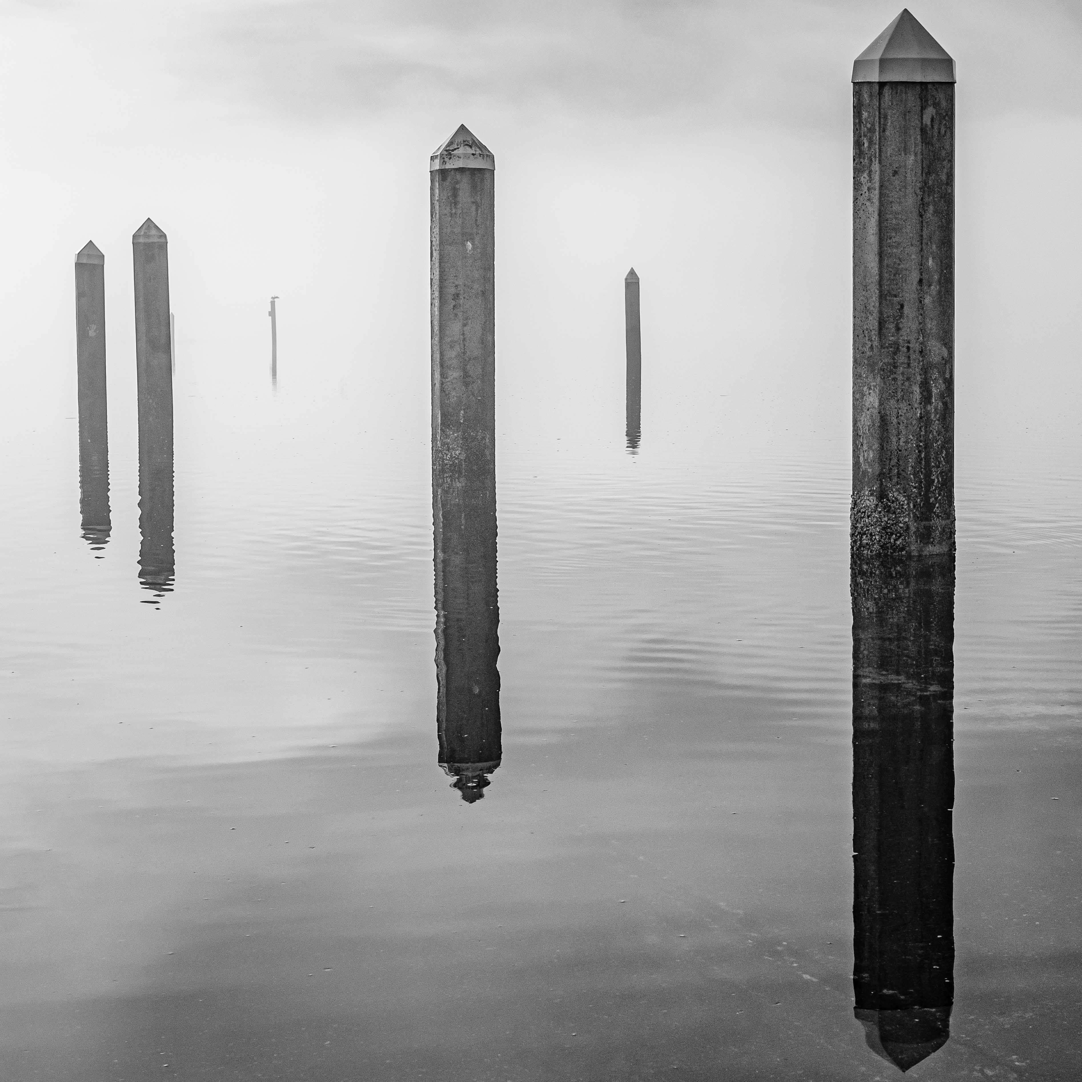
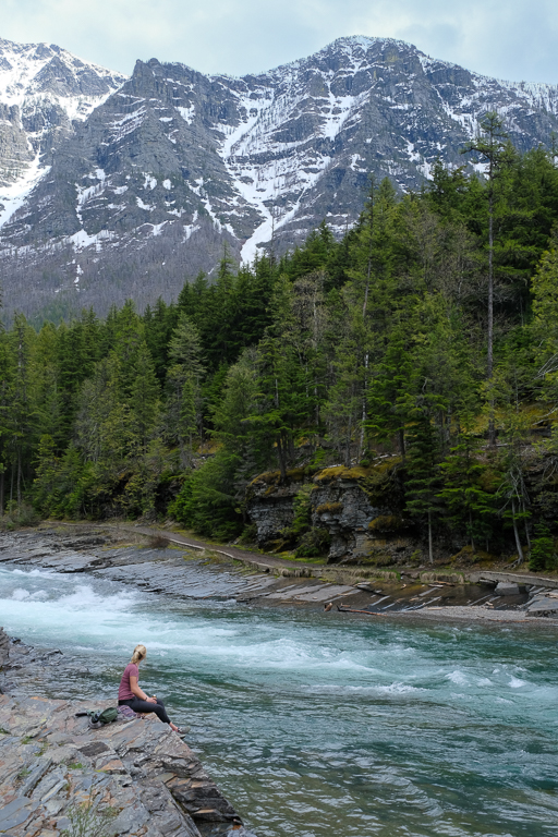
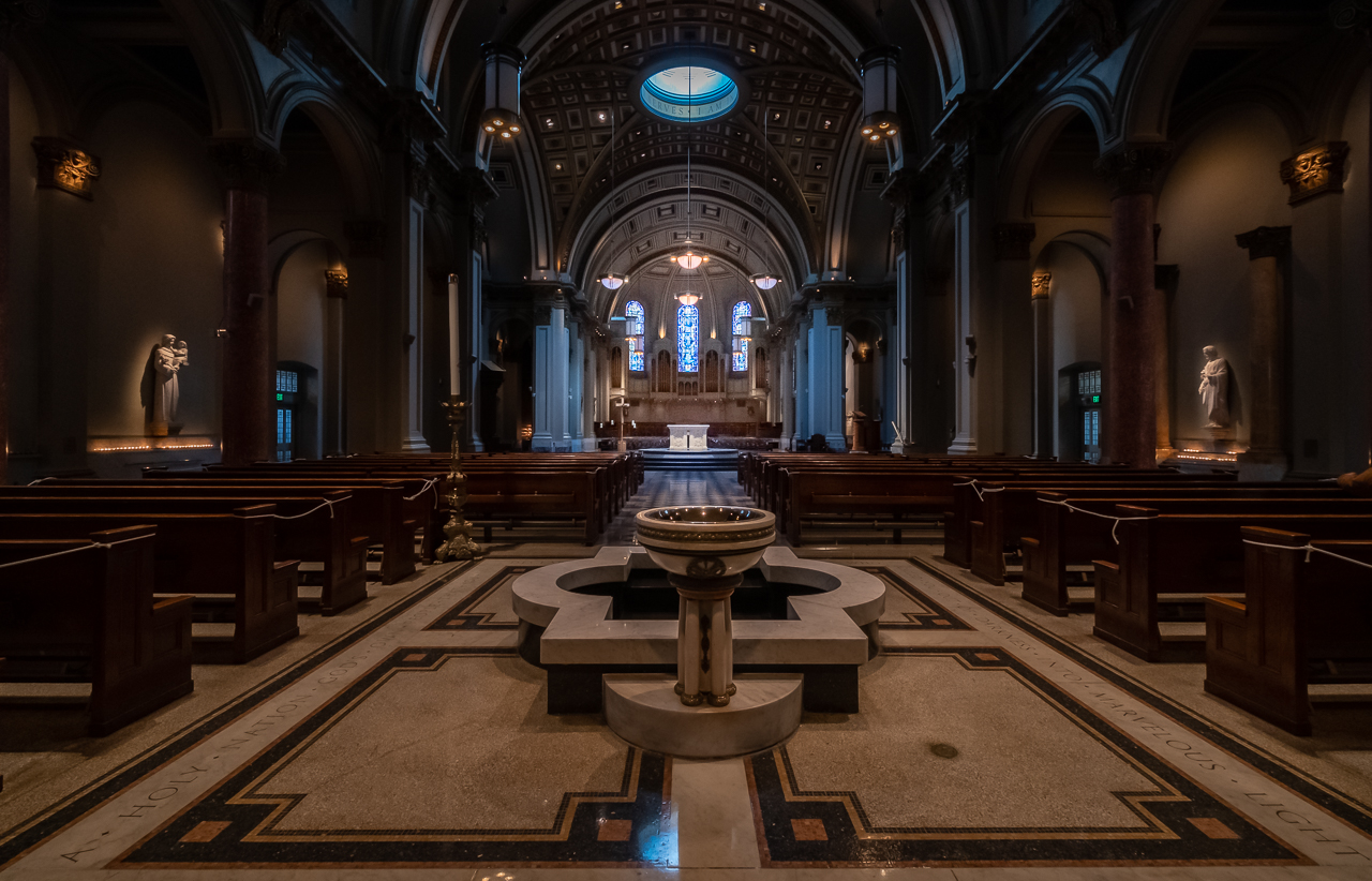
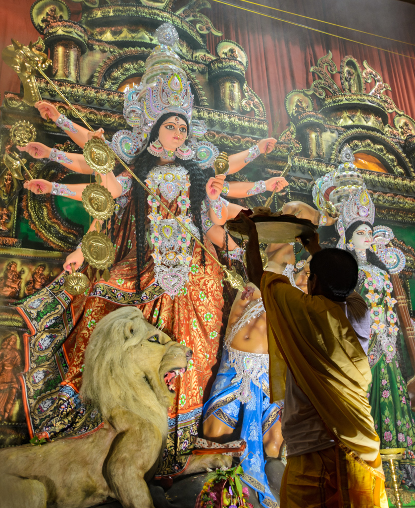
This is an interesting shot Anne, and if I had to, I'd classify it as a landscape. I think you're exposure is quite good really, as I see detail in all the shadows, and the only area that comes close to being overexposed is the one section of the ceiling that is being illuminated by a spotlight. Focus looks great all the way around, which I attribute to your short focal length, attention to keeping the shutter speed as high as you could keep it, and a steady hand. Colors seem natural to me. Good work on trying to get the symmetry into the composition with the reflections of the water's surface. You mention noise but you don't mention the ISO. What was it? As presented, I don't really notice it. I think it's a good take on an uncommon subject.
I think something that detracts a bit, and clearly was outside your control, is the relatively monochrome nature of the shot. I'm not advocating misrepresenting anything, but enhancing the colors within the bounds of realism, might lend some more pizzazz...if you can. Also, looking at the image, and kind of trying to gauge where my eye goes, I notice that on the left side of the image, the water leads us deeper into the cave, which is a great compositional feature. I think in order to maximize that, you might want to experiment with cropping in from the right, right to the center of that major stalactite, about 20% in from the right. I think that would take advantage of the existing elements in the frame to help keep the eye in-frame, and to put more attention on that deepening tunnel. Take a gander at it. See what you think. Good, interesting work really. |
Nov 17th |
4 comments - 8 replies for Group 60
|
4 comments - 8 replies Total
|