|
| Group |
Round |
C/R |
Comment |
Date |
Image |
| 60 |
Oct 22 |
Reply |
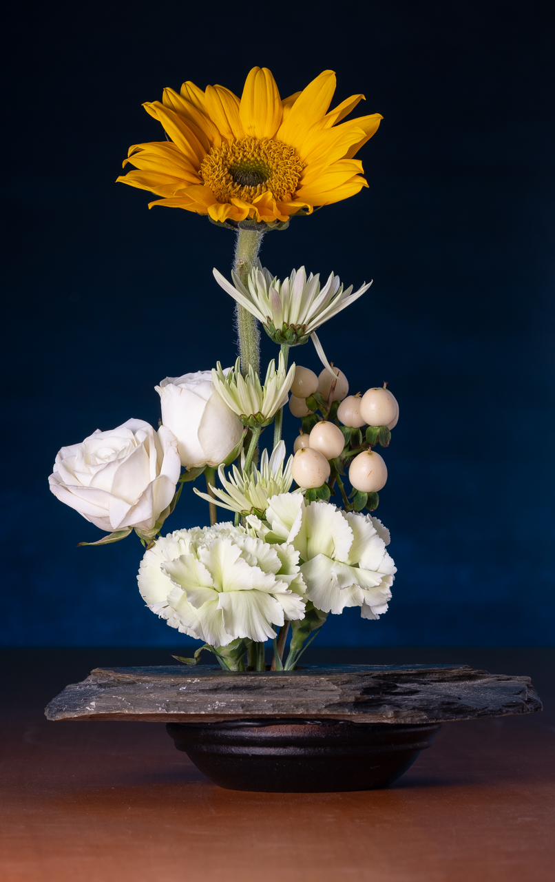
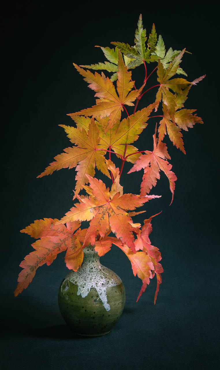
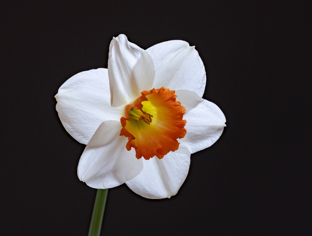
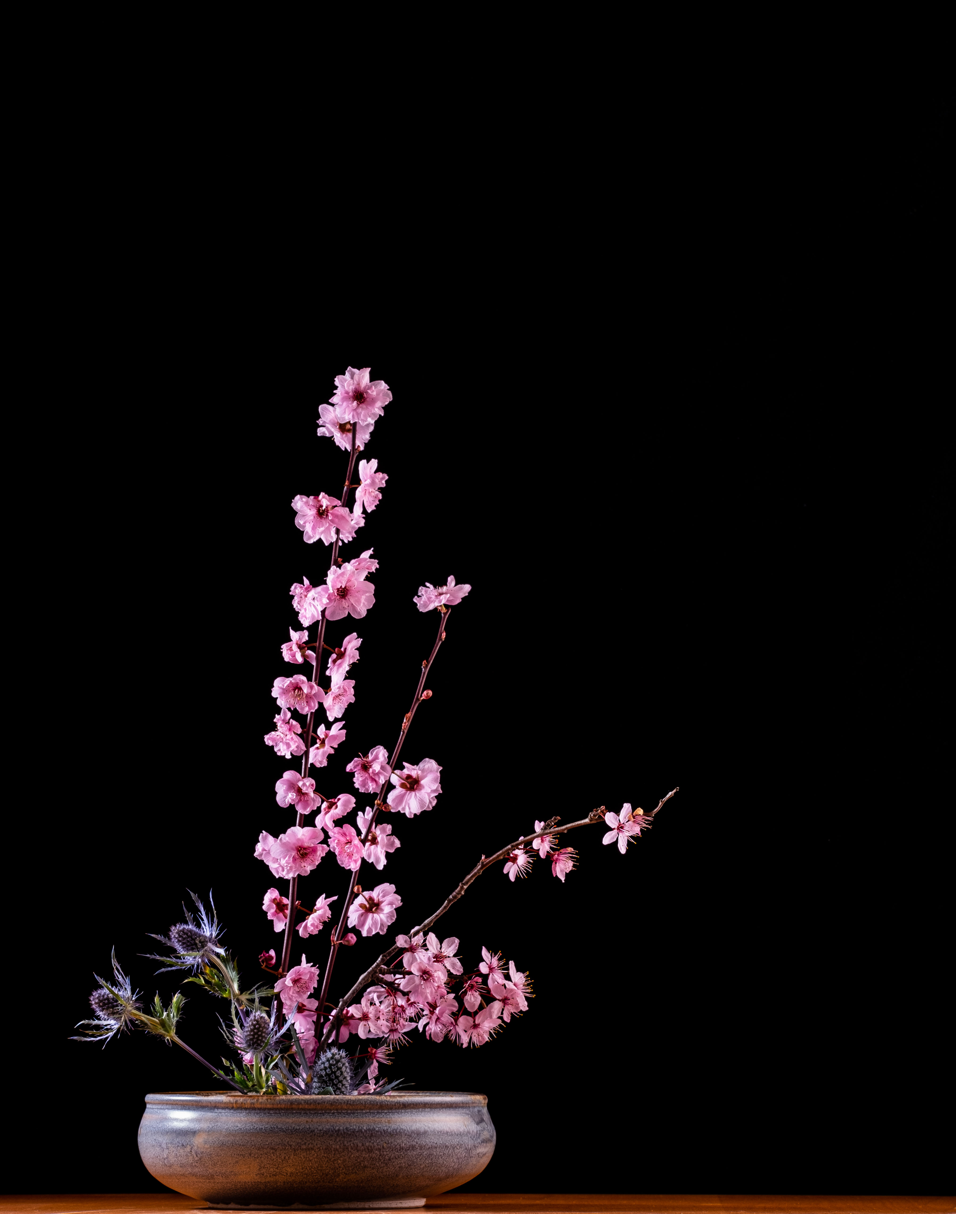
You know, I don't think there is a story really. I did this, and many other florals, for my wife, who is into ikebana. I think photography complements ikebana really well, as a way to capture something that is otherwise very fleeting (these are cherry blossoms). But is there a story? Does it have emotional impact? Probably not, on both accounts. |
Oct 24th |
| 60 |
Oct 22 |
Reply |
I like floral still life. But its still not an emotional subject to me. What are your thoughts on this? |
Oct 23rd |
 |
| 60 |
Oct 22 |
Reply |
Well, I definitely chose red for a reason which is, as you correctly point out, a power color. In fact, I even changed the color from like...crayola red, to blood red, in order to emphasize its presence.
You have a good point...AND THE ACTUAL REASON DD EXISTS, which is for us to help each other out! Right?! So, let's get to it! I'm hoping you submit an image that has the emotional angle you were going for, but that NEEDS technical assistance for your next submission. First, I recommend submitting stuff that is recent, because it reflects the photographer you are TODAY. Second, don't submit stuff you know is good. Submit stuff you can learn about from your team by submitting and getting critiques.
I will try to submit something that I wanted to have emotional impact, but that doesn't. You can coach me on how I might have achieved that. Make sense?
This stuff isn't easy. We might get our feelings hurt. But the WHOLE POINT of DD (IMHO) is to develop a group of trusted people who you can use as a sounding board. Let's do this Anne. There's no time like the present. |
Oct 23rd |
| 60 |
Oct 22 |
Reply |
When you say "dominant selective color" what do you mean. I did not use that feature in the camera or in post-processing. I found an actual (artificial) black rose. I don't think I'd know how to get a black, detailed rose in post processing.
You ask some good questions. To tell you the truth, I rarely create images with emotional impact, even for me. I'm too engaged in the technical, and too engaged in achieving a particular outcome (whatever that happens to be) to be too emotionally engaged. Maybe I ought to explore that. It's an interesting topic. |
Oct 23rd |
| 60 |
Oct 22 |
Reply |
That's a really good point Dean. That all comes under the heading of "presentation", which I'm just kind of learning about. Do you think it would still need it if it were matted and framed? Maybe it would need it more! |
Oct 23rd |
| 60 |
Oct 22 |
Reply |
Hey, it is 100% OK to say you don't like something about it. And, really, acknowledging that you don't like black flowers isn't really a comment about the image, as much as it is an expression of personal taste...which is perfectly fine.
One of the things I've learned recently is that in the process of developing a personal style of photography, you are likely to repel as many people as you attract. That repulsion/attraction may be because of subjects, treatment, or who knows what. But, that's why we have more than one kind of art...right? Picasso and Norman Rockwell are both timeless (IMHO), but have nearly nothing in common. |
Oct 22nd |
| 60 |
Oct 22 |
Reply |
You are very generous with your praise Anne. Thank you.
So, lemme ask this, would you say this has "impact?" If so, is it visual impact? Emotional? Both? Neither?
I have to admit, I don't think any of my images really contain emotional impact, and few contain story. I'm working hard to include both of those in my work.
But, I'd like to hear your thoughts, and it really is OK to be unimpressed. How could I/should I have given this more impact? |
Oct 22nd |
| 60 |
Oct 22 |
Reply |
GOOD comment John. But, now I gotta ask, WOULD you change the background color? Would it have the same impact? What color would have equal or maybe greater impact? |
Oct 22nd |
| 60 |
Oct 22 |
Reply |
You are very kind Dean. Thanks.
Now...as a piece of art. What could I have done differently/better? And, just as importantly, why would it make it better? C'mon Brother. I can take it. ;) |
Oct 22nd |
| 60 |
Oct 22 |
Reply |
What are your thoughts about it Rita? Comparing the two, which do YOU like more? IMHO, this looks much more natural, but does it have the same impact you were looking for?
This is just me talkin', but I find it excruciatingly difficult to critique my own stuff...'cause I knew what the intent was. And, because it's difficult to divorce myself from my images, I rely a lot on the critiques of others. But, the danger there is that their vision of my images, may cloud my own vision of those same images. I know this sounds really artsy and squishy and difficult to quantify and communicate...'cause it is, and I'm a pretty...straightforward communicator, so this is even more difficult.
But, what I'm trying to say is that you should have a very defined INTENT and understanding of each of your images. And, when you look at it on the screen, you need to evaluate if it meets your intent. If you wanted a really natural impression, and it wasn't quite there, then our input is helpful to you. But, if you wanted a stylized, more impressionistic or more intense look, and somebody like me comes in saying "colors look overworked", then you need to politely acknowledge it, but keep marching to the beat of your own drum. JUST MAKE SURE THAT YOUR WORK LOOKS THE WAY YOU ACTUALLY WANT IT TO.
Does that make any sense? Having said all that, I think your efforts to hear and respond to input demonstrate an essential skill that will aid you very very much. Keep it up. In my opinion, you're doing it right! |
Oct 22nd |
| 60 |
Oct 22 |
Comment |
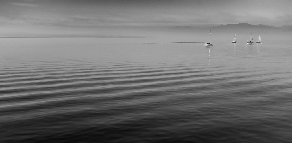
Hey Dean, kudos for taking the challenge to create a new work, instead of mining your existing library of good stuff (which I'm sure is well-stocked).
Nice land/sea/lakescape. Very sharp throughout, on my end, which I think adds visual impact. I love a lot of the elements here; dappled water in the foreground, textured rocks in the mid ground, active sky in the background. I think the very sharp line of the horizon does a good job of...well, I don't know. It kind of separates the terrestrial from the non-terrestrial. Never really thought of it that way, and not sure if I'm articulating it very well...but I like it. I think the inclusion of the headland on the left does a good job of pushing my eye back into the frame. Kudos. And, although I think sunslicks can be problematic at times, the texture still present in yours is pleasing.
By way of suggestion, in my opinion, although I think the intent of the tree on the right edge was to frame the image (just guessing), I have the feeling that it absorbs more of the frame, and intrudes farther into the frame than I might prefer. It's not fatal, just a personal preference I think.
I don't know about how the image appears on your screen, but it seems kind of dark on mine. Even the highlights don't really approach white on mine, and although the image doesn't appear low-key to me, I think there's a lot of dynamic range that could still be captured in the upper range, which would add visual interest IMHO. How's your histogram look? Anyway, if it's the way you want it, then so be it, but I just thought there's a lot of room for contrast and dynamic range, which might change the image dramatically.
And, wrt that last comment, yes my monitor is calibrated. In fact, after buying a calibrator about...three months ago, I was SHOCKED by what calibrated vs uncalibrated looked like. Maybe the Average Joe wouldn't be particularly interested, but I was amazed at how overly bright, and contrasty ALL my monitors were prior to calibrating. Perhaps this is old hat to you, but it was eye opening for me. Anyway, that's all just to say that I think I'm viewing the image as true-to-the-original can be done. What are your thoughts though? |
Oct 12th |
| 60 |
Oct 22 |
Comment |
This is a strong image, IMHO Rita. I think you have good sky activity, Sharp focus throughout (did you use a tripod?), and the exposure works for me. I think you did a good job of including fore, mid, and background interest. the water gives you some symmetry with the sky, which is a strong compositional element. Frankly, I like the little ducky thing, which to me, keeps the reflected sky from becoming deadspace.
If it were me, I think I'd work on two things here (and one of them is just a personal taste issue). First, I like the sky activity, but I think there are some hot spots resulting from breaks in the clouds. I don't know what can be done about them, but if I was a betting man, the cloning tool could probably square them away. But, to make things more difficult, you'd have to be conscious of their reflections as well. So, possible? Yes. Worthwhile? Maybe.
The second item is the colors, which just seem a bit overworked to me...of course, that's just me. So, if you tell me "I didn't touch the colors", or "I like'em like that", you win. Frankly, you win no matter what, so that's just my two cents' worth. Anyway, I think it's a winning image. Good submission. |
Oct 2nd |
2 comments - 11 replies for Group 60
|
2 comments - 11 replies Total
|