|
| Group |
Round |
C/R |
Comment |
Date |
Image |
| 60 |
Aug 22 |
Reply |
Those are good inputs Eric, and, I agree with you and Anne that the flowers should be more central in the image. Thanks for the comments on the details. What do you mean by "darkened the left flower area a bit." Elaborate please on that for me. |
Aug 20th |
| 60 |
Aug 22 |
Reply |
I get it. Photography is my first, and only, creative venture. But that's why we're here isn't it? So, go crazy. Do that thing that you do Anne. But always (IMHO) be intentional. Create what you want us to see. |
Aug 16th |
| 60 |
Aug 22 |
Comment |
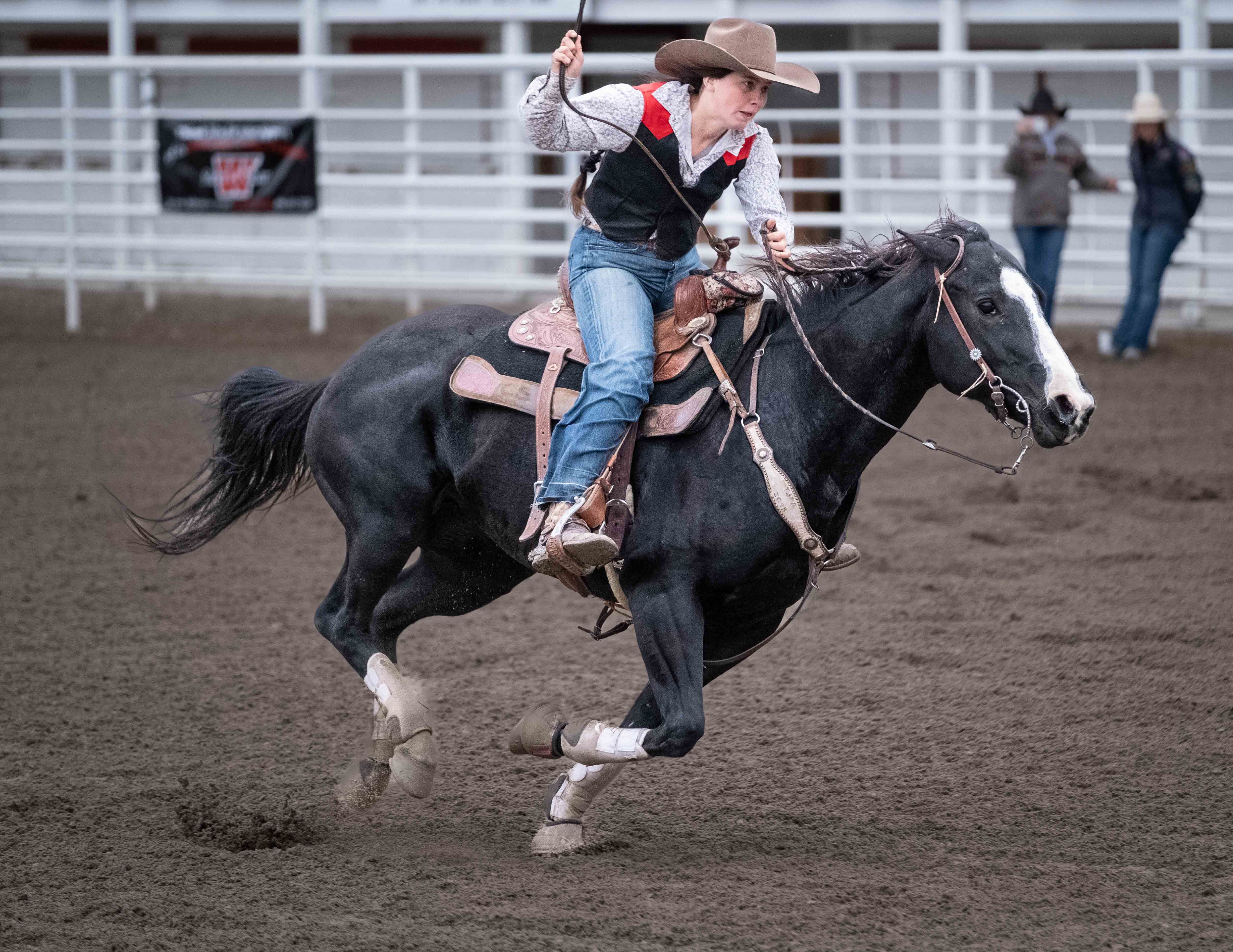
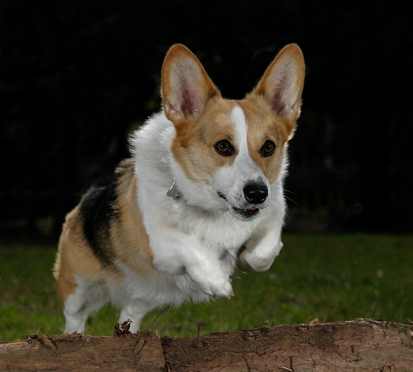
Dude. Print and hang it.
Now, just by way of suggestion:
Add highlights to the eyes. It changes EVERYTHING.
Focus could be sharper on the subject, but this is so charismatic nobody is going to notice unless you print really large.
Color, exposure, and everything else that matters is right. Composition is conventional and correct. Good job soldier....IMHO, of course.
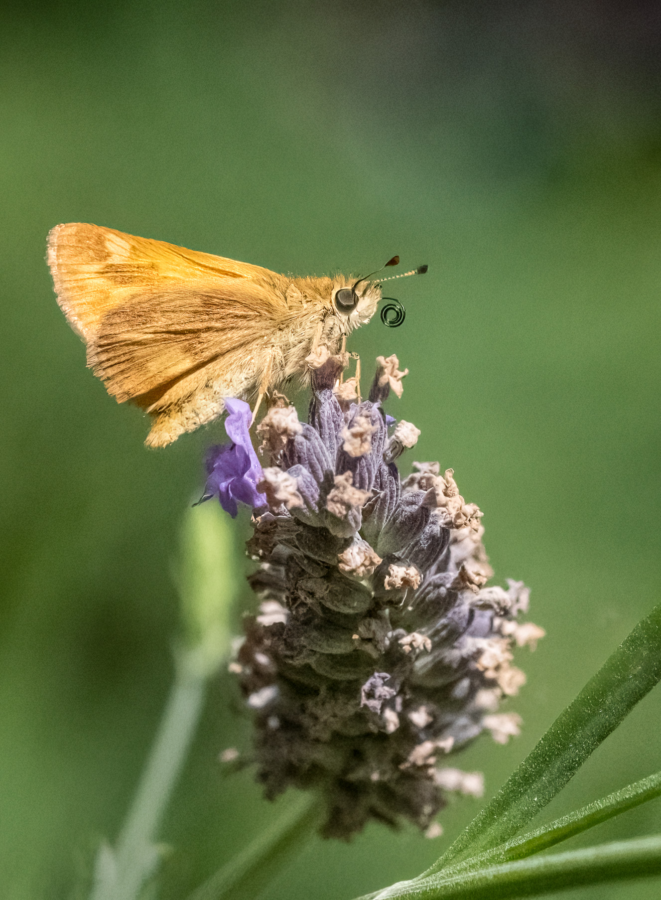
Go check out Thomas Mengelson's Catch of the Day. You'll recognize it immediately. Anyway, I had a chance to see a 4' X 7' (yes, those are feet, not inches) print at his flagship gallery in Cody, WY. Truth be told, the fish was blurry. Should've been shot about 1/2000. But, I WASN'T there to shoot it. He was. and he got it. And you got your seal. And it looks good. And nobody can talk S because they weren't there, and your seal looks great. Get the point? |
Aug 16th |
| 60 |
Aug 22 |
Comment |
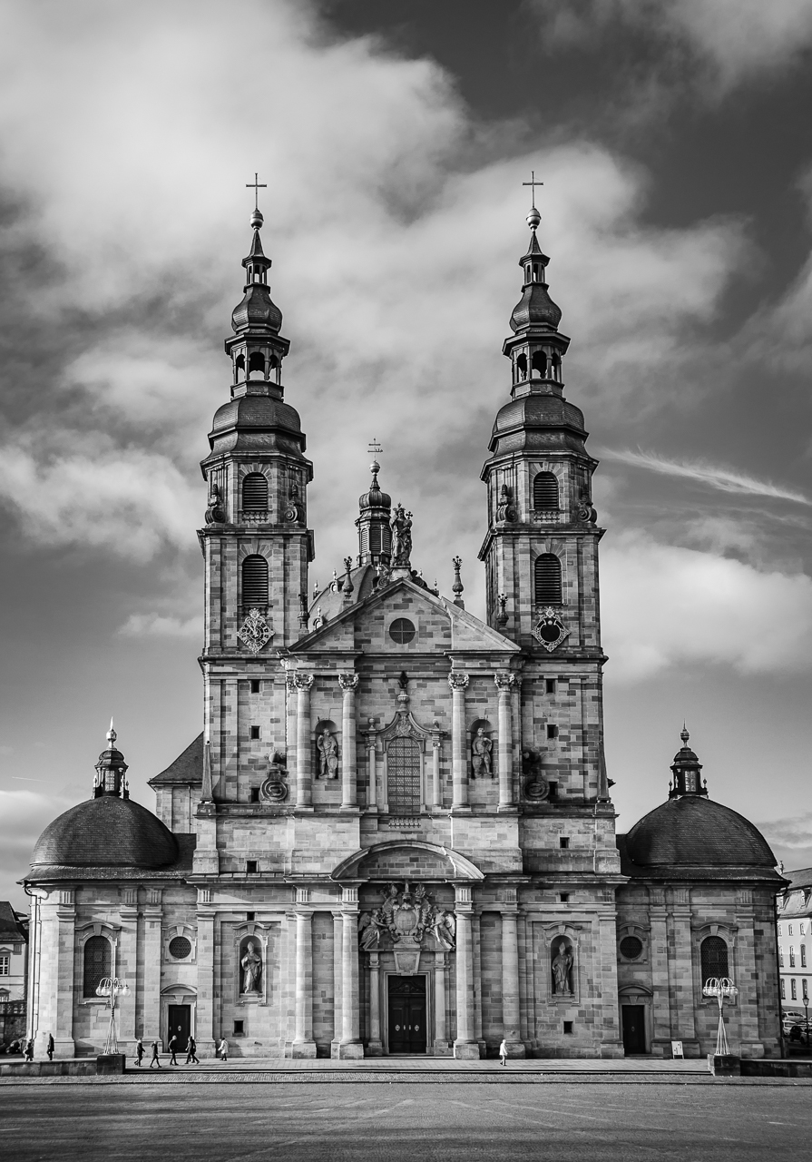
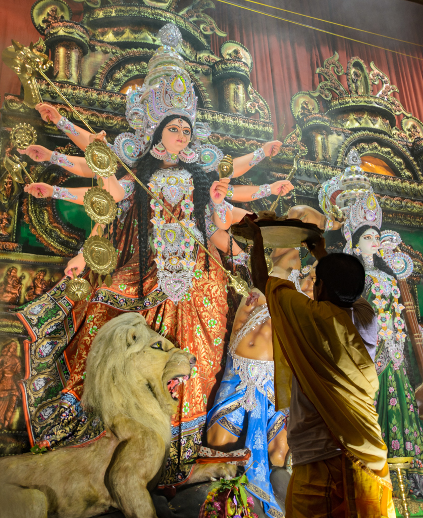
Yeah...that's a really good question Anne. You know, I don't have a clue. I mean, architecture as art, and architecture as mere document are different. Know what I mean? So, for you, if you're trying to create art out of architecture, you're going to have to...be very clear about what it is that you're creating. It's the Wild West out there. You're not wrong no matter what you do. The only thing I'd...advise...is that whatever you do, be very INTENTIONAL. Unlike Bob Ross (you know, that guy who used to do landscape painting on TV), I believe that the art comes in the intent, and there are few "happy accidents." Now, that's just my thinking and many people would probably like to tell me that I'm full of it. But, I do firmly believe that art (which is what your'e doing, like it or not) is CREATED, not merely stumbled upon. Therefore, IMHO, be intentional. Stop. Touch your cameras settings. Know why you are doing what your'e doing. Find the subject. Frame the subject. Click the shutter. Every press of the finger (IMHO) should be an act of creation. |
Aug 16th |
| 60 |
Aug 22 |
Reply |
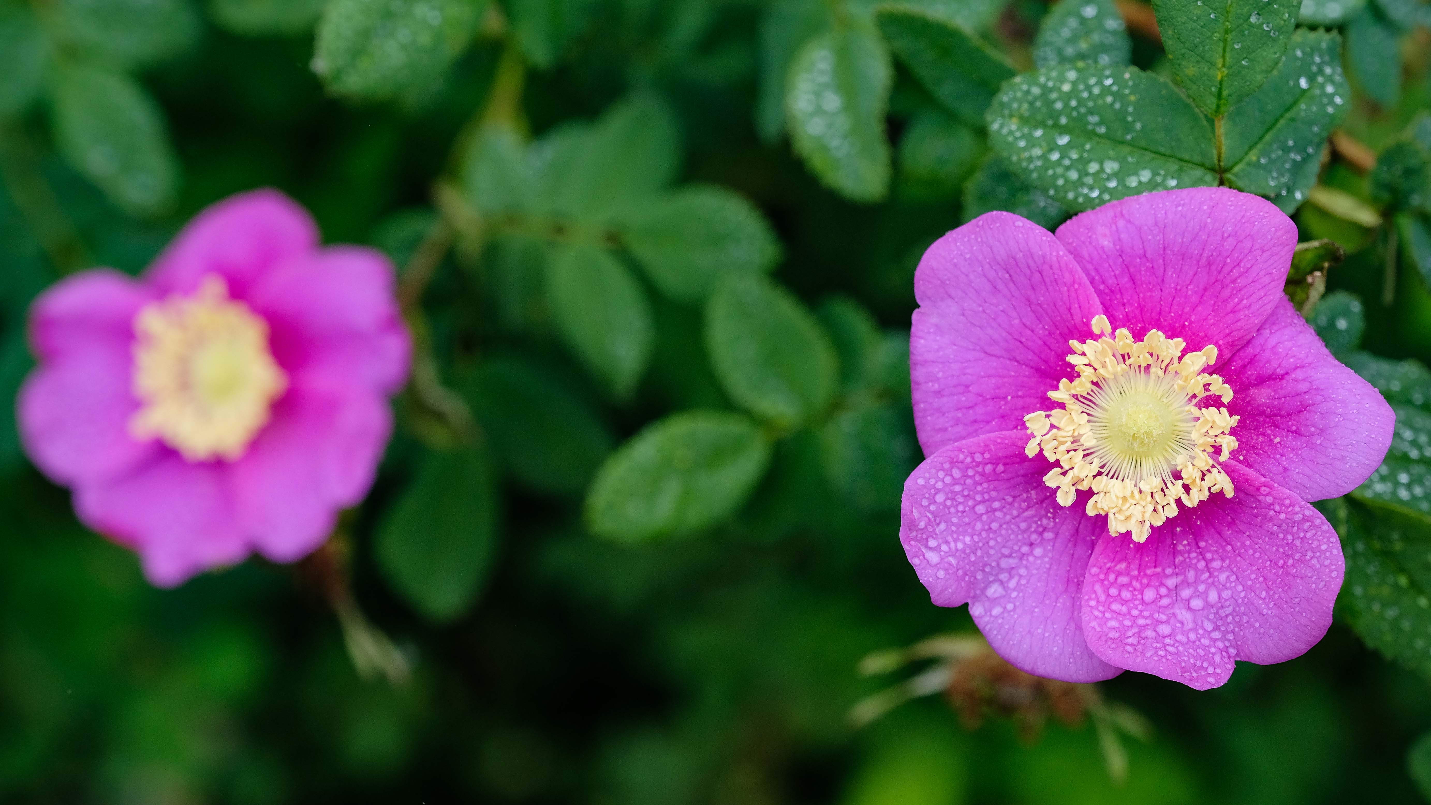
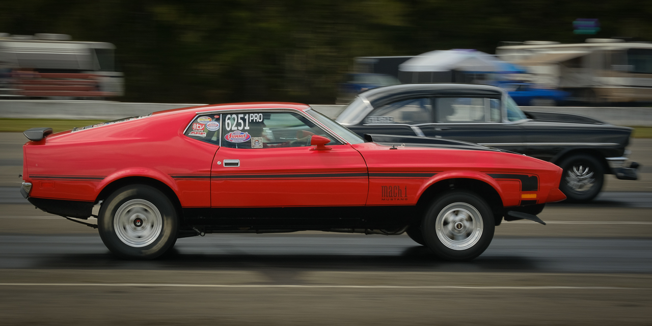
Thanks Anne. You know, truth be told, I agree with you on what the proper spacing should have been, and even given that this was a wallpaper, and so doesn't play by the same rules as other images, the composition could/should be changed.
I know you don't like to mix math and photography, but if you remember, I sent you an article about how the golden ratio is applied by aquarium designers. Well, it's pretty simple, and I think really powerful, and if you want to discuss the idea, I'd love to wax philosophical about it. But, the point of this discussion is that if I'd really been on my game, I probably would have put the right flower at that golden ratio point.
And here is where I rant about how putting PSA Interclub Competition Division Definition blinders on, can keep you from doing what you ought to. Furthermore, I need to appreciate the potentially limiting effect of the conventions we fall into. I've kind of had the rule of thirds beat into me over the course of the last three years, and it is now very clear that I need to understand the limitations of those rules. Those definitions and conventions are not evil, but they're not always right.
Good learning point for me Anne. THX. |
Aug 8th |
| 60 |
Aug 22 |
Reply |
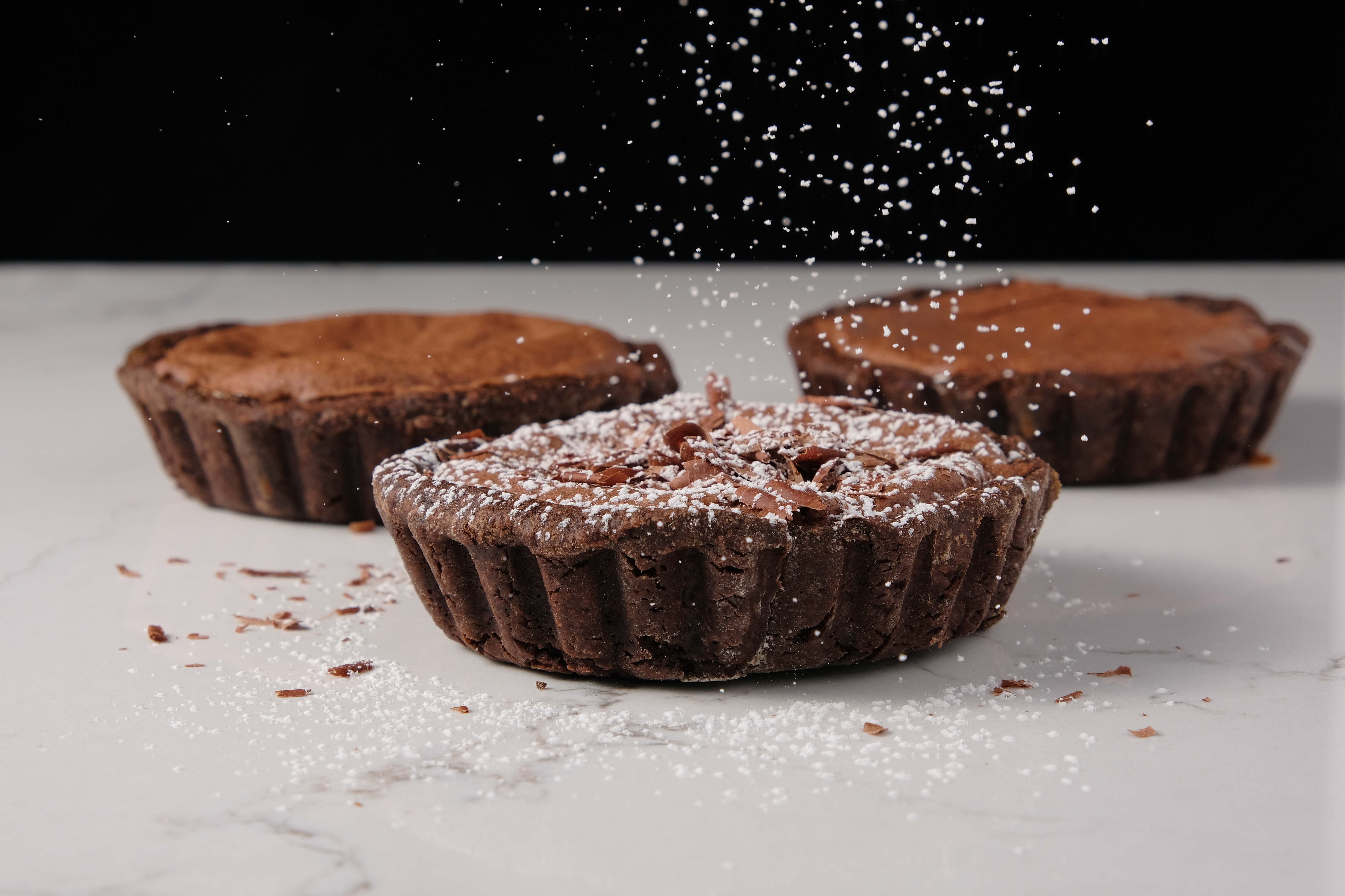
Good comment Dean. In this particular case, because I was planning use this as a wallpaper, I wanted the color of the other flower, but not enough detail to really draw the eye. I thought that the visual weight of the color blob on the left balanced the image, but if it's causing a distracting...visual pattern, perhaps it's still too distinct.
Instead of attempting to blur it in order make it recede in prominence, I'd probably do an LrC AI Mask Subject, then invert, then subtly drop the exposure of everything in the image except the flower on the right. When done correctly (sometimes I succeed and sometimes I don't) it can have a subtle, but powerful effect.
Thanks for the considered and timely input Dean. It helps. |
Aug 8th |
| 60 |
Aug 22 |
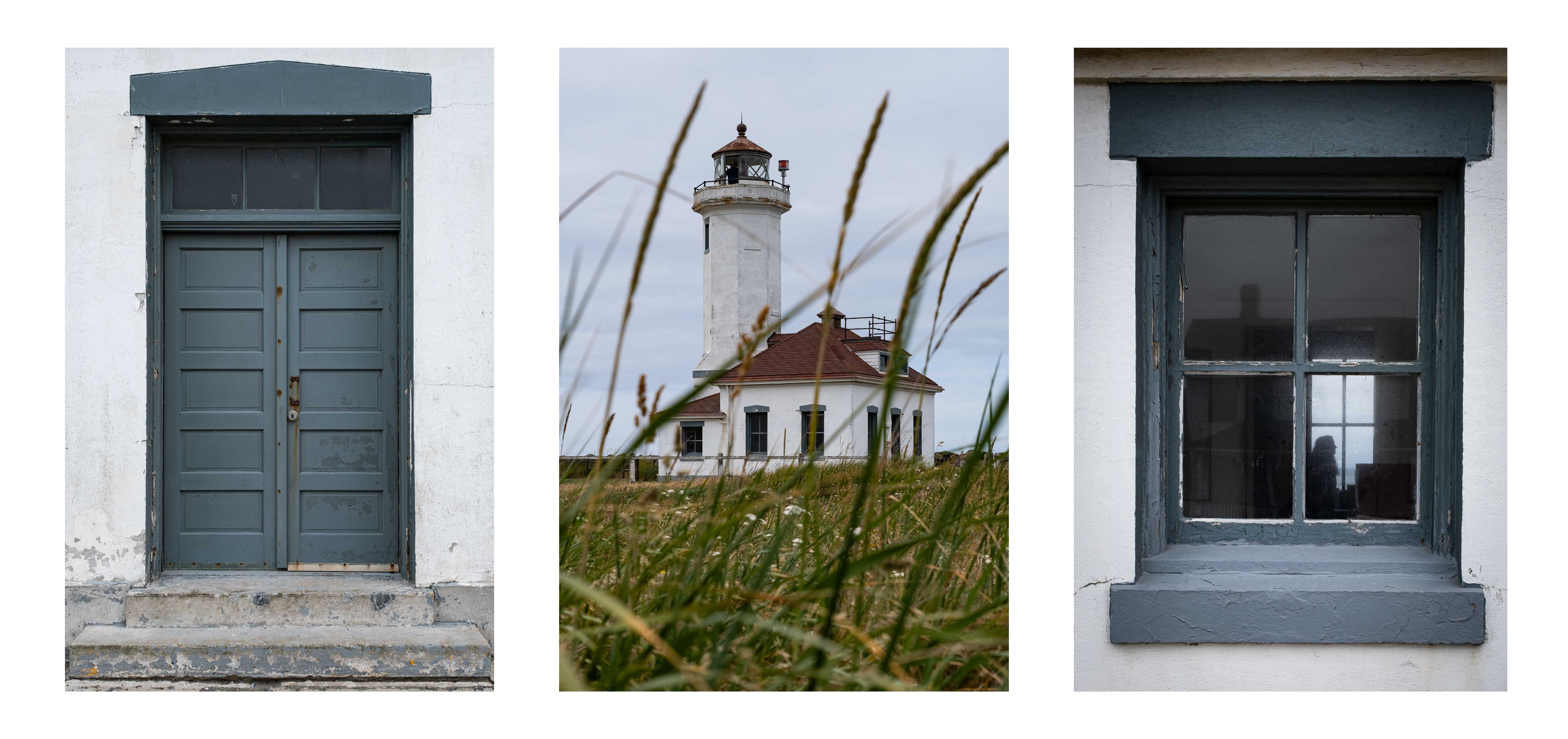
Comment |
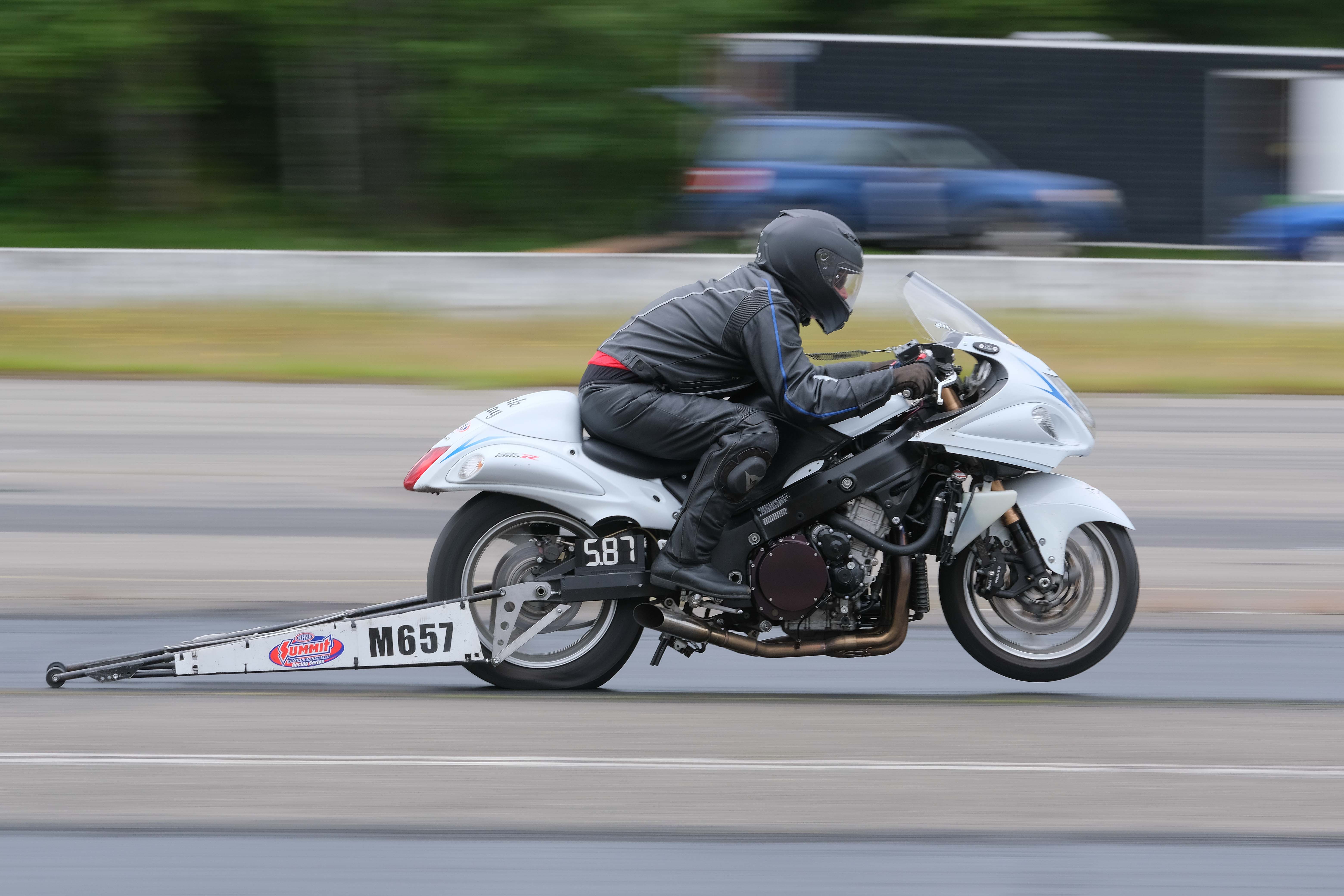
Congrats on your new tires. ;)
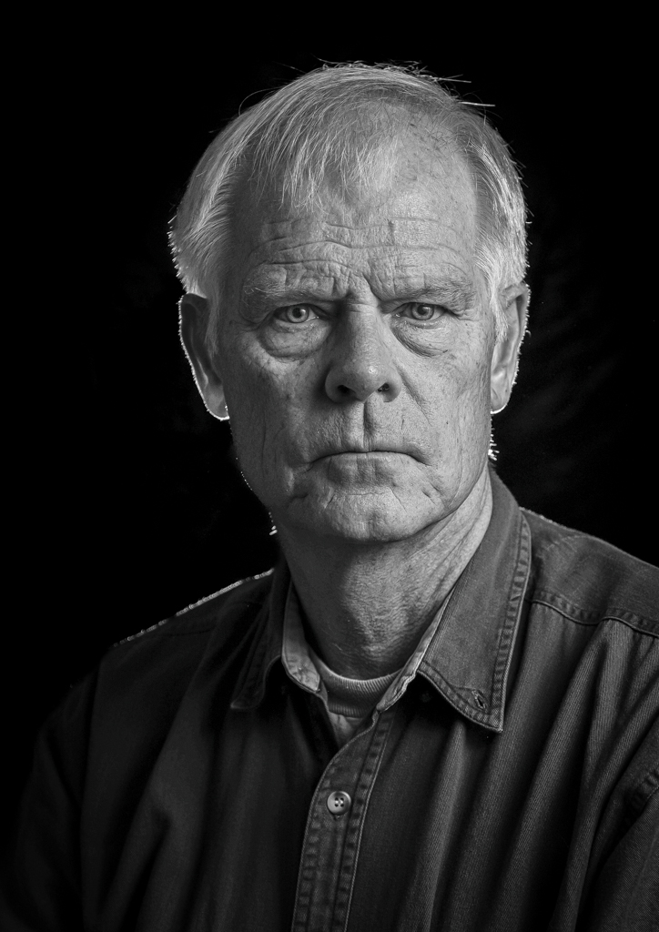
I agree with you re: the lines and reflections. Modern architecture is fertile ground for interesting photography. Technically (exposure including motion blur if at all, focus and use of DoF, and color) I think you're A-OK here.
I think your urge to straighten was a good one, although shooting on the bias (anything other than straight on a facade) and composition in general can thwart that. So, you do what you can, and make decisions about what, if anything can be sacrificed by cropping. It's stuff like this that demonstrates why they invented tilt-shift lenses. Another technique, that I learned from real estate photography, that may or may not work, is to simply ensure that the camera remains level (aiming at the horizon). Things at the corners may be distorted depending on focal length, but vertical lines remain vertical. Easier to deal wit but not necessarily possible, or even desirable based on your concept for the image. |
Aug 8th |
| 60 |
Aug 22 |
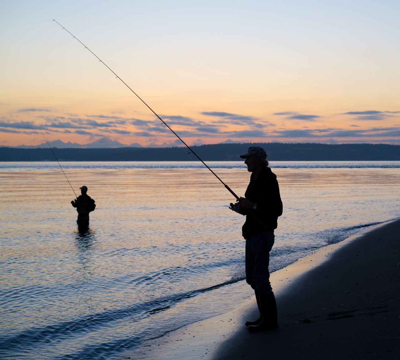
Comment |
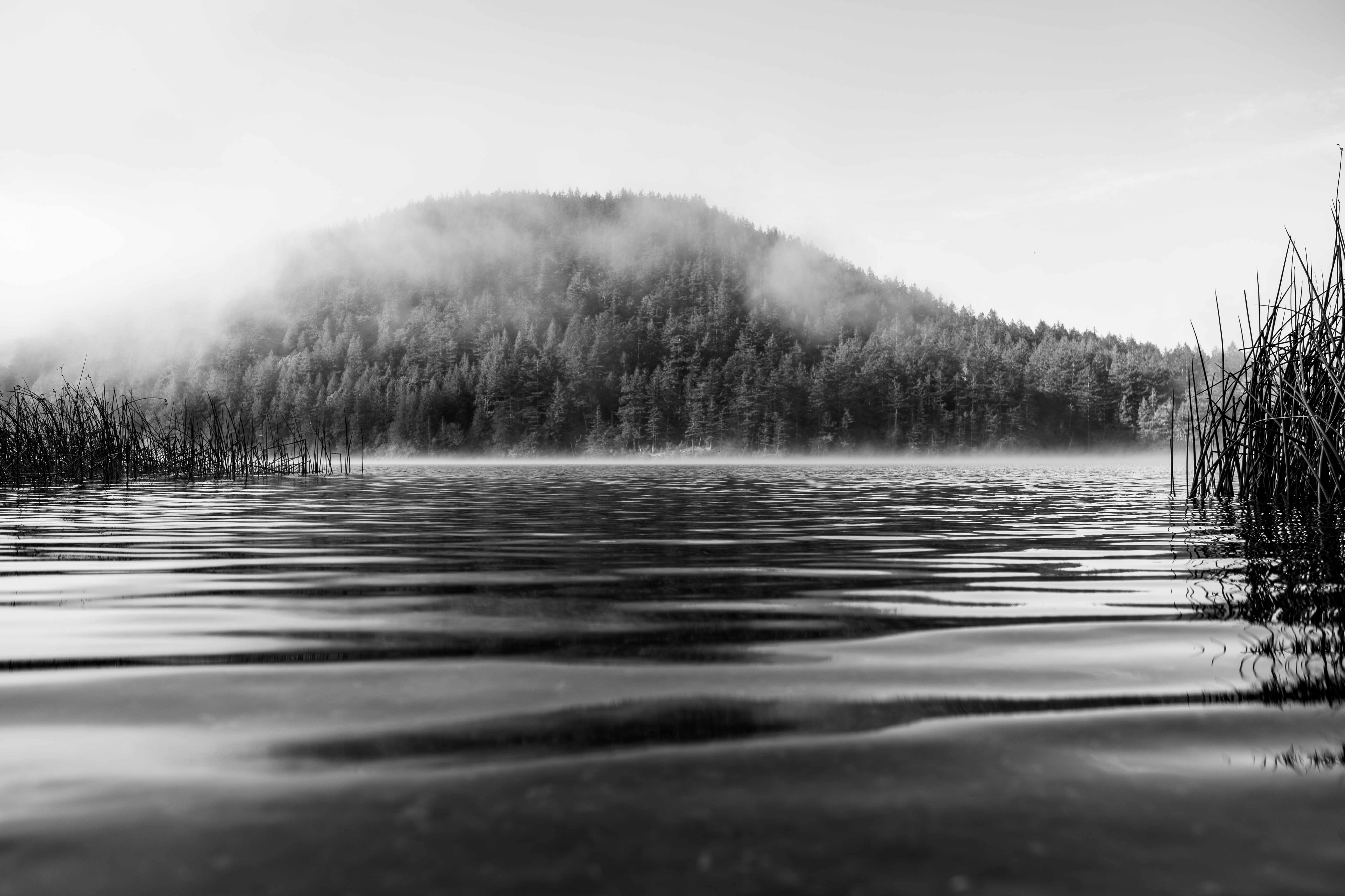
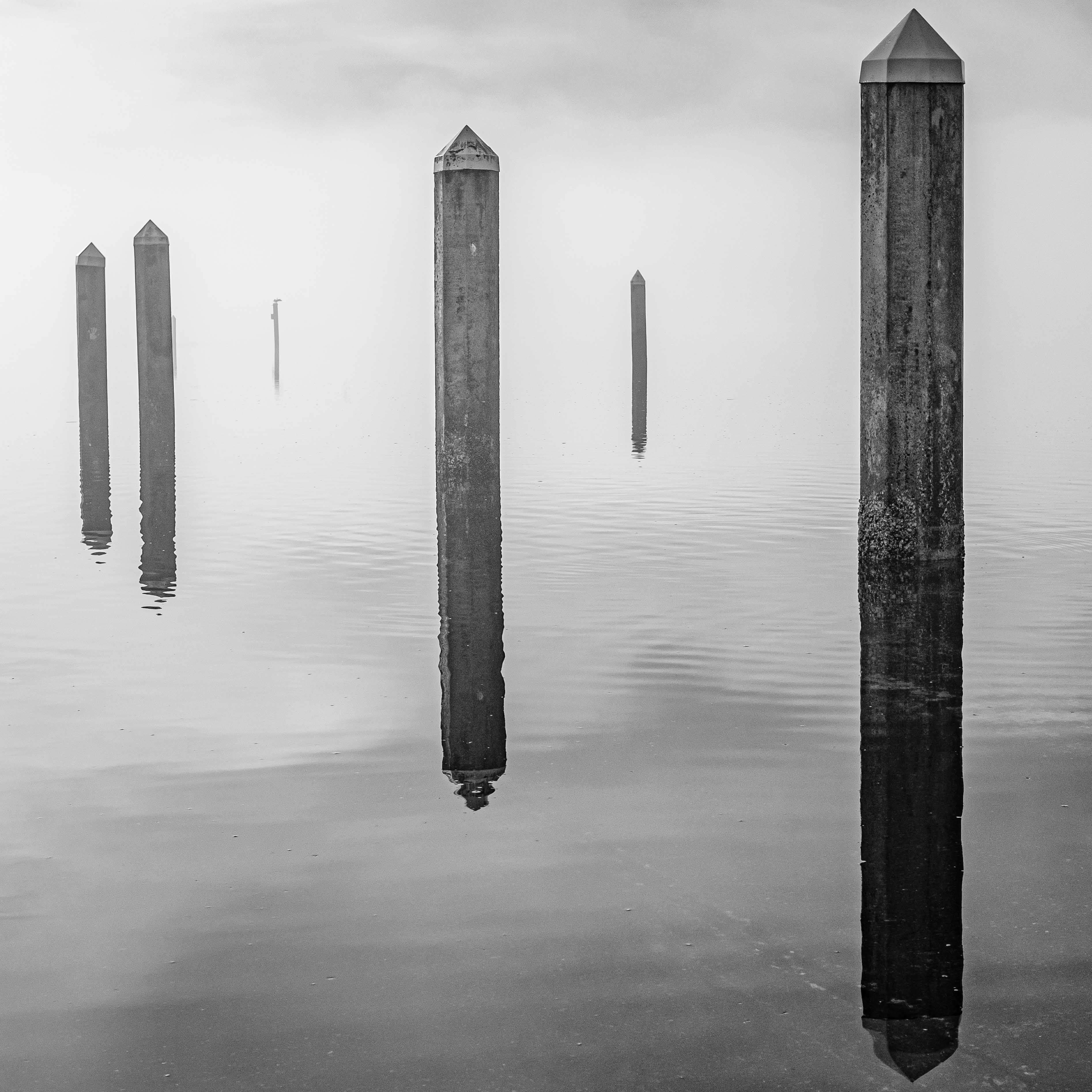
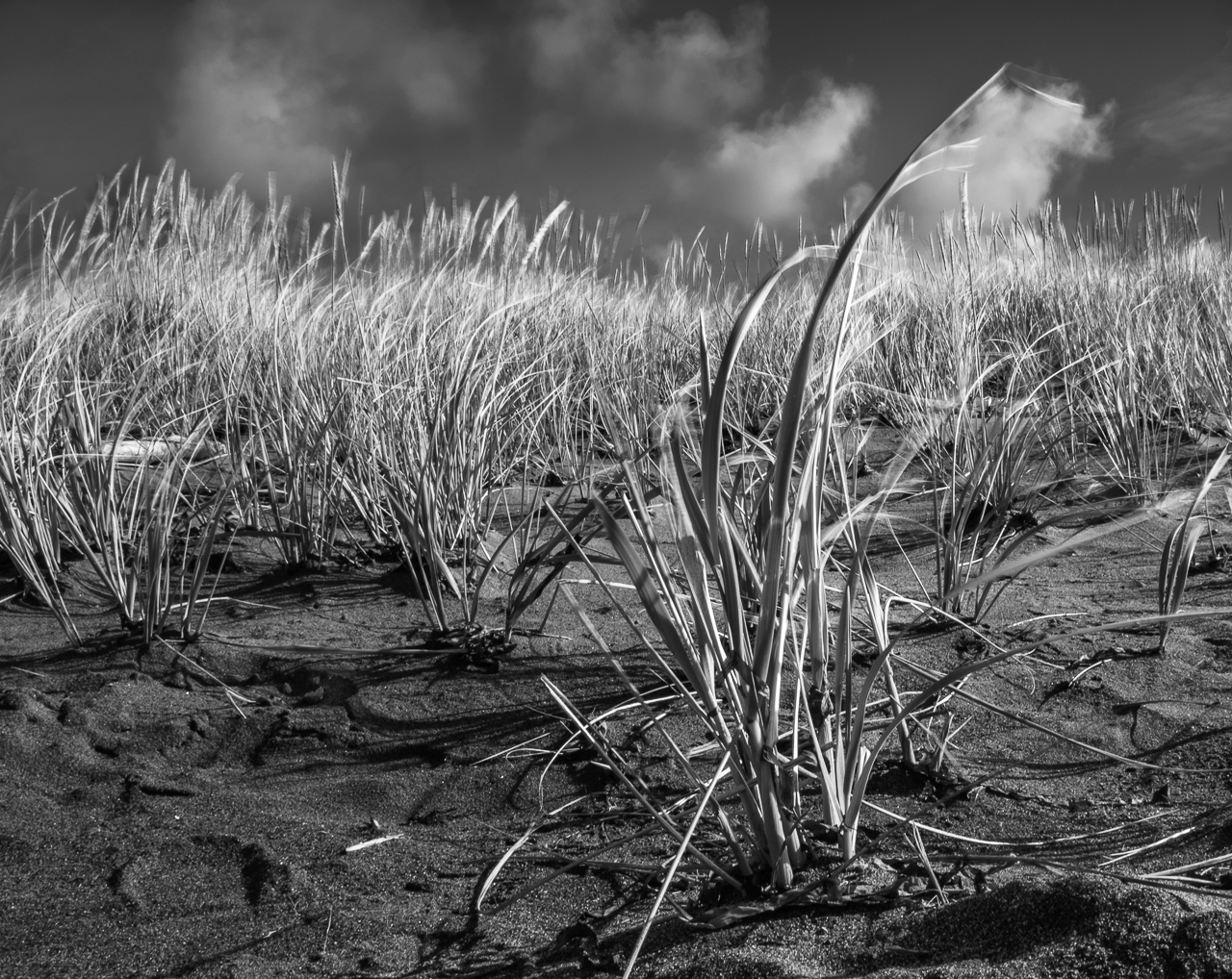
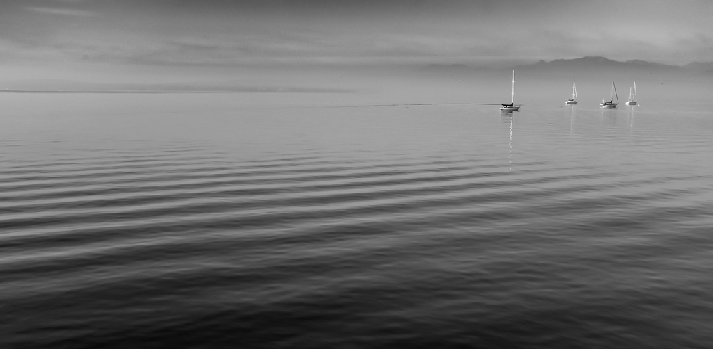
Hey Dean, cool seascape. Super sharp all the way around to me. Very well saturated (but not unnaturally so) golds and oranges to my eye, just as you planned. I can see lots of forethought in the composition, with that breakwater dominating the scene. I think your decision to keep the lighthouse was DEFINITELY the right one. In fact, I wouldn't mind if it were brought even further into to frame, in order to cement its role as part of the scene (instead of being closer to the frame edge than the sun is, thus making it seem like it might be trying to sneak out of the frame, IMHO).
You are absolutely right about the challenges of having the sun itself in the frame, some of which can be managed in post. Now, I realize that this is armchair quarterbacking, but from my lazyboy, I think that I might have done some exposure bracketing and then HDR in LrC in post, or done an in-camera HDR if I'd had the equipment that would do it. That might have added detail to your shadows, brought in some blue to the sky to balance the gold, and potentially lightened it all the way around. You might try an LrC Mask Sky, and invert it, then bump the exposure up. Could work. Beyond that, I'd suggest simplifying the image just a bit further by eliminating the bird and the pole near the lighthouse.
Regardless, it's a competent image as is. Your sunset work is good stuff. |
Aug 6th |
4 comments - 4 replies for Group 60
|
4 comments - 4 replies Total
|