|
| Group |
Round |
C/R |
Comment |
Date |
Image |
| 60 |
Jul 22 |
Comment |
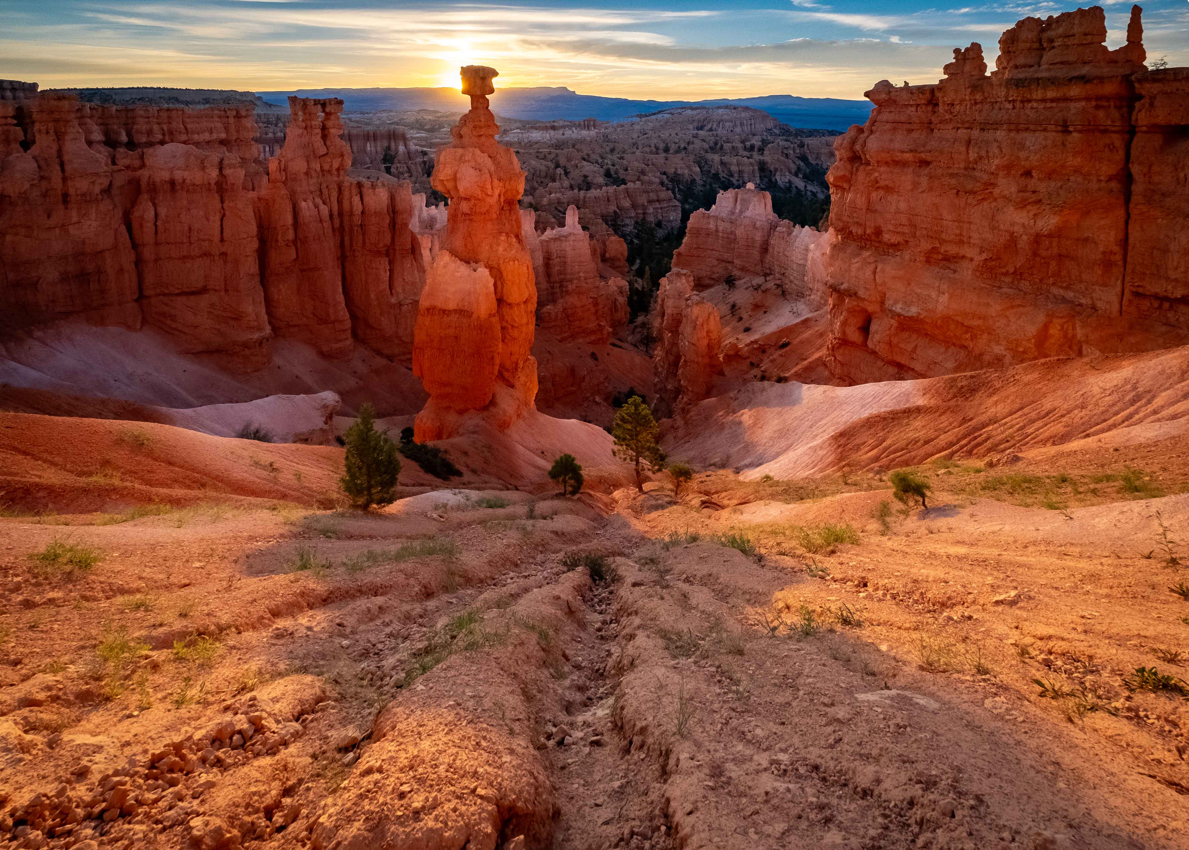
I think this his pretty good technically, with good focus, exposure, and color. Kudos.
I've taken a long time to look at this, and it finally occurred to me that I think we just don't have enough of the most interesting thing in the frame; the structure itself. I mean you have all that texture and the contrasting red adobe color and the white plaster. It's a total winner. But, IMHO, too much of it is in shadow, and there are other things between the camera and the building. Anyway, that's my take. It's good. I just wish there was more. |
Jul 25th |
| 60 |
Jul 22 |
Reply |
"Point of Burmese?" I'm assuming this was some autocorrect magic. No? If not, I'm behind the power curve so please help! ;) |
Jul 18th |
| 60 |
Jul 22 |
Comment |
Hey Anne, I don't care what camera brand you're talking about, everyone has stuff they don't understand. These are small computers in our hands these days. But, don't let that slow you down. We're still only talking about operator level stuff, and not engineer level stuff. And, as I like to say: paintings aren't about paint. But if you don't understand paint, you're going to have a hard time as a painter. The same philosophy is true of cameras and their associated technologies. But, it's a process. We learn bit by bit.
Re: the noise (grain), like I said, I don't think it's a liability...but it is there...which is weird given your relatively low ISO. Can I suggest that you try Denoise in LrC just to see what you get, and whether you like it? I think messing with the tone curves is equivalent to adding contrast, and yes, that could add some noise (it amplifies the existing signals, as I understand) but that's usually a very subtle change, and I'd be very surprised if it created the amount of stuff we see here. Mystery...
Wait, when you say you printed the critique, what do you mean? Tell me your process please. |
Jul 15th |
| 60 |
Jul 22 |
Reply |
I don't think it's too busy. I mean, it's not minimalist, but not every image can or should be. I think you should be pretty proud of this. Here's another experiment to try. Can you use the brush tool to select those boards near the far end of the building that are showing a bit of glare, and then use the Dehaze tool to see if you can get some glare off of them? If yes, then it would add some detail. If no, then it's not a biggie. |
Jul 10th |
| 60 |
Jul 22 |
Comment |
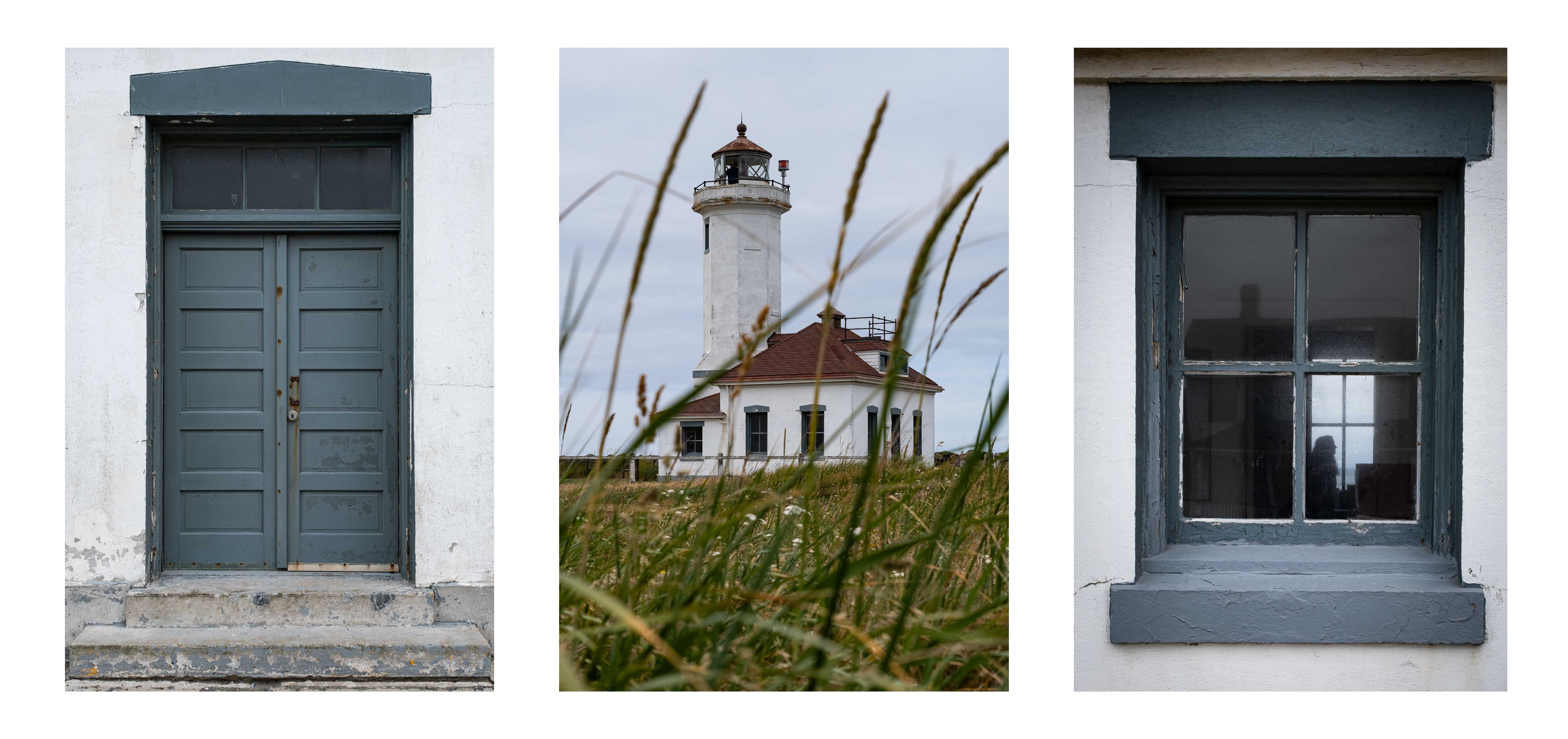
Neat architectural image, which is a genre all in itself really. Everything looks sharp to me. Exposure is good I think. Colors are... well color looks saturated but overly so. So, technically things are doing pretty well. And, I think artistically, as you said, the lines and repetitive angles are excellent. Frankly, I think this is a really good catch.
So, you mention that you didn't change to ISO (from 320) after having moved from the shade. 320 is still a very low ISO, especially on a machine that is touted as being "ISO Invariant", so I don't think that's really an issue of concern, but there is what I think is a lot of noise in the image (did you raise the exposure a lot in post processing?). I don't think it detracts personally, although some may. If you want to create an error trap for that, you can get off manual ISO, and set Auto ISO (I bounce between three different Auto settings, and manual, all the time).
But, with regard to Fuji and ISO, there's something else going on, which is that any of the dynamic range features (and I think the film simulations too) use a minimum of ISO 320. I don't know exactly why that is, but it's a fact. But it really isn't a problem, especially if you're using in-camera noise reduction which really is miraculous in my opinion (use +1 max).
Re: composition, I have a suggestion too, which is to photoshop out that tree and other object in the bottom. If it told a story, or seemed to be an intentional compositional element, it would be great. But in this case, I just think it can be removed, which is easily done.
And, your vertical lines can be straightened. This is a perennial challenge with architectural stuff. The fix is to hold the camera level when taking the image, although that's not always possible. But, the Transform function of LrC will square that right away, and since it's minor here, you'll keep most of the image.
Like I said, this is a strong one for me. |
Jul 10th |
| 60 |
Jul 22 |
Comment |
This is a pretty strong first image in my opinion Eric. I think the composition is really strong with tons of leading lines, fore (the graffiti to the right), mid (the boat) and background interest (the sun). And the subject too is dynamite (Q; who doesn't like boats? A: Hobbits). Exposure looks great all the way around to my eye. Focus is sharp throughout as far as I can see, which is challenging in an image with so much depth. I like the colors, personally, which to me lack the over-saturation that many seek for sunset imagery. Good work all the way around, IMHO.
I do have a small suggestion. Now this is a niggling trifle, but that black graffiti at the bottom of frame keeps dragging my eye away from the focus of all the leading lines. To me, this is proof positive of the power of high contrast to draw the eye. Fortunately though, cropping up just a touch eliminates it. C'mon. Humor me. Crop it up and see if you don't agree (which is entirely possible). |
Jul 9th |
| 60 |
Jul 22 |
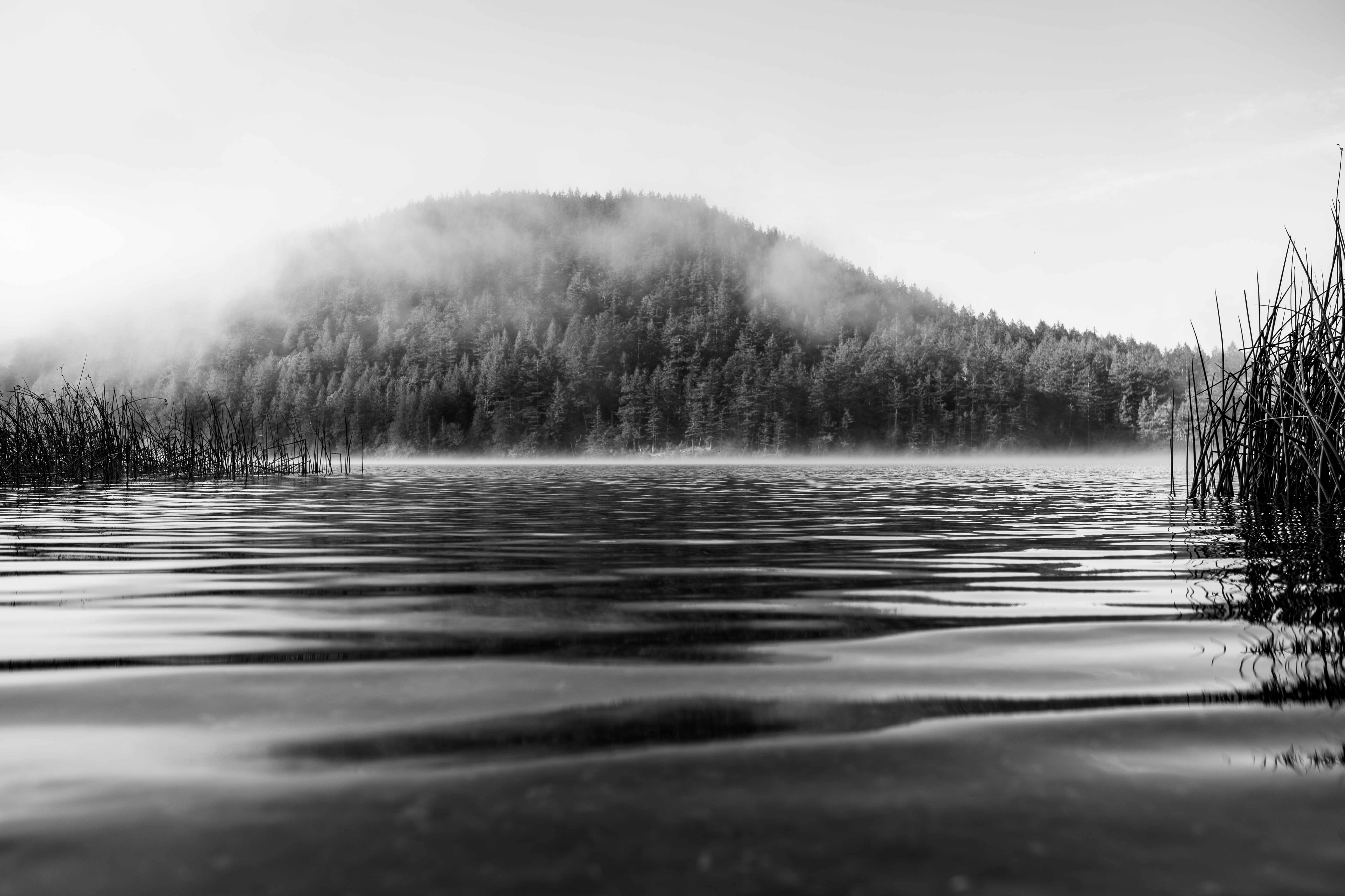
Comment |
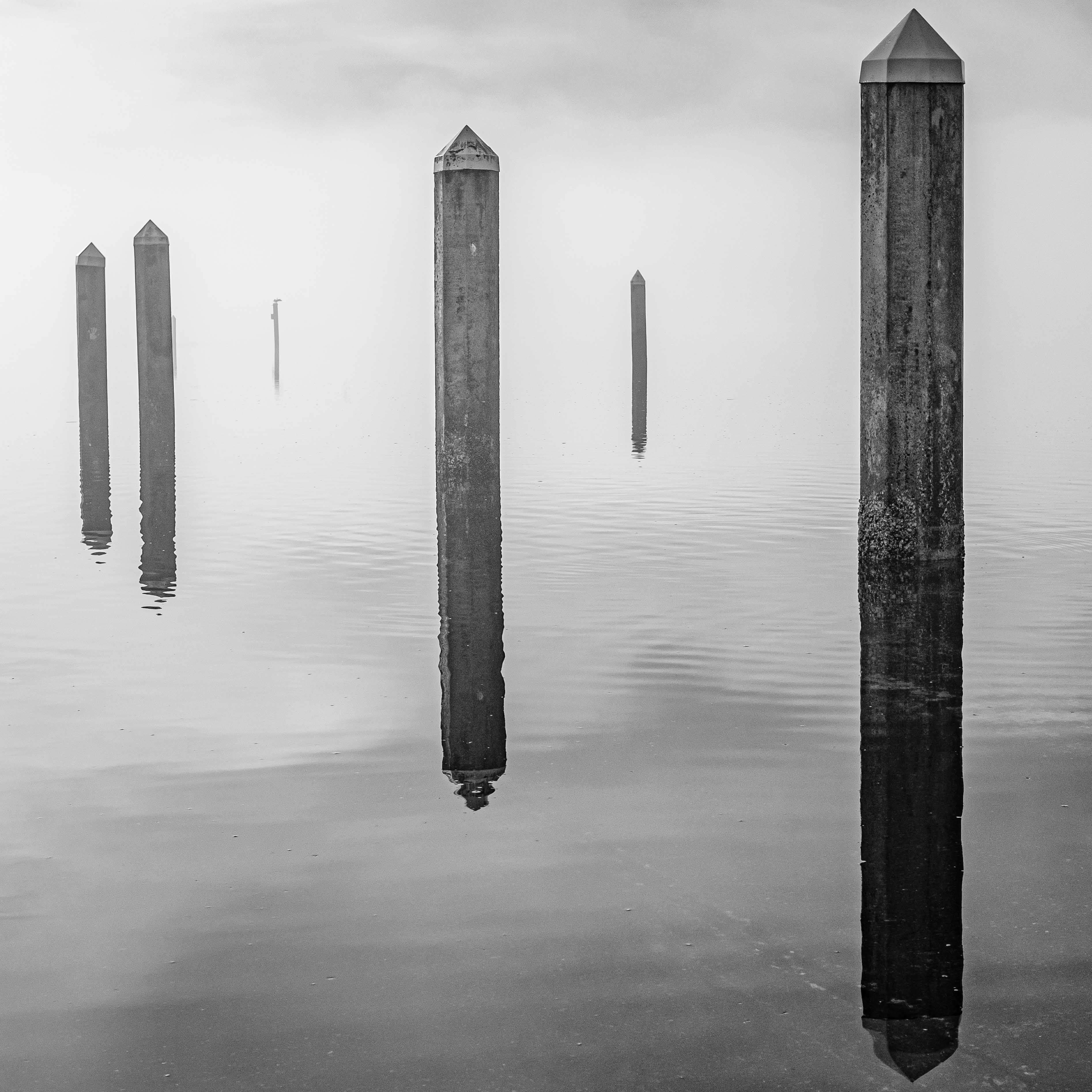
Rita,
Nice landscape IMHO. Very crisp, which shows the wisdom in your choice of a relatively high shutter speed, AND the use of a monopod (I like'em too). For me, the best part of the image is the composition. The island is out there all on its lonesome, and in high contrast, to the frozen lake around it. Then you have the clouds and hills beyond. I'm not sure if I get "serene" out of the image, but then again, the exact emotional response is on the viewer, and not the maker, in my opinion.
Question: What went into your decision to use f/5?
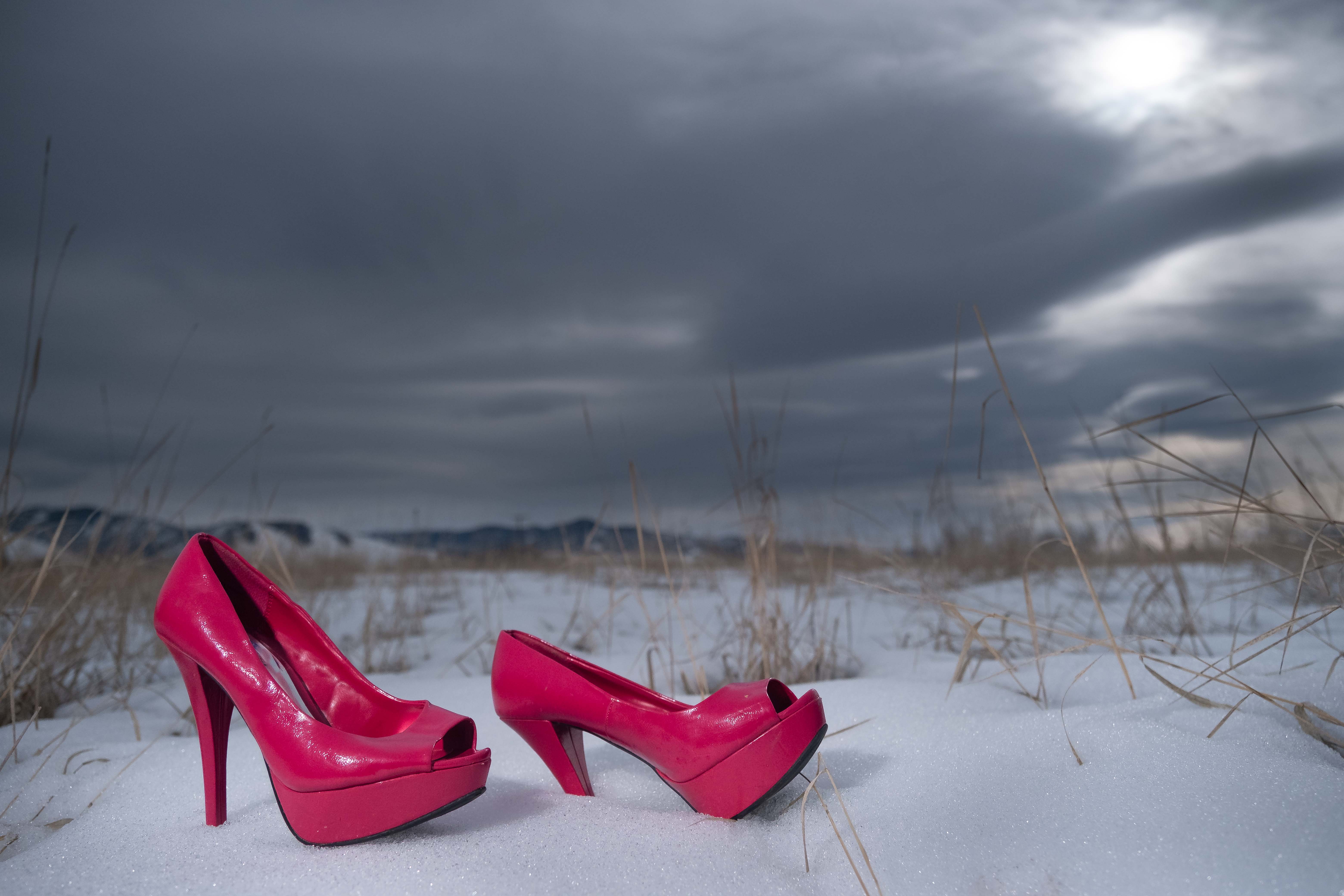
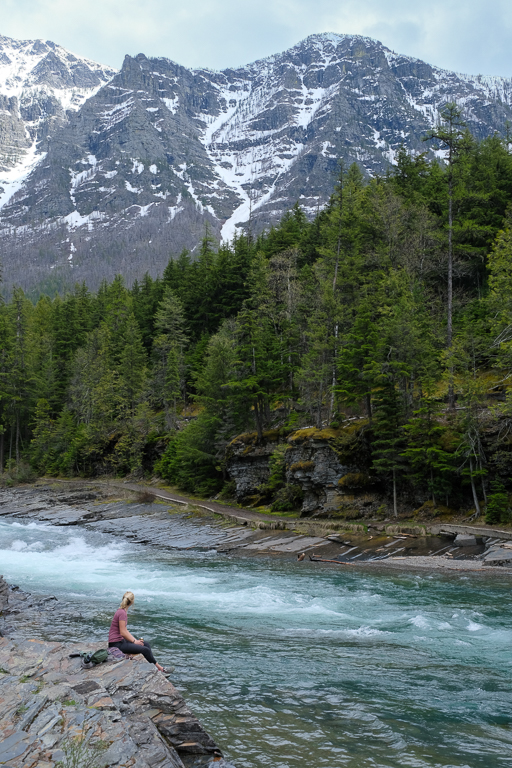
If I were going to make a suggestion on an improvement to this image, it would be to crop out the stuff in the lower right corner. They have more visual weight, and are higher contrast (and thus attractive to the eye) than anything other than the subject, but they're not in focus (at least the tree isn't that sharp). As foreground interest, I just don't think it works because it dominates, but isn't up to the task because of the aforementioned lack of sharpness...as I see it. And, the isolation of the island is where you make all your money here anyway, to me. Anyway, cropping is free to my mind and because you've captured a sharp image, there's plenty of opportunity to crop if you want. |
Jul 9th |
| 60 |
Jul 22 |
Comment |
Definitely some visual impact here IMHO. Very creative. This isn't my bailiwick in terms of genres, but I an see your intent here, and well-developed treatments. What's should be sharp is, as far as I can see. Exposure on the subject is appropriate too, IMHO. Composition works for me too, since there's breathing room for the subject around the perimeter. Frankly, I'm kind of impressed by your savvy re: using blurring to reduce masking (and halo, I assume) issues. Would you mind talking more about that, or maybe giving us a before and after, or some more training?
I sure wish you'd included some of that vibrant green in the final image. That color harmony may have really been electric. Still, that darker green is attractive too, I think, so maybe it's wouldn't have made a difference. Good, creative work, for my money. |
Jul 7th |
7 comments - 2 replies for Group 60
|
7 comments - 2 replies Total
|