|
| Group |
Round |
C/R |
Comment |
Date |
Image |
| 60 |
Jun 22 |
Comment |
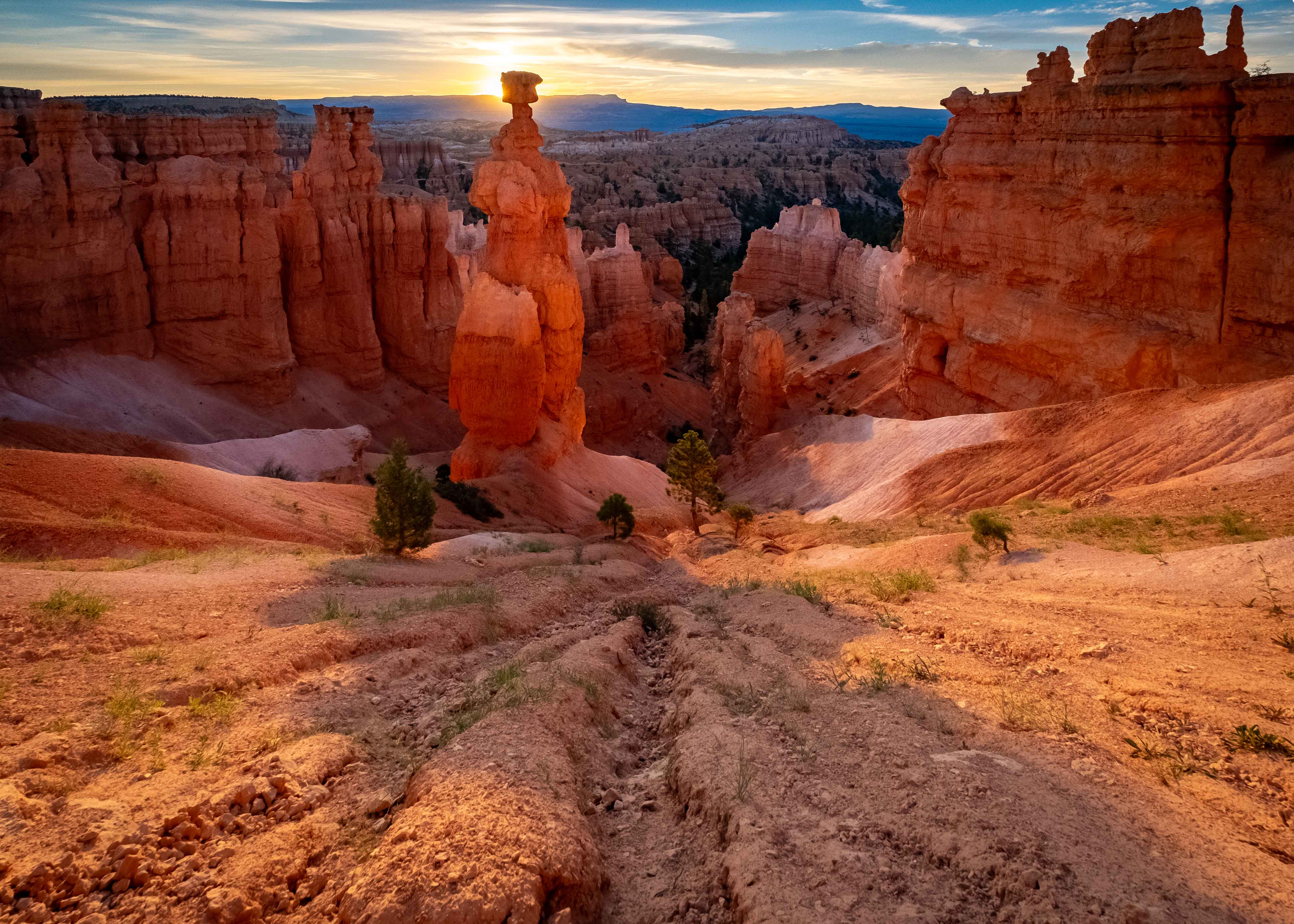
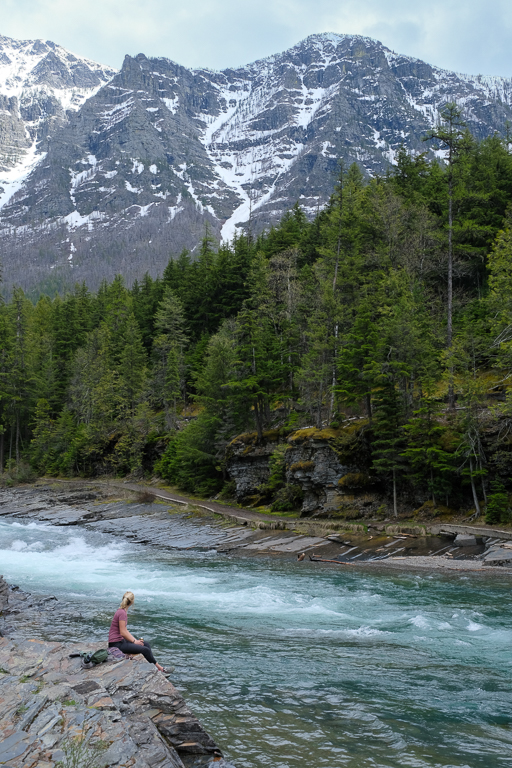
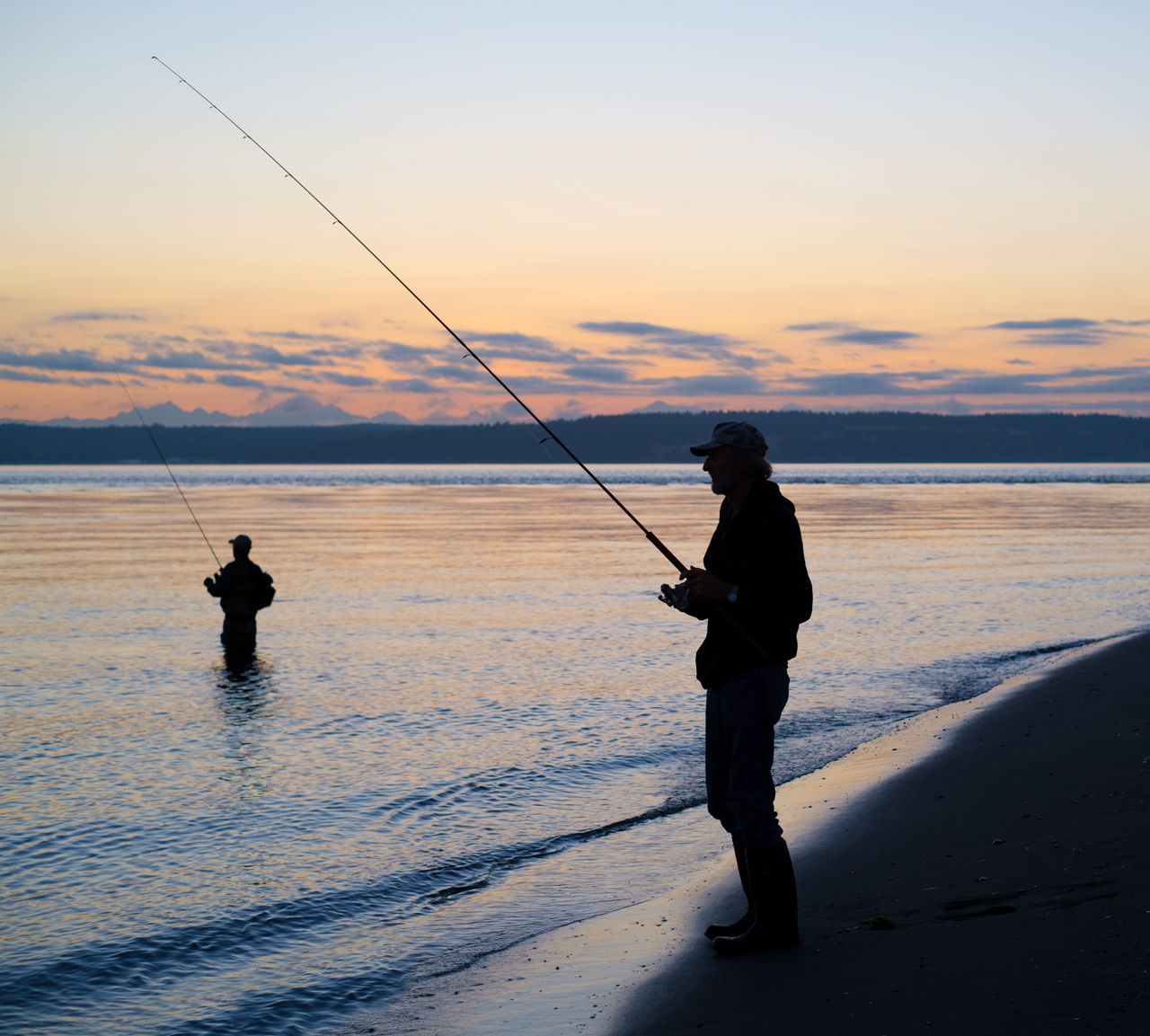
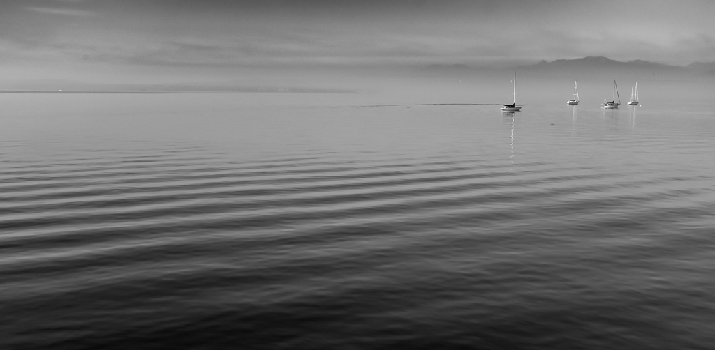
This is a strong image for me Dean. I think the composition is well-done, with ample fore-, mid-, and back-ground interest, and I can see your care in putting the line of the advancing water in the right, lower corner. Focus and DoF are well -done to for me, with sharp details throughout. I like the color harmony going on between the gold of the sun/clouds, and blue reflections off the water. Cool image.
I think there might be two opportunities for improvement. I personally, would like to see a bit more detail in the portion of the rock faces that are currently in shadow, which right now seem to lack it. That however, may be as easy as bumping up shadows.
The other is much more esoteric, and maybe irrelevant depending on taste, which is the cloud back on the right. Now, this is just my opinion, but I think that the size and relative darkness of the clouds put a fair amount of visual weight on the right, that is not balanced on the left, in an image that otherwise is fairly symmetrical. That's a pretty artsy, squishy thing for me to comment on really. But, my eye keeps returning to that cloud bank, and when you're offering comment on an image that is this strong, there's not that much to comment on. Take it as a compliment. |
Jun 20th |
| 60 |
Jun 22 |
Reply |
Thanks Eric. Both you and Emmy suggested doing something to make the observer stand out. I'm definitely going to take a look at that, but it seems to me its a fine line. I mean, I don't want her to become the subject, but merely an observer of the scene. Regardless, it's worth experimenting with. Thanks. |
Jun 20th |
| 60 |
Jun 22 |
Reply |
Thanks Dean. I too wish the sky was a nice blue with puffy stuff but alas. Actually I had to work pretty hard to get this much detail into it. I was plagued with flat, grey skies for a large portion of my time in the park (this is Glacier). On the flip side, you'll notice the soft, even light, which is one of the things flat, grey skies do FOR us, instead of AGAINST us. I considered cropping the sky out entirely, but then you lose the mountain peak, which (IMHO) kind of crushes the background interest. Anyway, good comments. Thanks. |
Jun 20th |
| 60 |
Jun 22 |
Reply |
Hey Emmy, thanks for the comments. I'll take your suggestion on contrast under advisement. |
Jun 20th |
| 60 |
Jun 22 |
Comment |
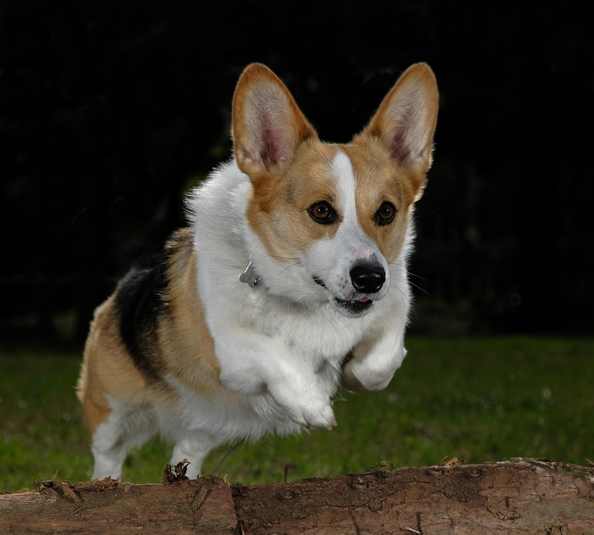
Hi Emmy. Sandy seems to be a real character. You did a good job getting her eyes nice and sharp, as far as I can see, which really adds to "capturing the essence" of both man and beast. Catching these candid events is tough, and you have to use whatever is at your disposal. Good job on wielding your trusty camera phone.
As good as camera phones are, they're not perfect...which is comforting! I'm actually a little surprised to see what I think are some blown-out areas behind Sandy's left eye. Phones often/usually automatically HDR stuff for us, so this must have been extra challenging circumstances.
And this is just me, but I think I'd like to at least be able to see the entirety of Sandy's head. There's no rule about that, and photographers often crop portraits pretty dang tight, so that's just a personal preference. Anyway, keep shooting Sandy, and if you must ( ;) ) keep using your phone. Animal portraiture is a demanding, but rewarding, genre.
P.S. I probably have more photos of my corgi than any other single subject. |
Jun 11th |
| 60 |
Jun 22 |
Comment |
Hey Folks, here's a little amplifying info presented by Dean re: his image. I think exemplifies the deliberate process that goes into many (most?) superior images. See what you think:
"I picked out his site along the beach well before sunset. I selected that location because I would be able to capture the setting sun between the two large rocks which would create dramatic shadows and
funnel the sunset light. I placed the small rocks to add foreground interest. I composed the image to take advantage of the horizontal layering of sun, water, and sand. I used a small aperture with aperture priority to provide good depth of field and produce a sunstar as the sun got lower in the sky. Of course, I used a tripod to provide a stable platform and turned off image stabilization. With some other images I experimented with some very slow shutter speeds; see attached.
I shoot primarily with a Sony A7R4 (always in raw) and use LR and PS to do post processing. I allow LR to do lens corrections and with sunsets I typically adjust the highlights and shadows and may add a gradient or a brush to make local adjustments.I also often add a vignette. I use other post processing software, such as Topaz Sharpen and Luminar AI, as needed." |
Jun 10th |
| 60 |
Jun 22 |
Reply |
Hey, you're not wrong. Many of these things are difficult to identify, difficult to disambiguate, and difficult to describe. There have been attempts to boil down, or categorize all the aspects of an image into "elements" in order to get a handle on them, so that we can discuss them, but there's no single consensus even on what they are (just google "photography elements" if you want to go down a rabbit hole).
But, that's sort of why we're here, which is to look at each other's stuff, talk about it, figure it out, and incorporate it into our own work if we desire. And, it's a process. You can't learn (or remember) everything in a day. So, here's a good article on tonality: https://digital-photography-school.com/understanding-tonal-range-photography/ . I suggest checking it out when you have some spare time. See what you think. |
Jun 7th |
| 60 |
Jun 22 |
Reply |
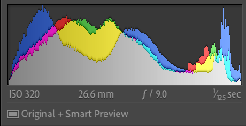
Anne, I've been thinking about your comment and wanted to ask you for a little clarification. When you say "brighten the tonality", I'm not 100% sure what you mean by that. Can you talk more about what exactly you're thinking? Are you talking about overall exposure? Boosting shadows? Highlights? Or something more complex? And, for reference, here's a shot of the images histogram, which tells us what the current exposure profile is. |
Jun 3rd |
 |
| 60 |
Jun 22 |
Reply |
Yep. You're doin' it right. ;) |
Jun 2nd |
| 60 |
Jun 22 |
Reply |
There aren't any other member images yet. Technically, folks have till the 10th to submit.
|
Jun 2nd |
| 60 |
Jun 22 |
Comment |
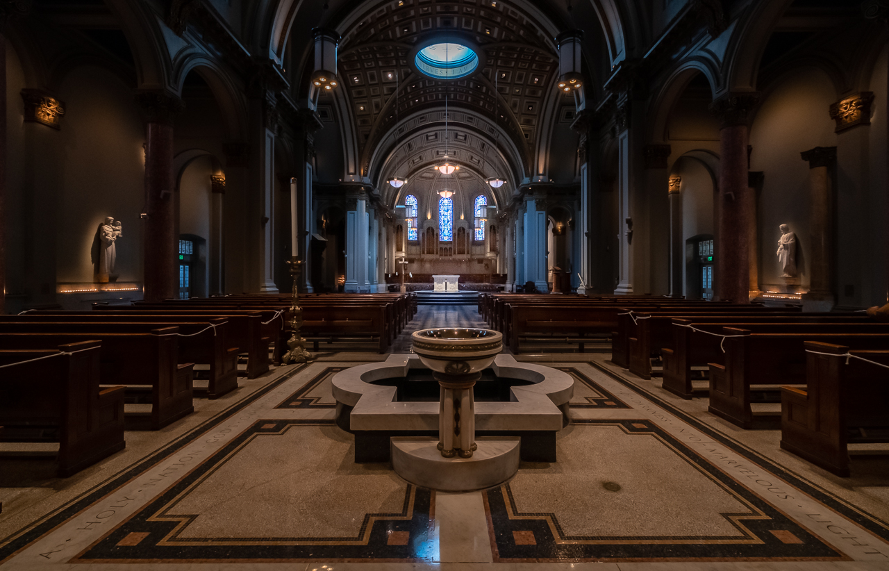
Thanks Anne. Very kind. The image tone changes that I use are in the Image Quality menu, but I've moved them to the Quick Menu for easier access.
And, you bring up a really interesting point re: portrait vs. landscape orientation for landscape images. In truth, I prefer landscape as well, but that's really because you get more image on the screen that way. But the plain fact of the matter is that it's all gonna depend on the subject and how I'm composing. But your point is well-taken.
There's another reason why landscape orientation is preferable, and that's the PSA Interclub Competition technical requirements. Max width for an image is 1400, but the max height is only 1050. So, if you're using portrait orientation, you just don't occupy as much real estate on the screen, and IMHO, that reduces visual impact. So, once again, good point. |
Jun 2nd |
| 60 |
Jun 22 |
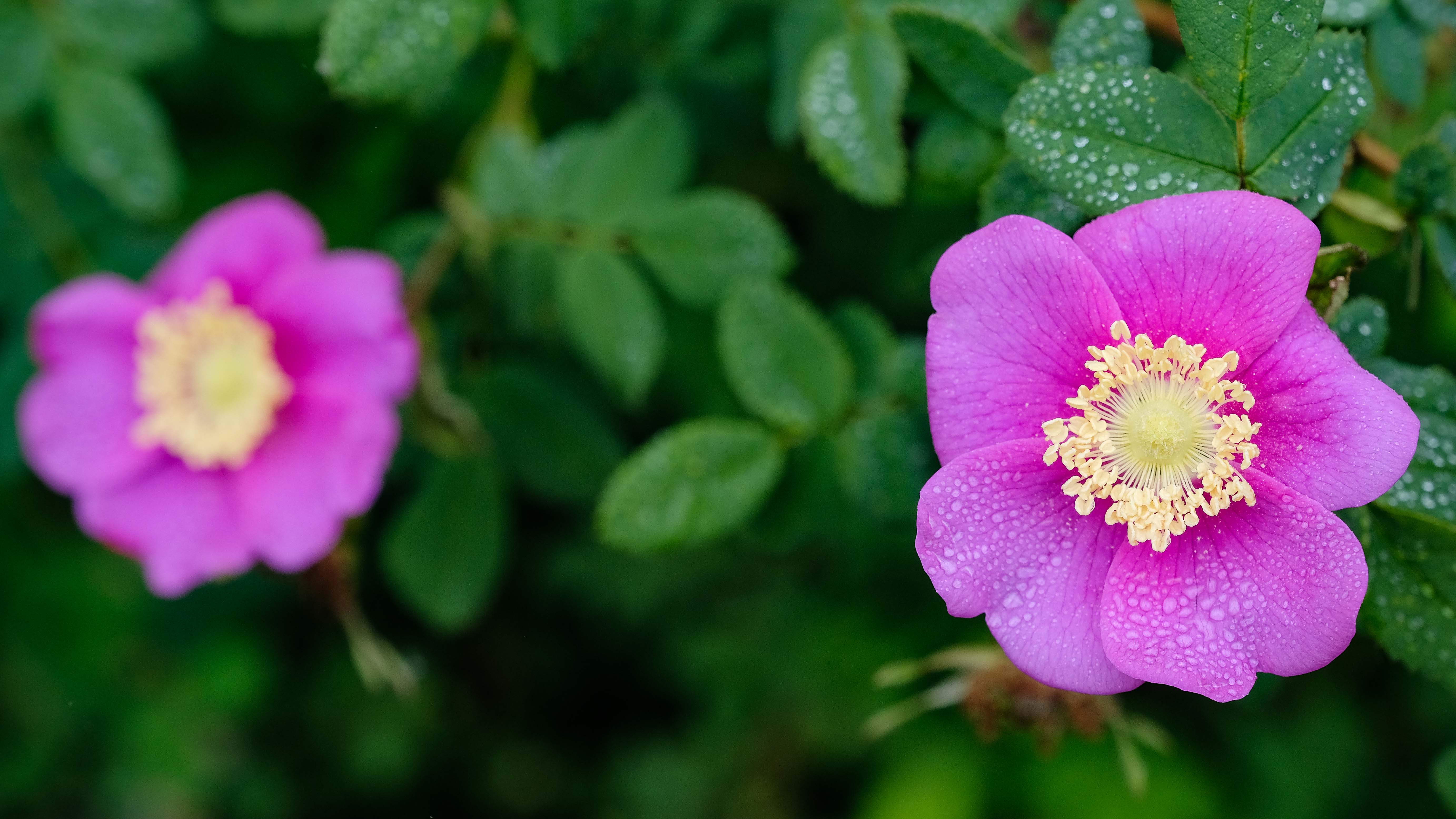
Comment |
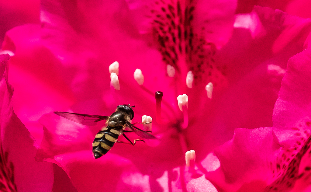
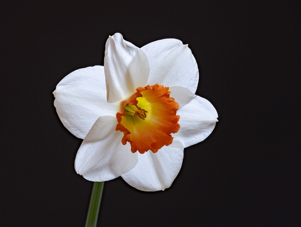
Hey Anne, I have exactly the same setup! GREAT, super sharp texture in the forward petals I think. But, what really jumps out to me is the beautiful color (complementary pink and green). Kudos on that. Nice effect on the water droplets. Exposure works well for me here. with no clipping or blowouts,
I really dig this lens but to tell you the truth, I haven't had a whole lot of success using it for macros, but instead use it mostly for stills, due to the "notoriously shallow depth of field" (or so says Allan Walls, a GREAT macro photographer, https://www.allanwallsphotography.com), which I can see you're dealing with here too. Using the 80mm for still life and table top stuff allows you to get farther away, instead of having to fill the frame for a macro shot, and thus broadens the DoF. Of course, I could always try focus stacking for some stuff, but that just doesn't work for subjects that move around like bugs in the field.
My only other comment here would be that in an image like this, you might consider composing to include the entire flower (subject, as I interpret it) in the frame, and place the subject somewhere other than dead center. Both of those are artistic decisions, and not technical ones, so it's entirely up to you, but I think you might find those two techniques really electrify your compositions.
So, this begs the question, about where to put the subject. I think it's pretty conventional to put it at one of the frame's crash points (think Rule of Thirds,https://study.com/academy/lesson/rule-of-thirds-in-photography-definition-examples.html). But, I learned about this composition technique that some Japanese aquascapers use, that I think gives a really natural and pleasing appearance. See what you think: https://www.aquatic-eden.com/2006/11/golden-rule-of-aquascaping.html |
Jun 2nd |
5 comments - 7 replies for Group 60
|
5 comments - 7 replies Total
|