|
| Group |
Round |
C/R |
Comment |
Date |
Image |
| 60 |
Feb 22 |
Comment |
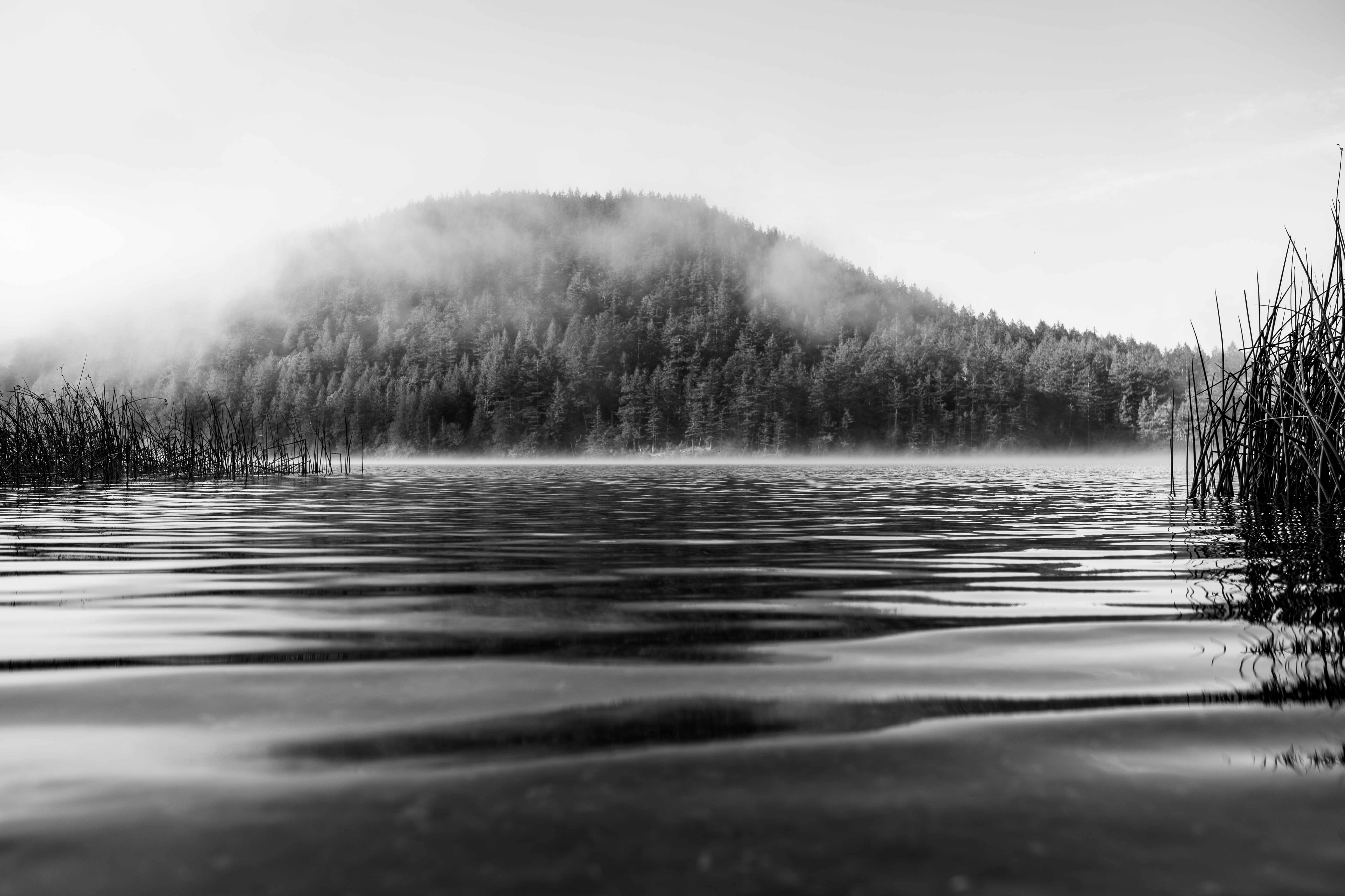
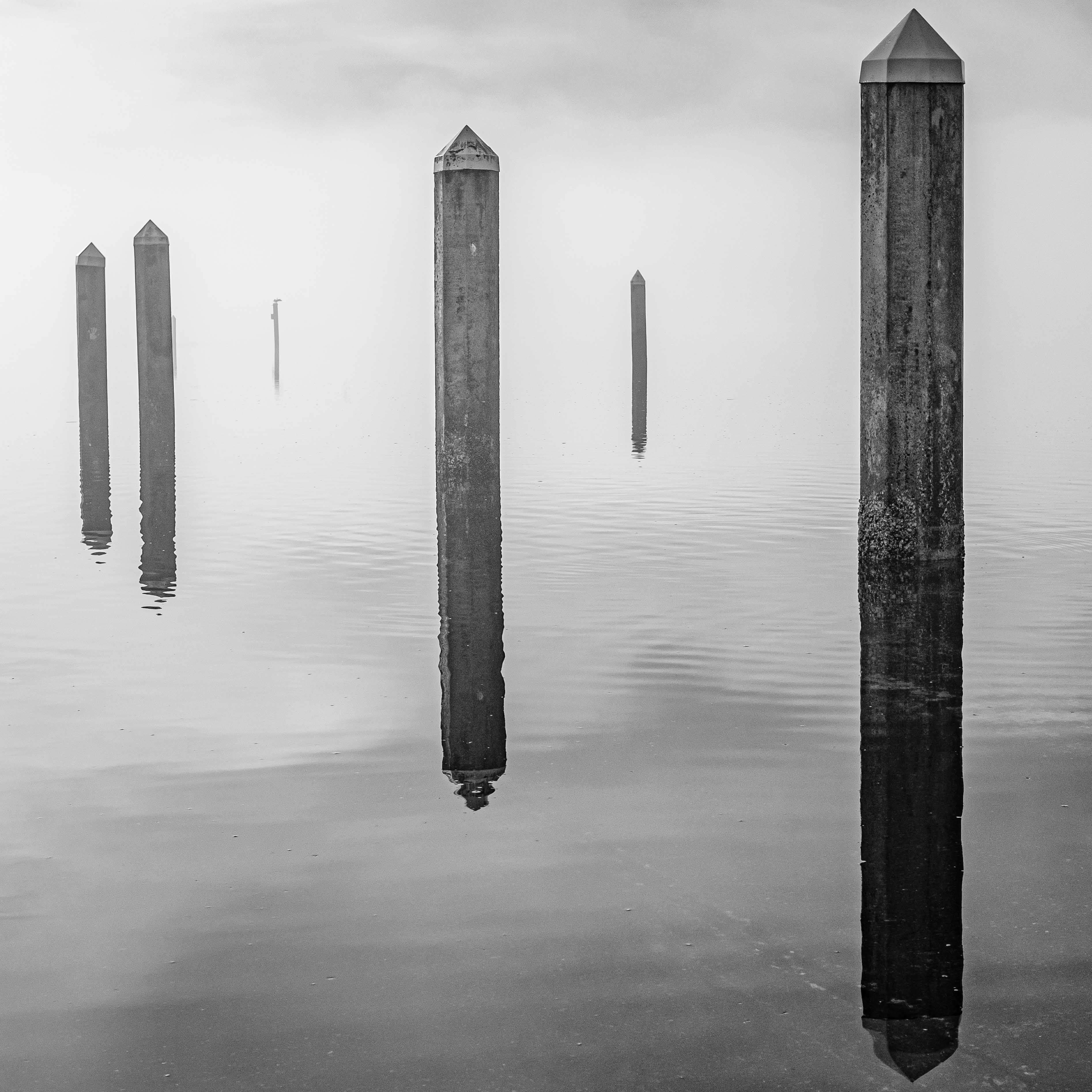
Very interesting point re: more reflection produced by the longer shutter time. I would not have thought that Richard. My sense usually is that longer shutter times on water reduce detail, and can create that milky, featureless look conducive to minimalism. Can you show me an example of how this works, or maybe point me to a discussion with examples? I'd appreciate that big time.
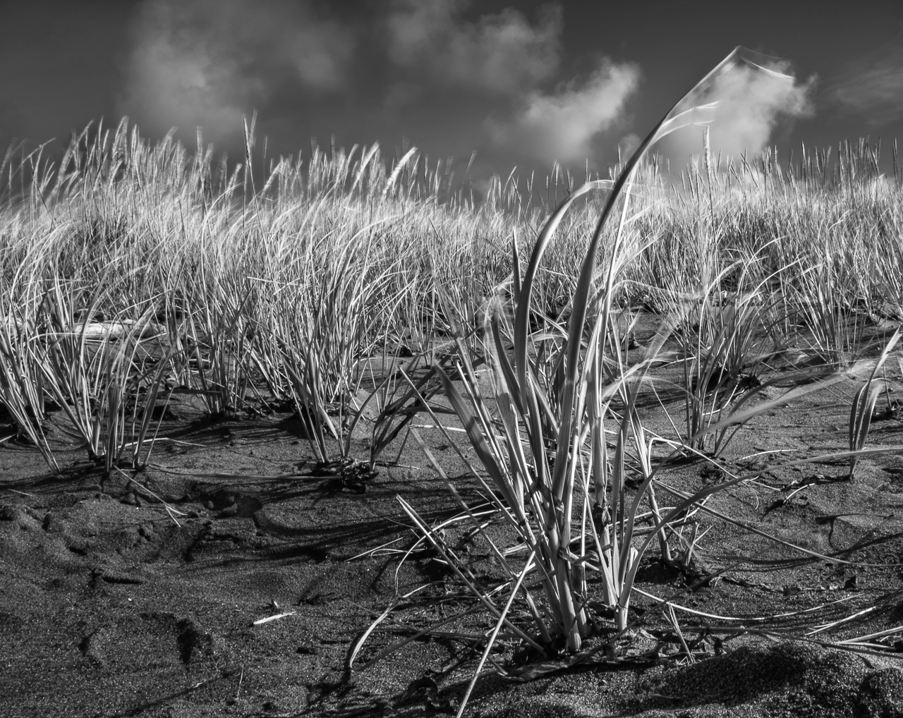
I like the image. This is just a thought, but I think you could also go the opposite direction in editing it, and get rid of sky details, just leaving you the angular and crisp pilings. Anyway, it's strong, as-is, IMHO. |
Feb 23rd |
| 60 |
Feb 22 |
Reply |
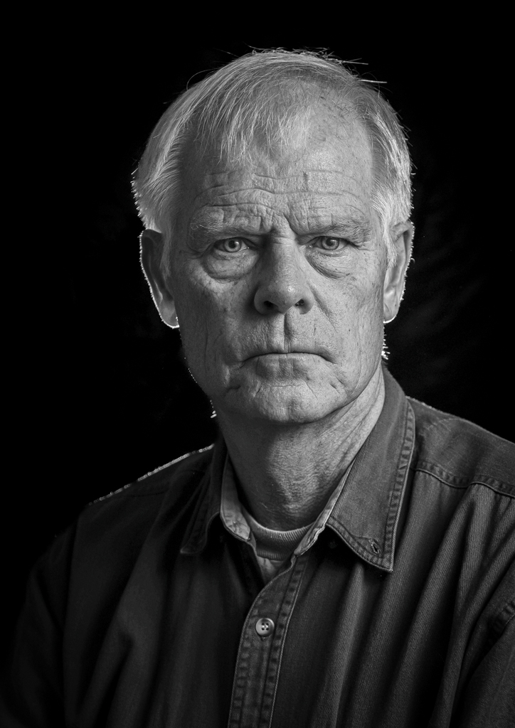
Too much on the shoulder? Actually, that's kind of the point of rim lighting, which helps outline the subject but I think I can tone it down. Like I said to Emmy, it should be a kiss, not a sloppy smooch. But you know what I really didn't catch before? Emmy caught it which is the excessive light on the ear. That really is too much, seeing as how it is shining THROUGH the eat. I think I can fix that though. Thanks for weighing in brother. |
Feb 23rd |
| 60 |
Feb 22 |
Reply |
OK. Got it. I think I have a bit more understanding of what you're going for here, in which case, I have a suggestion. I think you might try bumping up the contrast a bit, and maybe putting a radial gradient on the graffiti. That might bring the eye right there a bit more, which is a real point of interest anyway. Don't know. See what you think. |
Feb 23rd |
| 60 |
Feb 22 |
Comment |
Phone cameras are pretty amazing. Mastering them is a valuable skill. About 10 years ago, some friends and I spent a couple of months using ONLY phones. No zoom. No editing. No nuthin'. It was a great exercise.
Looking at the color and texture here, it's easy to see why it grabbed your eye. i like it too. I look at it kind of like an abstract. It doesn't have, or need a story, to be visually interesting.
I have two suggestions though, which you can pull off: brighten the upper right corner, or maybe even crop to below the uppermost beam, And, bump up your contrast a bit. Seems a touch flat to me. Try it and see what you think. |
Feb 6th |
| 60 |
Feb 22 |
Comment |
Hey John, I think the exposure works well. The colors are muted but realistic. It looks like a good subject full of compositional possibilities. I appreciate the leading lines, the repetition and the texture.
When I click into this, it's not particularly sharp. That's unfortunate, since I think it detracts from the impact. Tell me, what do you want the viewer to look at here, and what is the impact you want from this image? |
Feb 6th |
| 60 |
Feb 22 |
Reply |
Good points Emmy.
My understanding is that Rembrandt lighting is more about the geometry of it, than the intensity of it. You know, you're supposed to have the triangle of light under the eye of the shadow side. In this case, I did multiple flash repositions in order to get the effect of the light on the left cheekbone, but just as importantly, I felt I needed to get light in both eyes.
As for the hard/soft light thing, I've seen different takes on it. I think there's definitely value in the very soft lighting way of handling it. But I also wanted to bring out as much texture as I could, and so didn't want to soften it very much. I have a some images from this session in which I used a very close soft box to get a soft light effect, and for me, it just wasn't the same. It wasn't what I was going for.
Now, the left ear. Of course I saw it before now, but since you brought it up, I can't get my eyes off it. Thanks Emmy! ;) I can't unsee that thing now. Actually, I did darken the ear lobe a bit, already, but I liked the rim light. I do agree though, it could be toned down. IMHO, rim lighting should just be a kiss, and not a sloppy smooch. Good catch. |
Feb 6th |
| 60 |
Feb 22 |
Reply |
Your version isn't bad Stephen. I was looking for more detail in the shadows, but what you've produced works too, IMHO. Maybe there is no "best" anyway. Know what I mean? |
Feb 4th |
| 60 |
Feb 22 |
Reply |
Thank you. That's very kind. That lighting you're talking about is usually called "rim lighting", as far as I know. Whereas backlighting would be light projected onto the background...I think. I haven't really had any formal education on off-camera lighting, so am just using what I've gleaned from the interwebs.
You know, looking at this image right now, It kind of looks flat to me (lacking contrast). It didn't before I posted, but it does now. This stuff is hard. |
Feb 3rd |
| 60 |
Feb 22 |
Reply |
OK. That's interesting. Well, I think you might really benefit from the more advanced masking tools in Lightroom Classic, or even Photoshop (I have almost no Ps skills, but I'm pretty handy with LrC). I think they'd allow you to raise the exposure of the things you want to emphasize, without losing the color where you want to retain it. What editing platform are you using now?
WRT the color though, I gotta tell ya Rita, I barely see any on my end. Is it very vibrant on your end? |
Feb 3rd |
| 60 |
Feb 22 |
Reply |
Thanks Steve, and Welcome! |
Feb 3rd |
| 60 |
Feb 22 |
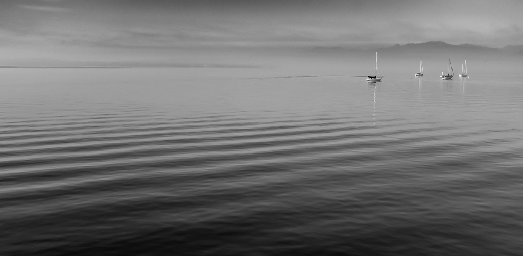
Comment |
Hey Rita. Boy do I know that bridge! And nice to meet you!
Everything front to back is sharp as a tack, as far as I can tell, which speaks to not only proper focus but to DoF as well...as long as that was your intent. Exposure is kind of tough to talk about. You've captured detail in the sky, but the silhouetted bridge and headland lack detail to my eye. The boats have details, as does the water, but they all look kind of dark to me. If that was your intent, then kudos. I can see hints of the colors you mention.
What would you say your subject is here? The bridge? If so, how have you tried to draw the viewer's eye to it? Composition? DoF or focus? Contrast or exposure? To tell you the truth, I really wish I could see the rest of it, in more detail (because, as I think you'd agree, it's an incredible piece of architecture), and without the details of all that other stuff between me and it to take attention away from it. Oh, and wouldn't it be cool to be able to see that green patina too (as I recall)? I really don't get very much color on my end though.
|
Feb 3rd |
4 comments - 7 replies for Group 60
|
4 comments - 7 replies Total
|