|
| Group |
Round |
C/R |
Comment |
Date |
Image |
| 60 |
Aug 21 |
Reply |
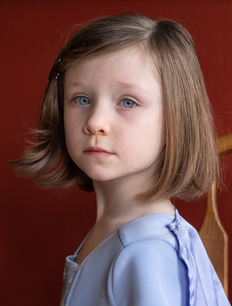
That is super flattering Dianne. Thank you so much. Thanks for the compliments on the vase. Truth be told, getting that right was a major pain too. I had big fat specular highlights all over it. Thank you heal tool! Since then, I've upped my game on light modification, especially diffusers, and I'm a little smarter on what kinds of surfaces work best for this kind of stuff. Matte is better than shiny...usually. |
Aug 25th |
| 60 |
Aug 21 |
Reply |
Backdrop Materials:
Two that I have been very happy with are some marine vinyl that I got from the fabric store. They were cheap ($20/yard), and can be wiped off so you don't have to worry about ruining them. I have a year of black and a yard of white. Work great, IMHO. But, you do have to make sure you don't get any reflection/glare off of them. And, you have to tension them property to make sure there are no folds/wrinkles.
The other one that's kind of magic is black velvet. It just sucks up the light. No reflections. It's a bit more expensive but works.
I use foam core, but just for V-flats. $1 a piece. |
Aug 18th |
| 60 |
Aug 21 |
Comment |
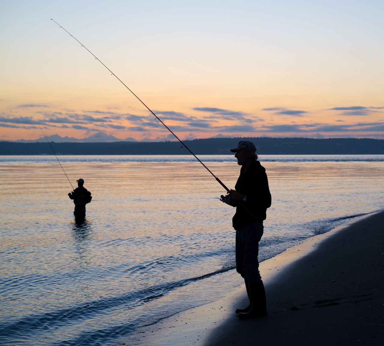
I like what you have going here John. I think your settings worked well. I would've been tempted to go with a lower F stop, to give myself a faster shutter speed, and reduce DoF, but then I would've gotten it wrong. Everything looks quite crisp, your DoF turned out just right at f/8, but even so, things start to lose their distinctness as they fade into the distance. Big kudos on that. Colors, although muted to me, are good and fit the mood (dawn). Exposure is great too, and generally fits the mood. I think you've done a great job of capturing the mood and sensations of an iconic experience. Good eye.
Did you take more than one image of this? Because I would pay $1 to see the version where you are just six inches to the right. That would a) move the bobber (that's a nice eye-catcher and subject) away from the stanchion it merges with, b) move the pole and bobber to the right of center instead of directly in the center, and c) possibly cut out the right two stanchions, which I don't think help your story (I suggest cropping these two out no matter what). Anyway, that's just me. Also, what editor do you use? Does it have a Dehaze control? I'd like to play around with ADDING haze, just to see if that helps create even more separation of the pole from the background. Don't know if that'd do anything productive or not. See what you think. |
Aug 11th |
| 60 |
Aug 21 |
Comment |
Great subject for BnW Dianne. Technically well done. No question IMHO. Sharp throughout which really works on this image. Lots of contrast, but a good range of tones as well. Composition is cherry, to my eye, with lots of repetition, leading lines, and other goodies leading the viewer into the image. I like the human element too, with the guy ogling the model on the billboard. I really enjoy looking at this image.
I think you can do two things to this image to add impact. 1) Crop out the flags. They really draw my eye, but aren't part of the story, and IMHO really dominate the upper half of the image. Crop'em? You lose the lines of the building though so I can't tell if this'll work. 2) This is just me talking', but I think you'd really make money by playing up the story of the man/model interplay. A radial filter that darkens everything but the two lovebirds might help focus on the story.
Anyway, Those aren't criticisms, just suggestions. I like the image and I can see your skill in composition here. |
Aug 11th |
| 60 |
Aug 21 |
Reply |
Gee willickers Barbara. That's high praise. Thank you very much. |
Aug 8th |
| 60 |
Aug 21 |
Reply |
Thanks Richard. Lemme look at the exposure thing. |
Aug 8th |
2 comments - 4 replies for Group 60
|
2 comments - 4 replies Total
|