|
| Group |
Round |
C/R |
Comment |
Date |
Image |
| 60 |
Apr 21 |
Comment |
Man, you have a knack for locating those lone trees. I love this image. Uh, tell me if I'm wrong, but it looks like you lit the tree from the right, no? It also seems like the rocks are illuminated from the left but I can't tell if that's artificial or the dawn glow. Seems like nice coordination on color temps between the two sources. How'd you do it? |
Apr 25th |
| 60 |
Apr 21 |
Comment |
Thanks Diane! That's high praise. And, your treatment in LrC just confirms the value of removing the chair. Thanks tons for the encouragement too. It matters. |
Apr 25th |
| 60 |
Apr 21 |
Reply |
Wait a minute... You've been dinged (by you're club's critiquers I assume) for "being too dramatic?" In your photos? I don't know what that means. Just for fun, wanna show me an example of an image that was "too dramatic?" I have the feeling that this is simply a poor description (on their part) of what they actually found wrong in your image. |
Apr 18th |
| 60 |
Apr 21 |
Reply |
Thank you for the compliments Jane. I bring this point up mostly just to begin a discussion about how we can separate quality and impact from our own personal biases (I'm not saying that you are biased...any more than we all are).
In my short time in the club environment, I have seen A LOT of bias work its way into the judging and selection process. In my club, if it's fuzzy, has a beak, or has a lollipop in its hand, it does well. Other very well executed (IMHO) images don't.
I think (emphasis on this is just what I think), in order to be able to grow, and evaluate our own work, we need to be able to appreciate and understand images that aren't necessarily to our liking, but are nevertheless well-conceived, well-thought-out, and well executed.
A photo of a squalling kid could be a hit, and have incredible impact, even if the emotion created is quite negative. Just my thoughts... |
Apr 13th |
| 60 |
Apr 21 |
Reply |
She's wasn't sad. Just demure. But, even if she was, does that really change the impact or quality of the photo? Just bringing up a point for discussion. |
Apr 13th |
| 60 |
Apr 21 |
Comment |
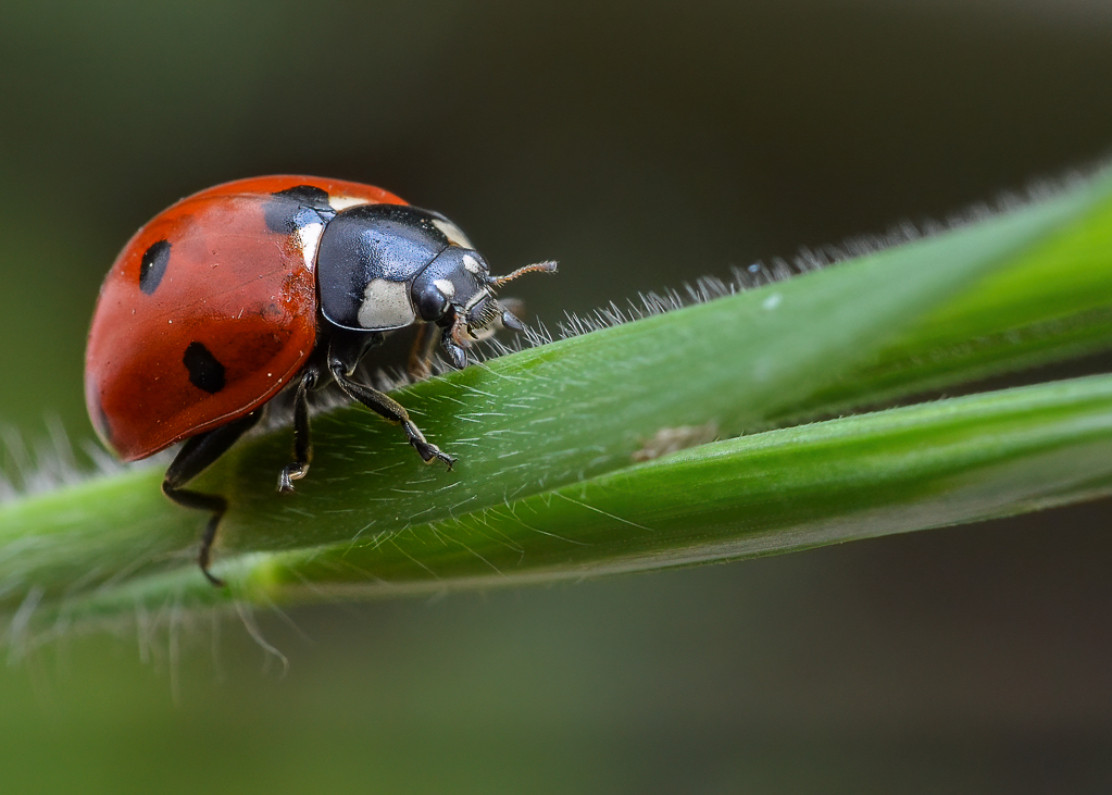
Hey Emmy, like Jane, I didn't really notice the tire till I read your description, but that's really here nor there since the I don't think the tire is large or prominent enough to really...be the subject. On the other hand, I can't get my eyes off the cross, which (IMHO) is an excellent subject since it's in the right place, has high contrast, has high emotional impact (since I think it's a memorial marker, no?). So, just asking, why try to shift from the cross to the tire?
I like the way the ocean and shore are kind of framed by the overhanging bows. All the technicals (exposure, color, DoF, focus) look peachy to me.
I can't really offer much in the way of suggested improvements, but I'd like to see even more detail in the clouds. Sometime dropping highlights or exposure will get you there. Sometimes you can' get there from here, because the ceiling really is just flat and smooth. Anyway, that's just a minor detail anyway. Can I humbly suggest a copying and editing toward the moody, by using a radial filter around the cross, and making everything else gloomy and darker (c'mon, humor me ;) ).
Re: how the image did in the travel division (PTD), I don't think it has so much to do with your image as the division definition. As I recall, the definition says that the image needs to have something that would allow a reasonably informed viewer to identify the location or culture in the image (I'm paraphrasing). Apparently, folks miss the mark on this so frequently that a few months ago PSA even had a zoom conference on the PTD definition. Check out the definition and tell me if I'm wrong. |
Apr 13th |
| 60 |
Apr 21 |
Comment |
|
Apr 13th |
 |
| 60 |
Apr 21 |
Reply |
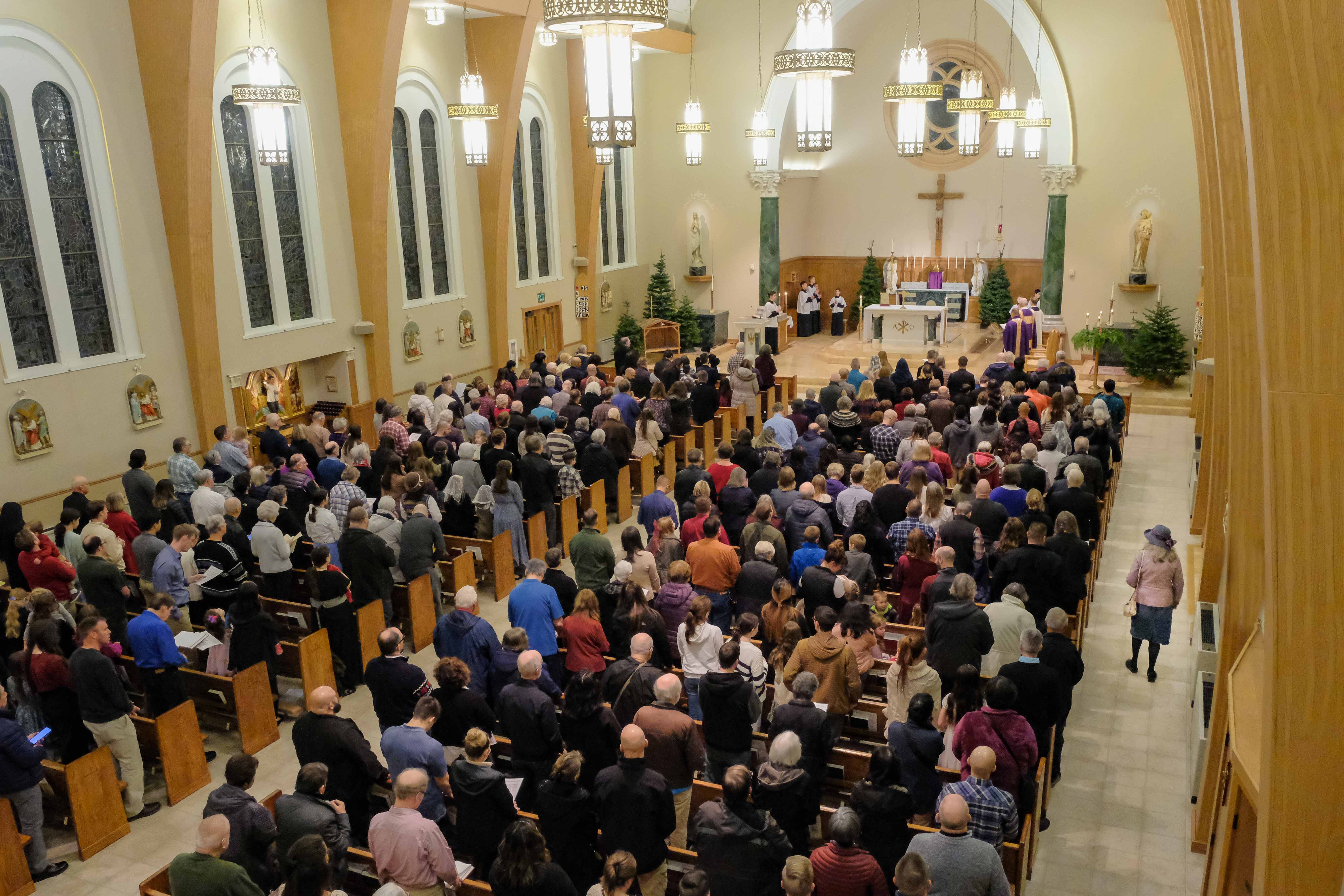
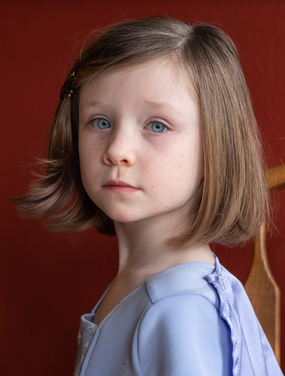
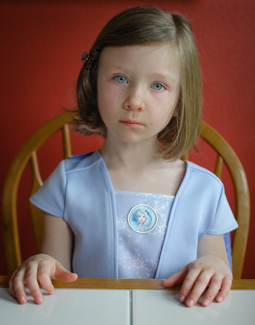
Hey Jane, what are your thoughts on this image? How does the chair impact it? |
Apr 13th |
| 60 |
Apr 21 |
Comment |
|
Apr 13th |
 |
| 60 |
Apr 21 |
Comment |
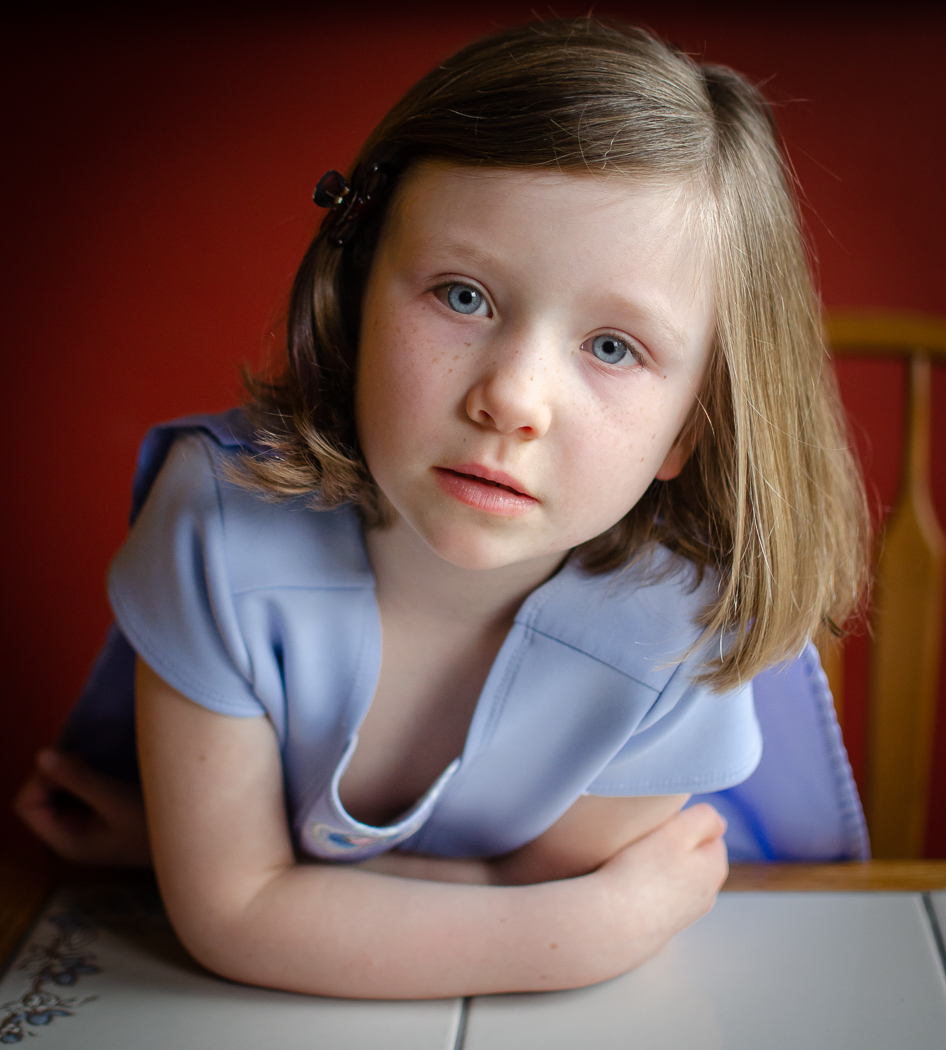
Here's a similar, sharper, but also busier photo. Thoughts? |
Apr 13th |
| 60 |
Apr 21 |
Comment |
|
Apr 13th |
 |
| 60 |
Apr 21 |
Reply |
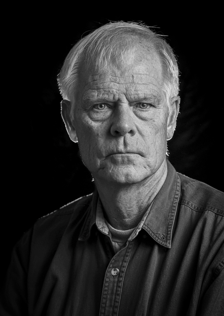
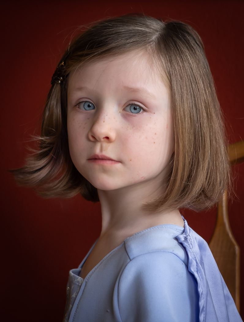
Thanks Emmy. You're right. The chair is not ideal. It was meant to be a candid, environmental portrait, and I thought the chair was sufficiently soft to kind of melt into the background, but that appears not to be the case. But, that's why we bring photos to the critical eyes of our DD-mates. No vignette, but that's an interesting idea. Check this out:
I did a vignette, which still didn't eliminate the chair. Then, I used the LrC HSL panel to target the particular color of the chair, and drag it down a bit. Thoughts? |
Apr 13th |
| 60 |
Apr 21 |
Comment |
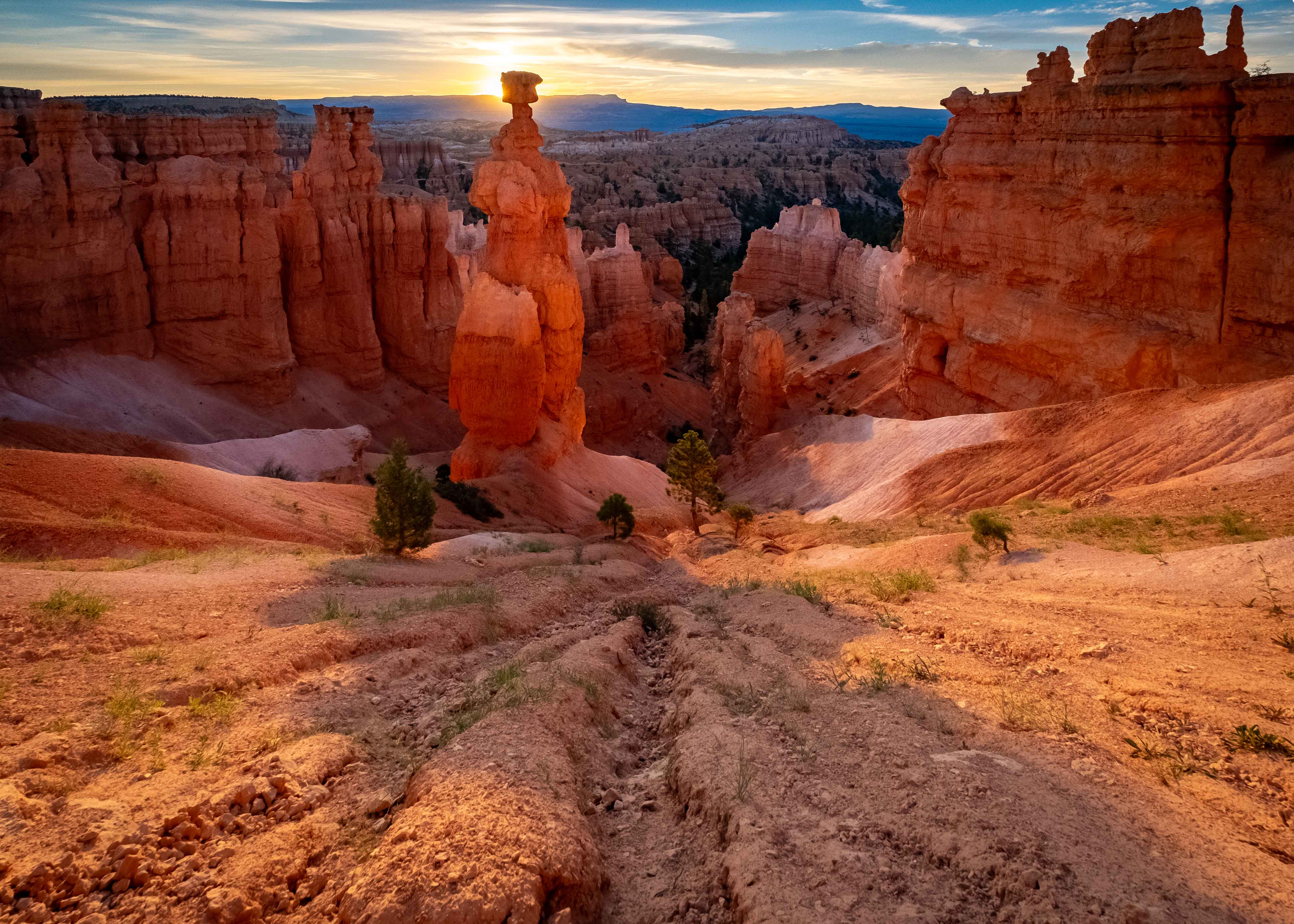
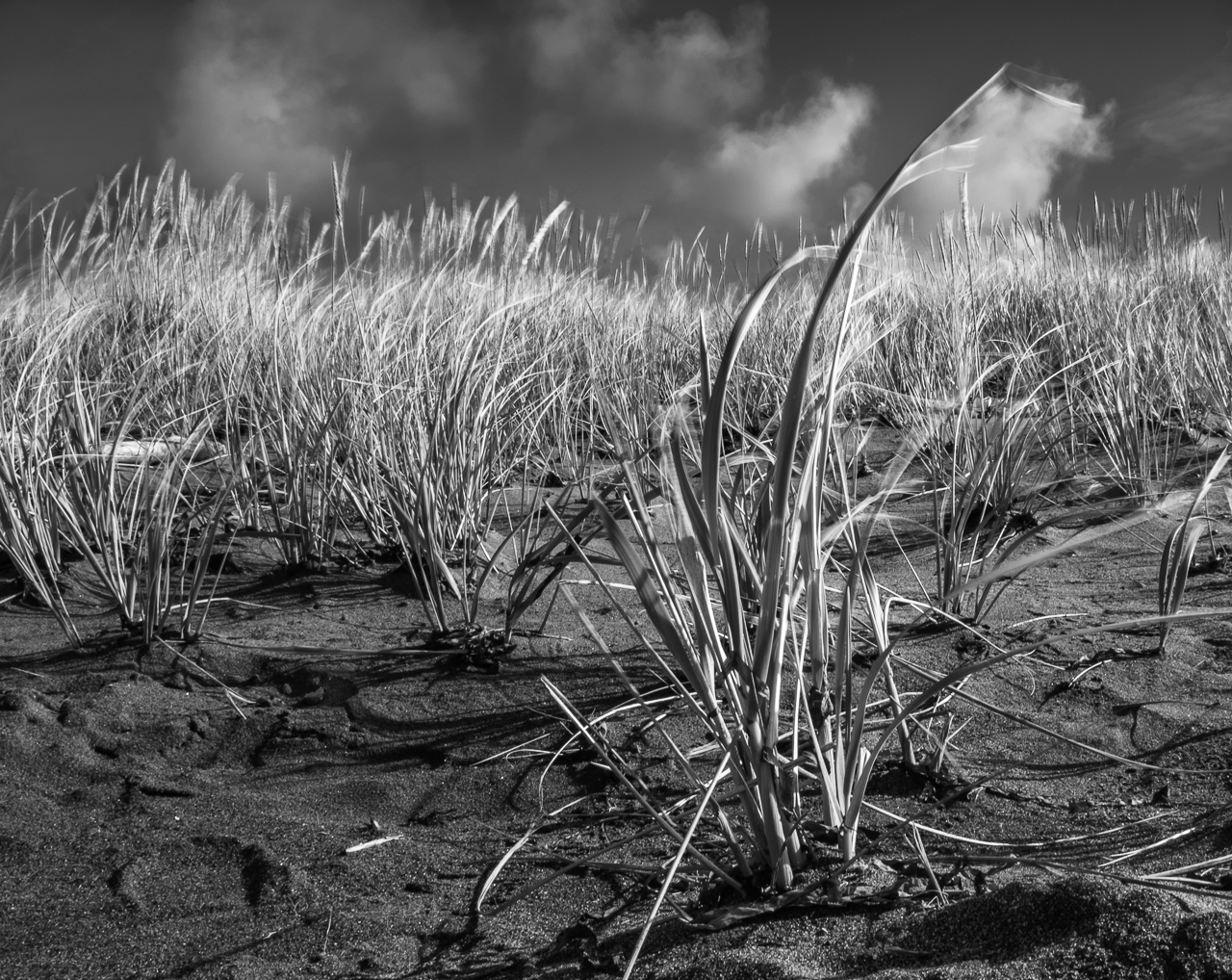
Hey Jane, great concept. I like the repeating V shapes of the trees and gorge, which center the eye in the image. The blue of the sky and the orange of the rocks are pleasantly complementary to me. Focus and DoF create GREAT detail in the rocks and trees (good use of hyperfocal distance). I think most interesting is the cast of light illuminating the rocks, having been bounced off the hillside you're standing on.
Truth be told, I didn't notice the climber till I read your description. That being the case, it really seems more of a landscape to me, which is OK. |
Apr 9th |
| 60 |
Apr 21 |
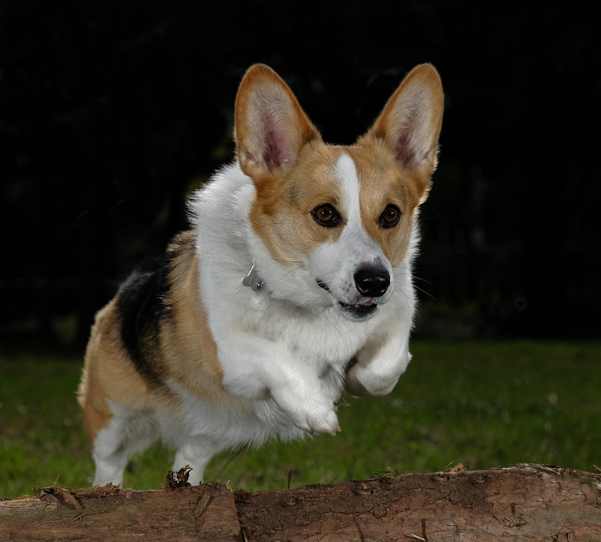
Comment |
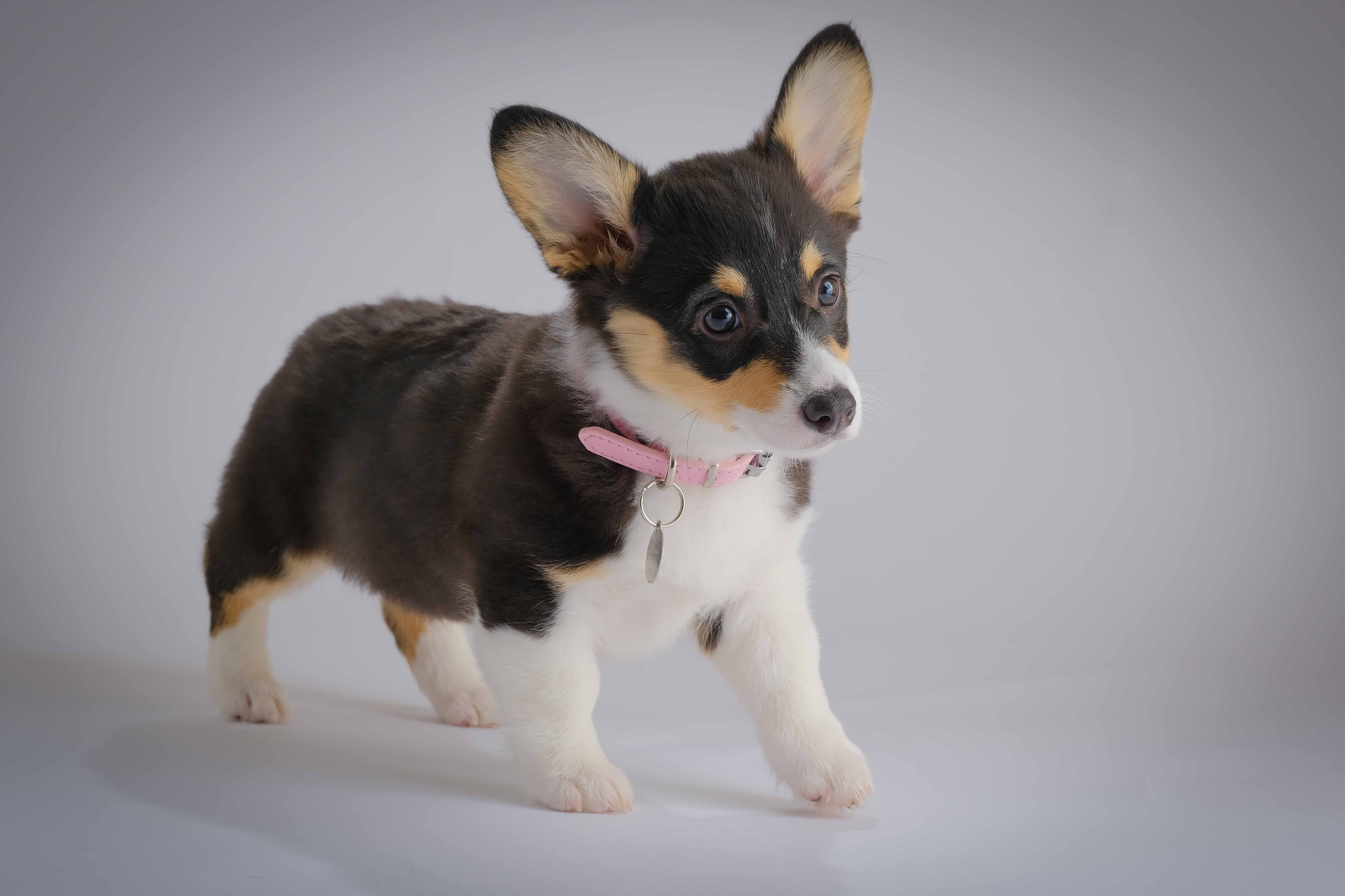
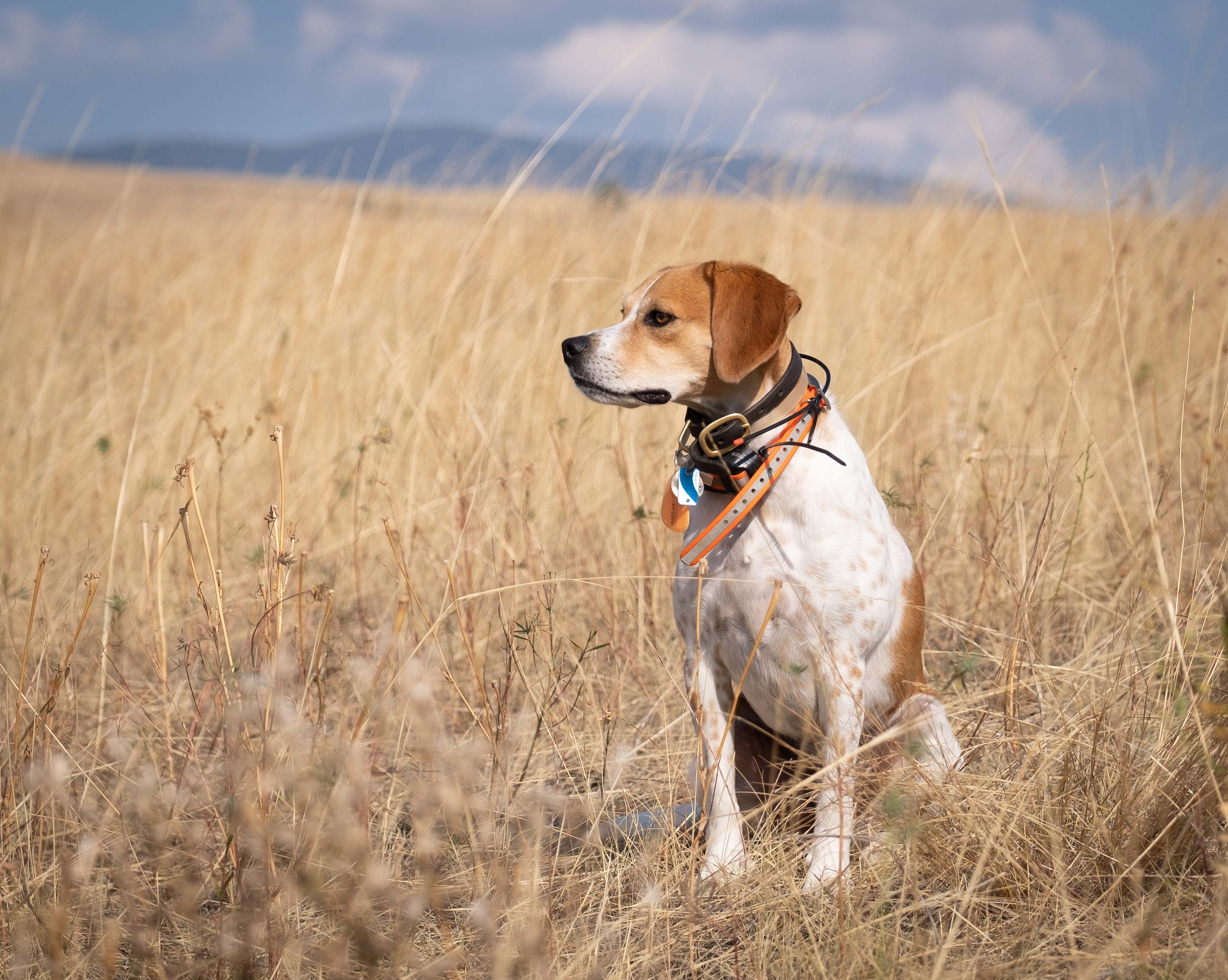
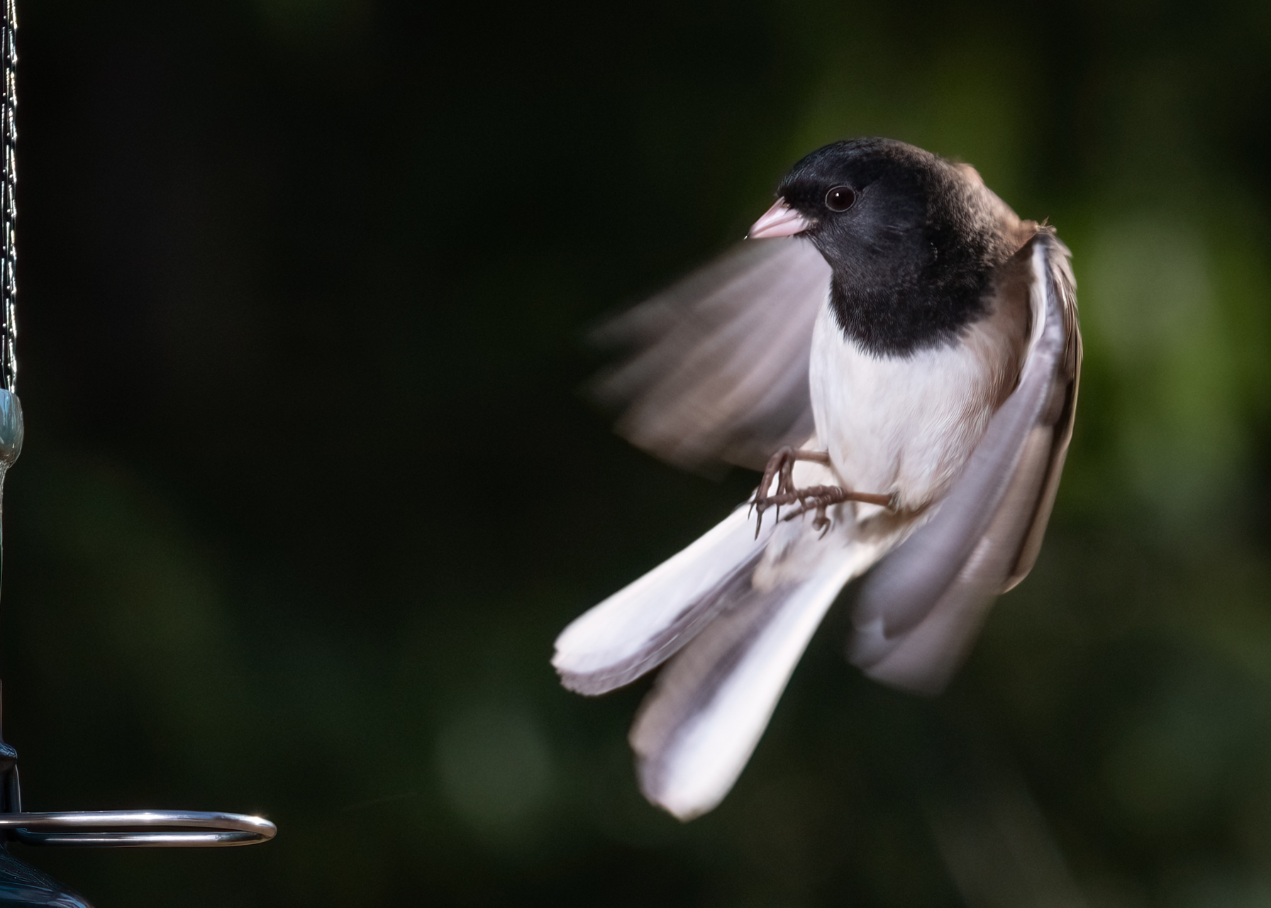
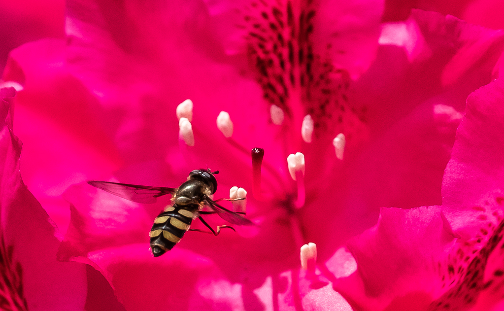
I love dogs, and I think this is a good, candid shot of what is obviously a good boy or girl. I'd call this a candid portrait. It's sharp all around, has a relatively non-distracting background, and a compelling story. They can be be tough to photograph sometimes too. Their very black fur (sometimes) can pose real challenges to exposure, and this guy's does.
Phone cameras are very powerful tools these days, and even PSA promotes "phoneography" education. A few years ago some buddies and I spent a month using only our phones, which kind of forced us to focus on composition. Their use is not to be discounted. But, phones usually lack control. As you know, I'm in favor of leveraging automation and technology, but I feel like I always need to be able to go to manual over-ride when I'm not getting what I need.
In this case, I think the exposure could be improved a bit. It might be a touch flat, which I think is probably the result of trying to get that black fur properly exposed. I've faced this myself. But it's a fun shot, and I think captures something in the dog. |
Apr 9th |
| 60 |
Apr 21 |
Comment |
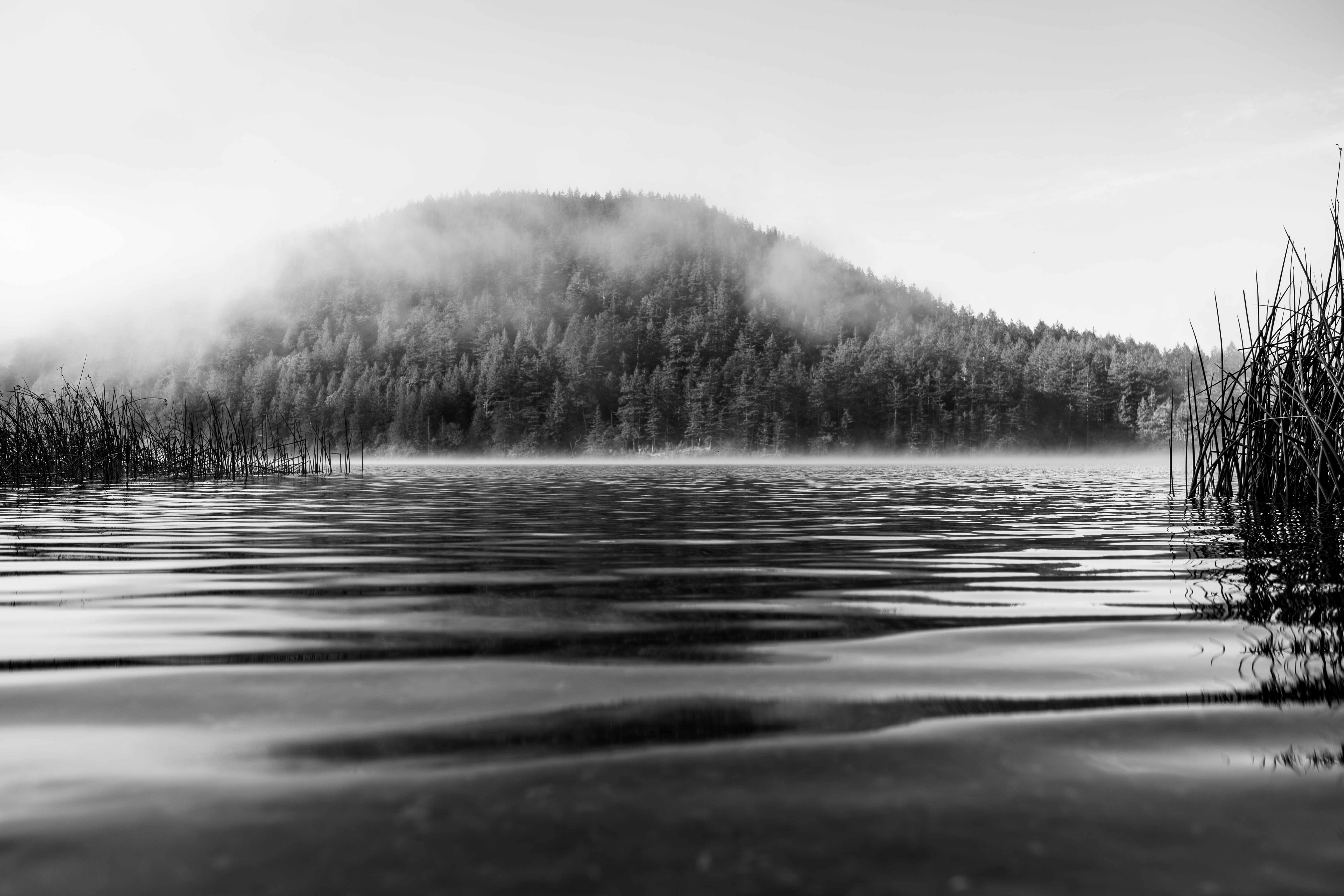
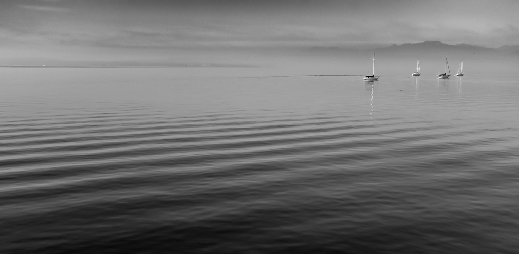
I can tell you've been working on your ICM Dianne. To me this is well-executed. Although soft there is still sufficient texture to get the sense of the water and waves. Colors look natural to me and the hint of orange complements the blues well.
I think there's an artifact just below the horizon, near the left edge of the frame. Not sure if that can be removed.
The strong horizontal line that trails down and right from the horizon, starting at about the center of the frame, makes me think that the horizon is tilted, but I'll bet it's not. Can that be softened? |
Apr 6th |
| 60 |
Apr 21 |
Comment |
Hey, Thanks John. Yeah, the chair back in the background is not ideal. But, then again, it's a candid shot of a kid. At least she's not wearing anything with My Pretty Pony on it or a bunch of glitter. ;) |
Apr 6th |
| 60 |
Apr 21 |
Reply |
Hey John, welcome to DD 60.
Strong first submission, IMHO. Composition uses repeating patterns in about the best way imaginable, and that creates a sense of depth. Exposure works well for me generally, with lots of color in the teepees, and just enough detail in the foreground to give context. Your extended shutter speed gives some sense of the wind whipping through the pennants atop the teepees. DoF is spot on too, to me. I think color harmony is great as well.
If you can get rid of the city lights at the right edge of the frame, I would.
When creating it, it might have been possible to exposure bracket so that the moon might have had detail, and then you could exposure blend. But we have what we have. HOWEVER, there's nothing saying that you couldn't Ps in your own moon, complete with lunar detail, which in this case I'm not sure I'd really call cheating. Think about it.
And, I gotta tell ya, I've never seen a pattern like this superimposed on an image before. And, I suspect that it's not a function of a CP filter. I say that because a) when describing the image you made it a point to say that there wasn't a CP, telling me you're conscious of when you use one and when you don't, and b) notice how the pattern appears to be oriented perfectly vertically and horizontally? That seems very unlikely that the CP would line up perfectly like that. Now, I admit that I don't know the functional details of the average CP that well, but this coincidence seems...well, uncanny. I suspect some other phenomenon (moire?). I'd like to learn more about what's going on here.
Anyway, great to have you, and I'm eager to see more nice work from you going forward.
|
Apr 4th |
11 comments - 6 replies for Group 60
|
11 comments - 6 replies Total
|