|
| Group |
Round |
C/R |
Comment |
Date |
Image |
| 60 |
Mar 21 |
Reply |
Hey, Bernie mentioned it first but you were all right re: the reflection in the foreground. Nice clean up of that. How did you do it? I wound up using Ps Clone Stamp (one of my first forays into Ps).
Anyway, thanks for the compliments. You are right that it's all a learning point. I usually do much better with images when I have a chance to shoot, review on the big screen, then shoot again. But, I MUST implement those lessons learned in order to shoot subsequent images right the first time. It's a process. |
Mar 28th |
| 60 |
Mar 21 |
Reply |
I think there's some truth to what you're saying. It's all about what you're going for, right? |
Mar 23rd |
| 60 |
Mar 21 |
Reply |
Thanks Emmy. Let me play around with the skylight. It is a little problematic, but I"m not sure if it's essential or not. Great input though. |
Mar 22nd |
| 60 |
Mar 21 |
Reply |
Hey Diane, I use a monopod technique of putting my legs shoulder width, and then putting weight on the monopod, essentially making myself the extra two legs of the tripod. It definitely helps.
Point taken on the blue reflection on the floor. I'm working on it (Ps clone stamp and Patch tools).
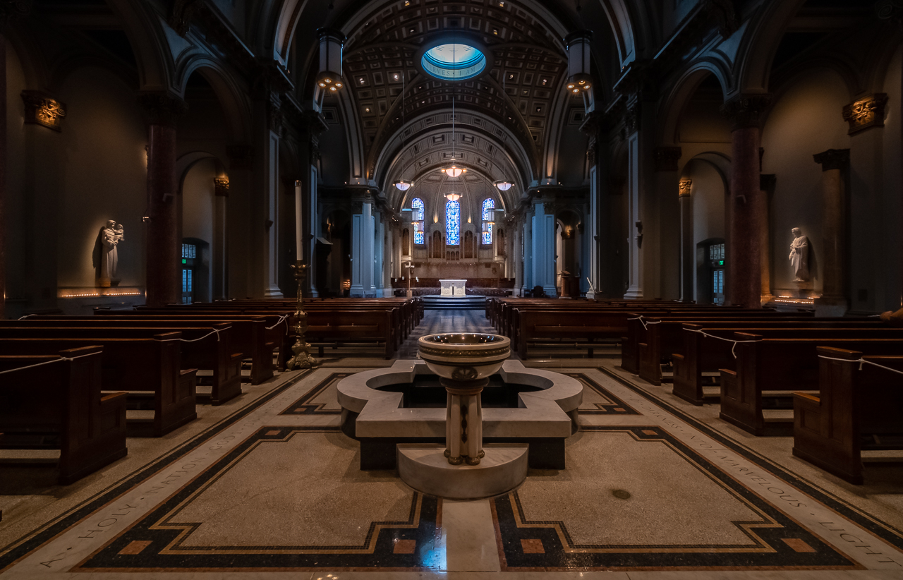
Re: the softness, can you do me a favor? In the full sized image, I can see individual stained glass panes, and count the pipes of the organ, so I'm not sure (without the noise issue), how it could have been much more crisp. If you'll click into the image, you'll get a slightly larger version. Does it still lack the clarity that it should have (aside from noise)? I'm just trying to diagnose the issue at this point. |
Mar 22nd |
| 60 |
Mar 21 |
Reply |
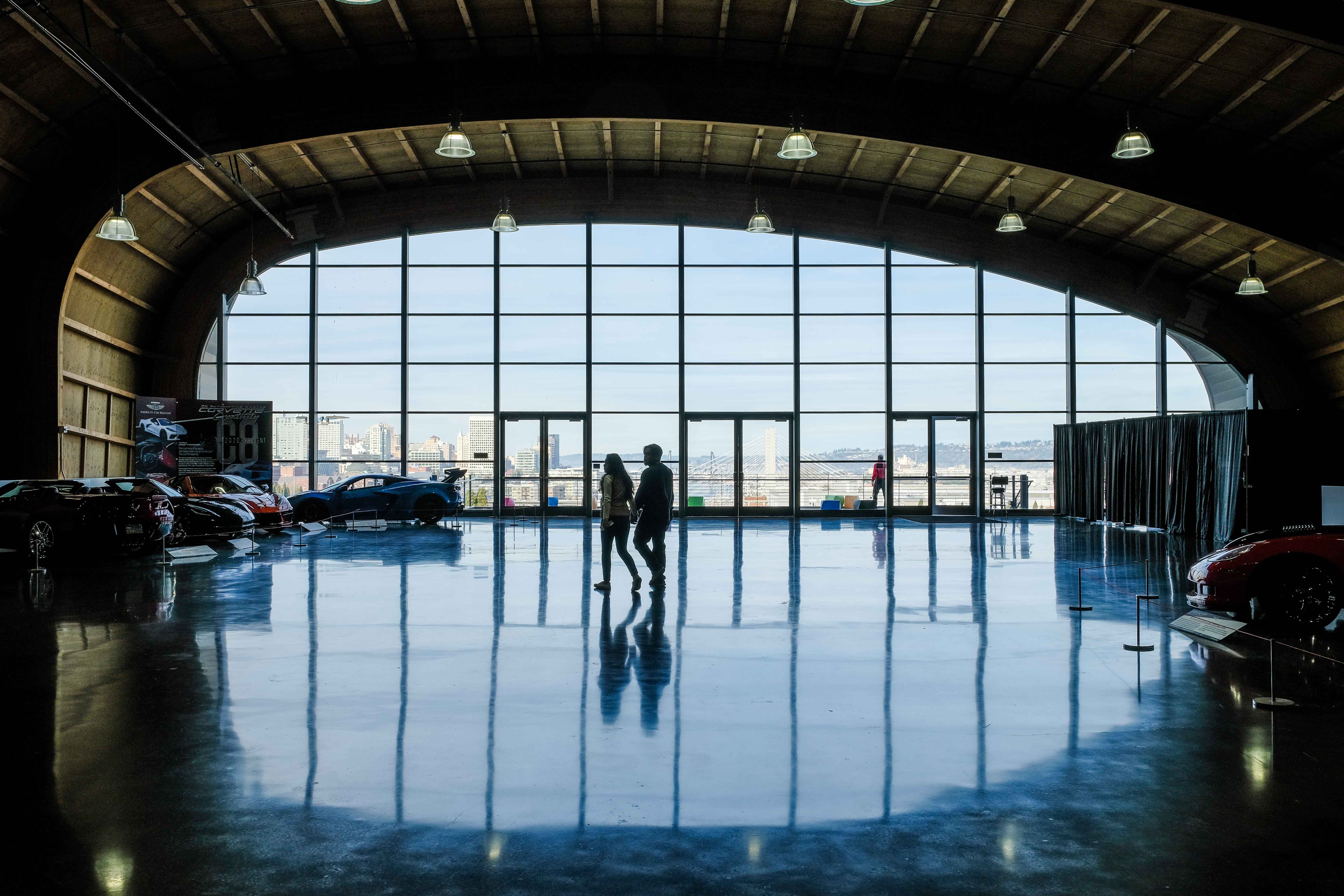
You Sir, have a keen eye. That blue light is a reflection from the skylight sitting over the transept. I'd noticed it but wasn't sure I wanted to tackle it (now I know that I should, but hey! That's why we post stuff here right?!). And yes, it an probably be handled in post production (I'm going to try to the Lightroom Classic spot remove, clone tool).
Thanks for the compliments too. As I understand it, creating a sense of three dimensions in this two-dimensional medium is one of our primary challenges/goals. I think that, in this particular case, that is significantly aided by the fact that I was within a three dimensional structure, which contains about a million parallels lines, all of which converge due to euclidean geometry and the rules of perspective. I just had to be there and know how to take advantage of it. |
Mar 16th |
| 60 |
Mar 21 |
Comment |
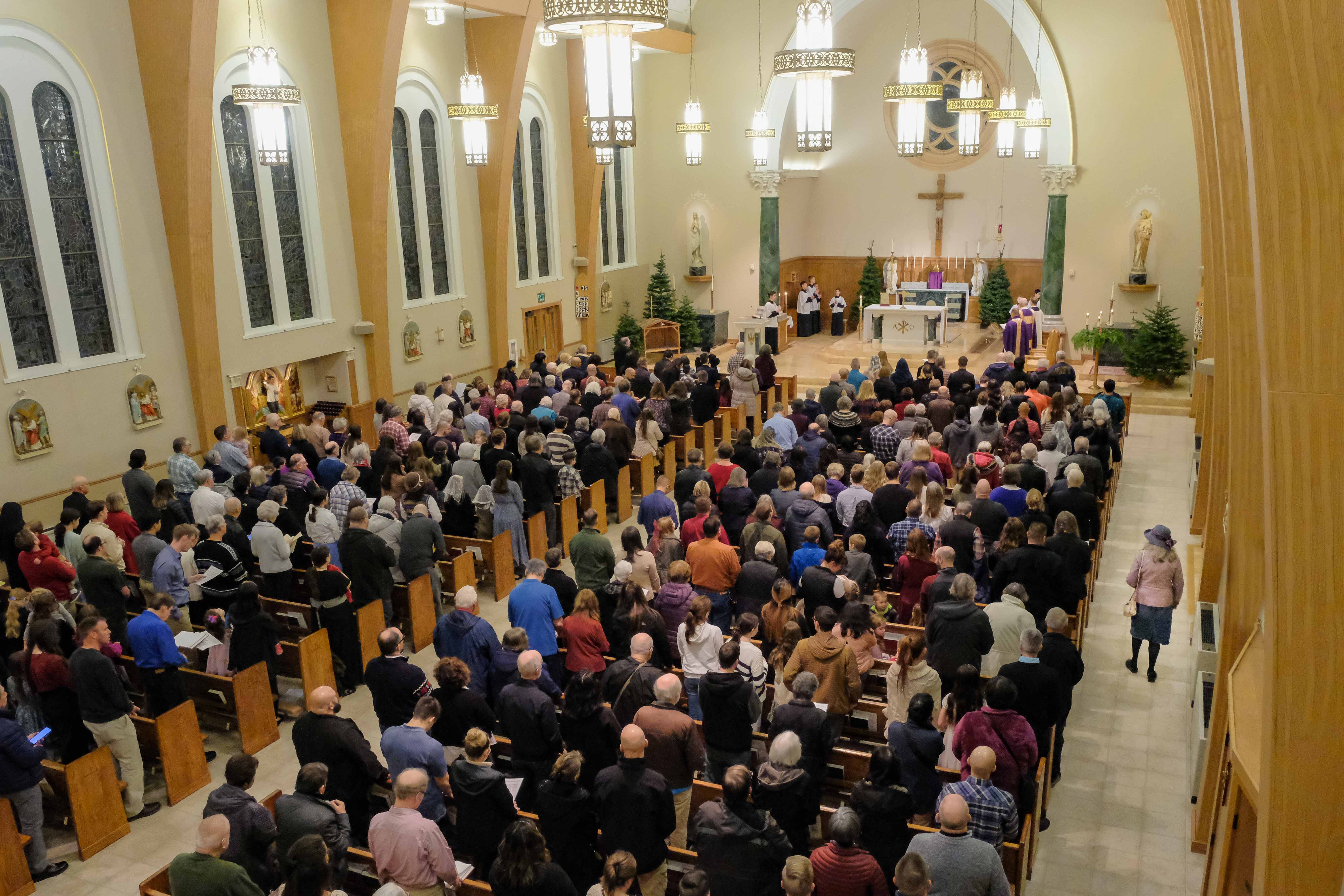
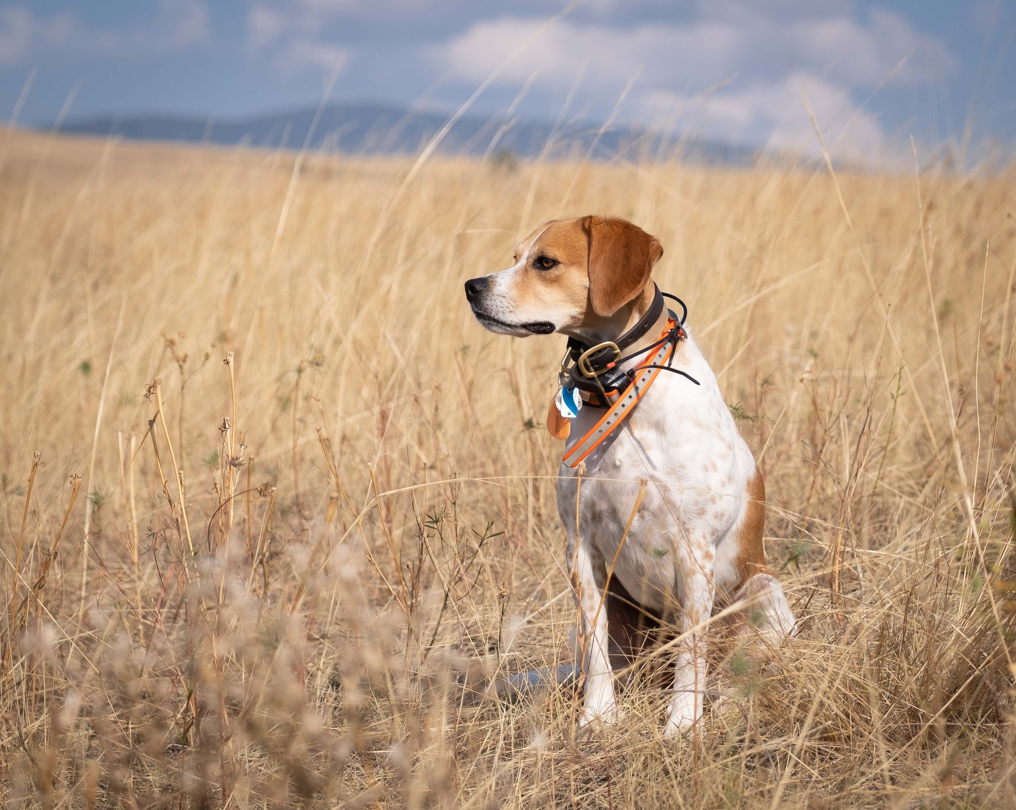
Wow. Thanks for the compliments Jane. The focus point was on the altar actually, merely as a distant point of aim. I think if you're seeing any softness, it probably is a function of noise due to a higher ISO, which I do see in the full-sized image (and as mentioned, I do blame the Fujifilm/LrC interface for part of that). And any other blur might be a function of the slow shutter speed and the fact that I was on a monopod, not a tripod.
I think heading to f/16 is probably a good idea, but with a monopod, and a shutter speed pushing a second or more, I'm not sure I could've pulled that off without adding more motion blur. Well, I guess it's another reason to get more conformable dragging a tripod around. Good inputs. Thanks again. |
Mar 15th |
| 60 |
Mar 21 |
Comment |
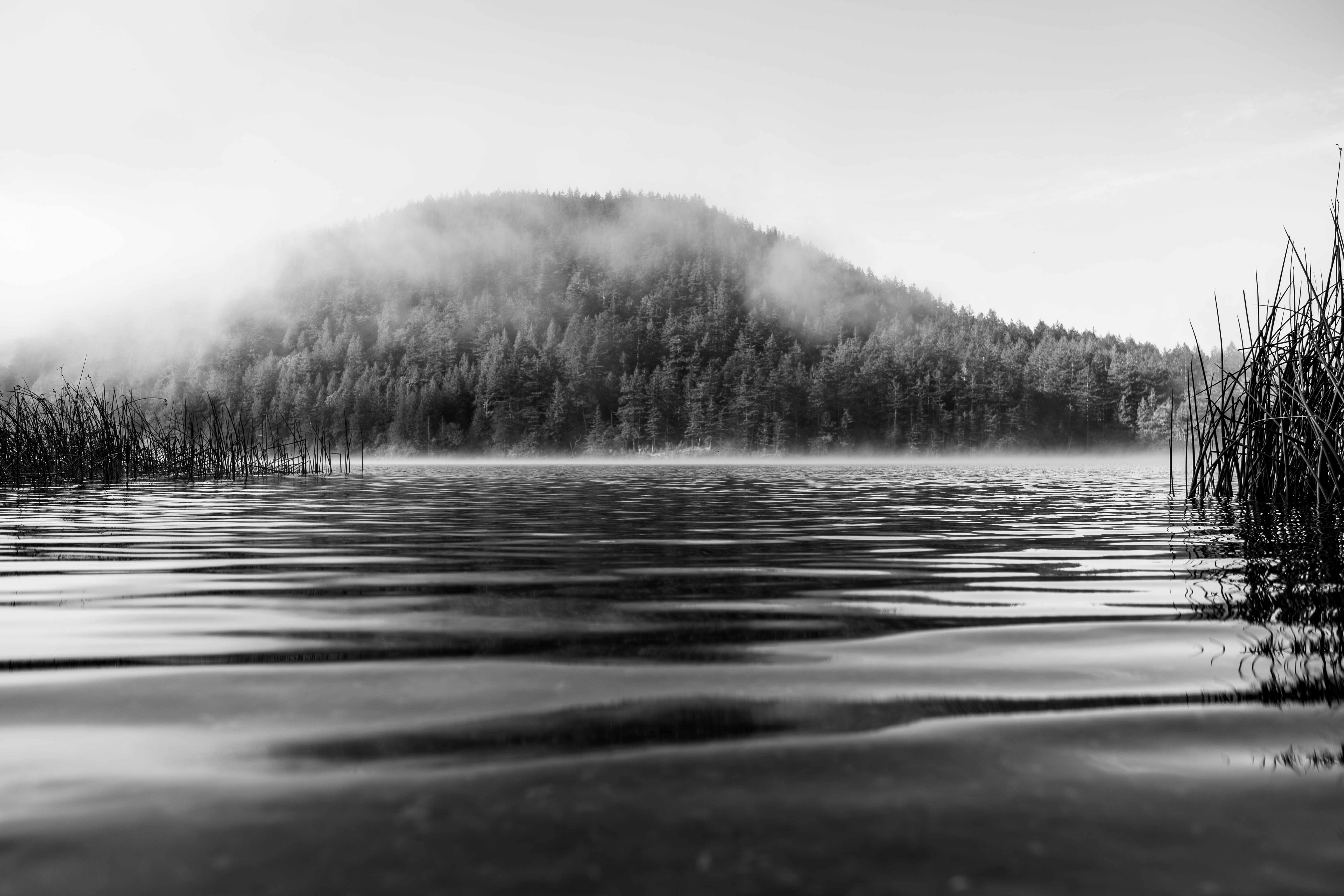
Hey Richard. Man, I love that tree and the fog. I think I've said before that we're all looking for that lone-tree shot. Well, thanks to the fog, I'm not sure it gets much more lone than this. Congrats.
You know, maybe it's because my club's monthly contest is Negative Space, and I have negative space on the brain, but I just can't help but think that I'd like to recompose this so that the entire tree/cow scene is in the left hand corner, with just foggy ground on the bottom, and a sea of grey everywhere else. And, this is just me, but I'd like to see what this would be like with some more contrast, which I think would increase the impact. Just spitballing'... |
Mar 12th |
| 60 |
Mar 21 |
Comment |
Hey Emmy, I'm glad to see some street photography in here. I think it's kind of under-represented sometimes, but IMHO, it's really about the toughest genre to do well, since the maker does not have control over so many aspects. I think this one is pretty well done.
To start out, I think the horizontal one is better; you retain all the benefit of the diagonal lines coming out of the corner, the people are more significant...it's just better IMHO. Focus is good for me, DoF too, exposure works. Did you shoot it BnW or process it that way? I see a fair amount of noise, but I'm going to call it grain, since I'm guessing it's intentional given that you probably could've used f/8, and ISO 400 and still had a nice DoF (ever hear the saying "f/8 and be there"?). Besides, I kind of like it. I think the tonality is nice, but would be interested in seeing the higher contrast (probably a different mood) version too. As far as I can see, you've handled the image well. Good on you.
Opportunities for improvement? I just wish the people figured more prominently, and we could get a sense of story from them. I think that would really boost the impact. Regardless of that nitpick, it stands as a creative and well-executed photo. |
Mar 12th |
| 60 |
Mar 21 |
Comment |
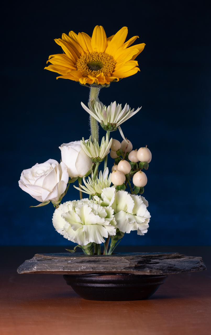
I think this is an attractive image Bernie. Reading the image definition for the Nature Division, I notice that Story is one of the most important elements. In my opinion, this really has that, which is a challenge to achieve (this is a lot more Story than just a shot of a bird flying around). Composition is strong with little distracting from the subjects, in my opinion. I think the DoF is right in that sweet spot of sharp in the foreground, sharp subject, and just beginning to trail off into blur in the background. Exposure is spot on to me. I think the colors are GREAT (complimentary red and green).
I think there are some things in the scene that only time and patience could make better...and a bunch of good luck. The leaf in front of the adult detracts, and the chick's hind leg looks a bit weird, but that's why nature photographers are doomed to endless hours laying on their bellies hoping for that one shot in ten thousand that DOESN'T have the leaf or the weird leg thing.
Things that you have more control over are here too. If it was me, I'd crop down from the top just a bit. Also, does PSE have a brush tool or a radial tool? If so, trying to bring out the catch light in the eye of the adult (which seems like a very small thing) would change things dramatically (I just watched a video by Matt Kloskowski on this very thing). |
Mar 12th |
| 60 |
Mar 21 |
Comment |
Wow Jane. Very strong image IMHO. Lots of impact and very well-thought-out composition (horizon in the right spot, repeating rocks). Sharp throughout, and colors look natural and saturated). I like the silhouettes of the rocks, although I think some folks might want some more details in them. Great image all around. Congrats. I just can't figure out how you got some sharp waves and water at only 1/40s. Whatever you did, keep it up. |
Mar 11th |
| 60 |
Mar 21 |
Comment |
Geez. This IS interesting. Glass sculpture shot against a black background? Anyway, I'd call this an abstract piece, so it has to be viewed through that lens, IMHO. I think it's sharp up front, but DoF falls off before the crest of the shape, though I would've expected a little wider DoF at f/9. Color is pleasant, and well (but not over-) saturated, and definitely has that greenish cast that thick glass takes on. The jet black background appears pretty noise free, as far as I can see (if you're gonna get noise, that's where you're gonna see it). Lighting works well to describe the shape and maximize the color.
I think having this suspended in space with no reference kind of makes it a bit disorienting, but it also makes it stand out, so that's not a criticism, just an observation. I also think another lighting option would have been a bit of rim light or back lighting, but I can't say they'd have any more impact, but would have put it in a bit more context. As for improvements, for me, I think it would be even more interesting with a greater DoF. That, of course, is an artistic decision, and just my opinion. |
Mar 5th |
6 comments - 5 replies for Group 60
|
| 87 |
Mar 21 |
Comment |
Hey Lance, Damon here. You invited me to come check you guys out way back in August, and I finally got the gumption to take you up on it. Cutting edges stuff! Mind if I just lurk around awhile? |
Mar 4th |
1 comment - 0 replies for Group 87
|
7 comments - 5 replies Total
|