|
| Group |
Round |
C/R |
Comment |
Date |
Image |
| 60 |
Oct 20 |
Reply |
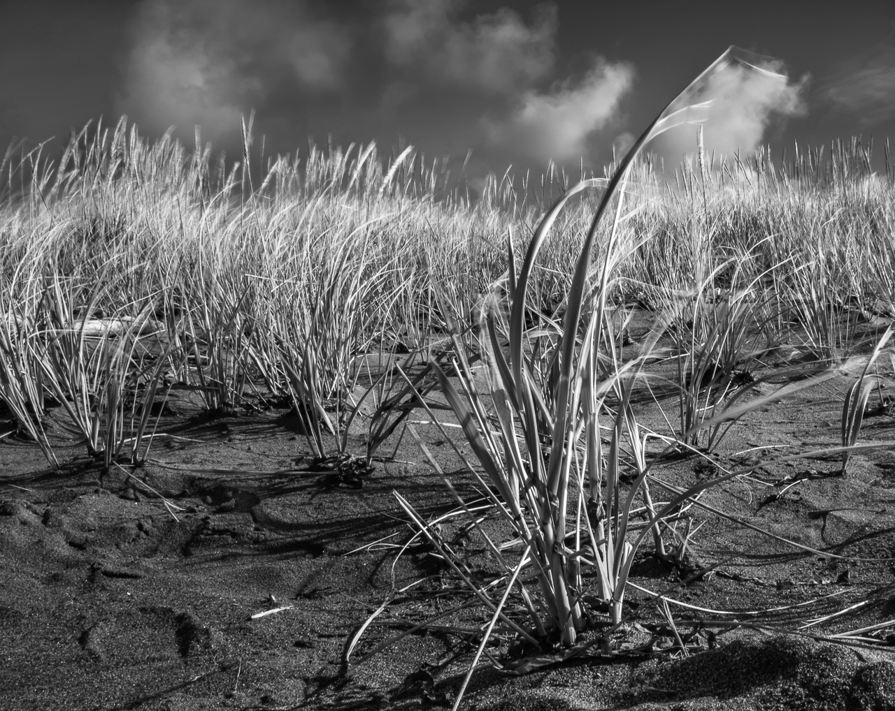
Thanks for the suggestions Emmy. I hadn't really thought about a recompose, except for cropping. I like the water droplet idea too.Slippery. ;) |
Oct 27th |
| 60 |
Oct 20 |
Reply |
Thanks Diane. Actually, I do have other versions of this with a wider DoF (bringing the stem into focus), but for whatever reason just didn't feel that it had the same impact. I'll take that under advisement though.
YEAH, the difference between LrC and Mac Photos is criminal isn't it? IT'S THE SAME FILE!!! Every time I talk to the Mac folks (which is a lot these days, ever since the advent of Mac 10.15) I tell them how they drove me away from Photos. Oh well. |
Oct 20th |
| 60 |
Oct 20 |
Reply |
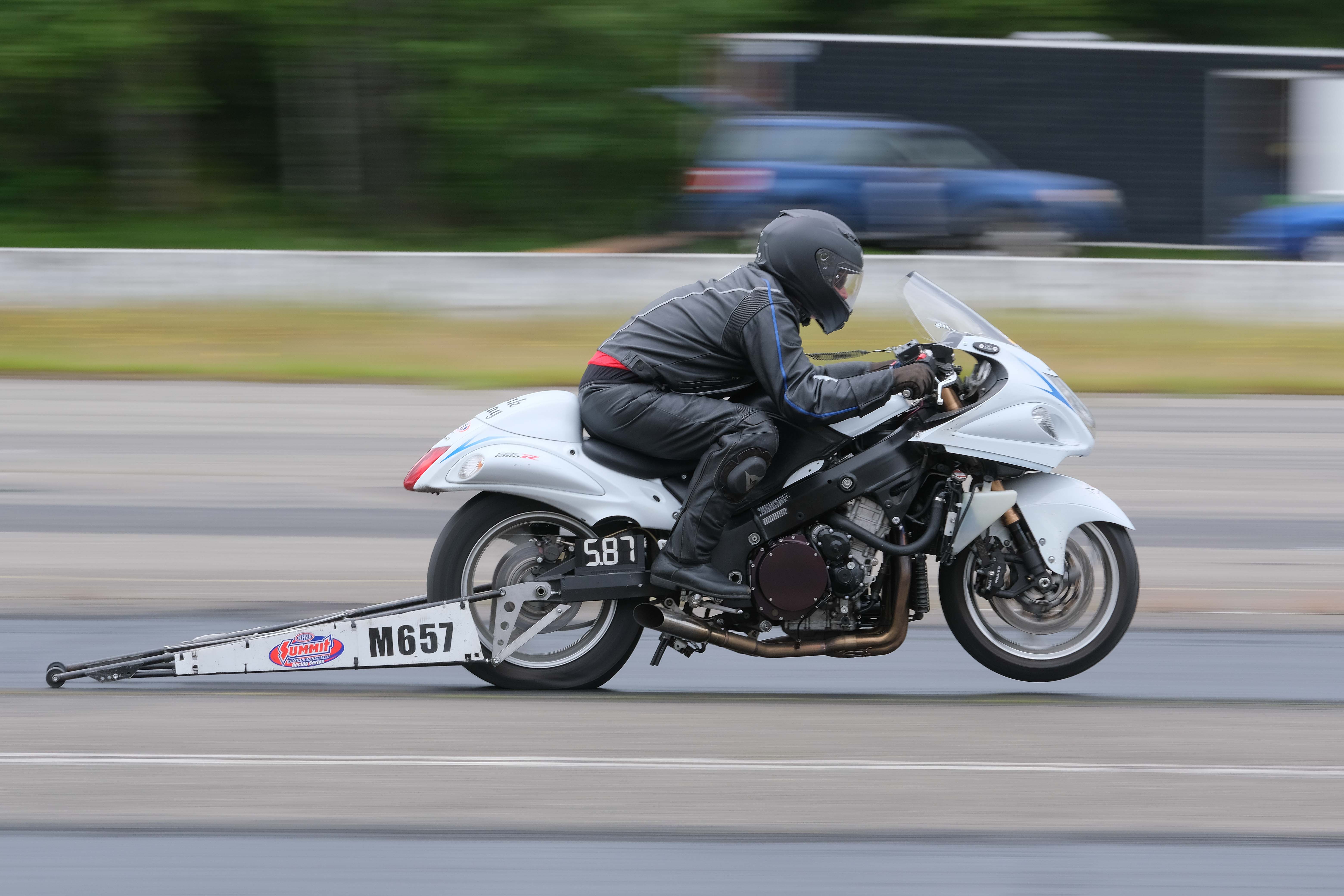
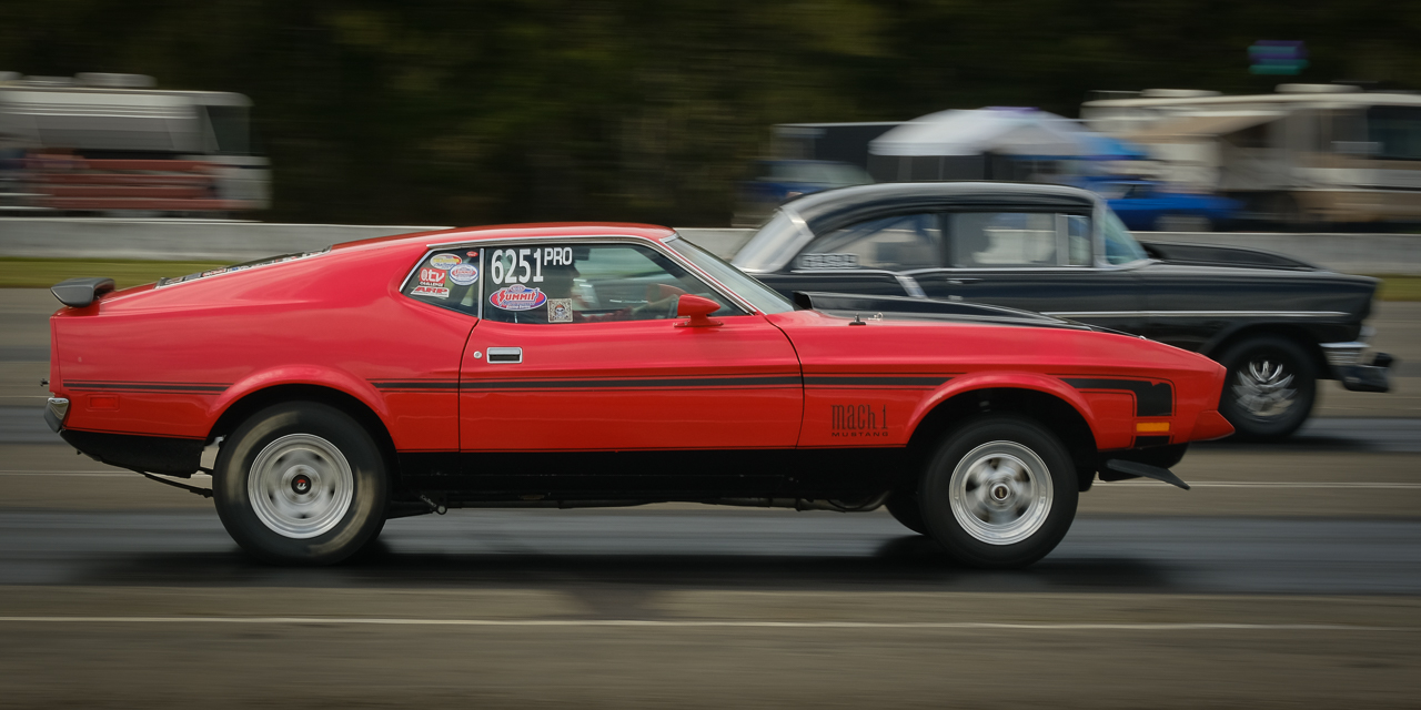
I'm pretty sure these guys are "bulldogging." Pretty hair raising stuff. I've done some fairly adventurous stuff in my time but this stuff is totally off limits. |
Oct 14th |
| 60 |
Oct 20 |
Comment |
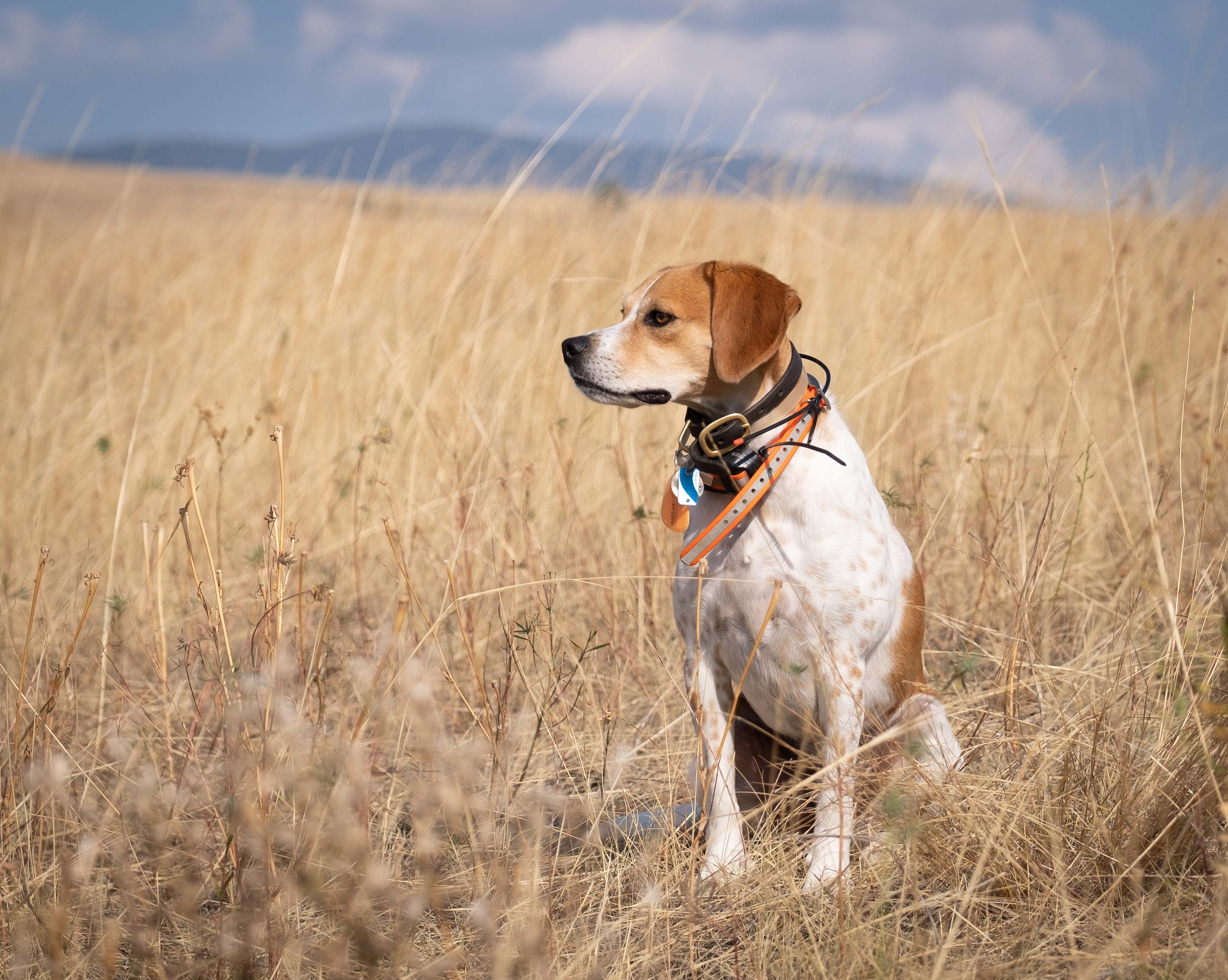
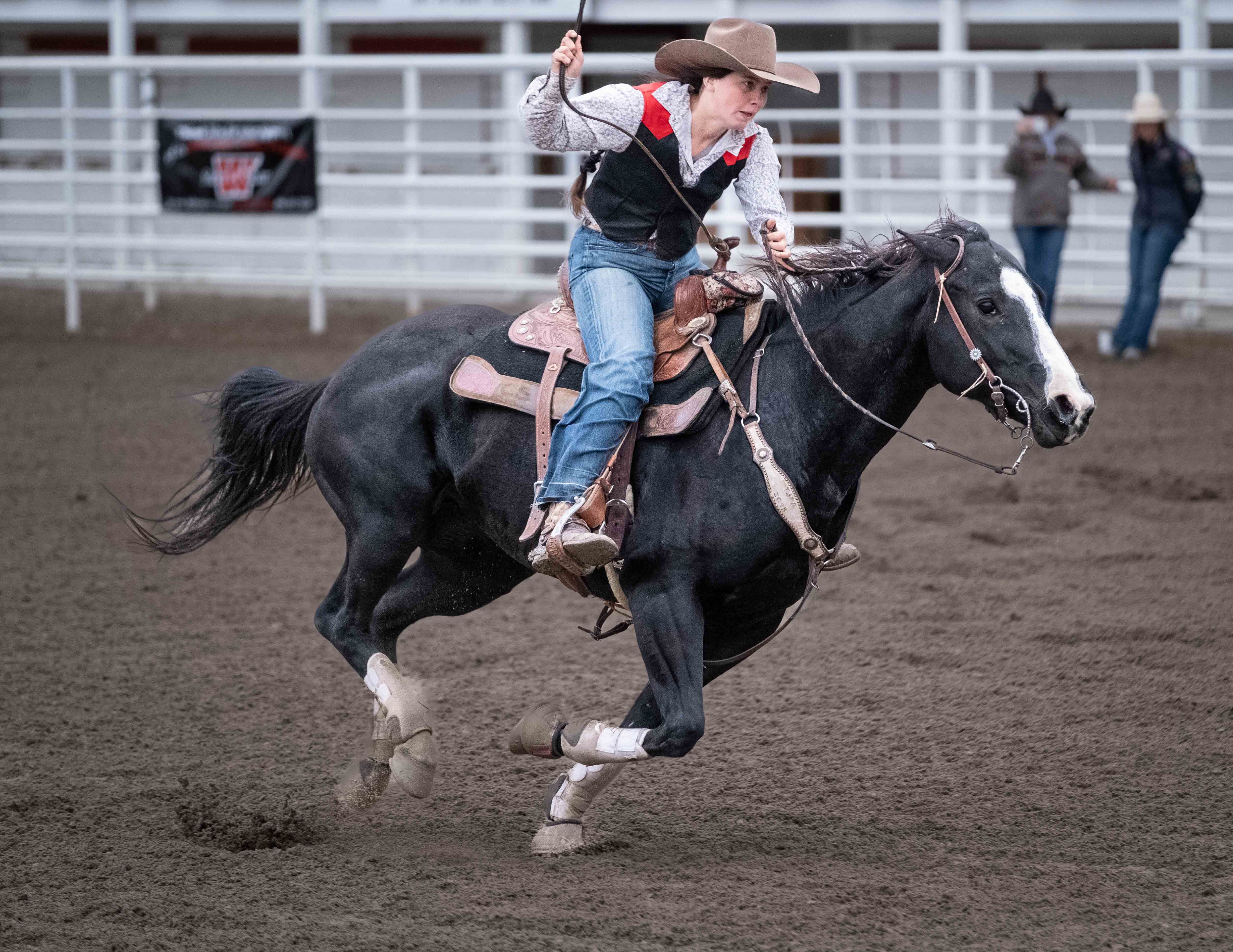
Hey Diane,
you seem to have nailed that panning thing down. Frankly, and this is just me, I don't think any faster ss would enhance anything. What needs to be crisp (the rider's torso, the horses' faces is). The blur in the image helps to tell the story (DoF and motion blur on the background items, motion blur on the horses' limbs, motion blur on the surface) IMHO. BnW does help to bring the attention to the riders and horses. Good choice.
I sure would like to see what that guy is doing to that cow though. ;) |
Oct 13th |
| 60 |
Oct 20 |
Comment |
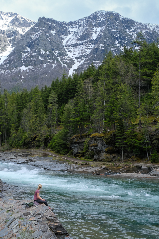
Hey Emmy
This has a lot of good stuff. The complimentary colors are nice. The detail in the sky is interesting too, and I don't think that it being gloomy gray is a bad thing in any way. I'm sure you do wish there'd been a way to get the curves of the stream, but frankly I like the way the canoe is framed (but I wish that one stinking twig would leave it alone).
Can I suggest cropping up from the bottom a bit? I think the merest hint of that brush at the bottom would act as a sufficient frame. Just an idea... |
Oct 13th |
| 60 |
Oct 20 |
Comment |
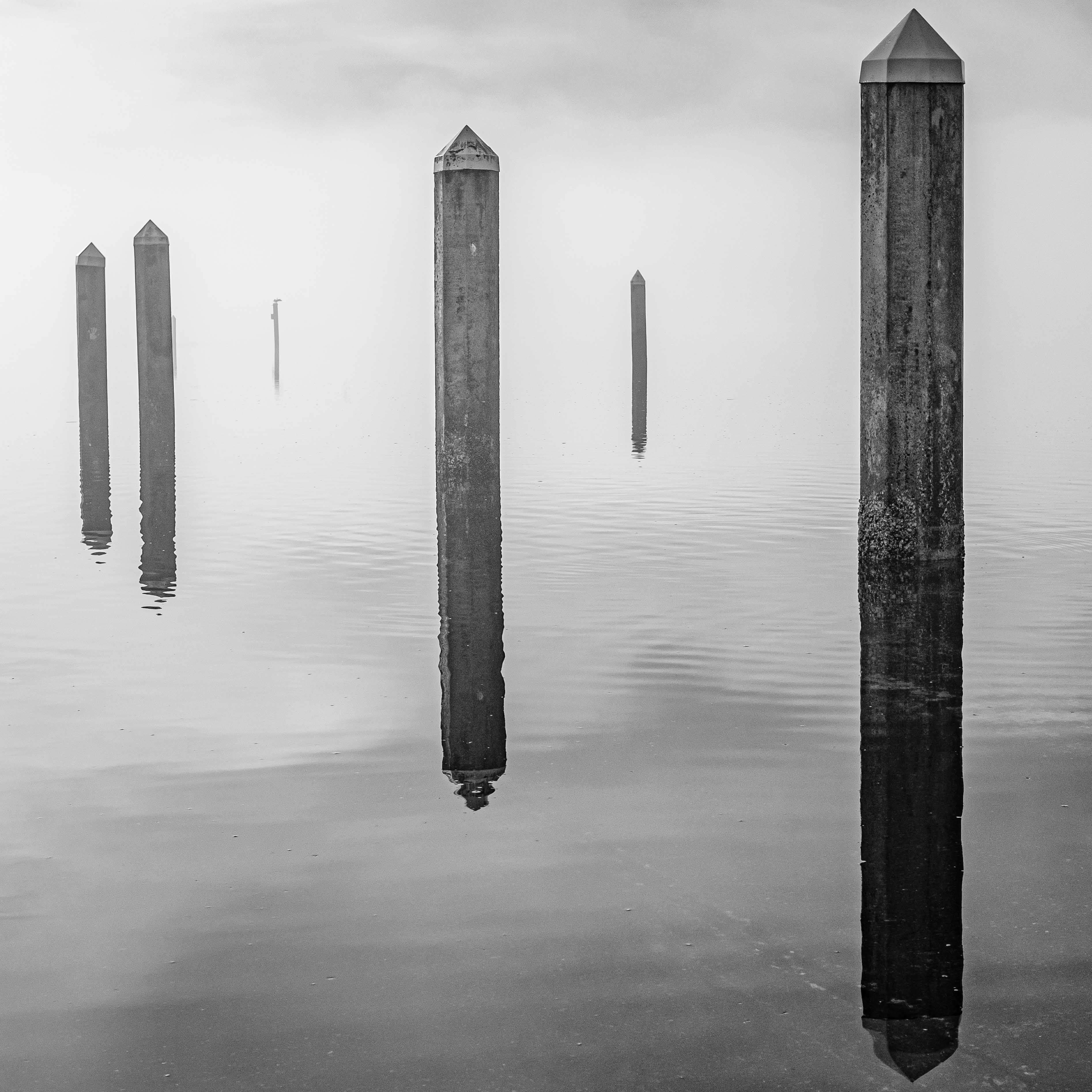
I think your patience paid off. We're all looking for that "lone tree" shot, right?
This wouldn't have nearly the same impact it does without that reflection, IMHO. And there's something else that I think this demonstrates, or at least it's a lesson for me: Like I wrote, we all want to separate our subject from the background, and get that "lone tree" shot. But so often, distracting backgrounds are just unavoidable. The way the treeline in the background bisects the tree is one of those bothersome unavoidables.
BUT, THE REFLECTION DOES NOT HAVE TO CONTEND WITH THE BACKGROUND, because of the angle from which it reflects. Not only is the reflection free of background conflict, it helps you see the subject better too. I don't think I've ever put two and two together about this particular phenomenon before.
I'm sure you were well aware of this effect, and absolutely meant this Richard, so good on you. And, thanks for the epiphany. |
Oct 13th |
| 60 |
Oct 20 |
Comment |
Oooh. To tell you the truth, I don't know crap about Ps. Funny you should ask. I wanted to try a multiple exposure shot to enter into the PID Creative division, and so I installed Ps two days ago for the first time. I watched a youtube vid of the process and realized it was WAY over my head so I closed the application with my tail between my legs. That's a long way of saying: I have no idea Jane.
I think there are other ways of bringing the eyes to the kayakers, without showcasing their state of focus. A radial filter could do it. A vignette maybe. Possibly bringing the whites down, to de-emphasize the fog, and bringing yellows up to brighten the green kayaks. Would have to experiment. |
Oct 8th |
| 60 |
Oct 20 |
Reply |
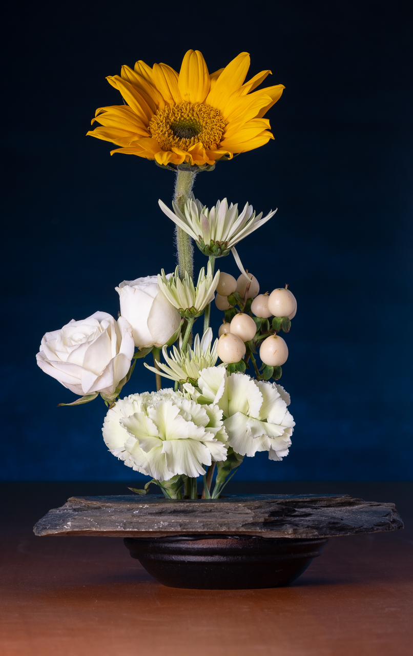
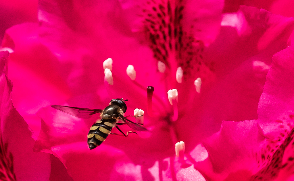
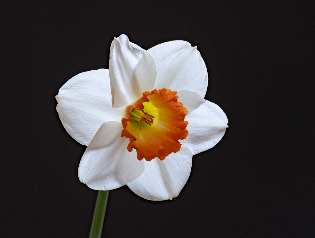
So, I guess you'd say "technical competence: A, artistic expression:...?, impact: D." You hit on an interesting discussion, which is the need to grab the viewer in some way. I think I tried to do so with the juxtaposition of the luminous flower and the deep black background. But hey, beauty is in the eye of the beholder so if I didn't quite nail it, then and I appreciate your candor.
Frankly, it's a miracle that we find impact in any images these days, given the fact that we're bombarded by pretty good stuff all day long because of the internet. Still, some stuff does stand out...so what is that thing that makes something stand out? Originality is certainly part of it, but how original can you be with a macro of a flower? How do you put lightning in a bottle?
You know, I think I mentioned this to Bernie last month, but I think one of the stages of development of a photographer (me anyway) is emulating the work that you admire. First, it's just a poor copy. At some point, you are able to create reasonable facsimiles. Eventually, if you stick with it long enough, and have some talent, you find yourself doing stuff that reflects your own style instead of someone else's. I'm not there yet.
Having said all that, these are just theories. I have no background in any artistic discipline, so can't speak from experience or authority. I've only been kind of serious about photography for a couple of years. Gimme 10 more years of hard work and maybe I'll have a little credibility. |
Oct 8th |
| 60 |
Oct 20 |
Reply |
Yeah. This is kind of the fun part.
Uh, I think what you're telling me is what you see as the "story" (the paddling into the fog). And, I think that goes a LONG way toward creating an interesting photo. I like to think of the story as being what the image conveys that ISN'T in the frame. Having a story that your image conjures in the viewer's mind is a real winning aspect to an image, and something judges look for.
But, what I'm asking is; what INSIDE the frame, is the thing (or things, or whatever) what you want to the viewer's eye to go to. I'll spoil it a bit, and say that for me, it's the kayakers. But it's not about what I THINK the subject is, it's about what YOU want the subject to be. And, whether or not you feel that your subject captivates the eye in the way you want it to. So, what's the subject (area of interest, focal point, whatever) of the image and does it captivate the eye the way you want it to? |
Oct 8th |
| 60 |
Oct 20 |
Comment |
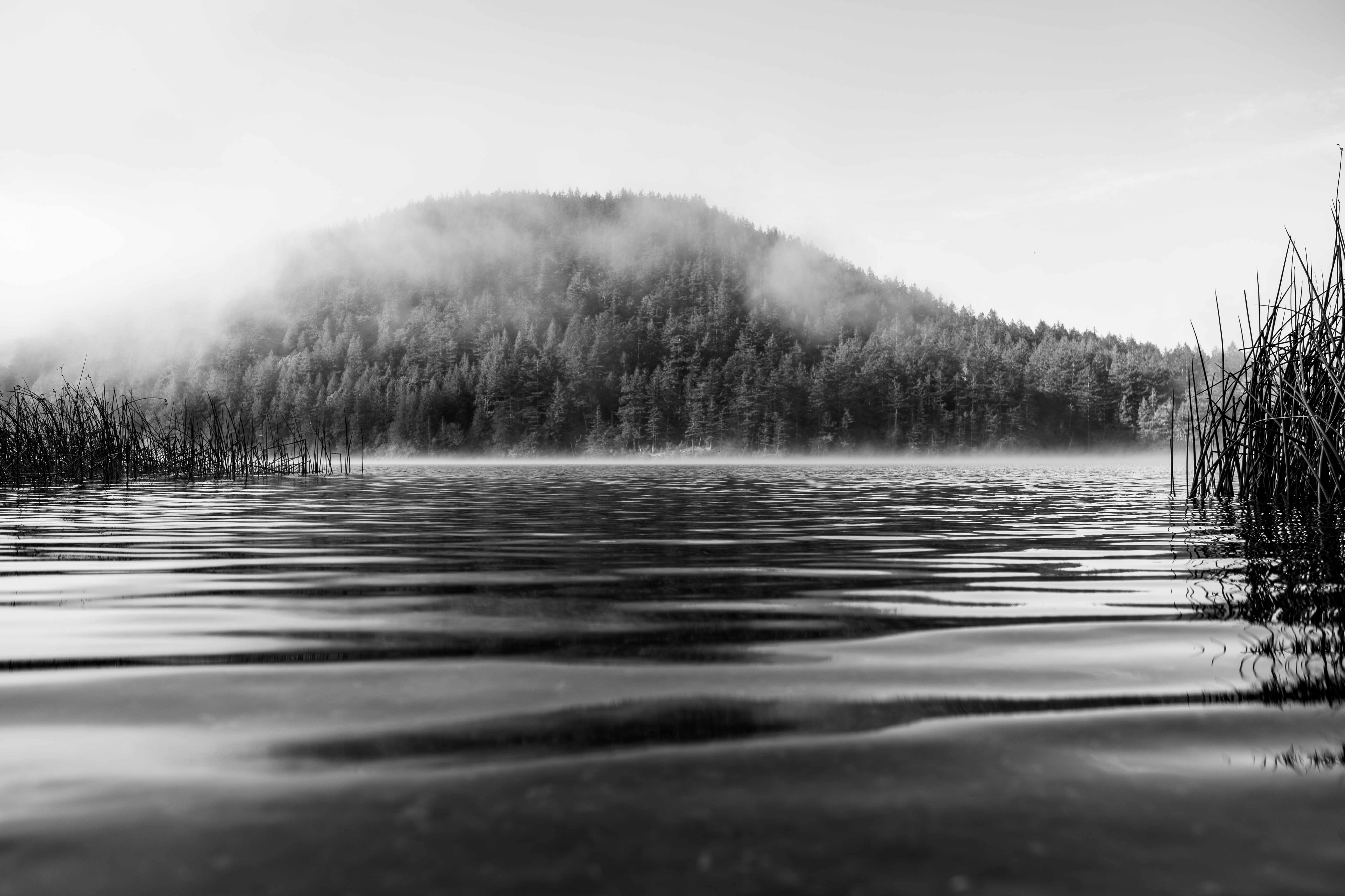
Wow. That's a toughie. Hmmm. The reeds don't look any lighter to me, and the more that I think of it, the more that are kind of looks like a dark blob to me. I can see that you've brought more definition to the sky, but I was hoping that would give texture, and not just more definition to the blue/pink line. As for the flip, man, I don't think that does a damn thing for it. Which, for me, just brings into question the validity of that convention (which is what it is, a convention, and not a rule), but that's just me.
I don't know. What're your thoughts? Why don't you humor me and give those reeds and bush (on the left now) a strong bump up in exposure and see what you think. I mean, this is about making this thing look like what YOU want it to look like, not what I want it to look like.
It's a fun exercise really.
Questions: What would you say the "subject" of the image is? Do you believe it sufficiently grabs the eye? If it does, is the image telling the story you want? If it doesn't, how can you get the subject to grab the eye? |
Oct 8th |
| 60 |
Oct 20 |
Reply |
That first one was exported from Mac Photos. The second one was exported from Lightroom. This hosed me for a long time, without me even knowing it, until I happened to be sitting with my club's PSA Rep when he was looking at my submission. I was like "that is not my photo!" After that experience, I started transitioning to Lightroom.
They look great on the screen, but the output via export is a much different product. In this case, I had to do a complete system reset last week, and most of my Lightroom photos were lost (well, I have the originals on a backup drive) but haven't set LrC back up so I decided to just try the Mac Photos version. The settings for both exports are literally the same. I was actually directed to the Apple Engineers a few months ago, for this issue, after some mutual head scratching.
Moral of the story: Not all editors are created equal. Second moral: Mac ain't what it used to be. |
Oct 4th |
| 60 |
Oct 20 |
Reply |
OK. So it'll be 180 out. But who'll know? I promise not to tell. ;) I only suggest that because it'd put the near high ground (that bush) on the left. You know, that whole upper-left-to-bottom-right thing. Does that matter? I don't know about that. Are we programmed by the way we read? I don't know about that either. But I do know that in the club environment, they like it that way. It's a convention. |
Oct 4th |
| 60 |
Oct 20 |
Comment |
Yeah, well, I don't know. This doesn't look so bad to me. I think the composition is pretty good with nice texture up front, good detail in the middle, and something to look for in the background. the leading line of the right shoreline helps you get to the kayakers, who are pleasantly, but not distractingly, brighter than the surroundings. I like the detail, light, and color of the trees across the slough (is this the Umpqua near Florence?), and the mist on the river and in the Coastal Range.
I think the reeds and bush on the right are darker that you might want them, but to tell you the truth, not by much (I can still see detail in there). Also, since there's not much detail in the sky, so you could dehaze or drop the exposure to get some...or crop most of it out. Have you thought about a horizontal flip on this one? Not sure it'd matter, but maybe.
Still, for not having your mojo on, you seem to be cranking them out anyway. Good job. |
Oct 4th |
| 60 |
Oct 20 |
Comment |
|
Oct 4th |
 |
| 60 |
Oct 20 |
Reply |
You know. You're right. it is kind of soft in the center. Take a look at this version. Does it look the same or better?
|
Oct 4th |
7 comments - 8 replies for Group 60
|
7 comments - 8 replies Total
|