|
| Group |
Round |
C/R |
Comment |
Date |
Image |
| 60 |
Sep 20 |
Reply |
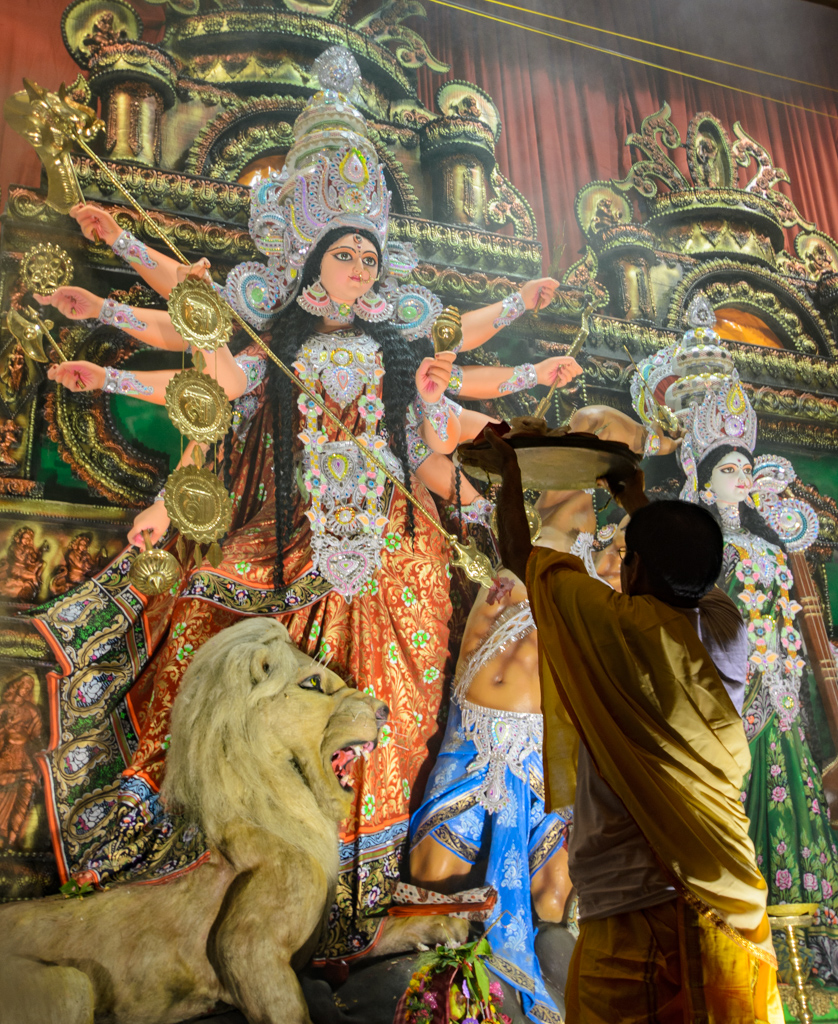
Now this is an interesting perspective. I appreciate the detail put into it. Simply for the sake of discussion, here's how I'd been looking at the images:
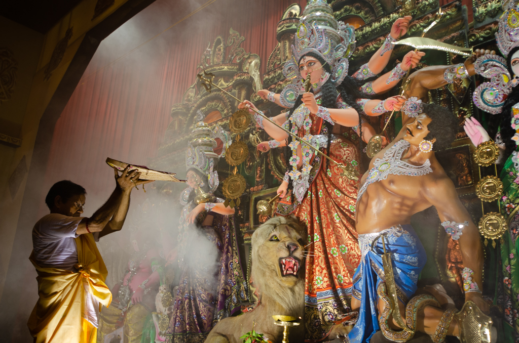
I really thought that the first image would be better appreciated. I saw the full frontal glory of the goddess, and the unmistakable leading line of her spear, as center stage. I thought that the lion's oblique posture prevented it from taking too prominent a role (but I now see, based on comments, that the large, plain canvas it creates is an eye magnet). I similarly felt that the priest's position in the frame, darker presence, and pose would drive home his role of supplicant (which he obviously is, and although the spear is aimed at the demon, it appears to point directly at the priest. In this image, it's all about the goddess and the priest, and the demon isn't a player really. This image lacks the dark corner (upper left) and hot spot (preist's robe) of the second image.
The second image does tell a more complete story. This is the whole Durga story, where she rides the lion into battle to vanquish the demon. The lion still takes up quite a bit of real estate, but maybe less than the first image. The demon is now a MAJOR player, and IMHO sucks up all the oxygen in the frame. The priest remains the minor player, and supplicant. The smoke is no longer a problem, which is nice. But, the goddess is not nearly as majestic (IMHO), and has that fatal flaw of having a portion of her face obscured. I think this one is a good candidate for horizontal flip though.
In both images, you couldn't ask for a better ambience and lighting (this is a staged, ongoing event, where people walk in an out of a theater-like setting 24 hrs a day for a couple of weeks). Having said that, there are not tripods, no flashes, no pauses, no poses, and about a million (wait, this is India, make that a billion) people swarming around, over, and through you. That's all to say that there's a sense of place and a sense of moment that is just really juicy and worth capturing but that it's a helluva place to take a photo...at least for me.
Having said all this, it's difficult (or at least I find it difficult) to really see your own images (some of them anyway). I appreciate the external point of view IMMENSELY, both from you Larry and my fellow DDers. I'll take a look at Image 2 with an eye of improving the issues I have with it, and capitalizing on its strengths. It's great to be part of a really productive group of folks. Thanks tons. |
Sep 24th |
| 60 |
Sep 20 |
Reply |
Well, thank you. The things you mention are strong, but they were strong about the other one too I think. The story is pretty good. Durga is an avenging goddess that emerged and rode a lion into battle with the demon and vanquished him, I think in the Mahabharata (maybe not). The background is that many of India's epics are actually vestiges of the stories created during the Aryan invasion of the Indus Valley (interestingly, the gods are the Aryans and the demons are the natives, of course, I'm not an expert so I could have major gaps here). My major beefs with this one are a) the goddesses face is partially obscured b) the priest is standing next to the light so is way overexposed and competes for attention c) the blank dark spot in the upper left. I think this, and the first shot, would be OK travelogue shots, where you are given ample discussion to fill out your understanding of what you're looking at, and truth-to-the-subject is the goal and not necessarily artistic acumen. |
Sep 18th |
| 60 |
Sep 20 |
Reply |
These are good suggestions Jane. With the exception of darkening the lion (I may try that), I messed around with all of them. What I found when I lightened anything, is that it started competing for attention (IMHO) with the goddess. And as for increasing haze, because of where it is, I had to take some out or it started interfering with the goddesses face. But, interestingly, I do have an image from the opposite side of the priest, that solves this issue. Of course, to me, it has its own issues. I'll include it. See what you think. |
Sep 18th |
 |
| 60 |
Sep 20 |
Reply |
Right. Vignette. That's one of the tools in my bag that I often forget but man it can work wonders. No? Good call. |
Sep 18th |
| 60 |
Sep 20 |
Reply |
Thanks Dianne. Your very kind. I have to say, I think that having been there, in the sensory assault that is India during a major festival, my perspectives on the images I captured is probably skewed. But I have to toss stuff out there to see what the reactions are. I mean, I kind of look at this as a safe space where we can test out techniques, and our work, and get good feedback, and no cost really, except the obligation to give feedback too. |
Sep 18th |
| 60 |
Sep 20 |
Comment |
Thanks Richard. I have a version like the too. I know the dark spot of the priest kind of draws the eye, and that's a negative. But when I lightened it up, I found that he competed with the goddess. So, in the end, I just left him dark and only added enough lightening to hint at the details.
All in all, although I like the shot, I don't think this is a winning image. I just have the feeling that I'm requires a bit too much explanation. But, I really appreciate the consideration of my compadres here, because it's REALLY tough to look at your own stuff truly objectively...at least for me. |
Sep 13th |
| 60 |
Sep 20 |
Reply |
You know Bernie, I just recently heard something that I TOTALLY need to take to heart. The point was that one needs to SEE the image, and not FEEL the image. I think that's totally true. When I look back on my most of the images that I've taken and like, it's because I had some emotional connection to the image. but when I look at it later, I just don't get it.
So, the point, I think, for me, of creating images that more effectively speak to OTHER folks, is to see it from a kind of detached positions. I'm still working on this. It's going to take time. |
Sep 11th |
| 60 |
Sep 20 |
Reply |
You're killing' me Tubbs. |
Sep 11th |
| 60 |
Sep 20 |
Reply |
OK. Well, IMHO, the thing to strive for is an environment of mutual admiration, in which trust allows each contributor to really take the submitter to task. Now, having said that, this is contingent on the good will of both the submitter and the viewer. And, critiquers have to be able to say some thing credible. If someone says "this is nice. Great focus." That's not particularly actionable. But, if I were to say "Jane, this is good, but that is bad," you would have to know that I'm coming for a place of competence, and concern for your feelings and your image.
I guess, it really just has to be a relationship building process. You don't know me. I have no credibility as a photographer or critic. Let's just move forward. I want to be part of the reason your photography reaches the state you want it to. |
Sep 11th |
| 60 |
Sep 20 |
Reply |
I don't know about you Jane but this is a much more powerful image to me Jane. I like this a lot. Man the colors are just perfect. Nice bokeh the bird is in just the right portion of the frame (IMHO). Balanced composition, to my eye. The only thing that could make this better is to have captured the bird's eye or eyes. I like the little sparkles in the background. I just can't nitpick this too much at all. Good work lady.
But what this brings up, is what kind of images we're presenting to the group. Are we presenting to each other out top images? Or, are we showing the group our head scratching images?
I confess, my real goal here is to take advantage of your practiced eyes to help me understand why my also ran images don't quite make it. I definitely have images that I like, or want to like, but that just don't quite cut it for me or anyone else. I want to know what I'm doing wrong, and I want you and the club to help me understand that.
One of the best things we can do for each other is to be honest, direct, and clear about how each of us has failed. Acknowledging our own failures is how we move forward. Of course, delivery is key, and the recipient needs to be a grown up with thick skin.
Of course, these are just my opinions. Thanks for putting your work out there Jane. I love this shot. |
Sep 11th |
| 60 |
Sep 20 |
Comment |
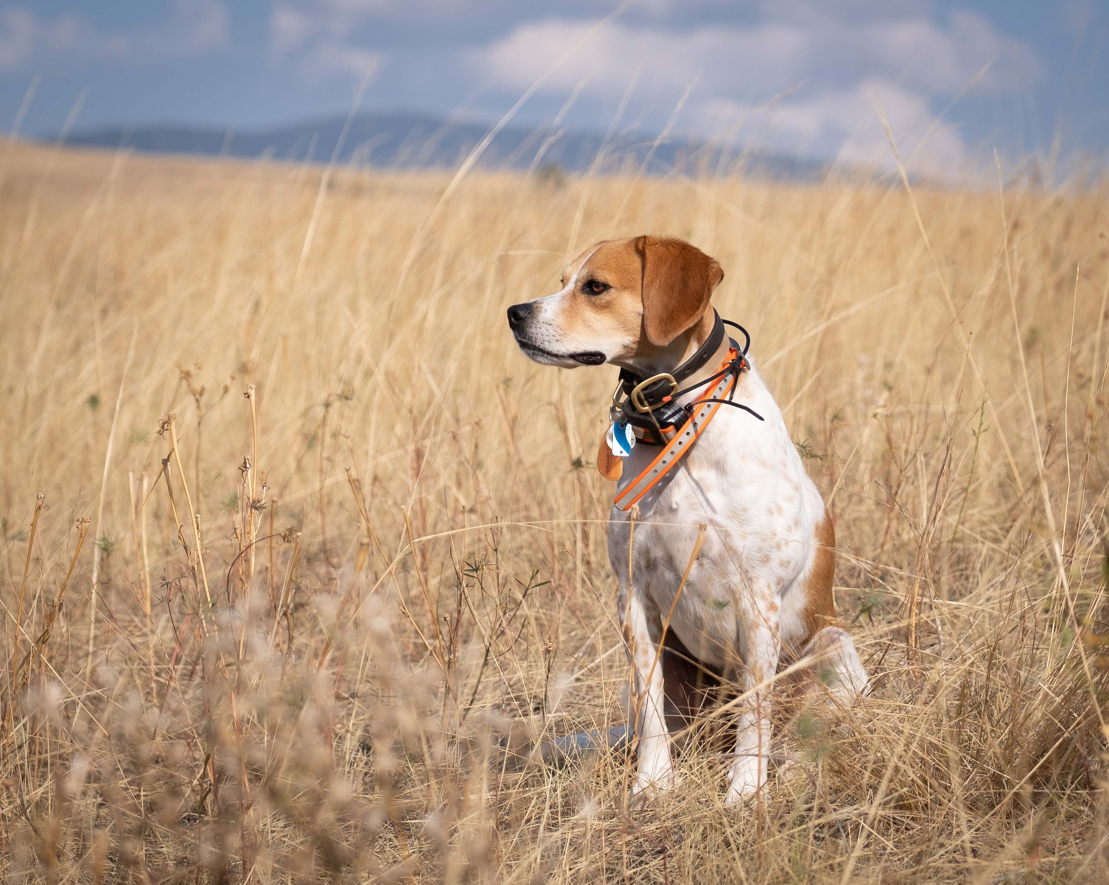
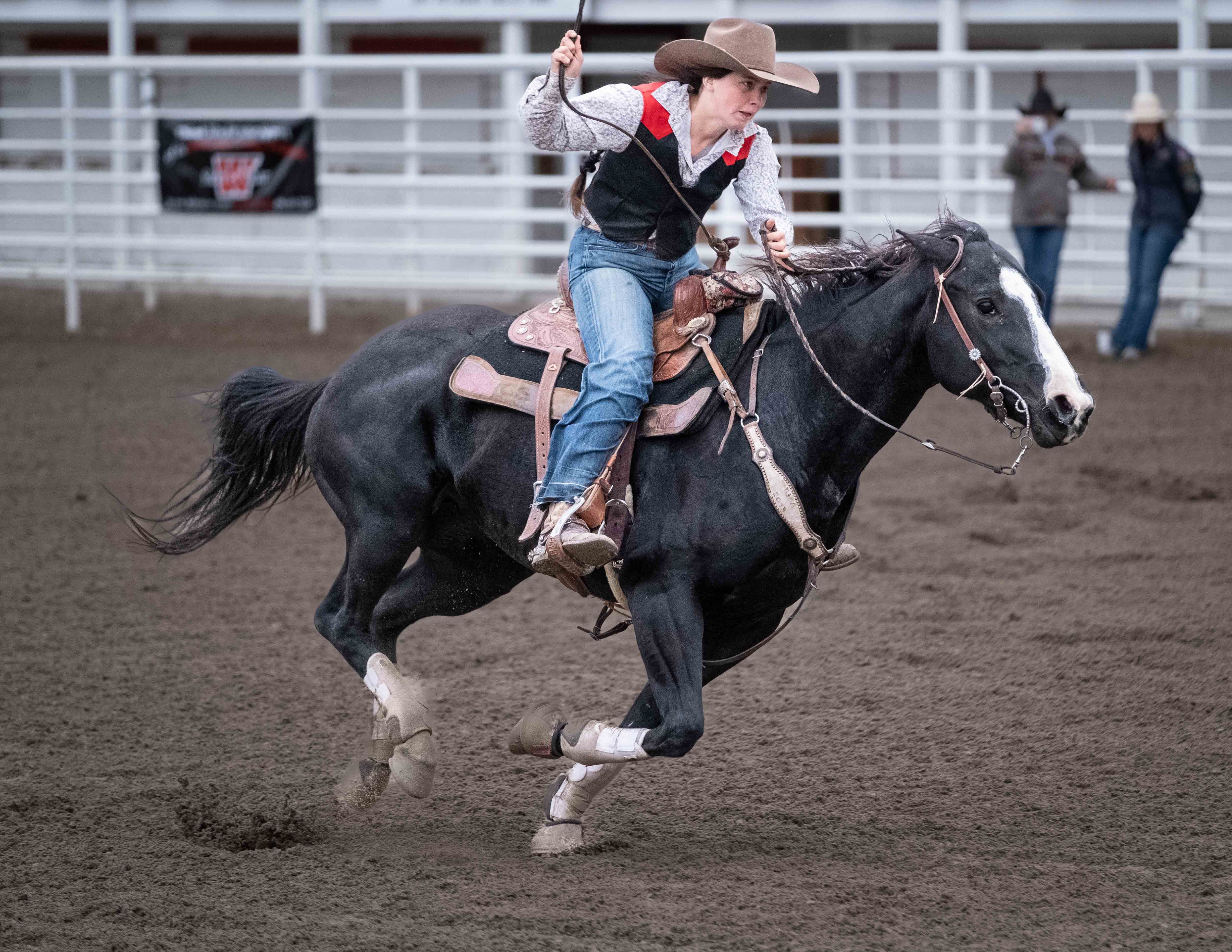
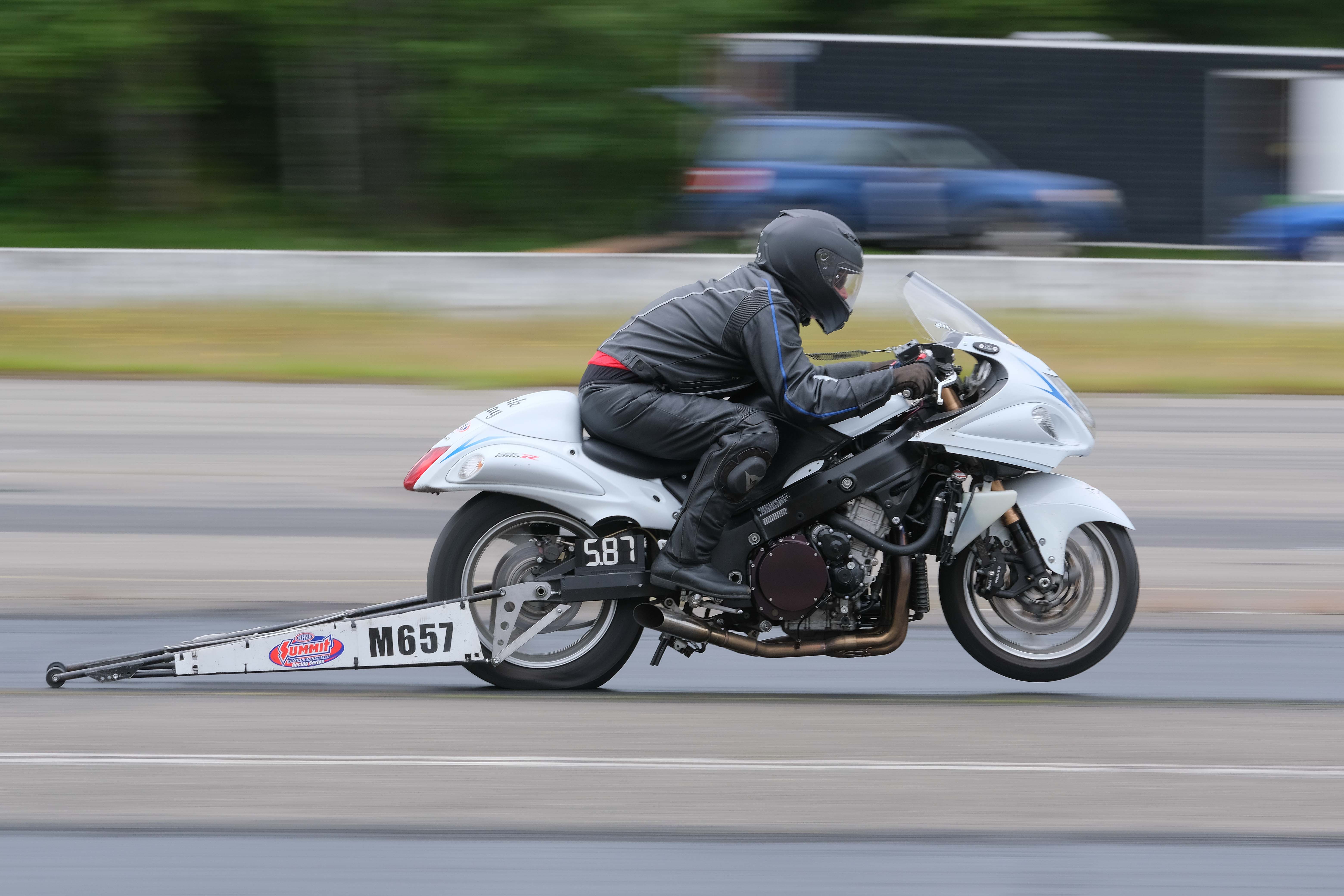
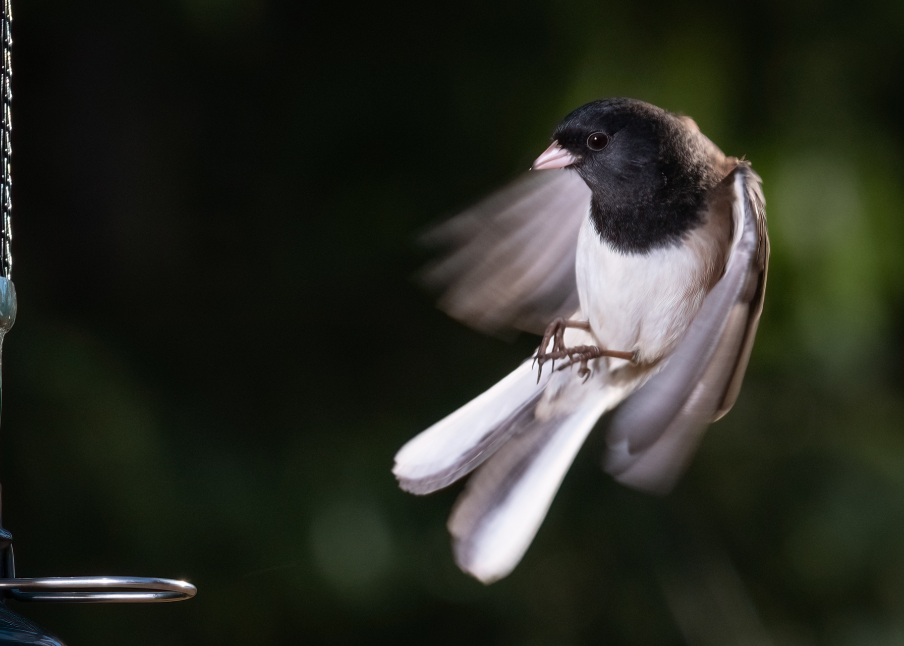
Nice action shot. I'm surprise you were able to effectively freeze the action at just 1/160. Good on you. Man, I wish the photo were taken from 180� out though so you caught the face. This happens to me all the time too.
Is it possible to brighten things a bit? It looks a little dark to me. Do you see some weird pixelation in the background? I do. |
Sep 11th |
| 60 |
Sep 20 |
Reply |
Good question. This was not a controlled situation in any way. I really just had to take advantage of what was presented to me. Flash wasn't really an option. It'd be like firing one off during a papal mass. So, if anything, this is a PJ shot. I had a wide angle lens and was hand holding everything in a darkened theater setting. Frankly, Thats all I got. |
Sep 10th |
| 60 |
Sep 20 |
Reply |
Sorry Jane. I don't. This was over a year ago I think, and I'm not sure I'd even recognize the dude...but I think he was shooting medium frame. Anyway, I just went to YouTube and searched "photography mist" and a whole bunch of stuff popped up. There's gotta be some interesting stuff in there.
D |
Sep 8th |
| 60 |
Sep 20 |
Comment |
This is a winner Richard. Your deliberateness in the technique is to be commended. And, I'll give you gold star for creativity in using the clouds to catch the color. Very creative and effective use of the elevated rail as a leading line. Kudos. Super crispy image.
The colors are kind of radical for me, but I think that's what you were going for anyway so good on you. Besides, they do kind of evoke something about Miami don't they? |
Sep 7th |
| 60 |
Sep 20 |
Comment |
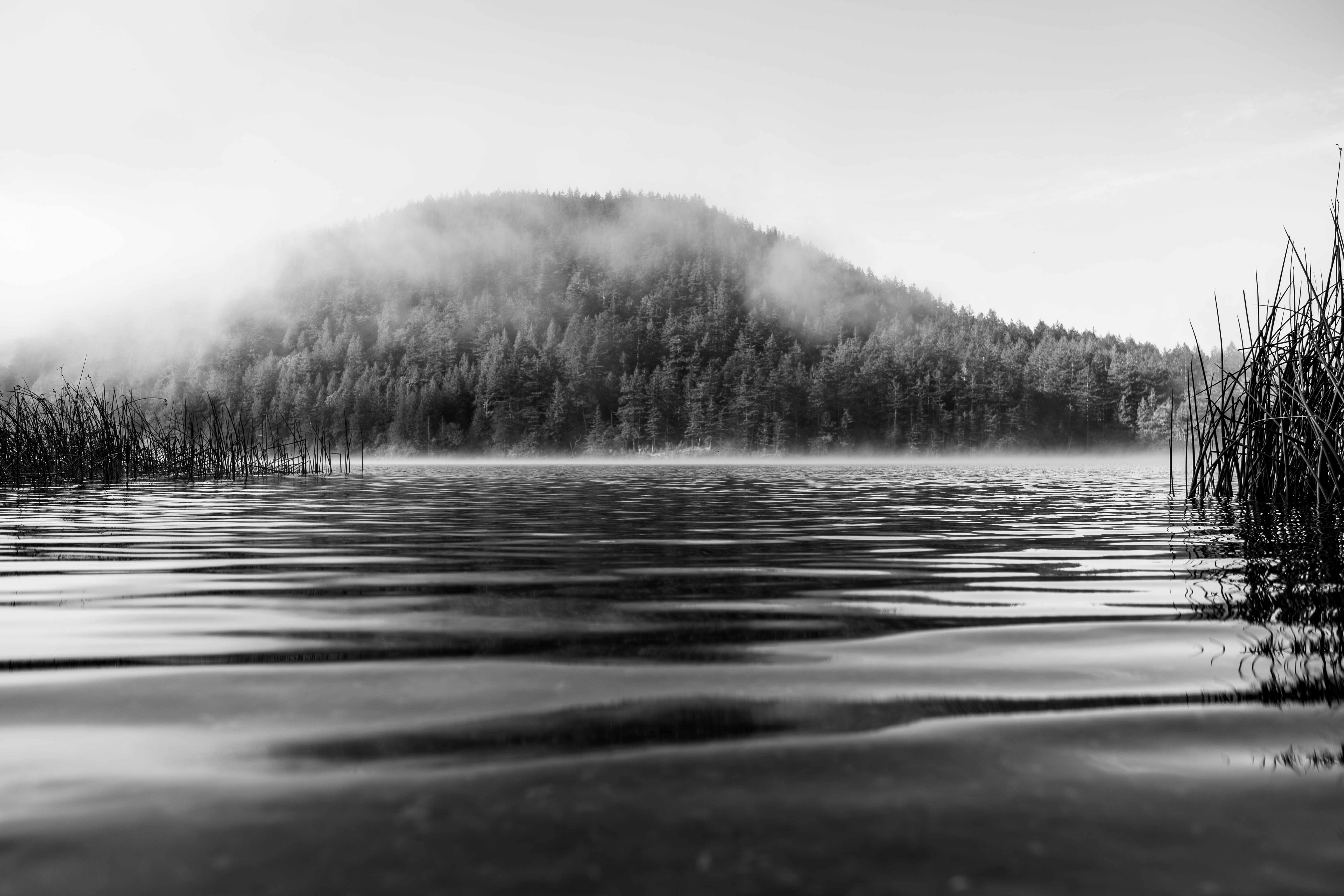
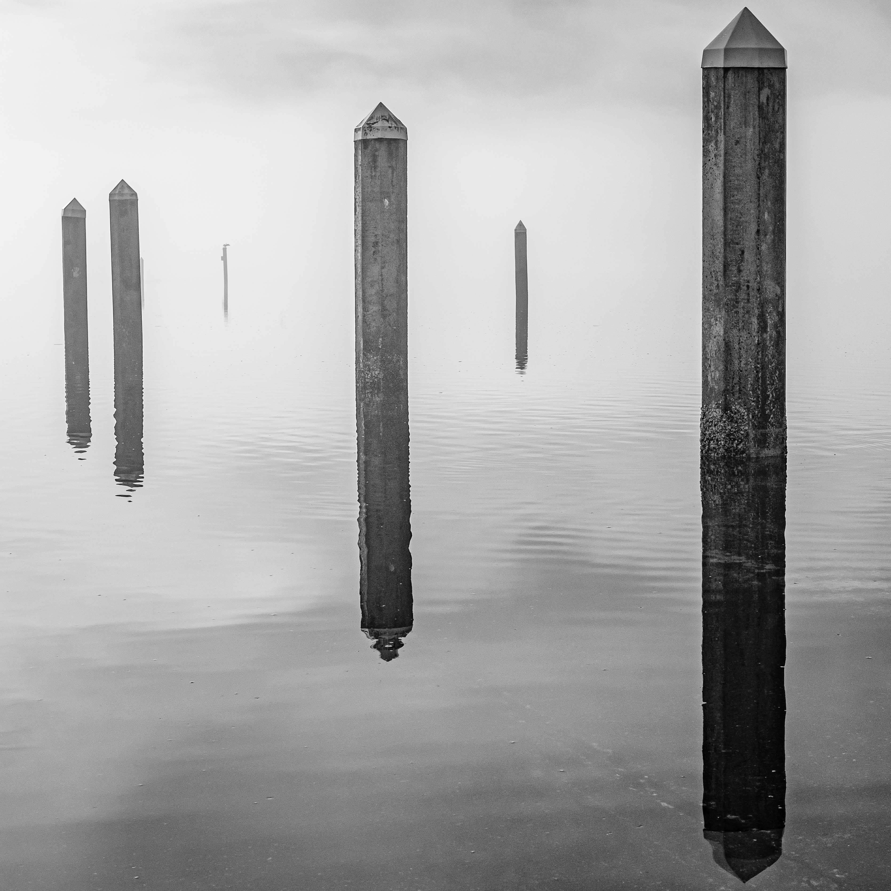
Good job on the fog Emmy. I think your use of layering (from the bottom up) goes a long way to creating that sense of three dimensionality that we're looking for in a landscape. I think some folks would whine about no foreground detail (I don't miss it here), but I don't think that's always required, or advisable. I think the whole image is very crisp, and given the wind you mention, wasn't easy. I like the tonality, but don't think it would hurt if you added some global exposure to achieve a greater range (as long as it didn't ruin your nice, dark foreground).
Tell me more about using the ND filter to accentuate the fog. I don't think I would've thought of that and am not sure how/why it works.
Two things here magnetically draw my eye to them. 1) the power line tower on the ridge which for me just clashes with everything else in the image and 2) the bright houses in the lower right, especially that arc of houses. Of course, those things were in the frame, and there' nothing you could do about it. But, a little post-processing magic can easily manage both of those, if you wanted to. |
Sep 7th |
| 60 |
Sep 20 |
Comment |
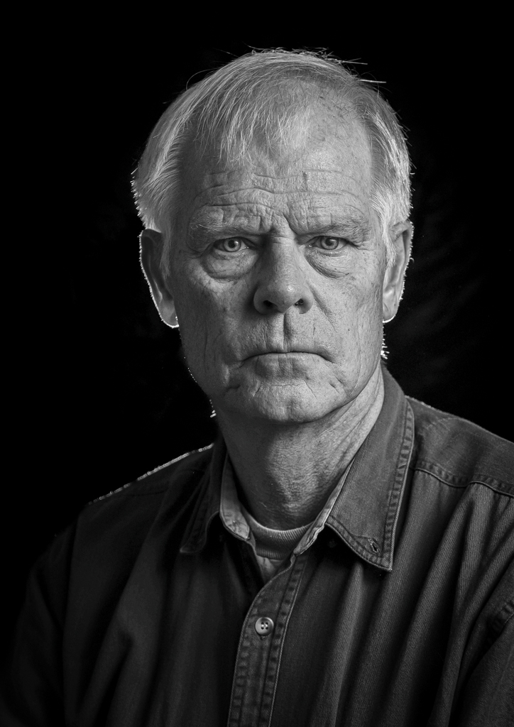
Hey Bernie,
nice work. I think you nailed the exposure of the subject, giving it lots of subtle texture, helping it appear lifelike and three-dimensional. Color is right on for me too, and everything looks very natural.
I agree with the others that it might help to separate the subject from the background more. You could that lots of different ways, but only have so many options once you're in post production.
IMHO, a photo like this is kind of a portrait, or at least has many elements of a portrait. Something that I learned in the PSA Individual Photography course, and which I'd never really heard before, is to be VERY conscious of your background when you're doing portrait stuff. Even if you can separate your subject from the background with DoF, a bright spot or lines or whatever, can draw the eye away from the subject. You've done a good job of avoiding any hot spots in the background, but the proximity of the background to the subject presents challenges. |
Sep 7th |
| 60 |
Sep 20 |
Comment |
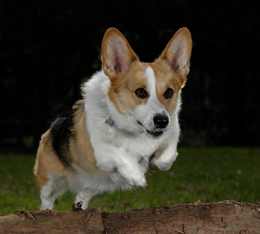
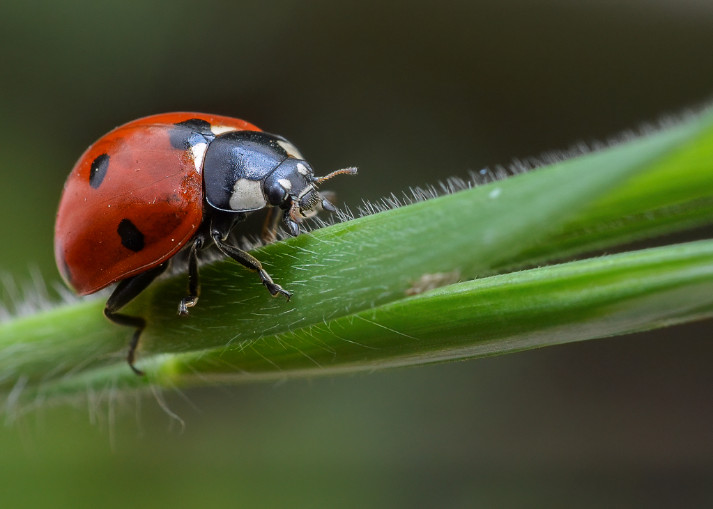
I love all your sparkly water droplets Jane. In fact I think that's a super effect, especially the way they bokeh due to your use of DoF. Colors are great too, well done. And your bird is tack sharp, which is no small feat. I like its very natural posture too. I think your use of DoF does a good job of separating the bird from the background too.
If I were going to make some suggestions for improvement, and this is just me, I would say that the bird merges with the flower in front of it more than I would prefer. I mean I'd like to see the bird, unobstructed.
I think you could crop out the rest of those flowers too without harming the image at all. If you want to keep them, to balance the bird, I feel it's probably best to make sure the entire flower is in frame. Maybe just crop out the flower on the right?
I sat out in the hot sun a lot this spring trying to shoot hummers in flight. Talk about challenging. I did some research and the folks who are able to really freeze them in flight don't use ss, they use speed lights. Apparently, at full strength, a speed lights duration is not all that fast (maybe 1/1000 as I remember), but at 1/32 or so, the duration is only like 1/16Ks or something like that. But, because it's so much less light, you need WAY MORE flashes. So these folks were using up to five speed lights to properly expose the birds. I didn't have the money or commitment for that sort of thing. Anyway, look it up. It's fascinating. |
Sep 7th |
| 60 |
Sep 20 |
Comment |
Hey Diane,
Your trees have lots of character. Well focused.
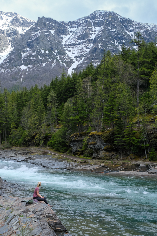
I think I know where you were going re: trying to create a sense of flow. I think 1/3s seems reasonable. Did you try other speeds? How did they affect the impression of flow?
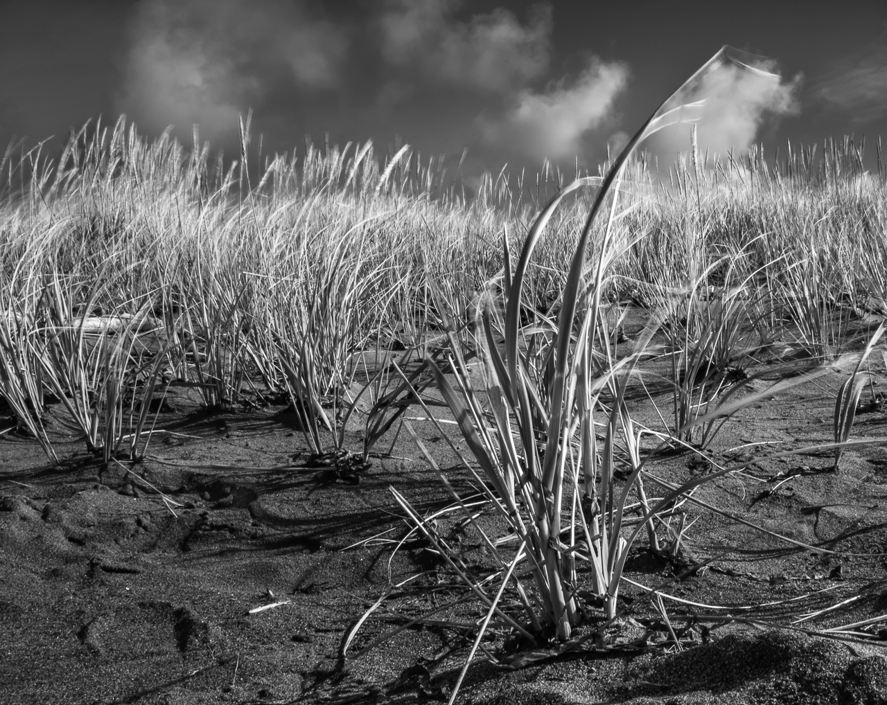
On my screen, the image does look quite misty (which I know is something you were shooting for, so well done), but since the entire image ie equally misty/hazy, I'm not sure I'm able to get the effect. I saw a youtube vid where this guy was doing nothing but shooting haze/mist shots, and his point was to use the haze/mist to isolate a portion of the image, the same way we use DoF. I thought it was pretty effective. |
Sep 7th |
7 comments - 11 replies for Group 60
|
7 comments - 11 replies Total
|