|
| Group |
Round |
C/R |
Comment |
Date |
Image |
| 24 |
Feb 21 |
Reply |
Got it. Thanks |
Feb 13th |
| 24 |
Feb 21 |
Comment |
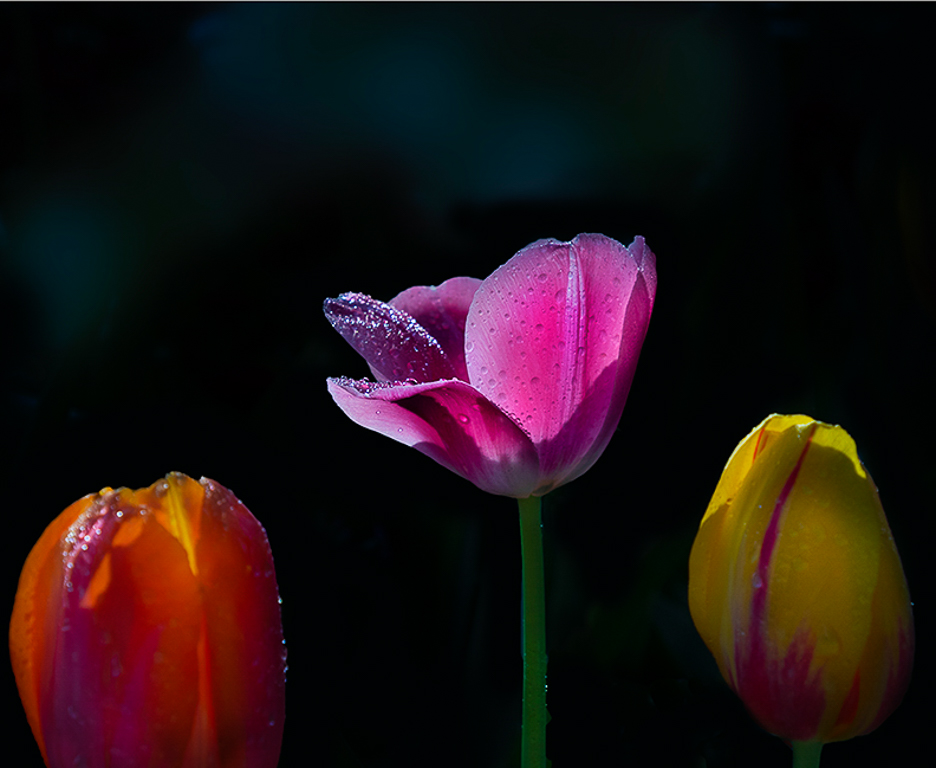
Sam great job darkening the background and cropping tightly on the three tulips. I love the clarity of the water droplets on the center pink tulip and the rich colors of the pedals. With your title of "Three Tulips" I would have expected all three tulips to be sharply in focus. With only the center pink tulip in focus my eyes are drawn there, and the other two tulips are just there to frame the center one. I would suggest cropping tighter on the center pink tulip to emphasis that this is the main subject. See my edited photo. |
Feb 12th |
 |
| 24 |
Feb 21 |
Reply |
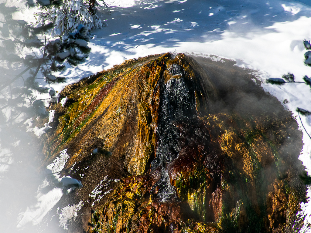
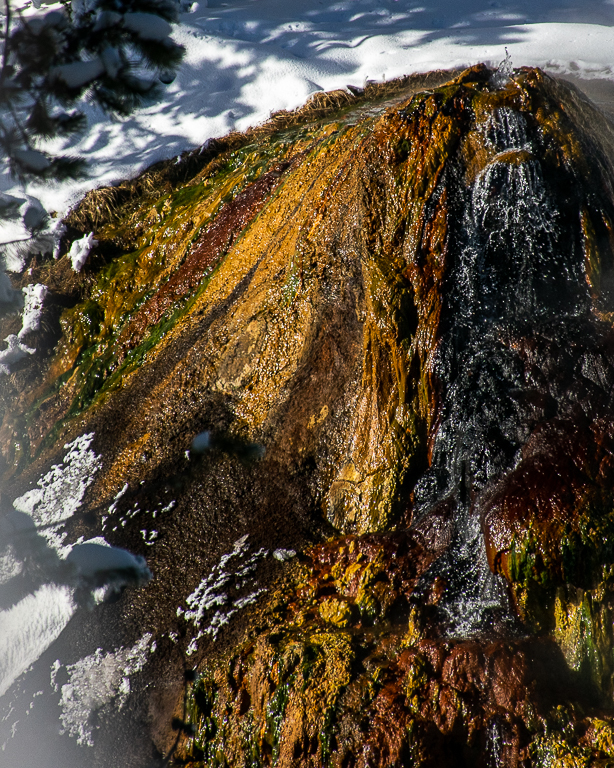
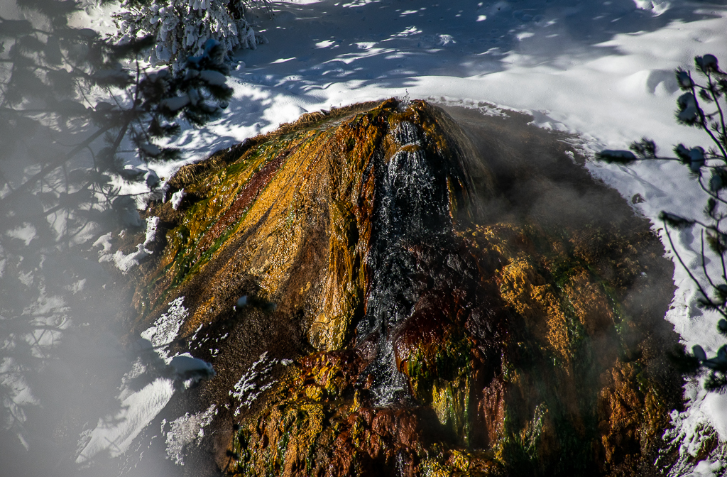
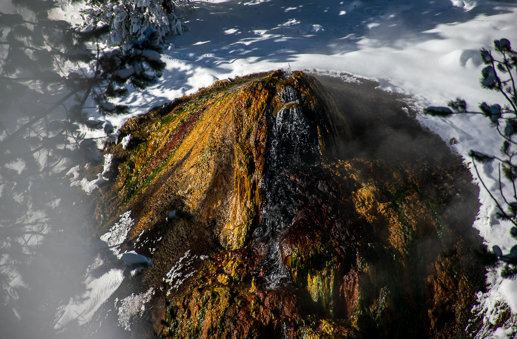
Albert I tried your suggestion for a tight crop on the left side of the thermopile. The photo now puts the focus on the rich colors of the thermopile. Let me know what you think. |
Feb 12th |
 |
| 24 |
Feb 21 |
Reply |
John the last edit looks much better. I will have to try your tips in PS on the RAW file. Thanks |
Feb 8th |
| 24 |
Feb 21 |
Reply |
John I like how you brought some more of the details out in the deep shadows of the thermopile. My only concern is that it looks like some of the rich colors in the lighter areas of the thermopile are now washed out. |
Feb 8th |
| 24 |
Feb 21 |
Comment |
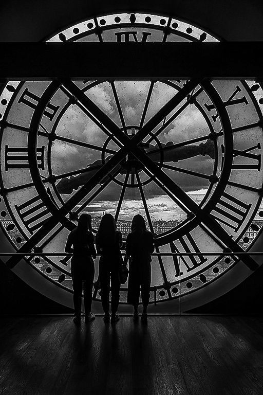
Laura I think this is a wonderful silhouette photo. Your post processing work is spot on. I like how the shadows on the floor lead your eyes into the photo and to the three women looking out the window. It makes you want to look out the window too. I do like Jim's edits to bring out the details in the floor a little more. You may also want to try this as a B&W photo to enhance the silhouette feel to the scene. |
Feb 8th |
 |
| 24 |
Feb 21 |
Reply |
Steve, I used a custom crop on the photo in Lightroom. I wanted to emphasis that the crop you made on the review photo better conveys the "Showdown" feel of the two birds that you were going for. |
Feb 8th |
| 24 |
Feb 21 |
Reply |
Agree |
Feb 4th |
 |
| 24 |
Feb 21 |
Reply |
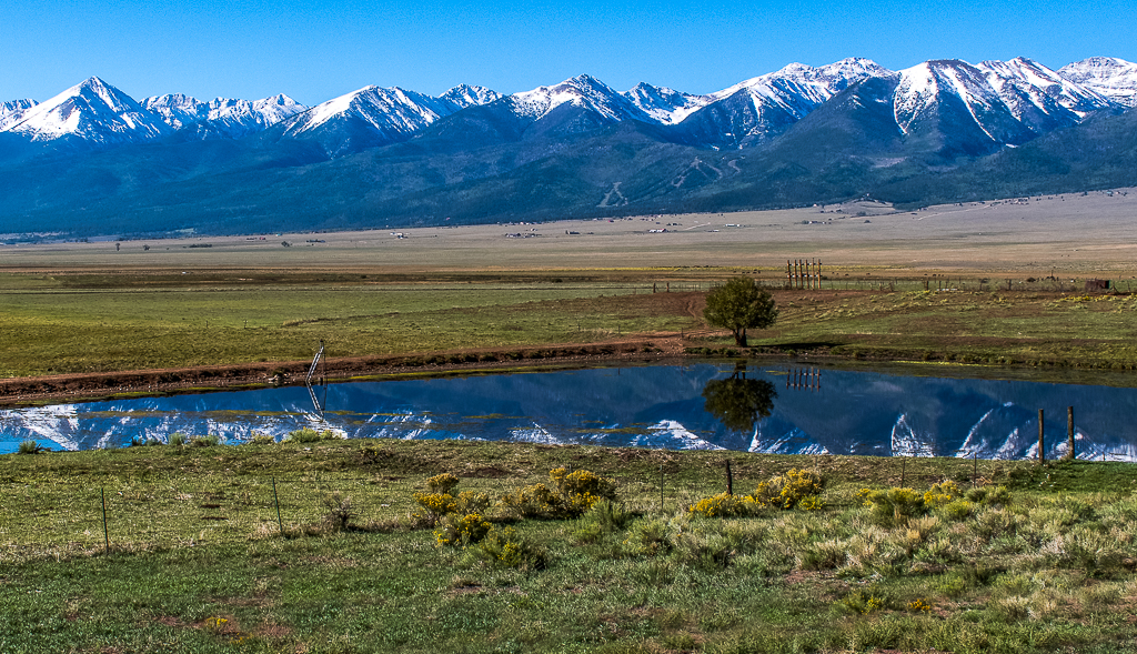
Great feedback. I was so focused on bringing out the colors in the thermophile I forgot about the background. I did wash out the snow and shadows too much in the first post processing edits. Let me know what you think of the attached second photo edits. Thanks |
Feb 3rd |
 |
| 24 |
Feb 21 |
Comment |
John great job bringing out the wonderful colors in the window and the walls. They rally pop. I also like the placement of the rooftops in the composition. However, I feel that the sky replacement takes away from the wonderful rooftop lines of the church. The dark grey clouds between the main dome and the right dome are distracting to me. |
Feb 3rd |
| 24 |
Feb 21 |
Comment |
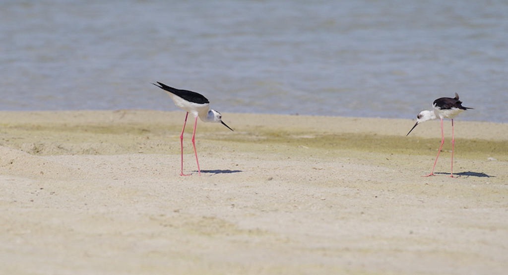
Steve this definitely looks like a showdown with the birds eyeing each other. I think your depth of field was exactly right. The birds and the ground around them is in focus while the foreground and background are blurred. I think your tone curve adjustment was exactly right to bring out the colors. Did you use a classic "S" shape tone curve to accomplish these changes?
My only suggestion would be to create a less balanced scene, that suggests that the bird on the right is invading the territory of the left-hand bird. This creates the drama for the Showdown. See my attached phot edits. |
Feb 3rd |
 |
| 24 |
Feb 21 |
Comment |
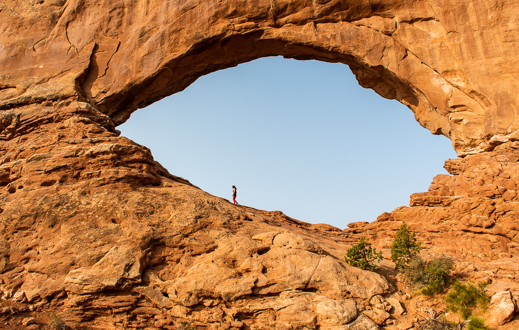
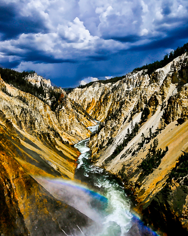
Albert you have created a dark and moody feel to this iconic scene. I like that you darkened the clouds in the photo. It adds real drama to the scene. Although you lost some of the details in the trees during the post-processing, I feel that this increases the attention given to the rainbow as the main subject in the photo. I did notice that you lost the yellow band in the rainbow when you desaturated yellows. I would also clone out the black dots in the clouds as they are distracting. It looks like you had a dirty lens or camera sensor. Lastly, I feel that the sky is a little overwhelming and distracts from the canyon and rainbow. I would recommend cropping the top of the photo a little. See my attached edits. |
Feb 3rd |
 |
| 24 |
Feb 21 |
Comment |
Jim I think lowing EV three half steps to capture the shadows worked well. The details in the pedals are spot on. Your choice of B&W for the finished photo really draws the viewer to the details and texture in the pedals. |
Feb 3rd |
6 comments - 7 replies for Group 24
|
| 97 |
Feb 21 |
Reply |
Jeffrey how about: "I got a quill for you". Kind of fits in with February's Valentine's theme? |
Feb 12th |
| 97 |
Feb 21 |
Reply |
Jeffrey I like the edits you made to the photo. The changes you made bring out the details in the bird's feathers. In addition the eyes now pop with more clarity. I also like the extra space you added to the right side of the photo. The amount space was just enough to give the bird room to look at. As I stated before this is a wonderful photo that is even better now. |
Feb 10th |
| 97 |
Feb 21 |
Comment |
Sophia's update on her photo:
Hello everyone as I promised a quick update with my photo. It took Honorable Mention. Thank you all for your suggestion. The judge did suggest that it will be stronger if it was B&W. She also said that the angle of how the photo was taken was fabulous. |
Feb 10th |
| 97 |
Feb 21 |
Reply |
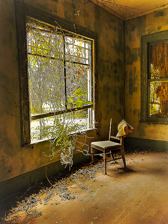
Stan I also like how you cropped Sophia's photo. This really puts the focus on the plants invading the room and the old chair. A very creative adjustment to the look and feel of the photo. |
Feb 8th |
| 97 |
Feb 21 |
Comment |
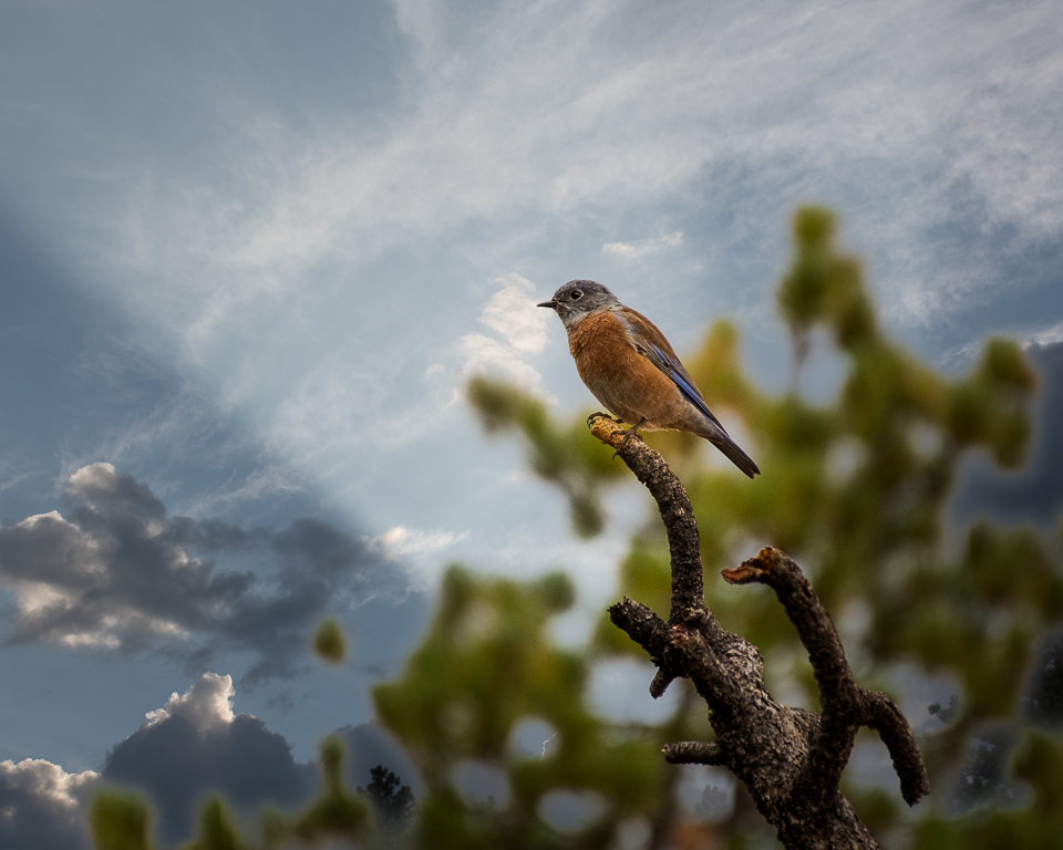
You have created a wonderful photo of the Secretary bird. The details on the bird's feathers are nice and sharp. You have done a great job in the post processing to enhance and bring out the colors in the photo. I love the bright red color around the bird's eye. I also like how you did a tight crop of the bird but left a little extra space on the side that the bird is looking at. It makes you wonder what is out three that has caught the bird's attention. My only suggestion would be to dial the exposure down a little bit to further bring out the details in the bird's feathers. See my photo edits (reduced exposure by -0.89, increased highlights and shadows by +20, added +20 for Clarity and set Sharping to 50 and Masking to 80). |
Feb 8th |
 |
| 97 |
Feb 21 |
Reply |
Jeff I tried your suggestion. Let me know what you think of these edits. |
Feb 6th |
 |
| 97 |
Feb 21 |
Reply |
Sophia thanks for the tips. Let me know what you think of these edits. |
Feb 6th |
 |
| 97 |
Feb 21 |
Reply |
It happens to me too. No matter how many times I look at one of my photos someone else seems to notice something I have overlooked. :)
|
Feb 4th |
| 97 |
Feb 21 |
Reply |
Matthias I love the edits you made to the photo. It makes me wish I could visit this place and enjoy the serenity you captured in your photo. |
Feb 4th |
| 97 |
Feb 21 |
Comment |
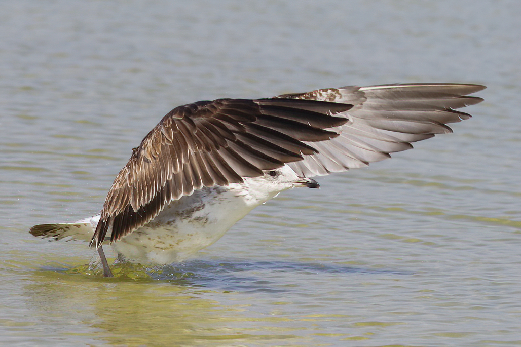
Steve I like the classic hood ornament photo that you selected. The bird's eye gleaming in the sunlight and peeking out from underneath its wing, grabs you as you look at the photo. I also like how you cropped the photo so that there was more focus on the gull, rather than on the water. I know you like the slight blur of the bird's wings but to me it is distracting. Since you were shooting at ISO 800 with a 1/3,200 shutter speed, I believe you were going for sharp images that day. You might want to try a noise reduction software such as Topaz DeNoise AI to enhance your photo. See attached edited photo that I ran through Topaz DeNoise AI software. |
Feb 2nd |
 |
| 97 |
Feb 21 |
Comment |
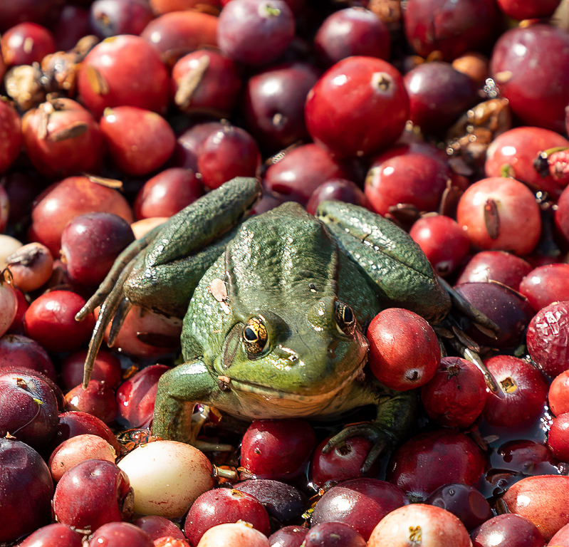
Stan I love how you captured the bright colors and textures of the frog and berries in your photo. The shallow depth of field with the sharp details of the foreground frog and berries focuses your eyes on the main subject in the photo. I also like how you placed the frog in the center of the photo further emphasizing the action of the frog. My only suggestion would be to clone out the small green sprout in the upper right corner of the photo as the green color is distracting. See edited photo. |
Feb 2nd |
 |
| 97 |
Feb 21 |
Comment |
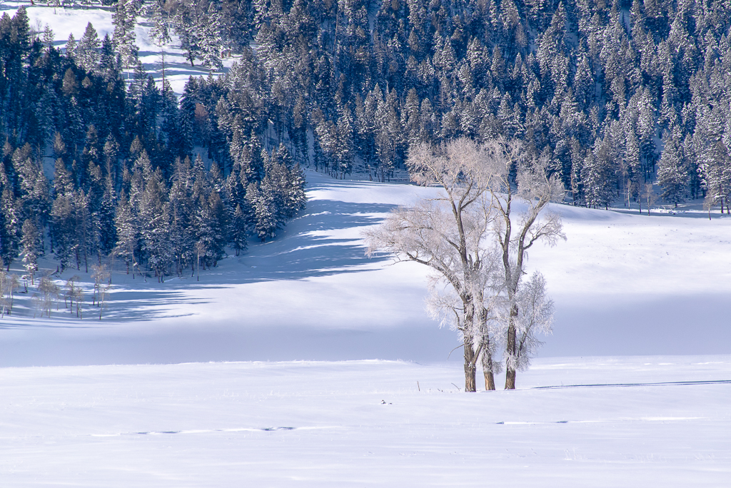
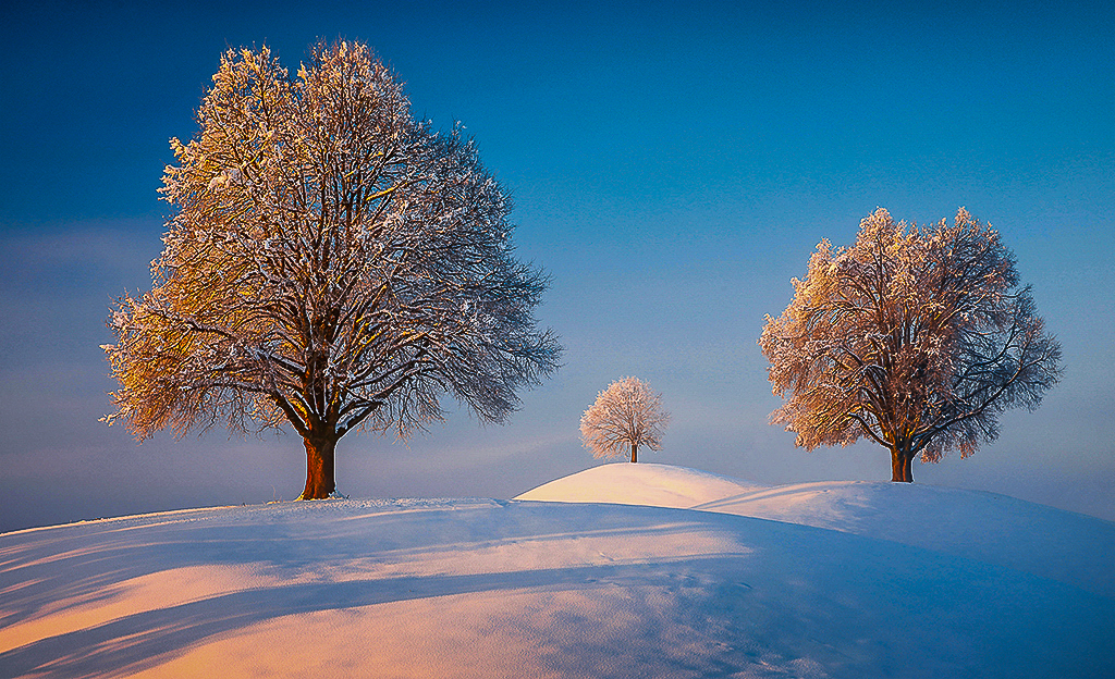
Matthias you did a great job capturing the geometrie of this place. More than that you captured the feeling of peace and quiet of the place. I also like how you captured the warm light falling on the trees and snow. As currently edited all the trees seem to have equal importance. When looking at the photo my eyes are unsure of where to look. If you flip the photo horizontally with the shadows coming in from the bottom left corner your eyes are drawn into the photo and the largest tree becomes the focal point. I think this creates a more dynamic winter scene, see attached edited photo. I also cropped a little off the top of the photo to reduce the amount of the sky and darken the exposure to bring out the texture and warm glow on the snow. However, this is just another way to edit the photo to create a different feeling. |
Feb 2nd |
 |
| 97 |
Feb 21 |
Comment |
Sophia you captured the feeling of the abandoned house with the faded wallpaper, peeling paint and plant growing through the broken window and dead leaves on the floor. I like how you reduced the noise in the photo and brought out the warmth of the browns and greens during the post-editing process. When you straightened the photo, you cropped off the upper left corner of the window. I personally like having the entire window in the photo, see attached edit of original photo. I only straighten the photo a little to keep the window frame in the photo. |
Feb 2nd |
 |
6 comments - 7 replies for Group 97
|
12 comments - 14 replies Total
|