|
| Group |
Round |
C/R |
Comment |
Date |
Image |
| 24 |
Jan 21 |
Reply |
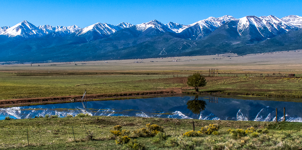
Sam great suggestion. As many times as I looked at this photo, I never noticed how distracting the ladder was. I also removed the six utility poles reflecting on the pond surface. What do you think of this edit? |
Jan 16th |
 |
| 24 |
Jan 21 |
Comment |
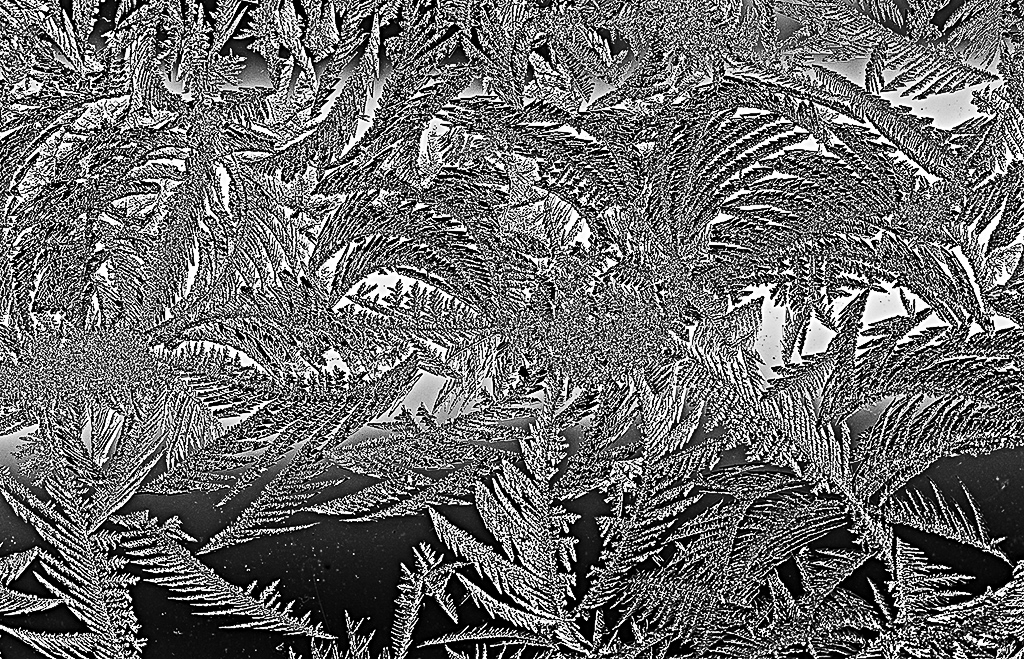
Albert what a beautiful photo of the ice on your window. I like that you wanted to deemphasis the blue in the photo and put the focus on the structure of the ice crystals. However, have you considered making this a B&W photo to accomplish this goal? See my edited photo for example. Let me know what you think. |
Jan 16th |
 |
| 24 |
Jan 21 |
Comment |
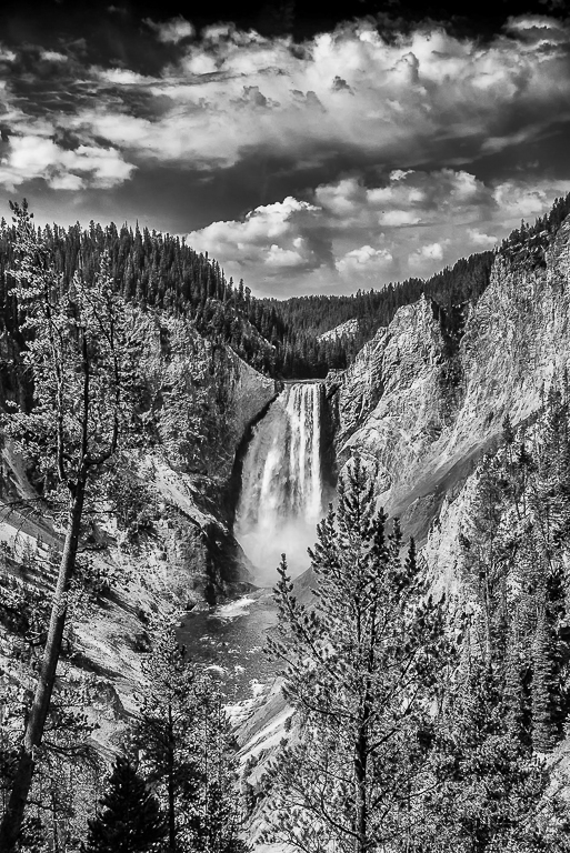
John Yellowstone Lower water fall is one of my favorite places in the park. You did a great job bringing out the details in the clouds and rocks. I agree with your choice of B&W for this photo as puts the emphasis on the textures in the photo.
I would like to see the dark gray areas a little darker (more black) to make the photo more dynamic looking. See photo edit. |
Jan 11th |
 |
| 24 |
Jan 21 |
Comment |
Correct cropped and edited photo. |
Jan 8th |
 |
| 24 |
Jan 21 |
Comment |
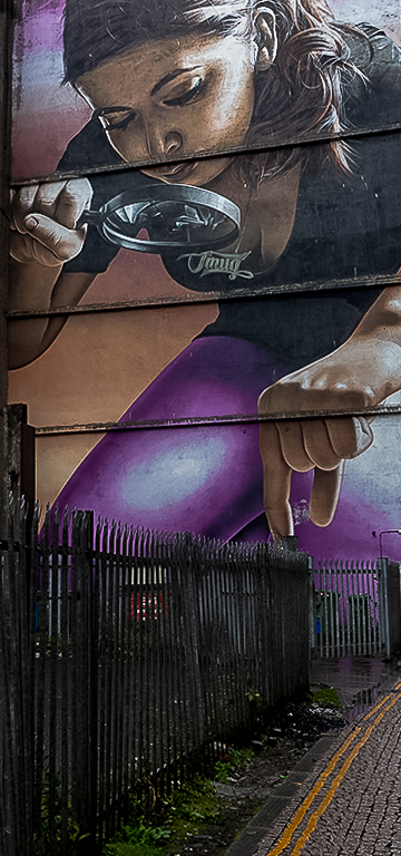
Laura I think you need a great job bringing out the tonal quality of the photo. The colors and details are wonderful. I do miss the leading lines created by the fence and the yellow traffic lines that you cropped out the image. These lines draw your eyes into the photo and to the girl's fingers leaving the viewer pondering what she is getting ready to pick up from behind the fence. Here is my attempt at cropping the original image. Hope that you like it. |
Jan 7th |
 |
| 24 |
Jan 21 |
Comment |
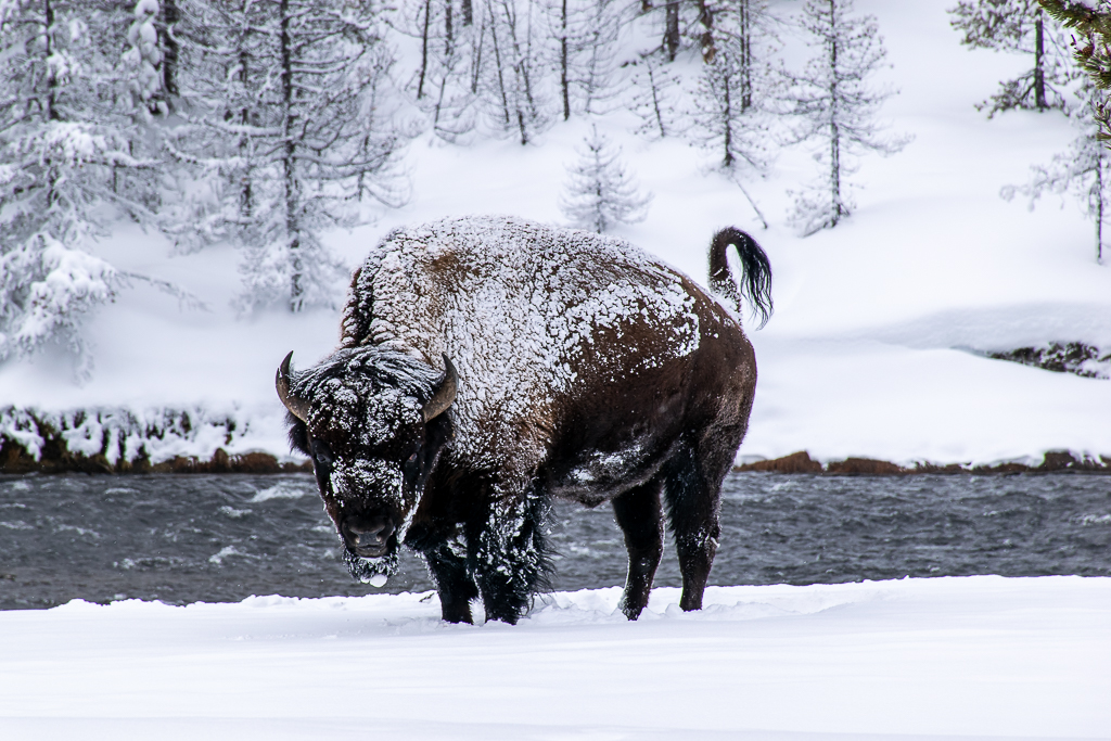
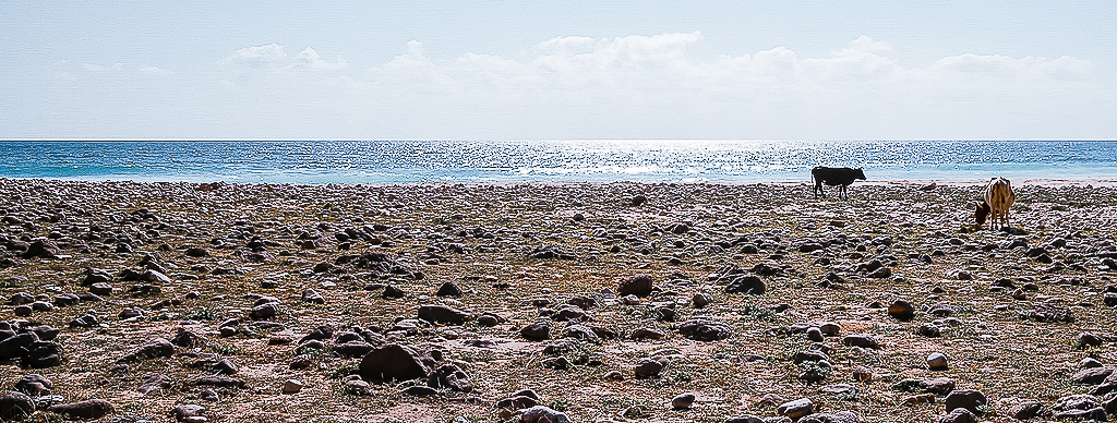
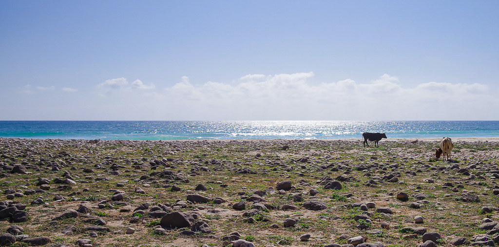
Steve interesting second attempt at minimalist. (Note: you can see Steve's first attempt on the Study Group #97 page) If you approach this photo from a minimalist perspective with everything to the left of the cattle representing the past, then I think you need to remove some of the green color from the left side to representing our fading memory of the past. I also don't think you need to such a large amount of sky above the clouds. Cropping off the top of the creates a wider landscape perspective that represents how long 2020 felt and how difficult the year was.
I used an Adobe Lightroom adjustment preset (free on the Adobe website) called "Cotton Candy" to make adjustments to the photo and cropped out the top of the sky. Let me know what you think. |
Jan 7th |
 |
| 24 |
Jan 21 |
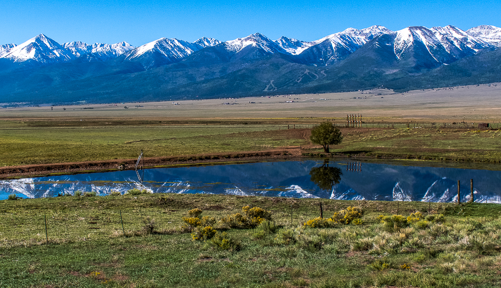
Comment |
This was private land and there was another fence between me and the pond that I shot above. I did raise my camera up so that I could capture more of the snow-covered mountains reflecting on the pond's surface.
As to your suggestion regarding the foreground, this is something I know I need to consciously think about more when taking photos. Also, I need to work on better understanding my vision for the photos I take. In this case was it the wide expanse of the open range where a strong foreground subject would help or was it just about the snow-covered mountains and their reflection on the pond. Both would make great photos, but I would need to shoot them differently. I did try cropping the photo to make the fence and the yellow bushes a stronger foreground subject. Let me know what you think?
Thanks for helping me on my photography journey. |
Jan 5th |
 |
| 24 |
Jan 21 |
Comment |
Sam I think this is a great photo composition with or without the Photoshop filtering that you did. I love the intense look of the right zebra's eye looking into the camera. I think your Photoshop filtering editing was great and gives the viewer a completely different perspective of these Zebras and what love means to them. |
Jan 5th |
| 24 |
Jan 21 |
Comment |
I think from a photojournalism perspective this is a great photo of the Great Conjunction. It is better than most photos I have seen online and those taken by my local photo club. I also like the detailed explanation of the postproduction editing process you went through. Looking at the original photo I would never have thought that you could draw as much detail of Jupiter and Saturn as you did out of the photo. It gives us newbies to Photoshop postproduction editing something to strive for in our own work. |
Jan 5th |
8 comments - 1 reply for Group 24
|
| 97 |
Jan 21 |
Comment |
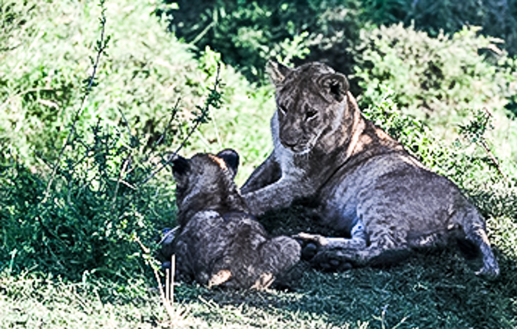
Jeffery I like the changes you made to the photo. The new cropping and the two green bushes on either side nicely frame the lioness and her cub and help draw your eyes to the main subject. The higher resolution picture also helps a lot. |
Jan 18th |
| 97 |
Jan 21 |
Reply |
Stanley the bulletin board has the same 1Mb photo size limit. |
Jan 17th |
| 97 |
Jan 21 |
Comment |
|
Jan 11th |
 |
| 97 |
Jan 21 |
Comment |
Jeffery I think you did a great job capturing the mother's look at her cub. I admire your patience in waiting to get this shot. Which I believe was your vision, to see the mother looking at her cub. I also like how you brought the lions out of the shadows. I do think the phot would look more interesting if the mother lion was not cropped into the middle of the photo, see my photo edit.
My only concerns about the photo is the photo seems to be highly pixelated which makes the photo look slightly out of focus. Not sure if this was caused when you downsized the photo below 1MB? Here are the settings I use when exporting out of Lightroom Classic.
1. Under file settings select:
a. Image format: JPEG
b. Color space: sRBG
c. Quality: 100
d. Leave "limit file size to" box unchecked
2. Under image sizing select:
a. Check the "resize to fit" box and select "width & height" on dropdown
b. Make W: 1024 and H: 768 and pixels on dropdown
c. Leave "Don't Enlarge" box unchecked
d. Make "Resolution" 72 pixels per inch
3. Under Output Sharping:
a. Check the "Sharpen for" box and select "screen" on dropdown
b. On the amount select "high" on dropdown
4. Metadata:
a. Select "copyright & contact info only" on the "include" dropdown
5. Watermarking:
a. Leave "watermark" box unchecked
After trying these steps check the size of the exported photo. If it is still above 1MB then export again after changing the "Quality" to 90. If file is still too large try again with "Quality" at 80. Repeat until file size is below 1MB. Note: I occasionally have to reduce the "Quality" to get the size down for my photos, but it varies photo to photo. |
Jan 11th |
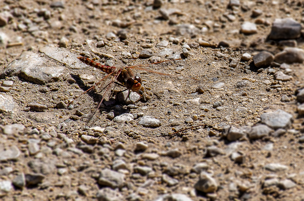
| 97 |
Jan 21 |
Reply |
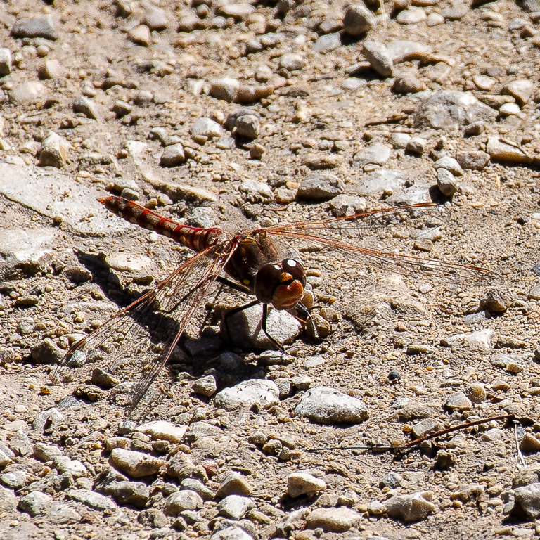
Jeffery here is a tight crop of the dragonfly. |
Jan 9th |
 |
| 97 |
Jan 21 |
Reply |
Thanks for the dragonfly tips. There is a park next to the lake located about one mile (1.6 kilometers) from my house. During the summer I always see a number of dragonflies there. I will have to try out your tips, especially about how to get close to one. As for the Blur Filter vignette while not the best way to highlight the dragonfly it was better than having everything in perfect focus. |
Jan 7th |
| 97 |
Jan 21 |
Comment |
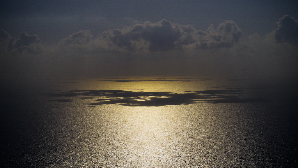
Steve I think you succeeded with your minimalist goal. Removing the birds flying around in the photo was the right decision. I also like that you centered the warm sunlight and the shadows of the clouds on the water. From a minimalist perspective this works for this photo. I love the way the warm sunlight draws your eyes into the scene and to the horizon and the clouds playing on the water as the sunlight turns a golden color. The photo makes the world seem less complicated.
My only suggest would be to remove the small white cloud above the main greyest clouds as its a distraction, drawing the attention of my eyes there as I looked at the photo. See attached edit. |
Jan 5th |
 |
| 97 |
Jan 21 |
Comment |
Stan that is what the study group is here for. To help each of us learn and grow as photographers. I have similar issues as you. I have been shooting photos for over 50 years. I even took a few photography classes in college. However it was not until the last 5 years that I have had a high resolution camera and only a couple years have I been shooting my photos in RAW and utilizing Lightroom and Photoshop for post production editing. Needless to say I have a lot of older pictures that are not up to my current expectations. I still have a lot to learn about photography and enjoy the monthly feedbacks about my photos. I try to focus on my current pictures for my learning and growth. Some day I will get to my older photos and treat them with love like the antiques they are.
My only suggestion for you is to look forward and take lots of new photos that satisfy your current vision. You can also look forward to revisiting some of the wonderful places you have been to so that you can recapture images based on your new photography skills. Good luck on this life long journey. |
Jan 4th |
| 97 |
Jan 21 |
Comment |
Sophia thanks for the feedback. I agree that darken the rocks would help the dragon fly stand out more. I need to practice on my Photoshop skills some more. |
Jan 4th |
| 97 |
Jan 21 |
Comment |
Stan the colors in this photo are wonderful. I love the reds of the cliff, the greens of the plants and the blues of the ocean. The leading line of the left cliff and the dark beach rocks lead your eyes up to the lighthouse in the background. Cropping the bottom foreground moves the cliff edge closer to the viewer. I just wish that the photo had a greater depth of field. The f/3.3 does not allow enough of the photo to be in focus so I am not sure what I am supposed to be looking at. |
Jan 4th |
| 97 |
Jan 21 |
Comment |
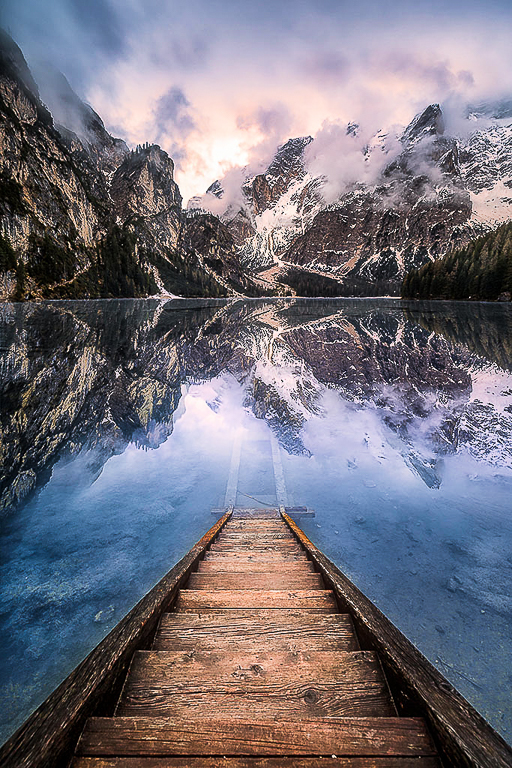
Matthias great job capturing this sunrise. I think you captured your vision for the photo. I like the leading lines created by the stairs that lead your eyes into the water, to the reflection and up to the sunrise. Centering the stairs in the photo works for this picture. I did find the colors of the water and the trees on the right bank a little muted. In Lightroom I tried adding a "S" Tone Curve and increased the Sharpening amount to 50 and the masking to 80 to get the colors to pop a little more. Let me know what you think. |
Jan 4th |
 |
| 97 |
Jan 21 |
Comment |
Sophia I think you did a great job capturing the owl with both eyes looking at the camera. I like how you sharpened the photo, especially the eyes. I like the cropping you did to offset the owl a little bit. I also how the horizontal flip worked. I think it draws your eyes to the owl better than the original. |
Jan 4th |
9 comments - 3 replies for Group 97
|
17 comments - 4 replies Total
|