|
| Group |
Round |
C/R |
Comment |
Date |
Image |
| 24 |
Nov 20 |
Comment |
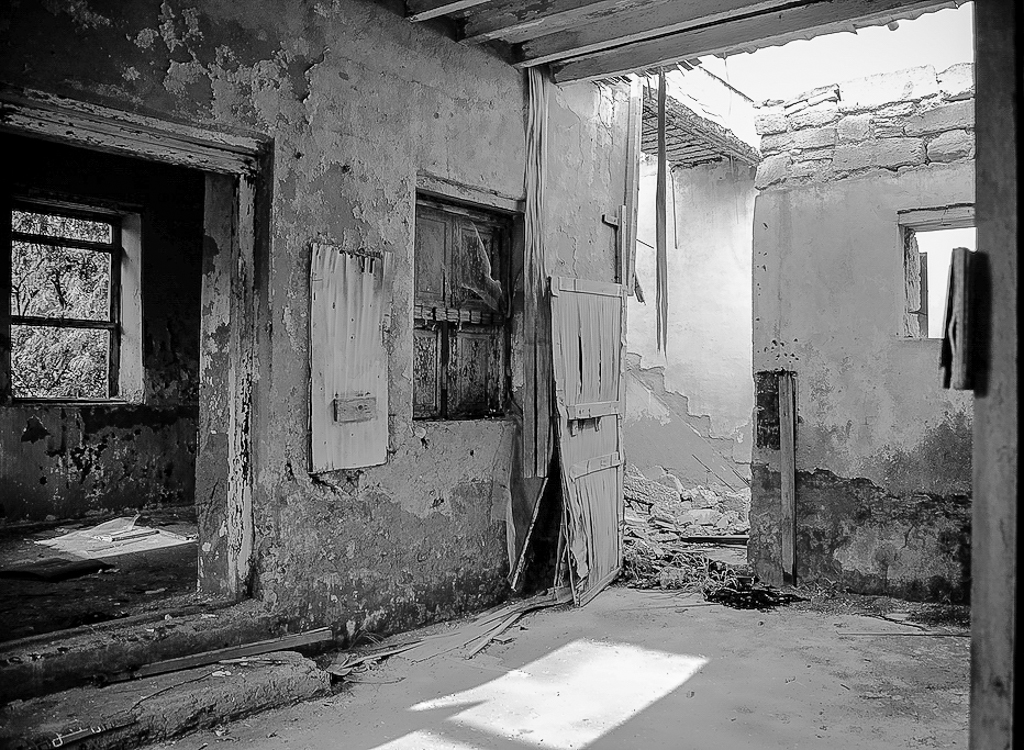
Steve great job capturing the damage and decay of this place. The use of B&W enhances the feeling of the photo. I also like the sight lines of the bottom edge of the right-side wall to lead your eyes into the room's damage and decay. I do agree with Jim about bringing out the details and textures in the photo. I used Lightroom to adjust the exposure, contrast, clarity and sharpening to bring out some of the details in the shadows and bright spots. I also cropped out the right-side blurred wall as I feel it does not contribute to the story told by the photo. |
Nov 10th |
 |
| 24 |
Nov 20 |
Comment |
New England Fall Colors is on our Bucket List. Your photo just whets my appetite even more. John, I like how you cropped the left side of the photo to create a leading line coming in from the left the side leading to the bridge. The crop also placed the bridge and fall colors in the sweet spots of the photo. As Jim mentioned the clouds in the sky add additional leading lines to the photo. Great New England Fall scene. |
Nov 3rd |
| 24 |
Nov 20 |
Comment |
Laura great photo theme for this time of year. I always carry my iPhone when taking my daily walk through the neighbor as you never know what you will see. I do find it hard to move my eyes through the photo to the Halloween display. I keep getting drawn down the left-side driveway wondering what is around the corner of the house. I would have liked to see a smaller depth of field to blur the driveway and house. I believe this is hard to do with an iPhone. However, you might have been able to accomplish this by clicking on the screen to set the focus area in the foreground. This should blur the background a little. You also might have been able to use the shadows created by the foreground grates to draw the viewers eyes into the display. Another option would be to add a Photoshop Vignette effect, see attached photo. |
Nov 3rd |
 |
| 24 |
Nov 20 |
Comment |
Sam what a beautiful photo. I love the placement of the flowers and the simple white background of the photo. The additional shadows that you created on the white background help to draw my eyes to the flowers. The watercolors on the flowers makes them look more delicate and interesting. Great job. |
Nov 3rd |
| 24 |
Nov 20 |
Comment |
Jim I love the final version of this composite photo. The lighthouse in the cutout adds so much feeling to the photo as if calling out to those who have made the ultimate sacrifice. The reflection of Chesapeake Bay also adds to this feeling of freedom. The placement of the memorial in the photo works well for the mood you are creating. I prefer the B&W version with the gold star as the background on either side in the color version detracts the eyes from the memorial as well as taking away the feeling of the photo. My only suggestion would be to make the U.S. flag by the lighthouse in color too. Great Photo. |
Nov 3rd |
| 24 |
Nov 20 |
Reply |
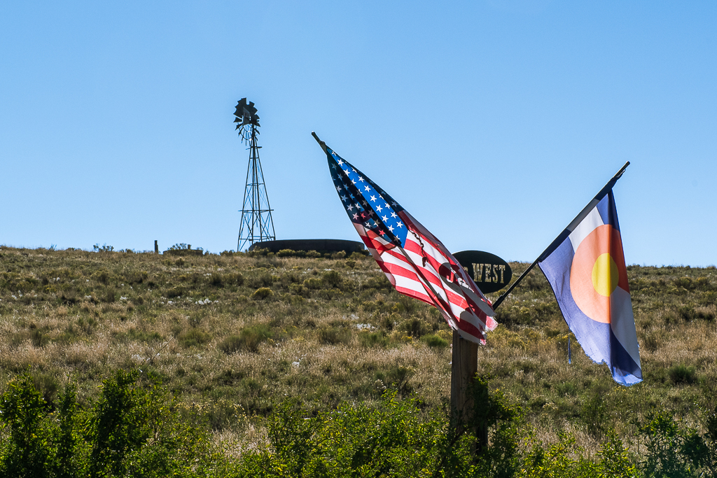
Jim thanks for the feedback and reinforcement in getting somethings right. It would have been great to fix the flag and maybe add a little separation between the flags and the windmill and water tank. However, I did not have permission to enter the ranch. I stayed on the highway side of the fence after reading the "No Trespassing" and "Video Camera in Use" warning signs. |
Nov 3rd |
5 comments - 1 reply for Group 24
|
| 97 |
Nov 20 |
Comment |
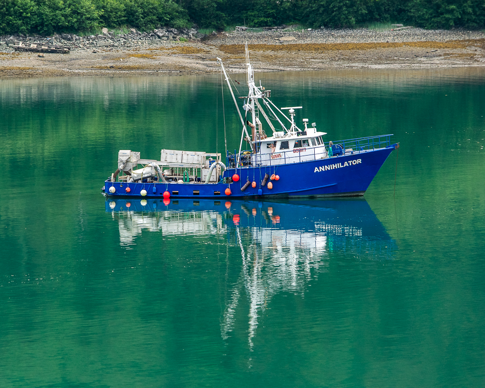
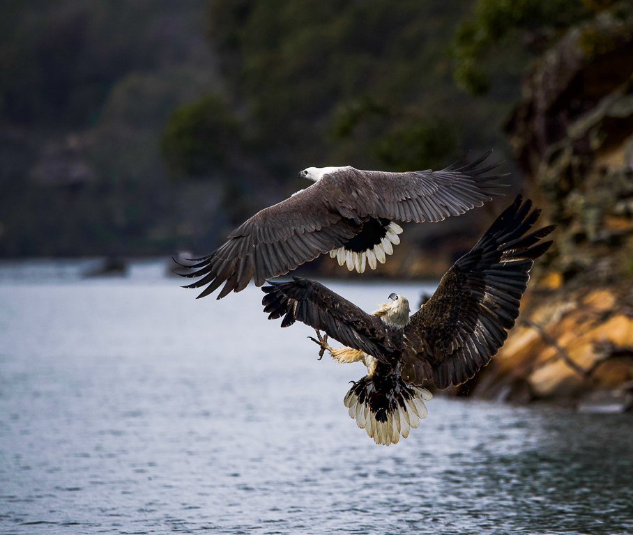
Else I used the spot healing tool in Lightroom to remove the red buoy. You can also use Photoshop to remove distracting or unwanted objects in your photos. |
Nov 18th |
| 97 |
Nov 20 |
Comment |
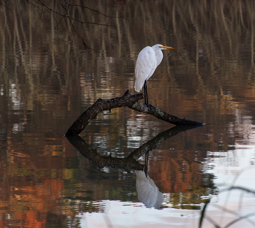
Else you did a great job capturing the eagles in flight. I agree that having the fish would have told the whole story as to why the juvenile was chasing the adult eagle in this photo. However, the photo is still amazing.
I am sure others may have better methods for better defining the adult eagle's right wing. I did go back to your original photo and edited it in Lightroom. I increased the contrast and exposure to bring out the eagle's wings. I reduced the cropping you did as I feel a slightly larger view gives more context to the scene and provides some leading lines to the eagles. In addition as you cannot see the fish and the eagle's eyes are hard to see, I think the background plays a greater role in telling the story in the photo. I removed the tilt to the background shoreline. I removed the red sign in the background as it takes your eyes away from the eagles. I also removed a couple of white spots on the lower left corner of the photo. Either something was on your lens or your sensor needs to be cleaned. Let me know what you think if these edits. |
Nov 11th |
 |
| 97 |
Nov 20 |
Reply |
Larry thanks for dropping by and providing your input. I find your feedback invaluable to my own photography journey. |
Nov 9th |
| 97 |
Nov 20 |
Reply |
Matthias I like the changes that you made to the photo based on all the feedback. It is really a wonderful Fall Colors photo. |
Nov 9th |
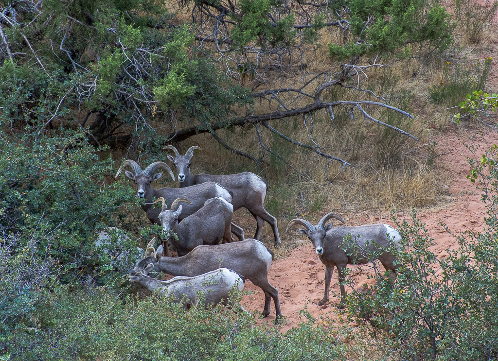
| 97 |
Nov 20 |
Reply |
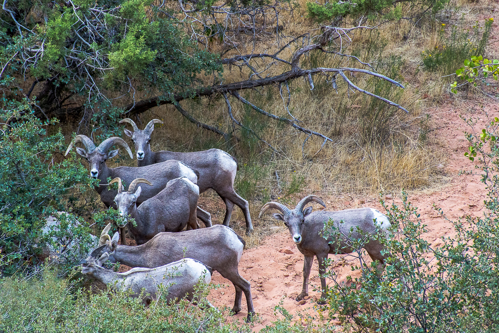
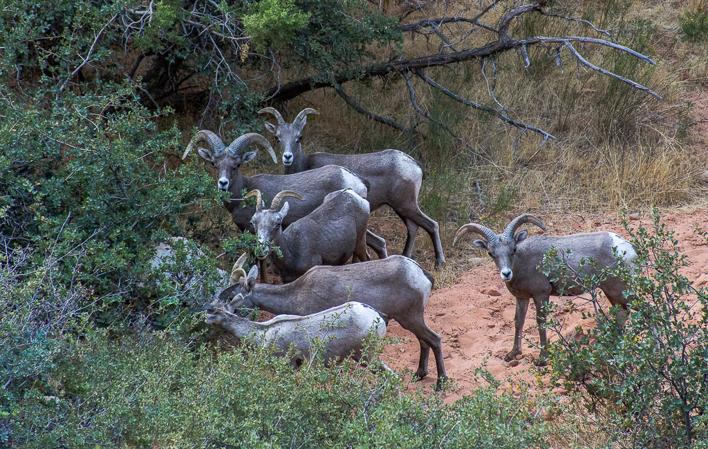
Matthias thanks for reinforcing the need to crop tighter on the sheep as recommended by Sophia. Here is my version of a tighter crop on the Bighorn Mountain sheep. |
Nov 9th |
 |
| 97 |
Nov 20 |
Comment |
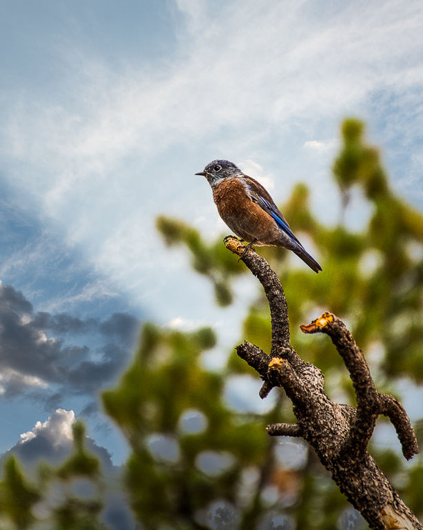
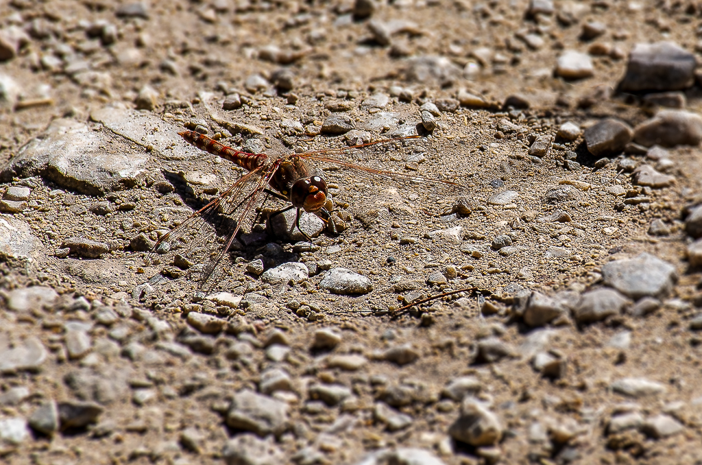
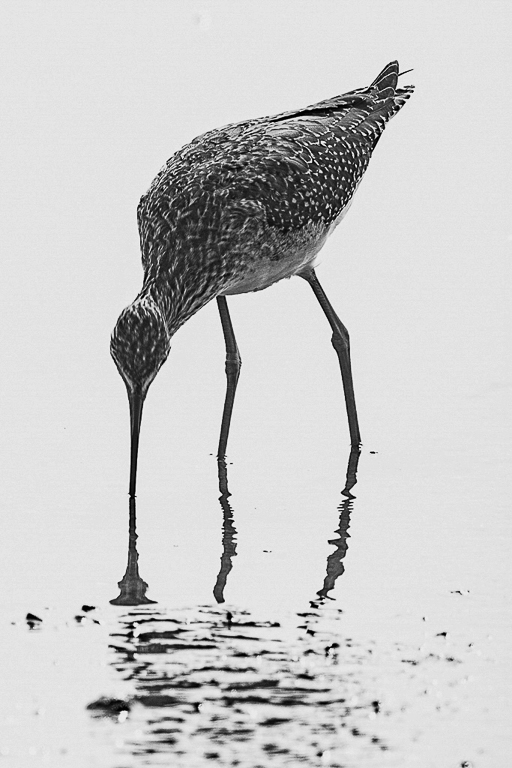
Stan I like the tight crop and the placement of the bird in the photo. It is perfectly placed for this photo. I also like the warm colors that you brought out in the bird during the post processing. The only thing missing is the bird's eyes to help me feel a connection to it. As shown the photo looks more like a study in form and texture. Have you thought about turning this into a B&W photo? I tried to see what it looked like. What do you think? |
Nov 9th |
 |
| 97 |
Nov 20 |
Comment |
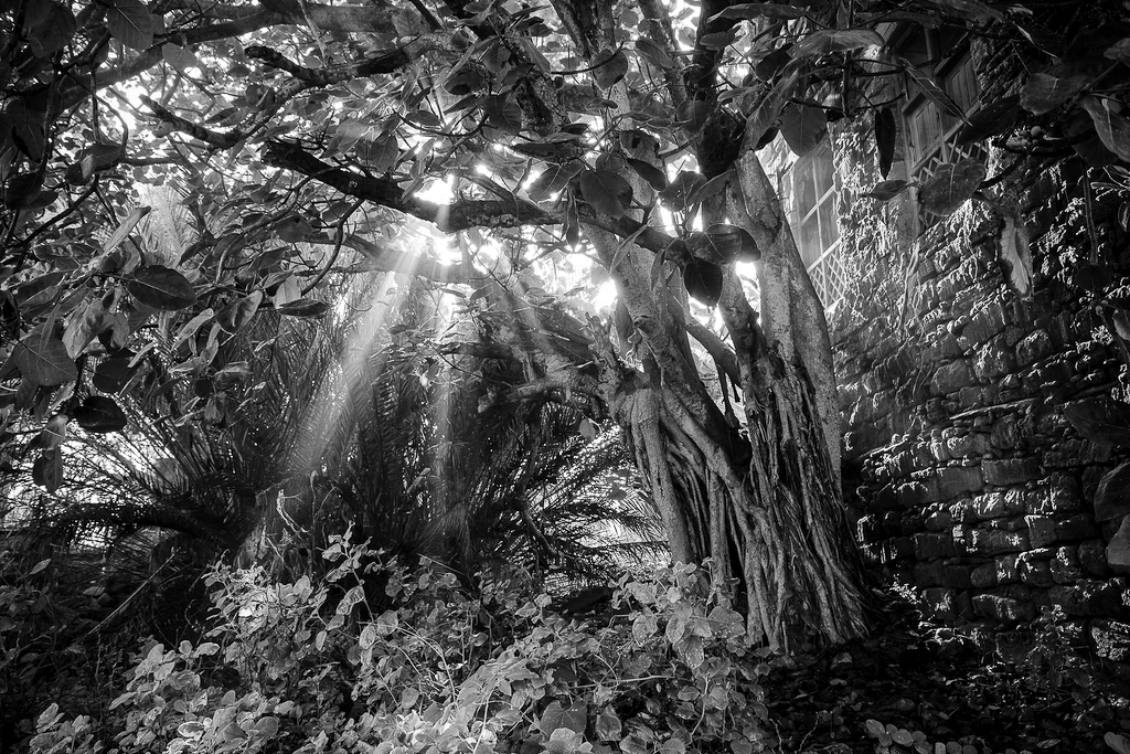
Steve what a great photography opportunity you have. Memorializing what the people who used to live in the neighborhood left behind does not come around very often. As such I like your choice of B&W photo to document the neighborhood. It as to the mood of an abandoned place. I like your use of the rule of thirds for the layout of the sun rays and tree. The sun lite plants in the lower left and the sun rays lead my eyes into the photo. My only suggestion would be to decrease the amount of greys and increase the amount of black in your B&W photo. Something that I was recommended by one of our PSA colleagues in another group. See attached edit. |
Nov 9th |
 |
| 97 |
Nov 20 |
Comment |
Sophia I like the contrast changes however I think it is cropped a little to much on the right side. |
Nov 6th |
| 97 |
Nov 20 |
Reply |
Sophia thanks for the feedback. I like your suggestions. I went back and darkened the dead tree and sheep's rear end in Lightroom. I then reduced the cropping to shown more on the left side of the photo. The photo looks much better now. What do you think? |
Nov 5th |
 |
| 97 |
Nov 20 |
Comment |
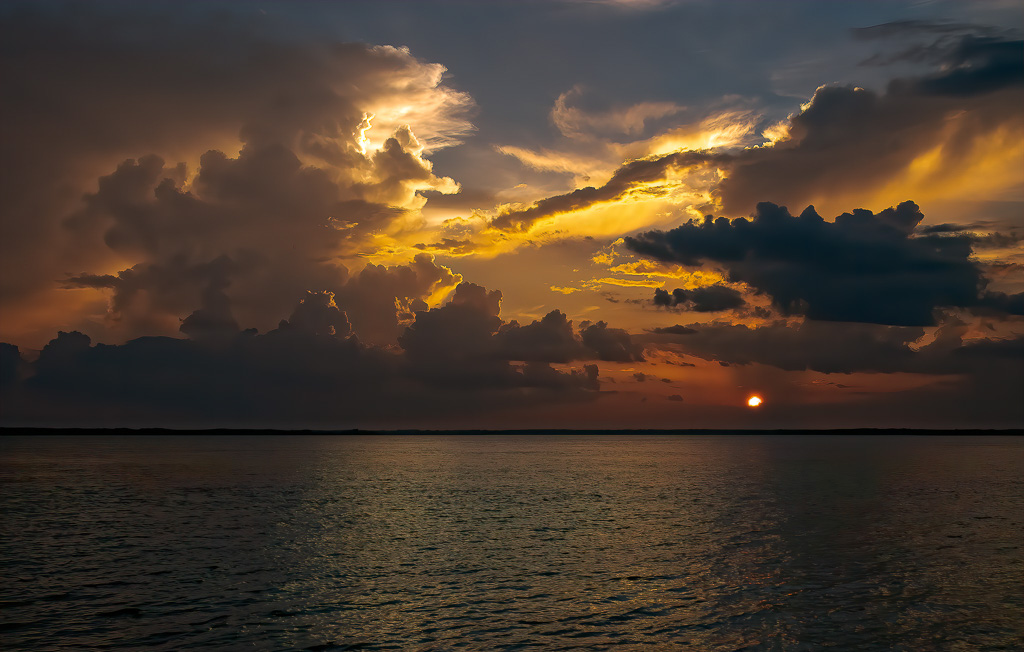
Sophia what a beautiful sunset you captured. You did a great job enhancing the colors in the sunset that are shining off the clouds and water. What a great "hand of God" feeling to the photo. However, there are black lines circling the sun just inside the outer edge that do bother me when I look at it. They make the sun look a little fake. I do not see these black lines on the original photo. Is this something you can correct in post-processing? I know some of the sunset reflects on the surface of the water, but I think there is a little too much water shown in the photo. The real action is above the horizon line in the sun and clouds. I would recommend cropping the bottom edge of the photo just a little so that the bottom rule of thirds line is at the horizon, see attached edit. |
Nov 5th |
 |
| 97 |
Nov 20 |
Comment |
Mathias I love the Autumn colors that you captured and the warm of the red, brown, and gold colors. The placement of the mountain peak and foreground tree is perfect per Rule of Thirds. Along with this placement, the leading lines draw your eyes to the peak and large foreground tree. The only thing that bothers me is the picture looks slightly blurry. If you were going for a blurred look to focus the viewers' attention on the colors, I would have added a little more blurring to the picture. Otherwise a slightly sharper picture would allow the viewer to linger on the subjects in the scene. |
Nov 3rd |
| 97 |
Nov 20 |
Comment |
Matt your picture fits right in with Autumn. Your capture and port processing of the warm browns, reds and golds are wonderful. The placement of the foreground rocks is spot on. I like that there are clouds in the sky to give it some texture and interest. I also like the interest brought out by the out-of-focus mid-ground rocks and shoreline. I do agree with you that a slightly smaller aperture would have included the foreground rocks with their warm sunlight on it as part of the area in sharp focus. My eyes are drawn to this lighter area in the photo and then they are disappointed with it being out of focus. Since you are shooting digital you may want to take multiply shots of your landscape scenes with different setting so that you have a higher chance of getting what you want. Speaking from experience, this is sometimes hard to remember to do in the heat of the photography moment, but an important lesson. For example, a very small aperture setting that captures the entire scene in focus would allow you to add a Photoshop Vignette with only the warm sun lite rocks in focus and the rest of the photo slightly out-of-focus. |
Nov 3rd |
8 comments - 4 replies for Group 97
|
13 comments - 5 replies Total
|