|
| Group |
Round |
C/R |
Comment |
Date |
Image |
| 24 |
Oct 20 |
Reply |
John thanks for the suggestions. I will have to see of I have a photo of this scene without amputations to start from. |
Oct 20th |
| 24 |
Oct 20 |
Comment |
Sam I liked how you darkened the background to focus the viewer's attention on the foreground. I also like that you brightened the red in the flowers. Even though you cropped and straightened the flower stem, so it is centered in the photo and not offset, I think in this case it works as symmetry draws your eyes to the butterflies. |
Oct 5th |
| 24 |
Oct 20 |
Comment |
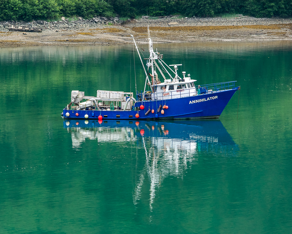
Jim while not as fun looking as my rendition the changes you made do bring a greater focus on the people and boats in the photo. Thanks for the tips. |
Oct 2nd |
| 24 |
Oct 20 |
Comment |
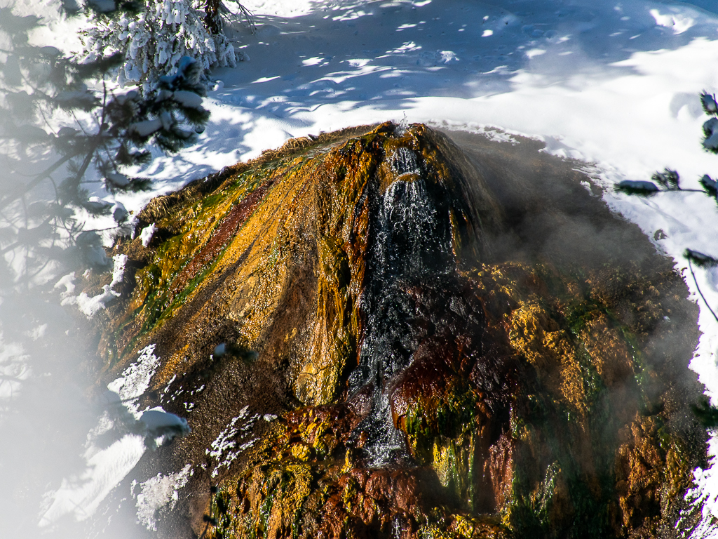
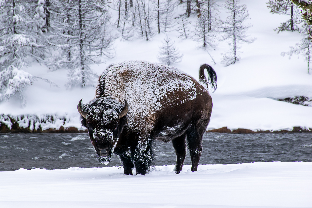
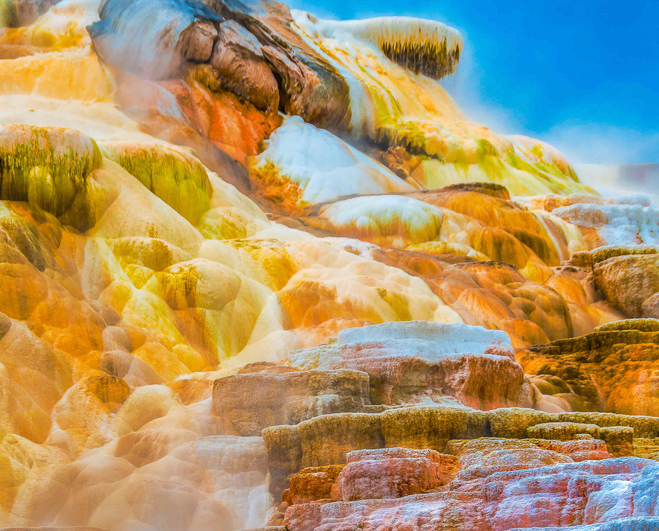
John you definitely brought out the color in the hot springs travertine formations. It looks like a photo from another planet. I do think the formations in the bottom third of the photo are so much different than the top two-thirds that they are distracting from technicolor look you are going for. However, I know the travertine formation is like this as I have a similar photo taken in February 2020 of this formation. I would suggest cropping the bottom third and letting the colors pop in the remaining photo. |
Oct 2nd |
 |
| 24 |
Oct 20 |
Comment |
Steve I agree with Jim that there is a lack of detail in the whites and blacks. I am not into portrait photography very much but when I do I like to capture the subject's expressions through their eyes and mouth. I do like the placement of the subject in the photo. Did you have to crop the original to get this placement? |
Oct 2nd |
| 24 |
Oct 20 |
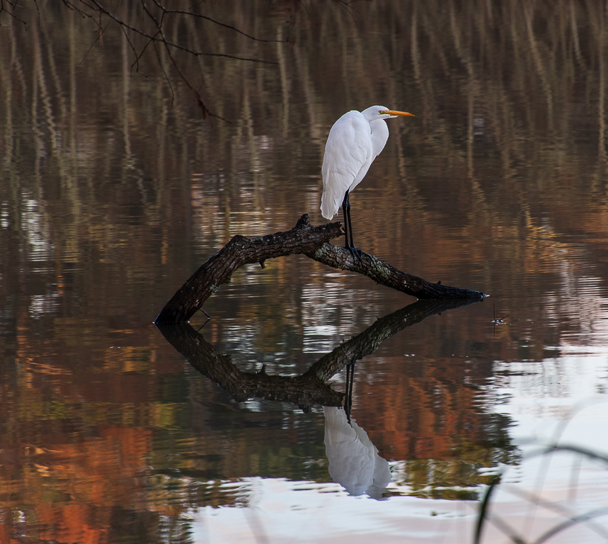
Comment |
Jim you did a great job bringing out the details in the heron's neck area and feathers in PS. The sharpness of the details in the feathers as well as the eye is amazing. I do agree that the water color is ugly. However, I am not sure how to correct the color unless you used another water photo for the background. |
Oct 2nd |
5 comments - 1 reply for Group 24
|
| 52 |
Oct 20 |
Comment |
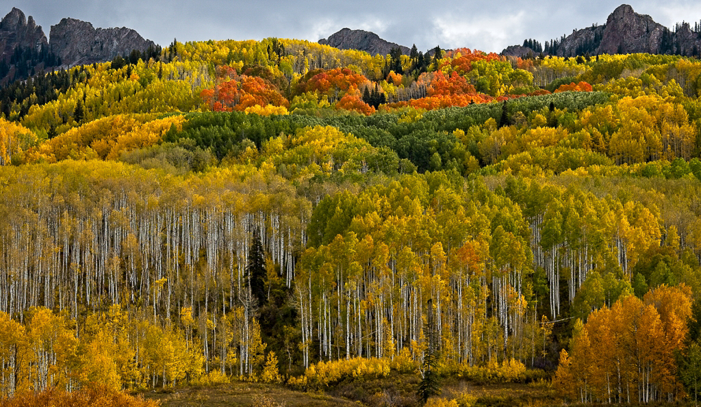
Pamela what a beautiful fall color scene. Your post-processing work has really brought out the colors in the leaves and made the photo pop. I love how the groupings of the leave colors and white tree bark draw your eyes into and through the photo. I agree with Lisa and Mike that the threating sky that you like does take away from the fall colors in the trees. See cropped pictured.
You mentioned the difficulty in getting sharp images of the trees due to moving leaves. Do you find that the 1/100 sec speed you used is fast enough to capture sharp tree pictures? I was wondering if a slightly higher ISO would have improved your shutter speed and created a photo requiring less post-processing work?
Thorro Jones DDG 97 Admin
|
Oct 8th |
 |
1 comment - 0 replies for Group 52
|
| 67 |
Oct 20 |
Comment |
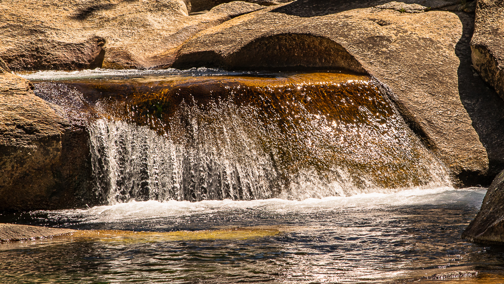
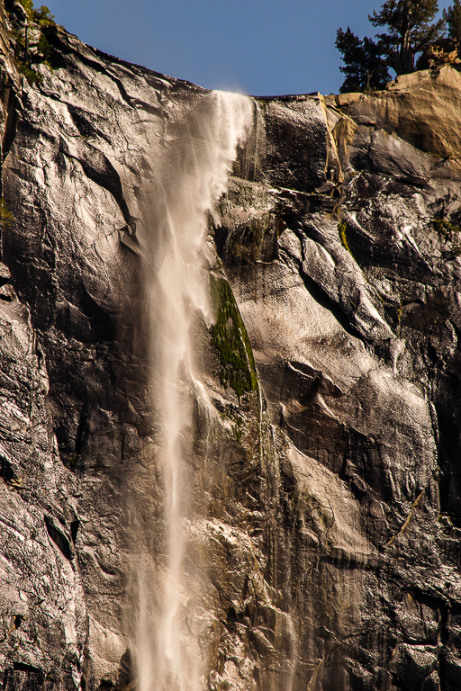
Larry what a beautiful photo. The hike back up was well worth the effort to capture this waterfall image. Also, all your post-processing work paid off. The final image is stunning. I think your placement of the waterfall in the photo is perfect and the blurring of the cascading water creates a very dynamic feeling to the image. The only thing I can see to improve the photo would be to remove the two left side logs (one leaning 45 degrees to the left and the other leaning against the rock hill) as they are distracting. However sometimes we must take what nature gives us. |
Oct 16th |
| 67 |
Oct 20 |
Comment |
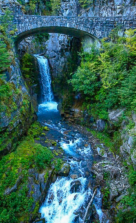
Todd what a wonderful waterfall to photograph. I will have to add it to my bucket list. I think your updated photo looks better as the original review pictures was too dark. However, the photo still looks blurry. Was it windy the day you took the picture? Why did you choose 1/125 shutter speed for this photo? I believe that 1/300 second is the minimum shutter speed setting to ensure the tree leaves are not blurry in landscape photos. You used a lower aperture f4.5 which could also be the reason for the blurry foreground and midground. I l do love how the line created by the right-side shore and rocks leads your eyes up to the waterfall. It was the first thing I noticed in the photo. You cropped the photo to have the waterfall centered in the photo. I think cropping the photo (left side) and offsetting the waterfall creates a more dynamic photo. See attached photo where I tried sharpening and cropping the image in Lightroom. |
Oct 16th |
 |
2 comments - 0 replies for Group 67
|
| 97 |
Oct 20 |
Comment |
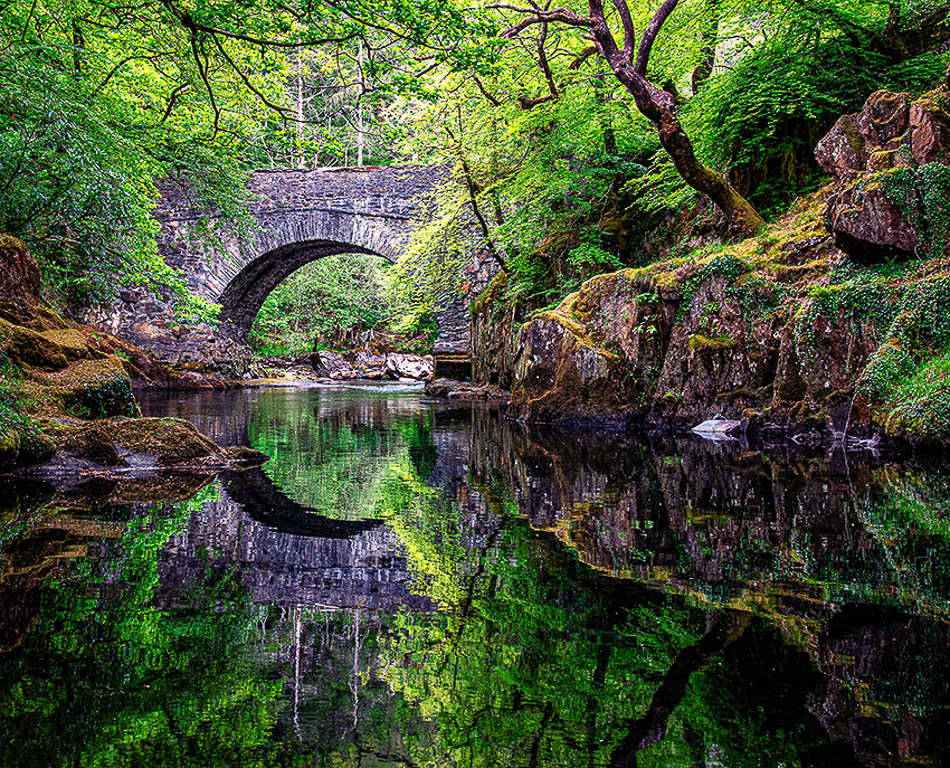
Matthias the warm of the colors in your photo are amazing. I love the sharpness of the reflections on the water. I also like how the trees on the banks frame the bridge. Truly an outstanding photo. I do feel that with all the details in the landscape scene to look at in the photo the viewer's eyes gets lost not know where to go. I tried cropping the left side of the photo (see attachment) and I feel it provides greater direction to the viewer and leads their eyes to the bridge. However, as I stated before I also like the photo as currently configured. |
Oct 15th |
 |
| 97 |
Oct 20 |
Comment |
Sophia great wildlife action shot. I like how you captured the intensity of the action as shown by the look in their eyes. The placement of the elk bodies in the photo causes your eyes to go to the center where all the action is. The only thing that I noticed was that when lighting the photo, you brought out a hint of green in the elk fur that is not in the original photo. |
Oct 12th |
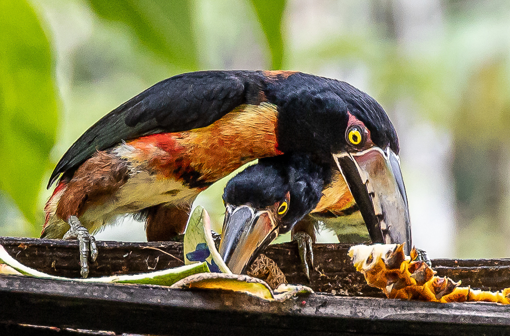
| 97 |
Oct 20 |
Comment |
Stan I like how you cropped the photo to get a nice close image of the birds and allowed the background to be blurred. The placement of the top bird's eye falls close to the rule of thirds gird. You also did a good job bringing out the bright colors in the bird's feathers and eyes. The only things that bother me are the birds looks slightly out of focus (especially the eyes) and there are some details lost in the black feathers of the top bird. I tried sharpening the Detail in Lightroom; sharpening amount 60, detail 50 and masking 50. See attached edited photo. This helped a little, but the lack of detail may be due to the high ISO. |
Oct 12th |
 |
| 97 |
Oct 20 |
Reply |
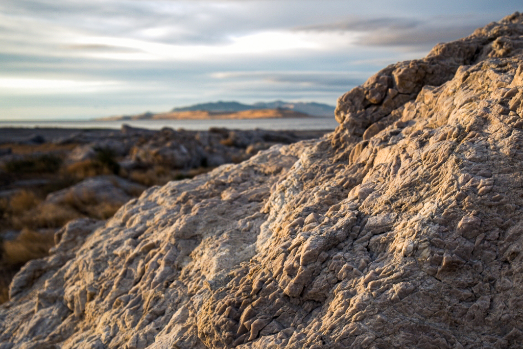
Matt my only suggestion for dealing with the contrast between the highlights and blacks is to shoot multiple images and create a HDR image. I would be interested in what others may have to say regarding your question.
As to your composition questions I think you were correct in balancing the warm colors of the rock with the warm colors on the island. This made for a more interesting scene that draws the viewer into the photo to experience the changing light at sunset. Otherwise as you noted this photo would be a study in the rock texture and the background should have been blurred and muted. |
Oct 5th |
| 97 |
Oct 20 |
Reply |
Matt thanks for the feedback. Based on some of your questions I realized that I forgot to include the image data with my photo. I have updated the posting to now include it.
For better or worse I tend to try to maintain the original ratio of the photo when cropping. However you have me questioning this rule. Something to consider in the future. |
Oct 5th |
| 97 |
Oct 20 |
Comment |
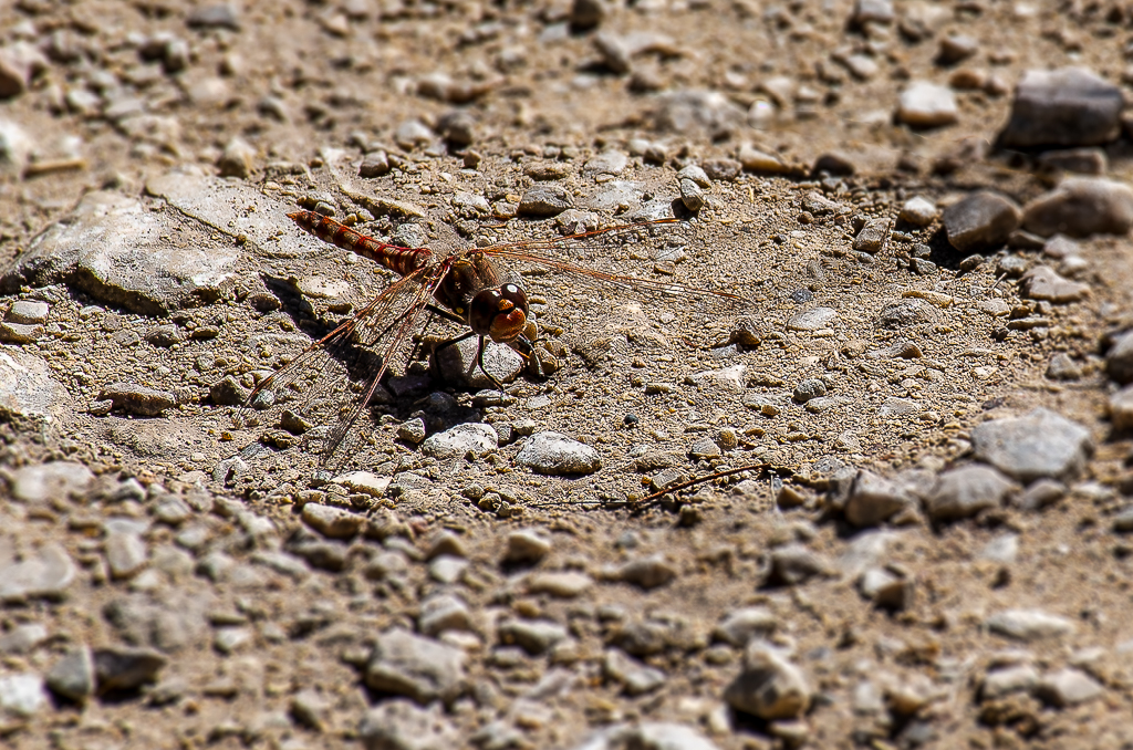
Steve I think you did the right thing in moving the dragonfly to the upper left of the photo. It gives it a greater look of being in flight. I tried cropping the photo to center the dragonfly, but it looks better where you placed it. Secondly, I am amazed that you were able to manually focus on where the dragon fly was going to be and then taking this shot at the right time. The details in the dragonfly wings are amazing. The only thing that would have made this photo better would be to have the dragonfly turnaround so you could capture their eyes. � |
Oct 2nd |
| 97 |
Oct 20 |
Comment |
Matt I like the way you captured the warm colors in the foreground rock as well as on the island in the background. The two nicely play off each other. I like that you captured the details in the texture of the rock. I also like the grey muted clouds in the sky as they add to the focus on the rock and the island. I do feel the foreground rock is dominating the photo a little too much and the sunlight could be a little warmer. I adjusted the photo in LR (exposure +0.07, contrast +7, highlights -7, shadows +21, whites +9, blacks -28. Clarity +10, vibrance +19, saturation +2 and a slight S figure to the tone curve) to bring out more warm in the sunlight. I also cropped the rock slightly to shift the warm highlights to the rule of thirds focal points and remove the dark gray clouds across the top of the photo. I found these clouds distracting. |
Oct 2nd |
 |
5 comments - 2 replies for Group 97
|
| 98 |
Oct 20 |
Comment |
Angela I like the sharpness of the Wilson Warble in you photo. Especially the sharpness and shine on the bird's eye. Great job capturing this elusive bird. The contrast between the foreground and the out of focus green background makes the bird pop out of the photo. I also like the little bit of background browns on the right side of the picture as they tie that side of the photo to the branch that the bird is sitting on. |
Oct 7th |
1 comment - 0 replies for Group 98
|
14 comments - 3 replies Total
|