|
| Group |
Round |
C/R |
Comment |
Date |
Image |
| 14 |
Jun 20 |
Comment |
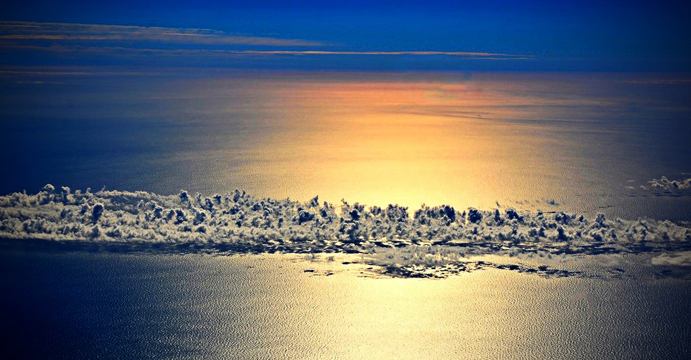
Hi Syed,
From your description I gather the image has quite a personal significance for you. I think given the circumstances the image was shot in, it is a nice capture of the serene ocean and clouds one sees from high above.
Personally I find the image a bit too plain lacking in contrast and saturation. I did some tweaking in levels and high-pass filter before adding a little vignette. I agree to Darcy's comments about the reflection spots and the suggestion by Greg that the image will be better presented in panoramic format. Hope you like it. |
Jun 19th |
 |
| 14 |
Jun 20 |
Comment |
Hi Stuart,
Appreciate your visiting our group page and your comments/adjustments to my image. I haven't experimented much with Topas plug-ins so far and I see the difference it makes. |
Jun 13th |
| 14 |
Jun 20 |
Comment |
Greg, you have captured this 'handsome' pigeon in good sharpness and details particularly in the eye. I think your composition is well done and the colors in the image blend very well.
I agree with Tom that the crop is a little too tight. |
Jun 3rd |
| 14 |
Jun 20 |
Comment |
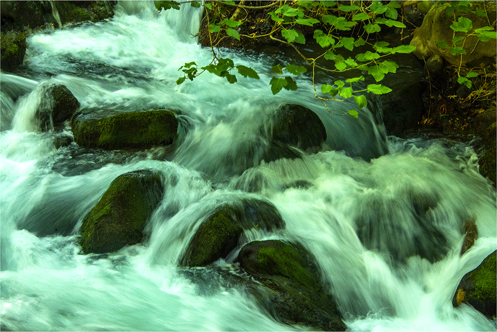
You have captured the rugged rocks, the foliage and the sky in good composition here. The lightening is good and brings out the texture in the stone. Fairly good details considering a hand held shot.
Yes a little darkening of the sky will increase the visual impact. Personally I think the right side of the image could do with adjustment in levels to bring out some more details.
|
Jun 3rd |
| 14 |
Jun 20 |
Reply |
Hi Greg, Thanks for your feedback and suggestion re monochrome. Regards. |
Jun 3rd |
| 14 |
Jun 20 |
Comment |
I think Darcy's comments above say it all.
For a fashion photograph, I feel the background is distracting and being of the same brightness as the model is dividing the viewer's attention between the model and the background. |
Jun 2nd |
| 14 |
Jun 20 |
Comment |
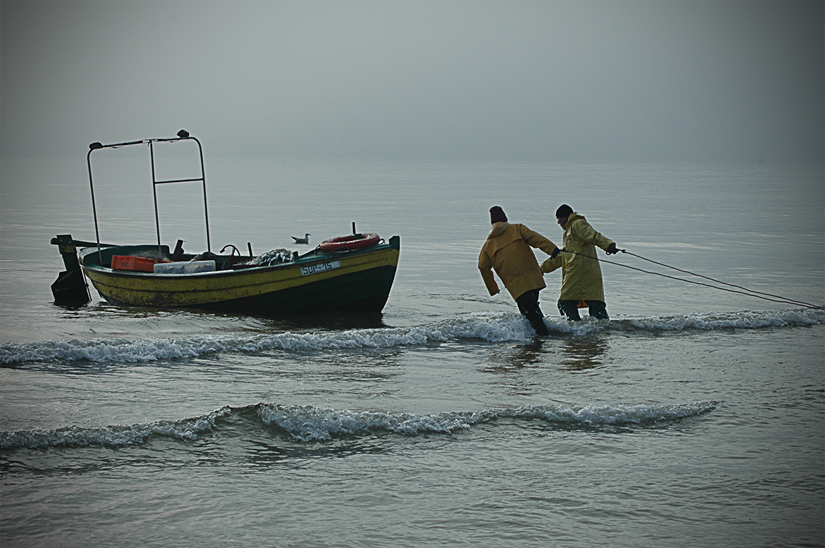
Thanks to all of you for the feedback.
Taking this image I wanted to capture the story of the two fishermen's hard life to go out to sea in their little boat and return with their modest catch to make a living. From my view point the dreary atmosphere adds to their struggle. I personally think making the boat and/or the fishermen brighter will lose the grimness of the situation that to me was the very essence of the scene I wanted to capture. Of course I agree about the waves. |
Jun 2nd |
| 14 |
Jun 20 |
Comment |
Tom, I think with the time and effort taken by you and your patience, you have achieved a very beautiful and interesting image. With good directional lighting you have captured good sharpness and details all over. The black background is a perfect choice here. Well done indeed.
My only suggestion would be to add a thin white border (1 or two pixels) to separate the image when viewed on a dark screen. |
Jun 1st |
7 comments - 1 reply for Group 14
|
7 comments - 1 reply Total
|