|
| Group |
Round |
C/R |
Comment |
Date |
Image |
| 14 |
Feb 18 |
Comment |
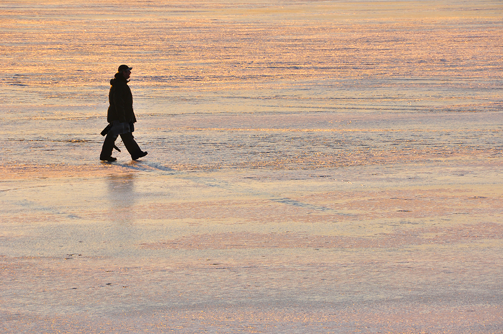
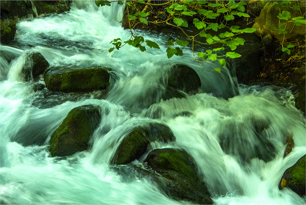
In my opinion just the ice by itself is not an easy subject to photograph unless there is some interesting formation as seen in the foreground of your image.
I agree with Larry's adjustments that make the main form here stand out against the now darkened background. I think cropping the image about a quarter from top thus giving a panoramic format may further improve the presentation. |
Feb 15th |
| 14 |
Feb 18 |
Comment |
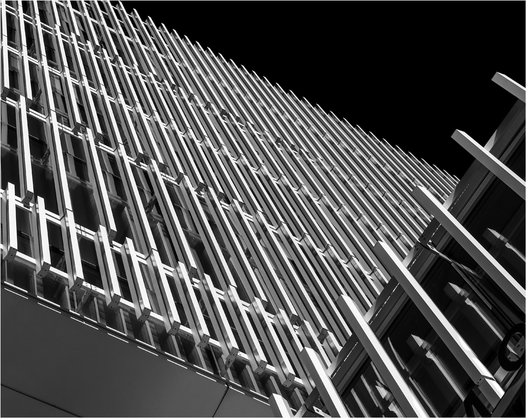
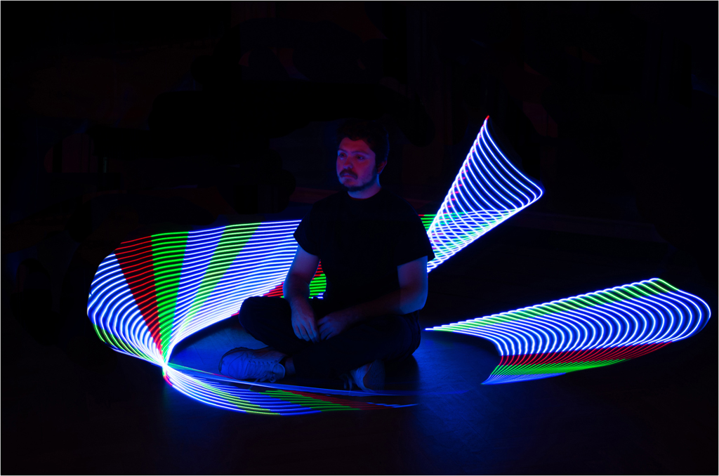
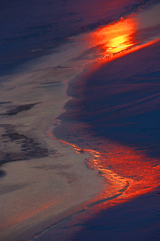
Evan -welcome to the group. I had a brief look at www.miksang.com and am quite impressed by a different and interesting approach to the art of perception. The images posted on the site speak of it. I have a book with a similar title "Photography and the art of seeing" by Canadian photographer Freeman Patterson. I look forward to seeing more of your images.
I like the diagonal composition and the pattern seen in this image. I see a story here though not a nice one. The red stains and the sharp edges catch the attention.
I agree the image would improve with increased contrast and perhaps a bit of sharpness too.
|
Feb 15th |
| 14 |
Feb 18 |
Comment |
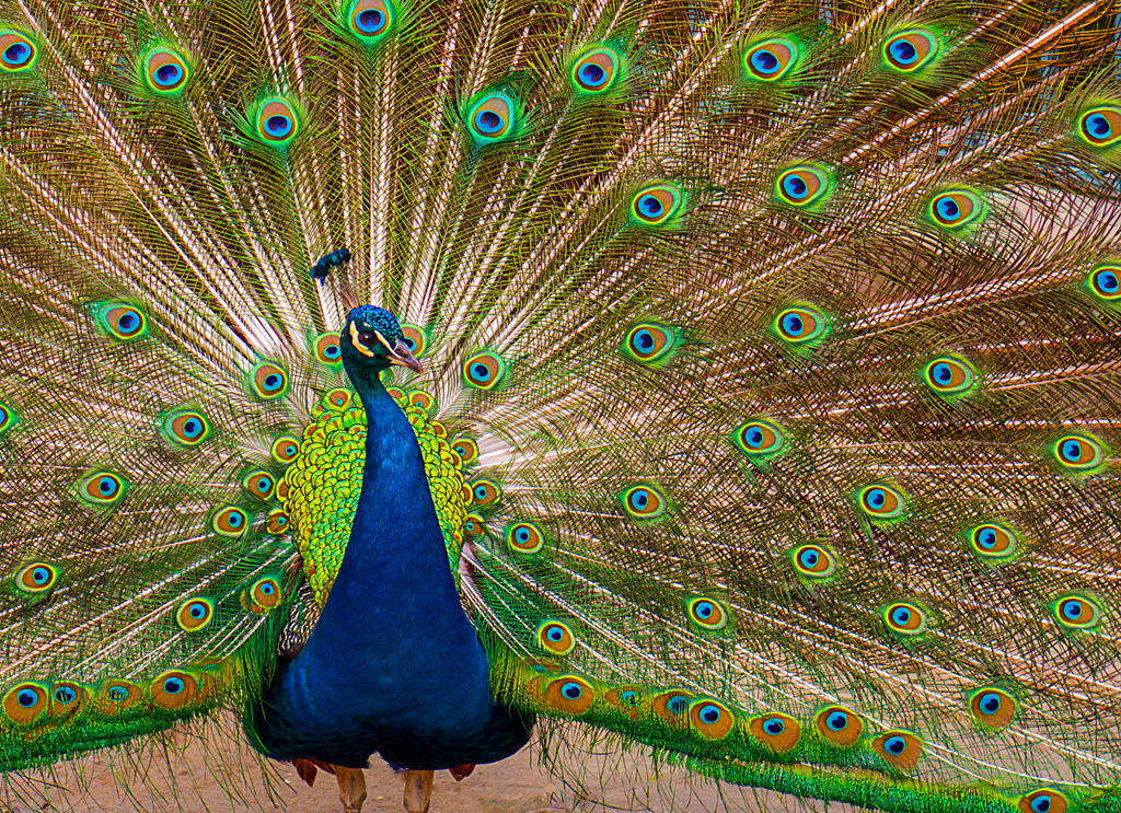
I like the bright colors, sharpness and details in the image. The exposure and focus are right on. I think the background is nicely off-focus. The presence of twigs near the face does not bother me as it shows the natural habitat.
I agree with Charissa about the lower claw. In my personal opinion the background is a bit over saturated. |
Feb 15th |
| 14 |
Feb 18 |
Comment |
I find this a very striking image, telling a story, something like a sentimental reflection. I like the composition of the faded rose resting against a book page that in its text has the word rose repeated all over. With a precise exposure and good DOF you have captured fine details in the image.
Wonder if re-positioning the rose with the stem re-positioned more diagonally will improve presentation. Just a thought. |
Feb 14th |
| 14 |
Feb 18 |
Comment |
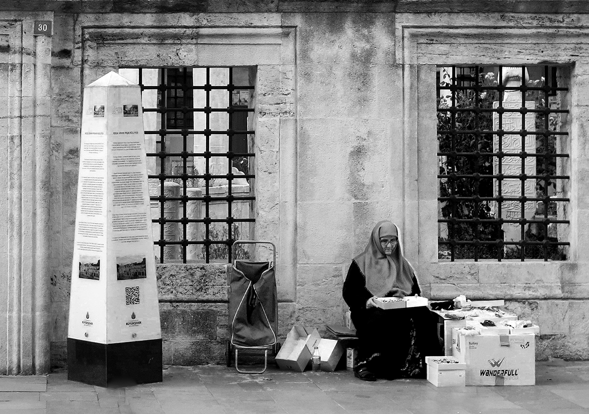
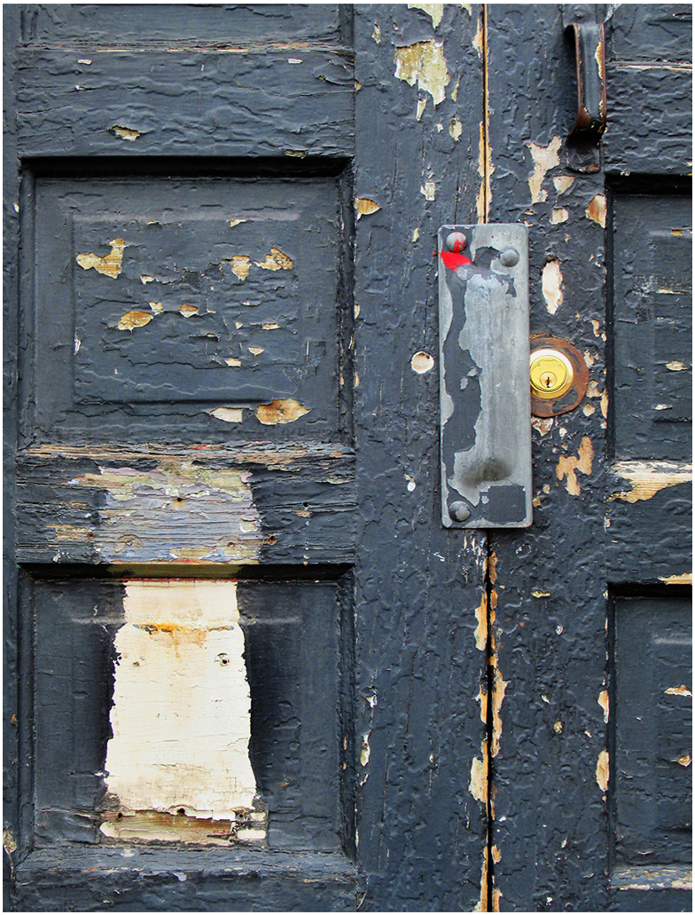
In my opinion this cropped version keeps viewer's attention more on the worn down details of the door.
I have corrected the perspective and adjusted the contrast and added a slight border. |
Feb 12th |
 |
| 14 |
Feb 18 |
Comment |
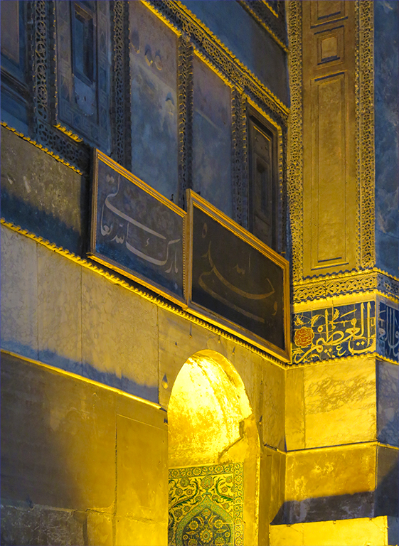
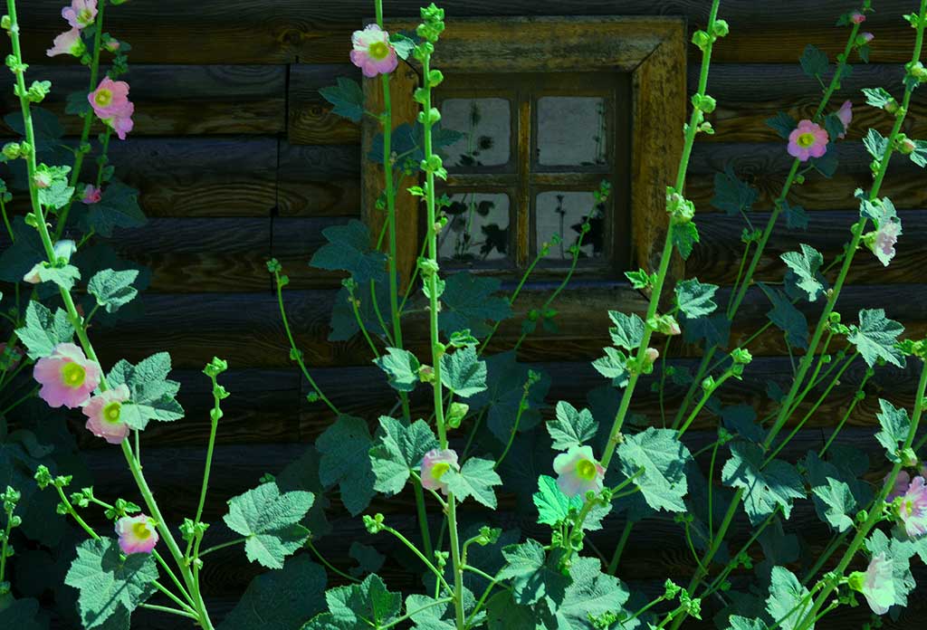
I like the composition and the intense colors you achieved with proper use of the light and post processing. Although the colors (as you say) may not be realistic to the scene, they do give an extra pep to the image. I find the image a bit on the soft side that on the other hand gives it an appearance like a painting. |
Feb 12th |
6 comments - 0 replies for Group 14
|
6 comments - 0 replies Total
|