|
| Group |
Round |
C/R |
Comment |
Date |
Image |
| 18 |
Oct 21 |
Comment |
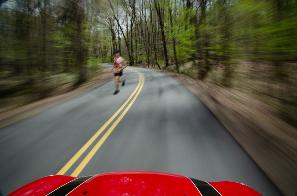
Thanks to Jim and Ian, I went back to the image and produced this one. The runner (and more importantly, the flag) are a bit too far away for me; what do you think?
|
Oct 10th |
 |
| 18 |
Oct 21 |
Reply |
Here's one possibility--I think the black background is a key element. |
Oct 10th |
 |
| 18 |
Oct 21 |
Reply |
Thanks, Ian, but my bike shot hasn't won anything except at my club contest. It happens that it was the other image I submitted to the contest I mentioned, so there's a possibility it will win something there. I'll find out on Nov. 14. |
Oct 10th |
| 18 |
Oct 21 |
Reply |
The judging hasn't happened yet. The results may be known next month. I'll take a look at Photocrowd, thanks. |
Oct 5th |
| 18 |
Oct 21 |
Reply |
Thanks, Jim. I played with the runner's position--left vs. right, nearer vs. farther, but I didn't consider closer to the center line. I think I was torn between my two roles, runner and photographer, as I would never run with oncoming traffic at my back (as I appear to be doing here), and particularly not in the center of the lane. Artistically, you may have a point, though I wonder if the danger to the runner would distract viewers. |
Oct 5th |
| 18 |
Oct 21 |
Comment |
Very creative, Jim! Congrats on finally finding the way to present the tractor--I'm sure we all have had the experience of knowing that there's a good image based on a shot we have, but not getting it right on the first X-number of tries. Kudos for your persistence and the final result. |
Oct 5th |
| 18 |
Oct 21 |
Comment |
The original shot is a very charming shot of the English countryside. With your changes, you made a painterly version of the scene, which I think works very well for the sheep, foliage and water. I wonder if partial masking of the bridge would be an improvement. |
Oct 5th |
| 18 |
Oct 21 |
Comment |
It's lively, vibrant. Well done! I'd also like to see more of this type of image, Mark. |
Oct 5th |
| 18 |
Oct 21 |
Comment |
I like your revision better too. It looks like the original was a painting; is that right? I do like the sense of depth one gets from the image. |
Oct 5th |
| 18 |
Oct 21 |
Comment |
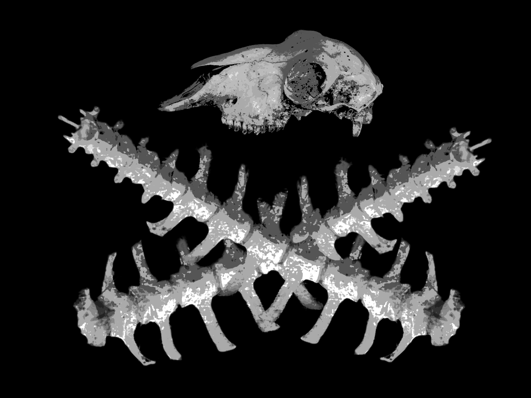
Sometimes creative works make us feel uncomfortable, but that doesn't detract from the creativity. You used found objects to make an interesting new image, well done! I agree with an earlier comment that I'd prefer to not show the areas of overlap revealing both layers. |
Oct 5th |
6 comments - 4 replies for Group 18
|
6 comments - 4 replies Total
|
