|
| Group |
Round |
C/R |
Comment |
Date |
Image |
| 18 |
Jul 20 |
Reply |
Hey Jim, I think that looks heaps better and the bright yellow really matches the bright colors behind it.
|
Jul 10th |
| 18 |
Jul 20 |
Reply |
Thanks John. I have a lot of trouble convincing my camera club that a creative 'set-up' image is just as creative as one that has been altered in post-production. I'm sure many more people would have a go at creative competitions if they knew that. |
Jul 9th |
| 18 |
Jul 20 |
Comment |
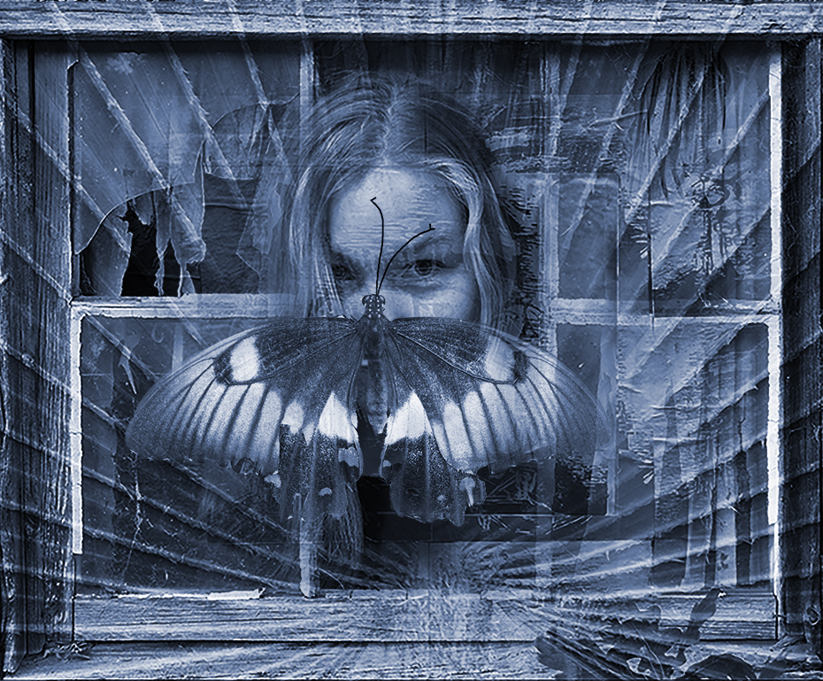
This is a really interesting technique that highlights the important subjects within the image. I think it's quite an interesting and appropriate image to start with that has some very distinct areas that can be included within irregular frames like this. I do note that the width of the frames are different throughout the image which might be intended but are a distraction for me. I agree with Mike that a little care in capturing the whole of the subject rather than cutting it off - ie the candles would make this a stronger image. |
Jul 9th |
| 18 |
Jul 20 |
Comment |
I really like the painterly effect you have created here and I LOVE the color palette. The problem for me here is that the cup feel 'plonked' into the image, and it looks too realistic to blend it. My suggestion would be to work on the cup before adding, converting it to a white shade and softening it down a little.
|
Jul 9th |
| 18 |
Jul 20 |
Comment |
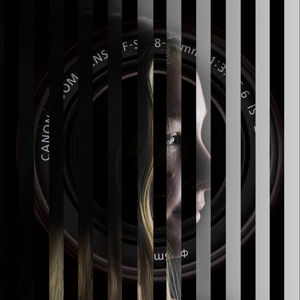
I'm really not sure what you are trying to achieve here, but I do understand the frustrations of trying to keep creative while stuck in lock-down. I can see that something like this might be used as a texture. |
Jul 9th |
| 18 |
Jul 20 |
Comment |
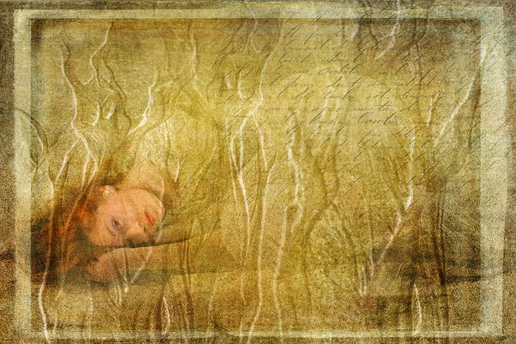
This image has a real Monet feel to me, especially the colors and I like how the greens blend into the blues. I'm not familiar with the topaz tools, but I did wonder if the effect could be toned down a little as this image is stronger for me when viewed at a distance. I also had a little trouble with the sun, but I though that by moving it down so that the middle plane pointed directly at it. |
Jul 9th |
| 18 |
Jul 20 |
Comment |
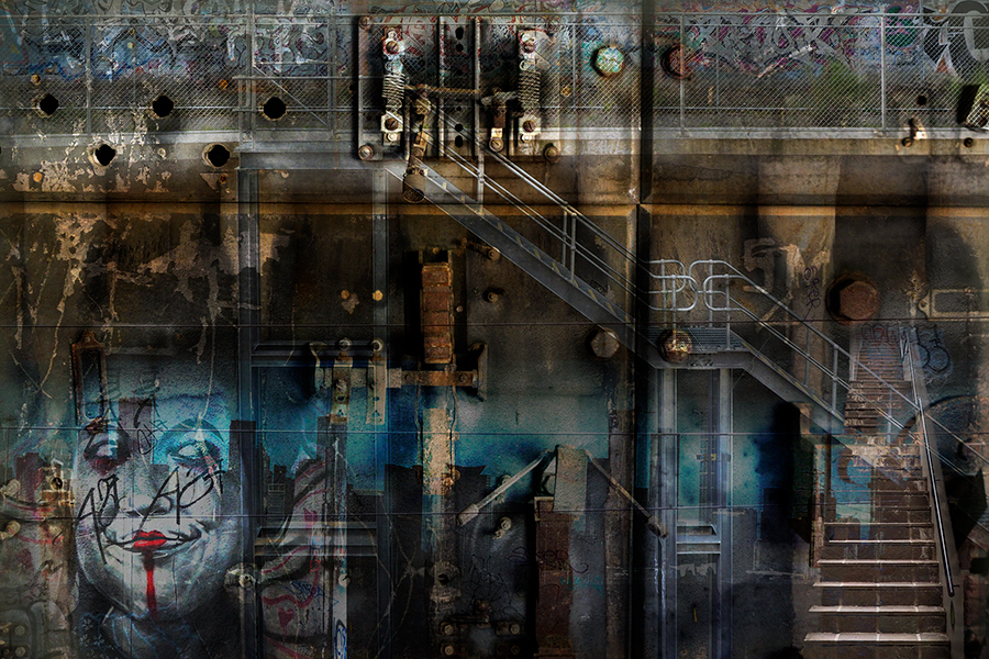
My first reaction was to grab your original and use some textures and antique colors to make the building more in disrepair. Your image made me realise that there are many more things you can do with an image. I like what you have done here, and I agree that it has a 'glassy' feel to it. To me the colors are nice and that broken heart in the middle makes the whole image feel quite sad. |
Jul 9th |
| 18 |
Jul 20 |
Comment |
I really enjoyed this image, and it reminded me of the 'Old woman in the shoe'. The colors are nice and vibrant and I consider the use of the liquefy tool has been done well. While I can see this is all just for fun, there are 2 things I think can be changed. The first is that the texture of the moon doesn't match the crispness of the rest of the image, and the cat appears to be missing a bottom. i do love the upside down duck and the crooked ears. |
Jul 9th |
6 comments - 2 replies for Group 18
|
6 comments - 2 replies Total
|