|
| Group |
Round |
C/R |
Comment |
Date |
Image |
| 38 |
Aug 22 |
Comment |
What a fun picture Marge, bright happy colors around the mannequin as she shows off her bunny ears, head band and long earrings! I like your version a lot, it has NYC written all over it! |
Aug 24th |
| 38 |
Aug 22 |
Comment |
Kurtis, your cardinal is beautiful, such a sharp image. Agree with the others, I also prefer seeing just the cardinal w/o other distractions. The snow adds a nice contrasting background and reminds us that winter will be here before too much longer. A great picture! |
Aug 24th |
| 38 |
Aug 22 |
Comment |
Art, a very nice image showing circular movement and a lot of energy. Great job! |
Aug 24th |
| 38 |
Aug 22 |
Reply |
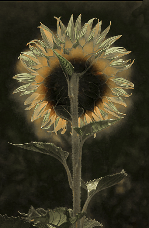
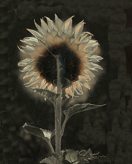
This is the second version of the sunflower. |
Aug 24th |
 |
| 38 |
Aug 22 |
Comment |
Regina, your image of the sunflower is great! I love how you captured light through the flower petals; your determined to get this shot is admirable!
I decided to play around with the original selecting the Basic Sliders in PS/Camera Raw just to see what other colorful variations might be possible. One turned out with cool tones and another with a warmer look. I also cropped the first one to move the flower off-center and kept the leaves at the base to help anchor the sunflower head.
To me, your image is great study in light and could easily compliment anyone's décor no matter what their color scheme is. Wonderful Picture!
|
Aug 24th |
 |
| 38 |
Aug 22 |
Comment |
I really like this image Gabriele, I can feel the movement and these colors work well together and grab the eye. Even though I have not experimented with ICM I have enjoyed seeing Art's work and think you did a great job, especially to be your first attempt. I'm looking forward to seeing even more of your work. |
Aug 21st |
| 38 |
Aug 22 |
Comment |
Sunandan, This image immediately grabbed my attention and I felt compelled to study every detail. So creative and well done, I really like it! |
Aug 21st |
| 38 |
Aug 22 |
Reply |
Regine, thanks for your thoughts on selective editing with this picture. I appreciate Kurtis sharing this idea plus showing how it would look. |
Aug 21st |
| 38 |
Aug 22 |
Reply |
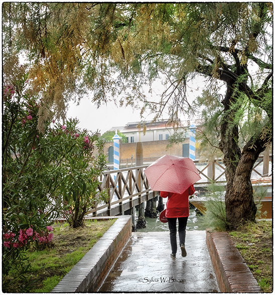
Thanks for your comments, Marge. I can see now how much the editied image was lacking in color and contrast. Also, I like they way you cropped it by taking the lady out of the center. Thanks! |
Aug 21st |
| 38 |
Aug 22 |
Reply |
Kurtis,
I like both of your edits especially the first one, the contract you added makes such a difference in the overall appeal of the image. Although, editing using selective color created an entirely different look. I think adding a red reflection from the lady's clothes is a great touch here! Thank you for your comments and showing a couple of different options.
|
Aug 21st |
| 38 |
Aug 22 |
Reply |
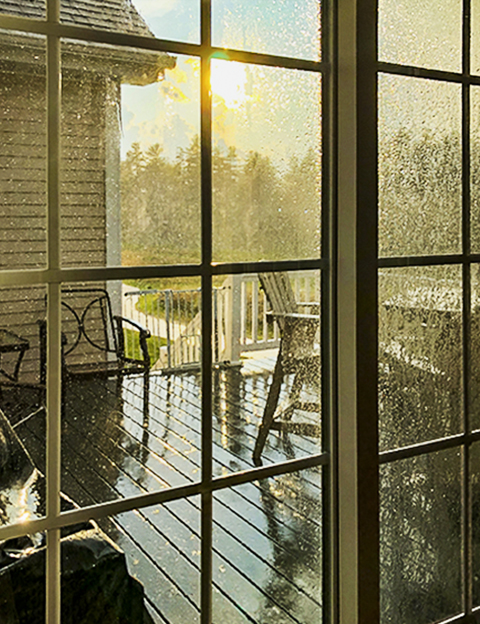
Thank you, Art, you have given this image an entirely different look. Personally, I prefer seeing bright, pleasing colors as a contrast to the rainy day. You are right about the title, not too interesting. I sometimes struggle with this, thanks for your suggests. |
Aug 21st |
| 38 |
Aug 22 |
Reply |
Gabriele,
I agree the original image shows more depth and space, initially it was edited without cropping. Although for this posting, my thinking was to put more emphasis on the lady's red apparel, surrounding garden and background.
Am wondering, if this was submitted in a competition, (which it won't be) would cropped vs not cropped be "more correct" or preferred over the other or would this be a subjective preference? Am I overthinking this? Thank you for sharing your thoughts.
|
Aug 21st |
6 comments - 6 replies for Group 38
|
6 comments - 6 replies Total
|