|
| Group |
Round |
C/R |
Comment |
Date |
Image |
| 38 |
Apr 22 |
Comment |
Sunandan, Wow, what a wonderful shot and so creative! The girl is so sharp and in focus in contrast to the soft swirl of motion all around her. Great Job! |
Apr 28th |
| 38 |
Apr 22 |
Comment |
Art, congratulations on your many photographic achievements! Well deserved recognition.
I think this is a terrific image Art, I love everything about it! Beautiful colors artfully blended together showing that the musicians are in harmony with each other. Beautifully done!
|
Apr 28th |
| 38 |
Apr 22 |
Comment |
Regina, I love this picture with the soft cherry blossom flowers framing the Jefferson Memorial. For fun, I wanted to see how it would look in a square crop with a few minor changes. Using PS/Camera Raw filter I lightened the blues and emphasized the pink in the flowers (Color Mixer). Straightened the horizon a bit, softened the bright reflections in the water and cropped it into a square. Regine, this is a beautiful picture anyway it is edited! |
Apr 28th |
 |
| 38 |
Apr 22 |
Comment |
Marge, this is a wonderful picture! The soft lighting on part of the model's face and shadows plus the catch light in his eye. Your did a terrific job, I'm looking forward to seeing more of your portraits!! |
Apr 28th |
| 38 |
Apr 22 |
Comment |
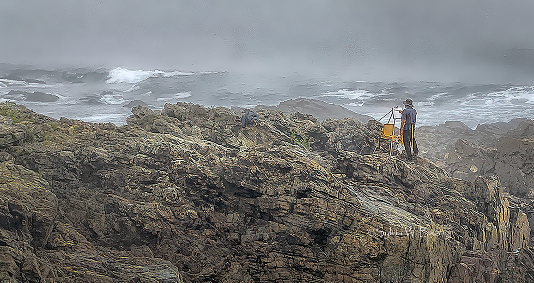
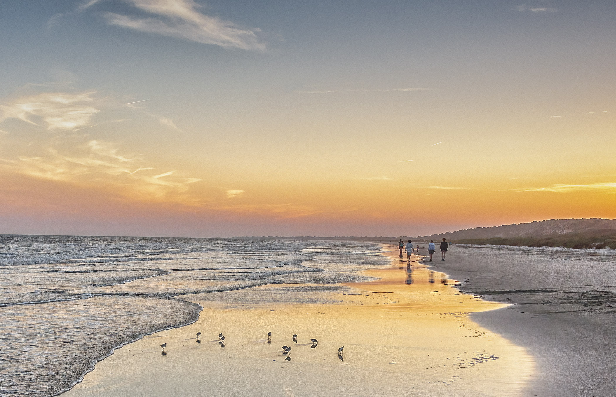
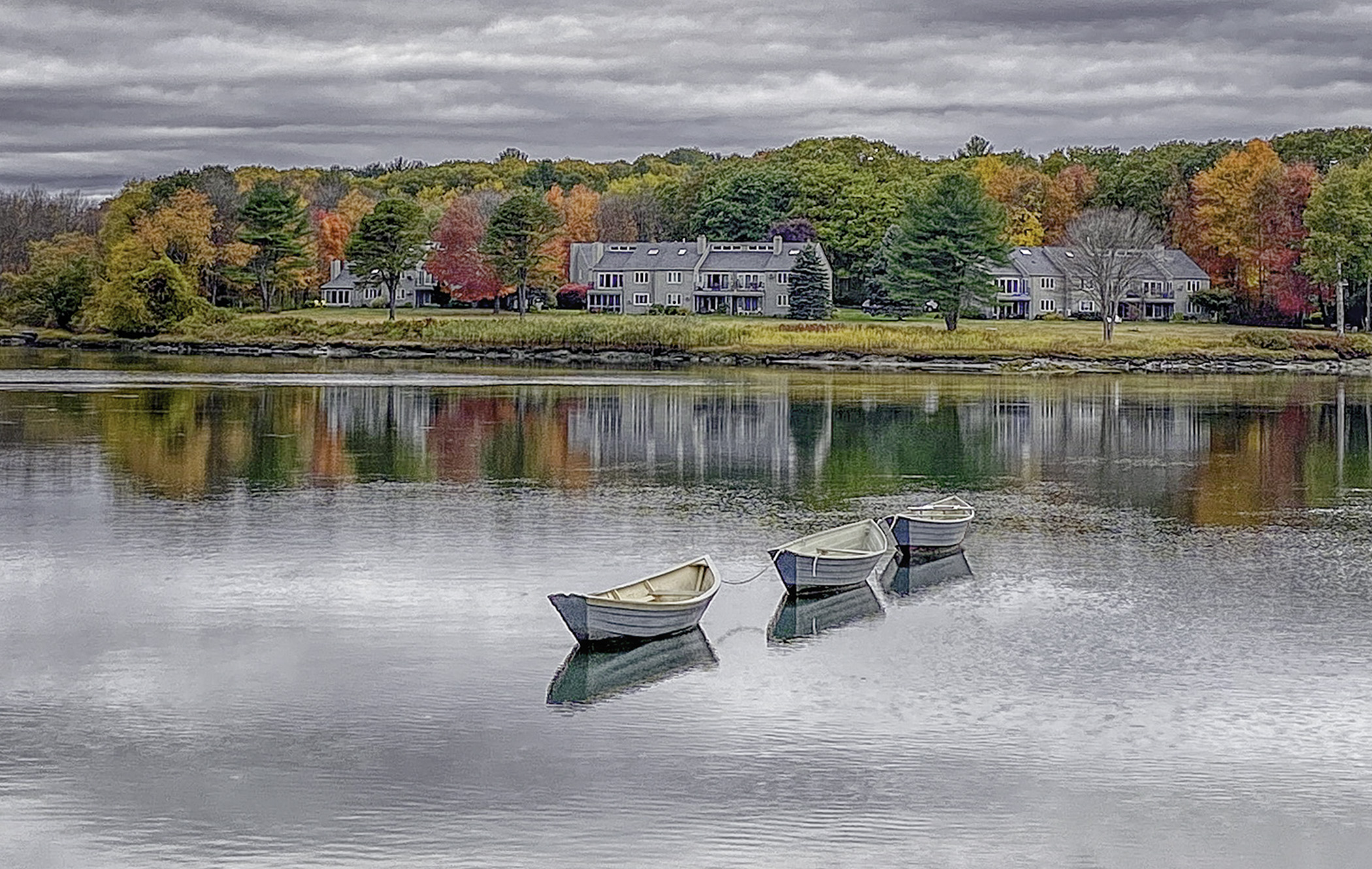
Kurtis, this is a wonderful picture, I think you did a terrific job of capturing these horses as they rounded the corner!! I feel that Art and Gabriele's editing shows that this image can easily be interpreted two ways - dramatic and exciting (I can hear the horses galloping!) or a more subdue, relaxing approach by including the lovely landscape and horses more in the background. |
Apr 28th |
| 38 |
Apr 22 |
Comment |
Gabriele, I like your picture a lot and can easily see it two different ways, depending on whether it is cropped or not. Your version shows three distinct parts which balance the image (as Kurtis has mentioned). Or, the other is the way Art has edited it, emphasizing the lovely warm colors plus patterns and details in the landscape. A great picture! |
Apr 23rd |
| 38 |
Apr 22 |
Reply |
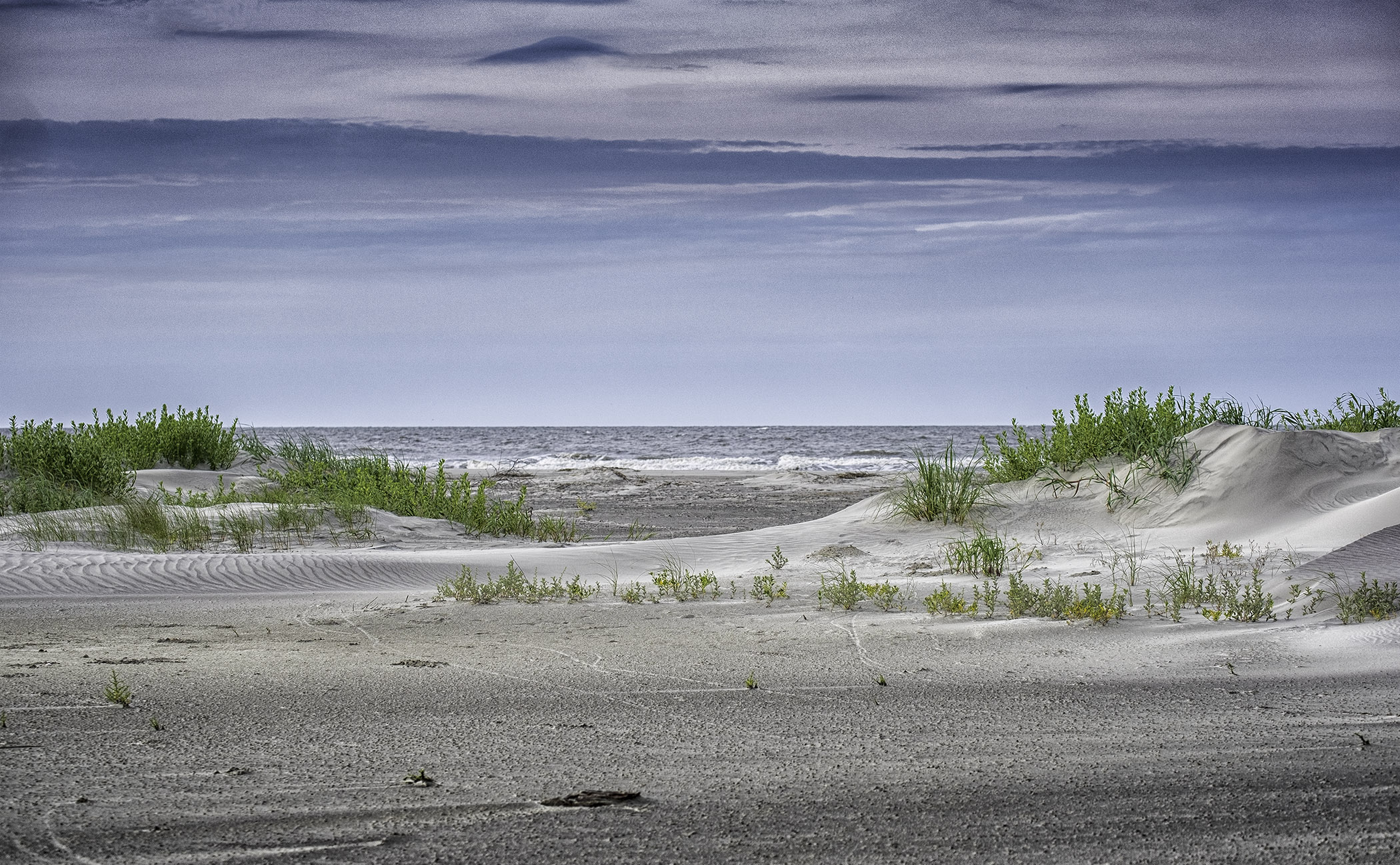
Kurtis, I like the way you edited this making the sky more prominent and adding more contrast on the beach. It looks very nice. You are right, this image presents a plethora of artistic options. Thank you. |
Apr 12th |
| 38 |
Apr 22 |
Reply |
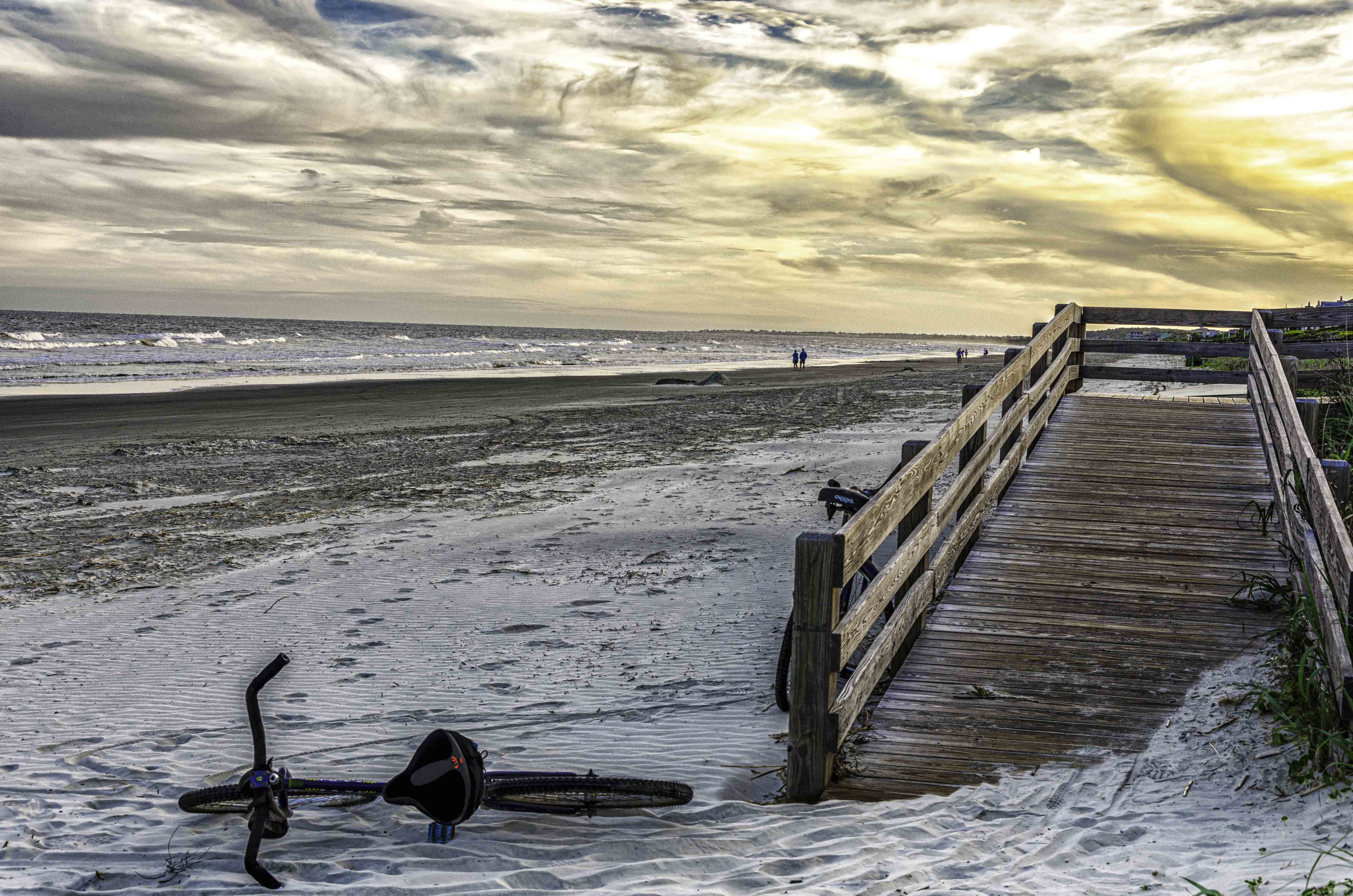
Gabriele, I forgot to add that I do like your interpretation of this scene, it has more of a moody/ stormy look without the bright blue sky above. Thanks. |
Apr 12th |
| 38 |
Apr 22 |
Reply |
Art, you took my "ok" photograph and made it into a picture where people might hopefully stop and take a second look. I didn't think about viewing it as two components (sky/sea and land/sea). Your additional dodging/burning made a big difference. Thank you! |
Apr 12th |
| 38 |
Apr 22 |
Reply |
Gabriele, no worries concerning uploading my image, these things happen. I appreciate your critique; this image was chosen because I felt it had potential but was not able to do it justice. Looking at my edit more, there does not seem to be enough contrast and definition and yes, too much overall warmth or gold cast. Thank you.
|
Apr 12th |
6 comments - 4 replies for Group 38
|
6 comments - 4 replies Total
|