|
| Group |
Round |
C/R |
Comment |
Date |
Image |
| 78 |
Mar 21 |
Comment |
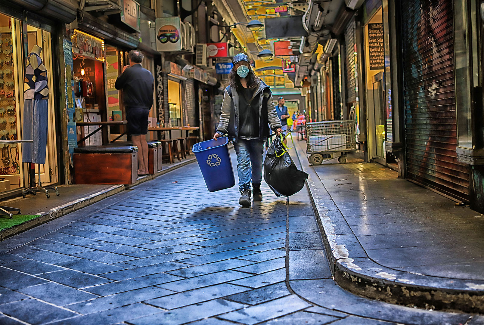
Here is my latest attempt. I have tried your suggestions and tried to:
- diminish the lights behind the main subject
- Remove the man behind the main subject
- Reduce the blue of the road.
I am not quite sure ..... what do you all think? |
Mar 12th |
 |
| 78 |
Mar 21 |
Comment |
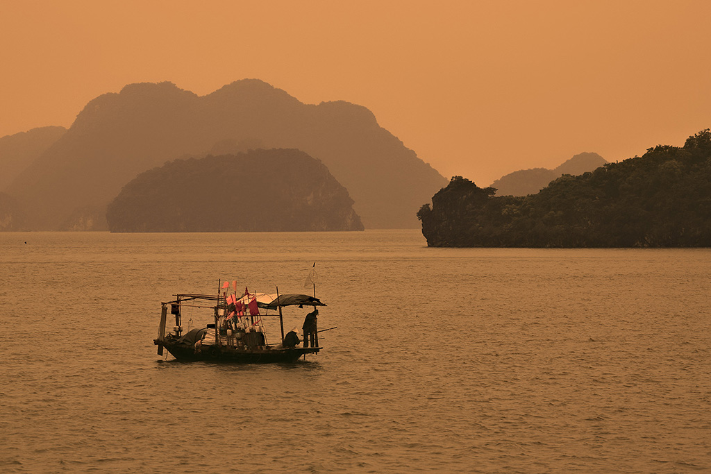
Hi Mitch, a big welcome!
Wow! I, like Jason, appreciate your first contribution to our group. Great start!
Landscape photography and complicated settings in Lightroom and Photoshop are my two serious weak points!
I appreciate the composition and the balance in this shot.
The only feedback I could suggest to you, would be to consider, when framing a shot, to avoid capturing white or very bright colours on the edge of a frame.
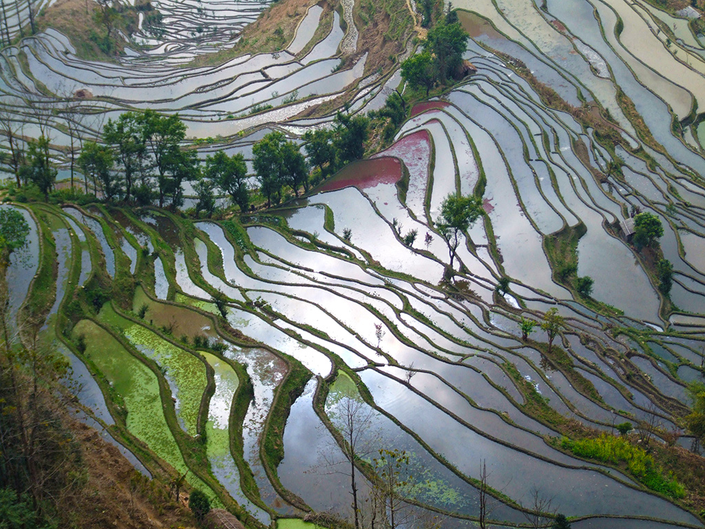
In this shot, despite the beautiful vista, I find my my eye drawn to the snow patch bottom left-hand corner. Are there enough pixels there to mute the white a little? I am not sure what the others think? |
Mar 10th |
| 78 |
Mar 21 |
Comment |
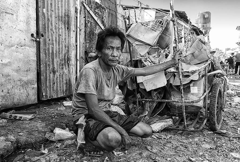
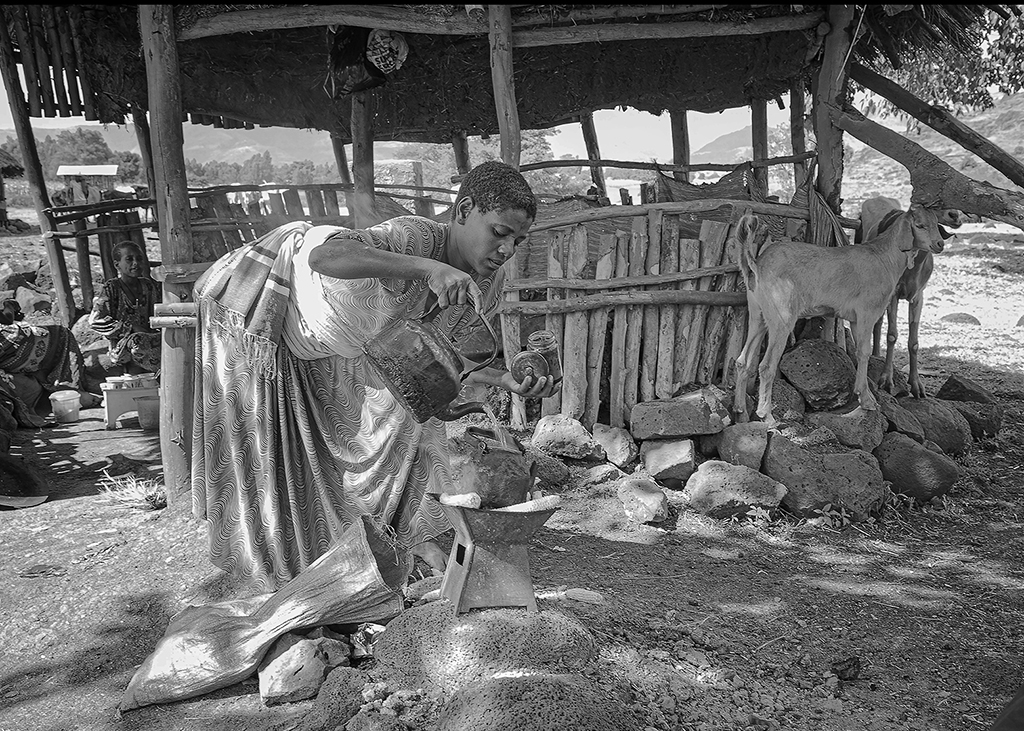
Thanks so much for your feedback Jason, Brenda and Sunil. I have edited this photo according to your suggestions.
BTW the subject is a male, not a female ;-)
1. I worked on the background Jason and Brenda. A rough job, cloning sections to disguise the burnt out sections.
2. I toned down the background at the same time.
3. Added a slight dark vignette around the edges.
4. Brightened the main character Sunil, I made the road a little darker and bluer.
5. I gave the guy on the left some tanned legs
Hope it looks a little better?
.
|
Mar 6th |
 |
| 78 |
Mar 21 |
Comment |
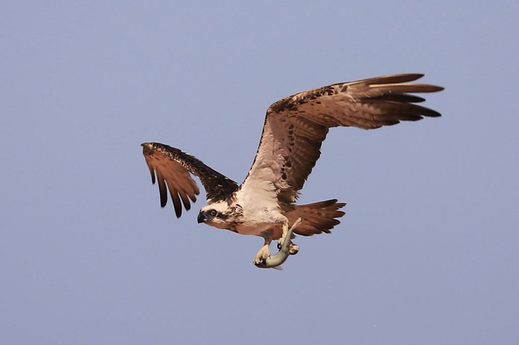
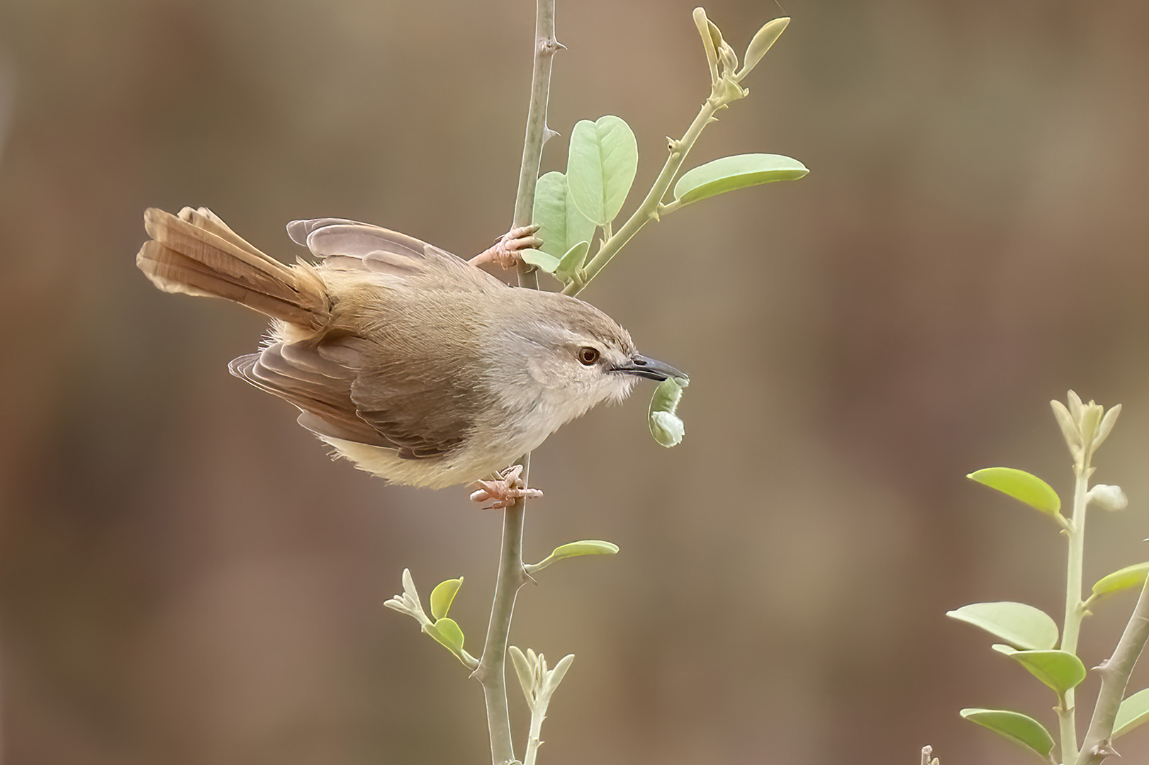
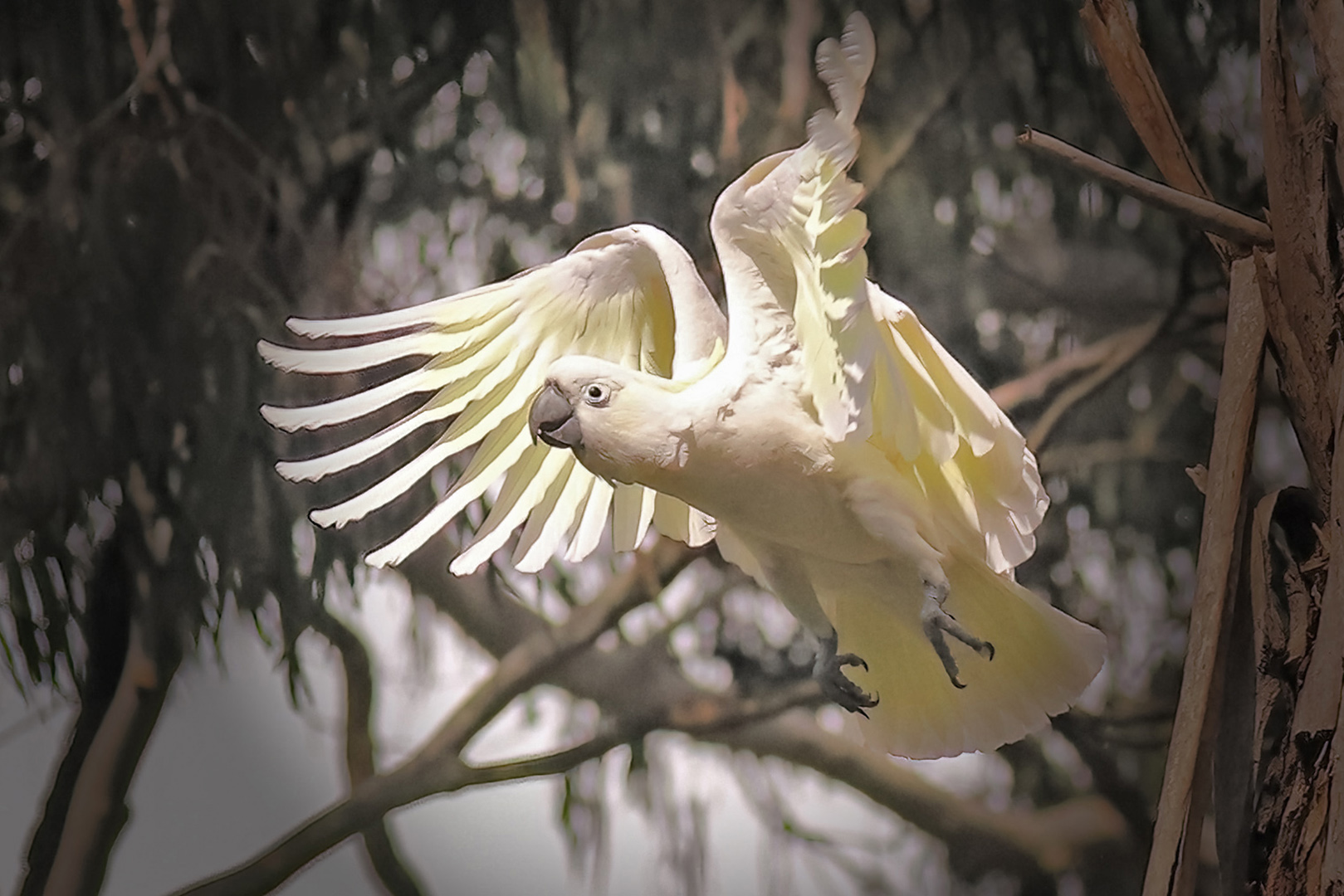
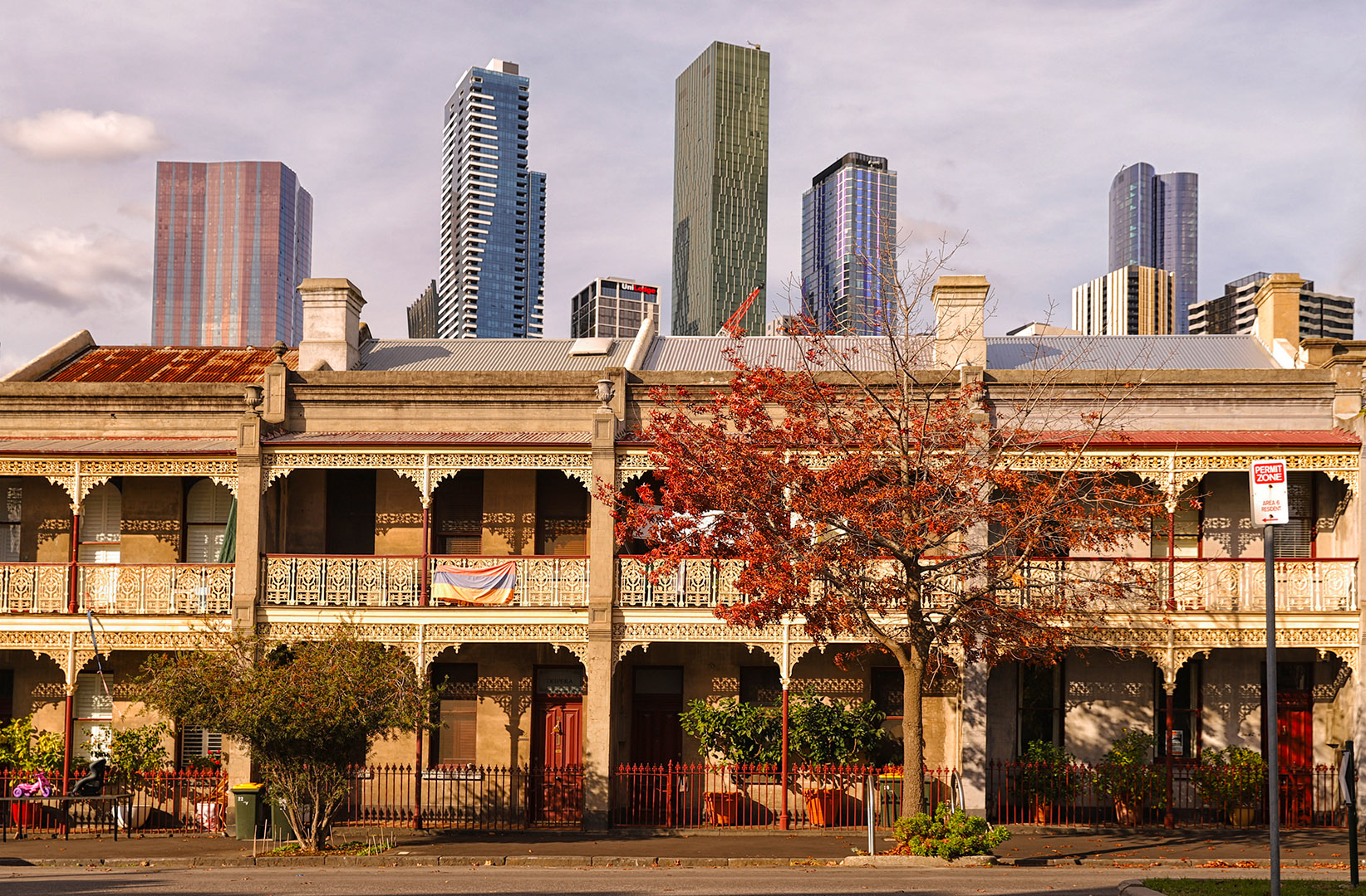
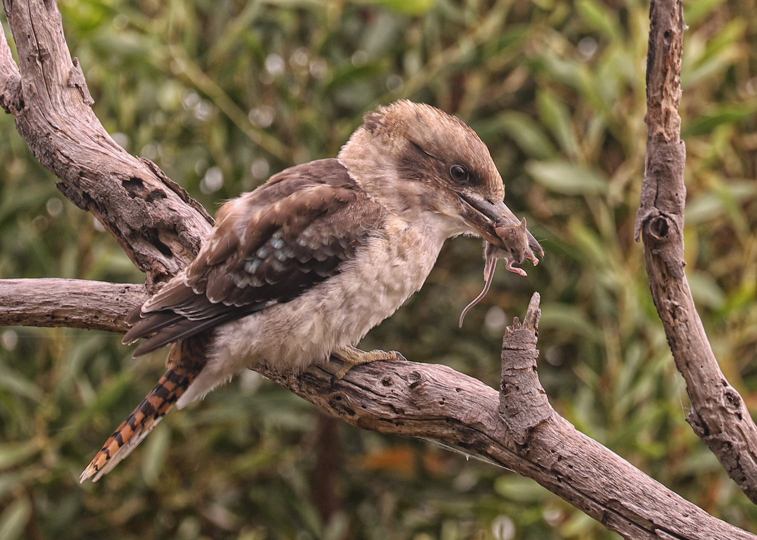
What a treat! Worlds collide with the ingredients in this photograph! What a beautiful bird. I am not sure what it is,
I do find the image a little soft, but perhaps a high-end sharpening manoeuvre might help? I would also suggest a small rotation to adjust the fence behind to the vertical? |
Mar 2nd |
| 78 |
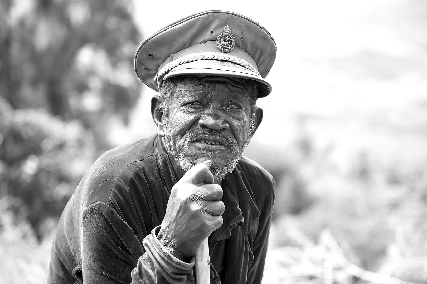
Mar 21 |
Comment |
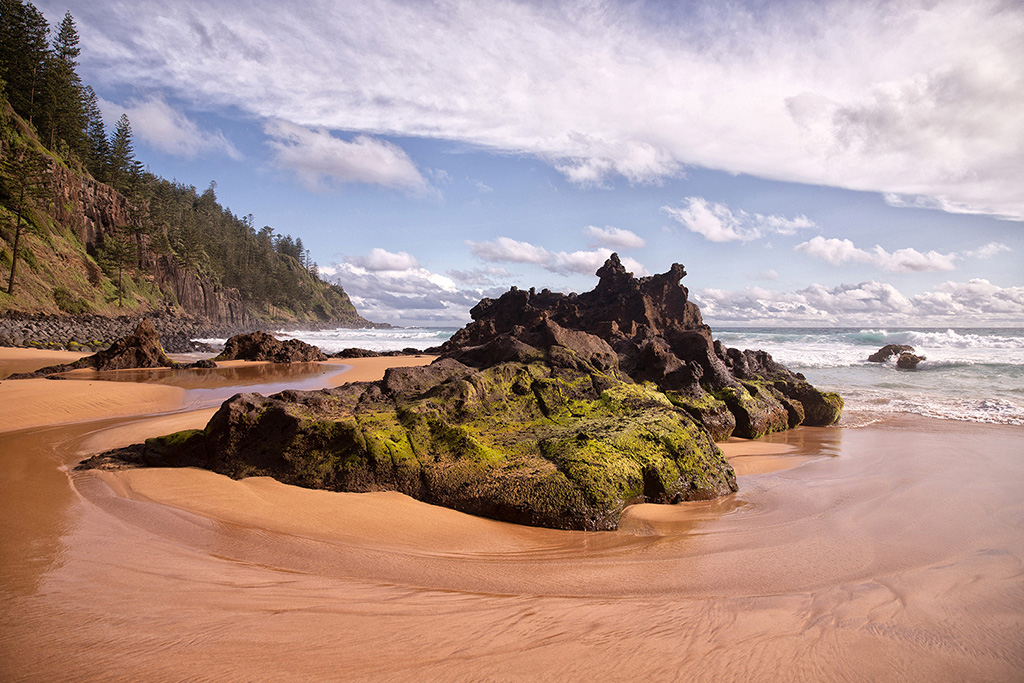
Ohhh, love this shot! You've done really well on the editing too. Congrats
I really love the colours in the original as well. The dirt brown and grungy black work really well. I think the texture shows up better on the rocks too. Did you try a grungy version with the original colour?
Decisions, decisions! |
Mar 2nd |
| 78 |
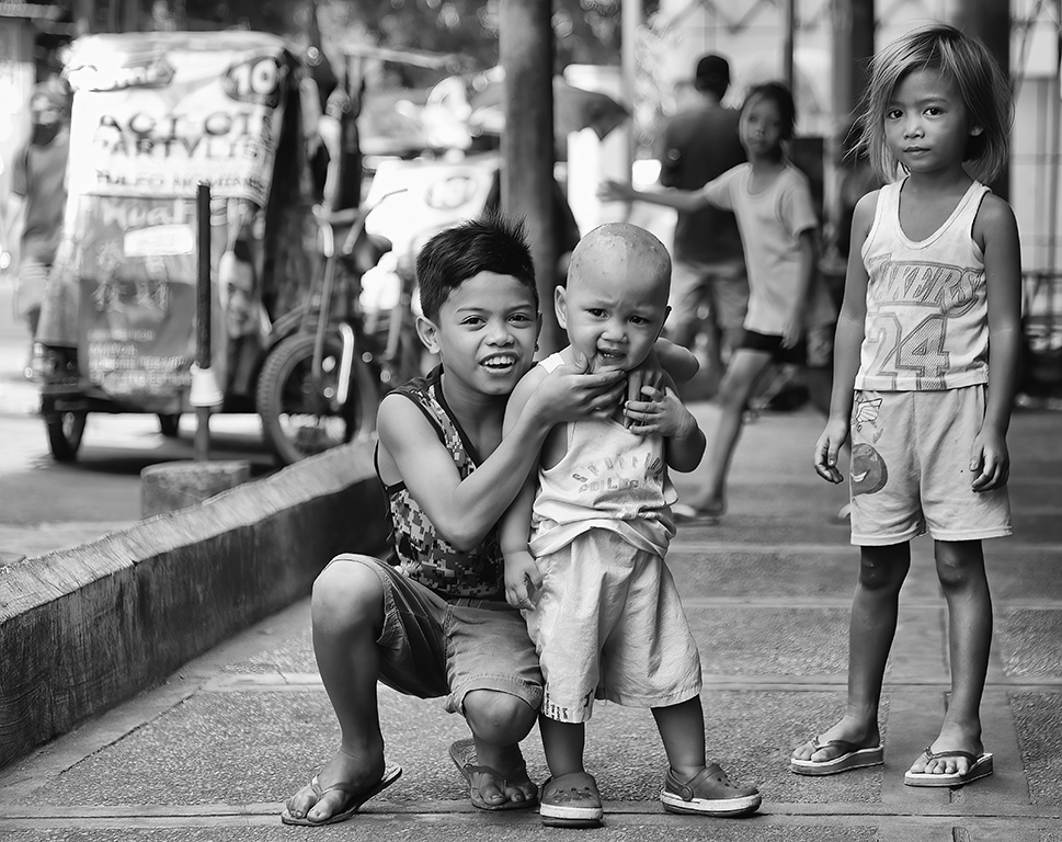
Mar 21 |
Comment |
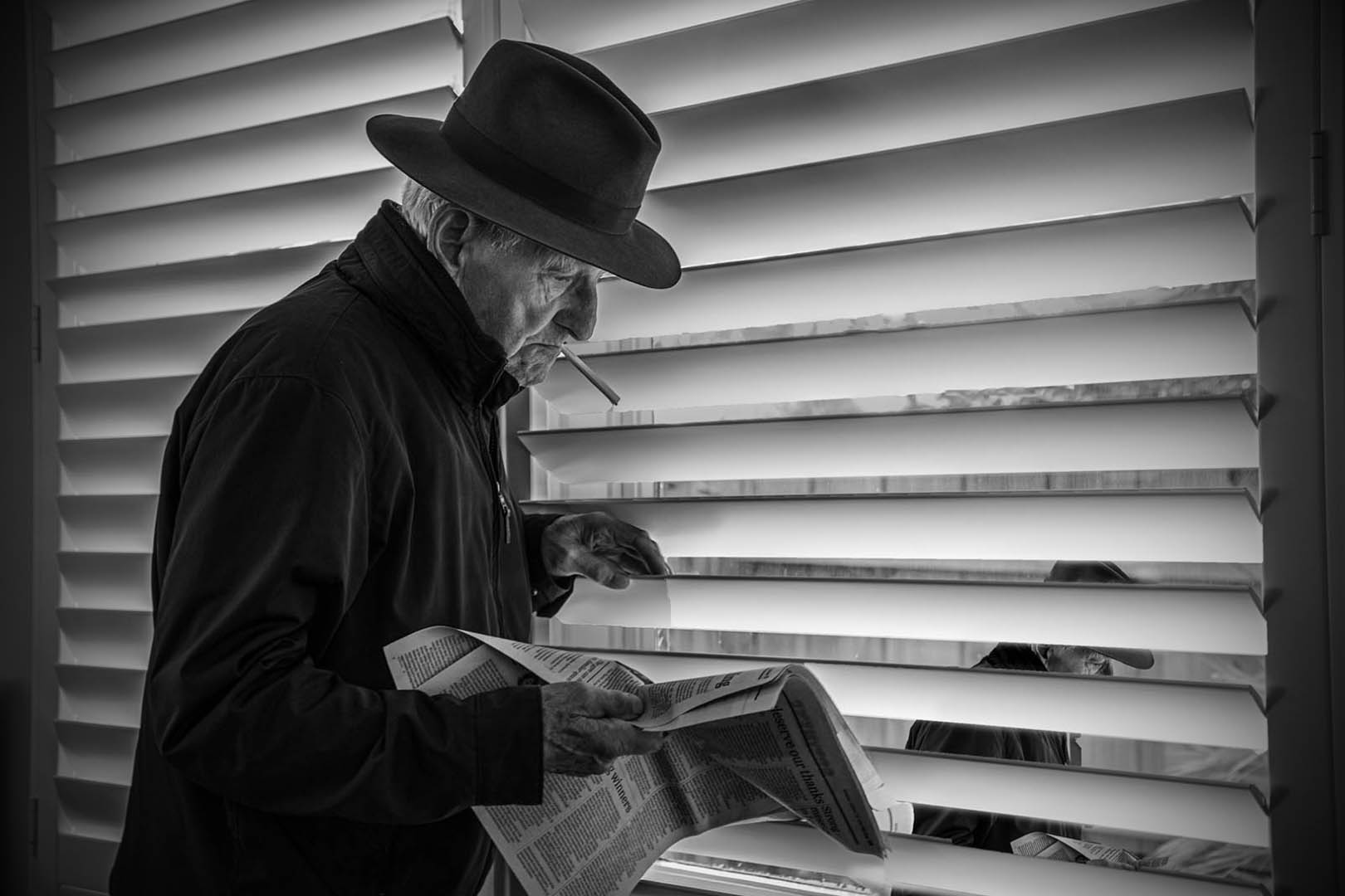
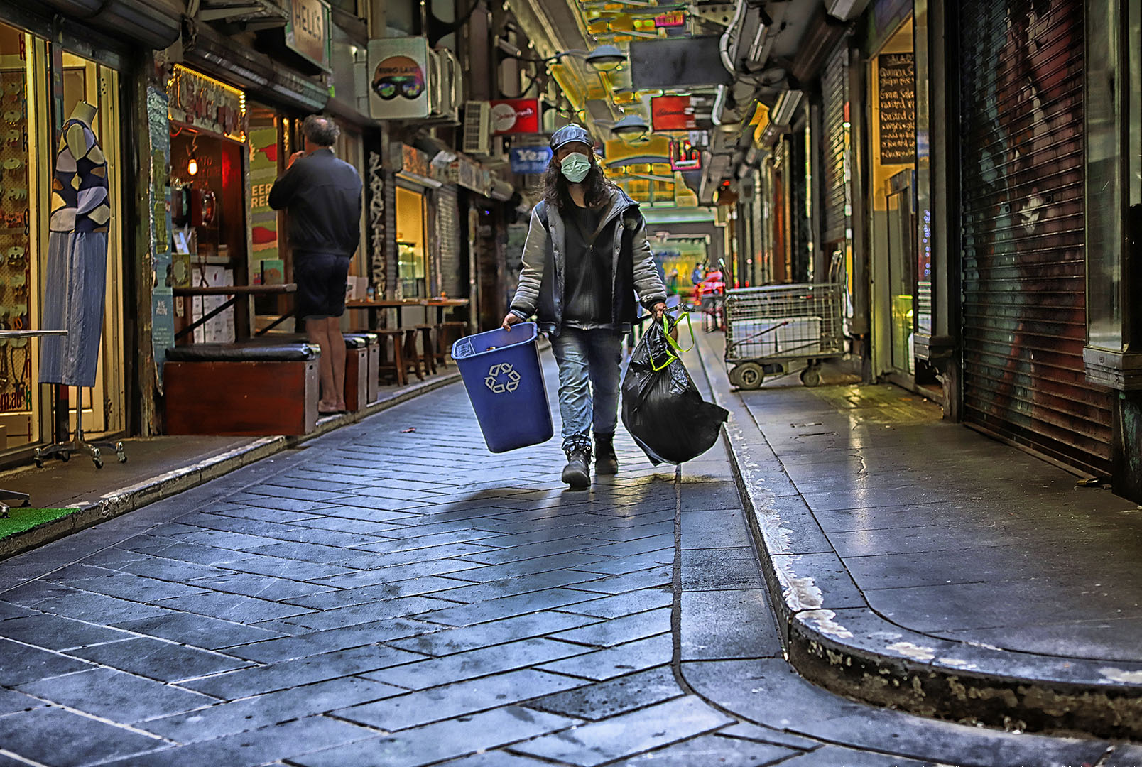
Well spotted Sunil!
I like the candid nature of this photograph. Beautifully balanced and you've managed the light well.
I would perhaps tend to give this photograph a light-hearted name such as "No swimming today". |
Mar 2nd |
| 78 |
Mar 21 |
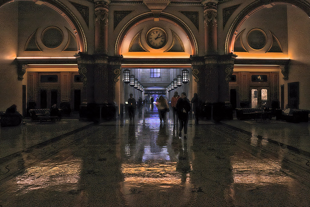
Comment |
What a magnificent staircase and an impressive shot! Congrats. I was impressed by your edit, but I must admit, when I enlarged your original, I hesitated.
I prefer the composition of the the original as the overall balance and curves draw my eye back and around the composition.
I find that the dark leading line on the right of your edit, leads the eye out of the frame. |
Mar 2nd |
| 78 |
Mar 21 |
Comment |
Great shot Brenda! Love the vibrant colours of the birds. You did well to change the background, it works well. I think the title is OK too. Cant really think of another.
The only suggestion I could make, is to tidy up that bit of branch showing in the bottom right-hand corner, then press submit! Good luck! |
Mar 2nd |
8 comments - 0 replies for Group 78
|
8 comments - 0 replies Total
|