|
| Group |
Round |
C/R |
Comment |
Date |
Image |
| 78 |
Nov 20 |
Comment |
Fantastic Abdo. I really cannot see anything that could be improved here, congratulations.
Must try the sky replacement one day. |
Nov 4th |
| 78 |
Nov 20 |
Comment |
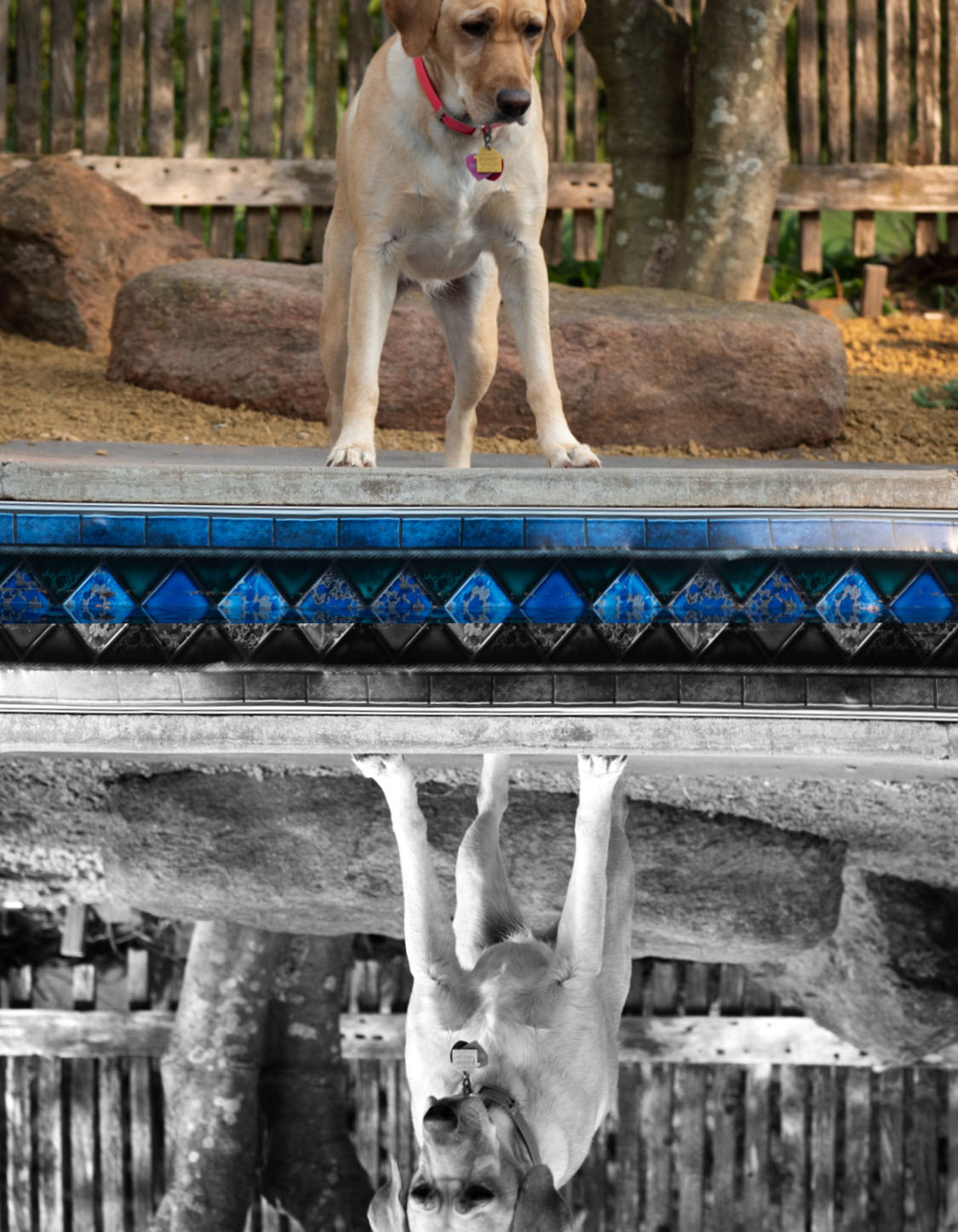
Hi Jason. Well spotted! It is an engaging photo.
I felt it was a shame that you hadn't caught the top of the real dog's head and that you hadn't stepped a little to the left to straighten the pool edge.
I thought I'd have a play in PS, to at least be able to make a suggestion.
I used the Warp tool to straighten and even up the pool edge a little. Then I made a copy and converted the image in black and white. I made a layer then cropped off the non-reflected B&W half of the real dog, rotated it and pasted it back as the reflected dog. Then I warped/straightened the fence posts in both halves.
If I'd been smarter I would have reversed the B&W so it looked like the real reflection, but I flattened it before I realised what I hadn't done! Silly me. But you'll get the idea anyway I guess. |
Nov 4th |
 |
| 78 |
Nov 20 |
Comment |
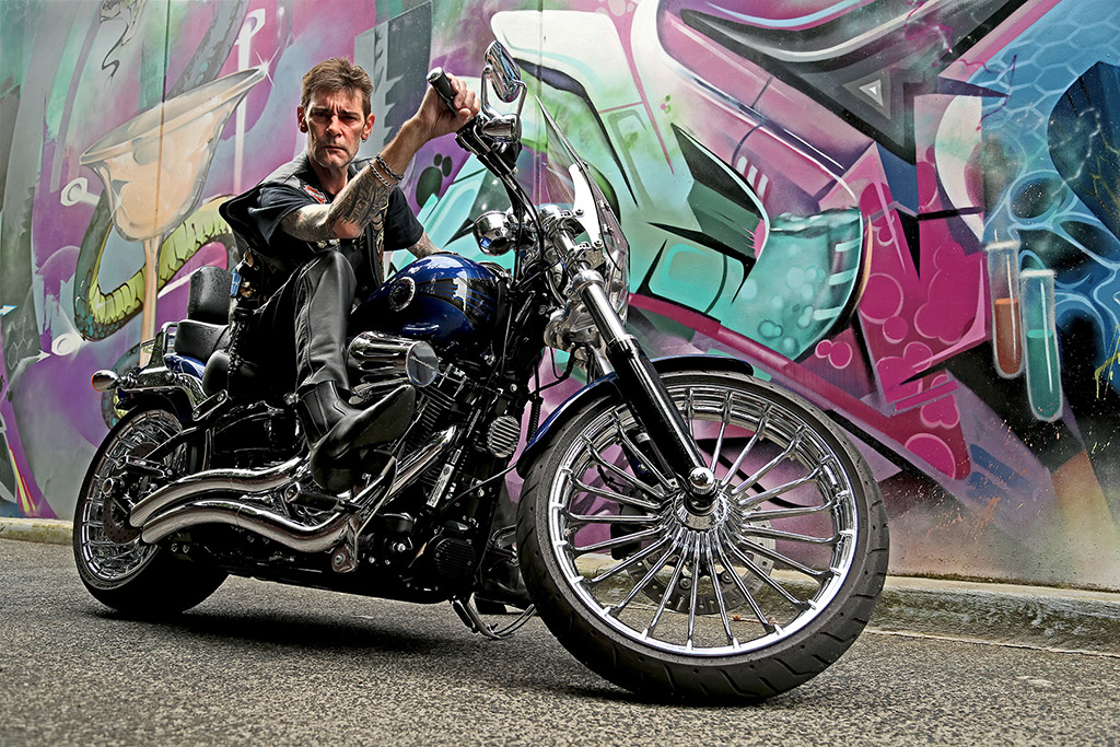
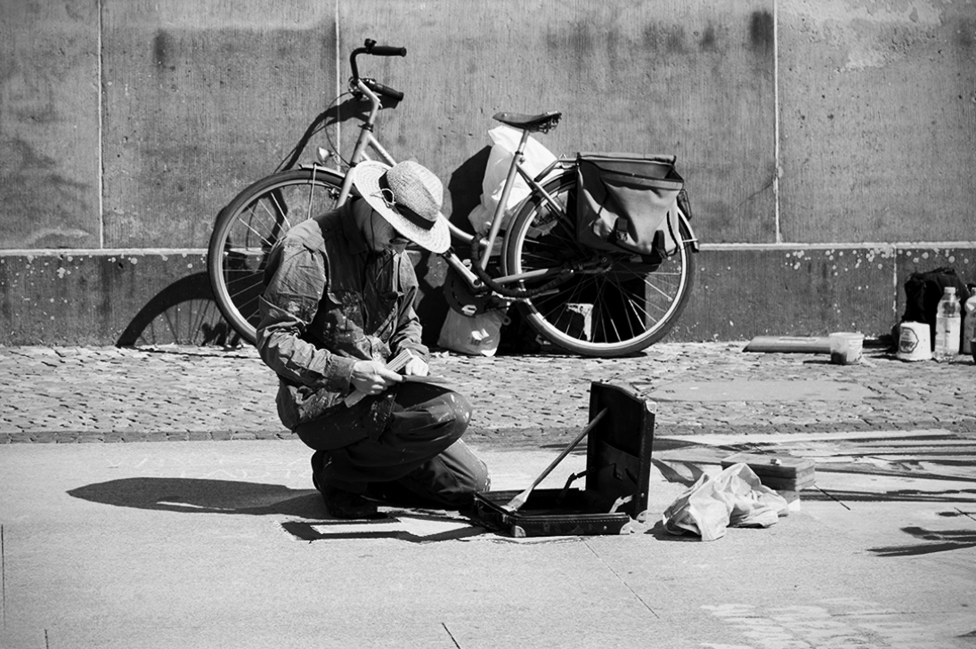
Hi Terry
Well spotted. An interesting shot. I liked the colour version and find that the mono also works well.
Similar to Jason, I prefer a little space on the left of the subject.
My main suggestion is to perhaps crop under the grout line of the background wall and level the image using the grout line behind the bike. It feels a little more balanced. (see in my example)
I also did a little dodging on the subject's face and cropped some of the base, as the B&W conversion removes the purpose of keeping all of the writing on the road. |
Nov 4th |
 |
| 78 |
Nov 20 |
Comment |
Wonderful image and edit Sunil. I like this image just the way it is. I cannot think how I could assist in improving it. Congratulations. |
Nov 4th |
| 78 |
Nov 20 |
Comment |
Hi Jim,
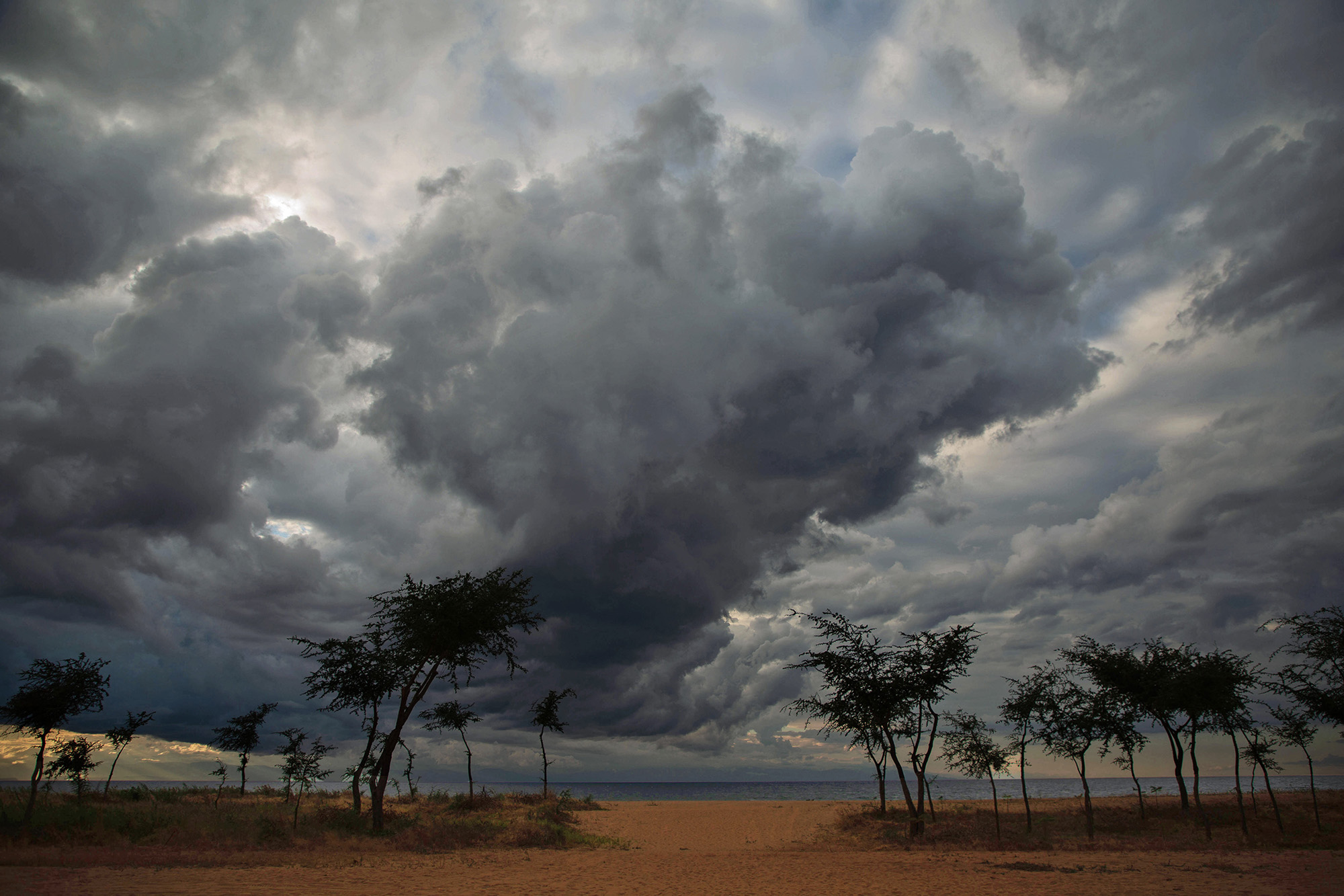
Powerful image! Bravo! I love the colour and contrast. The clouds are fairly strong, but they add drama and also add to the story of the image.
It appears that you rotated the image a little to the right? I prefer the original. The edit feels a little as if the hut is slipping away to the right.
I wouldn't have thought of adding something in the foreground, but I agree with Terry. It is a complementary addition.
Look forward to seeing the edits! |
Nov 4th |
| 78 |
Nov 20 |
Comment |
This is epic Brenda! Stunning shot. I really like the enhanced colour. Wow!
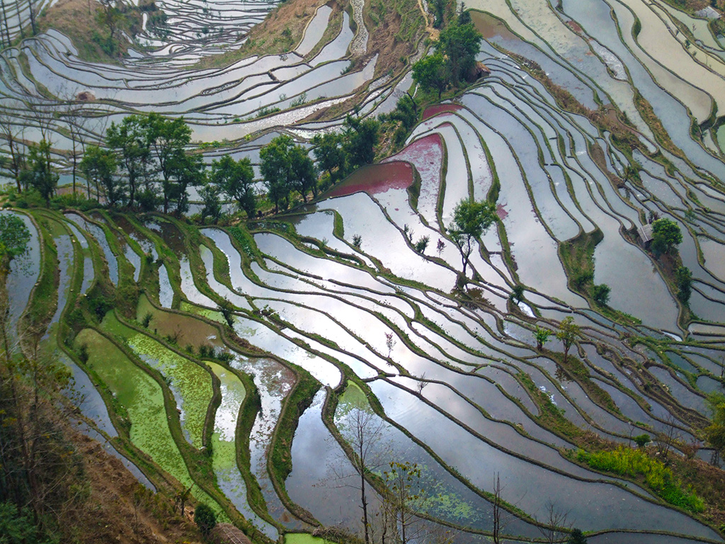
Only small suggestion from me would be to consider cropping a bit off the right-hand side of the panorama, leaving only the one tree on the right. It would help centre the main event of the image. |
Nov 4th |
| 78 |
Nov 20 |
Comment |
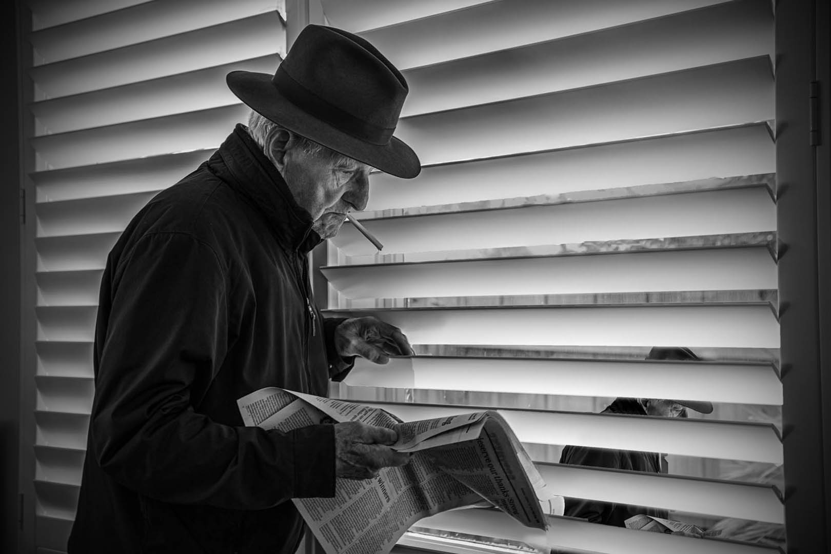
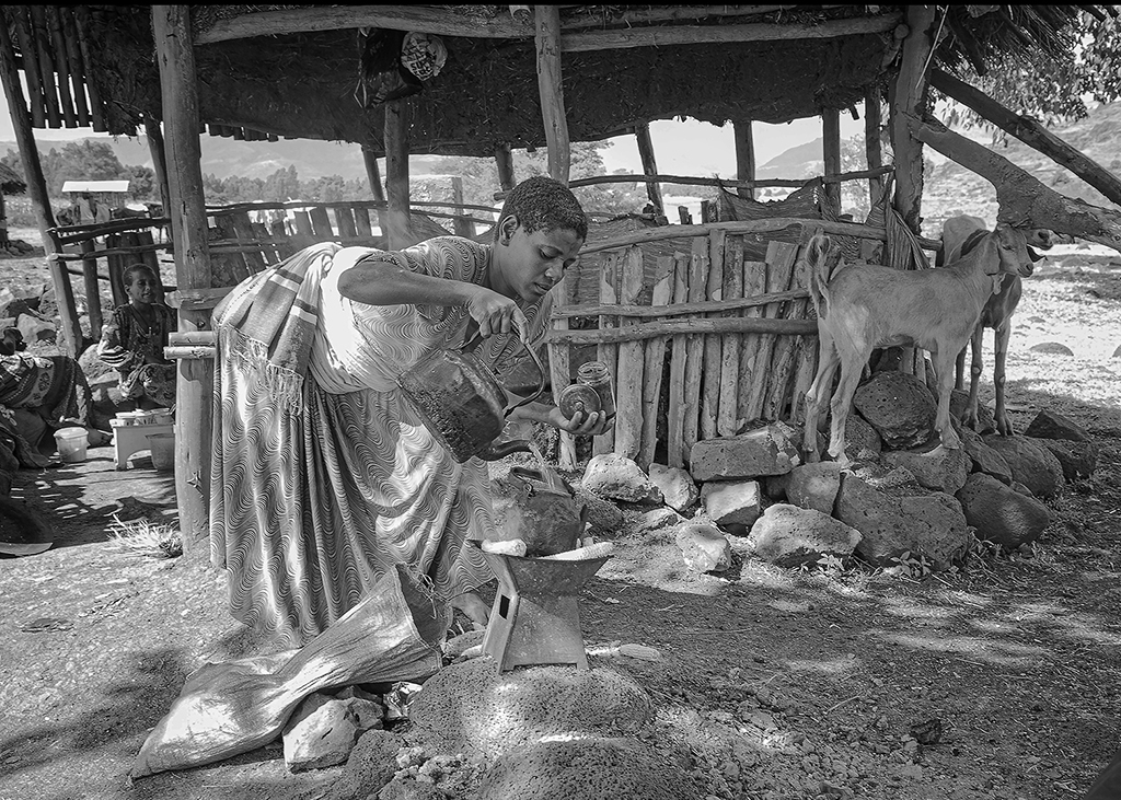
Hi Jason
Thanks so much for your help on this. Now that I have read your lighting suggestion, I am kicking myself for not thinking to take multiple exposures.
He was quite a challenging model. He was a lovely older Austrian gentleman who didn't quite understand what I wanted him to do. In the end, I had to make do with the best of it.
I appreciate your post suggestions, especially the Lightroom one, as I rarely use it. Your edit was great, thanks.
Hopefully, I'll get something better out of it. Moral is, take a good shot in the first place, n'est pas? |
Nov 4th |
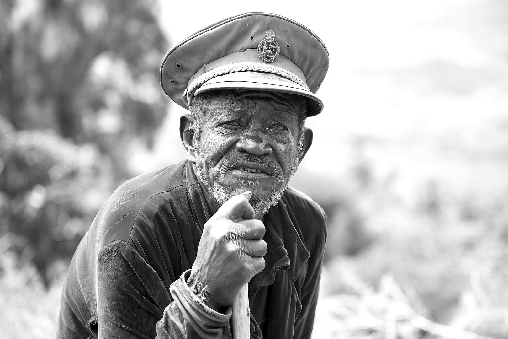
| 78 |
Nov 20 |
Reply |
Wow Terry, thanks so much for your compliments and especially for the constructive feedback.
I hadn't noticed things like the halo, the darkness of the hands against his face, nor considered the aged broadsheet.
Off to do some twiddling! Thanks again.
|
Nov 4th |
7 comments - 1 reply for Group 78
|
7 comments - 1 reply Total
|