|
| Group |
Round |
C/R |
Comment |
Date |
Image |
| 99 |
Aug 24 |
Comment |
For me the main interest is in the white flow of agitated water in the river before the fall contrasting with the nearly smooth water after it: two images of water contrasted by speed.
I think this is a very good shot - hard I am sure to compose but I see two almost diagonals meeting at the falls that reflect the contrast in the water's texture, both leading the eye to the drama of the vapor plume.
I think a little more light at the lower range might serve - but not sure. Perhaps dodging around the trees. |
Aug 10th |
| 99 |
Aug 24 |
Reply |
Thanks for looking so hard.
The mist is real, as is the ghost boat vanishing within it; the "join" is a sort of vertical connecting the right third.
I worried a long time over the centering of the boats and so far two reviewers see this as problematic :-) ... I agree that it is not normal, but I like the tension. |
Aug 10th |
| 99 |
Aug 24 |
Comment |
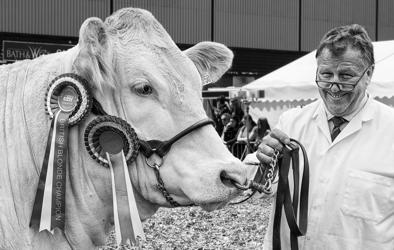
So much character ... in both beast and man.
As usual - well composed and focused
When I looked first I did not notice the people - but after reading the comments I could not unsee them. So I tried to isolate and blur the background, to burn them, and even to lighten the subject instead. To my eye, the best result came from just selecting the beast and the handler's face adding contrast alone which seems to draw my eye to the bull rendering the back-ground people irrelevant and the handler becomes the comic comment. |
Aug 10th |
 |
| 99 |
Aug 24 |
Comment |
Robin - I think I made it to Taunton once, but no closer. I like this image including the dark negative space at the top, especially the use of contrast. I always go too far with that, so you are probably just about right.
My one observation is that I could see with my eye alone that the center of the ditch is a little off centre and since this is the sort of image that is founded on symmetry, I would cut a sliver off the right to address this.
|
Aug 10th |
| 99 |
Aug 24 |
Comment |
John
I find this very effective, particularly the distortion - was that a lens effect (25mm ?) - which seems to bring life to the structure (as though breathing).
My eye was first caught by the clouds and personally I think the focus should be the bridge. I would suggest removing them above the height of the bridge-tower and cropping down a little to reduce that then negative space. |
Aug 10th |
| 99 |
Aug 24 |
Comment |
Kathleen, you were clearly (and correctly) drawn in be the patterning, and I love the contrast you achieved between the vertical/horizontals of the building face and the diagonals of the fence.
In my opinion, there is here too much of a good thing - but only slightly. I would removed the far left by one diamond in the fence because to eliminates both the change in the building's pattern and the more apparent depth-of-field problem on the fence. Also I think that the dark wood on white face is the strength of this image and so I would remove the filter and stick with B&W. |
Aug 10th |
 |
| 99 |
Aug 24 |
Comment |
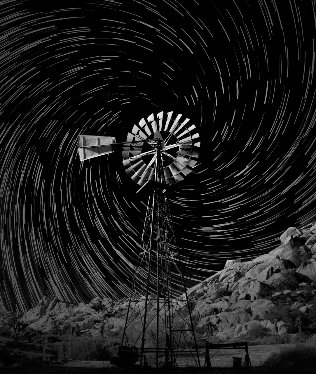
I agree that the time and effort you put into the vortex effect were well rewarded with the outcome which I think is excellent.
Following on from Robin's observations, I think the current image is a little "flat" in term of tonality and so misses the emphasis deserved of the windmill. As a possible modification, the image below is generated with a radial filter in camera raw. |
Aug 10th |
 |
6 comments - 1 reply for Group 99
|
6 comments - 1 reply Total
|


