|
| Group |
Round |
C/R |
Comment |
Date |
Image |
| 79 |
Jun 24 |
Comment |
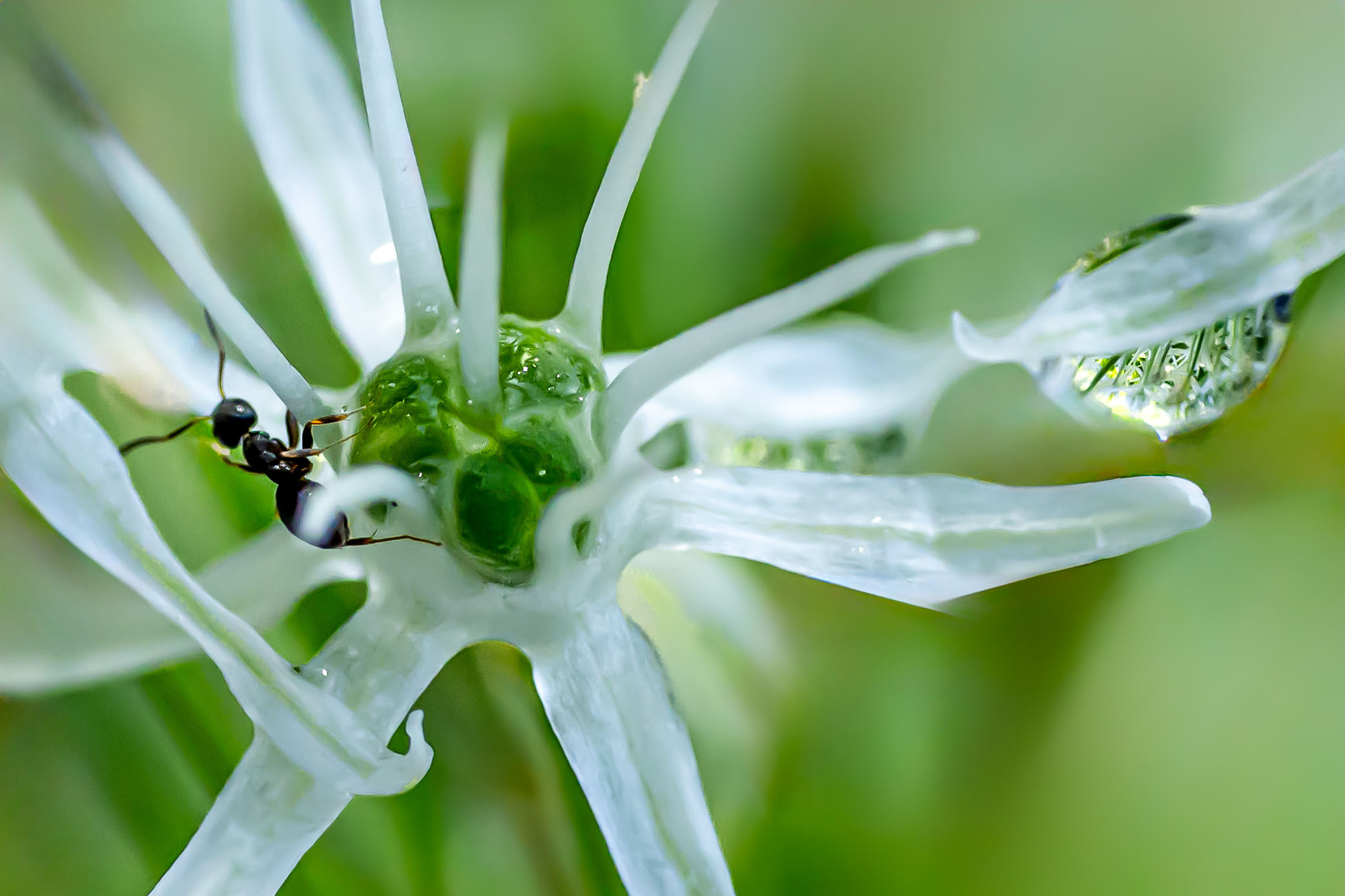
Judith
I prefer the final version for its sharpness and isolation of the primary interests. I think the flower though is fascinating in itself, with its shiny texture and the overlap, touching of one petal over another.
With cropping I would go slightly further, and put the ant on the left as I think the image reads better that way (large to smaller areas of foreground) |
Jun 19th |
 |
1 comment - 0 replies for Group 79
|
| 99 |
Jun 24 |
Comment |
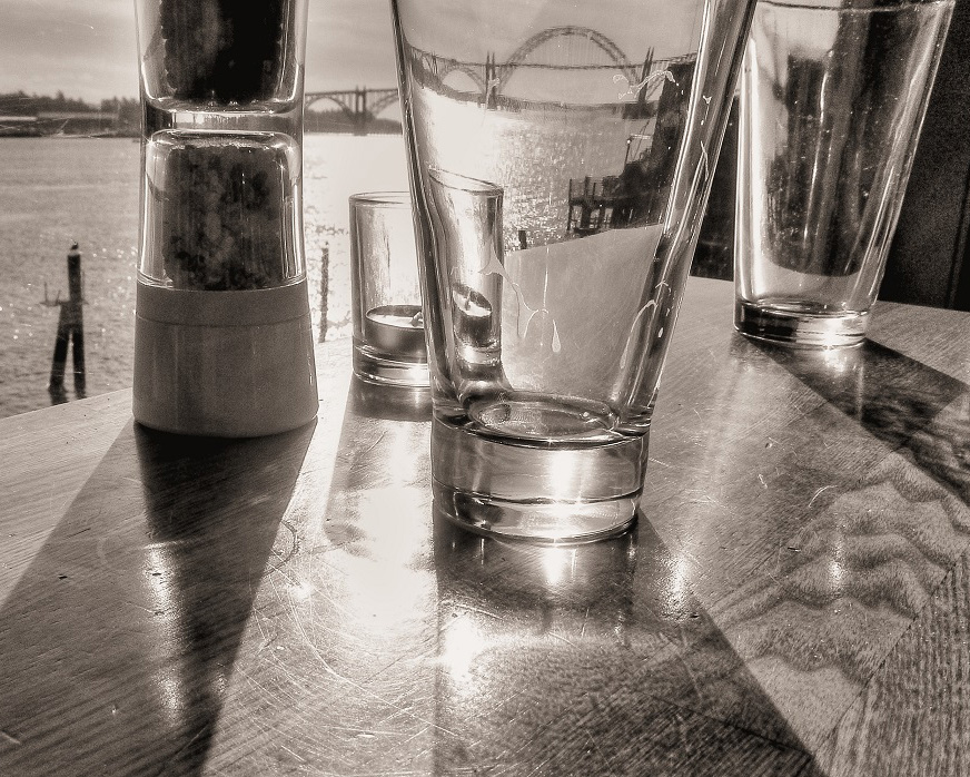
Gary
Rather than repeat the earlier comments, I want to make one observation (purely personal and by no means certain): I think I would have preferred it if you had move some distant to your left so that the river wall and road were all moving into the image rather then slightly across. My feeling is that there is something in these parallel lines that would have then received a useful emphasis. |
Jun 19th |
| 99 |
Jun 24 |
Comment |
Kathleen
I line the use of the glass to distort the background, and the waves in the table that act as analog to the water in the background.
With all the above talk of crops, I had to play. In my view, the version below brings the main glass more into the center and so brings the bridge through it out as the focus of the image. |
Jun 19th |
 |
| 99 |
Jun 24 |
Comment |
Robin, my immediate thought was Stubbs or Constable (but that's the English in me). I think it is well composed with the almost symmetry, and the emphasis from the vignette. Pulling that back a little though might allow more detail on both the ribbons the dog.
I particularly like the detail of the hair on the horses feet.
|
Jun 19th |
| 99 |
Jun 24 |
Comment |
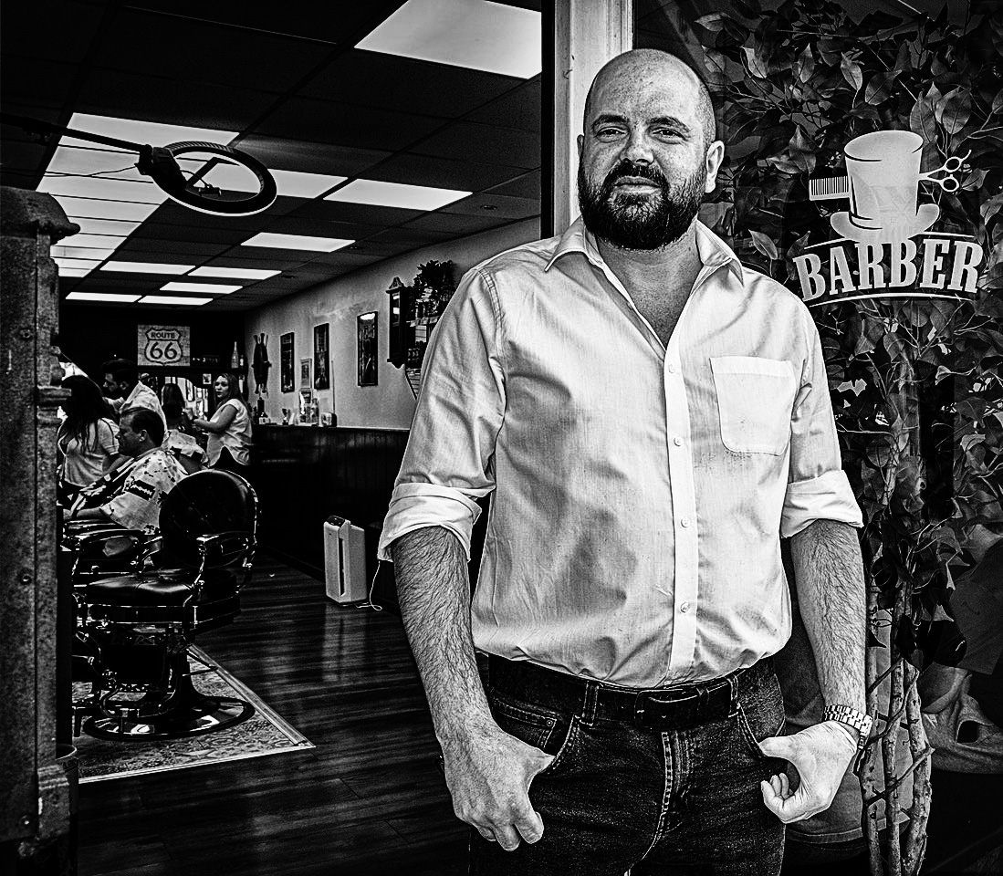
Peter, an "ad" as Barbara says perhaps, but I do not like this as a portrait. To me, he looks ill-at-ease, a little lost - due to the amount of action behind him and the strength of the ceiling lights: the man is not the first thing I see, nor the last.
My approach would be to darken the outside, lower the brightness of the lights (less than the shirt), and dodge the Barber sign and his glove, all with more contrast to sort of toughen him up. It may not be authentic, but I think it adds interest.
|
Jun 19th |
 |
| 99 |
Jun 24 |
Comment |
Compared to Blossfeldt's work that I can see on-line, I think your subject avoids his preference for symmetry and represents life as it is found.
Thank you for mentioning "Helicon Focus", I will wait until I have a little time to allocate and then download the free trial.
For my preference, I think there is some detail lost in the darkness of the image - was there more before processing? |
Jun 19th |
5 comments - 0 replies for Group 99
|
6 comments - 0 replies Total
|


