|
| Group |
Round |
C/R |
Comment |
Date |
Image |
| 79 |
May 24 |
Comment |
Mariann
For my taste, I prefer the B&W, and I would settle for half-way between your two which I think would balance between "calming" and "making an impact".
If I may ... I am sad because I cannot use your images to play with. I can load into photoshop but I cannot then use Nik software (it says "unavailable"). I do not understand - but I do notice that your file extensions come out as .jpeg and when I save my work in photoshop (File -> Save a Copy) I select the JPEG option but it comes out with .jpg extension ... so perhaps you are saving another way (?). |
May 17th |
| 79 |
May 24 |
Reply |
I think the ladybug flew away |
May 4th |
| 79 |
May 24 |
Reply |
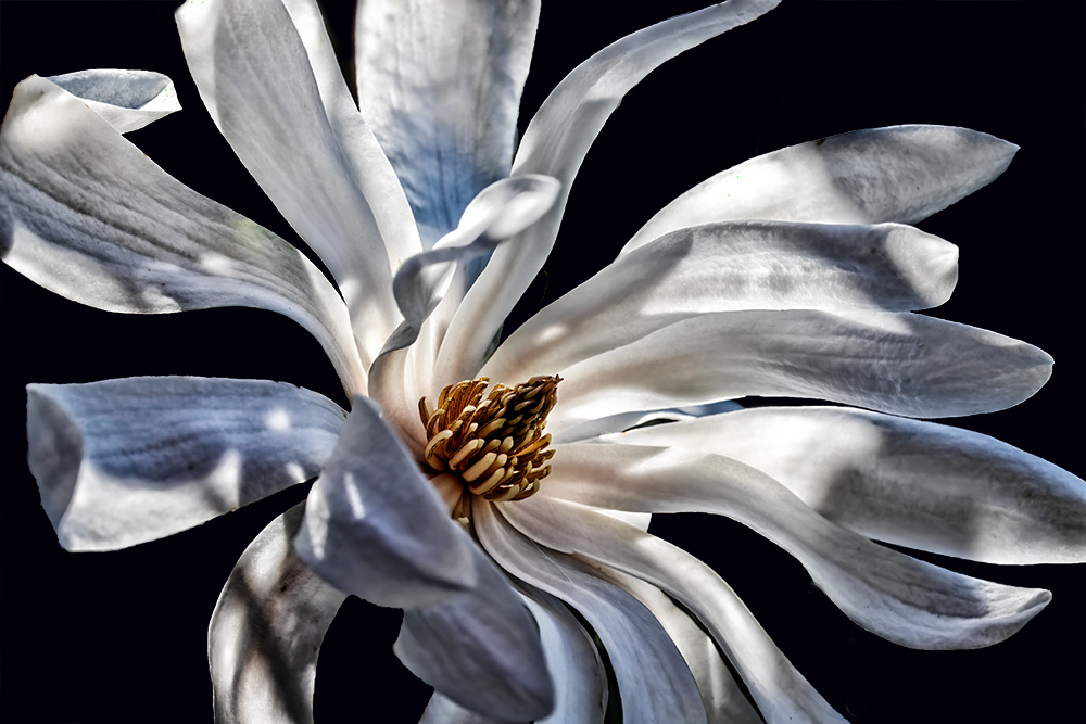
Or - what if I addressed the distractions thus - do you all think a black background works?
(Hoping to submit to a competitions so all opinions requested) |
May 2nd |
 |
| 79 |
May 24 |
Reply |
Um ... do you mean like this? Or closer? |
May 2nd |
 |
| 79 |
May 24 |
Reply |
Were it not for the black background of the web site - I would suggest no border at all; our site, however, does make a thin white border useful for display here ... but I would suggest that would be the only reason to add one at all. |
May 2nd |
| 79 |
May 24 |
Comment |
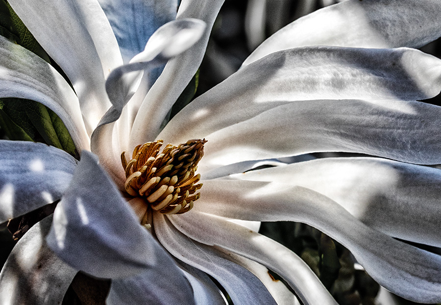
Freddie
I do not think goofy at all - it looks to me like a detail from Monet's huge installation of Water Lilies at the MoMA in NYC. You could probably sell it as a postcard in the gift shop and drive everyone crazy as they try to find it within the canvases.
So - I love it. The one suggestion I would make is to mute the hot spot at the top (just left of center) because I think that would bring the focus back to the white/light spots near the center, keeping the eye within the frame.
|
May 2nd |
| 79 |
May 24 |
Comment |
Karl, I think this composite is clever, original and effective ... and wow,. those solar flares around the outside are really amazing. A great capture. Who knew life on a farm could be so exciting!!
|
May 2nd |
| 79 |
May 24 |
Comment |
Peter
The ripples of the water seem to me to render this scene as an Impressionist painting - and this effect I think was enhanced by the lightening of the greens. I particularly like the overall gradation of light from the top to the bottom. Rather beautiful |
May 2nd |
| 79 |
May 24 |
Comment |
Judith
for me, the colors are beautiful - with a gentle amount of saturation (I am always tempted to add too much :-) ); in some parts it reminds me of a mosaic. Very well spotted.
I am not sure that the "tearing" of the border marries with the subject. |
May 2nd |
5 comments - 4 replies for Group 79
|
| 99 |
May 24 |
Comment |
Barbara - I think it is a lovely and the background does worth well with your smooth tonality. The leaves look like fans
My one suggestion is that bright leaf at the bottom (as Peter points out) is distracting. I removed the brightness in camera raw with a radial filter, but I still think it too "here am I" and so I concur with his suggestion to consider a crop.. |
May 17th |
 |
| 99 |
May 24 |
Comment |
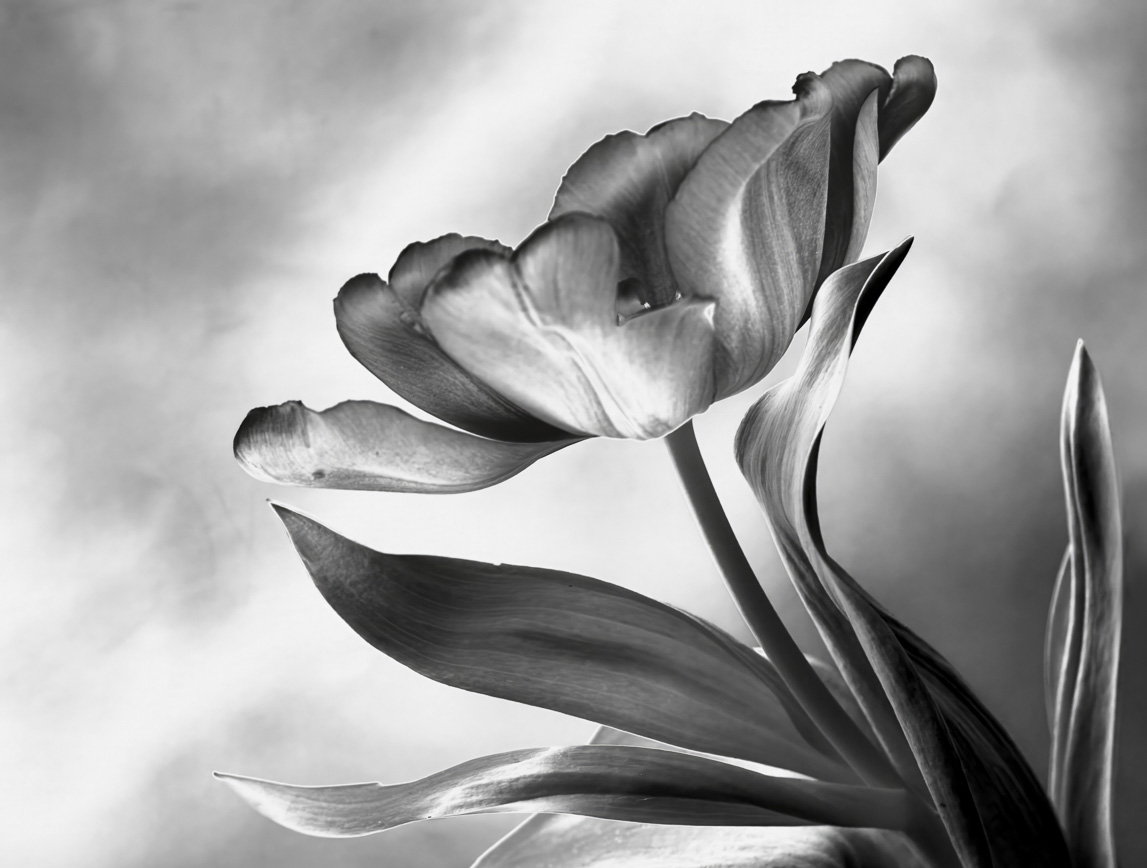
John
I like the image as is : for me the "construction" adds to an old-fashioned look that matches the processing decisions you made in the B&W conversion. I think for perfection (and obviously not here) I would put the text alone into red. |
May 17th |
| 99 |
May 24 |
Reply |
Peter, thanks for your thoughts which made me realize that I had made a mistake this month in that I forgot to send in my camera settings (the 2.8 is the lens minimum)
The image is shot with f/10 1/400 iso 320
The flower is incredibly smooth in tone in nature and so I think this is giving the impression of being outside the depth of field because there are no micro features on its surface. |
May 8th |
| 99 |
May 24 |
Comment |
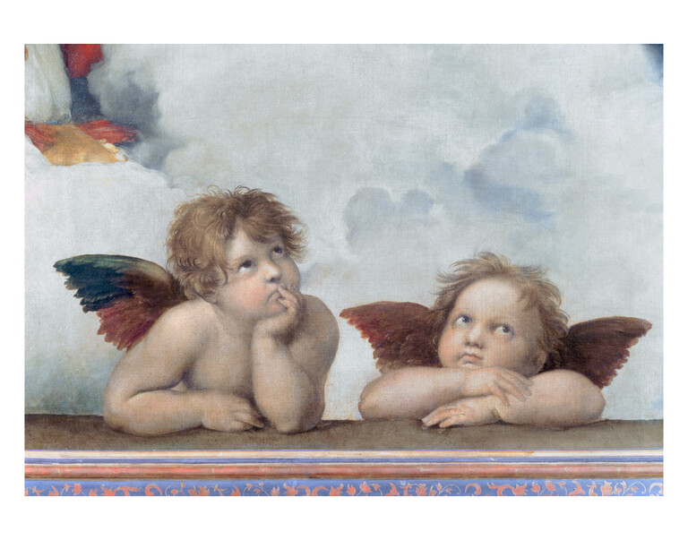
Reminds me of a Raphael ... |
May 5th |
 |
| 99 |
May 24 |
Comment |
Kathleen, I also like the backs of the chairs and think it a useful way of minimizing the distraction ofthe people that would have resulted from a straight shot down the center isle. For me the bands of horizontal lines are a contrast with the vertical pillars, and their perspective contraction towards the vanishing point acts as an arrow guiding the eye into the alter.
I think the tonality is perfect for this subject: sombre and resonant with age. |
May 2nd |
| 99 |
May 24 |
Comment |
Peter
lovely pair of subjects - nicely captured. I see this as immediately captivating.
I am unsure as to the crop since I feel that the portraits deserve more of the real-estate. In a slightly geekie vein, I also drew in from the left since I think pushing the girl beyond the 1/3 line adds a tension (removes your balance) to go along with your theme. |
May 2nd |
 |
5 comments - 1 reply for Group 99
|
10 comments - 5 replies Total
|


