|
| Group |
Round |
C/R |
Comment |
Date |
Image |
| 79 |
Apr 24 |
Reply |
Peter, It is in tiff - in case that makes a difference for you. |
Apr 17th |
| 79 |
Apr 24 |
Comment |
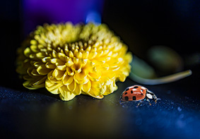
Mariann
Blue, yellow and an accent of red: I think the lady bug addition was key to making this image pop: it stands out so much more for its color than its small size.
Because I particularly like the size contrast between the flower an the bug, I would suggest a tighter crop which isolates the two elements more and puts the bug exactly in intersecting lines of thirds |
Apr 17th |
 |
| 79 |
Apr 24 |
Comment |
Peter
I think that color on mono gives many opportunities.
As created, I agree with Karl that the birds are a counter point to the color of life.
But I am a glass half full sort of guy and I wonder if there might be more hope if the birds were flying in the other direction (?)
|
Apr 17th |
| 79 |
Apr 24 |
Comment |
Judith
I am going with the macro interpretation rather than seeking the micro features.
I see your title of "evolution" - and a career in virology - so I am going with the "spark of life" interpretation. What I see therefore is the primordial soup with the arrival of an energy spark, et voila: pizza, taxes and armadillos.
|
Apr 17th |
| 79 |
Apr 24 |
Comment |
ALL - thank you for. your comments: the feedback helps me greatly in that it gives me confidence to continue with this approach of background color adjustment (which had been inspired by a little book on color theory). I was uncertain. |
Apr 17th |
| 79 |
Apr 24 |
Comment |
Freddie
I love how you provide such interesting originals for us to play with.
To my taste you went a little too far with the muting of the color. I love the languid nature of the background (texture?) and understand the desire to highlight that over the color contrast - but I do think that there is a lot of wealth in the colors in the original.
In my game I created one version in Nik Silver (B&W) and one in Nik Color - and merged the color of the latter onto the former at only 30%. |
Apr 2nd |
 |
| 79 |
Apr 24 |
Comment |
I think this is an amazing capture which must have taken so much patience :-)
The focus was good - was that the high shutter speed or were you also tracking the subject?
Personally I would have gone with a 16:9 crop - with the owl in the top of the right half which for me leaves a stronger impression of speed. |
Apr 2nd |
| 79 |
Apr 24 |
Comment |
An excellent composite - and I like the overhead pose giving a strong sense of mystery (or mysticism). Particularly impressed by the handling of the fingers in the merging.
Only thought is that you might make the face/body in the center brighter both to imply an energy and to account for the lighting on the model.
|
Apr 2nd |
7 comments - 1 reply for Group 79
|
| 99 |
Apr 24 |
Comment |
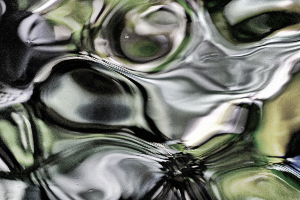
Gary
Great to have you into the group - especially as you and I have much in common (I retired from Intel last month :-) )
I think the image is a complex combination of micro and macro structure: the details of the small lines and features are themselves interesting but I think there needs to be a clearer macro structure to guide the viewer - which I seek by a closer crop. The snake motif is a good idea, though I confess that I a not seeing it myself (?). However, by suggestion is below. |
Apr 16th |
 |
| 99 |
Apr 24 |
Comment |
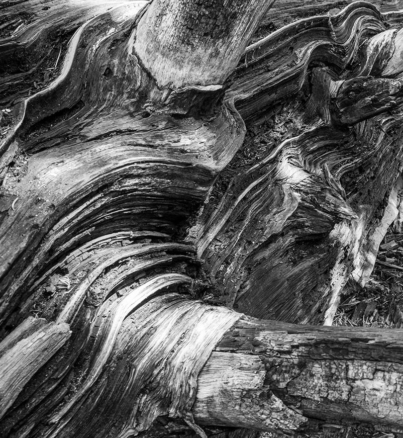
Kathleen
The strong diagonal makes this composition for me. I actually tried several orientations and decided that I liked yours the best with the "sweep" of the leaves from the left side rising up to the corner on the right.
The texture reminded me of an alien's skin from some scary sci-fi movie.
I do feel though that you would have a better shot with sharper focus and I would suggest using f 8 or more even if that needs a higher ISO number to keep the shutter speed to avoid camera shake. |
Apr 16th |
| 99 |
Apr 24 |
Comment |
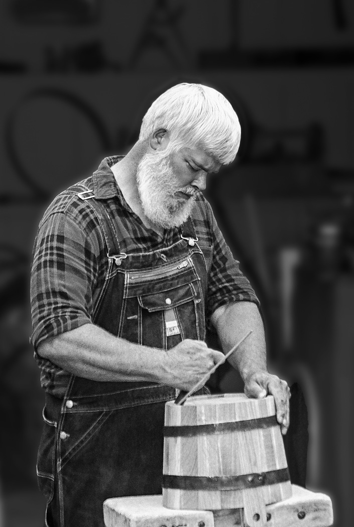
John
For me the image resonates with the concentration of the subject, caught in the midst of his work.
I concur that the background needs to be darkened since it distracts me at the moment, but not in my view as black as Linda since I like a little noise to bring the subject out of the studio.
In the following, I selected the subject and then separately applied contrast to the subject and curves to its inverse. I also found a white halo around the head which I removed by selecting the inverse of the subject and used the clone stamp in darken mode. |
Apr 16th |
 |
| 99 |
Apr 24 |
Comment |
Linda,
Seldom does an image impart to me such a strong sense of place; I am not sure it is real :-) but it is consuming and a fantasy I would like to live.
I am particularly struck by the way you have brought detail out from the shadows: a significant transformation from the original.
I like the crop as is. For me it provides context and so (again) that "sense of place". Technically, I see that many aspects are aligned with the grid of thirds, and I think it works. |
Apr 16th |
| 99 |
Apr 24 |
Comment |
Peter - I think it is a great image. For me the model is intriguing because she looks like she should be a model, but not in those pants and shoes: the girl is taking the day off, but she still has her hair and jewelry.
I feel that the compositional strength is in the balance of the two coats, especially in their placement up/down left/right. For that reason I would lose the left side upto the window frame (keeping that as the edge) because this would emphasize this aspect.
|
Apr 16th |
| 99 |
Apr 24 |
Comment |
Barbara, gentle and subtle - I see that you kept the tonal variation within a small, centered range and this for me affords a tranquility to the image.
I like the thin white border for but not the inner black one which I feel causes the leaf to end abruptly before the frame. |
Apr 16th |
6 comments - 0 replies for Group 99
|
13 comments - 1 reply Total
|


