|
| Group |
Round |
C/R |
Comment |
Date |
Image |
| 79 |
Dec 23 |
Comment |
Lauren
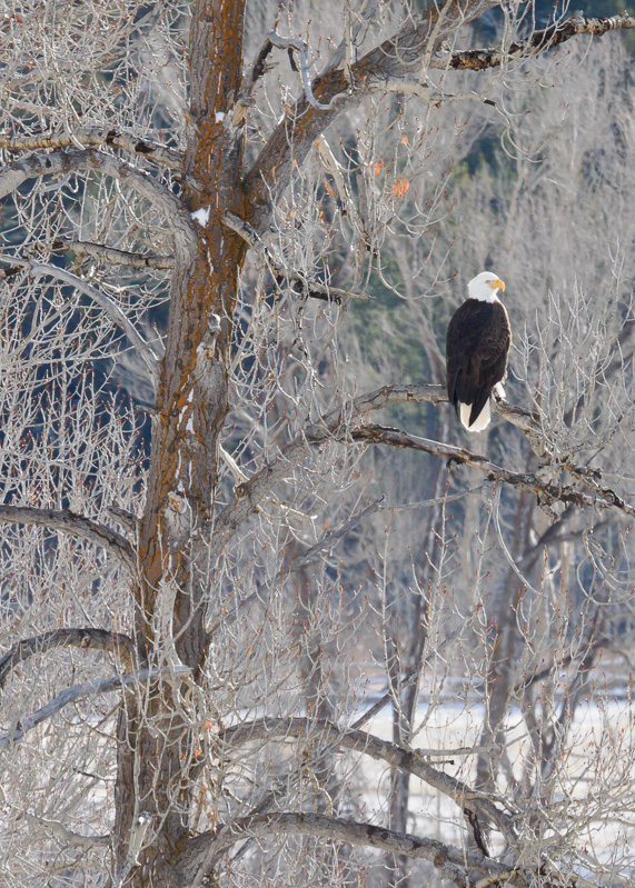
What strikes me first is the crispness of the weather - that comes across so well in the image. The eagle too is a great element which I think is made unusually effective by the white vertical line of its chest feathers seen on the right.
My wonder if the composition would be stronger without the right half of the image. For me this might focus the attention on the bird with the tree as frame, while retaining the foreground were the focus is sharp. |
Dec 16th |
 |
| 79 |
Dec 23 |
Comment |
Mariann
kudos in the handing of the light - I find it so hard myself to achieve the contrast that you did and to not blow some of the areas
I am tempted to take out the right hand trunk - which would center the sun - but then it becomes more like a visitation (spiritual or alien) than the joy of a beautiful dawn: perhaps a book cover. |
Dec 16th |
| 79 |
Dec 23 |
Comment |
Peter
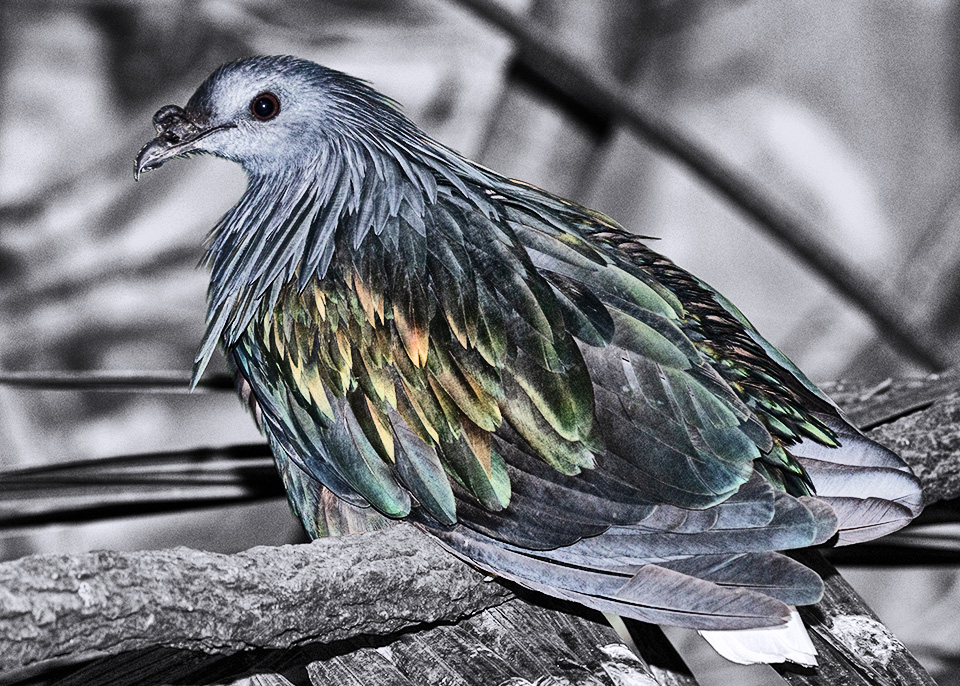
I think this is very well captured in both composition and focus, especially for so skittish a subject. The highlight for me is the color of the feathers.
Backgrounds in nature are often distracting but I a not put off that in your original image. I would suggest that the branch parallel to the bird's back in particular acts as a useful frame, and my instinct would be to retain it but to de-emphasize in by reducing or removing the saturation within it. |
Dec 16th |
 |
| 79 |
Dec 23 |
Reply |
Thank you - I like the orientation - but I still prefer the other details for context |
Dec 12th |
| 79 |
Dec 23 |
Comment |
If anyone would like to see another of my experiments - please look at Group 99 where I slightly bent the rules for a B&W forum :-) |
Dec 2nd |
| 79 |
Dec 23 |
Comment |
Karl - I think this is a delightful combination of elements - and happy holidays to you. I like the bright colors of the paper in contrast to the subdued sides of the box - and the combination of the fireworks seems faultless.
My one suggestion would be to reduce the opacity of text so that the texture of the box paper may seep through. |
Dec 2nd |
| 79 |
Dec 23 |
Comment |
Freddie - the tile of the head is masterful especially because the eyes are now looking straight down. Humility? Well actually I see resignation - but that is for me powerfully conveyed. The distortion screams "Mannerist" to me.
I wonder if a single tear would add? |
Dec 2nd |
| 79 |
Dec 23 |
Comment |
Judith
I love the image - the apparent texture in the white "swooshes" in particular - and I applaud the isolation of just two elements. The background color is I think beautiful and lends to the softness of the main elements.
I see jellyfish not dancers - but each to their own. |
Dec 2nd |
7 comments - 1 reply for Group 79
|
| 99 |
Dec 23 |
Comment |
ALL - I appreciate the comments on the B&W and particularly the gentle advice to stay with that rather than the added color. The feedback is very welcome. |
Dec 16th |
| 99 |
Dec 23 |
Comment |
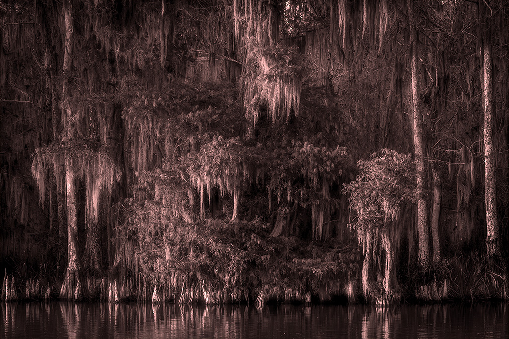
Linda
Beautiful
Actually I think magical
I see a circular grove in the lower center with a light chandelier above it and an Ent on either side.
Lovely lighting on the tree trunks especially.
Perhaps a filter (for example: #CC6633 50%)
|
Dec 16th |
 |
| 99 |
Dec 23 |
Comment |
John - I think this is a well-seen pattern and works well for B&W with the color differences translating into different tones.
My suggestion would be to cut the right and left slightly to avoid the imprecise verticals there.
I agree with Linda: I think a different angle might replace symmetry with contrast (in direction) though I have added a background rather than cropping. |
Dec 16th |
 |
| 99 |
Dec 23 |
Reply |
Thanks for the comparison �� I am not worthy |
Dec 2nd |
| 99 |
Dec 23 |
Comment |
Tom
I understand the impulse - and that it is part of an established genre (e.g. Duchamp's Urinal 1917) - but I have never been able to embrace it. Exhibiting the mundane is no longer as subversive as it once was.
However, I do think that there is interest in this image beyond its subject - and I see that in the light-play ln the back wall. In your version it is subtle - I have been more heavy handed. |
Dec 2nd |
 |
| 99 |
Dec 23 |
Comment |
Kathleen
Indeed, I do.
For the inclusion of the overhang is fascinating as it defines, with the road, a triangle of framing which is complemented by both the parallel line of the hill behind and the decreasing height of the ships and the quay in the center. You have lightened the underside of the overhang in such a way as to my eyes that is has become a feature in its own right within the image - it reminds me of a flying saucer.
I would lose the small sliver of the vertical post on the far right. |
Dec 2nd |
| 99 |
Dec 23 |
Comment |
Peter
I think this extremely effective and certainly brave to attempt "in camera" rather than taking two images. It worked.
I struggled to understand why it works - and I think it lies in the co-existence of two simultaneous vanishing points which cause my eyes to run first to the centre of the image (the circle of one exposure) and then they are forced dramatically upwards into the sky (following the other exposure). This gives me the feeling of being flung.
|
Dec 2nd |
| 99 |
Dec 23 |
Comment |
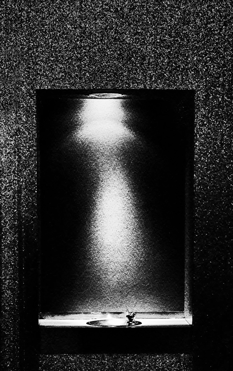
Barbara
Nicely isolated cone, looking good in my opinion in the muted tones you selected. For me the vignetting is particularly effective as it seems to make the light background around the code appear as a sort of "pop" or "flash": it creates a motion for the cone emerging from the image. |
Dec 2nd |
| 99 |
Dec 23 |
Comment |
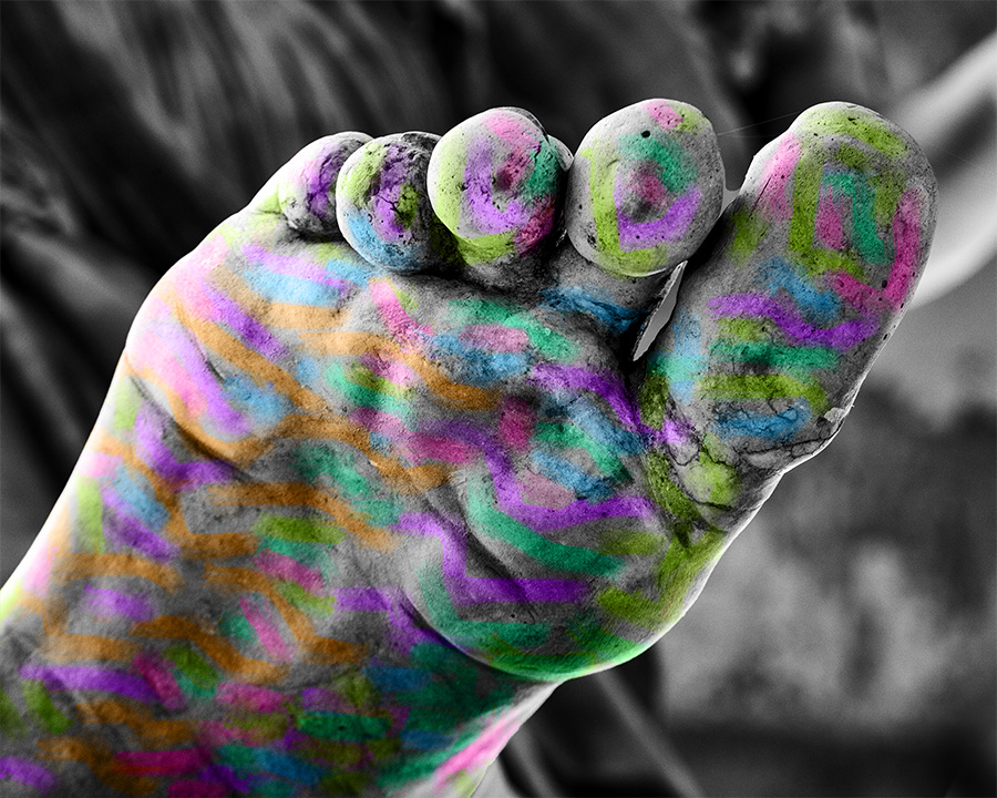
I hope you do not mind my "bending" the rules a little. - but I would like to ask your opinion on some work I have been doing recently. I read a book on ART in the 1910s where there emerged various movements which, to my mind, added color without any regard for realism (e.g. Matisse, Fauvism). I have been experimenting with some of this (see Group 79 Nov - Dec) and when I posted this foot here I decided to use it as a sort of canvas for simply adding - well - color.
There is a theory behind the six colors I used: they all have some permutation of the code numbers 50 150 200.
Anyhow - my request of the group is to consider:
does this "colored B&W" approach enhance my image or is it merely gratuitous noise? |
Dec 2nd |
 |
8 comments - 1 reply for Group 99
|
15 comments - 2 replies Total
|


