|
| Group |
Round |
C/R |
Comment |
Date |
Image |
| 79 |
Oct 23 |
Reply |
not sure if it is because I am happy with it - or because I am stuck - but my work flow is pretty consistent: I subdue highlights and shadows in raw, use Nik to create a B&W with the degree of contrast I like, and then Nik again to perform color contrast enhancement, and finally in photoshop I merge the color layer "as color" on top of the B&W - and potentially dial the color back a little (using % opacity).
I was told that one should develop a consistent and recognizable style ... so perhaps this consistency is leading to that.
|
Oct 13th |
| 79 |
Oct 23 |
Comment |
Lauren
This seems a nice sharp image; this auto-photostacking is a nice feature.
For me the patterning on the leaves is the first draw, and then the dark, star-like structure of the flower seems to assert itself.
As to your question: I would definitely leave the space. That emptiness for me accentuates the initial diagonal. If anything I would shave off some bottom and right foliage which could "add" to the relative size of the space and bring the large leaves forward. |
Oct 13th |
| 79 |
Oct 23 |
Comment |
Karl, certainly fun! The expressions make it for me: they make it seem to me as though the hidden guy is conversing with the "plant" and the others are thinking him crazy. What was he drinking? |
Oct 13th |
| 79 |
Oct 23 |
Comment |
Mariann
For me the most effective aspect is the interplay of the reed's silhouette against the moon's reflection in the water. Coupled with the illuminated clouds, this seems to impart an air of tranquility.
I am puzzled by which object you identify as Saturn. In the night sky, Saturn is never more that the size of a star to the naked eye/lens and is not even as bright as many. The sphere above the moon is, I think, either a reflection of the moon on the lens or an artifact of AI extending the border. |
Oct 13th |
| 79 |
Oct 23 |
Comment |
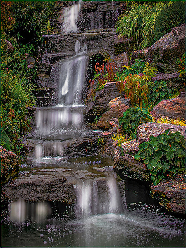
Peter,
In my view, the balance of luminosity is well chosen, and I like the cascade of motion blurred water especially as it forks at the base.
I wonder if some of the grasses are a little yellowed in post?
Below I have flipped your image - because I think this somehow makes the base rock more prominent. |
Oct 13th |
 |
| 79 |
Oct 23 |
Comment |
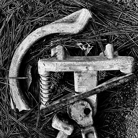
Judith - love the idea of exploiting the found objects this way - I wish my camera would fit in my pocket (but the SLR is now old and seems too big).
The image seems nicely sharp to me, especially around the spring which seems to draw my eye due I think to the framing / pointing of the shapes around it. I also agree with the orientation and the switch to B&W which seems to work well with this image that relies so strongly on shape/form.
I attach an image of my own not because I prefer my processing but only to suggest that the straw outside the shape might be usefully retained because it parallels the curves of the "part". |
Oct 6th |
 |
5 comments - 1 reply for Group 79
|
| 99 |
Oct 23 |
Reply |
https://www.glasgowgalleryofphotography.com/abstract-2024
interesting "test" - free to enter - you pay if you exhibit - closing date 13th |
Oct 9th |
| 99 |
Oct 23 |
Comment |
Tom,
oh - I spy a spider
I think the darkness of the tree (and its reflection) is the key to this image - which is another way of saying that I like the relative lightness of the grass behind: the contrast between subject and background is everything. Beyond that, I also see a contrast in "form" in that the tree is all sharp, violent lines compared to the smooth, gentle lines of the remainder - nicely chosen shot I think.
|
Oct 6th |
| 99 |
Oct 23 |
Comment |
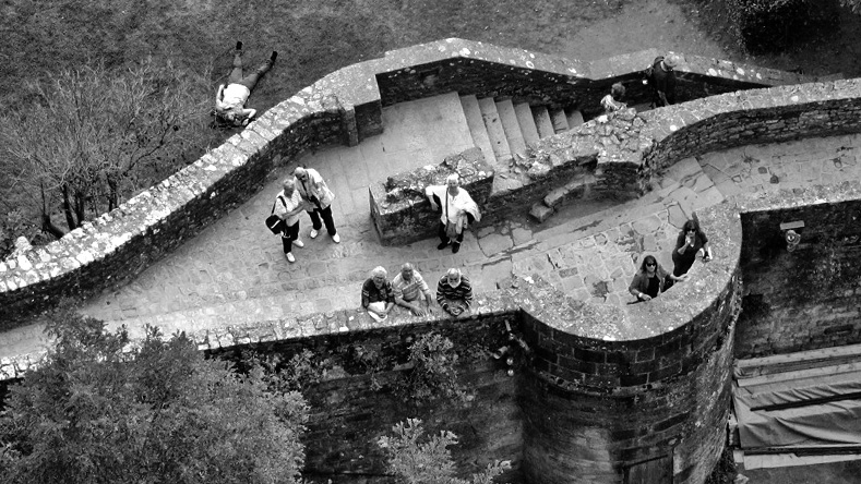
Kathleen,
I agree that the shape and grouping make for an interesting image and I think the patterning on the stone (on the side of the tower) have come out very strongly in your processing.
My one suggestion would be a wider crop - since I think the shape of the pathway could be bear further exposure without detracting from the interest in the people. |
Oct 6th |
 |
| 99 |
Oct 23 |
Comment |
Linda,
Kudos for capturing such a clear sharp image in a "live" environment - heck you can even see his braces! For me the image shouts the pleasure in his performance.
I like the square format. I think I would have moved him and the mike over a little to the right. |
Oct 6th |
| 99 |
Oct 23 |
Comment |
Peter
I am sorry but I feel that we have talked often enough for me to say ... that I do not get this at all. For me the image is so indistinct that it is already disassociated from reality and I see nothing remaining (in terms of form or shape or texture or whatever) that recommends the image to me.
However, abstracts have always been a puzzle to me - I think my few success have been luck rather than understanding - so this is just one fool's opinion. |
Oct 6th |
| 99 |
Oct 23 |
Comment |
Barbara
Lovely soft and fluid petals - so well extracted from the background (how do you do it?). As a B&W I think you have achieved a very good range of tone within the subject and this makes the image seem fresh and vibrant to me. The top left is in shadow compared to the rest and I think this really helps establish that total contrast.
My only suggestion would be to clone out the leaves from the base of the stem. |
Oct 6th |
5 comments - 1 reply for Group 99
|
10 comments - 2 replies Total
|


