|
| Group |
Round |
C/R |
Comment |
Date |
Image |
| 79 |
Aug 23 |
Reply |
My approach would be to use a B&W conversion (silver Efex) and then to blend it in photoshop with the original color. |
Aug 16th |
 |
| 79 |
Aug 23 |
Comment |
Karl - in my view a very successful combination of images with the bright spots (sources?) becoming moon craters.
As to the narrative - that is dark. Personally I would push the other way and retitle it as : NASA celebrating the 4th of July - because I think this is a very striking and beautiful picture. |
Aug 14th |
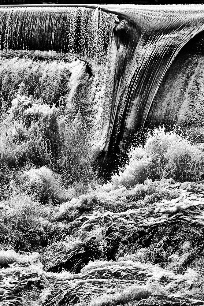
| 79 |
Aug 23 |
Comment |
Peter - a stunning image - particularly for me the detail in the water droplets and the small amount of "other" color in the center.
|
Aug 14th |
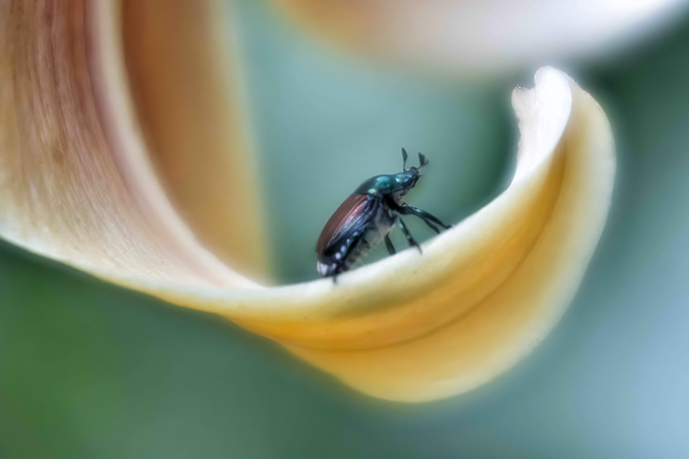
| 79 |
Aug 23 |
Comment |
Judith, the curve of the flower is so gentle. For me the contrast between the softness of the petal and the hardness of the shell (emphasized by the color difference also) makes this special.
My suggestion would be to include more of the petal - so that its sweep is included from the left. This also makes the beetle a little smaller which (with Topaz) seems to make it a little sharper to my eyes. |
Aug 14th |
 |
| 79 |
Aug 23 |
Reply |
well - B&W does indeed seem to offer many possibilities (though it tempts me to even higher contrast - sorry Judith)
I think the color is actually "mud" with the excessive flood stirring up the river bed. |
Aug 14th |
 |
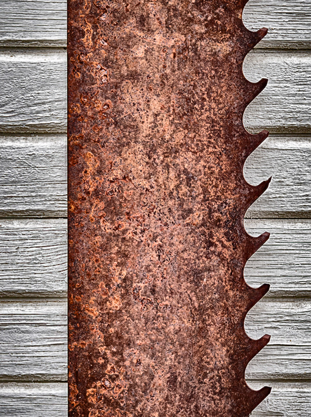
| 79 |
Aug 23 |
Comment |
Lauren
I think this is an excellent subject - and the sharpness brings it out. For me the strength is in the contrasts: straight edge vs waves, horizontal lines in the wood vs smooth in the metal.
One suggestion would be to use a perspective warp (in photoshop) to make the left edge of the saw precisely vertical. |
Aug 14th |
| 79 |
Aug 23 |
Reply |
indeed, an interesting twist |
Aug 5th |
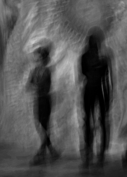
| 79 |
Aug 23 |
Comment |
What strikes me most is that the original image is so rich in possibilities for post-processing - I spent ages playing with color adjustments for my personal satisfaction.
In your image, I appreciate the contrast between the two subject. It seems to me that the right figure has become stark, linear, and yes sinister as I think you intended; whereas the left figure has retained a humanity.
Since my colors are ... not your colors ... I avoid any in the image below in making one suggestion: I think that your narrative would be helped if you left a little more space on the left which for me increases the impression of motion (by offering a space to move into). |
Aug 4th |
 |
5 comments - 3 replies for Group 79
|
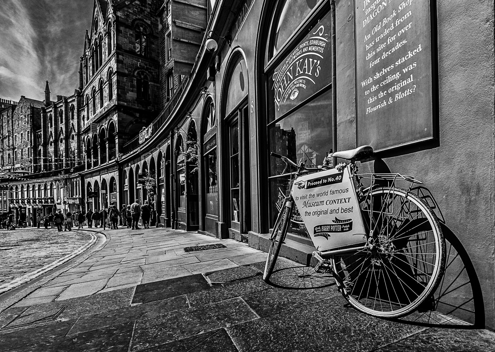
| 83 |
Aug 23 |
Comment |
Don, I think this is a marvelous composition - and the clarity is truly striking.
For conversions I tend to used Nik software (Silver Efex Pro) because, having selected a few favorite effects, one can jump through various options - pick a "best" and then further refine it with the sliders and film selection on the right.
Having once lived in Edinburgh for ten years, I was really surprised to read that you found a "sunny day", perhaps the weather has changes since I left.
I offer my own processing rendition for your interest - a closer crop and more contrast in the sky. |
Aug 16th |
 |
1 comment - 0 replies for Group 83
|
| 99 |
Aug 23 |
Comment |
Denice
A lovely and personal composition. I like the slight variation in the background.
Love the work
I do think that there is more "information" in the flower which seems to me to be a little too bright compared to the more muted tones of the leaves - and so I would suggest a little change which I think adds to its texture |
Aug 12th |
 |
| 99 |
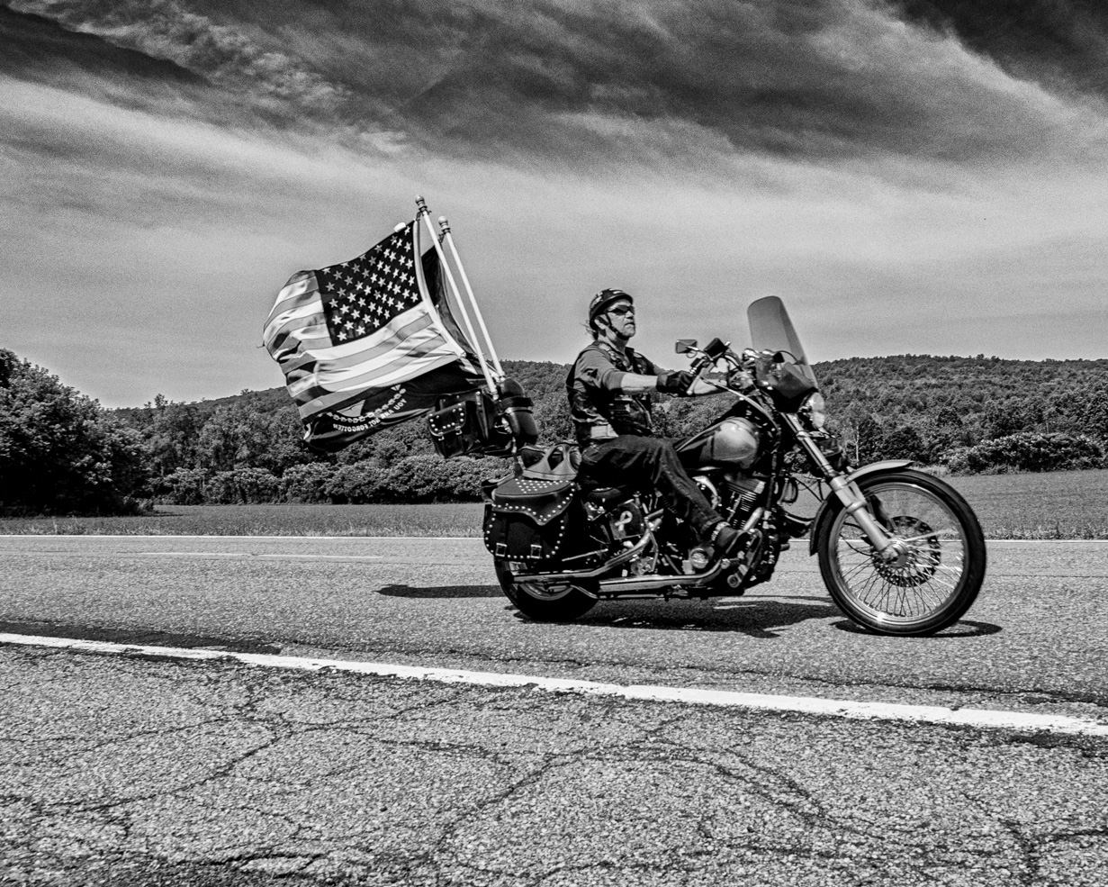
Aug 23 |
Comment |
Tom
Great shot, great sky. I particularly like the angle with the emphasis on the (hard) road. For me the post-processing is just about perfect, with the level of contrast seeming to match the subject so well. Well focused, including the moving flag.
Were you on the ride - or just enjoying the spectacle?
I think shaving a little off the right could provide a greater sense of motion (passing through) |
Aug 4th |
 |
| 99 |
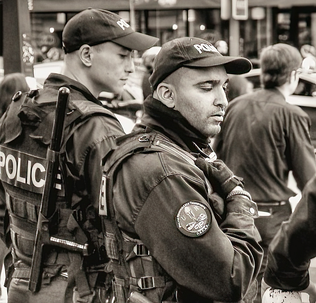
Aug 23 |
Comment |
Kathleen
Nicely cut and processed. I like the way your have lightened the uniform.
I am struck by a contrast between the violence of the weaponry and the relaxed tranquility of the subjects face with his closed eyes.
To the question of sharpness. As a general rule, I react to the softness in your image by associating it with old magazines - perhaps TV shots form the 60s and 70s; which is not, in my view, a bad thing, just a style. I suppose lens have now become so sharp that I expect that - but finding something different can be good.
In fact, I "reviewed" your image before reading your wording and had already prepared the image below to share. Unbiased by the question, I wanted to suggest that the front guy it too good looking for soft focus and so I passed him though Topaz sharpener (leaving the rest as-is). |
Aug 4th |
 |
| 99 |
Aug 23 |
Comment |
Linda
I think the post-processing has really added to this image. I love the way the wood planks in the wood become stripes of light/dark, and your leading with the tree (the flip) makes it so much stronger - other than being overshadowed after the tree.
I actually think that your brightening of the barn has made it a little spooky. |
Aug 4th |
| 99 |
Aug 23 |
Comment |
Peter,
For me the person adds interest more than depth - and I like their inclusion; it must have been hard to anticipate exactly when to take the shot. The B&W conversion has to my eyes made the wooden stakes and the human dominate the scene (where-as the sand vs sea color seems to fill the color).
In my vision, even for this competition, I would cut off the left third, think that less might here be more. |
Aug 4th |
| 99 |
Aug 23 |
Comment |
Barbara, a worthy egg indeed. The inclusion of a reflexion seems to meet add an extra dimension. The bright light source seems to me to create a sharp delineation between the light and dark side of the shell.
My concern is the focus, because the reflected egg is further away than the original one. I think (but am not sure) that increasing the brightness of the flash - perhaps by bringing it closer - would allow you to raise the f number and so increase the depth of field.
|
Aug 4th |
6 comments - 0 replies for Group 99
|
12 comments - 3 replies Total
|


