|
| Group |
Round |
C/R |
Comment |
Date |
Image |
| 79 |
Jul 23 |
Comment |
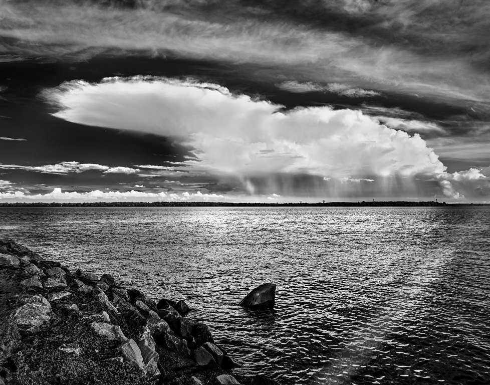
Karl - firstly - a good image especially the IR effects on the sky. The silhouettes of the trees on the horizon are tiny, but magnets for my eyes. For me it all comes across as somber, almost foreboding.
I was reminded of a course I once took (bare with me here) in which the example image was a bridge whose side was littered with spot reflections of light dancing off the river at night ... or at least that is what it seemed. It was revealed that they were all added in post - using radial gradient filters in camera raw.
This thought process made me wonder about your image - and for experimentation (discussion) only, I added three, each with a different intent: 1) to the "fin" giving a little more surface detail, 2) a horizontal strip of light in the sea close to the horizon to add brightness/variation in the water, and 3) an angled strip on the right hoping to complete a "triangle".
|
Jul 15th |
 |
| 79 |
Jul 23 |
Comment |
Chagall on acid was my first impression - and I thought glass rather than water. I do love the effects that post-processing affords for color though your starting point seems to me to be particularly rich.
I have a personal debate as to how far one is "allowed" to stray from the original in color manipulation but I have come to the conclusion that "fine art" in general, and "abstract" in particular, gives the maker free licence to explore, with the outcome being the goal rather than being tethered to veracity. Does anyone disagree?
In your image, I think that the organizing principle of three parallel strips is very effective in providing a structure, so that the viewer is not left with "just" color patches: it helps my appreciation. |
Jul 15th |
| 79 |
Jul 23 |
Comment |
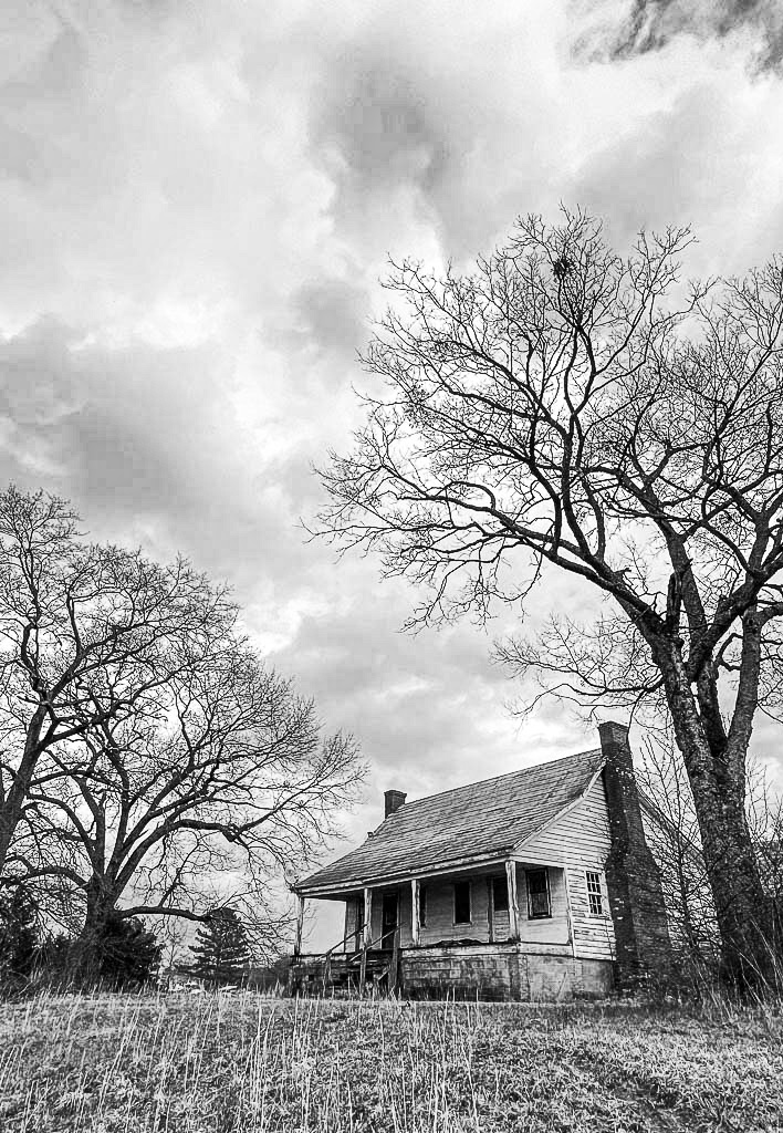
Liz, I have been having trouble with landscapes this year - this image reminds me of the value of a simple subject with natural framing: a very good example. For me the perspective is not a problem - it gives the impression that you were lower than the subject, shooting up-hill, and leads to a narrative of spookiness since the house seems more imposing that it naturally should be.
My cut would be slightly different for two reasons: 1) more grass adds to the idea of being below the subject, 2) the dark patch in the sky in the top right seems to break up the clouds and adds to the "framing".
|
Jul 15th |
 |
| 79 |
Jul 23 |
Comment |
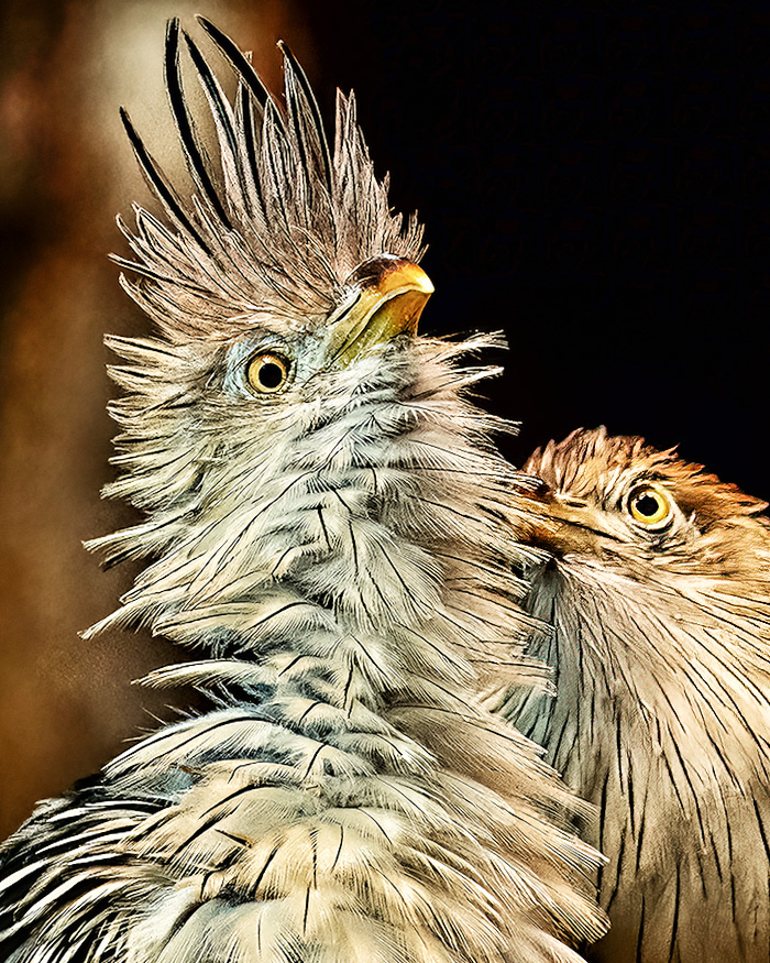
Peter
As always it is a matter of taste, but I prefer the original because the feather detail on the larger bird is so impressive there (a great shot - I see the high ISO gave you the speed) and specifically the head feathers are retained.
My approach would be to perform selective sharpening on the smaller bird and to retain the light areas of the background so that they show off the head feathers. Obviously this ends up will a different color treatment than yours - but I think it might be a good starting point for applying that vision. |
Jul 15th |
 |
| 79 |
Jul 23 |
Comment |
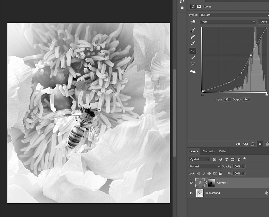
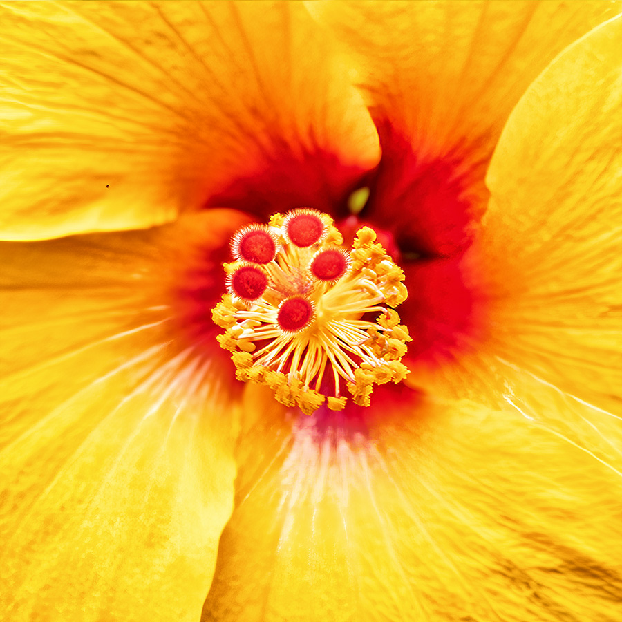
Judith, I appreciate the textural contrast in the image between the center and the surround of the flower: for me the bee adds interest, but more as a further contrast rather than as the main subject (in part because the background is noisy for the single subject). My instinct would be to embrace the textural variation and to add emphasis to it by bringing out the flower's center.
Below is one possible approach - I have added contrast with a gradient filter ( though projecting the bee) with a curve layer on your original B&W. |
Jul 15th |
 |
| 79 |
Jul 23 |
Comment |
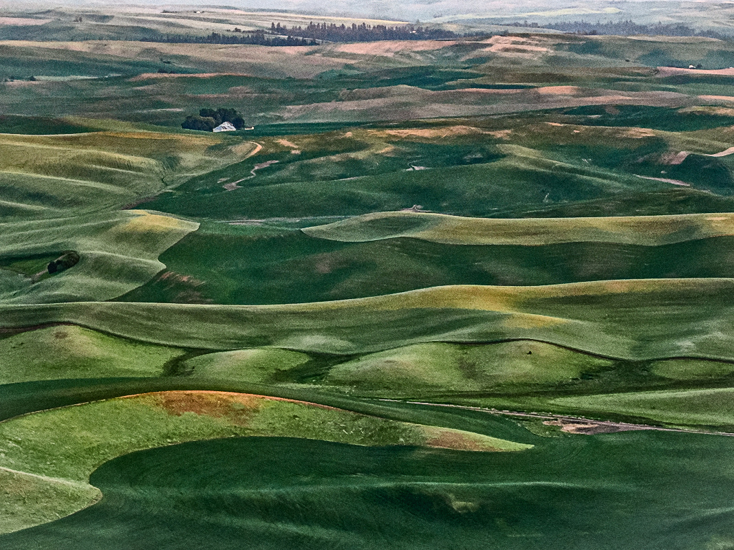
Lauren
For me the image is a striking as a sort of impressionist landscape. The color and tonal waves in the hills are stunning, and that one small building (I think) is so well placed in the frame.
One processing approach you might like to experiment with is to use Nik silver to create a B&W that hightens the tonal variation - and then to use the color layer as an overlay for just "color".
|
Jul 4th |
 |
| 79 |
Jul 23 |
Reply |
Is this more to your taste? |
Jul 2nd |
 |
| 79 |
Jul 23 |
Reply |
Peter thank you for the suggestions. I actually went, tripod in hand to capture a large depth of field. However this central part of the flower is over an inch pointing straight at me and I decided to go the other way and to capture only the tip. A deliberate choice for this shot, though perhaps not an effective one �� except it was my wife's favorite outcome, so there is that :-) |
Jul 1st |
6 comments - 2 replies for Group 79
|
| 99 |
Jul 23 |
Reply |
Linda
I agree entirely with your tone suggestion: in fact I have now done this before entering a (color) competition. Results in December :-) |
Jul 15th |
| 99 |
Jul 23 |
Comment |
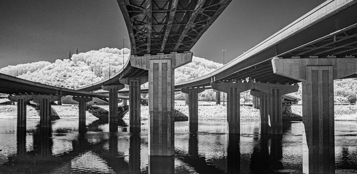
Tom, for me the sweep of the bridges is the important aspect of this image: the lines drawn across the sky.
I am unsure about the foliage - which seems to draw attention from the main event.
My one suggestion would be to dodge the shadows of the bridge in the water as I think this brings them into the collection of dominant lines. |
Jul 4th |
 |
| 99 |
Jul 23 |
Comment |
Linda _ I think this a beautiful shot particularly the way you have brought the dark horse to stand out against the white dust. The light through the horses' hairs seems very effective - and their shadows across the dirt add to the interplay of light and dark. And yes I think the eyes work. |
Jul 3rd |
| 99 |
Jul 23 |
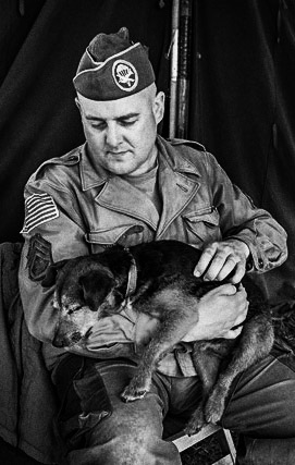
Comment |
Peter - a nicely captured spontaneous shot - and I think evoking pathos. My taste would have been for higher contrast to isolate the subject more from the curtain and I think to evoke the mimic the older film (at least as I perceive it). |
Jul 3rd |
 |
| 99 |
Jul 23 |
Comment |
Barbara
I was in Mystic Seaport last year - lovely location.
The machine is intriguing - and I think your image captures it well with a good depth of field (sharp throughout). The light areas look to me like a rib cage. The acute angle of the shot seem to me to be well chosen in terms of providing the details of the machines design.
The noise seems appropriate to me. I tried removing it and it seemed to render an image that was more like a graphic design. With an exposure of 1/2500 however - you might have traded off some of that speed for a lower ISO? |
Jul 3rd |
| 99 |
Jul 23 |
Comment |
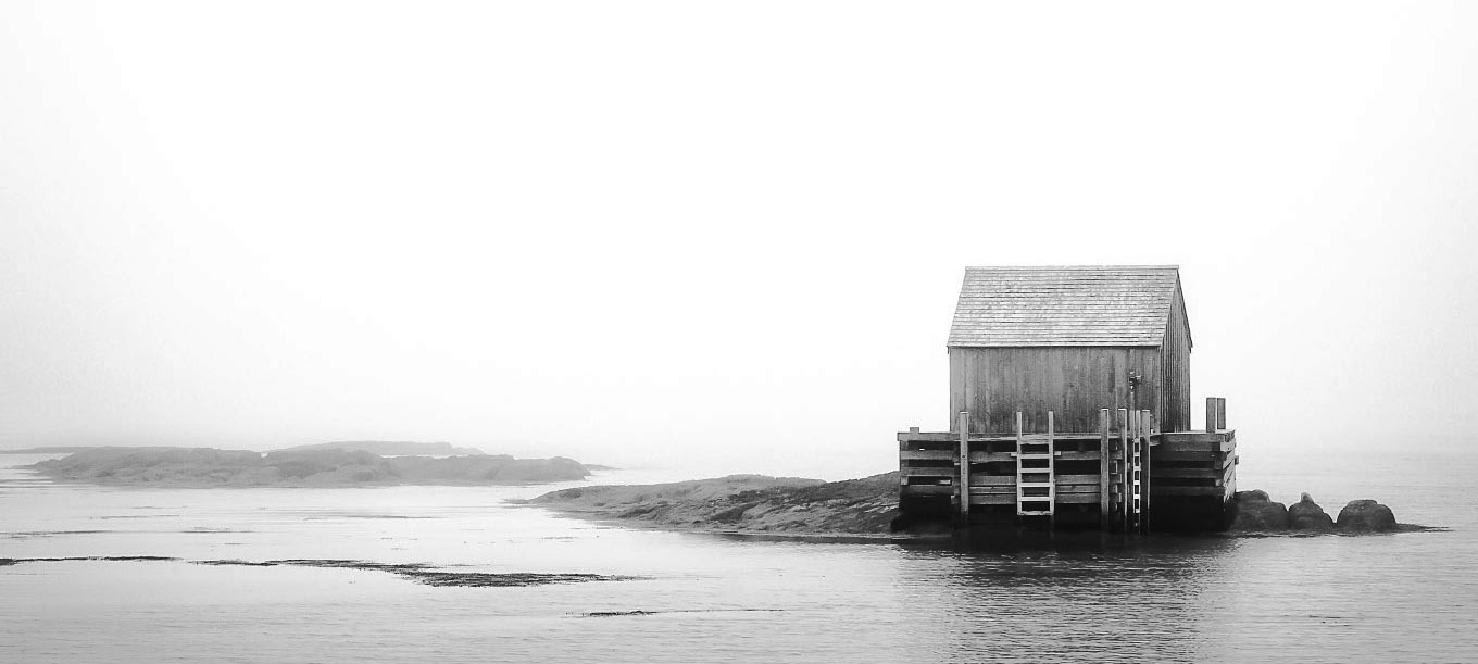
Denice - welcome - I can already see that you will bring much from which I will learn.
I love these images of minimal subjects - the eye is drawn to small detail - even in the mist. For me the focus are the ladders against the building, somehow supporting the structure and yet outside it. Their sharpness contrasts I think so nicely with the rocks on the rocks on the left fading to mist.
My instinct is always to higher contrast that others prefer - so I apologize in advance for the manipulation below, in which I have isolated the building and added a little extra. |
Jul 3rd |
 |
| 99 |
Jul 23 |
Comment |
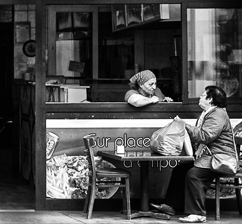
Kathleen - I find myself in agreement with all of Denice's comments. I find the interaction of the two women to be arresting, somehow evoking a pair of locals who have shared many travails in life. I would halve the gap on the left, and leave the back darker. My only additional thought would be to use perspective warp, because this would allow a taller cut that uses the window frame as an image frame. It makes the women smaller, but somehow in my view this adds to the narrative of survival despite history. |
Jul 3rd |
 |
6 comments - 1 reply for Group 99
|
12 comments - 3 replies Total
|


